James Rodriguez
-
Posts
69 -
Joined
-
Last visited
Everything posted by James Rodriguez
-
Mysterious. I likes.
-
Pretty cool. How about a shadow from those 2 street lamps on the lower left? They're in daylight and all other objects are casting shadows. Details, details. B)
-

affinity photo Kmart Christmas 1979
James Rodriguez replied to James Rodriguez's topic in Share your work
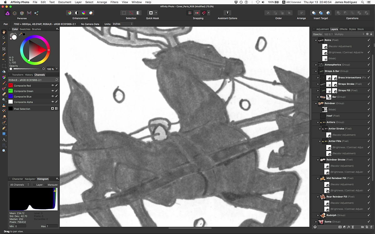
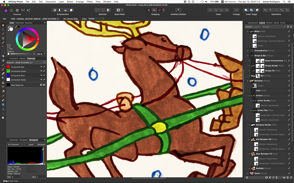
Thank you both. With as much time as this project took, I'm feeling more justified with every favorable response. For a while there I was second guessing the value of colorizing a childhood illustration. I mean, who would care? Also, my enthusiasm waned because I used only a handful of AP tools/techniques. The labor was mostly Brush tool usage—to eliminate, not create. Pretty tedious. Here's more detail of one of the reindeer and its 3 phases.
-
affinity photo Kmart Christmas 1979
James Rodriguez replied to James Rodriguez's topic in Share your work
WOW! Thank you so much, Stuart! :-) It was a lot of work, everything was created from scratch, including the label and script typography. As this was a personal project there was NO client supplied anything. I'm super glad you liked it and thanks for the kind word, friend. -
affinity photo Kmart Christmas 1979
James Rodriguez replied to James Rodriguez's topic in Share your work
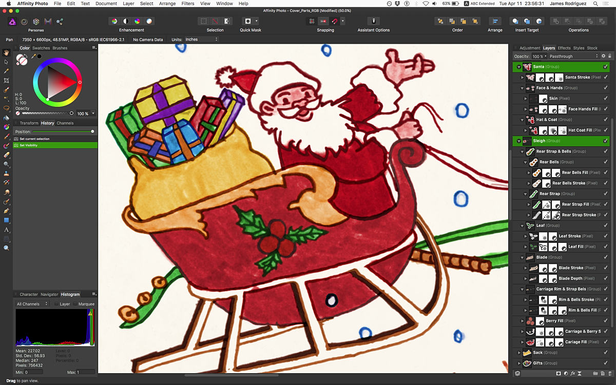
LightWave is the only other serious 3D package I used (Ray Dream Studio was used for my Battlestar Galactica Viper image on Behance). I'd like to learn zBrush, C4D and Blender. Sorry for getting off topic. My Kmart Christmas project was assembled with InDesign, but I'm excited for Affinity Publisher. How much longer do we have to wait? This screen shot shows Santa in his sleigh. Separating marker outlines from fills took quite a lot of layers, and all outlines got separated from the fills. If a fill was a different color, it got a different layer. Then everything was further segregated into element groups, for my own sanity.
-
affinity photo Kmart Christmas 1979
James Rodriguez replied to James Rodriguez's topic in Share your work
Thank you, Kevin. What 3D program do you use? -
Love the thick-thin attribute to your lines (perhaps if the range was greater?), but I wonder if the teeth would better match the rest of him if their strokes were thicker? I'm referring to the one chomping at the USB cable. They're all cool.
-
affinity designer Nutty Squirrel Games logo/illo
James Rodriguez replied to retrograde's topic in Share your work
Hey Kevin, The vector blends and gradients on your squirrel; are there examples of that technique in the Affinity Designer Workbook by you or other artists? -
affinity photo Kmart Christmas 1979
James Rodriguez replied to James Rodriguez's topic in Share your work
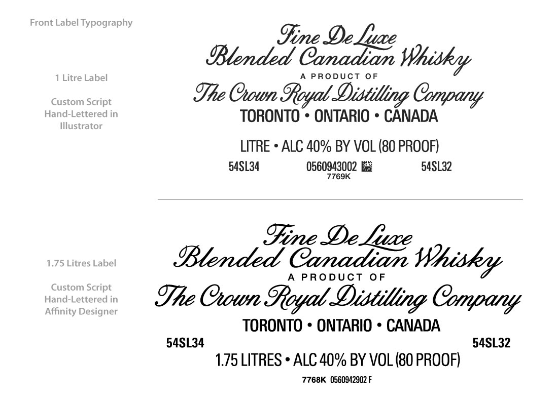
I did look at your squirrel paths and I knew there musta been some vector shenanigans going on. :-) I never tried that kind of vector approach in Illustrator and at some point I really oughta give it a go in Designer. I always brought vectors into Photoshop for softening and blend work, and I imagine I'll continue that trend with AP, but I must expand my toolset. I'm tentatively considering a second version of the Crown Royal bottle (a larger size) to learn different modeling techniques with Modo, and about a year ago I started work on the new label. Again for practice, I used a trial version of Affinity Designer for all the hand lettering. My intent was to fully complete the label with Designer, but the trial ran out, I waited for a sale which never came, and though AD is VERY affordable I was forced to finish the label with Illustrator & Photoshop. But I regretted not buying Designer. I needed the practice of that complicated label to determine if AD could handle all the subtle gradients of the curtains and pillow and background. And just the general workflow of AD—I wanted to see a complicated project through with it. I might've used your vector approach to blends, and I wanted to give Pixel Persona a try. To your point about crazy details, that's why I chose Crown Royal. The cap alone is a modeling challenge, but combined with the bottle itself and the detailed label I knew pulling it off would be impressive and a terrific learning experience. This is the only portion of the new label I completed with Designer. And if anyone is interested in the modeling and label creation, here's a thread on Modo forum: http://community.foundry.com/discuss/topic/93410
-
affinity photo Kmart Christmas 1979
James Rodriguez replied to James Rodriguez's topic in Share your work
Oh my god, I just realized Retrograde is Kevin, they're both the same person!! Holy crap. Thanks for the comment over at Behance, I'm flattered. I was checking out your Squirrel earlier and trying to figure out how you did the blends on the coat. -
affinity photo Kmart Christmas 1979
James Rodriguez replied to James Rodriguez's topic in Share your work
Thank you, Retrograde, I'm honored a fellow cartoonist approves! It was a lot of work, many long nights when I'd rather re-watch Babylon 5. But seriously, I really wanted to see this project to the end, and AP is awesome. I'm anxious to see it evolve although it handled this 300+ layer file without much complaint. Maybe some of that is due to my laptop: a late 2011 17" MacBook Pro with 16GB Ram. -
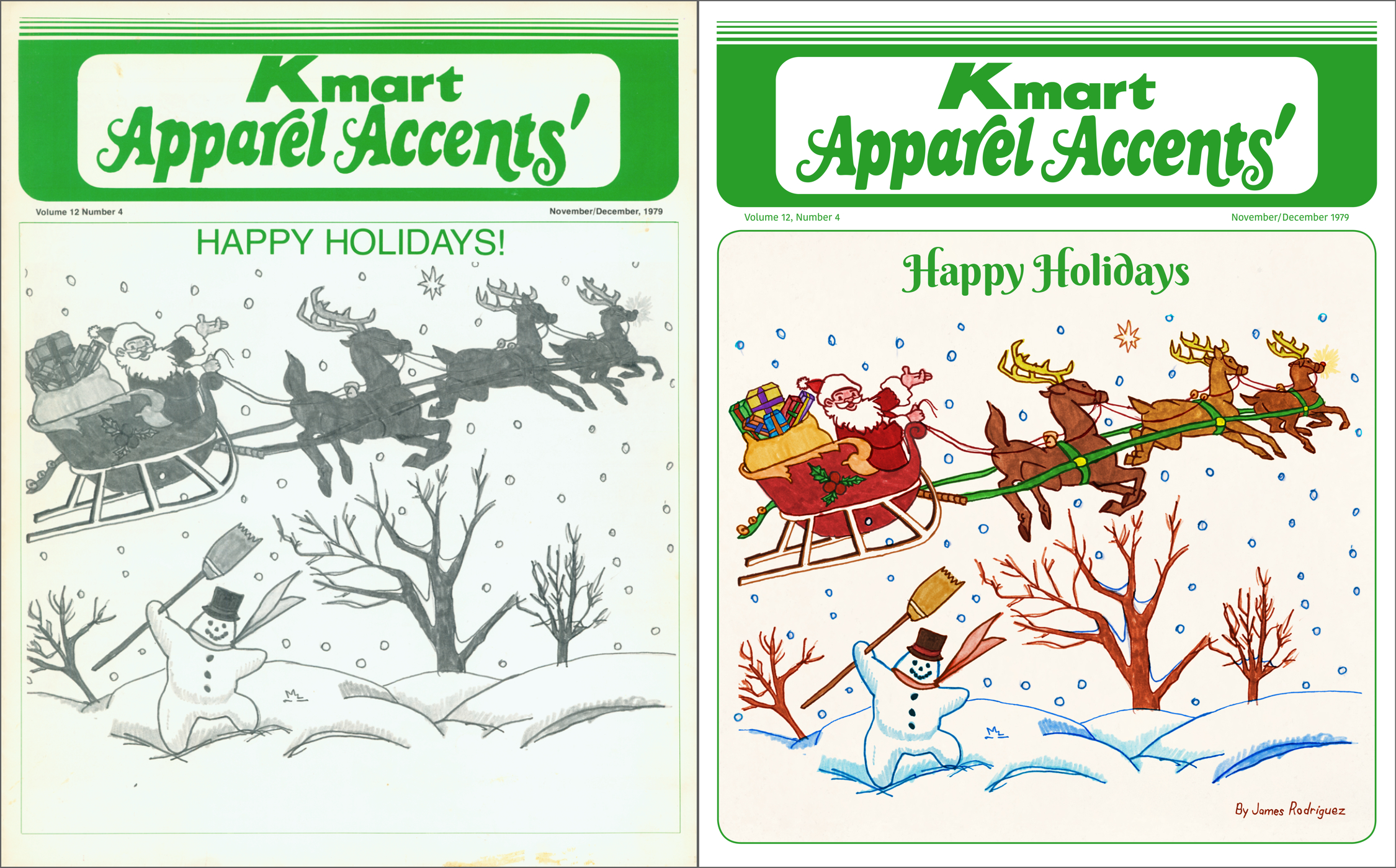
Hello all, I drew this when I was 11 and rediscovered it while looking through my ancient portfolio. Long ago it was printed on the cover of this newsletter in black and white even though my original was in color marker. As practice with Affinity Photo, I chose to recolor my old illustration, but all I had was the printed copy on the left. The colorful original was never returned and I think you'll agree the black & white reproduction is muddy and lacks contrast. I scanned the reproduction and AP helped bring color back to my childhood drawing. My main goal—aside from returning color to a cherished memory—was to keep the integrity of the marker work. Under no circumstance did I want to clean up or improve what is otherwise a child's drawing. I'm happy to say Affinity Photo handled this personal project flawlessly. The file is over 300 layers, and each hue is isolated and colorized using Recolor Adjustments and further manipulated with Brightness/Contrast Adjustments, and of course Masks. Before recoloring, I painted out the gray fills to isolate & retain the strokes. Separate layers of the original B&W fills were then used for colorization. The Paint Brush tool and its options helped me get the job done. My old childhood drawing has color again, thank you Affinity Photo. For screen shots and descriptions of the process, including Affinity Designer to redraw the title, please visit Behance at https://www.behance.net/gallery/51578699/Kmart-Christmas
-
Dr. Fate - comicbook colored inked artwork
James Rodriguez replied to Pixel and Poly's topic in Share your work
Nice use of Lens Flare. -
Thank you very much!! :D
-
Figured out to follow this topic, but I still need help with the Grayscale issue above.
-
Thanks Lee D I will, I'm on a Mac (late 2011 17" MacBook Pro, 16GB Ram). Stupid Question: How can I subscribe to this tread, or otherwise receive notification of any responses?
-
I have an unprofiled grayscale image that AP insists on opening in RGB color space, not Grayscale. The Color Profiles section of Preferences has different scenarios for assigning profiles, but is there a way to open an unprofiled grayscale file in Grayscale color space? Photoshop opens unprofiled grayscale files in grayscale color space as expected, why can't AP? I opened said file in PS, re-saved it as grayscale with Gray Gamma 2.2 profile, AP now opens it in Grayscale color space with Greyscale D50 profile. But what about AP opening it in Grayscale with the Greyscale D50 profile from the get go?
-
Photoshop can copy/paste entire Layer Styles (Layer Effects). Affinity Photo needs this workflow, please. Currently, I have to reapply identical multiple settings to different layers.