GarryP
-
Posts
11,044 -
Joined
-
Last visited
Everything posted by GarryP
-
 If the answer to this is something like “The Auto Enhancements are a lot more complicated than simply applying single adjustments/filters.” then I’m happy with that as a reason why they can’t be applied as layers. I guess that could also be why they aren’t applicable as Live Filters, like most of the other filters are. I’m okay with accepting that and moving on.
 -
You're welcome.
-
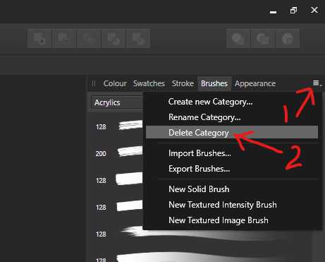
Have you tried to delete them via the menu in my screen grab?

-
You’re welcome. I came up against the same confusion myself when I started using the Affinity applications until a forum member helped me out. And now I’ve been able to help someone with the same problem. Hooray for the forums.
-
Ah I see. My curiosity is sated. Thanks. Maybe someone else has another way of doing it other than slicing.
-
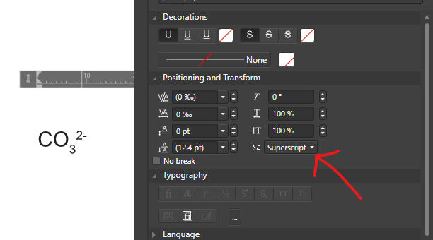
The buttons in the “Typography” section of the Panel let you tell the software to use (or not use) the subscript/superscript versions of some characters in the font itself – if they exist in the font – when you tell the software to use subscript/superscript. To use subscript/superscript you need to use the option in the “Position and Transform” section, see attached image.
-
Just out of interest, where do you get a 1.6-gigapixel image from and/or what would you do with it? I only ask as the Large Synoptic Survey Telescope has a 3.2-gigapixel camera which is the size of a car and cost around US $168,000,000 to build.
-
Haze Removal?
GarryP replied to Breadman's topic in Pre-V2 Archive of Affinity on Desktop Questions (macOS and Windows)
There’s an official video here which might be a useful starting point: https://affinity.serif.com/en-gb/tutorials/photo/desktop/video/301190699 -
If your pixel art is a pixel layer that has been placed into a document then the X, Y, Width and Height of that layer should all be integer values in pixels (not pt, cm, or others), otherwise you will get antialiasing. See attached video where the “X” is a 16×16 pixel square. 2020-03-25_13-33-42.mp4
-
I don’t think Serif have ever advertised Designer as being an alternative to Illustrator – or anything else – but I can see how it could be assumed that they could be similar as they have a lot of functionality in common with each other. If you, or someone else, can come up with a good use case for being able to measure the length of any curve, one that would be useful to a lot of people and not just pattern cutters (and similar), then I feel sure that the team would at the very least think about whether they could implement such functionality. If you want to get a quick approximation of the equivalence (or otherwise) of the perimeter of two shapes – or the length of two curves – then, if you have Photo, you can use a little trick with the Histogram Panel as shown in my attached video. It’s not particularly accurate but if you just need something close then it’s probably usable. The higher the DPI of the document the more ‘accurate’ the ‘measurement’ will be and the shapes should only have a very thin outline and no fill colour. Basically the Histogram will count the number of pixels ‘in’ the outlines. No guarantees with this, it’s just an estimate. 2020-03-25 13-20-03.mp4
-
Are your pixel layers on pixel boundaries? It can make a big difference if the positions and sizes are not all integers.
-
Yeah, that sounds like it could be a good idea to me as long as each Auto Enhancement only uses one adjustment/filter. I would be happy with that, even if the existing Auto Enhancements continued to do what they already do. We get two ways of doing the same thing, one quick and one that allows for later adjustment. Best of both worlds.
-
Dodge and burn not working
GarryP replied to doc74's topic in Pre-V2 Archive of Affinity on iPad Questions
Welcome to the forums. You will probably get a better answer if you posted it in the iPad section of the forum rather than the Desktop section. Maybe a moderator will move this thread for you. -
You’re probably right when it comes to the removal of excess lines that was mentioned but I don’t see where that joins up with getting “very sharp lines and edges” which was mentioned in the first question. Or maybe I’m just not reading the original post correctly. I will be nice to get more information so we can get a better view of the situation.
-
You’re welcome. Thanks for confirming. I think someone with a Mac may need to look at this and see if they can replicate it. Just in case there might be a nasty little bug in there somewhere, perhaps.
-
Like I said above, I understand that they are there for ‘quick fixes’, but I don’t know why automatically adding adjustment layers would make those fixes any less quick. One button click one way, one button click the other way, same thing. If the user doesn’t want to modify the adjustment then they don’t have to do anything else, they can just leave them alone. (There could be an option in Preferences – default to OFF, perhaps – that lets users have adjustment layers created for the enhancements if they want them instead of a destructive change.) I also don’t understand why making a destructive change gives the user more choice than allowing them to make changes later. I’m also not that sure that people would complain if they got adjustment layers automatically added. I’m not saying that they wouldn’t, only that I have no proof either way. I don’t want this to get into any kind of argument as I’m not particularly bothered about it – as I said, I don’t use them myself – I’m just wondering if there might be a 'better', possibly more useful, way of doing things.
-
Can you try switching one ON and the other OFF and telling us which combination(s) work and which don’t?
-
Interesting. Thanks for the extra info’. On Windows, I tried (with the Arial font): * entering the text via the keyboard and I don’t get what you get; * copy/pasting text from LibreOffice Writer and I don’t get what you get; * copy/pasting text from a text file in Notepad and I don’t get what you get. I also tried changing fonts but that didn’t make any difference. Your special characters are a different colour to mine but I can’t see why that would make a difference. Does this always happen after every apostrophe including those at the start of a line and/or those just before a full stop? What happens if you put two or more apostrophes together? Have you tried switching OFF either of the things marked in my attached image? (Might not be part of the problem but worth cheking.)
-
Simbad82, if you were specifically looking for software to be used as part of your pattern cutting requirements – quote “My main reason for buying Designer was for pattern cutting…” – why did you choose Designer? Designer has never, as far as I know, been advertised as having any tools that are specifically designed for pattern cutting processes. Wouldn’t some other software, that actually does what you want, have been a better choice?
-
If your design is a set of vectors then you probably cannot get it any more “sharp” then it already is. If your design is a bitmap/raster then you would have to use some other software to convert it to vectors first. You can manipulate vectors using the Node tool, and others. If none of this answers your requirements then we will probably need more information about your design and what you are trying to do.
-
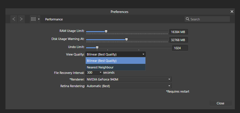
Welcome to the forums. You can try changing the View Quality in Preferences/Performance, see attached image. If that’s not enough then someone should be able to advise further.
-
Welcome to the forums. You can download a free trial of Photo via the link at the bottom of this page: https://affinity.serif.com/en-gb/photo/ P.S. You might want to choose a different user name so your email address doesn’t get scraped for nefarious means.
-
Welcome to the forums. I have a few starter questions: 1. Which version of Publisher are you using? 2. Are you using Windows or OS X? 3. How are you getting the text into Publisher? (Typing, copy/paste, something else?) 4. What do you see when you check the menu option “Text → Show Special Characters”? (A screen grab would be helpful.)
-
I can understand why they exist – a few clicks and your photo looks better without much effort, and that’s great – but that doesn’t tell me why they don’t create adjustment layers (or live filters) instead of making destructive changes, which was why I asked the question. Having the software add an adjustment (or live filter) – which can be later changed or removed – instead of making a destructive change, does not change the user’s workflow as far as I can tell; they can still just make one click per enhancement. However, by adding an adjustment/filter layer instead, the user also has the opportunity to change things later if they want to, thus giving the user more control if they feel the need for it without forcing them to do anything else if they don’t want to. To try and reiterate, why do they do what they do in the way they do it? And is there a good reason why they shouldn’t do it another way?
-
Would it improve usability if the Auto enhancements on the Toolbar – Levels, Contrast, Colours, White Balance – added a non-destructive adjustment instead of using a destructive filter? This way the user could hide, show, remove or alter the adjustment like any other. On the other hand, is there a good reason why these enhancements should be destructive, as they are currently? I don’t use them so maybe I’m not seeing the whole picture (pardon the weak pun). P.S. Which adjustment(s)/filter(s) does an Auto Colours enhancement use?