Wosven
-
Posts
4,129 -
Joined
-
Last visited
Everything posted by Wosven
-
 And that's a pain already discussed... it should be saved in the presets — like other apps do —, so we wouldn't spend half the time grumbling and needing to re-export PDF. The more embarassing being when you've send the PDF as you would do usually after correcting something and people complain about not having normal pages.
 -
Editable object styles
Wosven replied to Wosven's topic in Feedback for the V1 Affinity Suite of Products
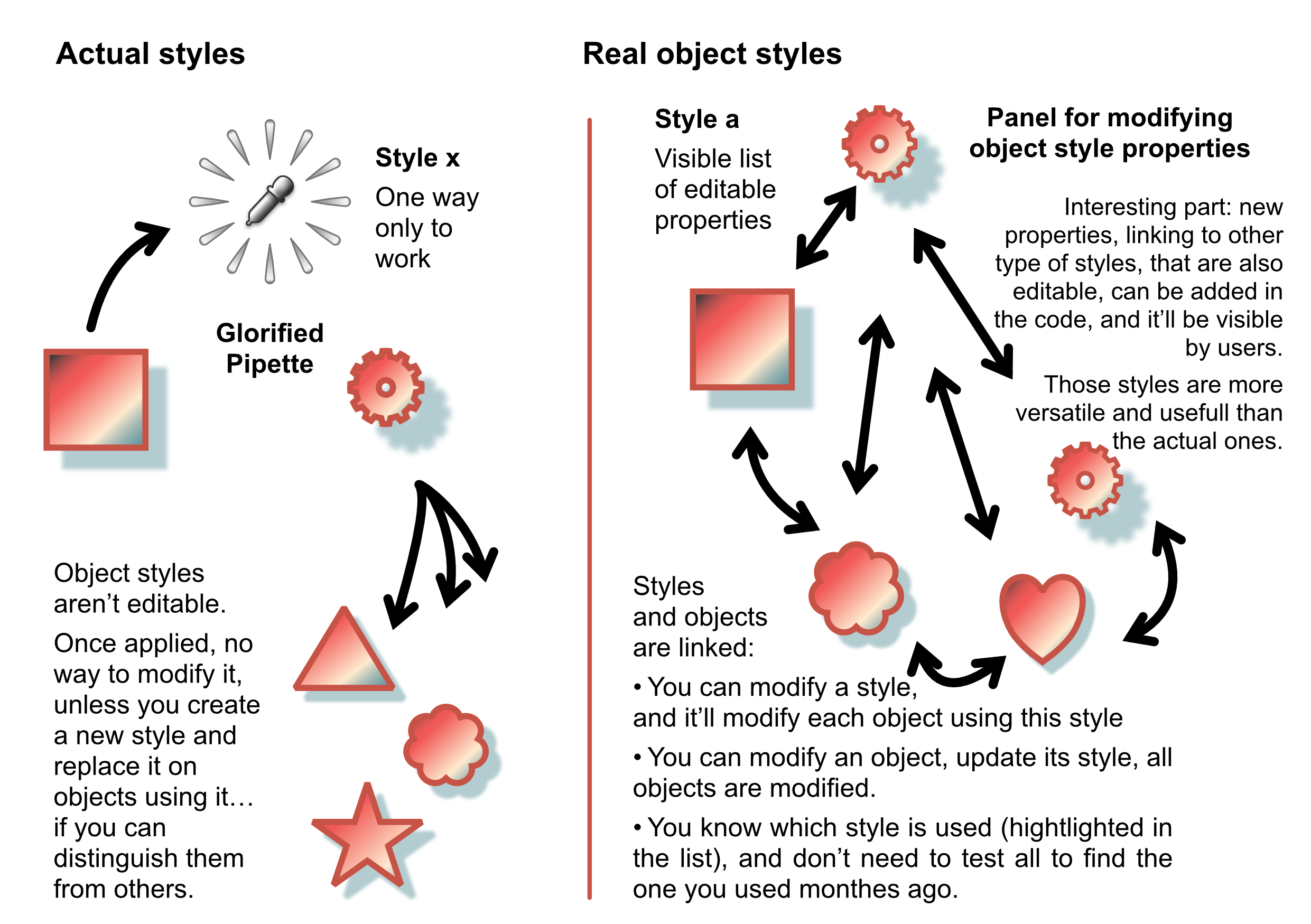
Another futur problem: scripting. Without any clear and net object model, with properties ordered in objects and styles, to easily access and modify them, scripting will be very difficult. Once, I had to apply paragraph styles to a 1500 pages book. The authors did their best, but didn't know about paragraph and character styles. But they did it "seriously", and used pipette on each paragraph (but one title, I can remember this one I missed formatting with the right style). In the end, it was possible to apply real paragraph styles once the necessary script able to find paragraph with specific properties was written... and able to search fractional values instead of the truncated ones visible in the app's contextual bar. Scripting Affinity apps will be this difficult if properties aren't ordered in a logical way with styles and parent-children links. If some sort of object method was used, it would be possible for the app to memorize the x last search-and-find requests, by document or by sesion, and reuse them later. Saving them with a proper name would just be adding a button in the UI and some file in the user's HD. -
Editable object styles
Wosven replied to Wosven's topic in Feedback for the V1 Affinity Suite of Products
Notice that we actually have the same problem with colors and brushes. Objects have a value/values properties instead of being linked to swatches or brushes. It's a one way of doing things: we can only apply them. No way to know which one was used, etc. The apps have some internal pipette applying those properties to next object, that's all. -
Since I wasn't in a mood to write, I did some drawings (or pages)... I'll develop more if needed. Styles_Pipette.pdf

-
I'm using Fastone viewer too, and it's annoying to not get previews when there are in other apps like XN view MP. There's interesting link here in this thread. I think somewhere the dev of an app like FastStone viewer (I'm not sure it's this app), asked details to be able to display previews, but I don't think there was an helpfull answer, sadly.
-
Ça c'est vraiment étonnant, généralement illustrator gère bien les différentes zones de PDF. Maintenant si vous avez PitStop, intervenir sur le PDF est simplifié. Mais bon, en l’occurrence, ça reste du bricolage. Bonne après-midi. C'est APub qui calculait la taille d'affichage en utilisant tous les objets de la page et du plan de travail, au lieu de ne considérer que la surface de la page elle même. Aller reconfigurer un profil et des dossiers Pitstop, c'est un peu lourd, même si c'est un bon canif qui voit passer et peut corriger ou refuser toute sorte de PDF Belle fin d'après-midi aussi.
-
Je me sens moins seule Les idées arrivent là où il n'y a aucun moyen de les noter, ou lorsque ce n'est pas le moment pour les noter... puis on oublie ! ISO Coated v2 300% ECI (Fogra 39), X-a:2003 à défaut de 2001, oui, en général j'utilise les spécifications finales pour me faire une idée du résultat, et pour vérifier les bugs d'exportations possibles. Et que le client ne voit pas un truc RVB flashy à l'écran, pour être déçu par une impression terne… (Par contre, l'inverse est aussi arrivé : document avec couleurs sympa et vives, imprimé chez le client sur une imprimante complètement dépassée => impression terreuse et fade, 3-4 tons au dessous des couleurs réelles. Résultat : le client a dû m'envoyer sa version imprimée pour que je trouve des Pantones équivalents car il adorait ! C'est le résultat de la méthode « à l'arrache », après de multiples modifs demandant de multiples réimports et recalages... je suppose. Sans compter que j'ai bidouillé pour que ce ne soit pas le design originel sur l'exemple. Mais normalement, l'autocollant faisait environ 6 cm sur une page de 10 × 10 cm, et le final devait avoir du fond perdu. À l'origine, c'était une affiche immense faite sous Illustrator. Avec de grands éléments que j'ai dû recadrer, ou tronquer/réduite quand le bug a fait que tous les éléments de la page, même cachés, même invisibles, étaient pris en compte lors des redimensionnements/réimports, au lieu de se baser sur la surface de la page. Car du coup, certains autocollants étaient mis à jour et affichés à 2 cm de large, quand d'autre restaient presque taille exacte... Le bug sympa Après, c'était il y a un an, j'ai vu plein d'autres bugs et faits plein d'autres choses depuis, et ma mémoire tente de mémoriser le positif !
-
They are just meant to be icons in folders... That's why it's usually low res and without profile. And why today, for larger previews, OSes display the file if possible. Not all file formats can be readable or integrated in the OSes, that's why in some cases PDF previews are added. As a foreigner, I aknowledge that searching forum isn't always easy, our own words being differents that others' way to describe a same idea. And it's worste when translating apps' menu or functions... But since I read those threads, I thought it was easier to find. (It's difficult sometimes to find our own threads by keywords!) From memory, PS permit to choose different preview sizes, perhaps asking for this feature would be an option. Or some apps have an internal "previewer", allowing to display bigger thumbnails when choosing to open or import its files. Don't you need first to export as JPG or PNG for databases?
-
Did you: First: try to resize the preview panel selecting the bottom-right corner ans use ctrl+mouse scroll to somm or other shortcut depending of your OS? Second: search the forum about this subject since it was already talked about when the feature was added and a there's a lot of comments and mentions in the release features ? [Edit] I was thinking about the preview when exporting... ...Not the thumbnail in the finder/explorer. But those are usually low resolution JPG, not using color profile, etc. And it's only usefull as preview, but not really helpfull. I suppose finder/explorer or some app 'd rather read the image and display them instead of the preview when possible, but it's not possible with proprietary formats. [/Edit]
-
Perhaps you missed the important part we're talking about (bottom of the page you linked):
-
Before Covid, I wouldn't have commented. But with it, and seeing friends loosing their job, having hard times, etc., I'm happy to use apps from a company with ethics and trying to help offering discount on their products, or video, articles. I'm not the last one to complain about bugs, but I wouldn't ask to modify their business model since they're not a "pigeon de l’année", and certainly know what they are doing.
-
[1.9.2.1035] File corrupt warning box on file change
Wosven replied to StuartRc's topic in V1 Bugs found on Windows
At least in my version, I known the popup was false, and I just had to close it and keep on working. Nothing disappeared. Your art is so detailed, that embbeded files should give huge files and take a lot of memory, isn't it? It would be sad that a nasty bug stop you to share impressive artwork. I hope they'll find a solution . -
Ah, et à l'époque, les cases pourcentages n'existaient pas, il me semble, d'où le besoin de créer un gabarit avec les formes pour tout redimensionner à la même taille. Tout un poème
-
@uneMule C'était plus ou moins le début des imports de documents multipages, et la possibilité de choisir les pages affichées. Donc bizarre comme diviser sa page en 3 × 6, importer son document APub avec page de 10 × 10 et réduire pour que ça tienne dans la planche... Ça, c'est la première version qui va bien. Après de multiples bugs, comme après mises à jour du fichiers multipages, le logo se retrouve à des tailles complètements différentes sur chaque instance... Pareil en utilisant un fichier PDF... (les objects vectoriels hors de la page ou masqués étaient pris en compte, au lieu de la surface de la page). J'ai dû créer 2-3 threads rien que pour ce document... Donc ça s'est fini avec la bonne vieille méthode "À l'Arrache". J'avais juste besoin d'une planche pour que le client choisisse sa ou ses versions préférées, pour faire la deuxième déclinaison, la taille n'avait pas (ou plus, à ce stade d'agacement) besoin d'être exacte. Les versions suivantes étaient juste des PDF multipages avec 2-3 versions taille réelle, jusqu'à la version finale.
-
Not always if it's only around the logo, without part of an article on the white too. I even had 2 versions for a logo, depending if it was on the left or the right side. The logo was meant to go in the bleed area (out of the page), but it seems few read the charter, since I saw it few times 5 mm inside the page!
-
I did this a lot with Excel charts, to give them more modern and interesting designs than the average charts done by accountants, and to replace fonts by the ones used in the magazine. It was the fun part while working on a magazine too technical to be fun.
-
@loukash and do we explain how sometimes parts of the logo should be used as mesurements for margins between logo and the top/bottom/left/right sides? Or others strange requirements in brand graphical charters...
-
+1 No, we are 2! Logos shouldn't be put on white square or rectangle unless it's part of the design. It's usually not allowed, and you need to check the graphical charter for the logo/brand. They'll provide examples, it can be using a white/grey/black logo depending of the background color, or other colors if allowed, or it can be completely forbidden to use the logo on something different than white, or solid color, etc.
-
[1.9.2.1035] File corrupt warning box on file change
Wosven replied to StuartRc's topic in V1 Bugs found on Windows
Same problem than in this Apub's bug: -
affinity publisher Library Flyer - trying to make it pop
Wosven replied to chasm's topic in Share your work
That's the "official way" for posters, the second and better one is half bottom of shops' doors (or any part they provide us), to stick posters. -
affinity publisher Library Flyer - trying to make it pop
Wosven replied to chasm's topic in Share your work
Hi @chasm, You nearly convince me to come, explaining your tour of the library and your activities! And since you can create videos, why not a short one or more of this tour on your site, with a QRcode linked to the main one on the flyers? I only choose the flyers I'll read. I'll decline if it's about cars, sports, fortune telling... accept the ones about cultural activities, restaurants, novelties. It's like ads in the mailbox, I never put a "no ads" sticker to avoid them, hoping to get interesting ones, but 99% aren't. If people don't wan't a flyer, they certainly won't read it. And discard them on the pavement out of view The students/children part is a good way to go. It's free advertising, and can convince people that think libraries are just a bunch of dusty old books stores in dark aisles. I have a friend that work in libraries, and she created a lot of expositions or cultural events. Sometimes inside the libraries or outside (in the city's park), with posters in the city for everyone to know. It could be about chocolate, or impressionists painters, or illustrators for children, origami... One of those event was particullary crazy: she and hers friends crocheted flowers and such to dress trees, guardrails in the park, to emphasis panels about artists and paintings scattered around. There are concerts on the Fête de la Musique day (perhaps difficult with Covid...) How old is your library? It's perhaps time to prepare an event for the xth anniversary… or expositions or contest children would be interested in, bringing their parents in. The chocolate expo ended with a funny (but messy...) pastry contest and tasting, and since the children needed to register to participate, it was possible to give each one a prize (a chef's toque with a label and few candies). The purpose is to show libraries are lively and different than what people imagine if they never went in one. It's also a good way to be known of the communication teams of the city and do more work with them, until it's natural and the library is associated with mains events (and get budget), giving more visibility. The goal is to be known, perhaps an article in the local newspaper! Flyers won't be able to do all this, but they'll help a lot giving a sturdy view or answer about details of what you're doing. You just need to bring people in, where you'll give more flyers Reading about what you're doing, and how you give flyers, I suppose you're at the best for this part. The next part is perhaps "how to get people coming and talking (or the other way) around about what we do,what we provide in the library?", to get more people. Another idea: did you make a "How to" video with a local celebrity? Perhaps it's a pastry chef, and he advertised in his shop about the 1st viewing you did in the library on wide screen, where you invited other people too and did a small party. And now, he'll keep a poster about the library and the video in his shop... and talk about it proudly. -
It look like it, but it's not done in duotones (we couldn't find good results with this, it always looks "muddy"). In fact, the images were keep in CMYK, and we used 2 different techniques. Easy one: using 2 fill layers with masks mix of yellow and magenta plates (usually lighter parts), for the lighter and warm color mix of cyan and black plates (usually darker parts), for the darker and cold color Hard method: using Channel mixer layers and adjustements to get only magenta & black, where we want them. on top of those, another Channel mixer layer with only Magenta and Black (avoiding 4 plates problems) last Channel mixer to convert Magenta to Pantone 1, Black to Pantone 2. (a bit difficult, to add in the right channel). Notice that we did this to get the "feel" of the final result, and be able to print a nearly correct document to send to the clients. Internet wasn't as effective or wide spread... For the PDF for print, we had to hide the last Channel mixer layer, or put back magenta and black in the fill layers, before updating the images. Modify ours colors in QXD (or import the colors or another document with same names but using magenta & black only). Create the PDF, check the plates, and send to print. Since we were able to script PS, save QXD files with the colors, etc. it wasn't too difficult, and let time to spend choosing nice colors. The clients and the boss were impressed, we were happy . (and it wasn't the rush as today...). It was possible in PS & QXD and its "generic CMYK" profile for PDF, but not in ID later. portrait.afphoto
-
Héhé, yes, it's an old technique. We used this a lot when doing 2 Pantones document. The trick was to use complementary Pantone, or 2 ones that can produce black or nice grey when mixing the colors. It means that in the end, the document looked like 3 colors instead of 2. And it was possible to obtain really interesting results with pictures. From near reality to infrared, lol It was also an interesting way, since QXD could select specific alpha channels stored in a file, to duplicate the same image on the same position, use different mask and color to produce good effect. Each year, we only had to modify the main colors of the documents, and voilà! (at the time, our printer just needed 2 plates, and we told him which plate matched which Pantone, and that was all). We could create swatches made of the mix of the 2 Pantones this way, etc. Today, it keep on be used in magazines that need to change monthly main colors in different parts and some drawings, logo, etc. Especially in magazines for children. Some examples, completely differents from the usual cyan & black or other less fun 2 colors used at the time:
-
Depending of Google or our own translation engine, depending of our point of view concerning the problem, the same question can be asked in different ways in the forum. It can be difficult to find them.
-
Extend mask layer to whole area
Wosven replied to Wosven's topic in Feedback for Affinity Publisher V1 on Desktop
Funny part/ I thought I could be smarter than the app,and decided to resize the page to include the bleed, so I could paint on it. Effectively, I was able to paint in the bleed area. Once done, and all masks/adjustements corrected, I just needed to resize again to the smaller size, and export the page. !!! Impossible now to export as PDF with bleed, my usual presets with bleed, checking and unchecking it, opening the file in AD, nothing was able to permit export with bleed! Problems encountered in this project: inability for Affinity apps to keep image size while pasting from an app to another, if you don't disable "copy as SVG" in the preferences mask/adjustement layers copied from another document will lock the workable area, and you won't be able to paint on the whole document or layer's surface resizing a page can bug and keep you to export with bleed etc. What is not fun but sad, is I just wanted to do a simple project: a funeral plaque. Working the pic in AP, importing or copying in APub, adding text and voilà! What could go wrong? … Voilà is more like finishing in another app since I don't have any iota of patience to keep on in APub. Please, stop adding new features, and begin working on diminishing the bugs. There's a lot of pages of them in this forum. Work on features that improve the UI, already existing features that need more work (swatches and colors, styles as in real syles for objects and not just a bunch of properties pasted on other objects, etc.). There's tons of good ideas here, but the more you wait before working on them, the more it'll be huge and an impossible task.