Wosven
-
Posts
4,129 -
Joined
-
Last visited
Everything posted by Wosven
-
 No, I mean the part copied and pasted and merged. In fact, the problem discussed in this tread, not the antialiazing.
 -
I doubt I would do such a project in APub. You can test prformance realizing a book, but I would worry that the lack of real object styles would add some work. Imagine you've done 5 books, and suddenly you/the client decide image frame borders should be 0.5 pt instead of 1. There's no way to select all of them at once in the Designer persona, it'll only select all the same ones on the same page. I use object styles since the were added in QXD, and others styles possible, and that's a feature difficult to live with unless you love to click a lot and do repetittive tasks. I love playing or designing in the apps, but once I need to do the work, I usually swith to another app. It'll depend also of the number of projects you did with them, and if you've got enough knowledge to solve different problems that can arrise, if you've got a workflow you'll be able to maintain for ten books. But I don't take risks usually. Perhaps other did a lot of projects without problems.
-
It just means that all your image parts/selections will be blured... if you don't keep your eyes on the Transform panel. I can understand wanting blured edges, but if all your pixels are misaligned, there's really no benefit. As you said, if you want to blur something, you do it consciously using filters, not misaligning before merging. All other app will give color/alpha value for whole pixel. You can have part of pixel when working with vector, due to/while calculation, but even those should be defined as whole pixels' color/transparency when merging or exporting to raster files to avoid blured results. I suspect that if there was an option for the app(s) to behave like other apps when doing selections and merging layers, everyone would enable this and forget about those .xxxx pixels mesures.
-
Why not: definitely add a shortcut to "Add fill layer", "Show" (Layer), Hide" (Layer) and: Select an area ("L" + selection) Add a fill layer (shortcut) Unselect (ctrl+D) Hide layer (shortcut) "G" for gradient Tool Alt+Click on the image for the first color Draw gradient Alt+Click second color Display layer (shortcut)
-
Of course we're talking about flowing text + master pages. The 1st screen shot show the resulting problem, the 2nd the original master page. It can be a flow problem, but also one of those 2 options that need to be checked: (my mind can't find the translation right now!) I'm not sure why those problem occur when re-applying a master page and not before.

-
Hi @Lillias, Since there's no reason to click on those files to open them, they are only used by Affinity apps, I wouldn't try to change anything. You can also right-click and modify the "open with" app, but again, it's only cosmetic.
-
It happens regulary when re-applying a master page in a book. I tend to use the bruttish method of stopping flow and reflowing to right frame, or erasing the master pages, applying the expected one, and reflowing (but I do this when I only need to do this on 1 page, if there's more, I test naming the frames). [edit] It can happen with page numbers' frames of title/author frames [/edit]
-
Hi @hughosb and welcome, It's probably APub messing with the text frames and putting regular text in the frame for page numbers. Try to names the frames in the master pages, perhaps it'll help APub reconizing them when adding master pages, to flow the text correctly. They are "smart master pages" (check some videos about this), but even smart AI can get it wrong sometimes
-
It's possible to set a shortcut to Reset the rotation: Preferences > Keyboard shortcut > Designer > View > Reset Rotation
-
A Reset and a field with the value that we can modify. For example, I use the Mouse's scrool to zoom in AP and AP, and disable it in APub since I use it from scrolling pages up and down. Most of the time, when needing zooming, I forget I set it to Crtl+scroll and do Alt+Scroll (and rotate the view). If it wasn't hard coded in the preferences, I would use Ctrl+scroll for all the apps. I would disable this in the preferences and would use the context tool bar for the View tool instead.
-
reset the view
Wosven replied to SilanEr's topic in Pre-V2 Archive of Affinity on Desktop Questions (macOS and Windows)
I'm not sure, but it's athought you're in Outline view mode. Check the buttons on top of AD. -
I don't think so, but it woul be nice to have it in the context tool bar of the View tool!
-
Hi @sopax and welcome, You probably use Alt+ Mouse scroll or similar shortcut.
-
We can only create Texture image brushes from PNG, and this file format only use RGB. The result is ugly colors when creating brushes... and it's nearly impossible to correct those colors to be used in CMYK documents. If those brushes are used for stroke (small), applying adjustements on them is also too much calisthenics. Example:
-
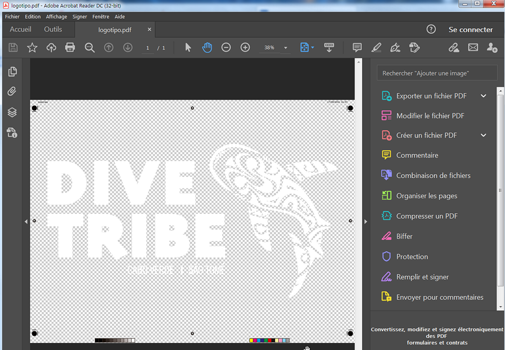
The logo is fine and the background is transparent: Usual view (white background) Display transparency: Result: logotipo.pdf This PDF was exported with settings for print that disallow transparency (to be more accurate: no objects with less than 100% opacity, void for backgroud — paper — is allowed).
-
It would be interesting to get a popup asking about keeping or deleting those constrains when pasting in an app without this panel.
-
Exporting SVG files
Wosven replied to ASG's topic in Pre-V2 Archive of Affinity on Desktop Questions (macOS and Windows)
I think size are accurate when they are given in other units that pixels, or if two units are used (for area, and object, i.e. points/mm and pixels). And it's logical: if it's a physical dimension (points, mm...), any app can open the document and get the right size, and the resolution can be modified depending of needs, or be different depending of app (inkScape will use 96ppi, AD 72 ppi). if there's a physical dimension and a pixel unit used, it's possible for the app to deduce resolution. if there's only pixel unit, and the app always open with a specific PPI, there's no way it's able to get right size. Worste, in the case of AD for example, it won't be able to open a file it exported at different PPI at the same size. An interesting part of the specs: https://www.w3.org/TR/SVG11/coords.html#Units It would be usefull when exporting to SVG to be able to specify the height and width units (or use the one of the document: in, mm, pt...), instead of using by default 100%, and having the viewbow set with pixel dimensions, or no viewbox and the document's dimensions set in pixels. This way, AD and other apps can open the files at the right size (instead of exporting at different resolutions but only importing at the same one, mostly 72 or 96 ppi (inkScape default value)). For now, AD is able to export at specified PPI (and it results in objects of different pixel sizes), but unable to read it since it always uses 72 PPI when opening files. -
Exporting SVG files
Wosven replied to ASG's topic in Pre-V2 Archive of Affinity on Desktop Questions (macOS and Windows)
Same files opened in AD (checking sizes): Inkscape: ok Draw: ok Vectr : bad Gravit: ok Photopea: bad AD: bad AD: bad -
Exporting SVG files
Wosven replied to ASG's topic in Pre-V2 Archive of Affinity on Desktop Questions (macOS and Windows)
The problem is that unless you export at 96 PPI, AD is unable to give accurate mesures. I tested with different apps and created an A5 page, with randomly positioned, a square of 50×50 mm and a circle of diameter 30 mm (60×60 mm): Inkscape will only give sizes in mm for page and objects: ok Draw (LibreOffice) will give size in mm for page and objects in pixels, same for the viewbox: ok Vectr will use pixel sizes: ok Gravit only give point sizes: ok Photopea only give pixel sizes: bad AD, export with 300 ppi, only give pixel sizes: bad (similar size than Photopea) AD, export with 96 ppi, only give pixel sizes: ok I checked the files opening them in InkScape, setting unit to mm, and checking size. Files: testUntitled6ink.svg (inkscape) AD_Untitled8bis_96ppi.svg AD_Untitled8_300ppi.svg Vectr_untitled.svg testDraw.svg testPhotopea.svg testGravit.svg -
This is only a logo, please do not use such term that are only relevant to some being suffering and only lessen the value of this word. From what I read of your process: you embed the logo in your files you keep history of its variants you don't update logo in older files. you produce books (I suppose printed ones, but mostly because that's what I do). With this, I deduce: you can easily keep an AD file of you logo, a modifiable one with vintage to keep track of modifications you'll do later in which you can duplicate, convert to curve and merge the layers to get the simple groups showed in my example and you can copy-paste this in your APub documents. It's simple, you keep your original that you can modify when needed, and you're sure the logo is correct on the pages. About keeping fonts in logos: it's not a problem if they are open or used on the same computer with the same font, but on another one, it's possible that there's a different version of the font, and the display will be different too. If you're the only one using the logo, it's not a problem, but it can be if you need to provide it to someone else, in a file in which you can't embed the font.
-
The font isn't relevant, I don't have it, and didn't bother to install it just to show a way you can directly paste your logo in yours documents and avoid the problems. Look at what I did and try to explain, not the look of your logo.
-
Since you embed the logo in your document, why not pasting it directly:
-
You can convert it to curves, to avoid further modifications, and also copy-paste directly in APub, instead of importing/placing a file. This way, you'll ensure it's Black 100% or x%, instead of having the logo in RGB, since SVG is only RGB (if you need CMYK and only Black for the logo). But perhaps you 'd rather keep a linked file, so it'll be updated if you modify the logo in the futur.
-
Can you give files for examples? AD add groups only with some effects, or when there are Layers. untitled_noLayers.afdesign untitled_nolayer_named.svg