Wosven
-
Posts
4,129 -
Joined
-
Last visited
Everything posted by Wosven
-
And that's the magical trick! No need for reading, and that's perfect for people visually impaired… unless they use their computer and applications to read the text on screen, but in this case, the apps would have to know each of those codes, and it would be more maintenance to update them than having automated reconition of syllabes. And again, what about subtleties? You can have simple sentences for simple cases, but, and especially for bank activity, I'd rather have the specific and needed vocabulary used when needed, and not a generic sentence. We can already see this problem on web site, with generic sentences used instead of ones related to your last actions, and we can't be sure what was done was exactly what we wanted.
-
For example, when you begin to learn English, your learn the verb "to say" ("dire" in French, "decir" in Spanish). And you'll use it in a lot of situations, because they try to teach you a varied vocabulary, but not extended lexical fields. Won't it be the same with such sentences? For them to be easily understood and translated? Perhaps we're too talkative, but we have a lot of vocabulary in some fields, and each verb is important, not using a basic and simple one is what we're taught in primary school after reading, writing and counting. Here a fun example, with various verbs and the help of the DeepL translation: French: « Il dit une blague, il raconte une histoire, il relate son aventure, il récite ses tables de multiplication, il conte un livre de Perrault à l'école primaire. » English: “He tells a joke, he tells a story, he relates his adventure, he recites his multiplication tables, he tells a book by Perrault in primary school.” (The fun part is that the translation mostly use "to tell", sort of killing the demonstration.) Depending of what we're saying, we'll use an appropriate verb. Or for conveying a special meaning, we'll use another: « il récite son aventure » / “he recites his adventure”, meaning that his way to tell the story seems fake, like if he didn't live it but forged it. So, using localized sentences would use a simpler vocabulary, or would be complicated. Like using a site to translate sentences. We try with what first come in mind, and in doubt, or for precision, with usual or specific words. But shouldn't it be done by real translator, able to convey meanings according to modern and local usages? Like we do translating again old texts to suit our modern era, instead of using old translation that nearly need to be translated for younger readers?
-
 Hi and welcome @qrk1, Your text frames shouldn't go in the bleed:
-
I'm not sure that is usefull. Look at the way Internet sites — and apps — work. Like Affinity Serif ones, for example. You've got a server somewhere, providing all the datas (and translations) for the site and pages, sorted by language. When you open a page, the browser will automatically select the language file depending on your location or OS settings. Only the datas for your langage will be send. If needed, since you can be a stranger in this location, you'll be able to select another language in a list. Or it's the main and first page option when visiting the web site of an international company. This ensure that only the needed language datas are send, since sending and receiving datas has a cost for each part. With apps, it's a little bit different: they'll install a list of various languages (10 for Affinity suite), and if you're lucky, one of those is yours, or you'll have to use one you're more at ease with. Some apps, like Libre Office or TextPad, will allow you to download and install a bigger variety of languages. The problem with this way, is that you possibly have a lot of unwanted datas installed. How would your localized sentences work? Servers would only send a code and every possibilities would clutter the user device (they need to be installed somewhere), to only display one language? Or would this device have only its language set installed? But in this last case, what about subtilities subtleties? If we can agree than a few handfuls of sentences can be pre-defined — like the first part of the Assimil methode, when you learn basic sentences —, it'll be harder when needing more complexe meanings. We already face this problem when needing to adapt a web service to our needs, asking to modify some generic sentences to the specific meaning required. (We also face this in the Affinity apps, with translation problems, that can be misleading.) That's why I'm not sure the idea of localized sentences reduce to a glyphe or code is useful or easy. I suppose it's what they already try to do with emoticones. But depending of the fonts, those can look slighty different, and I don't always get the meaning, or find it subtly different. And depending of local habits and usages, the understanding can be completely different! (I use once the "confused" smiley here, and when it was a completely litteral meaning for me — the post was confusing me, and I couldn't understand the meaning or didn't thought it was relevant to the thread —, someone around the word thought I was insulting him of being dumb). If it would be safer with simple sentences, how many of them should there be? And who will have to learn (or at least read) them all, to be able to find the right one in each case? Will they search for the right one or simply use the more common ones? Won't we feel lonely then, interaction with automated machines' sentences instead of humans? There won't be anymore fun pictures of terrible translations from around the world... (supposing they know and use them): https://ccci.am/lost-in-translation-7-funny-translation-fails/
-
You seems to use the replace colour brush (there's an option for Tolerance). Don't you want to use the regular brush instead?
-
It's really nice William, I'm certainly not a musician, but I can imagine it like some children songs or folk songs. They always have some rythm — or lyrics — that stay in mind... and for the worst ones, as a joke, we tend to remind them to friends or coworkers in the morning to polute their day
-
I'm wondering what will happen if I keep on at looking at it more than an handfull of seconds... Will I fall inside and disappear?
-
William, This is meaningless for the common of people. When I first try to teach people about the eaiser way on PC to write accented character using Alt+0201, for example, I also need to explain that each character have a number and it's another way to write them without searching a glyphe panel. And in other languages, you'll write: 983 € For some people, simply reading this: Will seems too complicated and you'll end up with a comment: "That's too complicated, you're a geek, speak in French and common language!"
-
It would be so simple if the left side (or right one when RTL will be implemented for documents, and the document set with this setting) was always positioned with pixel alignement… or if when exporting artboards instead of the full documents, each one was set or calculate like if it was pixel aligned. The only exception for this — and I'm not sure it would help or is important to have blurry result —, is when exporting the full document as an image, as in the Export persona "Background" default..
-
It looks like a decoration, backgroung for text or big underline. You should also check the character panel, or simply try to paste without format.
-
It's not a bug, it would be if we had no options to resize the text proportionnaly, or only the option to not resize the text, when resizing an artboard.
-
That's strange, can you post the file here? Are you sure it was made of vector elements and not rasterised?
-
It doesn't need to be converted. The handle appears when there's text inside. It allows you to resize text or not while resizing the Artboard.
-
I have the same colour values when I export to PDF with a colour profile, and open the PDF in AD, and the profile is also reconized. I tested with 3 different profiles. It's when I begin to use a different profile when exporting that the values are different. So, the exported PDF contains the exact values. What you did is placing this PDF in another document. And checking the colours values of the preview of this placed document. And the preview, displayed in RVB, don't give you the CMYK values. That's normal. But if you export the page, and open this new PDF in AD, the objects in this PDF have the exact values.
-
Some apps will import at 72 or 96 PPI. If I export your file from AD with 96 PPI, it's nearly the same in Inkscape: By default, it's importing at 96 PPI, perhaps you need to test 72 and 96 for each app.
-
I used this site, that permit having a "big" logo in the center (the other sites with bigger size logo wanted some fee...): https://www.qrcode-monkey.com/en/#text I paste the text and add a regular image (that I'll replace later with a vector element, to get a better quality). I choose my options: Next step, I open the SVG file in AD, to replace the image by vectors: And now, I can save as SVG, or other formats.
-
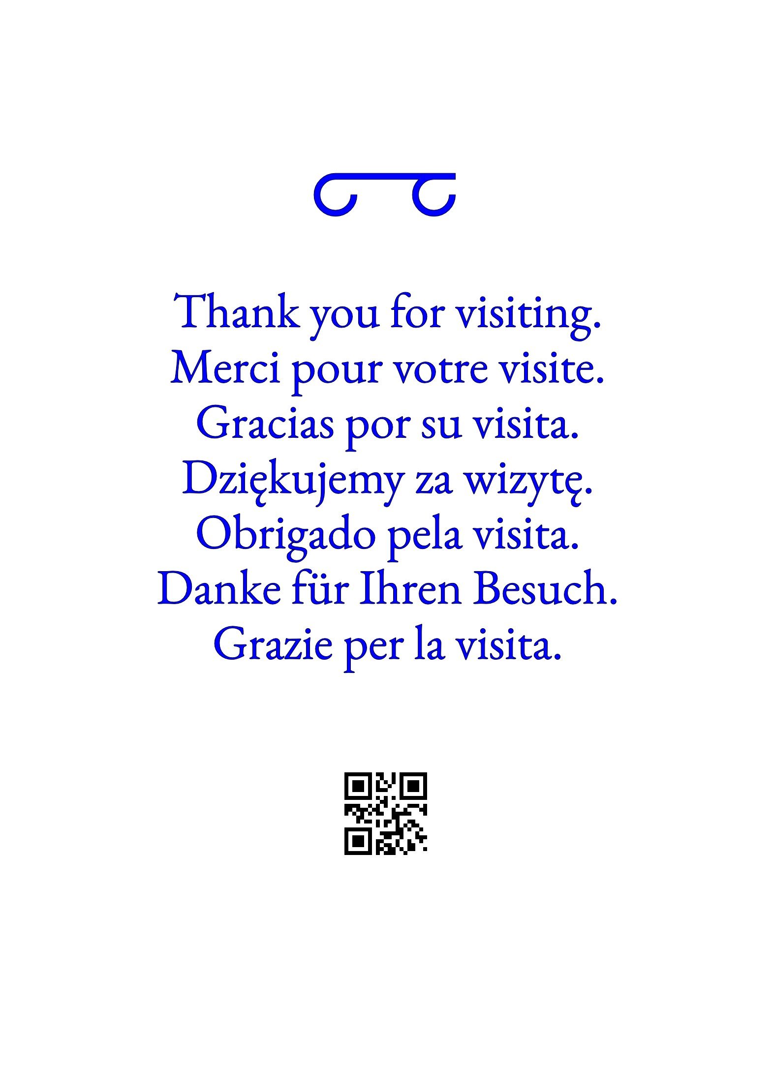
Hi all, The QR code don't seems usefull in this, but the overall page look like a drawing with the translation below (if we don't think it's only decorative): Reading the QRcode give simply another enigma, that can be frustating! (What the heck is that??? 😂) Since my brain process text nearly instantly, instead of searching my phone, unlocking it, searching for the app, trying to scan the code, and reading the result... I tend to only scan when it's important... If there's an URL below, I'll type it faster in a browser. But we can make it more intriguing: Txs_qr-code.svg
-
Don't forget the copyright factor. If itwasas simple as downloading usable fonts for print as downloading them from sites using them, we would go back to the 90', when a lot of people had hundreds or thouthands of fonts freely and without paying anything, since we usually shared working files instead of PDF. That's why since the 2000 years, Adobe and other companies did a lot of warning and checking to ensure people get the licences for the fonts they used. At the time I worked in a small compagny, and we had to delete most of our fonts and do from scratch, and we just could buy ± 20 font families with the "big" money allocated by our boss. At the same time, founderies sold also bundles, and it was a good thing, or we would have been fed up working with so few fonts and not being able to do what the clients asked for. Today, some companies are specialised to check fonts in magazines, and asked/checked with the editors to provide the licences. Especially in the market for children, where we tend to use lot of different ones. When needing to update computers, apps, fonts and licences, it's easier to decide when you have few of them than a lot, since the price is really different. We began to work on this few years ago, and Covid and other problems arise… Questions where about using services like Typekit, buying fonts depending of need or punctually, etc. In big companies, there's also other tools needed, for managing the magazines's workflow, archiving, viewing, etc. It's certainly easier to manage "few" font files using variables ones, than a huge library with lot of files, for PC and OS X, etc. "One file for all usages" would be a dream on our side*, but perhaps not for the foundries. I don't know, I didn't check the last evolutions of this. * But prices are different depending on usage, quantities, time, etc., perhaps having different formats help them keep track of this.
-
And to complete @Lagarto' s post, beside the "Most recents locations" list, on Win10, you can use Ctrl+L to go directly in the adress/URL field and copy the path (in navigators and explorer). It's handy, especially when the explorer displays the folders tree with default location as "Desktop".
-
The image is complexe, I wouldn't take chances with printing such an image, so I would rasterise first (the only way to get it right) and use a preset not allowing transparency problems with rasterized images5.pdf
-
Close all files without exit the app
Wosven replied to Sonny Sonny's topic in Feedback for the V1 Affinity Suite of Products
In some apps, they are not always in the File menu, but Ctrl+Shift+Alt+S, Ctrl+Shift+Alt+W save and close all files. -
Hi @Samstu, You should find suitable tutorial here: Do you kow about the mask part of the adjustement layers? https://affinity.serif.com/en-gb/tutorials/photo/desktop/video/332168517/ It's perhaps what you'e missing.
-
From memory some apps or drivers were giving you the percent in the old days...
-
Need of a fonts manager in AD & AP
Wosven replied to Wosven's topic in Feedback for Affinity Designer V1 on Desktop
Thanks @Hens, I feel less lonely now! 😂 -
Did you checked the properties to see if A4 is selected? And does the scale percentage value is different depending of the selected option? Since it should fit to the paper, it shouldn't stay at 100%, isn't it? 5I don't have a printer to do some tests currently)