Wosven
-
Posts
4,129 -
Joined
-
Last visited
Everything posted by Wosven
-
 You can begin reading this to get an idea: https://affinity.help/publisher/English.lproj/pages/ObjectControl/pinning.html https://affinity.help/publisher/English.lproj/pages/Panels/pinningPanel.html But it certainly won't do things by itselft, and you'll have a lot of work to do manually.
 -
For now, I would simply test on the first pages in a copy of the document, to check what happen and the best options. It's difficult without seeing your document or part of it.
-
Hi @cirmaraki, You can try to pin the footnotes frames in the main text.
-
Did you try duplication and converting to curves first? It's possible, if it's text, that the space is the leading of the font.
-
Need of a fonts manager in AD & AP
Wosven replied to Wosven's topic in Feedback for Affinity Designer V1 on Desktop
This is already a PITA, since there's no styles, a lot of items in a lot of groups, and even trying to work logically, creating a color palette and styles in a document and importing them, make it a waste of time. Like needing to reselect each time the missing font in the Fonts manager, before hitting again "localization", before searching in the screen if the selection is visible. Once found, scrolling the Text styles to the one you want... strangely, — and it's certainly a Murphy's Law —, the one you need is at the opposite end of the visible text styles! -
Aside from the real problem, why not using Acrobat reader to print to fit A4, or to 200%? Same results/problems on Windows.
-
We did some tests usefull for this thread in the feature request :
-
Need of a fonts manager in AD & AP
Wosven replied to Wosven's topic in Feedback for Affinity Designer V1 on Desktop
Thanks for your help, but half of the posts here should have been in this thread, about the warning not displayed: It's difficult to know if the problem come from the files, from the differences between apps version or font version, etc. But someone opening the file and not using APub would have a hard time — and long — trying to replace the fonts. That's why I ask for a Fonts manager in AD and AP. I'll point to this thread from the bug report. -
The real solution would be to export at the round pixel, as in the field. That's what are doing other apps when exporting images. If you extract the values in ID, it's different than the round number of pixels displayed in the field, since the app need this for calculus, but it stay behind the hood, no bad surprise... you don't look like a fool trying to explain to new users that never use such apps why it's so complicated or need so much precautions to resize an image or export it right.
-
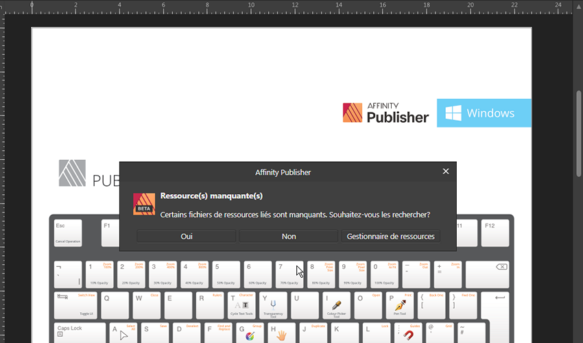
Yes! Because those are different, and need to open different manager. How should I deduce a font is missing without warning? Especially in AD or AP, where there's no Preflight panel. I tagged the 3 apps, because in there's only 1 warning for the missing ressource, but none for the missing fonts each time. You can download the APublisher templates here and you'll get the problem (the logo is missing, and also fonts): https://affinityspotlight.com/article/downloadable-affinity-keyboard-shortcut-cheat-sheets/ Do you means it only happen once? If so, it's a problem. I can switch computer when working on a file, and I need to know each time if a font is missing (I didn't did it for this report, but it happened in the past, ending up sending PDF with Arial instead of the real font...
-
They talked about such fonts in the 90', and it take them 20-30 years to begin working together and try to find a substitute to fonts problems (a lot of files and versions, with different encodings depending on your location, etc.). I read articles about them or the main idea when I was a student, and I'm happy to see them coming now. Especially when OS are completely modified et won't support older fonts for long. It'll be a huge investment, but it means that people won't suffer the different problems we had with font dues to encoding, font versions, corrupted fonts, etc. It'll be simpler. And we'll have choices, and the typography won't be anymore the "poor relation" ("parent pauvre" in French, the neglected one everyone despise or ignore) in design, with only regular/bold/italic/bold italic. It'll also be easier to create designs, without needing to discard a lovely font because it's only got the 4 basics variants and you need more. It'll take time, but it'll be better. And it won't make us font designers! We'll simply use the options or values available in the font, as designed by its creator, nothing more. Since Internet came in the 90', and it wasn't possible to easily include fonts — bandwidth was a real problem, and fonts are heavy —, it was simplest to use the commun fonts installed on each OS. Yes, there was a problem since most interesting or differents fonts were simply images. At least for headers. Or more... in tables!
- 89 replies
-
- 2
-

-
- typography
- fonts
- (and 1 more)
-
Need of a fonts manager in AD & AP
Wosven replied to Wosven's topic in Feedback for Affinity Designer V1 on Desktop
But shouldn't the warning occur each time there's a missing font? I think so. And it's about having a font manager in AD & AP, to avoid sending PDF with Arial instead of the real fonts. This happened with another computer and another font, it's not specific to this document or font (mine is version 1.10). An improvement to the current fonts manager would be to display the versions, like in ID, since using a different one can modify the text in the page... but that's another thread to do. It should even do a warning about different versions of font between the installed one and the one used in the document. The problem is to not being able to find where the fonts are missing in a document. Especially one done by another, in which you don't know where fonts are used, what it should look like (if the fonts are different enough to notice). -
I Don't think just looking at a page/book/magazine, you can determine if it's a variable font or not...
-
Need of a fonts manager in AD & AP
Wosven replied to Wosven's topic in Feedback for Affinity Designer V1 on Desktop
Can you try installing just 1 variant of the font, perhaps it'll make the difference? I have all installed, but the app can't reconize the regular one, and I need to replace it in each file (the bug is with all those files). -
Look at this post and my screen shots: Did you had other warnings before this one? What happened with the file in the post above?
-
Need of a fonts manager in AD & AP
Wosven replied to Wosven's topic in Feedback for Affinity Designer V1 on Desktop
The warning doesn't appear every time. Not always. You can test with this file: And the missing font:
-
Affinity Publisher: language of style
Wosven replied to Pyanepsion's topic in Feedback for Affinity Publisher V1 on Desktop
It's like working with files badly created, without any style, that you need to modify when there's a missing font. I tested it with the downloadable templates for shortcuts... a real pain, it was like going to the 90' when people didn't know what styles are for Trying to have few base styles, and other depending of a parent is a good habit. Even if at some point we mess something, it's easier to manage later. -
Exported file showing artifacts from hidden layers
Wosven replied to Old-George's topic in V1 Bugs found on Windows
And I noticed the display in your AD is wrong, when it's correct (similar at your exported file) in my Win7. Do you have hardware acceleration enabled? -
Exported file showing artifacts from hidden layers
Wosven replied to Old-George's topic in V1 Bugs found on Windows
Disable the effects, especially the last one.
-
Affinity Publisher: language of style
Wosven replied to Pyanepsion's topic in Feedback for Affinity Publisher V1 on Desktop
Hi @Pyanepsion, Shoudln't it be correct after simply modifying the Base style? -
Calibre.
-
It is easier to download the images from the site (and have better resolution) than doing all this. It's to learn APub, not Photo retouching.
-
Flip the pages? I'm not sure of the term, but did you never search something in a book just like this, until you found the part you want? (At least some illustrated book, it's more difficult with only text, unless searching for a specific chapter. And I tend to keep the pages in the same order, even those without number, unless an accident occur and they end up unordered. Perhaps it's an habit we've got, doing books, printing pages, and searching in them, keeping them ordered. For this test, I just let the app do it, and by default it'll use usual HTML headers (but I tend to write the code I need, to be sure, not in this case). Since the TOC is made of lists, it didn't give good results with the help files. Duplicating and modifying the index.html (using headers and disabling javascript) should be enough to get a correct import.
-
Yes, it's more a TOC than an index. It can be usefull since, after few reading of the TOC, you know a little bit about the order or the different parts, and you can scroll the pages knowing it's after of before the current one... or you think you know it! In the PDF version, the links work, but you only get the headers of the TOC. Same here, or copying the folder to put it on a smartphone to look at it. You can keep important parts and annotate them easily. Some people learn better reading and writting things (as opposed to video, for example). The export need some tweaking to get the TOC right, since my default for usual book produce a strange TOC:
-
Having a full index would be important, even if we don't have page number,at least to check if what we need is in a chapter (imagine search for advanced table formats...) Reflowing would be important, to or modifying the code for people wanting a bigger text to read (I'm getting older, and I understand better now why people complain about small text ), this way, the PDF would get bigger text too, without needing to zoom on the pages. It's perhaps not for printing the whole document, as I did with HTML and CSS documentations long ago to read them entirely, but perhaps simply to print important features a simple post-it won't suffice to remember, or some chapters. Or the shortcuts... But the print button doesn't work, like some sub-menus in the shortcut section.