Nic727
-
Posts
77 -
Joined
-
Last visited
Everything posted by Nic727
-
Hi, I would like to know if it's possible to hide everything outside a shape? For example, I have this circle and I need to make create a certain design in it. To make it less busy, I was looking for a way to hide everything outside the circle, so like that I could only see what's inside. I was trying to figure how to use the mask, but I'm not sure how it works. Thank you

-
(Designer) Sound wave
Nic727 replied to Nic727's topic in Pre-V2 Archive of Affinity on Desktop Questions (macOS and Windows)
Another question related to that. I create the wave with dotted line. How do I make each corner to be a perfect triangle instead of having a hole in the middle?
-
(Designer) Sound wave
Nic727 replied to Nic727's topic in Pre-V2 Archive of Affinity on Desktop Questions (macOS and Windows)
Thank you. It works... In fact it's easier than I thought. I'm sure in Illustrator it's much more complicated than that and it's why I love Affinity Designer. Easier and much better! -
Hi, What's the best way to do a custom sound wave in Designer? I tried with the pen tool, but it doesn't look like music at all. Thank you ---- EDIT : I think I found a way to do it by snapping to grid and draw the lines from there, but the problem I have is to make the curve circular instead of straight line. Any idea to make all the corners having the same curve?
-
Thank you
-
Hi, How to get the same space between objects/images? It doesn't seem to snap at the same position. Thank you
-
Affinity Web?
Nic727 replied to John Rostron's topic in Pre-V2 Archive of Affinity on Desktop Questions (macOS and Windows)
There is also Visual Studio Code which is very good. They now have automatic indentation! Notepad++ is also good, but now it's a bit old in term of design and functionalities. That's only free alternative, but never tried pinegrow (didn't know it existed) but look very good. -
Thank you very much :) Yeah, I stick to this idea. Was great!
-
Canvas resize?
Nic727 replied to Nic727's topic in Pre-V2 Archive of Affinity on Desktop Questions (macOS and Windows)
For Designer. Thank you very much. Didn't know it was with Artboard tool. Now it created an Artboard, but whatever, it's fine. Is it possible to change background back to black or it will stay light grey? Thank you -
Hi, I'm trying to resize my logo to a smaller size, but it's impossible. See attachment. Vectors are not supposed to scale correctly? Thank you
-
Hi, Is it possible to resize a canvas/document by dragging the canvas border or it's only via document settings manually? Thank you
-
affinity designer My logo, which one do you prefer?
Nic727 replied to Nic727's topic in Share your work
Its a real picture, but I think you can achieve this easily by bluring a bigger stroke behind another clear stroke. -
affinity designer My logo, which one do you prefer?
Nic727 replied to Nic727's topic in Share your work
For me it still difficult since I'm doing lot of different things since I'm at school. Like I said, I'm doing web, design, video, 3d and now I have an internship as a E-Learning creator with Storyline. So hard to focus on one thing. I know that I really like making videos, but didn't make a lot yet. So for the moment my logo should be kind of general with an original touch which is what I'm trying to do. -
affinity designer My logo, which one do you prefer?
Nic727 replied to Nic727's topic in Share your work
But client is myself... I'm making a logo for my own portfolio.
-
affinity designer My logo, which one do you prefer?
Nic727 replied to Nic727's topic in Share your work
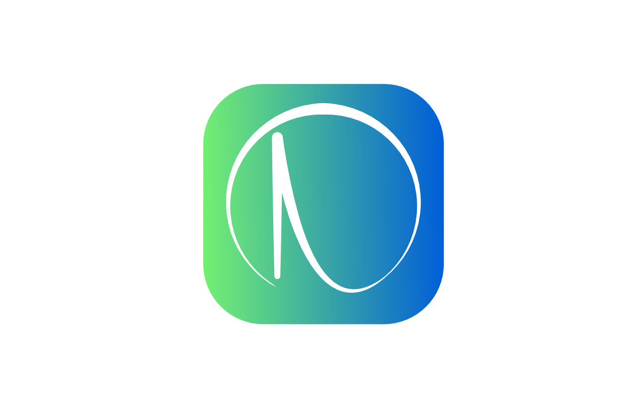
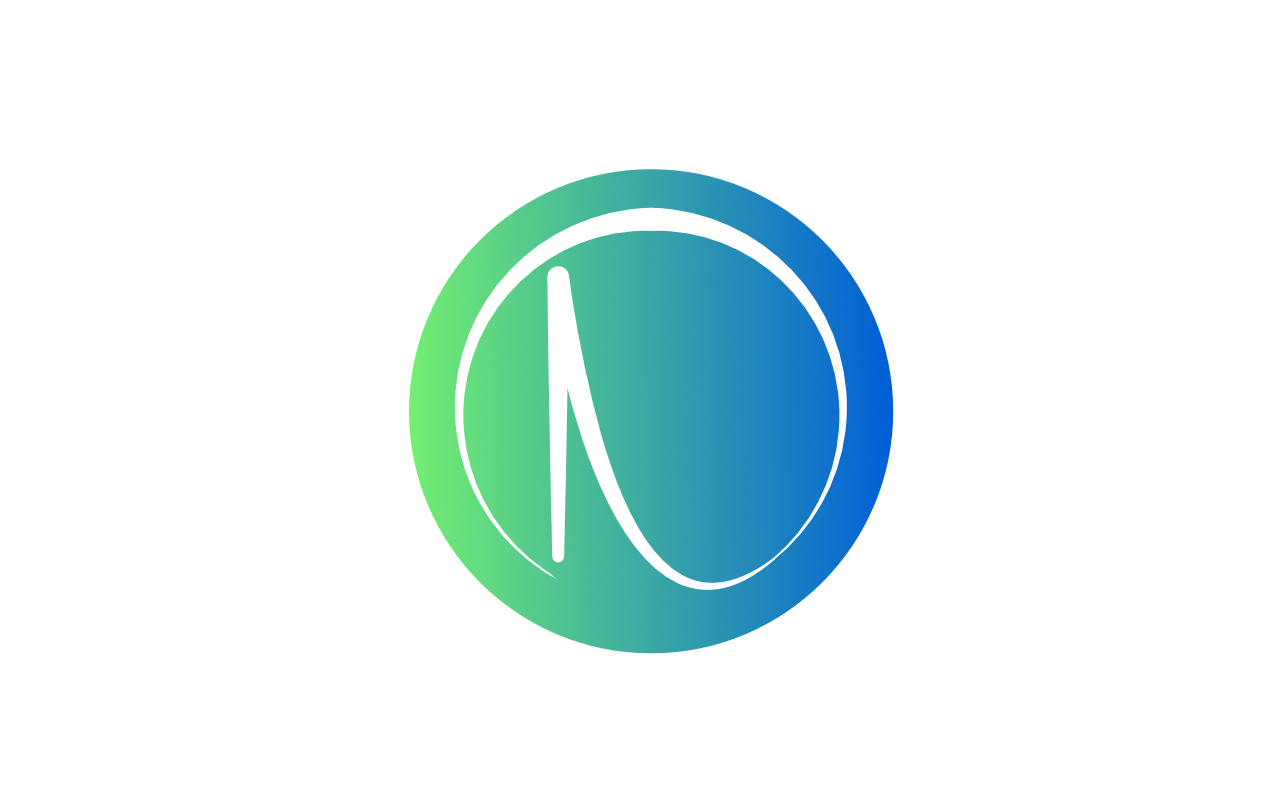
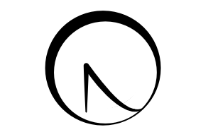
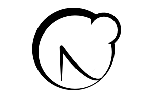
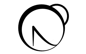
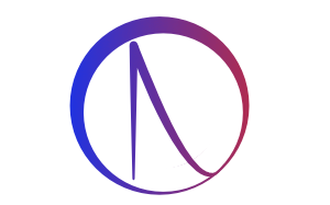
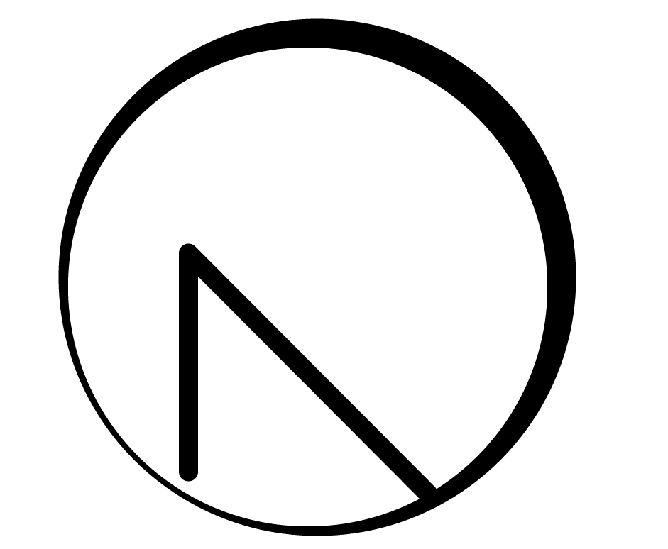
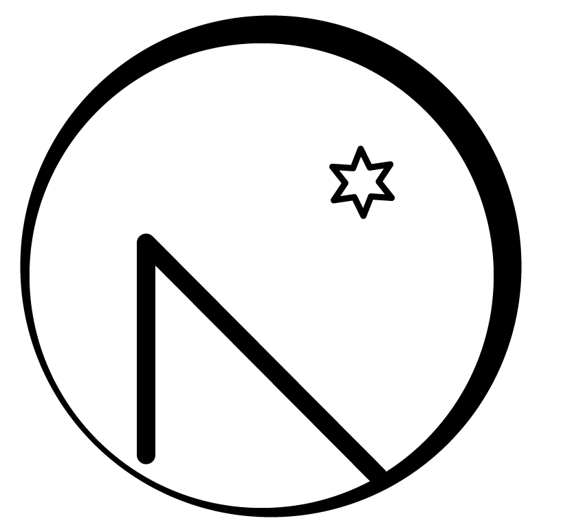
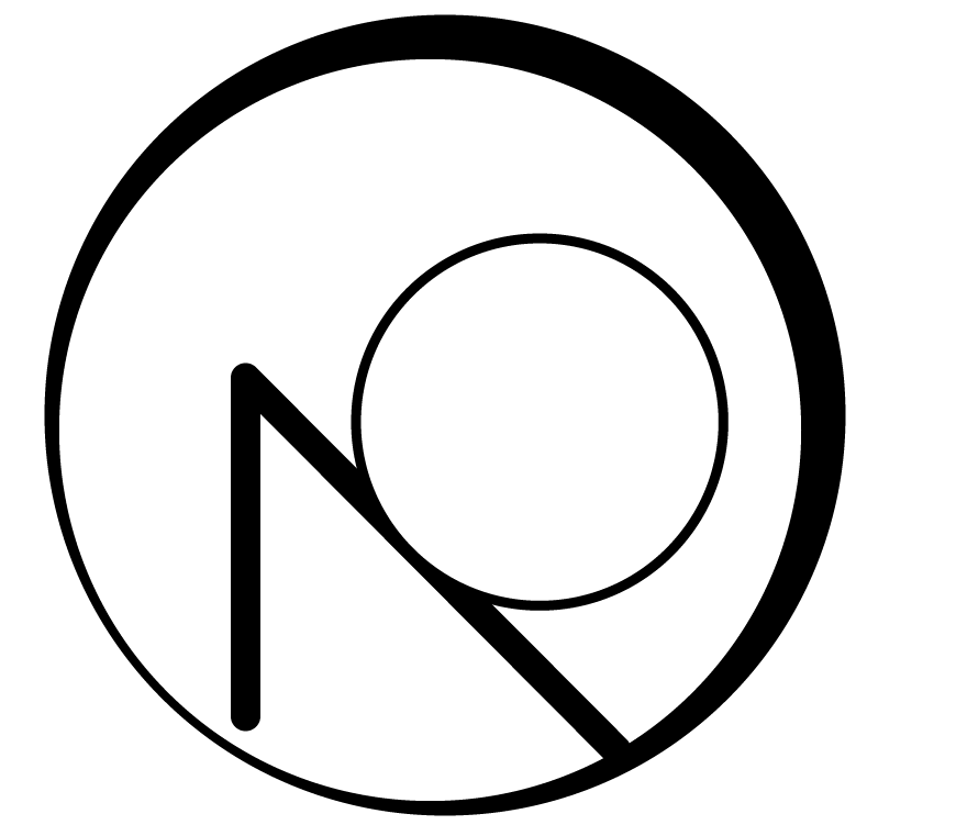
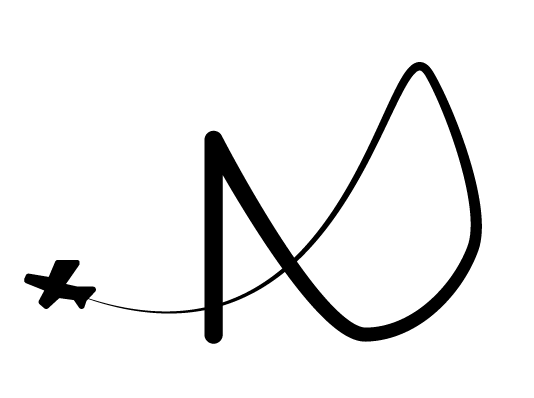
Currently I'm student, but doing lot of things like Web, design, videos, 3D, etc. I made more : The last two logos I was testing some cool gradient colors too. My final version will certainly be white or black on the website, but in color for the favicon (same color as website). Whatever, personally and I don't know about you, but number 3 and 4 look like a face and I appreciate the bigger N in number 6. It take more space and you can figure that a D is appearing with the curve of the N. What do you think? I love number 2 too, but since the circle is not complete, I'm scare it will not look good on a website. Number 7 I was just trying this plain background. I saw a lot of people portfolio with just a letter inside a square or circle as logo. Currently mine is an empty circle, but people are using filled shape. Thank you again and thank you to the people making logos for me ;) My inspiration first came from this guy : http://michaelacevedo.com/I love that is M is integrated into some mountains. I was trying to look at something "natural" like this for my logo, but a "N" is harder because a part is missing hahaha. My logo is not just about ND, but can be N alone too. My other inspiration :
-
affinity designer My logo, which one do you prefer?
Nic727 replied to Nic727's topic in Share your work
Thank you everyone. Will come up with something cool soon when I will get the time to work on something. -
Thank you. I found this video :
-
Hi, I'm currently remaking my personal logo for my portfolio. I would like your advice on which one do you prefer, because I don't really know what to do... Also, if you have some suggestions to improve my logos, feel free to share them. For the moment it's only draft and not final. I was looking something that represent me. My first name is starting with "N" and last name with "D", but really difficult to make a cool design with those letters. I really love nature, animals, space and aircraft. For my logos I was thinking about solar eclipse or how to introduce an aircraft for my logo. I prefer something circle since it's easier to put on a website or favicon. I don't know if it should be transparent or be filled up with colors. You can find all drafts in attached files. Here is my current logo that I want to remake. I think it was too simple. Basic questions : 1. What do you think? 2. Should I add colors? Gradients? 3. What should I add/remove or how can I improve my logo? Thank you for feedback.
-
Affinity Video Editor?
Nic727 replied to Epic-dude9807's topic in Feedback for the V1 Affinity Suite of Products
So while waiting for a cool video editor with small VF like After Effect, but from Affinity (maybe in 20 years), what is the best tool to make videos out there other than After Effect and Premiere? I heard about DaVinci Resolve or Hitfilm express (the only one with good looking UI), but since they are not full linear, I'm scare to start using them. There is also Filmora or Camtasia Studio which are easy to use, but don't have VFX support. -
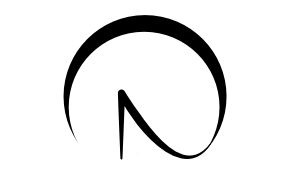
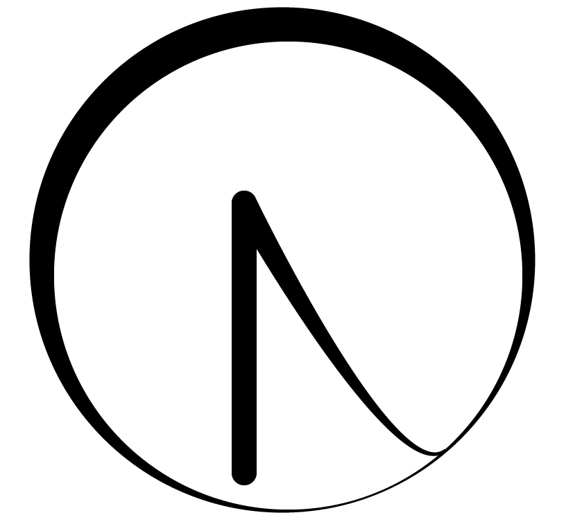
Hi, I'm really new and currently using the trial version on Windows. Very surprised that it reads .AI files correctly... Don't know why it's not in the features list on the website. ;) Whatever, I'm here because I have two questions : 1. I'm trying to make a line with the first part very small and the final part larger. Any idea how to do this? I tried playing with stroke size variance, but nothing is changing. Don't know what I need to change in the settings to allow size variance. 2. I have two circles. How do I correctly place one circle in the center of another circle (or any other shape)? There is no indication? Does it work only when magnet is activated? Also, just something very weird, is it normal that I have some aliasing when using the software? It's not everywhere, but just on some parts. Just something I'm doing. A remake of my portfolio logo to something original matching with my name containing a letter "N". (with indication about aliasing) What do you think of my new logo? Do you have any idea to improve it? Trying to make an eclipse with the letter "N". Thank you very much.