Renzatic
-
Posts
419 -
Joined
-
Last visited
Everything posted by Renzatic
-
I originally heard about Affinity Designer about the time when I was in the market for a new computer, and was toying with the idea of buying a retina iMac. I heard about this awesome vector program that had the potential to match Illustrator. The fact it was Mac exclusive, along with that promo video (let's begin wah wah chooka chooka wah wah...), made the idea of taking the big plunge across platforms pretty tempting. But alas, I ultimately opted to stick with Windows. All my stuff is here, and the everpresent idea that, for the same amount of cash, I could build a machine myself with enough power to drop satellites out of orbit AND get a new monitor made me stick with the tried and true. I decided to stick with Photoshop, toyed around with Inkscape a tiny bit, and all but forgot about Designer. ...until this December. By that point, I had long since become tired of paying $10 a month for Photoshop, and was out looking for something that could possibly replace it. I had just about ready to settle on Krita with a side order of GIMP, when, by total chance, I happened across an announcement that Affinity Photo had just released for Windows. The name is what caught my eye. It rang a subtle bell in the back of my head. I looked them up, and, hey, yeah, I remember these guys. I was looking at their vector program awhile back. I dropped $40 with the intentions of getting a refund if I ended up hating it, and gave it a whirl. The first thing I did was run it through The Test: this old .psd file of a bookshelf texture I made mostly with the intention of seeing how complicated I could make something. Each individual book had its own subgroup filled with shadows and detailing, which were then grouped together in nice little hierarchies depending where on the shelf they were located. Each board had its own layer. And adjustment layers? Out the wazoo! Layer FX? Oh yes. I went all out on that thing. I hadn't run across anything that could open it except Photoshop. Krita choked, and GIMP would just start crying. I figured that no matter how good Photo was, this would probably bring it to its knees. But it opened it. Without fail. Well, minus a couple of organizational issues that took about 10 seconds to fix. I would say this surprised me, but that'd be putting it lightly. It was more like abject shock. I couldn't wrap my head around the fact that I just spent a mere $40 for a program that could nigh perfectly replicate a high end program I had already spent about $200 on. Playing around with it beyond that showed me it was capable of doing everything I was used to in PS with just a few differences here and there. I declared it a keeper, and cancelled my PS sub the next week. Fast forward a couple months. I had intentions on buying Designer, but decided to wait on the Windows trial before making the plunge. It finally arrived, I rode the free week doing tutorials, and, well, here I am.
-
affinity designer Getting Used To This Vector Thing
Renzatic replied to Renzatic's topic in Share your work
"I didn't know what was going on. Guy just showed up out of nowhere, and, like, started talking about violins and stuff." ...though me personally? I'd prefer to use a banjo. -
A nice time restraint would probably do me a world of good. After an hour, I'd have, at most, the basic wireframe up. I can spend endless amounts of time futzing around with the size, proportion, shape, and scale before even committing on the actual brunt of the work. And even there, once I'm past the initial setup, I can iterate through 5-10 different versions of the same idea before I settle on one I like. By my standards, if I can get something done in less than 5 days, I'm thrilled with myself. :P
-
affinity designer Getting Used To This Vector Thing
Renzatic replied to Renzatic's topic in Share your work
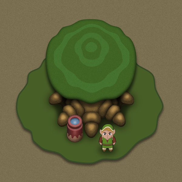
I decided to take a little break from doing Zelda sprites. I just...yeah, I couldn't handle staring at Link's creepy smile any more. But seriously, folks. I wanted to branch out a bit, see what all I could do without having a tutorial to lean on. I decided to work with a style a bit more traditionally vector: a little building off in the country backroads, somewhere deep in the woods, drawn from a flatish perspective, and lit with bold, flat colors. Of course I couldn't resist applying noise to it, despite the fact I did actively try to forego it this go-round. Don't know how or why the lightest application of nearly invisible grain manages to do so much to improve a scene to my eye. I haven't started the forest or most of the incidental details yet, but the building is mostly done, minus drawing in some of the lighting highlights on the roof. You can complement the scene if you want, but what I really want are critiques. Tips, tricks, suggestions, and other things you all think I could do to improve what I've already done. And of course it's an interface shot, cuz I think they're awesome. Your mileage may vary. :P
-
I gotta say, if you're posting these as you finish them, you're not only good, but incredibly speedy. I wish I could work at half the clip you do.
-
Derp. Yeah. I shouldn't have been working under the assumption he'd have Photo as a default. Though if he doesn't have it, he should consider getting it, especially if he's going to mix raster images with his vectors. The more I play with them both, the more I realize that both programs are designed to complement each other.
-
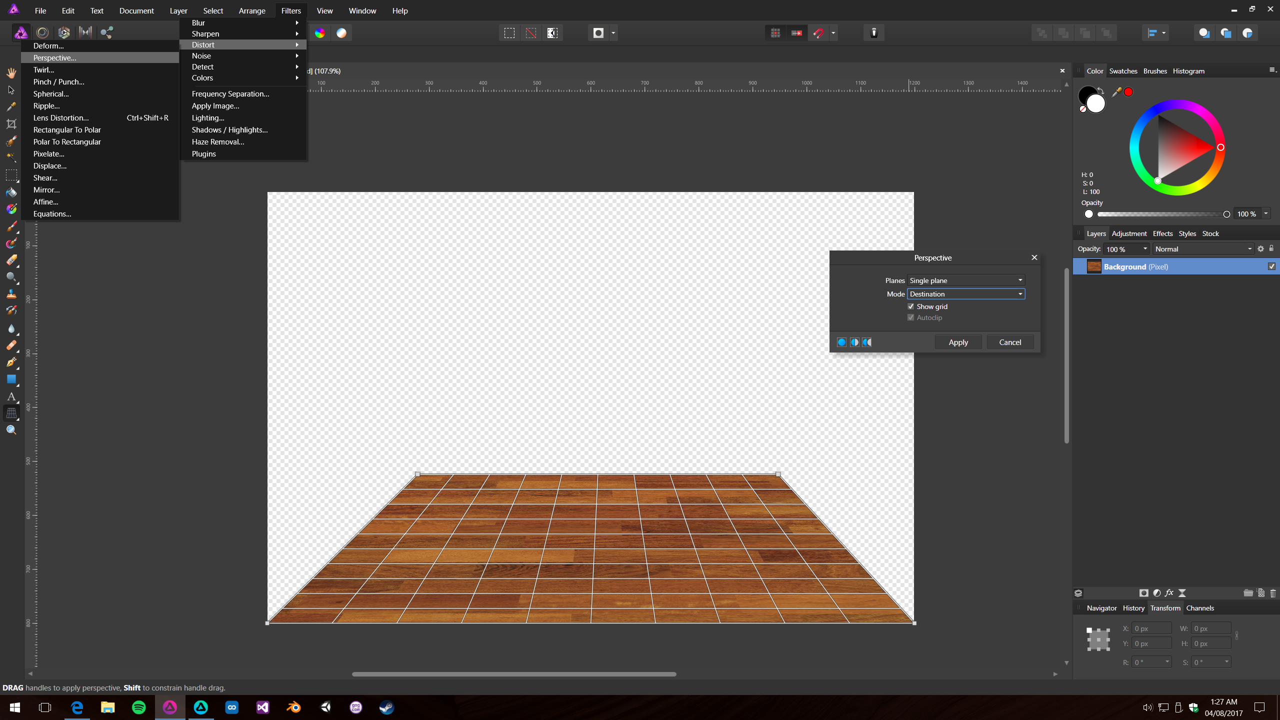
Not too half bad. Though for your floor, instead of just laying out a flat top-down texture, I suggest taking the image you have, hitting up filter/distort/perspective, and playing with it a bit to add more depth to your scene. Like so...
-
affinity designer Getting Used To This Vector Thing
Renzatic replied to Renzatic's topic in Share your work
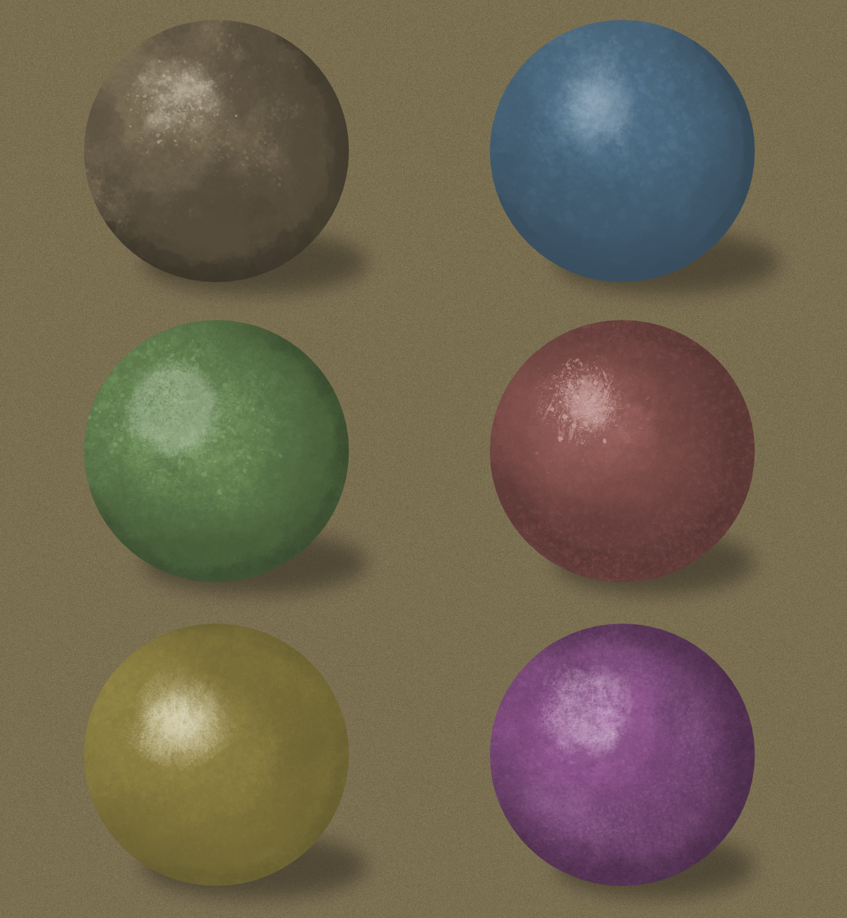
My guess would be because those brushes look the most like what Frankentoon used on his cartoon Dracula. Especially the Cork Table. They're just cool brushes. I just got through spending an hour goofing around with painting spheres, and I've found that Old Rock Wall in B, and the Mixed Materials C make for great blending brushes. They're better than Kitchen Smoke, since they don't spatter randomly like it does, but still produces a similar effect. Duster04 is also a decent one for adding texture. Here's the end result of my little tests if you want to see them.
-
affinity designer Getting Used To This Vector Thing
Renzatic replied to Renzatic's topic in Share your work
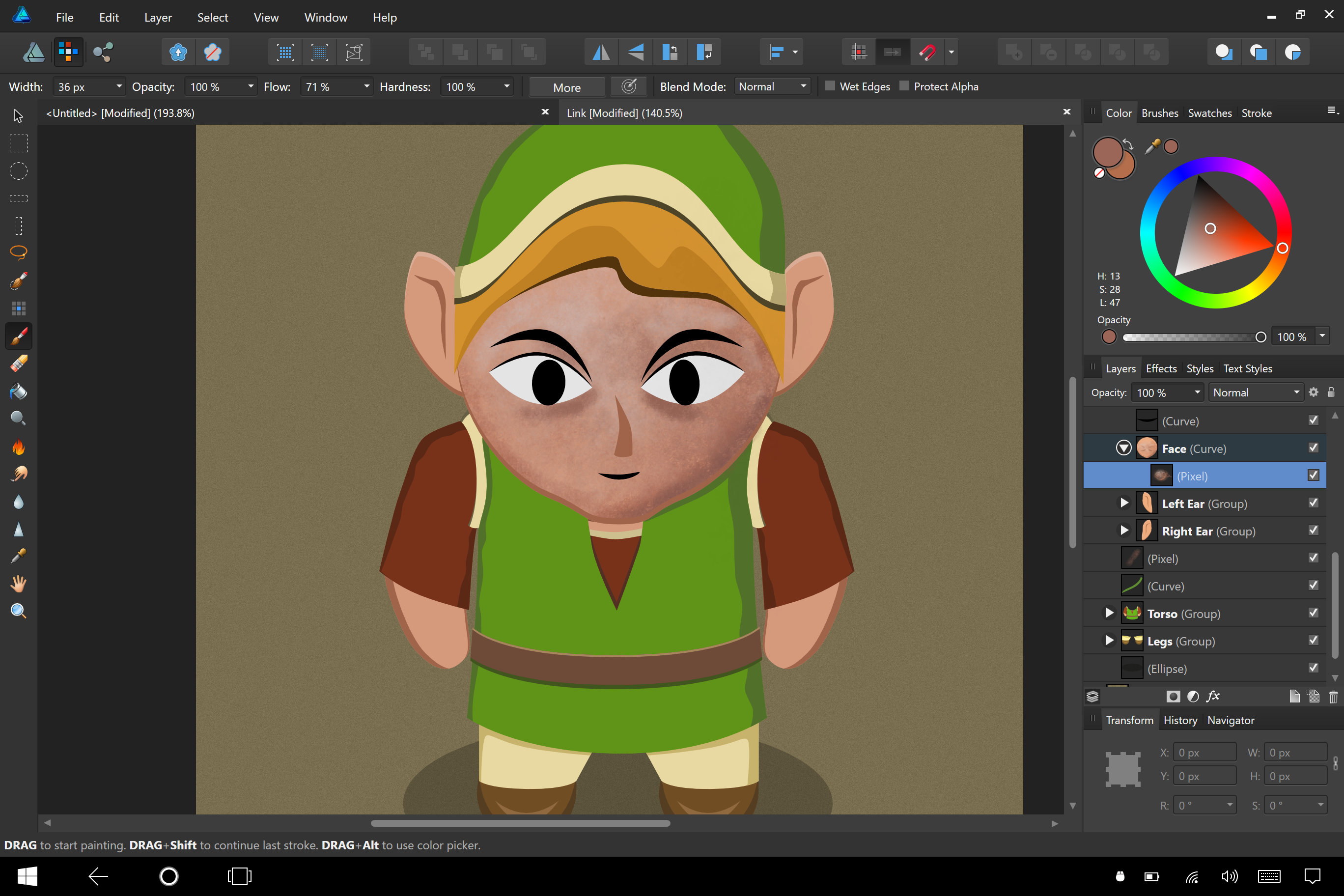
Mostly Kitchen Smoke in the Frankentoon-A set, with a few dabs of Cork Table 01 from the B set to give it that spotty look. My only problem with the above is that I wasn't too bold with the shadows. I really wanted to give it a more rounded look, but couldn't quite pull it off without making it look weird. -
affinity designer Getting Used To This Vector Thing
Renzatic replied to Renzatic's topic in Share your work
Not bad for a first try.
-
That is absolutely incredible. Props, sir. Well done. :D
-
affinity designer Getting Used To This Vector Thing
Renzatic replied to Renzatic's topic in Share your work
Props where props are due. Okay, I bought the Texturizer Pro brush pack, and, yup, painting with a mouse is horrible. Gonna break out the Surface, and order me up a Wacom tablet ASAP. ...it also doesn't help that I'm not too great at digital painting. But hey, this is as good a place to start learning as any. edit: out of curiosity, what are the chances of Serif porting the touch interface from the up and coming iPad Pro rev of AD to the Windows editions? One of the reasons why I don't like using it on the SP4 is because, besides the stylus feeling a little mushy, the default interface doesn't lend itself all that well to touch. edit 2: Okay, it looks like one of those Ren and Stimpy closeups... Practice will resume.
-
affinity designer Getting Used To This Vector Thing
Renzatic replied to Renzatic's topic in Share your work
Yeah, same here. I stumbled across his stuff when Bleduc suggested I try out the pixel brushes. Ended up liking his style. I guess I could break out my SP4, and see how well it works there. I normally don't like using it for stylus work, since it's, at best, pretty clunky. ...which is kinda tragic, cuz that's the whole reason why I bought the SP4 in the first place. :P -
affinity designer Getting Used To This Vector Thing
Renzatic replied to Renzatic's topic in Share your work
Don't go questioning the righteosity of my deciduousness. It discombobulates my chakra. So I've finally come across something I'm struggling with: leafy greens. No matter what I try, I just can't quite seem to produce something I'm happy with. It always ends up looking like I've made flat plants made out of construction paper, no real depth to it whatsoever. I'm thinking about going out, taking a few pictures of some random bushes from a slight overhead perspective, tracing the results in AD, then converting the results to my intended style. I probably won't produce anything that'll go well with what I have thus far, but it'll help me learn how to structure plants, so I can pull off something better later (I hope). ...though as usual, I'm open for a few quick hints, tips, critiques, or links if anyone's willing to provide them in the meanwhile. -
affinity designer Getting Used To This Vector Thing
Renzatic replied to Renzatic's topic in Share your work
Well, yeah. I mean what's the point otherwise? Landscaping without conifers is like...I dunno. Something. -
affinity designer Getting Used To This Vector Thing
Renzatic replied to Renzatic's topic in Share your work
I always thought that we should all be required to post up gifs of us pantomiming our posts to help with the fact that, yeah, tone and sarcasm don't always translate across in pure text. Sometimes even the most benign thing can come across as overly mean if you read it in just the wrong way. ...then I realized that making people post gifs of them flailing their arms about would probably end up being pretty awkward. Though it'd be hilarious and horrible in equal measures (thus totally making it worth the attempt), we should probably just stick to futzing about with the emoticons. And now? I'm off to work on some bushes! I think moreso than the soldier, I need to spruce up my landscape a little more. Wish I had more time to work on this stuff. -
affinity designer Getting Used To This Vector Thing
Renzatic replied to Renzatic's topic in Share your work
Yeah, I know. I was just being goofy back. Obviously so, since everyone knows Wacom has only been around for about 3000 years or so. :P -
affinity designer Getting Used To This Vector Thing
Renzatic replied to Renzatic's topic in Share your work
It'll make it look a little less plastic at the very least. Though I'm saving the softening effects for the very end this go-round, since when I resize everything to its proper scale once I'm done with the design, I inevitably have to redo my layer FX to account for the smaller pixelage (I'm pretty sure that's a word). It'll save me a bit of excess time and effort having to readjust everything. Guy questioned my carbon dating skills. Yeah, I've got my eye out on him. :mad: -
affinity designer Getting Used To This Vector Thing
Renzatic replied to Renzatic's topic in Share your work
Two things: A. My carbon dating skills aren't exactly exact, but they're good enough. B. I've never heard of the Volito2, so I'm gonna have to assume it doesn't exist. ...so I'm still right. My Bamboo Fun is 50,000 years old, plus or minus 10,000 years, and nothing can be older. As as long as occasional lip service is paid to me (aka the required dues), I'm pretty alright with anything happening in my threads. :D -
affinity designer Getting Used To This Vector Thing
Renzatic replied to Renzatic's topic in Share your work
Yeah. I'm liking the celshaded look more and more. Not only does it look nice and sharp, but it's so much less strenuous on the program. I could stack tons of vectors on top of each other without AD even breaking a sweat. But in the end, I'll probably break out the gaussian blurs and drop shadows for this as well. Oh, and getting off topic's fine. It's fun to read, and this thread doesn't have to be ALL about me. :P -
affinity designer Getting Used To This Vector Thing
Renzatic replied to Renzatic's topic in Share your work
The symbols do the job they're supposed to, but for mirroring, it's really too involved a process to at the front end. It really shouldn't require more than a few clicks before you're ready to roll. Serif should consider looking at Krita to see how to make multibrush mirroring an easy process. And yeah, Blender would probably be good to look at too for simple X/Y mirrors. Now, as for my AD work, I've decided to hold off on pixel brushing for the next little bit, cuz...well, my 50,000 year old Bamboo Fun has seen better days, and isn't...well, working anymore. I figured it's about time to retire the old thing, grab one of the lower end Intuous tablets to replace it with. I'll probably order it next week, but until it shows up, I don't wanna paint with my mouse. That's too annoying. Oh, and I started another sprite. It's turning out okay so far. My only problem with it is that it looks too much like a motorcycle helmet, not like a piece of armor.
-
It's not too half bad for one of your first attempts. You're already showing you have a grasp of the basics down. Just build up the techniques and skills you're already showing us here, and you'll eventually be making amazing things.
-
affinity designer Getting Used To This Vector Thing
Renzatic replied to Renzatic's topic in Share your work
...well, I just learned something new today. Like you, I've used PS for years. I probably know about a couple dozen shortcut keystrokes off the top of my head. So how the hell have I manage to consistently miss the one thing that would've solved my biggest irk issue with the program after all this time? Geez. The fact I'm only learning about it now, after I've dropped the program, and taken off for greener pastures? That's just funny. : P I've been meaning to try out the pixel brushes. This is as good an excuse as any to finally take the plunge. Something like this might look pretty good with the style I'm going for. Provided, of course, that I can pull that off half as well as he did. -
affinity designer Getting Used To This Vector Thing
Renzatic replied to Renzatic's topic in Share your work
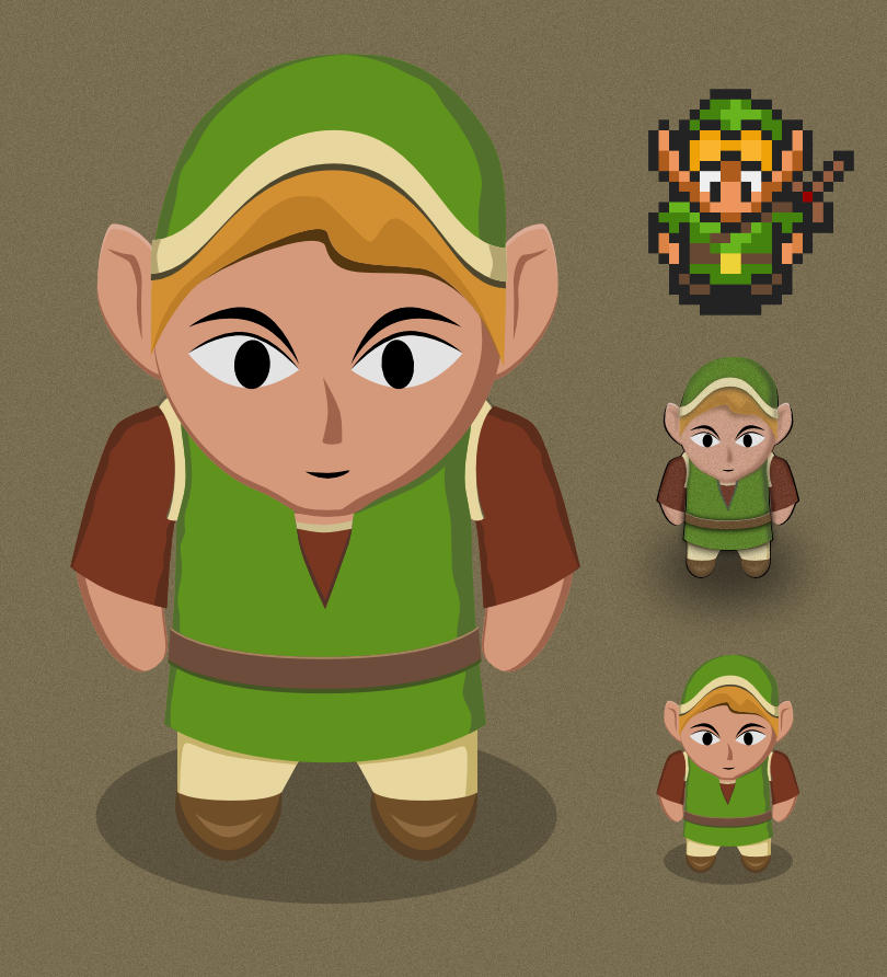
I've been fighting with that since I started designing him, because he does look better without noise, but he clashes too much with everything else. I know what you mean by having him stand out from the backgrounds, but at the same time, I still want him to look like he's a part of the world. But really, he already does stand out more even with the noise anyway, since he's the only thing I've made so far without any highlights. He looks flatter compared to everything else even as my current default. I'll goof around with it, see if I can find a happy compromise. Though I could just go all out, and use the celshaded look I originally designed him with. It was easily my favorite, but looks totally out of place with the whole 3D construction paper look I'm going for (which I really like). edit: just tried him out with no noise. It doesn't look terrible, but he still looks like he's done in a slightly different style from the rest. I'll see what you all think.
-
affinity designer Getting Used To This Vector Thing
Renzatic replied to Renzatic's topic in Share your work
Thanks, and I plan on it. :D Though if anyone has any critiques, feel free to air them. I'm always up to hearing what I could improve upon.