ch22
-
Posts
83 -
Joined
-
Last visited
Everything posted by ch22
-
Sorry, Dave, I cannot open your file with my current version (1.7.3) —I got the warning “The file includes features from a later version of Affinity“. As for the right operating process, I join a short video demo_contrast_negate.mp4
-
By November 2017, dmstraker was asking for information about Contrast Negate (https://forum.affinity.serif.com/index.php?/topic/49811-your-big-friendly-guide-to-layer-blend-modes/&tab=comments#comment-250891) . As I found nothing about this point in more recent posts, I give my opinion. I think that the luminosities of the two layers are analyzed, but in the sense of lumas, i.e. L'=0.3R'+0.59G'+0.11B' where all quantities are normalized quantities varying in the (0,1) interval. First a selection is built of areas where lumas are both below 0.5 ou both above 0.5. Then, the upper layer is replaced with its negative within the selection. I enclose a macro, simu_Contrast_Negate.afmacro which (hopefully) does this job —to be imported in the Macro panel. Select the upper layer and run it. An Invert adjustment should be created above the upper layer (allowing to recover the selection from the adjustment mask) simu_Contrast_Negate.afmacro
-
Saturation Mask
ch22 replied to dmstraker's topic in Tutorials (Staff and Customer Created Tutorials)
Another method for obtaining the saturation mask or the equivalent saturation selection, which requires no HSV capacity : (1) open an HSL adjustment, put saturation to -100 and put the blending mode to "difference" (2) open a level or curve adjustment so as to get a x2 gain (for instance, with levels, put the white glider at 50%). This amplifying step will allow to get a full saturation mask, i.e. with white or black corresponding to fully saturated colors or gray tones. At this stage, the (max, med, min) triplet for color components is replaced with (max-min, xxx, max-min) where xxx is lower than max-min (3) in order to retain only the difference (max-min), open the channel panel and successively (i) right-click the red line for " load in the pixel selection", (ii) and (iii) right-click the green and the blue lines for "add to the pixel selection" —this is equivalent to choosing the highest of the three RGB components. We then have the wanted saturation selection. -
Additionally, switching to English in Preferences dialog makes the Overlay item reappear in the drop-down list with seemingly the expected behavior.
-
I confirm. The second occurrence of the "Superposition" (Screen) mode is not a mere mistake in the drop-down list names, it really calls for the Screen mode.
-
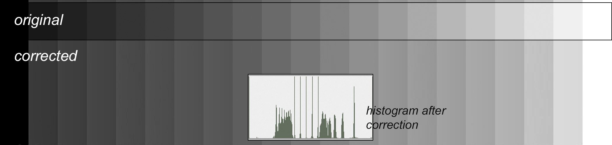
The Shadows/Highlights Filter has changed (poorly)
ch22 replied to ch22's topic in V1 Bugs found on macOS
I confirm we are speaking of the new S&H filter. Below is a picture showing the effect on a gray chart, with the original and the modified chart together with the histogram of the modified chart (this histogram comes from Photoshop). The ray widening is characteristic of the action of S&H filters.
-
Actually, since a RAW file does not contain any ICC profile, the luminosity and the colors of a RAW file just opened does not matter very much. It's only at the output of the raw software that a ICC profile is added to the file and that RVB components are given a true color meaning. However, the camera JPEG file or the display by the system commodities or Adobe software (and many others, of course) are in reasonable agreement and thus offer a convenient reference with which Affinity Photo should comply — and unfortunately it does not always. Under MacOS and with Serif RAW engine, I observed nothing special with NEF, CR2 or ORF files, but I actually got this odd darkening with RAF files. However, it disappeared when I switched to the Apple RAW engine. Below are compared screen copies for RAF and CR2 between AP 1.6, AP 1.7 and Photoshop (in this case, with no correction) and a screen copy with the Apple RAW engine :
-
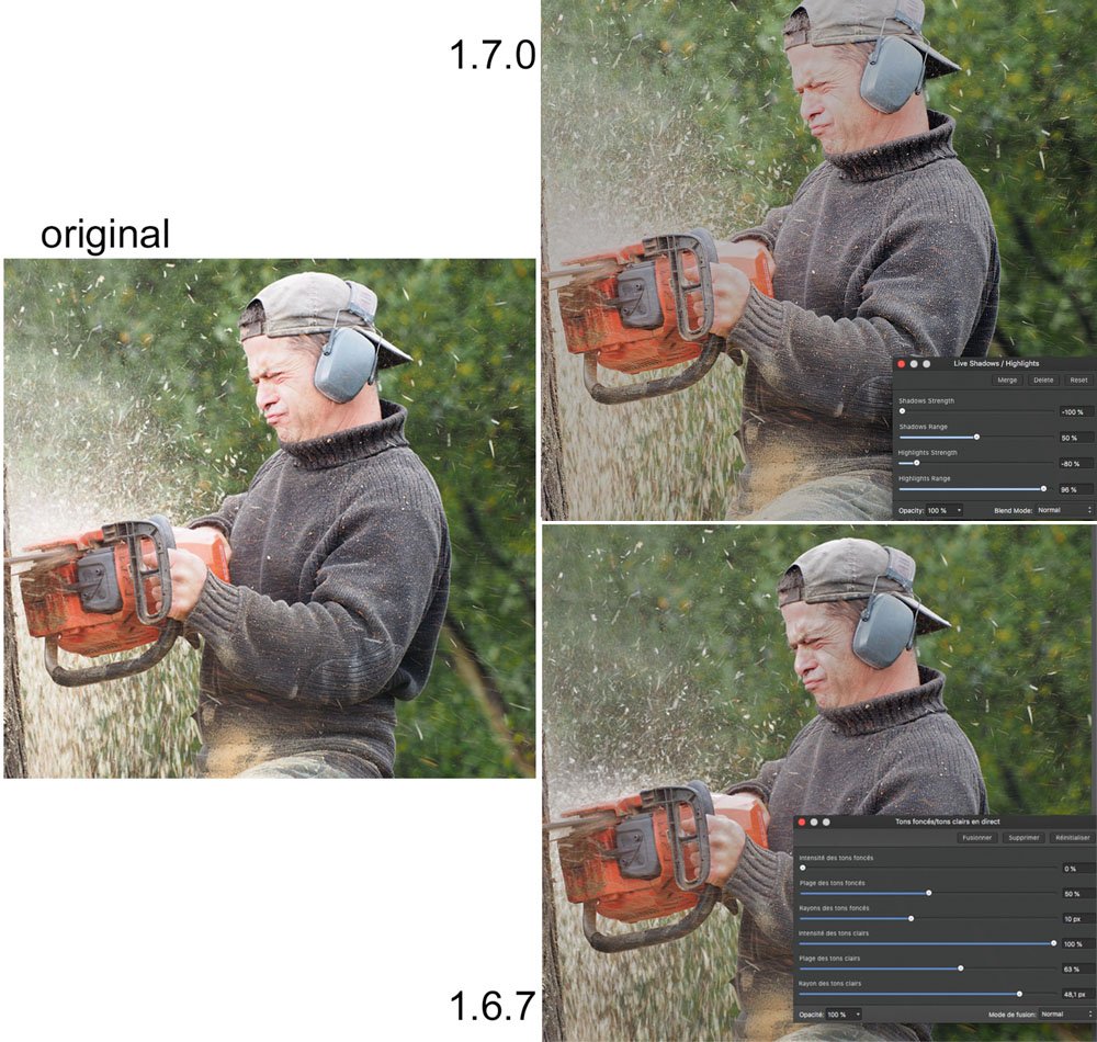
The Shadows/Highlights Filter has been rewritten and I find its new version far less satisfactory than the previous version (incidentally, I hardly understand how such a filter may run without the Radius glider) I enclose below an example of comparison. Increasing the correction intensity in 1.7 would lead to a picture even more grayish
-
Beginner videos for Affinity photo
ch22 replied to mikep's topic in Tutorials (Staff and Customer Created Tutorials)
I'm just one year late, roughly, but I discovered this discussion only recently by chance and I'm grateful for the appreciation. Actually, I wrote these tutorials with true beginners in mind and I tried not to lose them when advancing in the intricacies of AP. Now, by the beginning of 2019, many of the tutorials which were missing by the time of the jmmermet post are now in line. Only for french speaking people, I'm sorry, nobody is perfect ! Let me repeat the adress http://www.oitregor.com/numeric/affinity_photo/contenu.html -
Under MacOS, I compared various prints of a gray chart on a matte paper, on the one hand from Photoshop with perceptual intent (without black point compensation), and on the other hand from AP, either perceptual or relative, with or without black point compensation. All of them are practically identical.
-
Saturation Mask
ch22 replied to dmstraker's topic in Tutorials (Staff and Customer Created Tutorials)
Sorry, my reference to the Photoshop model was somewhat irrelevant... and it does not matter. The key point is, whatever the actual model used in the AP colorimetric model, that putting saturation to 0 in the HSL adjustment makes the (Max, Mid, Min) trio replaced with (Max, Max, Max). This can be checked in a practical way by monitoring what happens to RGB components of a color sample in the Infos panel. Then, switching to the difference blending mode makes the original trio replaced with (0, Max-Min, Max-Mid). Since the largest component is now Max-Min, the second HSL adjustment puts the three components to Max-Min. -
Saturation Mask
ch22 replied to dmstraker's topic in Tutorials (Staff and Customer Created Tutorials)
Alfred : thanks dmstraker : finally the sorcery can be easily explained, provided that HSV model is really the cylindrical HSL model used in Photoshop Adobe color requester. In this model, if the RGB components are sorted in decreasing order as (Max, Mid, Min) — think of these components as reduced quantities varying from 0 to 1— the HSL components can be then written as H =(Max-Mid)/(Max-Min) ; S = Max -Min ; L = Max where H actually is the decimal part of a reduced hue varying from 0 to 6, with an integer part depending on which colors correspond to Max and Min components. This formulas can be inverted as Max = L ; Min = L-S ; Mid = L-TS Now, following the dmstracker process : (i) putting S to 0 in the first HSL adjustment makes the three components replaced by L (the largest component) (ii) switching to the Difference blending mode replaces the (Max,Mid,Min) trio with (0,S,TS). Since T<1, the largest component is now S (there is also a hue jump but it does not matter) (iii) opening the 2nd HSL adjustment and putting the Saturation slider to 0 makes the three components all equal to the largest component, i.e. S : we thus obtain the wanted mapping of the initial picture saturation. Unfortunately, I am not sure this Photoshop model really is the HSV Affinity model, since when one moves the Luminosity slider the above RGB components do not change in agreement with the above formulas... But maybe that's another story! -
Saturation Mask
ch22 replied to dmstraker's topic in Tutorials (Staff and Customer Created Tutorials)
My file is a macro record ; you must import it in the AP macro ou library panel -
Saturation Mask
ch22 replied to dmstraker's topic in Tutorials (Staff and Customer Created Tutorials)
I return to the original post of dmstraker. Though the recipe looks somewhat sorcery, it really builds a grey picture with R=G=B=Max-Min where Max and Min are the largest and the smallest of the original RGB components, i.e. the genuine absolute saturation in HSL models. I wrote a script which performs this computation and I obtain exactly the same results. This script can downloaded at http://www.oitregor.com/numeric/affinity_photo/divers/selection_saturations.afmacro Of course, this does not yield saturation in LAB sense, but in practice this should have little consequence. I also wrote a script for chroma — SQR(a^2+b^2) — but I failed to convert it from Photoshop to AP. -
[AP] An odd saturation information
ch22 replied to ch22's topic in Older Feedback & Suggestion Posts
OK. The AP value for S (33%) is consistent with the formula given in this Wiki paper, in Fig.14-d. But what does it mean ? Saturation should not become almost meaningless. This Wiki paper does not seem internally consistent for me. In the beginning, the saturation is explicitely defined as Saturation = "colorfulness of a stimulus relative to its own brightness" = Chroma/Lightness" In the case of my near-white color, this leads to Saturation = (Max-Min)/255 (i.e. 6/255 = 2%) and this does not agree with the formula mentioned above. At the end of the paper, I read Using the same name for [various] definitions of saturation leads to some confusion [...] Even worse, the word saturation is also often used for one of the measurements we call chroma above... Oh yes! I must confess I make the confusion myself ; even worse, I consider the chroma the most interesting quantity for image processing. Anyway, thanks for the answer! -
For (RGB) = (243,249,247), through the Color panel or the Information panel, Affinity Photo claims the saturation is 33%. How such a high value can be obtained ? In my opinion, for this special case, the saturation value should be (249-243) divided by a number between 256 and 243 (depending on the colorimetric model), i.e. near 2%.
-
I would be far happier if the various histograms displayed in the Histogram panel and the dialog boxes in Levels or Curves adjustments were more consistent between themselves. More specially, when a selection is activated, I would like all these histograms to be restricted to the pixels within the selection. Seemingly, the Histogram panel shows this selection histogram when the Marquee option is activated. Fine! But at the same time the histogram in the Level adjustment conspicuously corresponds to the whole image (see attached file). And the histogram in the curves adjustment shows nothing readable (added in my file). Generally speaking, what is the meaning of the histogram in the curve dialog ? I found no information about these questions in the online manual.
- 1 reply
-
- 1
-

-
I would enjoy the possibility of typing numerical values for nodes input/output values
-
In Level adjustment, holding ALT whilst moving the Black Level or White Level provides a real time clipping preview. Unfortunately, this preview does not work in individual channels Red, Green or Blue. Also, I would appreciate the same clipping preview to work in Curve adjustment (as in another well known competitor software)
-
Pas de mal. De mon côté, j'ai oublié la balise [AP] dans le titre : je ne sais pas on peut la rajouter après coup.
-
C'est ce que j'ai voulu dire ; aussi que ça n'a pas d'importance pratique, mais y-a-t'il autre chose ? Si on refait l'expérience avec un filtre en direct (un flou, par exemple), les résultats à l'écran sont différents. (That is what I meant; also that it does not have practical importance, but is there anything else hidden? If you experiment with a live filter, a blur for example, the results on the screen are different.)
-
I found two different ways to do a click-and-drag in the layers panel in order to apply an adjustment layer to a single pixel layer, with seemingly not the same behavior in the layer panel. I tried to explain what happens in the attached file. My question is : is it a real difference between the two process ? (the red bar in the second process is simply due to the deactivation of the adjustment; it should also appear in the first one but this has no practical importance)
-
In the color panel, a color with 0% opacity looks white in the foreground plot, exactly as a true white with 100% opacity. In the layers panel, a totally transparent layer or a totally black layer have the same black thumbnail. Why not use the classical grey-white checkerboard to make the difference ? This would be quite more user-friendly, specially for beginners.
-
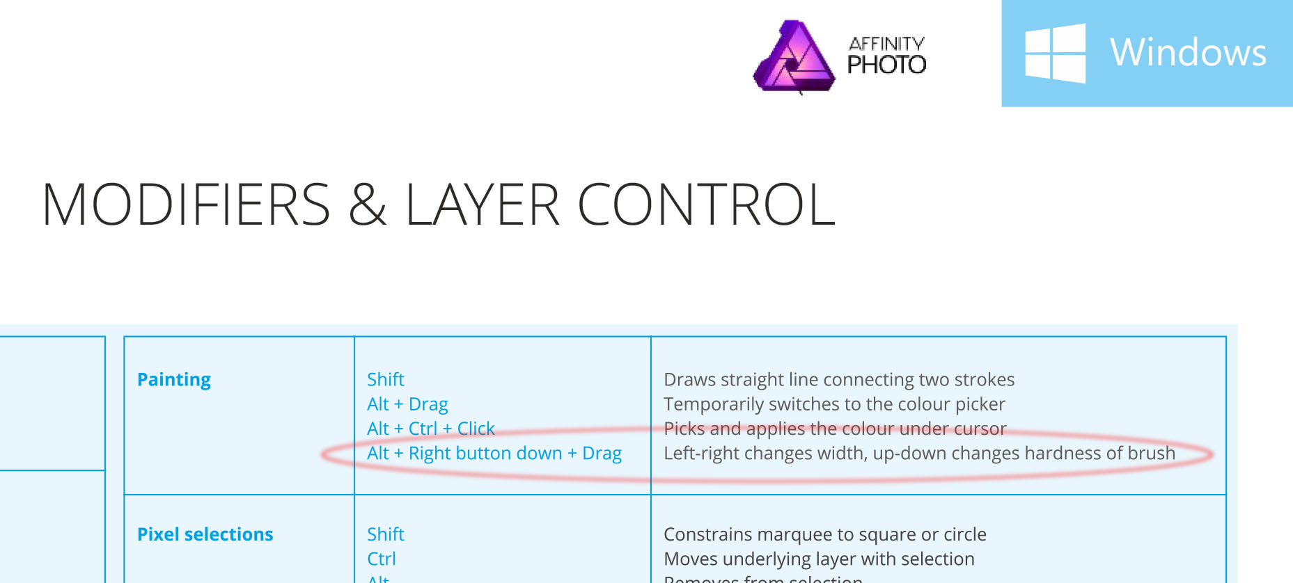
I am surprised, the shortcut mentioned in the Affinity-Photo-Shortcuts-Windows.pdf is simpler, as it involves the right button only (see the attached file). Why this disagreement ?
-
Strictly speaking, you are correct, but my main point was to show what happens in the "luminosity selection". One can visualize it as I did in the video, or alternatively, one can open a mask through this selection and then visualize it with an ALT-click on its thumbnail. One gets the same display.