Interior Book Design
-
Posts
104 -
Joined
-
Last visited
Everything posted by Interior Book Design
-
Thanks, great proposal. Meanwhile, I've discovered the No Break option, already, and use it as a workaround.
-
I've spotted the following problem, see image: (Sorry, I cannot upload the image. I try to type it:) Behaviour in Publisher 2.4: Er blickte mich mit seinen treuen Augen an und sagte: „Hallo! “ How it should be and how it is in Publisher 1.10: Er blickte mich mit seinen treuen Augen an und sagte: „Hallo!“ Bottom line: The closing (German) quotation mark incorrectly breaks after a full stop or exclamation mark ... which makes it extremly difficult to typeset special kinds of books such as novels.
-
I opened a novel, typeset in v1. In v2, many closing quotation marks, that once were at the end of the line, now break to the next line, see image attached. And no, there is no blank between the full stop and the quotation mark, of course not.

-
That, in fact, is a very good workaround, thank you!
-
I know, but after editing the Default profile the name of the Profile switches to <Custom> and next time Default shows the same, unwanted behavior, again. I want it once and for all, Walt!
-
To my mind, the preflight function is overzealous. Spelling mistakes shouldn't even create warnings. Spelling check is done by my colleagues who do the copy editing/proof reading. It should be done in a word processor, not in a DTP app. Therefore, I would like to get rid of those annoying warnings for good! How can I do that? I know that I can create my own profile and that I can create even categories. But that means I have to choose this profile/category first. For me, this is one click to many. I want it out of the box, by default. Is this possible? Maybe by somehow (but how?) changing the settings of the Default category? Can I break the habit of always creating warnings in regard to (alleged) spelling mistakes? Thanks!
-
Nicholas, not sure if this is a good idea. You get automated responses only and might wait for weeks for an answer.
-
Publisher Workbook not received
Interior Book Design replied to Actaeon's topic in Customer Service, Accounts and Purchasing
I'm growing more and more frustrated. On 30th of November, I ordered the Publisher WorkBook, together with some t-shirts. The t-shirts arrived a few days later, the book did not. On 5th of January I wrote a kind e-mail to support. Almost instantly, I've received an automated reply: "Thanks for getting in touch. Due to high amounts of e-mails there will be a delay in replying and we expect to get back to you within 72 hours during the working week." Yes, they did. On 9th of January, I've received another automated mail: " We are sorry that your email to Affinity Orders has been in the queuing system for more than 72 Hours. Due to the high number ..." That's it. Automated responses, no book. WHAT'S UP, GUYS? PLEASE BE SO KIND AS TO SEND MY BOOK. AFTER ALL, YOU HAVE RECEIVED PAYMENT, ALREADY. THANKS! -
Publisher Workbook not received
Interior Book Design replied to Actaeon's topic in Customer Service, Accounts and Purchasing
Well, same with me. Ordered Publisher book on 30th of November, not yet received. No response to my email. Very frustrating, indeed! -
No, I did not have optical kerning turned on in InDesign. And it doesn't explain why TextMaker 2018 (not 2016) does such a great job, a program that is not know for excellent typography.
-
Thanks, Gitta, interesting, so, do you think the font is wrong and needs to be mended? This is nothing an "ordinary" user can do. Word 2010, 2013, 2016, 2019 displays it wrongly, too, so does LibreOffice.Writer and QuarkXPress 2018. InDesign CC 2019/2020, however, does a great job. Is it something the font vendor needs to fix or is it the app's fault? Kind regards Johann
-
Palatino Linotype is a popular font, both on Macs and PCs. However, Publisher (and maybe all Affinity apps) don't seem to be able to unleash the full potential of this font as far as kerning is concerned. Look: 1.) Kerning is switched off 2.) Kerning is switched on (in German word processor TextMaker, but in InDesign CC 2019/2020, it looks exactly the same) -------------------- 3.) Kerning in Affinity Publisher, working only partially By the way: Word is not better than Publisher, nor is QuarkXPress 2018 or InDesign CS6.
-
Thanks, I'm not the only one. Great.
-
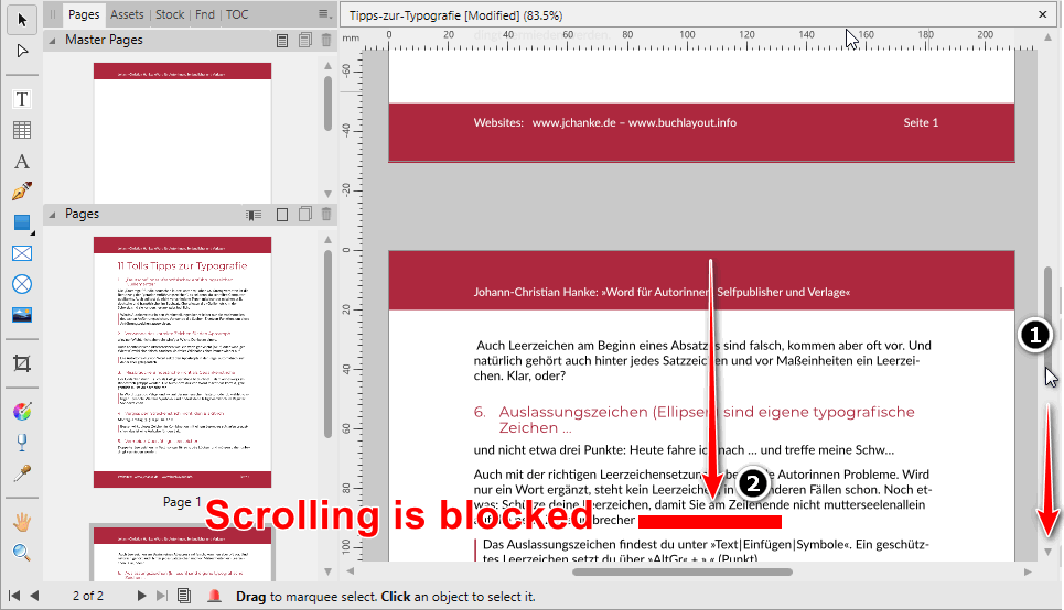
I have a two page document and scrolling on the last page seems to be inhibited, no matter whether by mouse wheel or scrollbar. Preview mode is on. If it is off, scrolling works. I'm using 1.8 on Windows 10.
-
For me, simple letters like in PagePlus, InDesign or QuarkXPress just do. Letters that can be switched on and off. But I need it, urgently.
-
I'm attaching a document with a single image. It does not disappear but somehow jumps out of the frame when I try to convert that image into an image frame. I'm also ready to provide a document with images that disappear completely if you would kindly provide a link. Thanks. ImageBehavesStrangelyWhenTurnedIntoImageFrame.afpub
-
Yes, I'd love to, but not in public. Please provide a link.
-
In this case, I can't. It's client's work and my valued customer would not be amused to see their content in this board. I'm not even allowed to share this convent, even if I would upload it directly to your server, I'm sorry. (It was a long document with many images. Just my daily work.) However, If I import Word documents with linked images, the images don't show, anyway. The attached files may serve as an example: Word file with LINKED image and Publisher file with imported Word file. SerifsVision.afpub SerifsVision_2.docx Note: I've been working for many publishing houses for more than 20 years. We've always accepted manuscripts with linked images, only. This was the case 25 years ago and it still hasn't changed. Yet, selfpublishers or very small publishers, who are less experienced, mainly embed their images which often impairs the image quality. (If not customized otherwise, Word compresses the image and reduces the resolution to 220 dpi.) So, as a professional tool, Publisher should support linked images in Word because linking images it the professional way.
-
To link images is the gold standard, not just in Publisher and InDesign, but also in Word. I tell my customers to always link their images to the Word file, not to embed them. Linked images don't loose quality, this technique helps keeping the file size of the Word file (ID, Pub) small. However, when I try to import a Word document with linked images into Publisher ... Publisher freezes. 1.8.0.523 and older versions. Win 10.
-
I'm importing a Word file into Publisher with embedded images. I'm changing the number of columns. The images go wild, get distorted. The same happens if a draw another text frame (1 column) and thread the text into that frame. Applies to 1.8.0.523, not to earlier versions, Win 10
-
I import a Word document into Publisher. This Word file has embedded images. The import works will, the images show. I try to convert those images into picture frames. The images disappear. Do you need a sample file? Applies to 1.8.0.523 and earlier, Win 10
-
Wrong Typographical Quotes
Interior Book Design replied to Kurt J. Meyer's topic in V1 Bugs found on macOS
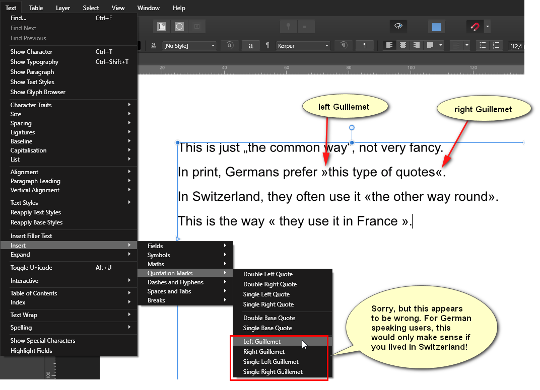
Definitely, but in Germany/Austria the opening one looks like this: » and this one « ist the closing guillement. In Switzerland they use it like in France, but with no spaces. Makes translation more complicated. -
Wrong Typographical Quotes
Interior Book Design replied to Kurt J. Meyer's topic in V1 Bugs found on macOS
Yes, this seems to be quite obvious.It's exactly the way I interpret the commands for double and single left/right quote. The left opening one is named first, the closing one after it. Maybe, but I would never think of it. So, I guess, it is pretty misleading. Well, this exactly what I criticize: the auto-correct setting should not give us a poor choice but allow us to choose the best kind of quotes. I'm a typesetter, in 9 out of 10 cases we choose »this kind of quotes«. -
Wrong Typographical Quotes
Interior Book Design replied to Kurt J. Meyer's topic in V1 Bugs found on macOS
But is is not a clever setting, limiting the type of quotes to the boring German ones, Pauls! In books we prefer »quotes like this«, similar to the ones used in France or Switzerland, but exactly the other way round and without spaces! So, you should review your quote management in Publisher! It is incomplete and partly wrong. See my image. My two cents: Do it as you have done in PagePlus, allow the users so choose their individual type of quotes. Some other DTP apps grant you the same choice, for instance InDesign and QuarkXPress. There is only one ignorant word processor that does not care about German preferences at all: Word. Other word processing apps do!
-
Hi Sean, hi Lagarto, I've created many test documents both on APub Win (481, 502) and Mac (just 1.7.3) and tried to repeat the situation. However, In all three programmes, I'm was not able to convert a RGB document to CMYK, at all. I'm very sorry. Both buttons, Assign and Convert, are inactive. They sames holds true if I try to convert a CMYK document into RGB. Assign and Convert don't work, as well. Strange. So, you are not supposed to convert RGB into CMYK and vice versa?! I can't figure out what I did differently, in the first place. Starting off with a RGB document, text colour is always rich black, not 100K black. CMYK documents, however, provide the right black value: 100K. Anyway, I think there should be a mechanism making sure that black text always stays/gets 100K black when converted into a CMYK PDF. You shouldn't be forced to check before printing, whether it is rich black or 100K.