pbass
-
Posts
96 -
Joined
-
Last visited
Everything posted by pbass
-
Delete Object Gesture
pbass replied to pbass's topic in Feedback for the Affinity V2 Suite of Products
Hey Dan, thanks very much for the consideration! (Delayed response...). Cheers, - pbass -
Delete Object Gesture
pbass replied to pbass's topic in Feedback for the Affinity V2 Suite of Products
Very helpful indeed, Dan! Tell me, any possibility of a movable/custom-placeable Trash icon in the future?? Though right-handed (wielding Apple Pencil in right hand), I like the interface in Left-Handed Mode (Studio accessible to left hand). If I could just get the Trash back over where my left thumb could reach it, I'd be happy. (Frankly, I'd love the tool bar and Studio to be at the left, but I don't think that much customizability is in the cards...) -
Old topic, I know – cuz when I forum-search for 'Delete Object Gesture' I get a sea of threads dating back to V2 beta. As of May 2023, is there finally a simple, dedicated gesture for this (on Designer iPad); or do we still need to either use the Trash icon or bring up the Quick Menu & choose Delete there?? I could manage with just the Trash Icon IF it were custom-moveable to where it's handy for me. Otherwise, I feel the Quick Menu is too indirect for a command that I use dozens of times per session. Anyone else feel this way?? [By the way, for me, 3 finger gestures are a bust; on my iPad 3 fingers Zoom & Unzoom the screen.]
-
You guys are well-oiled machine. Every time I forget about updates, one turns up – usually an excellent, meaty one, like this. I hope you're proud of your team! There aren't many devs so creative and productive. I'm really excited to see what you come up with as Designer for iPad! cheers, - pbass
-
iPad: See Layer in Isolation – like Option-Click
pbass replied to pbass's topic in Feedback for Affinity Photo V1 on iPad
Yes, some kind of icon on the Layers palette would be great. Only a minority of graphics people keep a keyboard connected to their iPad – otherwise most of us would just use a laptop. -
iPad: See Layer in Isolation – like Option-Click
pbass replied to pbass's topic in Feedback for Affinity Photo V1 on iPad
Maybe you could include the idea of an 'S' (for 'Solo') button in the Layers panel – or perhaps 'I' (for isolate), would be more appropriate. Thanks, - pbass -
iPad: See Layer in Isolation – like Option-Click
pbass replied to pbass's topic in Feedback for Affinity Photo V1 on iPad
I appreciate it! Saves me the trouble. cheers, - pbass -
iPad: See Layer in Isolation – like Option-Click
pbass replied to pbass's topic in Feedback for Affinity Photo V1 on iPad
Thanks MEB. Boy, that is a feature I use constantly, on desktop. :^/ It's the quickest way to compare your work to your original; and lets you compare the current histogram to the original. I would really like layer isolation to be available on iPad, even when no keyboard is attached. Audio mixing desks/boards (which let you blend tracks or channels – like layers) have an isolation feature called Solo – there's usually a button labeled with an 'S', on each channel strip. That'd be massively helpful for Layers. Cheers, - pbass -
Hi, In Photo for iPad, what is the equivalent of Option-Clicking a layer, to (in audio terms) 'Mute' all the other layers temporarily? I.e., to visually isolate a layer's display. Thanks in advance, - pbass
-
Thanks, BMd, it _is_ a good explanation!
-
Ok, a lightbulb just went on! I had thought that Pencil tool could start off with a 'Texture Line' Style (i.e., a vector brush); but I realize now that when you select that kind of Stroke, it automatically goes back to pure vector line ('Solid Line' Style). I hadn't noticed that before. You can change a Pencil line's Stroke to 'Texture Line', after the fact; but not while drawing. Got it. The developers' choice of a double-sphere colour-picker for the vector Brush tool confused me – with no fill available, it can only have a stroke, right? (Even if the stroke is derived from bit-map image.)
-
I see I made typos in my OP, and referred to the Pen tool when I meant Pencil tool – now corrected. I was pointing out the differences between the Pencil tool (not the Pen tool) and the Brush tool – both of which can draw vectors with 'Texture Line Style'. {<—My misapprehension, see next post.} (Although the Pencil can have a fill, I'm talking about both tool's Stroke.) Wondering specifically about the reason for the Pencil & Brush's different Colour-pickers.
-
{I mistakenly said Pen tool a couple of times (corrected); I meant to only compare Pencil & Brush in Draw Persona.} In Draw Persona, both the Brush tool and the Pencil tool {<—wrong! see below} can be used to draw with vector brushes (StrokePalette>Style>'Texture Line'). The obvious differences between Brush & Pencil (that I can see) are: - The last drawn Pencil tool line is automatically selected – not so for Brush tool. (This would be my criteria for picking one over the other.) - A Brush tool line cannot have a fill. - While the Pencil tool's stroke colour can be chosen with the Colour-Pickers 'stroke' ring, when you use the Brush, the Colour-Picker switches to two 'fill' circles. ¿ What is the thinking behind this? Why does the vector Brush's Colour Picker have two circles? thanks, - pbass
-
[Designer] Hi, Is there another way to convert nodes, other than going to the Pen or Node Tool's Contextual (horizontal) Toolbar, and pressing buttons? Like, shortcuts for: Convert to Sharp or Smooth node? Or Reverse Curve? I already have keyboard shortcuts for Close and Break Curve – whose toolbar buttons are right beside the Convert ones. But those are the only Pen or Node Tool shortcuts I could find in the Prefs. Two related things I would love: - A way to 'pull' Control Handles out of a sharp node (or pop them back in to make a sharp point), via some modifier key(s) with the node tool. (Like: after-the-fact editing of a path, not while drawing it.) and - When you're manipulating one of a node's Control Handles, for a certain modifier key(s) to cause its opposing handle do the exact same thing – i.e., stay in perfect symmetry/mirror image. Including, on a non-smooth node, the control handle angle. That would be _so_ handy! (It's available with 3rd party Illustrator plugins) Thanks for your attention! - pbass
-
affinity designer A Spring Day Illustration AD
pbass replied to digital_wampa's topic in Share your work
Anyone see the animated movie 'Coraline' (2009)? In a sinister parallel world, the heroine's family all have black buttons for eyes. Über creepy; and symbolic of surface personality that doesn't match what's going on inside the person! Well I'm wary of what's going on inside those flowers. ~:^{ -
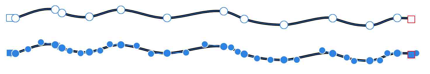
Hi, [This is a repost of what I posted last week – somehow it missed the attention of Serif/Affinity folks. Thanks for reading! https://forum.affinity.serif.com/index.php?/topic/37639-node-control-handles-%E2%80%93-distinguishability-in-designer/?p=187464] Request for better visual contrast between Smooth Nodes and their Control Handles. Blue Circles, all! Because the Control Handles are only distinguishable by being a bit smaller, when you've selected a bunch of nodes, it can be a real visual challenge to sort them out. It's not a big deal if you're mostly drawing straight lines. But when you draw complex, organic shapes (like sketching in vectors with a stylus), you get long lines full of nodes, and when you select them, it looks like a string of blue Christmas lights! Click attached JPG, 2 views of the same path: Top is with nodes unselected, Bottom is selected.) The Control Handles make it look like 3 times as many nodes. Personally I'd prefer if Control Handles were either - a different colour than nodes, or - a different shape, or - both. (Or customizable in Prefs!) Thanks, - pbass

-
Wow, that's pretty impressive. :^) Hopefully if there's an option to turn that on, there'll also be options for its strength, & for general accuracy of tracking. Around when is v1.6 due, btw?? Thanks, - pbass
-
Hi, When I freehand sketch ('Draw Persona'), Designer makes certain choices when interpreting my Vector Brush-ed or Pencil-ed lines into vectors. ¿¿ Is there a preference or settings dialog to control how accurate the resulting sketched path is?? Like: many nodes for 'Accurate', fewer nodes for 'Simplified, etc.? thanks, - pbass
-
Node & Control Handles – Distinguishability (in Designer)
pbass replied to pbass's topic in Older Feedback & Suggestion Posts
Thanks Aammppaa! I'm sure the Dev's are extremely busy; but there's usually someone reading our posts. I'd love to know that _they_ know that some of us struggle with that particular node/handles clarity issue. I notice that in Inkscape they use hollow diamond shapes for the control handles. [Edit: They're not diamonds after all, just pixelation playing tricks on my eyes. But diamonds'd be a good idea!] I like that a lot; but for Af Designer handles, even just hollow (transparent/no fill) circles would be great – would be a fine contrast from Nodes. [Edit: Er, no, hollow circles could just be confused with unselected neighbouring nodes. So maybe a different colour for handles, or diamond shape or something.] Cheers.- 4 replies
-
- 1
-

-
- point
- visability
- (and 3 more)
-
Node & Control Handles – Distinguishability (in Designer)
pbass replied to pbass's topic in Older Feedback & Suggestion Posts
I realize that my usage profile (sketching in vectors) – may not be typical of a Designer user. Not everybody needs to edit within rows of close-spaced nodes. But even if it isn't judged to be a useful suggestion, I would still love it if someone from Serif/Affinity would acknowledge having read my opening post. Thanks in advance! - pbass -
Node & Control Handles – Distinguishability (in Designer)
pbass replied to pbass's topic in Older Feedback & Suggestion Posts
** Bump ** :^) -
Hi there, Request for better visual contrast between Smooth Nodes and their Control Handles. Blue Circles, all! Because the Control Handles are only distinguishable by being a bit smaller, when you've selected a bunch of nodes, it can be a real visual challenge to sort them out. It's not a big deal if you're mostly drawing straight lines. But when you draw complex, organic shapes (like sketching in vectors with a stylus), you get long lines full of nodes, and when you select them, it looks like a string of blue Christmas lights! (<—Click attached JPG of the same path: Top is nodes unselected, Bottom is selected.) The Control Handles make it look like 3 times as many nodes. Personally I'd prefer if Control Handles were either - a different colour than nodes, or - a different shape, or - both. (Or customizable in Prefs!) Thanks, - pbass
- 4 replies
-
- 3
-
-
- point
- visability
- (and 3 more)
-
Thanks Alfred & MEB! Quick, clear answers, happy OP'er! :^)
-
It's been a while, but it seems to me that in the MegaCompetition's apps, if you pressed D, you got a default black stroke & white fill. Is there any equivalent, or other shortcut strategy, to accomplish this in Designer? thanks in advance, - pbass
-
Designer (vector) Pencil Tool: Continue Path
pbass replied to pbass's topic in Older Feedback & Suggestion Posts
Thank you, U R No Baboon in my eyes! ;^>