

expressoaddict
-
Posts
33 -
Joined
-
Last visited
Posts posted by expressoaddict
-
-
On 10/19/2017 at 1:32 PM, Patrick Connor said:
Thanks for your help with this bug. We have now resolved the problem and will make the fix available in the next iPad & Mac release.
I am still three years later seeing dozens and dozens of Noto fonts appearing as soon as I install Affinity Designer on a new Mac.
They are locked by the system and cannot be deleted (without, as described, me creating a new partition and installing a new instance of MacOS — please let's agree that that's quite a cumbersome, time-consuming and overly complicated thing to have to do to get rid of fonts that were installed against my will...)
Please advise!

-
Hi all,
First of all sorry for double posting — I'm sorry if I made a faux pas by posting this in the bug section, but since it sits unanswered there I'm coming here for help. Here's hoping someone can explain to me what's happening (and how to stop it...)
Problem:
I am using a Wacom pen (intuos pro M) and love using it with Designer. I'm using a Mac.
Since I have my keyboard positioned above my tablet, every time I use a keyboard shortcut or enter some text the pen rests in my hand and the back tip hovers over the tablet.
For that reason, I have set the back tip functionality to DISABLED in the Wacom settings, so as not to involuntarily do something with the back tip.This works fine in every other app; the reverse tip does nothing.
But. In Designer, if reaching for the keyboard so the reverse tip hovers over the tablet, I find that Designer will:
1. Almost always: Change my cursor to a circle (probably an Erase Brush, because the undo menu item changes to "undo erase brush tool" — something I didn't voluntarily select, and also something that to my knowledge should not be possible in the vector persona?)
2. Sometimes also: Add a mask layer to the current layer
3. Occasionally also: Add marching ants to the edges of the full page, as if I had performed a cmd+a on pixel layer
4. occasionally also: Show the assistant notification telling me a layer was rasterized for me.Is this by design? If so why?
Why does the reverse tip of the Wacom perform stuff in Designer when globally set to off?
Should I even be able to select the eraser brush in Designer without switching to the Pixel Persona?
Am I missing something?All help appreciated, this is driving me somewhat crazy...
/E
-
Hi all,
this just has to be a bug — I can't see it documented anywhere, nor anyway to turn it off (if intentional):
I am using a Wacom pen (intuos pro M) and love using it with Designer.
But.
Since I have my keyboard positioned above my tablet, and I also love using keyboard shortcuts (plus of course, need to type text every now and then) both in Designer and elsewhere, I have globally disabled the "reverse tip" in the Wacom settings so as to not involuntarily invoke something as the pen rests loosely in my hand.
This works fine in every other app; the reverse tip does nothing.But. In Designer, if reaching for the keyboard (so that the reverse tip hovers over the tablet) I suddenly find that Designer will:
1. Almost always: Change my cursor to a circle (probably an Erase Brush, because the undo menu item changes to "undo erase brush tool" — something I didn't voluntarily select, and also something that to my knowledge should not be possible in the vector persona?)
2. Sometimes also: Add a mask layer to the current layer
3. Occasionally also: Add marching ants to the edges of the full page, as if I had performed a cmd+a on pixel layerIs this by design? If so why?
Why does the reverse tip of the Wacom perform stuff in Designer when globally set to off?
Or am I missing something?Please advise!
/EA.
Edited to add two things:
1. I should probably mention that I’m on a Mac
2. Another “sometimes” symptom is that sometimes, the assistant notification appears telling me it has rasterized a layer for me.PS to moderators: If I ought to have posted this is the support forum rather than bugs feel free to move it; I don’t seem to be able to myself. Then again, I guess the right choice of forum depends on whether this turns out to be unintended behavior or not... 😆
-
Thanks -- I did try everything except rebooting, so that was not a no-brainer for me (in fact, I didn't expect that to help at all...)
After that, import from cloud worked for me too.
Plain open, or drag from finder, is still non-functional. But as long as there is a way, I guess...Thanks again.
-
Just wanted to say that I am having the same problem:
Created a drawing on my computer, saved it on iCloud. The preview looks nice and all, both in the files app and if going to the location via the + button in Designer for iPad.
However. On my ipad:
1. Trying to open it from the + button — whether I choose "open from cloud" or "import from cloud" (what is the difference?) I will get the message "could not open the file test.afdesign".
2. Trying to drag it from the files app, i do get a green + when dragging it across to the gallery view — but when releasing it, nothing happens at all.
So, there seems to be no way to open it at all. Expected? (A more elaborate dialog might have helped, now I just know that it won't...)
Attached is a screen recording when I try the three different methods in the order described above.
All help appreciated.
-
Thanks!
For anyone running into the same problem, I think I found a workaround.
Incidentally, this once again seems to relate to "resolution" — which coming from other vector apps should not really be a factor in an app like this.
But to avoid the problem, here's what I did:1. Set "scale with object" to all strokes (luckily, can be done by selecting all and checking that checkbox)
2. In the transform box, type 1000% for size
3. Convert the oversized version by selecting "expand stroke"
4. In the transform box, type 10% for sizeIt is now correctly converted.
-
My need:
Make illustration using a pressure profile to simulate hand drawn lines
Then convert those lines to outline objects, for preservation when areas are needed instead of lines (such as vinyl cutouts, or any other situation where line weights are not supported)Result:
When converting lines to areas (using "expand stroke"), the exact line is not converted into areas, but weird artifacts are introduced (probably depending on incorrect interpretation of ends and joints).Questions:
a. Any thoughts on how to avoid?
b. This quite like being a bug, what is the best way to report it? Here or elsewhere?/LA.
-
Well then. Complicated as it may be. Is there any way to copy stuff out of Affinity the way things can be copied out of Illustrator?
-
9 hours ago, R C-R said:
Quite a few apps cannot render vector based objects, so to ensure that they can use the contents of the clipboard, it is not at all unusual for apps like Affinity to place more than one version of copied content onto the clipboard.
BTW, the MacOS Preview app can only open .ai files if they include an embedded PDF version of the file's content.
Sure — but is that relevant to my problem, really?
MacOS Preview does indeed render vectorized objects fine, regardless of whether it is a PDF or an SVG or something else under-the-hood. Any such vector/object based file format is a collection of objects, in which a full-resolution pic could well be embedded. No need to resize it just because we put it on the clipboard.
So on one hand, you're right: It's not uncommon to enclose a bitmap (preview) of a vector illustration, together with the unaltered resolution-independent vector version, be it in a saved/exported file (such as PDF) or when copying to the clipboard.
But my point is not that. My point is that when copying an illustration with an image in it, while any enclosed bitmap fallback/preview part will obviously by definition have a resolution and thus have all contents jagged if zoomed, the object/vector part should just be preserved as is — including images which should just be enclosed at its own original full resolution. Again, the reason for downscaling images in this case is none, as proven by other illustration packages.One more example — perhaps the most obvious one as to why Affinity's current model is far from ideal:
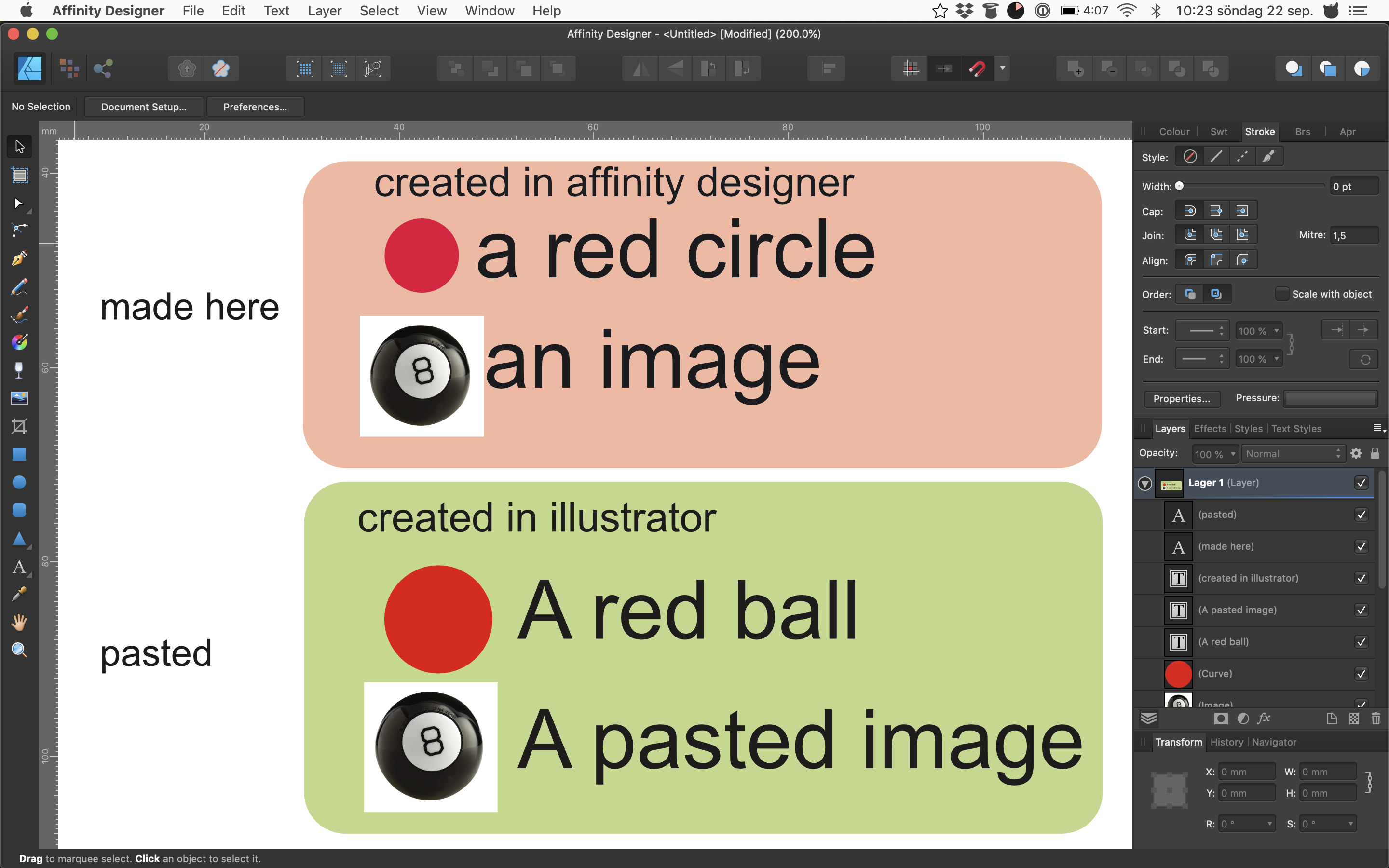
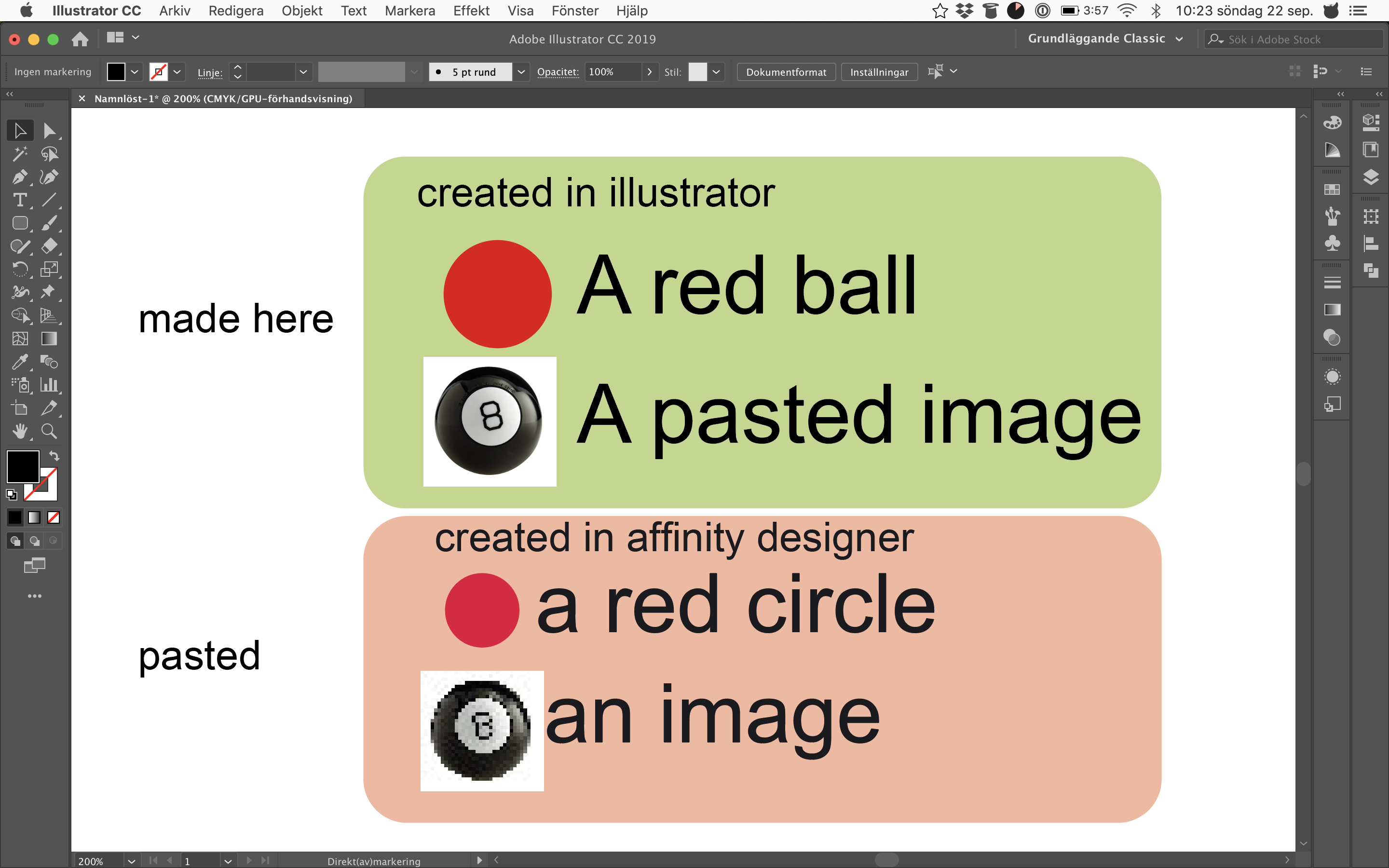
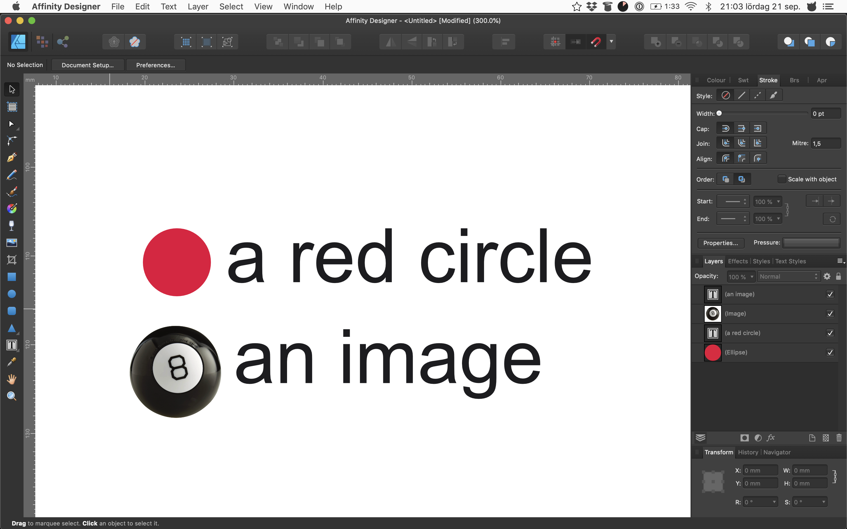
Below, two screenshots.
First, I create the same kind of graphic in both Affinity and Illustrator, with some native objects plus my one random pasted pic from google.
Then, I copy the Affinity artwork into Illustrator, and the Illustrator artwork into Affinity.
Note how Illustrator encloses all data and lets me continue to work with the unaltered material in the destination app, whereas Affinity downsamples the data and makes it useless.
I don't think it's inappropriate to say Illustrator gets this right and Affinity gets it wrong.
-
8 minutes ago, walt.farrell said:
What application did you paste into for that last screenshot, @expressoaddict?
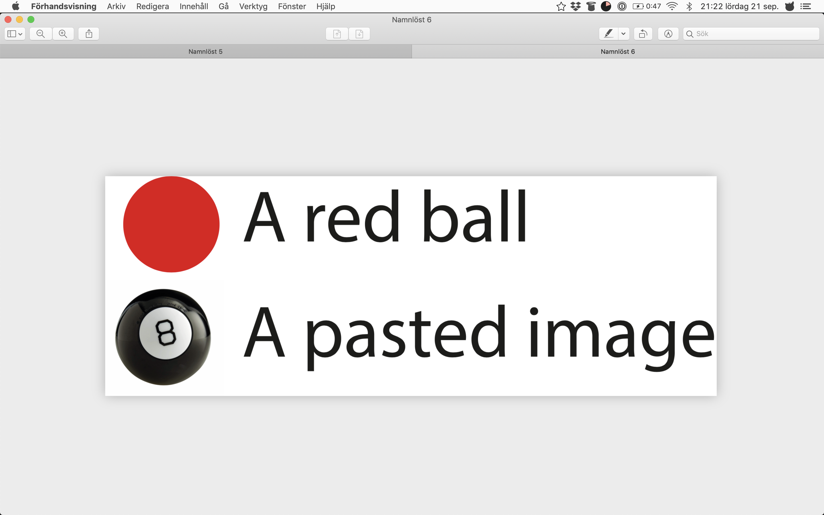
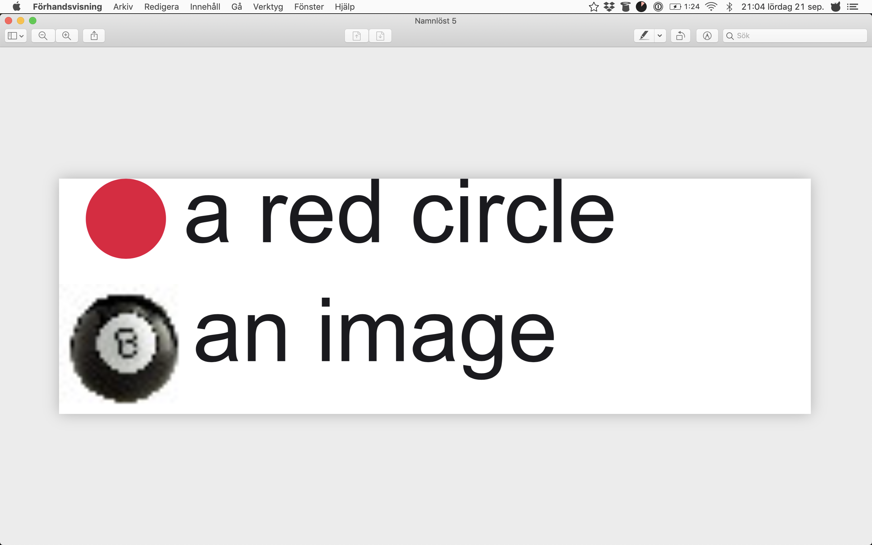
Same as when pasting from Affinity Designer — namely MacOs Preview.
So: Copying from Illustrator to Preview gives another result (resolution independent) than if copying from Affinity Designer to Preview (resampled).
-
In fact, and for comparison — doing the exact same thing in Illustrator gives me this: (sorry for another set of large screenshots below)
In short, Illustrator copies the image to the clipboard like any other object, leaving for the destination app to render it to any resolution at output time.
If Affinity's take is by design, I would love (well — need!) a setting to opt out of that behavior...
-
So math aside, coming at this from any other vector based illustration software I need to say this doesn't make sense to me at all:
Being an object oriented, vector-based app, it feels completely against the norm for Affinity to let the clipboard receive a rasterized-to-the-measurements-of-its-own-internal-workspace version of anything — the entire point of vector based illustration being that no rendering takes place (should take place) until actual printing/exporting to a resolution-dependent entity is performed.
So just as a an elaborate bezier curve doesn't get jagged when copying it out of the app, nor should a pic get downsampled in the process.
(Or, conversely, if a pasted pic will not be handed over as-is, why are not also vector objects rasterized and downsampled to that internal resolution?)Below is a graphic with some vector objects + one pasted pic, first seen in Affinity Designer, then cut-and-pasted to the MacOs Preview app.
To me, it honestly makes no sense why the image is re-rasterized when nothing else is — and unfortunately, it's inconsistencies and quirks like this, where Affinity sort of seems to invent their own workflow and logic in a world where certain agreements have already been made, that stops me from dumping Adobe and switching for real. I may hate Illustrator and inDesign for a number of reasons, but none of them is unpredictability, and when things needs to get made on a deadline, clunkiness is a small price to pay for not having to struggle with unexpected results...
/L.A.
-
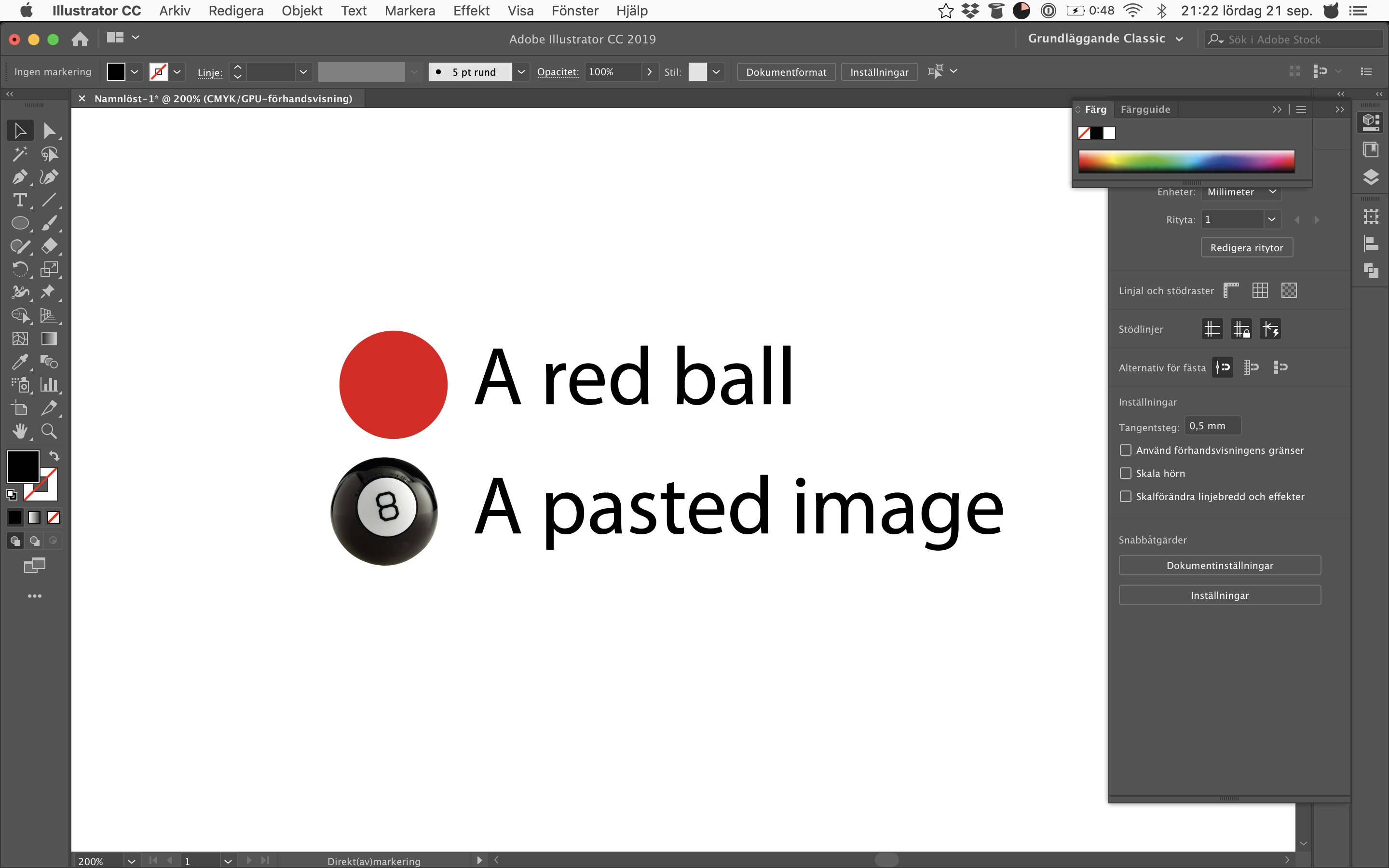
So here's my specific problem.
I have a Designer document, into which I have pasted a nice and (reasonably) hi-res photo.
Selecting the photo in Designer gives me the top-left info that its resolution is 900x1350 pixels.Very good. But if I try to copy it...
...and paste it into another app (word, preview, photoshop) this will quite unexpectedly give me
1. a letter-sized blank frame/workspace, with
2. a centered version of the photo, at very low resolution.For some reason, what's copied into the clipboard is a pdf (with its size set to portrait letter, which makes no sense since I'm cutting the photo from a landscape A4 document anyway) with a centered photo object whose resolution has been reduced to (in this case) 244x363 pixels, i.e. about a quarter of its original width and height.
Is there a setting to actually copy the selected photo in its entirety to the clipboard, not as part of a pdf but as the jpg it actually is?
Is this a bug or is it by design? (And if so, please explain to my why I want it...)But most of all: Please help me cut my pasted pic out of Designer and into other apps, with the original size and resolution preserved — how can I do that?
-
Small glitch — I could be wrong but:
Seems like if "change straight quotes to typographic quotes" is checked, Publisher will always correct them to the English/US standard
even if I choose Swedish in the Replacement menu. (My system language is already Swedish).
In other apps, quotes are converted to the correct Swedish method:
I got the last one in Publisher by actually entering the correct quote manually (alt+shift+2 on a Swedish keyboard) so it CAN be done. But would obviously be better for Swedish (and Finnish) users if the correct conversion took place automatically.
Thanks!
-
My bad,
Incorrectly posted in Designer Beta, should have been Publisher Beta.
Might a moderator help move this there or should I post anew?
-
Perhaps by design, but to me this is an oddity/quirk:
Add a couple of photos.
Say you want to mimic a classic photo, so you put a white stroke on one, and a drop shadow.
Some of the photos you crop, some not.
You then copy the layer effects from the first photo to the rest.Result: All parts of the stroke that goes outside of the photo bounding box will be cut on cropped photos.
You CAN work around this by only using "stroke inside" — but it is a bit counterproductive since the drop shadow, while no doubt outside the cropped bounding box (correctly) stays visible.
So I would suggest the paradigm should be "stroke is added to photo after crop", not "before crop and thus affected of the crop itself".Hope you see what I mean.
Thanks,
/Fredrik.
-
Small glitch — I could be wrong but:
Seems like if "change straight quotes to typographic quotes" is checked, Publisher will always correct them to the English/US standard
even if I choose Swedish in the Replacement menu. (My system language is already Swedish).
In other apps, quotes are converted to the correct Swedish method:I got the last one in Publisher by actually entering the correct quote manually (alt+shift+2 on a Swedish keyboard) so it CAN be done. But would obviously be better for Swedish (and Finnish) users if the correct conversion took place automatically.
Thanks!
-
Thank you Mike for your response/followup — and sorry for not answering sooner.
I guess I'm starting to understand what's going on, and I will use this post to elaborate, but let me start with saying I think Affinity Designer has a fundamental flaw in its CMYK color handling, probably due to the fact that Affinity has its roots in bitmap graphics and thus implicitly in the RGB color model.
First, to answer the questions above:
I am choosing 100% black (known as K in the CMYK world) by choosing CMYK for color model and 100% black from the CMYK slider window.
After that, whether I print directly or export to PDF (and thus also if exporting to PDF, then printing said PDF) the black surface will appear not solid black but rasterized (probably at about 85%K)
This is not correct behavior.
I attach two photos below — a 100%K square as printed to the same printers directly from Affinity Designer and directly from Adobe Illustrator.
As can be seen, when printed from Affinity a 100%K comes out as a rasterized grey. The same from Illustrator becomes solid black.
The problem, I believe, is this:
Sure: Everybody knows 100%K isn't perfectly, deeply pitch black. BLACK ink/toner lacks the depth to create a rich, full-bodied black. This introduces problems when interpreting an RGB photo for printing with the CMYK model, since RGB(0,0,0) means perfectly black and 100%K optically really doesn't. To compensate, RGB(0,0,0) is normally printed by complementing the 100%K with some extra C, M and Y to thicken it.
As a result of this, going in the other direction — i.e. converting a CMYK artwork to RGB — 100%K is often rendered only as a dark grey, since it would take 100%K + some extra CMY to make it fully RGB(0,0,0) pitch black.
This is all fine and dandy. BUT. For some reason, Affinity Designer seems to be INTERPRETING a CMYK artwork when printing to a CMYK printer — and this should not be done.
CMYK values should just be passed on as-is to a CMYK printer, meaning 100%K should be printed with 100% coverage from the BLACK cartridge/toner/ink. As can be seen on the print from Illustrator, that is also exactly what happens there.
However, Affinity seems to be thinking "hey, 100%K isn't really black, so let's interpret it as 85% black" which is like paying tax twice: When printing just 85% coverage with the black cartridge, which you may argue already isn't optically black in itself, the blackness is reduced even further — in direct conflict with rules, logic and most importantly: the values I have chosen.
So, in summary, it seems as if Affinity applies some kind of "interpretation" for CMYK values even when printing to a CMYK printer, which is incorrect behavior for a vector graphics program.
Photos below. Please also note that this becomes even more visible when printing to a black-and-white laser printer — I apologize for the quality issues (stripes) due to low toner levels, but even so the square (and supposedly solid black text) come out as grey and rasterized. Whereas again, from Illustrator they don't.
-
I did ask this before, and found myself somewhat trashed for not getting CMYK/RGB conversion.
I left the forum (and finished my work in inkscape because I had to get it done) but would like to ask once again, hopefully this time someone can help me with a solution.
The short question is: When working in CMYK space, assigning 100%K to an object, why is it not printed as 100%K?
To reproduce:
Start a new document. For settings, I choose PRINT and color format CMYK/8.
For color space I'm quite sure I've been through them all, from US WebCoated SWOP vs (which I think was the default) ending with Generic CMYK.
Add an object, set color to 100% K.
Print.
Whatever I choose, a 100%K object will be printed as rasterized (on a black and white laser printer) or grey in a PDF etc etc.
What do I need to do to make Affinity treat 100%K in CYMK mode as something to print with 100%K black?
-
??? Vector or raster makes no difference in this respect. Everything still has to be handed off to the printing software & rasterized to be printed by a laser or inkjet printing device. In particular, a typical home/office class color laser printer has four toner cartridges, one each for cyan, magenta, yellow, & black, while an inkjet might have three or more color ink cartridges, plus two black ones, one used in combination with the colored inks for better color mixing & the other used for 'pure' 100% K blacks.
The printing software takes into account the properties of the paper or other print media & how that interacts with the inks or toners, which is determined in part by the color profile specified for the document. On a Mac, depending on the installed printer driver, this can be set in the "Color Matching" section of the print dialog to either use the built-in Colorsync matching or the printer's color management system, & the "Quality & Media" & "Color Options" sections can be used to set it for various media types, color levels, & printing quality.
Together, all these things determine the colors of the printed output, including how black the printed blacks will be.
Let me just close this topic by stating that if I have purchased a vector design package that does not print the same CMYK values to a CMYK printer that I have set the artwork to be, then I am the fool for thinking an app for forty bucks could do a professional job.
I don't want to be rude — I have just read your bio and realize that you are not a graphics professional — but the information in your post above makes no sense at all from a professional standpoint, nor are your deductions about color handling correct.
I could go back to the early days of manual color separation, when we printed four sheets of black-and-white film at the very expensive typesetter service, then exposed them onto plates, which in turn were used for offset printing onto paper. Those four sheets were the respective originals for the C M Y and K printing colors, which meant that if I gave an object a certain mix of these components, each film would represent that mix in a literal, one-to-one ratio. If my color was 20C, 30M, 40Y, 10K, then the cyan film would be 20% grey, the magenta 30% etc.
This, quite simply, is how CMYK printing works.
So. Designing in CMYK and printing to CMYK, I don't want any conversion to take place.
If I want my blacks to be 100%K, I design my artwork accordingly. If I want something else, then that's the value I'll set.
But I alone decide how black my blacks will be.
In case your answer is to be considered an official contribution to this forum, I guess I'll have to go back to using apps like InkScape which, while crazily inferior in features and UI, has never once let me down in terms of printing and designing in CMYK.
-
Perhaps at the risk of becoming crazy here...
If I add an object, set the color picker to CMYK, make the object 100%K — then right there in the document what I get is an almost-black object.
If I then change the color picker to RGB, it will change not to (0, 0, 0) but to (35, 31, 32).
So quite obviously, Affinity Designer has decided that 100%K is a greyish color — which is also the way the object prints.
I don't think I can explain it any clearer — all I do is wonder why something I set to a CMYK value won't print with those values.
-
I am pretty much at a complete loss as to understanding this thread. I mean, is it about 100% K hitting the print device? Or that 100% K should map to 0,0,0 if exported to an RGB format? Both? And what is the OS being used? What is the print device used?
Both, in fact. Printing a 100%K object, either direct or from a PDF, gives me a weak, weak raster — I guess corresponding quite well to the 94% I see if exporting to RGB. So one could also say that the only way for me to print full black is to set RGB(0,0,0) and not 100% K.
I'm on MacOS Sierra, printing to two different Laser printers, one Samsung and one HP.
So I think you're understanding my question perfectly — I would so dearly like my CMYK objects to print at the CMYK values I set... :)
100% K will hit the PDF as 100% K unless there is a profile to profile conversion.
So — you can choose a conversion? Is there a way to just turn it off? Or what am I not doing the way you are?
-
Rendering also happens during printing, as a stage in a RIP or by the print driver. Color conversion between color spaces is necessary in any color managed document. Between an additive color space like RGB & a subtractive one like CMYK conversion can never be exact, but it would be impossible without some kind of color space reference.
I am sorry, but are you responding to my question or to one that you would like me to have asked instead?
I am designing things in CMYK. When ripping such graphics to a CMYK printer no conversion shall take place.
That's the beauty of vector graphics — and the difference to bitmap/raster — if working in CMYK I set the values to be printed and that's it.
Color conversion may take place for display onscreen (which is RGB) but that is totally different from the ripping process.
If I have a number of CMYK objects, as in Affinity Designer, they shall be ripped/printed/separated as per my settings, period.
If I also add an RGB photo to my design then by all means, it — and only it — need be converted at the time of rip/printing.
But not the rest.
It is true that no color conversion can be exact.
That is why none should take place, when I design a CYMK object and print it as such.
My question, to clarify, is: Why does it?
And: When conversion does take place, why is it off, so that 100%K — the blackest — isn't rendered as RGB(0,0,0) ?
-
Rendering happens for monitors. CMYK colour in vector object usually stays as it is though its appearance on screen may be altered by using colour profiled work flow.
...
OP, I have no answer for your question. What kind of work flow you have? Do you have any idea why any RGB profile mixup would be happening? Your document colour format is CMYK8, right?
Thank you for understanding my initial question.
Yes, this is what's odd — even printing a 100%K surface (to printer or to PDF) gives me a not-quite-black surface where it should. I can't really see why RGB conversion should be involved in the process at all here — especially of the color "completely black" which should be at the absolute end of any color model anyway.
And the answer is yes — my color model is CMYK8. Which makes it even less understandable.
So how does everyone else do? I surely can't be the only one using CMYK colors in Affinity Designer...?


Ability to hide fonts
in Feedback for the V1 Affinity Suite of Products
Posted
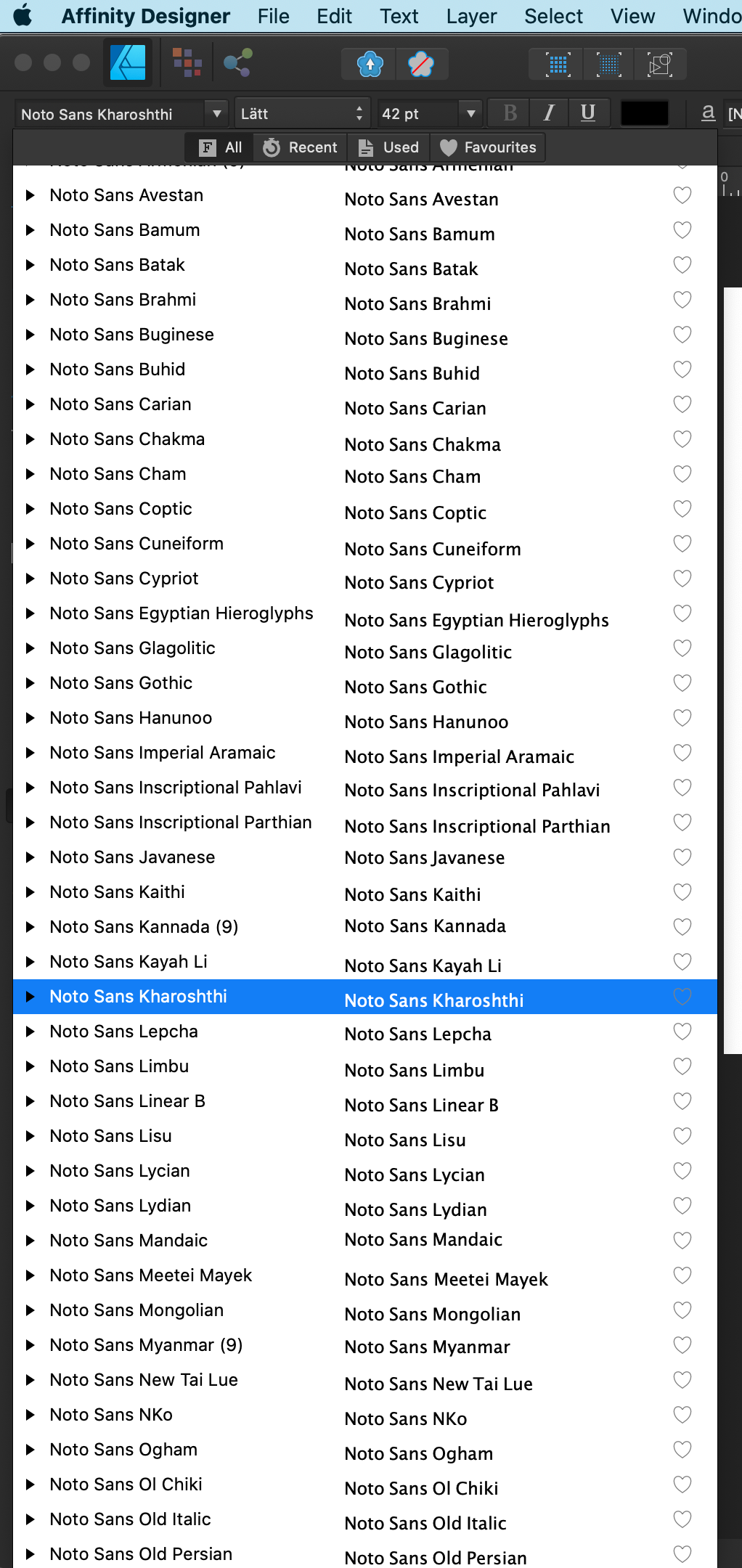
See attached screenshots below:
The problem here is that these only seem to be seven actual typefaces (or even six, if you disregard the one not activated by the system) — see screenshot of Font Book below.
For some reason, though, Affinity seems to be listing each and every sub-character-set, including hieroglyphs (!) as if they were individual typefaces.
If I'm right, this means that the bug — which really needs to be fixed! — is that Affinity lists character sets instead of typefaces.
If I'm wrong, it means that those are not subsets at all, but that Affinity lists typefaces that aren't even on my computer.
I can't really decide which one is worse — but having to scroll past some 60 fonts in the middle of the font list is a real pain.
It would be great to hear from the devs what's going on here — I see in the forums this problem dates back to at least 2017...