

Kochab
-
Posts
20 -
Joined
-
Last visited
Posts posted by Kochab
-
-
@Frozen Death Knight Well, now I feel stupid. Did not even realize you could type in there. Thanks!
-
+1. I don't want to go bigger, I want to go smaller, but the small sizes are too small, like icons. Ideally, I'd like to just set the res. Otherwise, I'd like to see half size, third, etc.
-
3 hours ago, Jowday said:
The issue must be the website or/and browser.
It actually is. I ran all my tests with aa off. If I upload with Firefox, it looks bad in both Firefox and Chrome. If I upload with Chrome, it looks good in both Firefox and Chrome. That is too weird. Well, I'm glad to know it's not AD then, and at least we can do the coverage map thing. Thank you to everyone who replied and took the time to test this out.
-
Well, now I'm really confused because I just dusted off Illustrator CS4, made some text, exported a PNG with anti-aliasing disabled, and it still looks bad in the preview.
-
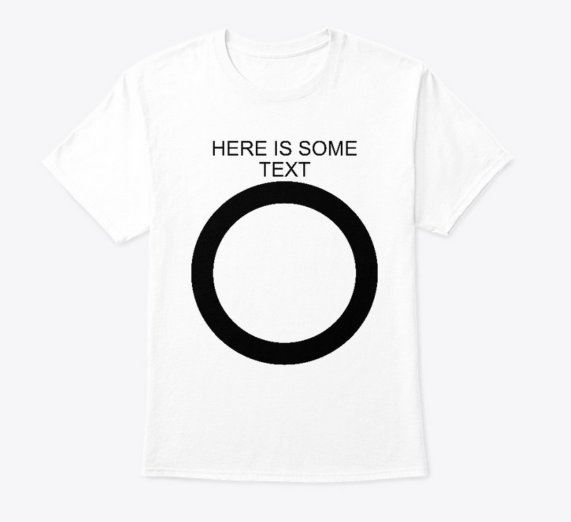
@Jowday I uploaded your bicubic_flat file to Teespring, and it did not look great. The text and circle is jagged.

-
12 hours ago, firstdefence said:
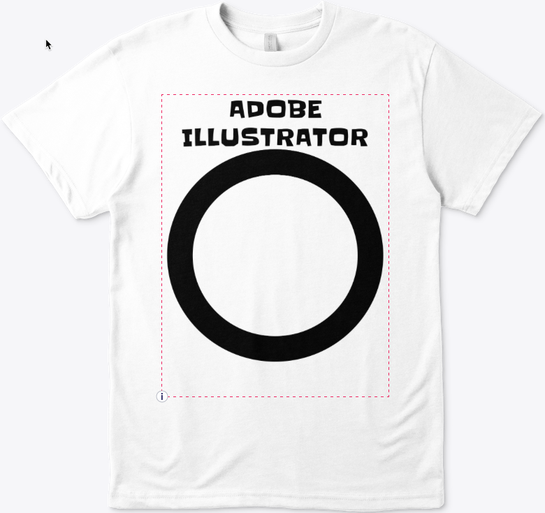
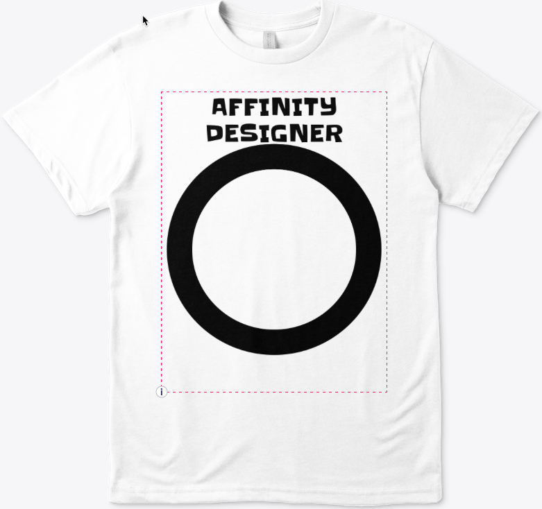
Just for comparison of the same graphic from different apps.
This is the text and ellipse from Illustrator CC
This is the Artwork from Affinity Designer
They both look roughly the same because you were in design mode. I can tell because of the red outline. You have to actually click the preview button to get an accurate representation. The preview is how it will look when the listing is created. When a user zooms in on the shirt in the listing, the jaggies will be especially apparent. Like I said, other shirts I've looked at don't have this problem and even small fonts will look nice and crisp because they can turn off anti-aliasing in whatever app they use to export the image.
-
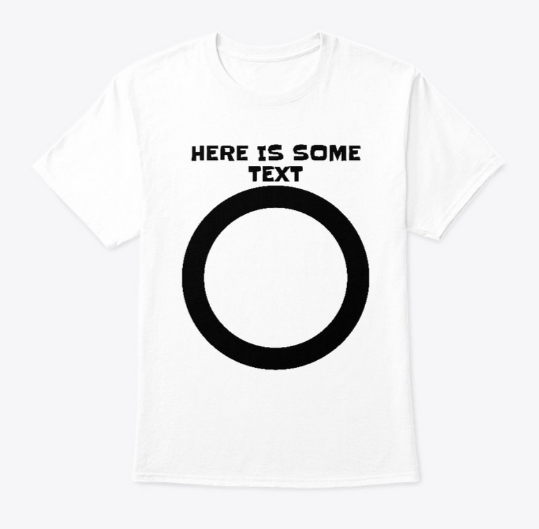
I posted an AD source file and what it looks like on Teespring when uploaded on a t-shirt. This is a 12.4" x 14.9" document at 300 dpi. Exported as PNG, this is 3720 x 4470 px. You can see on the font (Slackey from google fonts) and circle that it's jagged around the edges. If you look at other shirts on Teespring, they do not have this problem. This is exported with the default PNG bilinear, but all resampling algorithms come out jagged on Teespring. Thank you for looking into it.
-
I'm having the same problem. My designs look horrible next to others. Honestly, I'm shocked this is an issue. I love AD and have been using it for years, but just started getting into print-on-demand work where it hasn't been going well at all. They all want PNG files, not vectors. I tried exporting with every type of PNG resampling AD offers and all result in jagged designs. Here is the page on Teespring that talks about anti-aliasing. We desperately need this in AD:
https://community.teespring.com/training-center/design-file-tips-best-practices/ -
Would also like the clone tool in AD. I'd pay extra to combine Photo and Designer into one comprehensive thing. I also miss having control over the separate channels.
-
Is there a way to have editable text when exporting to PSD? I wasn't having any luck, at least in CS4 Illustrator and Photoshop.
-
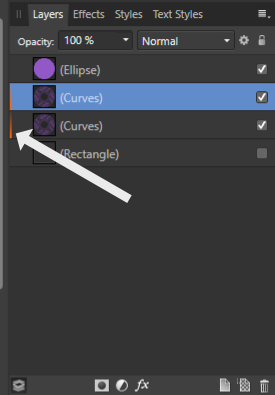
Ok, that works. Thanks. The problem I was running into was that I pulled the combined shape out of the symbol and put it on its own layer. That seems to implicitly make it a symbol layer, but it doesn't show up in the symbols pane. If that's confusing I can make a screenshot to try and explain it better.
-
Thanks for the fast reply! That's interesting because I did start out with a symbol to create that shape, but once I got what I wanted I selected the individual shapes and combined them. Then I deleted all other symbols in my project. Is there a way to de-symbolize?
-
-
Apparently the creators of ADe aren't aware of my disability. This is what a shaky hand on a slick Wacom tablet looks like: http://goodvibrato.cgsociety.org/art/affinity-designer-vst-ui-1699366
I'm being slightly facetious here. I don't have any disability that causes this as far as I know, but I certainly do suck at using Wacom tablets. On some level it looks kind of cool, but this is not what I want all my vector art to look like. As is, I don't have much use for the brush tool, especially when I want to move slowly and take my time, like tracing an image or something. Even my fast strokes don't look that great, and they're probably also out of position on top of looking mediocre. I'm very disappointed that there is no smoothing option or line stabilization feature in ADe. Any line work I do is with the pen tool, and then I adjust the pressure graph in stroke options. That gives great results but certainly takes a lot of time. In one of my projects, I will have to "draw" about 500 variable-length lines for eel-like fins. That will be a long day with the pen tool.
-
Is there a way to edit the RGBA channels in AD? Someone posted a workaround here:
but I wasn't sure what "colour page" he was talking about and it's from 2014.
-
Lazy Nezumi looks amazing, but I would be happy with even a basic implementation, such as Mudbox's steady stroke or Krita's stabilizer. +1.
-

Hide an instance of a symbol causes all instances to get hidden
in V1 Bugs found on Windows
Posted
Still an issue as of 2 years later, but another workaround is to click the symbol, click the symbol tab, click the Sync button to unsync the symbol, and then you can hide it. But you won't be able to resync the hide/unhide after that.