Starbase1
-
Posts
57 -
Joined
-
Last visited
Everything posted by Starbase1
-
 Thanks Walt. I'm starting to wonder if the easy way for fonts would be to create a document that used my all favourites, and pick them up from there! Nick
 -
Hi All, I have Affinity suite installed on 2 windows computers, a main one, and one I use when the more powerful one is tied up, or misbehaving. One irritant with this is that I can't see a way to keep the fonts I have marked as favourites aligned, or things like what LUT's are on which machine in line. I recently upgraded my hardware and I'm about to reinstall windows and all the software for a fresh start. And it would be really cool if there was a way to get things back the way they were quickly. Now I realise that Affinity is not going to shuffle the fonts and LUT files around for me, but is there a good way of doing this? Even exporting a checklist would make this task a lot less prone to errors. Thank you, Nick
-
GarryP, thanks for that - you have hit the nail on the head with the question! This is why I was thinking of the kind of controls you get in the dust and scratches. It's a 50 year old document on cheap paper that someone pointed a low res phone camera at from what I can work out! Not the best source quality... Nick
-
Very interesting! That's a lot better than the last time I looked at conversion to a vector format. I'd still like to know how to do the selection though. Thanks, Nick
-
I'm currently working on cleaning up some old archive images, that are very poor quality, (I attach an example). What I want is to preserve the lines in the diagram, clean-up breaks in them, and lose the grey blotches in the background. It occurred to me that this is basically the opposite of a dust and scratches filter, i.e. I want to keep the fine lines! The obvious first step was levels, but darkening the lines made the blotches more visible. So, is there a select option that will allow me to select the sharp dark elements, like I would if I was selecting scratches? That would seem to be an excellent starting point... Thanks, Nick

-
I'm having problems cleaning up scans - and the scans are not by me, so I can't just do them again properly. My problem is that I find myself often working with scans where the are near the fold in the book is distinctly darker. And while adjusting the levels helps, there are also grey images on the pages, which lose subtlety with a contrast stretch. Now, I can generally get to good enough, by mucking about with lots of selections, but I'm wondering if there's a better way. The shading is very regular, so I think there may be a way... I attach an example, which may help clarify. Thanks, Nick
-
Arrows with a dogleg / bend
Starbase1 replied to Starbase1's topic in Affinity on Desktop Questions (macOS and Windows)
Thanks to al who helped with this. That whole style is new to me, but I was able to get something I was very happy with, which I attach, in case anyone is interested.
-
Arrows with a dogleg / bend
Starbase1 replied to Starbase1's topic in Affinity on Desktop Questions (macOS and Windows)
Thanks to all, Blueliner, that is particularly helpful! Nick -
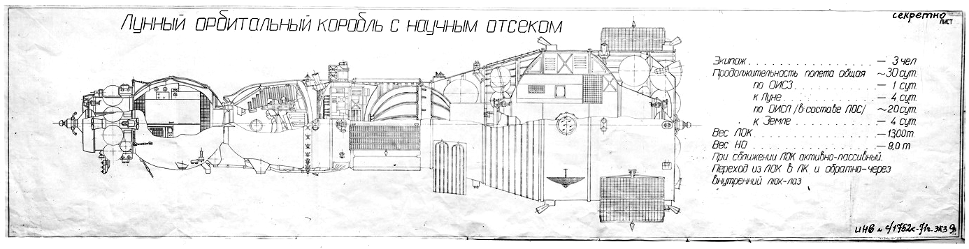
Hi All, I do most of my work in Affinity Photo, but this feels like a Designer question. (I have that too). I'm redoing old Soviet space illustrations, translating as I go. I attach the one I am currently working on in case it helps. I think it would look better if I changed the arrows from straight to something with a bend in, probably with the tail horizontal, to lead to the captions. Now I found tutorials on curved arrows, but that's not what I'm after here. I want one with a bend in the middle, (or maybe not the actual centre!) Can affinity handle this? If so, how please? Thanks, Nick
-
Wow! My first product here seems to have gone fairly well! 🙂 Happy to listen if anyone thinks something needs improving, or if you'd like some kind of a follow up...
-
Hello All, I'm a CGI artist, and fellow of the International Association of Astronomical Artists, and I've put together my first resource product! I dislike using long exposure photos of the night sky, as they really don't look much like what your eye sees. So I decided to make a big collection of both accurate constellations based on the real night sky, and fictional ones, (I have generally made these a lot richer). High resolution, (over 6k across), mostly lossless PNG, some PSD. Some star fields are provided with multiple layers you can turn on and off for even more variety. https://starbase1.gumroad.com/l/NightSky The star fields are big enough for you to pan around them, or zoom in and out, even with 4k resolution video. I've also included high resolution renders of the Moon in all phases, and two styles, (realistic and dramatic). Also views from directions other than from Earth, for spaceflight scene2. 1.5 Gigabytes in total, for a mere $3.99 There are also tutorial videos, using my favourite image software, Affinity Photo. These are intended to help people get the most out of the resources, and cover things like blending the Moon into a sunset sky, adjusting the star fields for specific purposes, adjusting star colours, and working with the multilayer files. I attach a starfield with added Moon seen from the far side, to give you a better idea of what's in there. I hope you like them. Nick
- 1 reply
-
- 6
-

-
Here's an example I found - to my untrained eye this example seems to preserve whites while under-representing blue tones. I'm really not great at colour. So I'm hoping to buy something that would let me apply a colour change to a "well balanced" modern image, and turn it into something like this. Ideally for several different specific film effects. Nick
-
Hi, Is anyone aware of Affinity plugins that will give a period film look? I'm hoping for something that will make my CGI work look less CGI. For example, the old Polaroid instant photos had a distinctive colour balance that I struggle to reproduce. Similar for early colour photos from NASA, and I can see it being really useful to process a video image sequence for that period look. Please feel free to suggest commercial solutions! Thanks, Nick
-
Thanks for the suggestions! The table seemed elegant, but my first attempt has the picture frame elements floating above the cells, rather than inside them. Nick
-
I'm looking for a way to get a set of square images in an array 4 across and 2 high, preferably with a small gap between them. End destination is Publisher, but it's perfectly acceptable to arrange the elements in a Photo image file. Desktop versions. Any clues please? Nick
-
Wow, the video is super helpful, thank you! It's probably easiest to find a font with numbers in circles for the label end...
-
I looked at pen and node help / tutorials, and found nothing relevant, so I'm probably thinking of the wrong commands. I want to add a key to a diagram, with a line leading to the part I am describing, so I want attach something to a line. I drew the line with a pen tool, no problem, but I can't see how to (for example) attach an arrowhead to one end, or a circle to the other, (which I will put a number in). If some kind person can tell me the command I should be able to find a tutorial on it, Thanks Nick
-
Sorry for the delay in getting back to you, thanks, this looks very useful.
-
Yes, my bad, sorry! This is for Publisher.
-
Hello all, I'm trying to find tutorials on setting up an index, and I keep finding index for tutorials instead! There seem to be a LOT of text format styles that go into an index, and I'm hoping to find some templates or presets that give a nice coherent look with a minimum of tweaks and twiddles. The same applies to a table of contents, which is next on my list to tackle. Also the sheer number of elements you can adjust for a style is a bit baffling to me as a beginner - I plan on digging deeper into this, but for now I'm looking for a shortcut.
-
Ah, those look very relevant, thank you!
-
Thanks Carl123, I appreciate the suggestions.
-
Thanks Thomaso - I was thinking something similar about getting out of my depth with a complex template. Though perhaps it would still be useful to see some good examples, even if I do not use much. Nick
-
Hi All, I've not worked with any publishing software before, and I'm really struggling to get going. I suspect the problem is that I keep expecting it to be like a word processor, when perhaps something like PowerPoint (spit, snarl!), is a better comparison. I have a fairly clear idea of where I want to get to - the final product is going to be a fairly technical booklet, produced as A4 landscape, probably about 80 pages. Most pages are likely to have 3 columns of text, or two portrait images side-by-side, or one portrait image and some text beside it. It will be sold as a PDF E-Book, and will be printable by the customer. I have a big pile of photo images, and another pile of my CGI renderings, so I'm well covered for graphical elements. The best tutorial I have found so far is the Page Layout video by "Andy" on this page: https://affinityspotlight.com/article/learn-how-to-use-affinity-publisher-fast/ And I'm wondering if it would be sensible to buy a template - the "Lynx" one here looks to be a fairly good match for what I want. https://creativemarket.com/SlideStation/4712748-Lynx-Publisher-Brochure-Template#fullscreen (By all means, recommend templates of your own if they are a good fit). So... Any other recommended tutorials for me? Is buying a template a good idea? Anything else that will get me thinking about it the right way? I'm expecting that once I get my head around it, the other tasks like contents and an index will make a lot more sense to me. Thanks, Nick
-
Ah, thanks for the explanation