kaffeeundsalz
-
Posts
452 -
Joined
Everything posted by kaffeeundsalz
-
 I would simply use the Flood Selection Tool to isolate the red tones from the text and copy the selection over to a new layer. You can then do whatever you want with that layer to achieve a uniform color fill. Three minute quick and dirty example: Edit: I forgot to mention that if you invert your selection, you can edit the color of the text in a quite similar way.
-
The cross in your example screenhot is not dim, it's invisible. You need to hover the mouse cursor over the tab to make it appear.
-
Since Affinity Publisher doesn't have a built-in barcode generator, I wouldn't bother too much replicating the exact appearance of the reference image with only Publisher. You'd have to convert the barcode font to curves, manually add lines to the code, increase their length and realign the numbers accordingly. I would simply use one of the many online barcode generators, output the EAN13 code to PDF or SVG and import that into Publisher.
-
Maybe so, but since the letters are pretty geometrical, it's also not that hard to trace them with the pen tool to fill the gaps. Snapping helps a lot in this case. I know my version is not perfect, but it's just supposed to be a quick example. The hardest part was the letter G because there were so many key points missing and I don't think I got this one right. Anyway, it should be doable.
-
Not sure how you'd define a newcomer, but Scrivener has been around for ~15 years now.
-
Since G'MIC doesn't seem to work as an Affinity Photo plugin on macOS, you may want to have a look at Exposure Software's SnapArt if you're using a Mac.
-
Running a crappy business being convinced that you are an expert when really you are not is what I'd consider a sad story. But I know this is probably an entirely subjective matter. For me personally, I really, really appreciate people who know what they're doing, and I find there are too many people out there who don't.
-
@Ron P. This is probably the saddest story I've heard in a long time. 😢
-
Try ImageMagick where it shouldn't matter how many files you throw at it. You need to be familiar with the command line though. Provided that you work on a Mac, you could also try GraphicConverter if you prefer a GUI solution.
-
I don't have any personal experience with converting that many files, but it would probably help to know which applications you've tested and what you mean by "nothing works". Also, what operating system do you use? Are the files you want to convert located on a network drive?
-
Affinity Photo is not a suitable solution for what you want to achieve. Use a dedicated batch processing application that's specialized on handling large amounts of files.
-
Please excuse me if this will become kind of a long read, but I'd really appreciate your input from a workflow perspective on this. I recently had the opportunity to make use of Affinity Publisher's StudioLink feature while working on a project for a client because I was able to do most of the design work myself. This included retouching the main photograph, drawing some vectors and also creating the prepress files. You would think that this is ideal for StudioLink to prove its strenghts – and overall, it really was. What I noticed afterwards was that things could have been even more seamless if I had done everything in one color space from the beginning. On the other hand, this would have broken other parts of my workflow. So here's the scenario: It was certain from the very beginning where the project would be printed, so I already had the correct settings for bleed, margins and color profiles in place. I created the Affinity Publisher document accordingly and worked in CMYK from start to finish. Apart from some basic blemish removal and color corrections, the selected photo mainly needed some sharpening. Playing around with the available filters, I gained the best results by placing a High Pass filter on top of the layer stack and change its blend mode to Linear Light, which is a common technique for output sharpening and gave a very natural look in this case. In theory, I could have done the entire retouching work for the main image in Affinity Publisher using the Photo persona. The big, big advantage of this would have been the perfectly non-destructive approach, giving me access to all adjustments and live filter layers (and their masks) directly in Publisher. This would have allowed me to fine-tune the retouching at all times even while mainly working on the project design rather than the photo. I ended up not doing this because the entire idea fell apart with the chosen sharpening method: Using the High Pass filter as described only really works in RGB, and at least to my knowledge, there is no way to get it to work in CMYK with the available blend modes (or is there?). I think this is not specific to Affinity Photo; I used to have the same problem in e.g. Adobe Photoshop. This situation is of course part of a bigger issue when it comes to working in different color spaces: There is a number of filters and adjustments in various image editing applications which only show the expected behavior when applied to RGB images. It's just that the problem becomes very obvious in an integrated environment like StudioLink. My solution was to retouch the image in Affinity Photo separately, converting the final (flattened) document to the correct CMYK color space and finally placing the exported TIFF image into the Publisher document. I also kept the original .afphoto file with layers. The exported image did not contain any color corrections; these were in fact done in Publisher because this made it easier for me to match the color appearance of the image to the color scheme of the design. The disadvantage I had was that whenever I needed to fine-tune the image (which happened rather often, in part because the client had specific requests after each draft), I had to get back to Affinity Photo, edit the image, flatten the document, convert it to CMYK, export it again and refresh the linked image in Publisher. What I could have done instead: Stay entirely in RGB with the project as long as possible. With this, I would have actually been able to work exclusively in Publisher, perfectly making use of the StudioLink scenario described above.The conversion to CMYK would have been done as a last step during export for print. Place the RGB .afphoto document in Publisher instead of the exported TIFF file. Not as integrated as having all the filters/adjustments available directly in Publisher's layer stack, but still a good solution. It would have been a matter of just double-clicking the image to get back to editing it. The reason why I did not do this was because I couldn't find a way to control how the placed .afphoto document would be converted to CMYK. How does Publisher determine the rendering intent to be used in this case? Changing the settings in the Color Preferences seemed to have no effect. The colors were always slightly off compared to the flattened TIFF image. Avoid using filters and adjustments that can't resonably be applied in color spaces other than RGB. Here, it would have meant choosing a different sharpening method, e.g. Unsharp Mask or Clarity. This would have made a CMYK-only workflow possible. So, I'm interested in what would have been your solution. Of course, it doesn't need to be one of the above. Maybe I missed additional options? Is there something obvious (or not so obvious) that I didn't consider? Thanks for your thoughts and ideas.
-
Thanks @Alfred, this is very interesting. I know there are many people around here coming from the legacy Plus range of Serif products. I'm not one of them, so I'm doomed to work my way backwards through Serif's history. 😉
-
M1 Pro
kaffeeundsalz replied to basha's topic in Pre-V2 Archive of Affinity on Desktop Questions (macOS and Windows)
Yes, I think we can both agree on this 👍 It's clear that more RAM is always the fastest option if you really need it. But RAM demand has always been pretty low with Apple's ARM chipsets. We've seen similar effects e.g. on the iPhone and especially iPad. Earlier models had little RAM compared to their Android counterparts, yet were much faster in benchmarks. And I'm tempted to say that the number of people out there who really need 32 GB RAM or more in a Mac have somewhat decreased with the release of the M1 chips. Also, I think buying one of the new MBPs with 16 GB RAM will still make the Affinity Suite fly. As always, it depends on what you intend to do with it. -
M1 Pro
kaffeeundsalz replied to basha's topic in Pre-V2 Archive of Affinity on Desktop Questions (macOS and Windows)
That may be the case for traditional x86 systems. With Apple Silicon's ARM implementation, it's simply wrong. The architecture is different in a number of ways, and all chips of the M1 range get along with much less RAM, as was proven in countless reviews of the 2020 and 2021 models. Also, I fail to see how the base specs of the new MBP would be anything less than sufficient to outperform the vast majority of systems on which the Affinity suite is currently in use. -
@spidermurph No missing feature here. The same thing is possible in all three Affinity applications.
-
UI too small
kaffeeundsalz replied to mr.burns's topic in Pre-V2 Archive of Affinity on Desktop Questions (macOS and Windows)
It did happen in the past though. Adobe took away much of its modal UI design once Affinity Photo had demonstrated how fluid photo editing can be if you don‘t have to confirm every tiny step in the process. The correlation is pretty obvious in at least some UI behaviors (e.g. layer scaling) where Photo had it first and then Photoshop followed. -
Did you measure the ink percentages with the image already in CMYK and with the correct profile applied? You example image looks like you didn't: Those luminous greens of the island's vegetation would get pretty muted in CMYK (unless you make use of additional spot colors, but then the question is what your proofing setup is). If the sampling was done on an RGB image, the control points of the picker may have just given you wrong or at least inaccurate results. In general, adjusting ink limits of photos is not a trivial task, but in fact shouldn't be necessary because the color profile takes care of this on document export. If you really have to do this manually, you could probably use a Channel Mixer adjustment to gradually lower the ink levels, consistently across all CMYK channels to avoid introducing a color cast. This will brighten the photo slightly, but since total area coverage typically only exceeds specifications in dark areas, you can limit the effect to the image's shadows using Blend Ranges or by applying a luminosity mask to the adjustment layer. Ideally, you'll only go so far until TAC meets the specifications so the visible impact will be as low as possible.
-
It depends on the control handles you use. If you drag from a corner, width takes precedence. If you drag from an edge, the dimension that gets scaled by whole pixels is always the one you‘re actively manipulating.
-
From what I can see in the video, it's because the scaling happens proportionally. In this case, Affinity Photo can only align to whole pixels in one dimension if the original aspect ratio can no longer be written as discrete integer pixel values after resizing.
-
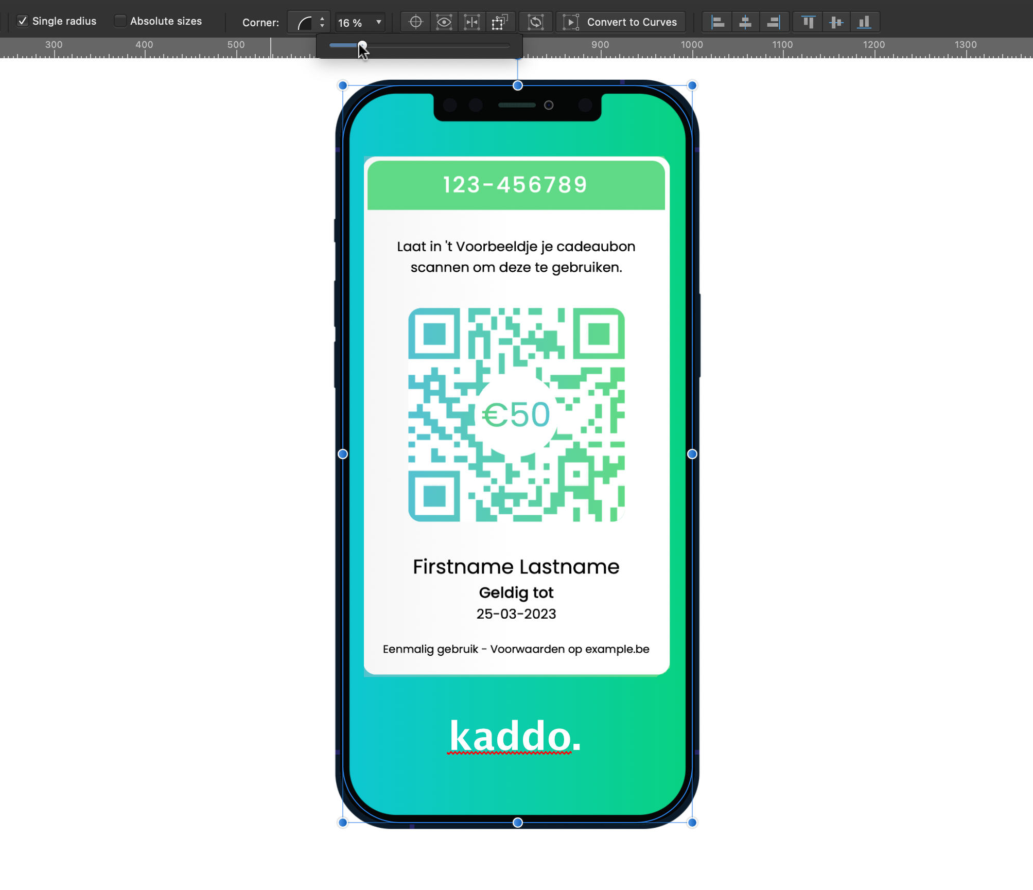
Since the iPhone border is pretty straight, why don't you just match the shape of the background rectangle to the mockup frame? First, scale down width and height of the rectangle so that it's a bit smaller than the iPhone. Then use corner rounding to match the shape:
-
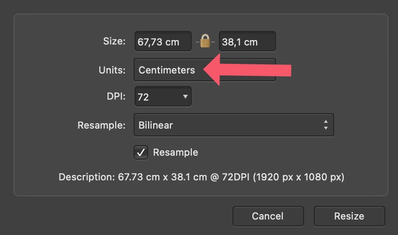
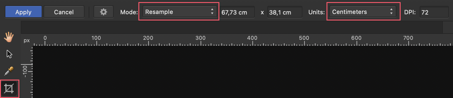
Resize image
kaffeeundsalz replied to Paul467's topic in Pre-V2 Archive of Affinity on Desktop Questions (macOS and Windows)
@Patrick Connor Thank you for clarifying. 👍 -
Resize image
kaffeeundsalz replied to Paul467's topic in Pre-V2 Archive of Affinity on Desktop Questions (macOS and Windows)
-
Resize image
kaffeeundsalz replied to Paul467's topic in Pre-V2 Archive of Affinity on Desktop Questions (macOS and Windows)
There's so much wrong with this approach – I don't even know where to begin. First, if you have a professional-grade image editing application, why would you not want to keep working inside it as long as possible? And why of all things would you want to outsource one of its most basic features? Second, why should the best way of resizing an image involve getting it out of Affinity Photo, uploading it to a website, having the server do some obscure processing, downloading the result and finally getting it back into Photo? Also, without knowing exactly what happens to the images once they get uploaded, isn't this both a security and privacy nightmare, at least theoretically? If you follow the link to Depositphotos, it immediately becomes clear that the purpose of their (additional) service isn't even resizing per se. It's upscaling photos that would otherwise be too small for whatever purpose, and it apparently uses some AI voodoo so the result looks arguably better than with conventional resizing algorithms. Now, I don't even dispute the quality of the website's results – the enlarged photos may look fairly decent (I don't know because I didn't try). But this is a very specific use case rather than a resonable universal way for resizing images. For starters, try Document > Resize Document in Affinity Photo. -
Resize image
kaffeeundsalz replied to Paul467's topic in Pre-V2 Archive of Affinity on Desktop Questions (macOS and Windows)
Are you serious in suggesting people should upload their photos to a website just to do a simple resize job?