

kaffeeundsalz
-
Posts
451 -
Joined
Posts posted by kaffeeundsalz
-
-
19 minutes ago, Bit Disappointed said:
As soon as Canva encounters turbulence, such non-binding promises will expire.
In what way is this different from the situation before? Serif as well could have encountered turbulence, letting them reshape their business model. It is perfectly legitimate for you to distrust company promises phrased this way. But I don't see what this has to do with the acquisition.
-
15 minutes ago, iconoclast said:
I think, GIMP 3.0 will come soon.
If there's one thing I've come to learn from 20+ years with GIMP, it's that their release cycles are entirely unpredictable 😂
16 minutes ago, iconoclast said:But will it have CMYK-support?
Probably not the kind of CMYK support that you're hoping for. From everything I know, true end-to-end CMYK is something the codebase of GIMP is now capable of, but will not be available straight from 3.0 onwards.
22 minutes ago, iconoclast said:And as far as I know, Krita once was a spinoff of GIMP
That's only true for the very earliest versions, showcasing a Qt based UI for GIMP in KDE. Krita was developed from scratch soon after.
25 minutes ago, iconoclast said:If you ask for CMYK in GIMP or Inkscape forums, they suggest to convert your images to CMYK in Scribus. And that is really unprofessional bullshit. Not Scribus itselves, but this workflow.
What you want is full end-to-end CMYK support in GIMP. As long as that's not available, notice that CMYK support did improve significantly in GIMP over the last years. We got CMYK color proofing and even CMYK export features (so for many formats, the workflow you mentioned above is not necessary anymore). It's still a long way to go though.
-
-
-
Well, we'll see how all of this turns out in the long run, especially for the users. I wish Serif all the best for being part of Canva. Let's give them a chance to prove that the well-known narrative of the evil giant swallowing up small software companies doesn't apply in this case. I am looking forward to the features that are yet to come for the 2.x versions, really hope that the planned Q&A session will shine some light on future plans and will follow the development of v3 with great interest.
-
2 hours ago, Andy05 said:
(and worries?)
I'm not an offender of subscription models in general. If they are fairly priced (which I know is a highly subjective manner), I'm happy to give them a try. With Serif, I don't know. What I'd like them to be is a healthy competitor for Adobe because I think that benefits the creative market, and one-time purchases are one area where the two companies differ. That said, I'm also a happy Affinity user, so anything becoming more expensive for me would of course be disadvantegous. On the other hand, subscriptions don't necessarily mean an increase in pricing. There are countless examples where this was the case, but it's not set in stone and also depends on how the user handles updates, upgrades etc.
The more important point for me is the integration thing because I don't like user interfaces that try to cross-sell other products and services. I do accept Studio Link in Affinity Publisher because I really see the benefit of that level of integration (it's a dream to use) and after all, that's why there's a universal license that lets me purchase the entire suite for a fair price in case I want it. Also, everyone who decides to buy Publisher as a standalone application can very easily customize the main tool bar and get rid of the persona buttons. The same was true for the old Welcome screen: It did advertise addons, but you could choose to turn it off and never see it again. This is how it's done: Don't constantly give users the subliminal feeling that they are missing out on something or have just bought a lite version of your software. Don't let buttons triggering addon services that I'm not subscribed to eat up precious screen real estate. Let me hide every upselling attempt quickly and effectively because I really know best what I need and don't need to get the job done.
In other words: If Serif were to integrate big buttons with Canva logos on them that I can't hide, I'd be upset.
-
The title pretty much says it all. Serif has been acquired by Cava:
https://www.canva.com/newsroom/news/affinity/
Now I wonder mainly about two things:
1. Will the Affinity suite give up on its one-time purchase philosophy (given that Canva is a subscription service)?
2. Will we see integration of Canva services in the Affinity applications and if so, will users be able to hide it in case they don't need them?
I know that it might be a little early for definitive answers, but since we only have the Canva press release so far and no official statement from Serif yet, I was hoping that staff might be able to comment on this.
-
22 hours ago, thomaso said:
Why is the world not simply the way we want it to be?
Maybe Serif can do something about it.
-
18 hours ago, Polygonius said:
I do not can the "imndustry.standard-key command" Shift+Command+K.
Shift+Command+K is hardly the industry standard for creating a symbol (at least to my knowledge), it's just the keyboard shortcut that Serif chose to assign to this function. Since it triggers a menu command (Layer > Create Symbol), it's configurable! Just choose whatever key combination seems appropriate to you.
-
-
A somewhat related question in this context is why Apple wouldn't include native Affinity files on their Design Resources page. Is there any way to work towards this?
-
5 hours ago, dominik said:
I want to add that it might be usefull to leave a little of the shadow in to make the image look more convincing. Human eyes can easily and intuitivly tell that something is wrong - even if they can't explicitly say what it is. The mountains in the right half of the pictures do have shadows and do not fit well with the manipulated mountain.
This. While the solutions posted here are all technically correct, they're not visually convincing. It just doesn't make sense that the mountains on the right have shadows while the one on left doesn't, especially since the direction and distribution of light in the scene strongly suggests that there should be at least some parts of the large mountain that are completely in the dark.
-
Another method is to use the Style Picker Tool from the toolbar. Select the text frame you want to change with the Move Tool, switch to the Style Picker and click on a text frame with the desired style. You can change which attributes are copied by using the checkboxes in the Context Toolbar. Because you said that you use certain text frame designs regularly, best practice is indeed to create a Style for each of them as @GarryP already mentioned. You can select objects and quickly apply a saved style to all of them by just clicking on it – and you can drag styles from the Style Panel to any object (not just the selected ones, which I find quite handy).
-
Oh, okay – I should have been more specific with the selection part. I tried a few things and could get the best selection by:
- using the Magic Wand tool (Contiguous option off, Antialias option on) but instead of selecting the tips, I selected the background until I got a clean marching ants frame around the tips;
- then inverting the selection
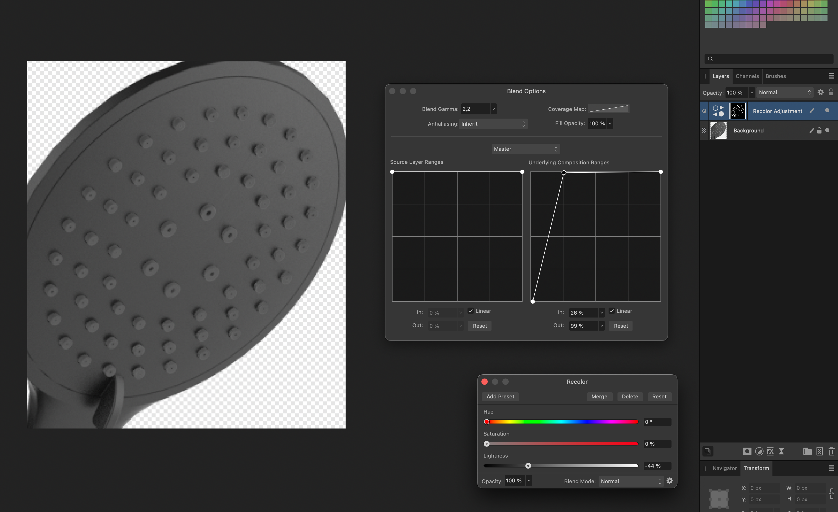
- then putting the Freehand Selection tool (Polygonal type) in Intersect mode and roughly circle around the area with the tips to exclude anything outside the desired area.There are probably easier ways to achieve this, but this was the first idea I came up with that resulted in a selection good enough to show you the actual recoloring.
Hope that helps!

-
The Color Replacement Brush doesn't do what you think it does. It replaces color based on hue and leaves saturation unchanged. This is why nothing happens on grayscale images: There simply isn't any color information the tool can use. Saturation is zero for all pixels.
That said, I have no problem whatsoever to quickly select all the tips in the image using the Flood Select tool. I can then apply any color I want to the tips by adding a Recolor adjustment and change the settings to my likings. To mimic your result from the screenshot above, I simply lowered the saturation to 0% and tuned down the Lightness slider. Admittedly, I didn't manage to do it in 10 seconds, but in 50. I can even fine-tune the result further with Blend Options which let me control how strong I want the color change affect e.g. the shadows of the tips.
If you only want to darken certain parts of the image (without actually applying color to your selection), you don't even need the Recolor adjustment. Just use the Brightness/Contrast adjustment which is even simpler because it has less sliders.
-
@JayNomad The idea is that you have a common location on your system where all your LUTs are saved and then import these to Affinity Photo as presets so you don't have to use the file browser all the time. For this, you have to use the Adjustment panel and import LUTs from the corresponding section. These can be organized into categories to make things easier for you. This way, you can build kind of a library where all your LUTs are accessible in an instant. The standalone LUT adjustment from your screenshot is then only necessary if you happen to have a specific LUT file that isn't part of your library and want to use this for the current job only.
Apart from that, while I can't comment on Windows Explorer's capabilities to remember last used file paths (Mac user here), the Open window in your screenshot looks as if it's perfectly possible to navigate your files and folders using the sidebar and/or top address bar. I can even spot a search field next to it. So not sure what you mean by "it's impossible to search for the LUT location". Of course, knowing where your LUT files are stored would help, but I'm unsure whether that's part of the problem here. You'd have to provide more details for us so we can understand how you expect the feature to work (and what doesn't work in your case).
-
21 hours ago, loukash said:
Eventually I figured it all out
It's not impossible. In fact, if you have a lot of time to spare, you can dive-in fairly deeply just by trial and error. Some people are better at it than others. In either case, documentation and/or guidance help a lot to get things done a) more quickly and b) more correctly, because more or less every professional DTP application is that kind of software where you can easily figure out one way to achieve something while another one would have been even better.
-
12 minutes ago, cirkē said:
I used indesign without any problem would you say that indesign is not pro ?
The comparison between those photobook websites and Affinity Publisher is what you came up with in your initial post. People are just picking up on it. So, to be clear: What you're saying is that Adobe InDesign is as easy to use as, say, Pixum? Or Blurb? I very much doubt so, and I think that comparison is unfair towards both InDesign and Publisher. Put an inexperienced user in front of an empty InDesign page and see how far they can get. I've done it sometimes, just as an experiment, at the beginning of InDesign courses at university. The overall result is that people are just completely lost if you deny them any guidance. The same is probably true for Affinity Publisher. But I think what's happening here is that you confuse intuitiveness with the fact that you just know how to use the software.
-
Als Ergänzung und um das, was @thomaso sagt, noch einmal hervorzuheben: Unabhängig davon, ob im vorliegenden Fall überhaupt ein so großer Versatz zu erwarten wäre, möchte ich mich ganz allgemein mit sowas im Layout eigentlich nicht herumschlagen. Klar, bei einer Klebebindung ist immer die Rückenbreite zu klären, damit man das bei der Umschlaggestaltung berücksichtigen kann. Aber insbesondere so etwas wie Bundverdrängung wähne ich im Aufgabenbereich der Druckerei – zumal diese entsprechende Software haben müsste, die den Versatz automatisch berechnen und vornehmen kann.
Abgesehen davon hat @thomaso natürlich Recht: Warum sollte bei einer Klebebindung die Bundverdrängung außen überhaupt ins Gewicht fallen?
-
17 hours ago, Casey Whitcher said:
Simply for example, When I'm usually filling something in that manner, it is not a specific shape.
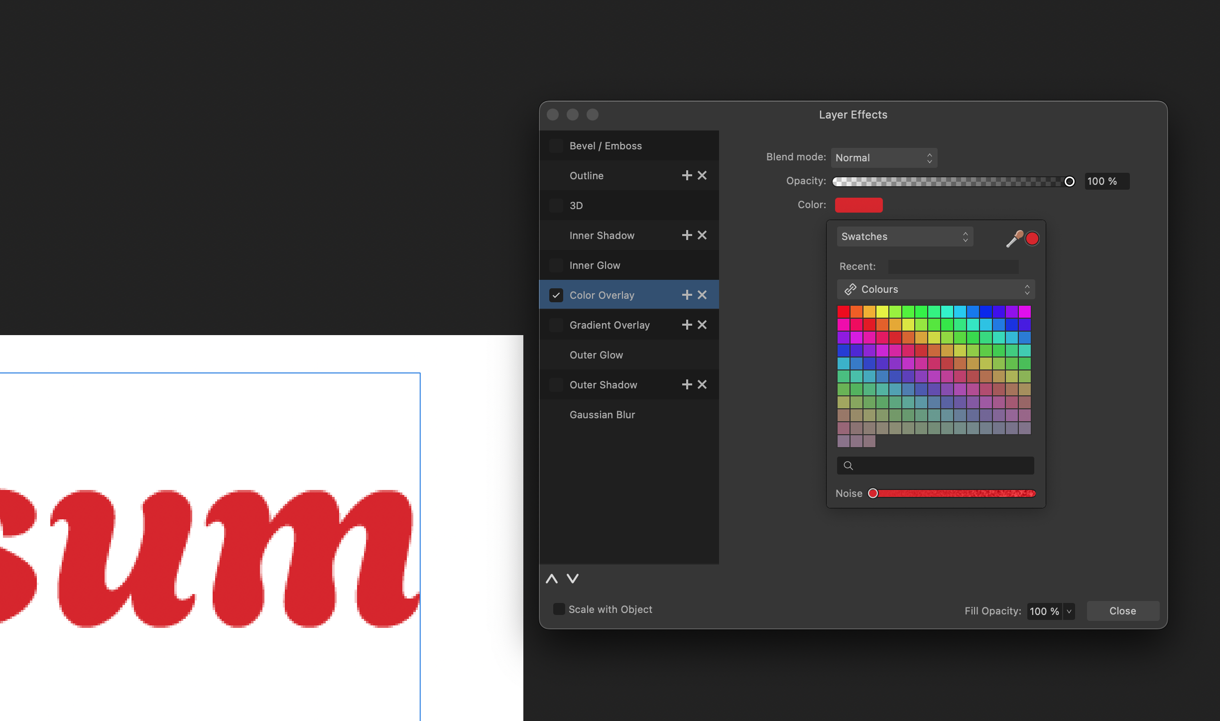
I see. Color Overlay in Layer Effects would probably be the solution I'd choose then. Just for the record, though I did get that you just provided it as an example: You CAN blur shapes without converting them to pixel layers and still keep their properties including the fill color. This works because a) Gaussian Blur happens to be available as a Layer Effect and b) most Adjustments and Effects can be applied non-destructively, not altering the layer contents they're applied to.
-
Hi @Casey Whitcher, thanks for your explanations and the screenshot. That makes things a lot clearer for me. Here are some further comments that might or might not help:
- I see where you're coming from. In my opinion, it's a very specific use case, but yes: If you do have Pixel layers with transparency and want to fill them with a pre-selected uniform color, then there's no one step keyboard shortcut to do so in Affinity Photo. In order for this to work, Photo would need a "lock transparency" setting in various places of the UI, most notably the Layers panel and, which is what you'd need, the Fill commands in the edit menu
- One thing I don't understand is why all your shapes in your screenshot are pixel layers. You do notice that when you create them with Affinity Photo's shape tools from the Tools panel, each object has its own distinct fill color? And that the primary/secondary color selector immediately update when you select one of those shapes? The same is true with text objects – which you did not convert to pixels in your screenshot. This means that you don't need the Color Overlay effect at all to change the text color. You can do it directly with the text object's own fill color which will immediately show as primary color as soon as you select one of the text layers.
Cheers
kaffeeundsalz -
8 hours ago, Casey Whitcher said:
For the record, I think probably my go to way of doing this would be to fill a layer with the color I want to use, then set the cut from layer to visible, ctrl+click the layer to select all the pixels, then jump back to the solid layer and ctrl+J to cut it from the solid layer, the delete my solid layer.... Just seems like a lot of work.
That does seem to be a lot of work, and I don't understand why you think you have to do it this way or why it's supposed to be a better method than those that were already mentioned. But if you further explain your workflow, people here in the forum will most likely be able to give you further assistance.
-
8 hours ago, Casey Whitcher said:
Thanks for the effort in this Kaffee, I do appreciate it, however, I think the fact that you had to take so much effort to "explain' how to do a workaround that is a 1 second shortcut key in PS is the problem.
I beg to differ, but that's of course a subjective thing. 1) What I showed you was not a workaround but how things are done in a different software instead, in this case Affinity Photo. If you expect everything to work exactly as in Photoshop, I'd recommend sticking with Photoshop. 2) It didn't actually take that much effort to explain the steps, I just tried to do it thoroughly and provide some screenshots to make it easier for you to follow. Sorry if you confused that with complexity. 3) After all, creating a fill layer and changing its blend mode is indeed a one second operation in Affinity Photo, too. Also, the limitations I mentioned are the same than in Photoshop; if your text layer doesn't have any transparency information, Shift+Alt+Delete won't be of much help either with what you want to accomplish.
-
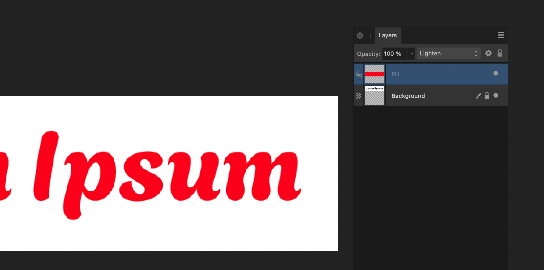
Hi @Casey Whitcher, there are multiple ways to achieve what you want. One of the fastest that I can think of is this: Create a new layer, fill it with the foreground color and set its blend mode to "Lighten". This will work in your specific example with any color as long as you have black text on white background. With white text on black background, you would use "Darken" respectively. For anything in between, the case is more complicated and will depend on the colors used and your desired target colors.
Another method that works well with white backgrounds is this: Select your Background layer and go to Filters > Colors > Erase White Paper. You can then use Layer Effects to create a new Color Overlay. Granted, there's no direct access to the current foreground color here, but you could create a swatch first or simply use the eyedropper and drag it to the forground color selector. If you want your white background to reappear, the easiest way is to create a new Fill layer with white and drag it below your Background layer in the Layers panel.
EDIT: You can save the Erase White Paper step when you set the Blend mode of the Color Overlay to "Lighten" in the Layer Effects dialog.
Again, with different text and background colors, things might become more complicated. Especially the Erase White Paper filter only works well with backgrounds that are 100 percent pure white. There are other methods people can show you here in the forums.
Cheers
kaffeeundsalz


Canva
in Affinity on Desktop Questions (macOS and Windows)
Posted
The mistrust stems fromt the fact that your post made an argument in favor of Serif along with your forum account being just a day old. The hidden accusation is that you are a fake member created by Serif to counter the negative comments. Which I personally think is a fairly bold thesis.