trialanderror
-
Posts
14 -
Joined
-
Last visited

-
 thomaso reacted to a post in a topic:
Shortcut collision on German keyboard
thomaso reacted to a post in a topic:
Shortcut collision on German keyboard
-
Note: The following issue applies specifically to a German ISO keyboard layout (and maybe only the German version of Publisher). In Publisher, the key command for “select next” is ⌥ ⌘ ] and for “select previous” it’s ⌥ ⌘ [ For “move one forward” (or whatever the phrase may be in English) it’s ⌘ ] and “move one backward” it’s ⌘ [ Now here’s the catch: on a German keyboard, [ is typed as ⌥ 5 and ] is ⌥ 6. So, in order to type ⌥ ⌘ ] I’d have to type ⌥ ⌘ ⌥ 6 which obviously can’t work. Effectively, the “select next/previous” shortcuts work, the “move one forward/backward” shortcuts don’t.
-
BennyD reacted to a post in a topic:
1 bit TIFF/Bitmap support please
-
1 bit TIFF/Bitmap support please
trialanderror replied to Chris L's topic in Feedback for Affinity Photo V1 on Desktop
+1 for 1 bit support! “line art” illustration is the whole reason I’m dipping a toe in Clip Studio. Support for different colour depths is great there; the interface, however … 😕 -
 trialanderror reacted to a post in a topic:
Affinity suite for comics
trialanderror reacted to a post in a topic:
Affinity suite for comics
-
Affinity suite for comics
trialanderror replied to trialanderror's topic in Feedback for the V1 Affinity Suite of Products
You have just solved one issue for me! I hadn’t really noticed the page navigator.* (I was on the look-out for something like Publisher’s big palette with the actual thumbnails.) Page visibility is not an issue when you switch to the Photo persona inside Publisher – all the pages remain in view just as before, but you do indeed need the navigator to jump to another spread for drawing. (I had to jump between personas before – Publisher to navigate, Photo to sketch.) Designer gets his part too, for speech bubbles, text boxes etc., but I prefer sketching in pixels. *addendum: A native drawing tool in Publisher would still be nice, because then you wouldn’t even have to go to the navigator – just scroll through the pages. -
With its interacting tools for drawing/painting, page layout etc., I’d love to replace Clip Studio with the Affinity suite for comics. I’ve given Clip Studio several tries, but I’m a graphic designer in my main job, hence used to Adobe apps (and Quark before that), and using Clip Studio only ever goes well for an hour at most before HULK SMASH CINTIQ … Two things (mainly) I’d love to see: 1 – 1-bit support. I know, I know, this has been discussed here at length: Apparently there’s not too much hope for 1-bit editing, but maybe at least for export? (For those who don’t know why not use normal grayscale mode – 8/16-bit grayscale images are rasterized in print, 1-bit images are not.) 2 – Publisher could use a (really) simple drawing tool. Why? Because Affinity Photo only works on one spread page at a time. (Alternatively, this restriction could be lifted.) It would be handy to sketch rough thumbnails while zoomed out in Publisher, with ten, twelve pages in view; then later zoom in on single spreads and do the finer sketching in Photo.
-
Many printers/publishers provide downloadable PDF export settings in Acrobat’s joboptions format. My wish: make Publisher (or the whole suite, respectively) able to either import these, or export their own export settings file.
-
You’re right, of course. Sarcasm pisses those off who put some thought behind this when they implemented the function in its current way (and maybe had good reason to do it exactly like this), and reading the manual might have, well, not helped me, but at least made things clear. It’s always dangerous to expect the same function behind the same interface. That doesn’t work even between Adobe’s apps. On the topic: I can still move/transform points on a locked object, or on objects inside a locked group, so it seems inconsequential, which is why I thought this was a bug.
-
What’s the purpose of the neat little padlock symbol in the layers palette? Is it ornamental, or is it supposed to do anything? If so, it certainly doesn’t prevent me from selecting a locked item, deleting it or anything else I consider worth preventing. I would appreciate a behaviour not unlike that found in Adobe Illustrator, where a locked object or group is actually, you know, locked.
-
Umlaut broken
trialanderror replied to trialanderror's topic in [ARCHIVE] Publisher beta on macOS threads
As of 1.7.0.145, the kerning seems to be back to normal (at least with the fonts and OpenType options I’m using in this test project). The right alignment, however, still goes haywire as soon as small caps are turned on. -
This looks like the same issue as with my problem, which I had attributed to umlauts at first, but it seems to be a matter of Publisher’s handling of stylistic sets really.
-
trialanderror reacted to a post in a topic:
Glyph Browser
-
Umlaut broken
trialanderror replied to trialanderror's topic in [ARCHIVE] Publisher beta on macOS threads
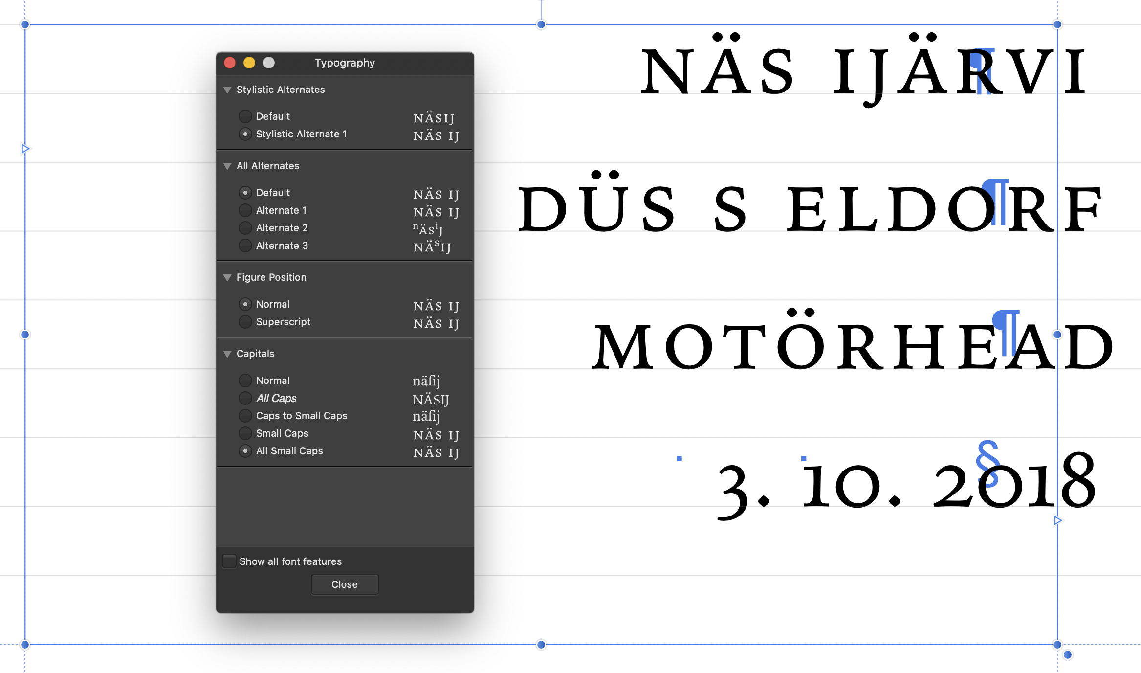
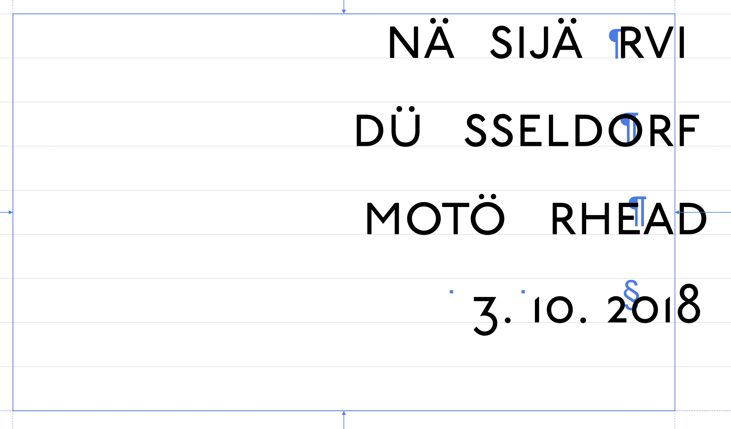
Hi, I’ve uploaded the culprit (please delete after inspection). On further investigation, it seems like it occurs not only in connection with “Small Caps” or “All Small Caps”, but in addition with an OpenType stylistic set, particularly SS06 (in this font responsible for turning square dots into round ones). Setting stylistic sets to default “solves” the issue, but at the expense of reducing typographic options. I have found other fonts that also behave unexpectedly with stylistic sets selected, the macOS system font Iowan Old Style e. g. has the gap after each letter S (see new screenshots with and without stylistic set selected). The horrible alignment on right-aligned text persists independently.
-
In the latest beta (1.7.0.139) in some fonts like P22 Underground Pro there appears a ridiculously wide gap after umlauts (ä, ö, ü) with “Small Caps” or “All Small Caps”. (see screenshot) Line 4 appears normal, but the “Special Characters” are off, too. This was not the case until at least two betas ago (I skipped the one before this), and other fonts appear normal, as far as I have tried. And right-aligned looks even worse, although it hasn’t been flush in any beta yet.