

Pixel and Poly
-
Posts
74 -
Joined
-
Last visited
Posts posted by Pixel and Poly
-
-
Please Please Please let us easily edit, paste in info into the channels. I've been using the Affinity suite since it's beta on Windows and working in game dev and 3d we need easy channel editing/pasting. Channel packing is used all the time in game dev and it's an enormous pain to do in Photo.
It should be simple to copy a greyscale selection and go into any channel and simply paste it in. I love recommending Photo to people but always stop short when it comes to 3d / game work as this is a sorely needed feature.
-
9 hours ago, NotMyFault said:
If you have a „deconstructed“ workflow, meaning you need to manage the 3 color channels individually, it could make sense to keep the channels totally separate during edits in 3 groups, all containing one channel, and use blend mode add to combine.
It will take some time to adjust your style to this non-destructive approach, but then produce results faster and more reliable. It does not make sense to use Affinity apps „against the system“, sticking to destructive workflows which worked great in other apps.
I'll take a look at that file and workflow. I feel like it might just be easier to use macros to insert the grayscale images into the single document over this method but I do appreciate it and will feel it out!
-
1 hour ago, NotMyFault said:
Pasting into channels has been requested repeatedly, unfortunately it is not available. Affinity always creates new layers when pasting, and ignores channels panel settings.
It requires at least 2 steps, but totally depends on how often do you want to do this, and what color formats the different documents have.
The basic workflow:
- have the source image within your document (paste, place, …), and layer selected in layer stack
- choose channels panel, choose one of the color channels, create spare channel
- Select destination layer in layer stack
- choose channels panel, choose spare channel, and click „load to layer R/G/B“
Hi, Thanks for the quick reply! I was kind of hoping there was a 'paste into channel' option that I was missing somewhere. Your first method is the one that I did figure out and currently use but was hoping there would be a quicker method somehow. I might just make a macro that will do these steps for me in the end. I have three different types of grayscale texture maps that I need to place into a single RGB document to use in a game engine where I will be accessing each of the channels separately for their desired purpose. I think I will just make a macro for each color channel.
-
So I'm just trying to find an easy way to take a grayscale image and put it into one of the RGB channels of a different document. I figured out a method but it takes many steps for each channel and I'm assuming there is a much easier way that I'm missing.
I was hoping that I could simply copy a grayscale image; go to a specific RGB channel and paste it into that channel but that just creates a whole new pixel layer.
Any suggestions are appreciated! Cheers!
-
@walt.farrell Thanks so much! That setting fixed the issued. I did get a tablet a while back but didn't make the connection.
Thanks for the help!
Jeff
On 3/23/2017 at 9:28 AM, Sean P said:Hi Mithferion
We've seen this a few times before and it is caused by the 'Handedness' option set in the Tablet PC settings dialog.
Bring up the Run dialog (WinKey+R), paste the following and click OK
explorer shell:::{80F3F1D5-FECA-45F3-BC32-752C152E456E}
You will then see the Tablet PC settings dialog. From here change the Handedness option from Right to Left and click OK. Your menus should now appear where you would expect them
-
I noticed this on the previous version but was hoping it would be fixed on the latest version of Photo on Windows. The menus are all over the place depending on where they are on the top bar. Just wondering why they are all not flush left for all of the menus. I feel like it used to be that way and changed at some point. It kind of drives me crazy and makes it hard to be sure you have selected the correct menu. Not sure if this is happening for everyone.
Thanks,
JeffSee the examples below:

-
-
It would be great to add an option/pref in Photo to make scaling of placed images consistent with scaling of other elements.
SHIFT=proportional / NO SHIFT=non-proportional
The way it is currently leads to more errors due to muscle memory. I would like to ALWAYS have to hold shift to keep an item proportional. It seems like an odd choice to have SHIFT behave different for different objects. Sometimes I end up slightly distorting a placed image because I hold shift to constrain it but I'm actually not constraining it.
-
On 5/1/2020 at 4:47 AM, AnaliseThis said:
I had the same problem with a Deco 3, but solved it by turning off Windows Ink in Designer preferences. All worked well after that.
Just a quick thanks for this! Was searching for reason why my tablet wasn't working correctly on the latest Affinity update and this fixed it for me.
cheers!
-
On 11/1/2019 at 5:19 PM, walt.farrell said:
Thanks for the sample.
Sorry, I don't see any way to have a tab before the numbers automatically when you tell Publisher to put the numbers before the text of the TOC entries.
Thanks for looking into it for me. I guess my request for having ONLY the numbers appear would still apply as it would open up some options for us.
-
10 hours ago, dominik said:
Hello @Pixel and Poly,
out of interest I downloaded the sample file, to look at it. I opened it in the latest Beta version of APub (1.8.0.499). When double clicking on the text style 'TOC 1: Heading 1' APub immediately crashes.
Question: did you save this file from the release version of APub? And, can anyone try to reproduce this with the latest Beta version?
Perhaps this can help to find a bug to report.Sorry for not contributing to your original question. I hope in order to improve APub this is OK.
d.
Hi @dominik , yes this was created in the latest full release. Not a beta. It's fine about posting/asking about that here.
We all want a bug free application.
-
Sure, here's a small example that I put together that shows what I'm trying to accomplish and what happens after an update.
Thank you!
Jeff
-
20 hours ago, walt.farrell said:
The numbers have their own style, by default TOC 1: Heading 1 Number and TOC 1: Heading 2 Number.
Just update the text style and it's taken care of no matter how many times you update the ToC.
If you've used different TOC styles, you'll have different text styles for your numbers, but the same approach applies. Update the text style once, and you're done.
Ah, that makes sense! Thanks Walt. I was able to update those styles and it updates now without resetting the type formatting.
I have it displaying like this> <tab>page#<tab>heading
Do you happen to know if there is any way to have a tab inserted before the numbers automatically? Every time I update the TOC the tab that I manually insert before the page # goes away and I cannot see a way to have it set up to have the first tab in the settings. I see how we can insert tabs or other elements between #s and headings but not before.
Thanks for you assistance!
Jeff
-
It would be helpful if we could have the option to have a TOC field be composed of the associated page numbers without the accompanying text. This would allow us to have a TOC field that is only the numbers which could be formatted a different way from the associated heading text but it could be updated without the need to reformat any style.
This would be useful for TOC that need to have the page numbers a different style than the heading text. We could simply have a field for the #s and one for the text and then update both of the fields and everything would be good to go. As of now after an update of the field we need to go in and change all of the numbers to the desired style every time.
Hope that makes sense! If there is an easy way to accomplish this now that I'm missing I'd love to learn.
Thanks,
Jeff
-
Thanks for the reply, Dan!
I can work around the text getting updated as the TOC I’m working on is not that large and the text style I’m using takes care of most of the formatting. Maybe I’ll submit a feature request to add the ability to have a TOC with only the page numbers with no text as it would allow for more flexibility in designing a TOC that can be updated without the need to make manual changes.
Jeff
-
I prefer to use Designer as you can do a lot with constraints and it's a good place to create any SVG graphics to be used for the final websites (and use Photo for any images needed for the site). There are programs specifically made for web design, though, such as https://www.figma.com/ or https://www.sketch.com/ . I still prefer to use Affinity Designer for my web mock-ups and design, though.
-
Is there a way to keep all of the formatting on a TOC text area after you update the TOC content? When I update the TOC area it resets any new tabs and specific character formatting I have applied to the page numbers.
Also, is there possibly a way to have the TOC page numbers appear without the associated text?
Thanks!
-
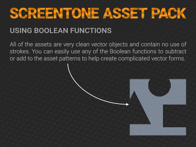
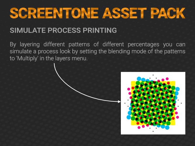
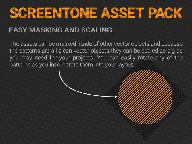
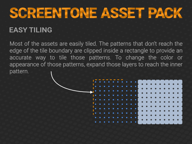
The Asset Pack contains 80 clean vector assets. Almost all of the assets are set up for easy tiling. They are all solid objects with no stroke so you can easily apply any fills, gradients or fx to the objects. The PDF has some more info and lists all of the individual assets.
The assets are broken into six sub groups:
100mm screentone blends (7 assets)
60mm screentone dot tints (19 assets)
300mm screentone blends (6 assets)
300mm screentone dot tints (19 assets)
300mm screentone reverse dot tints (10 assets)
300mm screentone line tints (19 assets)Screentone Information Document.pdf
-
21 hours ago, ChristAlix said:
That's right!
But you can help yourself and activate the symbol manually!
Thanks for that answer. Was just about to ask the same question. I wonder if the default node toolbar icon should be the one with the pullout for the point transform instead of the original one.
-
Cheers guys!
I purchased Publisher but this is for a live product so I'll wait for the final release to come out before using it on a job.
-
Is there a way to add a hyperlink to text in Designer so when we export as a PDF the link will stay live?
I see the hyperlink option in the PDF export dialog box but I don't see anywhere to actually add the link data to text (or an object).
Cheers!
-
16 minutes ago, Edward Goodwin said:
Thanks for the reply.
Is this something that can be added into a list for new feature requests? I think it'd be really useful. It is available in photoshop (hence why I'm used to it...)
Edward
I agree that this would be useful. Many times I like to keep the darkened area very dark. It would be great to have a % option next to the check box.
-
1 hour ago, Fixx said:
BTW, 3 colour Pantone job tends to be more expensive than standard 4-colour CMYK job, which is more expensive than simple B&W job..
Agreed! A print job with 3 spot colors plus black will be pricey.
If they are looking to save costs I would probably have one version of the logo that can be done in 1 color and then you could also provide a full color logo for 4-color printing or if they want to use it on the web.
-
I would probably just have one artboard for all the bills and then have all of the elements that are the same between them at the bottom in one (or a few) layers.
Then I would have a separate layer for each of the denominations where you can have the specific $ amounts and any specific pictures.
If you need to change any of the base features you just need to adjust them once. If you really want separate art boards using Symbols like @Alfred suggested is probably the way to go. There are some video tutorials on symbols on their YT/Vimeo channel.


Canva?!????!
in Affinity on Desktop Questions (macOS and Windows)
Posted
My hope is that the products will continue to be available as stand alone products with no sub. And they will probably also get integrated into the subs that Canva offers. Hopefully the extra capital will enable even more development of tools for us. It would be great if they can see the value in keeping both the non sub products as well as any they might offer in the Canva subs. Time will tell. Keeping my fingers crossed!