

JGD
-
Posts
548 -
Joined
Posts posted by JGD
-
-
4 hours ago, Frozen Death Knight said:
I'm not sure I quite understand what you mean by your first feature request. Do you have an example of how it should work like in a video or something?
As for your second one, I am not a Mac user, but the way "New View" works on Windows (I guess that's the one you are referring to with "Separated Mode") is that it opens up a new window of your project in docked mode as a tab next to your original file that you can then just drag to the side like to a second monitor. Is it supposed to act differently on Mac? Do you have an example video of that too?Ok, let's address these separately:
No, I do not have a video example yet, and unfortunately I shall not be doing one of those until after the 24th, as I have a keynote presentation to make, hundreds of pages to print and annotate and a few books and papers (including my entire dissertation) to review yet again. But I'll try and do a few after that, in between sending out CVs and going on vacation.
As for the second one, it depends on the app; Safari, Finder, etc., (i.e. apps that open multiple windows, but which aren't necessarily documents) allow you to open new windows in a “old-school” way (usually cascading, though when they are full height they open side by side) by pressing Command+N, and tabbed, by pressing Command+T, whereas Photoshop allows you to set the default as a global preference. In either kind of app and default setting, you can always dock and undock windows from tabs (though in the Finder and Safari, to dock single windows to a different window you must have “Show tab bar en
 abled”.
Now, the entire CS suite, traditionally, worked in a Application Frame-less state, with docked/floating toolbars, toolboxes and panels, and floating document windows that, when zoomed, would automatically fit the available space, as long as the Workspace (i.e. the Studio, in Adobe's parlance) was fully docked. The intermediate step, if I am not mistaken, was the addition of tabbed windows. And the ultimate step was the addition of an Application Frame, which looked and worked precisely like all versions of Adobe apps since Illustrator v.1 on Windows, Corel on Windows, and Affinity's default mode since its inception on both OSes. But, to this day, you can still work with Adobe CC's DTP portion (the old Design Standard/Premium subset of the larger Master Collection, which equates roughly to Affinity, except for the added bonus of Acrobat Pro) in that “classic Mac” mode.
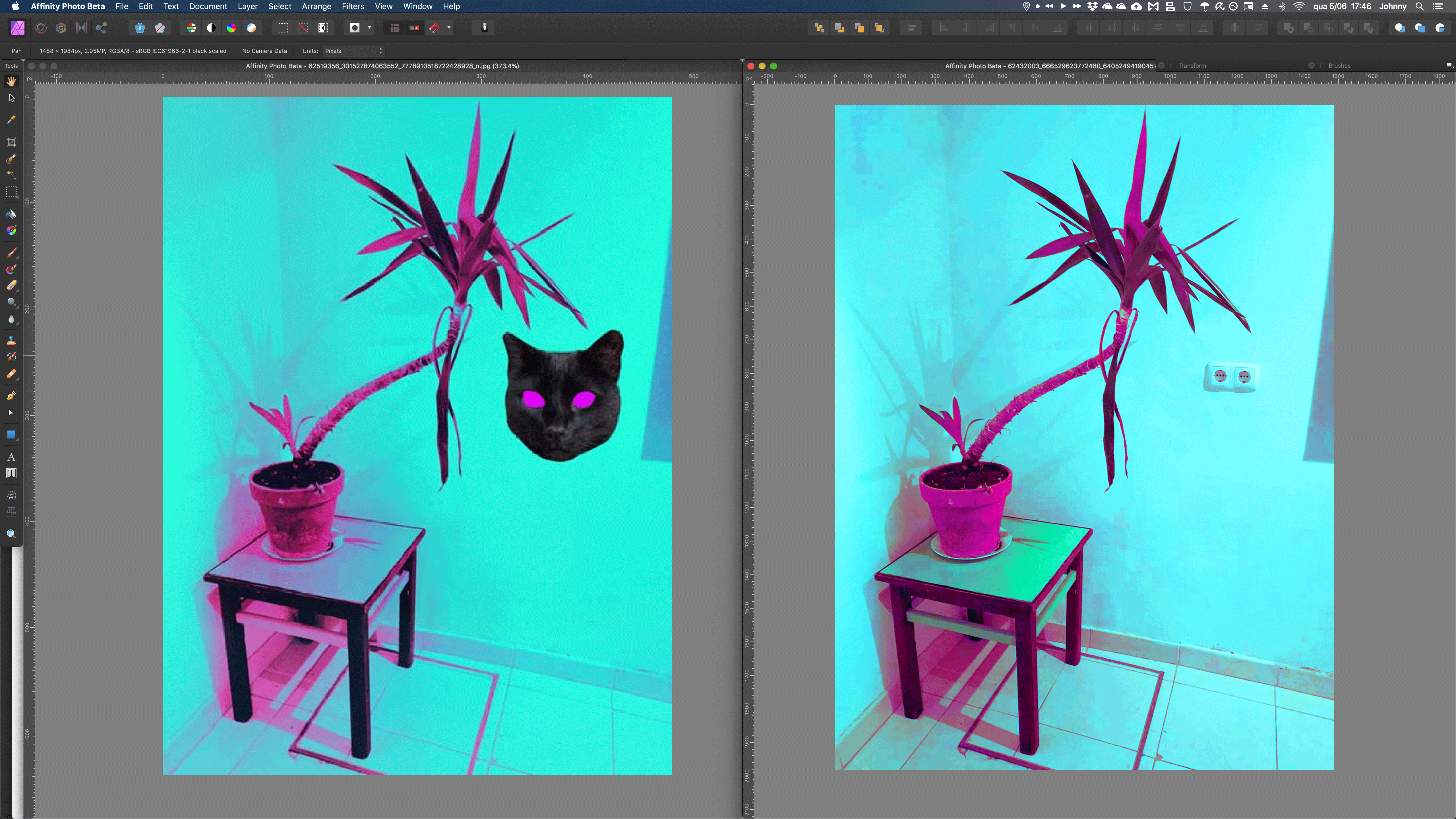
I've since stopped working in that mode in Illustrator and InDesign, mostly because of the advent of Affinity (so I would get used to the Application Frame, because Affinity's Separated Mode was and still is suboptimal), and also because I get spoiled with my 27'' iMac with 40 GB of memory and open too many windows for Exposé/Mission Control to be useful (though I usually work around that by using a dedicated desktop just for DTP apps) but I keep working in that mode in Photoshop. There's no other way to easily move entire layers across documents, period. And there's no split document view/automatic tiling on Affinity Photo, either, so… Yeah, things look a bit bleak. I tested Affinity Photo the other day for a pro bono project (basically I was recreating a vaporwave filter a friend of mine used on some Android app, except on a proper photo editor and with the original, full-res image), and I did have to compare two files side by side, which forced me to fidget with window resizing operations to get my views just right, something which, on Photoshop, would've been a breeze. Now imagine if I had to an operation across four different files at the same time or something? Imagine if I had to do that every day, for 8 hours?
So, in a nutshell – and, unfortunately, only in screenshot form, and not video screen capture –, this is what I wish for. I would like to see toolbars docking to the edges of the screen, and windows not sliding behind them (whether when performing the Window>Zoom/Option+Green button command, or when manually dragging the title bar behind them), just like in Adobe CC and other old school Mac apps. Seriously, try it out on any Adobe app on a Mac (you have to turn off the Application frame first, though; it's akin to Separated Mode, except… it's functional, useful and most definitely intuitive and not frustrating in the least): when the viewport zoom level is small, the windows will neatly wrap around the content, when it's high and makes the canvas exceed your screen size the windows will neatly snap to the docked UI elements, and then you try and drag the windows behind them, no matter how far you push them, their titlebars will always snap back into full view. And this is good, well-researched UX. Is it too much to ask?
-
On 6/3/2019 at 5:13 PM, Old Bruce said:
What I do is
Select the object, hold down the option key begin dragging (this makes a copy) let go of the option key (snapping is back on) and then I can snap it back in place if I so want.
Yes, that's what I eventually resorted to doing, too. Except then I end up with one (or multiple) extraneous object(s) which I then have to delete. It's an extremely cumbersome workaround, which becomes vastly impractical with larger, multi-object selections (or, worse even, selections of objects which then obscure or are obscured by others).
You see, most of my proposed solutions – which are, in a nutshell, reimplementations of stuff Adobe already did – make sense, are well thought-out and can save a lot of time. Which, for all their other failings, is a testament to Adobe's developers' foresight. These aren't just “entrenched Ai user behaviours”, as if that's a inherently a bad thing or something; they are about the only practical and logical ways of solving certain use cases. Ghost objects – whether they are a ghost of the “before” or the “after” – and self-snapping are useful and, in some cases, essential features, period. And workarounds sometimes just don't cut it.
-
1 hour ago, Old Bruce said:
Hold down the Option key and it doesn't go to Full Screen mode. and this disabled green button turned into Zoom would go against the Apple guidelines.
I'm obviously not 100% sure, but I reckon it wouldn't. Is there anything forcing developers to implement it by default? There are many apps which, to this day, still don't support fullscreen mode as a design and UX decision, and Apple hasn't ceased promoting them. Besides Illustrator and, more importantly, Photoshop (duh… and there's a reason for that, so users can do precisely what I described above and compare images, drag layers and other stuff across documents, etc.), I can name a few other examples, if you wish. And it's not like Apple is enforcing the HIG with a stick and eschewing apps and developers if they fail to comply at every step of the way (Affinity being the most glaring example; it suffers from a lot of un-Mac-like decisions and behaviours and, yet, it's consistently put by Apple high up on a pedestal at every opportunity – like, say, WWDC, their app stores, etc.… As long as a developer takes advantage of their latest tech and SDKs, Apple really doesn't care if they veer off of conventions slightly, especially if it makes sense and doesn't break something else, and that really doesn't seem to be the case here).
As for the workaround you suggested, I already addressed it in my first comment. It doesn't work properly. When you Option+Click the now mostly “Fullscreen” button, the window indeed doesn't go into Fullscreen mode, yes, but the button still behaves as a MS Windows “maximize” button (something which, on the Mac, should only ever happen with single-window apps just like Affinity apps themselves while on single-window mode, iTunes, Calendar, etc.), and not as Window>Zoom should behave as per the HIG. When performing Window>Zoom on a floating document window, the chrome should always toggle between default/custom (it starts out as a default size and once you resize it, the coordinates and size are saved somewhere) and fit-to-content sizes (I'm not even sure how that would work on Designer and Publisher, but if you were at such a small zoom level that all your artboards/objects/pages fit on your screen, I suppose the window could shrink to fit them; as for Photo, make it behave the same as in Photoshop, period).
I didn't want to go there, but you forced my hand; I'm sorry if I come across as rude or something, but please don't argue with a veteran Mac user who studied UX in higher education, or if you do at least take the time to properly decode what I've said. I know my comments are long, but the information, albeit a bit drowned in fluff and asides, is all there and it's entirely factual and correct. As I've said before, I'm no expert, in the sense that I didn't take a full degree like the postgraduate one some former colleagues of mine are now teaching, but I'm a bit of a UI history buff myself (all the way back to Douglas Engelbart's famous mouse demo and the Xerox Alto) and I know without a doubt a badly implemented Mac app, professional or otherwise, when I see one. I've strongly, persistently and informedly complained about this and other issues (which you've recently saw me rehash on the forums as well) more than four years ago, and they all went unaddressed. As I've said before, I'm unabashedly sticking to a bit of a program here: not giving Serif devs a moment of respite until I'm no longer available to badger them with these requests or until they do indeed address them (whichever comes first, and right now I'll have to go offline so I can prepare for my viva voce on the 24th; after that, it's a complete blank, and maybe you'll still see me around, or maybe I'll be gone to work full-time somewhere, pursue further research opportunities, whatever).
To recap: Serif's implementation of Separated Mode seems to be completely lifted off of other “lite” apps such as Pixelmator, and, thus, suffers from the same glaring limitations and “un-Mac-like behaviour”, instead of going full-on against the 800lb-gorilla-beast-thing like its marketing seems to imply. It feels like an afterthought, like something which the devs themselves don't really use daily and, as such, never got to become frustrated with, and it's not nearly as useful or practical if it had been done right in the first place. And for examples on how it can be done right, it's not like there aren't hundreds of apps, both old and recent, an official Apple HIG and nagging veteran users like myself to learn from. At this moment, Serif devs have zero excuse not to get this right by at least, say, version 2 or 3 of the suite (yes, I'm indeed giving them some leeway here, as I remember Adobe CS' palette implementation, for instance, being a complete, all-over-the-place “flustercuck” until CS3, with internally inconsistent implementations such as those weird InDesign's CS/CS2 sliding tabs). Huge screens, floaty UI bits – some of which could and should be dockable, even in separate mode – and pro photographers and designers wishing to tile their stuff, automatically or by hand, on their Macs aren't going anywhere, no matter how many million iPadOS-powered iPad Pros Apple ships, so these features should at least be tucked into some internal roadmap of theirs somewhere.
Anyway, my job here is, for now, done. I'll point whatever easily fixable bugs I find here and there (and you may have noticed I'm already doing that much more frequently, again) if I keep testing Affinity apps, but hopefully these last few posts cover my biggest, “foundational” gripes with the suite (if you put them all on one table you'll recognise the two running themes are “inconsistencies with the host OS” and “inconsistencies with sound WYSIWYG behaviours well accepted and established across the industry” which Serif looked over or, worse even, created for no good – or overall positive and justifiable – reason; those are the biggest factors which, historically, made Mac – and pro – users eschew altogether or otherwise tolerate through gritted teeth certain software packages – never forget Word 6! Ai versions in general in the eyes of former FreeHand users! QuarkXPress during the OS X transition! The list goes on… –, as I've said before, perhaps Serif would have even more happy users, right now, if they addressed those). I would indeed love to be able to make more video demos, but considering all the work I have to do over the next two weeks, you guys are on your own for now, sorry. If you want to see how proper Mac apps in “separated mode” behave, fire a an old Rosetta-compatible Snow Leopard VM (there are some pre-packaged ones lying around, I'm sure), or Basilisk II/Sheepshaver if you want to go even further back (and yes, I know that would be venturing further into Mac OS Classic/Carbon territory, but it's still possible to do those under Cocoa – Adobe CC being a prime example of that, and it works perfectly –, and it should be done if and when it makes sense), download some old abandonware and see for yourselves. Do your own research, please. That should be your job, not mine.
-
Hi guys. Once again, I'm sorry for overusing my “CRITICAL & OVERDUE” “tag” of sorts, but… until the end of the v.1.x cycle, better get used and pay attention to it. I'm reserving it only for the most glaring omissions, especially those which damage Affinity apps' reputation the most as professional tools.
Anyway, I digress; what I'm asking is: please make Affinity apps (especially Photo, where it makes the most sense) under Separated Mode behave like all Adobe apps when the Application Frame is disabled, FontLab 5.x, Microsoft Office X/2004/2008 for Mac, AppleWorks, and pretty much every classic Mac app with floating UI elements since 1984. Nineteen-freaking-eighty-four; those are thirty+ years of muscle memory for some users (in my case, it's only a respectable 16, but still).
Floating palettes and other UI elements have a reason to exist, but they also should work in a sensible and intuitive fashion, otherwise you might as well not have them at all. If you decided to implement a “Separated Mode”, at least take the time to fully learn, understand and respect Apple's Human Interface Guidelines (and, by extension, Mac users). Don't make the same mistakes Microsoft did with their infamous, universally-hated Microsoft Word 6 for Mac (source: https://blogs.msdn.microsoft.com/rick_schaut/2004/02/26/mac-word-6-0/ ).
As it stands, the Separated Mode is very cumbersome, forcing users to painstakingly resize windows by hand, one by one, so that they fit on the screen and fit their content, aren't obscured by the floating UI elements (which forces them to switch to another app or toggling the Studio just so they can grab their titlebars), etc. Making them dockable and properly coding the document windows and Zoom behaviour to prevent those scenarios would allow one to open several windows in cascade, side by side, tiled, etc.
I should add that the Window>Zoom command/green “+” titlebar button is not MS Windows' “Maximize”!!! We all know that Serif devs come from a Windows background, and this is a common misconception former Windows devs have, and a common error they commit, when porting their apps to the Mac. To make matters worse, the Affinity apps actually started out as Mac-only but never even behaved properly as such, ever. Please make that button behave precisely like in Photoshop, Preview, TextEdit, Pages, etc. Will it be inconsistent with the Windows version? Maybe, yes. But it should, first and foremost, be coherent with the host OS. On the Mac, that command/button should be a toggle between a default/custom size and a “fit-to-content” size (which can be very useful in Affinity Photo, and which I constantly use in Photoshop, Preview, etc.), and not a “maximise button”; for that, we have the default Fullscreen behaviour.
Better yet: under Separated Mode please disable Fullscreen for the green button and make it Zoom (properly, please) by default. Seriously, try activating Separated Mode and opening a document window in Fullscreen; it's not very useful and doesn't bring much to the table, functionality-wise, over opening the app in regular mode and making it Fullscreen am I right? I'm willing to bet that maybe 0,0001% of your users ever turn to that particular combo… At least, please allow the user to set the default behaviour under Preferences.
Yes, I know this is no longer the default “green button” behaviour in macOS, and that Apple is pushing us heavily towards Fullscreen mode. But seriously, until Apple disables it altogether (and I reckon they never will, as they keep selling huge iMacs and now will start selling the even bigger Pro Display XDR, which will be a massive hit with pro photographers), please implement it correctly for the users who still use the Window>Zoom command. It's the least you can do as a self-respecting Mac developer.
-
Hi guys! Yeah, that pretty much sums it up.
I was rearranging my Studio panels across the suite so that they would be somewhat similar on both Single-window and Separated mode, and I realised Publisher was missing the Cmd+Opt+F shortcut for that toggle which is already included by default on Designer and Photo.
I manually added it back via System Preferences, but having it set by default on Publisher as well is obviously the optimal scenario.
-
Hi guys. Basically that's just it, what's on the tin.
I was fooling around with my new Huion tablet drivers and realised that that essential shortcut for a multi-touch-less workflow – I've since stopped using my Bamboo Pen & Touch, and besides my H950P I only have a Magic Mouse connected to my iMac – was MIA (it's present and fully functional on both Designer and Publisher on their default personas, and also on their respective Pixel and Photo personas).
Can we expect it to be back on the first 1.7.0.1 fix?
-
Hi guys. Despite all my latest criticism on the suite as a whole, and all the delays in Publisher in particular, your progress on the latter lately is absolutely commendable, and I must say that I am very happy with its current state (cool new splash screen too, by the way), as it does feature some essential features for longer texts, which may come in handy if it's released in time for my next project. The number of “must-have” stuff you managed to finish in time for the GM is, indeed, impressive, and I can only hope you keep up this level of work across the suite.
Now, as for the pre-order pricing and installation when it finally comes out, I have just a practical question: how exactly does the whole payment and download situation work on the Mac? Does our pre-order give us access to some sort of Mac App Store download redeeming code or something? Or are we buying the app directly from you and then have to update it internally like with the betas?
-
Oh, another thing: even if we accept the Command+Drag as the default behaviour for duplication operations as a fatality, let me just add that it is extremely buggy as of now in the latest v.1.7.0.12 beta. If the operation is done too quickly, AD will not duplicate the object and, instead, just drag the original, which makes it extra frustrating, to say the least.
That was not an issue in the MAS version, and if this latest beta is already an RC, as I've read elsewhere, the next MAS update will come with a new bug right out of the gate.
-
Also, on this subject, I should add that, for consistency and usability, objects should already snap to their originals when doing Option+Drag duplication operations, which is already their behaviour when performing Command+drag operations.
And I've just realised, while looking at the status bar messages, that apparently Command is [now? Since v.1.6? Since… ever?] the default modifier for duplicating and Option the default modifier for ignoring snapping. This, per Apple's Human Interface Guidelines is completely unacceptable and inconsistent with the behaviour in the Finder and pretty much all macOS apps.
When you click and drag an icon (or an image or block of text in any text editor, like TextEdit or Pages, or any object in Keynote) while pressing Option, you will always get a duplicate, and when you click and drag the same icon while pressing Command, in a window – or the desktop – with “snap to grid” activated, the Finder will ignore the grid (and so will Keynote regarding snapping, if you're dealing with objects). WHY should Affinity behave in such a blatantly inconsistent way with the rest of macOS? It started out as a macOS app, first and foremost, and if you really must have it be consistent across OSes, at least allow the users some degree of finer control as to how modifier keys affect its operation.
You don't want to become the new Adobe (or, worse even, outdo them) when it comes to OS-app UX inconsistency, trust me on that one. Designers do not take that lightly.
-
Hi again. This is a rehash of yet another feature request I made more than four years ago, which is still preventing me from working in Affinity Designer in a sensible fashion.
As you know, Ai implements drag operations in an '80s/'90s style “ghost” drag model (not unlike the Classic Mac OS window and icon drag model). The WYSIWYG part of the equation is the original position of the object, while the new position will be shown as a “ghost”, i.e. an outline, which you can snap to the original position of the object. This behaviour, while not being completely WYSIWYG or very elegant, is VERY useful, especially – but not limited to – when doing modular typography.
Affinity Designer, on the other hand, features a completely WYSIWYG drag mode, in which no “ghosts” exist. You just can't snap an object to its initial position, period. This is suboptimal, and forces the user to use impractical workarounds, such as duplicating objects instead, or to rely on complex grid arrangements, which may be overkill for simpler projects.
[For some context, InDesign features both Illustrator's drag model, when you perform a quick click+drag operation, and Affinity Designer's model, when you perform a longer, click+hold+drag operation.]
My suggestions (either a single one of them or a combination thereof) as to how this problem can be solved are the following:
• Add a toggle in preferences so a different drag model can be used instead of the current strictly WYSIWYG one;
• Allow users to perform a different drag model, perhaps like in InDesign, by holding the position after clicking and before dragging, but reversed (the preferred default model should still be a selectable option, as above);
• Allow users to use the Command+Drag operation to temporarily activate a ghost of the initial position (currently, this shortcut duplicates the object, which makes zero sense as the Option+Drag shortcut already does this and there's no need for two redundant shortcuts for the same operation).
As before, if you want me to make a little demonstration video of the intended behaviour, I'm more than happy to do so.
-
16 minutes ago, fde101 said:
I'm taking Publisher quite seriously whether it has these or not. While I do see there being value in having these, not everyone needs them all the time, and there are plenty of things I can do without them. Even though I have this capability in QuarkXPress now, I rarely use it, as most of my projects are small enough I see no real value in leveraging multiple layers for them.
The fact that tables can't currently span multiple pages is a bigger issue for me personally right now, but I'm convinced both of these limitations will be addressed in the (hopefully near) future.
Well, that much I can say about InDesign, too. I rarely use layers on that. There's probably one or two complex and recurrent projects I've used them on, but that's about it.
However, in Ai, that's a whole different story… I just can't work without functional, universal layers in about half of all my projects. And on AD, the only workaround I can think of is treating it like Ai CS2 and just ignore artboards altogether until I need to export stuff (which can be a bit of a bummer if I'm working with a client and need to show some .PDFs along the designing process, by the way).
-
Ok, some observations on the feature, which I may eventually use one day for the aforementioned kind of projects (and, indeed, the kinds of arrowheads available right now do seem to be mostly geared at technical drawings rather than “artistic” stuff):
What I like: the fact that you can see the arrowheads in outlines mode. It really helps a lot, since in the projects they are most useful in their current state, that's also where that mode frequently comes in very handy. It's also a nice preview of the Expand Stroke command when working in that mode. So, kudos on beating Adobe on this particular point, as it's already shaping up (ha!) to be nicer overall.
What I don't like much, but understand it's probably not to be expected in a v.1.7.0 implementation, as it's so new: you can't have separate “within the line/at the end of the line” parameter settings for head and tail, but must instead select it for both. Seeing how there's an “origin” terminal, it would make sense to have, say, that one “at the end of the line” on the tail, and an arrowhead at the other end, “within the line”. A small panel reshuffling would be in order, as the “swap arrowhead with tail” button would have to give way to a duplicate pair of radio buttons for that parameter (maybe by getting rid of the “Start:” and “End:” labels altogether? I mean, that portion of the stroke panel is pretty much self-explanatory)… And, by the way, the “swap…” button should also swap that parameter along with the corresponding arrowhead. Since I've mentioned Adobe before, I just realised Ai does not even allow for this option. Should you choose to implement it, you'd actually be one-upping them.
Also, and I know I'm going out on a limb here, I've just realised that the “cap” on a stroke is just another form of terminal (please pardon the typographic jargon, but that's just how my brain works). What if you consolidated the panel further and got rid of those three “cap” radio selectors altogether, while changing “arrowheads” to just… “terminals”? The “square” (or, in Ai jargon, “projecting”) cap could just be achieved by using that parameter, with the added bonus that you could also have a round cap with the outermost node contained within the stroke, and different caps on different ends. Again, that's something Ai can't do, and which could be very useful in diagrams like the ones I've shown you on the other thread (and please, oh please, do add triangular caps/arrowheads that don't protrude further than the stroke, while you're at it; I know it could also be yet another form of “cap”, but the arrowhead implementation is just so much more flexible right now and could become even more so if you added that suggestion).
The only issue I could see with this would be… now that you've opened the whole outlines view can of worms, how would those caps display? But eh, I suppose that would be a little inconsistency (either the caps would not be visible at all, or be visible and appear as “arrowheads”, as the strokes/stroke bounds shouldn't appear in any case) that wouldn't hurt users that much.
-
On 5/24/2019 at 12:13 PM, fde101 said:
This has been discussed already in other threads. The current layer structure is inherited from the other products (Affinity Photo and Affinity Designer) which use the same file format as Affinity Publisher so this is not likely to change (I certainly hope it does not as it is exactly what is needed in the other programs), and the current structure does work VERY well for what it is though it may not be what you are accustomed to from other layout software and is a solution for a different set of problems than the type of layer you are requesting.
The Affinity team is aware of the need for what we have come to refer to as "global layers" in Publisher and they have indicated clearly that they do plan to implement such a feature but it is unclear to the rest of us if this will happen in 1.7 or not - it might come in a later update.
Indeed it has. Maybe you could take part in the discussion and chime in on those threads, even if it's just with your reactions? You see, it's also best to consolidate the discussion on those, instead of spreading it out across new ones.
This is a pervasive issue across the entire Affinity range and it must be solved ASAP (as in, hopefully in v.1.8.x, as it is way overdue) if it is to be taken seriously. I've been seeing scattered users asking for this, but I believe there are many more of us than Serif devs suspect. Many of them may not even be reacting, but just abandoning the suite altogether after they finish their trial.
-
On 6/1/2019 at 10:44 PM, Jowday said:
Bingo
Well, not exactly. I HOPE! I am 'angry' with the decision makers. However I share @JGD's feeling that engineers made feature design decisions here and there. Fx one of the features in Designer we saw early in the beta - that has been withdrawn. Hardly a popular feature request.
Release early and often: "early and frequent releases in creating a tight feedback loop between developers and testers or users, contrary to a feature-based release strategy"
What feature are you alluding to, pray tell? Maybe I missed something, and/or I'm not fully understanding your comment.
As for the development strategy, I do believe you can and should have a mix of both.
Yes, you must adhere to some sort of over-arching strategy, lest you give off that aimless vibe I was talking about before, and not just pander to whatever preconceived notions of your audience, as that would also devolve into the whole “giving them a faster horse” thing.
On the other hand, you really should listen to your user base if they flat-out tell you that one of your ideas is completely nonsensical and hinders them more than it helps them. Yes, even if that means buckling to one of said “preconceived notions”, because not all of them are inherently bad/wrong. I can absolutely guarantee that while Adobe's implementation of multiple artboards isn't as elegant as it might have been (Freehand's, as far as I can remember, was much more so, as you could even select and focus on the damn things directly on the Navigation panel, and I can't for the life of me understand nor accept how Adobe, being the sole owners of Macromedia's entire IP, couldn't have straight up lifted the entire UX from FH and put it into Ai after all these years), the overall layer concept and its relation to artboards is more flexible, WYSIWYG and intuitive.
And that's not just for me, but for the entire combined mad-at-Adobe-because-of-CC Ai, former-and-even-more-disgruntled-because-of-the-Macromedia-takeover FreeHand, and curious CorelDRAW user base that Serif seems to wish to attract judging from their marketing (even though, in all fairness, they seem to be gearing themselves towards the Pixelmator and Sketch crowd with the actual product). And it's a very safe extrapolation for me to do because I happen to have used all three applications throughout my career, and so did many of my colleagues (CorelDRAW being very popular in secondary education in my country and elsewhere in Europe, I believe, and the former two in undergraduate and professional education since time immemorial); I really feel dead sure that Serif's management and devs are shooting themselves on the foot with this.
Unless, of course, that is a remnant of Draw Plus' UX, to which I also say – much to the chagrin of Plus users, which I know are also a bit disgruntled – good riddance. They weren't afraid of distancing themselves from their old suite in the past, and if it's the case again they shouldn't be now, either. In any case, whether it's a rehash of an old idea or a brand new one, this whole lack of universal layer support and “artboards-as-containers” thing is the proverbial hill I'm willing to die on.
Users are willing to tolerate drastic changes/omissions to their tools, and even to the UI (Corel's, for instance, is very different from everything else, with those ridiculous panels that only open one at a time and waste huge amounts of screen space, and that's one of the reasons I personally didn't wish to go back to it even if I had the chance – and, in fact, I now do once again –, but if I was forced to at least I would be able to, you know, do my job somewhat unhindered; and I guess the same goes for Quark, even with its likewise stupid, non-standard keyboard shortcuts, and its limited tool set…), but there's only so much divergence they are willing to accept and live with when it comes to core features and workflows. And if those changes/omissions render a piece of software useless for half of their projects, it's all but guaranteed they will just ignore it or, worse even, if they are reviewers or influencers, outright pan it.
Once again, my mention of Corel and Quark isn't that innocent, either. Right now, Adobe has real, cross-platform competition from three different companies, and while Serif is the only one which offers a comprehensive and affordable suite that also runs on iOS, the other two also offer perpetual licenses, so if you're that mad at Adobe you could, in theory, buy a CorelDRAW suite and a QuarkXPress licence and have, right here and right now, a complete, mature, industry-standard and cross-plaftorm solution on desktop hardware. Ever since CorelDRAW came back to the Mac, this scenario became a serious existential threat to Serif, IMHO. No matter how expensive those products are, we all have to face that reality head-on, because… guess what, schools can get those software packages at a reduced price, too. On the other hand – and I'll say it again –, judging from Corel's feeble commitment to the Mac and Quark's abysmal response to Apple's technological transitions in the past, the upcoming transition of the Mac to ARM-based A-series processors is a golden opportunity for Serif. But that will only work in their favour if their product is ready for competing with the “big boys”, which, no matter how good their sales figures may look, I feel it still isn't.
Edit: even with the latest “2 million users” milestone revealed at the Serif Keynote, I'm not budging on my last statement. How many of those two million bought Affinity apps and then left them in the drawer? Are those stats for customers, as in people who purchased the apps, or individual active users in the last “x” days? And how many of them are just dabbling with the apps while they get up to speed, instead of being heavy, daily or near-daily users?
-
13 hours ago, Patrick Connor said:
..or agreeing with you and angry with the developers. We'll see, if he returns.
True. Still, even with the current limitation in number of reactions per day (which sometimes feels a bit constraining, but I understand where you're coming from with that), it would be nice to have some more elaborate feedback from other users than the odd and not very constructive emoji.
Or, you know, some suggestions as to alternative UX models or even workarounds (I just came up with one in a different thread: using AD more like Ai CS2 and older, as in, not using artboards at all while in the designing process, but just for exporting the final artwork for printing/linking… It's not 100% practical or elegant, but a functional workaround nonetheless).
Debating stuff, if done with respect, is healthy, and I hope you take my jabs at you well. I don't wish to make users mad at you and pile up on you for the sake of it, and if that's the end result of my rants, well, I'm very sorry. All I say here is in good faith and with a very specific goal which is arguably in your best interests, and I'm not even mad or angry, just a bit sad and disappointed at the overall slowness of this process of attracting new users to the fold (I really wanted to work towards that goal in earnest, but I just can't bring myself to do it until a certain bare minimum of functionality is met, and I'd say this is the last big hurdle to be overcome). But oh well, at least I know I and others are being heard, which is much more than you can say about the competition.
- Patrick Connor and A_B_C
-
 2
2
-
On 5/31/2019 at 1:51 AM, Jowday said:
You seem to be… err, mad, and judging from the lack of positive reactions to my other posts, you don't seem to agree with my stance, either, but… care to at least elaborate on why?
-
2 hours ago, ygoe said:
A "workaround" may be acceptable, but it certainly isn't desirable.
Yes, @ygoe, I know. And I know that expecting users to just accept having to use workarounds after four years of requests is, at the very least, worrisome. But surely you can appreciate that, in the grand scheme of things, ignoring the fact that your app doesn't work at all for a sizeable portion of your current customers and/or potential user base is, for lack of a nicer term and using the obverse of the one you just used, unacceptable. We're talking nice-to-have vs. absolutely essential here.
I don't know about you, but if Serif devs spoke to me, as a customer, about their strategic decisions in the same terms I outlined in my latest posts, I would understand and applaud them, because there is indeed real power in numbers (in this case, number of users). I would feel that they would be measuring twice and cutting once, trying to attract as many users into the fold as possible, and admitting that v.1 or even v.2 would indeed be a bit “road-to-Abilene-ish”, in the sense that it wouldn't be perfect for absolutely anyone but at least barely usable for everyone (that's not what they do, quite the opposite; they will say that their product is great for some users who are very, very happy… Well, good on them all, then; I've been waiting for four years for some bare essentials, and one of my biggest “small” gripes with it took as much to be fixed; I suppose you could say that doesn't bode well for the future, am I right?).
As it stands, Affinity Designer, in its current state, is great for illustrators and prosumer/amateur designers, and next to useless for almost everyone else. Or else, Serif would be swimming in cash – and might've been able to hire a few more people and speed up development – and Adobe would already be trying to acquire them, or something. Even with a manifestly incomplete product by 20/30-year-old-app standards (yes, I would buy the entire Affinity range, in an incomplete – but functional – state, for an entire, multi-seat professional studio just to stick it to Adobe, even if the current tax rules in my country actually make paying a CC subscription when you own a small business a bit of a no-brainer because of rebates). Just my €0,02.
Also, this kind of shortcoming is still acceptable in a product like Publisher, as DTP is an über-complex field, the app suffered a lot of delays, and is not even commercially available yet. But Designer is supposedly the most mature of the bunch and, yet, these features aren't even on the roadmap. Instead, we're getting… arrowheads. I don't know a lot about software development but, to me, this all kind of reminds me of the active procrastination I did while finishing my MA dissertation. I would invariably turn to every fun DIY project I had going on the side instead of focusing on the boring 90+ page behemoth I really had to finish and turn in before the deadline. Sure, I would feel very accomplished, but that didn't change the fact that with every delay I'd be paying more and more tuition fees and further hampering my future career.
Same here with Serif: focusing on cool new tools may make Affinity look good on paper, but it won't necessarily attract those potential users anyway and will result in a loss of media and word-of-mouth momentum. They're already losing me, for one, and I'm what you could call an “influencer” (former Mac room monitor at the leading fine arts faculty in my country, with hundreds of followers and customers, and in the future hundreds of students, anyone?). Oopsy-daisy.
Anyway, I digress; until I'm proven otherwise, I'm betting Serif decided to focus on illustrators and prosumers for v.1 and that's that. I sure hope to be surprised with some v.1.8.x beta or something, but it seems that the make-or-break moment will instead be v.2. If that one isn't a serious attempt at expanding the user base, with a feature roadmap ostensibly geared for just that (having it laid out in a Trac-like system would also be nice, by the way), I will not be buying it. Worse even: I probably won't be paying much attention to its development and to v.3, unless it somehow reaches critical mass and I start getting students mentioning it. You see, if and when I become a teacher, I will be able to afford a CC subscription… forever (probably with some discount, even… or maybe I'll even get it for free, depending on where I'm working). And as much as it pains me, and as much as I hate Adobe's guts, my patience is limited, and I've been trying for more than five years to help Serif devs turn this into a serious contender. And I won't be doing that anymore, possibly soon, especially if I end up doing a PhD and my entire mental energy is directed elsewhere again.
-
On 5/29/2019 at 8:23 AM, A_B_C said:
I believe JGD spoke of “technical” drawings as opposed to illustrations in a more artistic sense. In his other thread he gave the example of a map or a public transport information system, which is a technical drawing in a loose sense only. Certainly, he didn’t mean to confine himself to diagrams of electrical circuits and the like.
I was thinking more of technical drawings of 3D objects with top, bottom and side views, with measurements and stuff… In fact, you can see that in the examples I've given on my videos, there's probably only two arrows in total, and those are precisely the instances where I wouldn't mind in the least drawing them by hand (in fact, I did draw them manually in Illustrator, as those aren't even strokes, but shapes, and the arrows aren't even arrows per se, but just pointy bits).
Imaging doing this other example I'm attaching without automatic arrowheads; yeah, it would be an absolute pain to do. But one could argue that a) this isn't yet one of Affinity Designer's target use cases (nor should it probably be anytime soon… A communication designer like myself, who can't use product design-bound CAD apps, doing a project such as this one will always be an extremely niche case) and b) for me to be able to even think of doing this in AD I'd need a sensible layer model, and having the whole mass-selection situation sorted out would come in handy, too. Even with arrowheads in AD, yes, so I really fail to see the urgency in implementing them, even with this 4-year-old request. Do you people now see where I'm getting at with my logic? I'm not being all pompous and envious about it, there's a thought process and a method to my opinions as to Serif's priorities. Features and tools don't exist in a vacuum; they must support each other, make sense, and correspond to the needs of specific target users.
In fact, even Ai isn't very well suited for this… If I was making this today, now that CorelDRAW is finally available on the Mac again, and not two years ago, I might give it a spin instead – and bear with its horrid selection, zoom and pan model, which is all but erased from my muscle memory after 15 years without touching it – just because it has a dedicated and automatic measure-marking tool. If Serif ever wants to tackle that market and try to eat Corel's lunch as well by implementing such a tool, sure, I'm all for it, but only after the basics are addressed.
I believe even Adobe initially implemented arrowheads as a a bone to throw at this kind of niche case more than anything else; the fact that it's also useful in other scenarios, including artistic ones, is just a nice side effect that eventually became their main application (because, you know, almost everyone uses Ai anyway). And yet, Ai is horrible for this kind of work because if you need to make a 3D render of one of these, boy oh boy, are you in for a world of hurt. But at least you can manage to do it with a sensible layer model, as SketchUp can import vector files just fine. Now try and do that with AD, and having three plates (this one I've shown is just plate 2 out of 3) in the same document (which makes sense, as you can have guidelines across them) with the same layers on all of them (which is critical for subtracting all the unneeded, human-bound measurement fluff when doing those renders); whoops, you can't, because AD will insist on treating artboards as “containers” and moving all your stuff (oh, I forgot to add: including guidelines) into them instead of letting you have it on specialised layers.
So, to sum it up: Affinity Designer is great for doing collections of self-contained artwork, like different illustrations or logo versions (and even then I have a few doubts about its limitations), but positively, absolutely horrid for complex projects where some logical relationships between each artboard's content are needed or at least just desired. Really, if all we can have are several small “mini-documents” instead of projects containing an entire document-level logic, we might as well not have/make use of the current multiple artboard tools at all and work like we did in Ai in the pre-Macromedia days (as in, we could have rectangles on their own layer as faux artboards, and turn them into actual artboards whenever exporting and be careful enough not to save our artwork and thus screw up the entire layer situation). It's just that sad and would, indeed, make more sense as a workaround.
-
11 hours ago, ygoe said:
I haven't read all of your post, but it sounded like you believe that arrows on lines are only for technical drawings. Have you never seen any arrows in your environment outside of technical drawings? Or is everything with an arrow a "technical drawing" for you? I see arrows every day, in all kinds of places. They are one of the most basic sign language concepts of mankind. And as with a drawing tool, I want to be able to style my arrows as I like while keeping them accurate (i.e. not MS Paint freehand-mouse style). The old point-outline-shape tools were simply inappropriate for most such cases. I very much welcome the addition of arrows in the beta and now quickly switch from 1.6 to 1.7-beta whenever I find I need arrows in a document.
That is not in any way, shape or form what I said. What I said was that automatic arrowheads at the end of strokes are useful mostly for technical drawings, when you may have to draw hundreds of them at a time just to indicate measurements. For everything else, manually drawing them and saving them as symbols is most definitely an acceptable workaround, especially if you're drawing just a few of them.
My issue with Serif's priorities is the fact that there are no possible workarounds for issues like the ones I cited. Missing core functionality usually turns your life into a living hell and just makes you stick with what you already have. To add insult to injury, it does seem like those two features could be implemented with a few lines of code. They are not even tools that you have to draw entire icons and design entire studio panels for (well, when it comes to universal layers and if they want to implement those in a neater fashion, maybe, but there could be an intermediate and even temporary compromise just for v.1.x, as my demonstration videos attest; it's already technically possible to somewhat circumvent Designer's weird “artboard-as-container model”, with no ill effects, except you can't really work at all because you'll be fighting the application at every corner; as for selection options, Serif could very well implement basic, Ai-like selection options for v.1, and work on a more advanced, Freehand-like selection dialog for v.2 or even v.3).
If you have users trying, or wishing, to fight your app, and if not addressing that is reason enough for them to quit using your app, and if addressing it is easy enough for you to do, you should definitely consider yielding. To me, this entire container model nonsense feels like it's Serif's “darling” and they're afraid, or just too proud, to “kill it”. This isn't a case of being something too hard to implement, no. It's the case of them having reinvented the wheel five years ago for no real good reason, and now maybe being stuck (except they aren't; their document engine would work just fine in an Ai-like way if only we were given a measly checkbox). There's a lot I hate about Ai, but their implementation of layers and artboards is not one of those things (the overall crustiness and slowness of the app, the horrid bézier tools, etc. are, and Affinity Designer did seem to bring a breath of fresh air when it came to tools). And sure, they got a lot of compliments from users – mostly illustrators, I'm guessing – on their model, but those users could very well live with Ai's model and wouldn't even bat an eye because they wouldn't know any better, whereas many other users just can't use Serif's container model. At all. Period.
And before you tell me that I'm being stupid because I want Affinity Designer to be more like an Adobe app, well… No. I want Affinity Designer to be more like every single design app in existence since the beginning of time. Glyphs.app (a type design app) works like this. AutoCAD works like this. ArchiCAD works like this. CorelDRAW works like this. Inkscape works like this. Illustrator obviously works like this. ALL design apps feature universal layers which are sacred. Affinity is the only app that treats artboards as containers (I will say it again: paper is always the bottom layer, not a container; and if you want a container, well… I dunno, create/use a specific slice/crop tool/whatever for that, or just group your objects into a group or a layer) and makes layering/grouping decisions for you, and before you tell me that that kind of abstraction is a good idea because kids these days will just use iPads and be done with it, no, no and no. Some professionals will always use some kind of real media, just like some photographers and DJs will always use some kind of physical media, and even if they don't, having a sensible, WYSIWYG/skeumorphic/whatchamacallit connection with the physical world and its inner workings is always a good idea.
I am sad about this, but I'll have to repeat it again in this thread: Serif devs think more like engineers than like artists, and whichever artists or designers who worked with them and told them this was a good idea or at least failed to warn them of the side effects led them astray because they didn't know any better. I'll even go further and say that I will consult with some former MA colleagues of mine and UX buffs (I mean, they are teaching a postgraduate degree on that very subject) at my faculty just to confirm that I'm not the one in the wrong here. And yes, having your app making decisions for you can be good in some scenarios, but if some of your users start actively complaining about it maybe you should reconsider having that as the only option. And in this case, being different from the established standard interaction model, with not enough of a tangible benefit and verifiable disadvantages is indefensible, no matter how happy some users may be about it. At least give the users the option to disable that “feature” (I've said it before and I will say it again: in some cases, especially those which I've outlined in my demonstration videos, it feels more like a bug than anything else).
Since I've already talked about wheels and reinventing them, I'll adapt an analogy used elsewhere in these forums: Affinity Designer is a bit like a Lamborghini with square wheels. Or maybe with a square, rusty steering wheel on a curved column. Or both. Sure, it has a beefy, modern engine and you can go reeeeaaaally fast with it (as in, you can import very complex .PDF documents, and look at them with buttery-smooth scrolling and zooming), but you can't make it go where you want it to go. You can't work with it. I mean, maybe you personally can, but many users – including myself and my future students – can't, not for the lack of tools (heck, I've been manually doing stuff that I know for a fact to be easier or automatic in other competing apps for years, that's just par for the course), but for the lack of core features or the weird document model. This is a deeper issue and Serif's priorities are completely lopsided, that's what I was getting at. And yes, you may be able to do simpler projects with it, but consider this from a professional's perspective; if you have to invest time – and, thus, money – in retraining your muscle memory for a new app, wouldn't you wait until you could do like 95% of your projects with it, just for the economies of scale/ROI? For me, Affinity Designer hasn't even passed the 50% threshold, hence why I'm holding off (I may make an exception for modular type design or the odd illustration to put into InDesign documents, as Designer would be just another cog in a larger workflow, but for end-to-end, .afdesign-made print media? Fuggedaboutit).
-
On 3/4/2019 at 10:58 PM, Hokusai said:
Maybe this thread can be put to bed now that Arrowheads are in the latest Designer Beta!
It would be lovely to see other long-running threads such as this one being put to bed, too:
Or other, more recent ones detailing also long-standing conceptual issues in Affinity Designer, like this one:
The popularity of certain feature request threads and the time Serif devs take to address them makes me sometimes wonder what exactly is their criteria; is it the marketability of them towards a certain target user? Is it the technological implications and dependencies of each tool or feature?
Well, I'll tell you something: this tool seems to be very useful mostly for people into technical drawing. It is no accident that in Ai it's lumped in with stroke customisation, such as dotted/dashed strokes. But… I will stand my ground. If they are finally trying to attract technical drawing users now, they must implement these two features I mentioned first, because… they will also benefit other less technically-inclined users and lay an important groundwork without which those users won't even get to use or even test those arrow-head terminations. It's a simple cost-benefit equation and a matter of priorities, even if these two features are harder to implement on a deeper level.
Or maybe they are in fact not trying to attract those users by adding arrow-heads because… people may want to use them artistically? Or just sparingly? If that's the case, I believe they are wasting their time on fluff (users who need them artistically would probably be better served drawing them by hand, and if they are doing just a few of them at a time can very well afford to do so) and only dangling yet another carrot which will only serve to disappoint those technical drawing users when they inevitably run into the aforementioned limitations. Yes, I'm actually saying it: some new tools may actually harm Serif's reputation more than they help it because of the expectation they raise. It's better to keep a certain user at bay, by not offering nearly any of the critical tools they need, than to attract them and disappoint them, as that may actually be your only chance of successfully luring them in.
Again, here are Serif devs focusing on the tools instead of on the core and general usability features. Please fix the core first, guys. And I'll tell you something else, which is indeed very worrying coming from me, the soon-to-be-graduate in a MA in Typography: these omissions are more serious than even those pertaining to typography. And I know I've badgered you with how important those were even before Publisher was a blip on the radar, but… drop everything else, including those, and focus on these features first, even if you have to address these in a phased manner. Show some commitment into making Affinity Designer a bit more “universal”, even if the tools that go with many potential use cases aren't there yet and won't even be there for a while. That will at least signal to your user base your true intentions of eventually replacing Ai, while not really hurting your current, happy user base in any way, shape or form. And yes, I will make no excuses for my use of that verb, no matter what the apologists will inevitably say about “Affinity being an alternative and not a replacement”. Of course it won't be but an alternative for a while, and of course the end-game is for it to become a replacement, even if it takes them 20 years to do so. But for them to be able to do so, they will have to line up their actions in the correct order and create the kind of proper, positive engagement with their user base.
And yes, I know what I'm proposing sounds a bit paradoxical and even hypocritical, but to me it somehow feels that it's much easier to justify that you don't have the time to implement tool a or b because you're busy getting the basics, core feature x or y, right. I know that I would be much more accepting of that than the current status quo. It feels as if Serif set some lofty goals, and still boasts about them on their website, but in all truth has just settled for keeping their illustrator/artistic/web/UX user base happy (by the way, I can't, for the life of me, understand how their UX clients haven't raised the same issues I did; or maybe many of them could, but just fled from Affinity instead of putting in the time to explain their reasoning…) while migrating them to iOS. Those two goals are super important, I'm sure (and regarding the latter, the upcoming rumoured transition Apple will make on the Mac from Intel x86 processors to ARM-based, A-series ones will be a golden opportunity for Serif to do to Adobe what they did to Quark), but I'd rather see a price increase on the entire Affinity range and see them hire a few more developers and UX experts (and yes, I also know that putting more people in a project doesn't always translate into faster developing times, but clearly Serif seems to be biting more than they wanted to chew and could certainly use a few more hands on deck) so that four-year-old basic requests and inexplicable and indefensible UX gripes become a thing of the past.
For all those who may think that I'm being self-centred, well, I'm not. I'm thinking not of what I do currently (or not just of that), but as a former design student and potential design teacher (as in, of the main project subject). I can immediately think of several academic and professional projects that would be an absolute pain to do, if not outright impossible, without those two features I mentioned, whereas… arrowheads? Excluding technical drawing, those would be just nice to have in some niche cases.
As for the whole Mac vs. Windows thing, and the slight mismatch in tools and/or features – in a beta, mind you – I'm siding with the devs on this one; it's commendable that their releases are as in sync as they are right now. What other companies, besides the 800lb gorillas in the room – i.e. Adobe and Microsoft (and maybe now Corel, too) –, do you know that can keep entire cross-platform software suites so very much aligned in their feature set and so cross-compatible in their file formats? Come on, give us some examples… You can fault Serif for a lot of what happened (and especially what hasn't) these past few years but, if there's something you can't really be mad about is their level of commitment to different platforms. Indeed, it's that very commitment that admittedly caused all the delays in projects like Publisher, so, as someone who eagerly waited for that piece of software (and still does, for its final commercial release, at least), methinks the gentlemen (and ladies?) doth protest too much.
-
On 5/22/2019 at 10:56 PM, A_B_C said:
Personally, I wouldn’t call Designer “dumbed down” or its UX results “disastrous,” as they work pretty well for a whole lot of scenarios. And I also understand that the developers are reluctant to make changes that are certainly of the far-reaching sort. But apart from that, I am clearly seeing what you are after, and it makes a lot of sense to me. There is also the parallel, still unresolved problem of “global layers” in Publisher that is a real hindrance in some use cases. So I fear there is still some conceptual work lying ahead …
https://forum.affinity.serif.com/index.php?/topic/66333-publisher-some-thoughts/
But it seems that global layers are on the roadmap already:
I'm quoting you again because only now did I have the time to properly check out the other threads.
So, as I said, there are indeed other users speaking about this issue in as strong a language as I am (“wrong layer concept”, “users won't take Affinity seriously”, etc.). The omission of Global/Universal/Document layers is severe enough to make some users dismiss the Affinity Suite altogether as an Adobe CC alternative.
@TonyB was made aware of that, as his quoted reply on one of those threads seems to imply, but I feel I should tag him anyway, because this mustn't be a Designer-only or Publisher-only issue, and the proliferation of similar requests across the board proves just that. Many projects of a certain level and/or kind of complexity, whether they are DTP or large-scale print ones, absolutely require this feature, and even optimistic and enthusiastic potential switchers like myself won't do so until it is properly implemented.
Tools are flashy and make quite an impression on feature set website pages and social media posts, as do all those state-of-the-art technologies, formats and standards already supported by Affinity apps; but low-level, workflow-defining behaviours and features like this one are absolutely make-or-break and those upon which users decide to stick with an app or not. You're better off attracting users to strong, dependable apps still lacking some tools (users can always fire up a CS5 counterpart or something else if they need to trace a bitmap into a vector, or do a vector blend, or use a specific Photoshop filter, or something else altogether), than doing things the other way around (what good are Affinity's nice tools if users feel more like using Adobe CS/CC apps from the ground up anyway? Case in point: I've been using AD/APhoto for the occasional gradient, which I then import straight into Illustrator or InDesign, so… that's telling).
-
Interesting how the DTP crowd is the most vocal about global layers. For an in-depth discussion on this issue, which also affects Affinity Designer (but in Publisher it is, I'll give it to you, even more galling), check out this thread and, if you feel you have a contribution to make, do chime in.
True, document-level, global layers – and objects – over which the end-user has complete control, regardless of pages or artboards – and what Serif developers thing should be their container-like behaviour regarding objects and layers, which is, indeed, wrong on so many levels –, must come at some point across the entire Affinity range.
-
On 5/23/2019 at 8:01 AM, CLC said:
I could never word this better @JGD - thank you so much!
I know I'm rather verbose, and could probably say as much with less than half of the walls of text I output here every now and then, but I try my best. I really want Affinity to be as close to perfect for everybody as possible. And I'm glad you're all paying attention to that.
Anyway, keep the suggestions coming. I'm sure we'll all get at a workable solution.
-
You know, a great way of summarising this entire issue is thusly:
Affinity Designer is like a great set of brushes, pens, rulers, protractors, compass, etc., but then the draftsman table it comes with has wheels under its feet, its surface is buttered so your stuff slides around, etc.
The problem with Designer is, then, not the tools, but the canvas. And my choice of word isn't innocent, either. That's a physical, white thing atop of which you scratch with pigments and splosh paint. I've said this before here on the forums about abstraction, left-vs.-right-brain, etc.; Illustrator is very WYSIWYG, even if it uses some apparently abstract conventions like the all-inclusive pasteboard (they're not abstract at all, however; originally, Ai was thought-out as a literal table where you had a literal, single sheet of paper, and now it's thought-out as a literal table with multiple sheets of paper, just like Freehand was). And that behaviour in AD we're discussing here is an attempt to make it even more WYSIWYG but, in its… AI-ness (as in artificial intelligence, not Adobe Illustrator
), can and does rub many users off the wrong way. It rubs me off the wrong way just like, say, iTunes' and Apple Photos' automatic library management rubs off Windows switchers, used to manage their stuff manually, the wrong way.
The difference being that if you buy a Mac, you're not forced to use either of those apps and can carry on doing stuff the old fashioned way, whereas switching from Ai to Affinity Designer forces you to give up useful – nay, essential – workflows for certain kinds of projects. Do you now see the deeper, underlying philosophical issues I'm getting at?
Automatic ≠ WYSIWYG (especially if having a layer above an artboard creates the opposite expectation on the user…). And database (something which Affinity Designer's rigid container tree does feel a lot like) ≠ WYSIWYG. If you're working on a physical table, you may have a single sheet of transparent paper over many other sheets of paper, am I right? Shouldn't you be able to work on that level/layer unhindered, then, just like in real life? Unfortunately, from a purely psychological standpoint, AD really is also worse for visual creatives (including, yes, illustrators) than Serif devs think (no, we don't usually conceptualise our work as boxes inside other boxes, but as layers of meaning/material/pigment – the lowest of which is always the paper or the canvas, hence the reason why we’d never think of an artboard as “containing” stuff, but, instead, as the substrate atop which stuff is layered, or the final artwork cropping area extracted from a larger substrate – which can be common across several different pieces – and, indeed, I've seen people working on many at the same time and on the same table –, and that also includes web and interface design! This still comes from the annals of analog media, when stuff was physically layered and then photographed for print production, and students are still taught that way in fine arts schools and faculties). It really feels like AD was designed by engineers more than Adobe's offering was, and I never really thought of ever saying this about any piece of commercial software (GNU/GPL/FOSS stuff is a different matter), ever, as that's a common grievance when it comes to users calling out the latter's developers on their mistakes (like, say, on that infamous thread about gradients in Photoshop I always love to quote as an example).
Look, I'm no UX expert. But I've been doing design for almost 20 years, formally studying it for 15, practicing it professionally for around 10 and am just now starting to teach it in earnest. And I've dated a painter and illustrator (who works with actual, physical media, but also with digital tools) for a couple of years and watched her and her colleagues very closely while they worked. I know how designers and illustrators work and think, and I assure you Serif devs are absolutely in the wrong here. In real life™, physical media doesn't change its z position just because you tweaked the other two axes, you know? But that wouldn't even be an issue if we had a choice, and from a technical standpoint there are strong hints that such a choice may indeed be on the table (pun unintended), and that Serif may not be as boxed in (pun also unintended) with this model as it may appear. Let creatives be creatives and use their tools in a freer way, and if Serif devs manage to reconcile both models, they'll achieve something rather hard and not quite unlike squaring the circle. But I do think it's doable, and I'm dead sure it must be done.

")
Make toolbar and toolbox dockable in Separated Mode; force windows out from under docked UI elements so that UI chrome is accessible; make Zoom [+] (Opt.+Green Button)/Window>Zoom command adhere to HIG
in Feedback for Affinity Photo V1 on Desktop
Posted
Yep. It could definitely be improved… Your workaround will also work, but only as a one-off for the odd project, not as a workflow to be used daily (that would drive any heavy pro user crazy). By the way, here are some examples of that feature on older software… It's not as good as full-blown video, but you can see how all of these apps respect the window chrome and force it from under any docked floaty bits:
FreeHand MX 2004 with invisible toolbars (because I had Stuffit selected as the active app):
FreeHand MX 2004 with visible toolbars (and also a nice example of a very old multiple-artboard document with universal layers – *wink-wink* *nudge-nudge* – which I did back when I was still a designer foetus, in my third year at the uni):
I didn't have to do anything to avoid the window chrome from going behind the toolbars; when pressing the Zoom button, it would just snap to their left edge. As for the panels, the only thing I missed was the vertical scrollbar and all the scrollbar buttons and resize handles, but as I had, like most people, a scroll wheel mouse (actually, I already had an Apple Mighty Mouse by then) that was no biggie. In any case, Illustrator CS3 solved that for good, as docked panels automatically resized windows to fit along their left edge, too.
Office X for Mac, taken from this article, which also explains the whole earlier Word 6 for Mac debacle, which, if I'm not mistaken, didn't include floating toolbars and irked Mac users to no end also because of that):
Again, the toolbars, when snapped to the edge and to one another, wouldn't allow the title bar to go under them, no matter how hard you tried. I can't absolutely recall if that was the case, but I'm guessing that that floating panel on the side also stopped the Zoom command on its tracks along its right edge, too.
And now, for a more modern app, FontLab VI, in both full “single window” and “separated” mode (they're not really called as such, but you can reproduce both by manually docking the toolbars to the sides of the screen or to the main window):
For a bit of context, FontLab VI is based, of all frameworks, on Qt, for crying out loud! The very same framework used to produce that Soulseek Qt abomination. The difference here being that Adam Twardoch and his buddies have been working on a cross-platform (i.e. Mac+Windows) suite of apps for decades now, and fully respect the expectations of Mac users because they have all that prior knowledge and do care. IMHO, and no offense, but Serif devs seem to suffer a bit from the Dunning-Kruger effect when it comes to Mac-specific UX and UI; sure, they are excellent coders, and they indeed managed to produce a miraculously fast and smooth render engine and a boatload of tools to go with it. But for all their expertise, there are probably no first and foremost Mac devs/product managers over there a day older than 35 (i.e. who started coding for the Mac before 2005-ish); otherwise they would probably know just how important these details are for Mac users, and sweat them with nary a thought because they would know the good ol' Apple HIG by heart, too.
I would strongly advise Serif to interact more, and compare notes with the guys from Panic, the Omni Group, John Gruber from the blog Daring Fireball, these guys from FontLab Inc. who I've just mentioned, Georg Seifert and Rainer Erich Scheichelbauer from Glyphs.app who I also mention on occasion, etc. Indy Mac devs – both Mac-centric and cross-platform but with a strong Mac tradition – who aren't even their competitors and who really show they care in whatever piece of software they put out there. I, for one, feel a bit betrayed sometimes; Affinity started out as Mac-only, but never really felt 100% like it, and that perception hasn't changed one bit.
The preferences window still looks odd through and through, as do the gradient transitions on titlebars because of the custom UI gamma thing and dark/light UI before that was even a system-wide thing – I'm guessing Serif eschewed native interface elements and conventions so they could implement those features, which would also explain why the window borders and titlebar corners looked a bit off during the transition to Mojave; on the other hand, Adobe CS/CC has always looked weird for similar reasons, so… meh –, but you know what? I've already let that kind of nit-picky UI stuff slide and am willing to live with it – again, see my comments regarding CS/CC; I really stopped caring a long time ago, and as long as apps aren't broken by design to the point they use crappy Flash-based panels (yeah, Adobe really did that a lot at one point) and don't react properly to a keyboard (Affinity apps had, and maybe still do, some issues with tabbing between panel fields, by the way… and then there are all those modifier key inconsistencies with bundled or otherwise first-party macOS apps I keep harping on about) and a multi-touch mouse, I'm good.
I've been focusing mostly on UX instead because, at the end of the day, that's what really counts and affects one's daily grind, and this incomplete and cumbersome Separated Mode is, accordingly, yet another hill I'm willing to die on. If FontLab Inc. devs managed to do it properly – and on version 6.0.x and using a completely different framework than the Carbon-based one, probably some arcane Metrowerks CodeWarrior nonsense or something, they were were used to, no less –, so will Serif's team, eventually.