JGD
-
Posts
531 -
Joined
Everything posted by JGD
-

macOS document icons and type names
JGD replied to gafvert's topic in Feedback for Affinity Designer V1 on Desktop
Not that hard. As a matter of fact, one of the few things I find Affinity Designer great for is creating macOS icons. The pixel grid snapping grid works great and, as long as you keep each artboard’s origin coordinates as an integer, you’ll be fine and have no need for Ai’s stupid “make pixel perfect” command. In AD, if you do your prep work properly, everything is always pixel perfect. And as for creating the final .icns icon files themselves, it’s easy as pie: just plop your exported .png artboards/slices into a folder with an .iconset extension, name your files correctly and run a Terminal command. Boom, instant macOS icon, ready for Retina and old, regular screens and all. However, I should add that there’s a pretty strong reason for Serif not to have bothered much with it; with QuickLook, which is enabled by default, the Finder already creates preview icons. Still, for those who may wish to disable that feature, those default icons should definitely be HIG-compliant, and they’re miles away from that. There are rules to follow and all of the examples given by @hawk mostly stick to them. -
Oh, ok. I stand corrected, then. As for my generalisation, you’re right, it was uncalled for. Anyway, before leaving once again, I’ll just ask you to trust me on this one; the workarounds offered, while very nice and well-intentioned of you, pale in comparison to what’s possible with this feature, and many of us will benefit immensely from it. Even some of those who may have never tried it in Ai, let alone in Designer (well, it’s not like they could, either, because it doesn’t even exist). And those videos will further stress my point, because while some of you already “got it”, it was only on an abstract level and even you may be shocked at just how cumbersome it would be to try and redo some of my older Ai projects in Designer. They’re technically possible to make, because Designer is already mature enough in the print production department, but would take me perhaps more than twice as long to do so (and no, considering I do a lot of pattern/symbol-based backgrounds, with hundreds of repeated elements at a time and not always in neat orthogonal or isometric grids, that’s very likely not hyperbole).
-
Indeed, you are right. However, they could and should eventually pop up in the roadmap. Well, maybe they won’t until version 3, 4, or never will, but that, too, would have consequences, which I’ve alluded to before. I’ve explained it 3 or 4 times already in this thread, but here it goes again this time worded in a different way; it’s the same behavior as (or at least functionally similar to) when dragging in Ai, or the same behaviour when duplicating an object by Option+Dragging and snapping it to its original instance (not outright superimposing it – though that could certainly be an option, and I do use it sometimes in Ai for some applications – but, say, snapping node A to node B’s original position). I won’t be doing video demos just now because I have a viva to prepare, but sure, come the 25th I’ll get around to it. This feature is essential and easy enough to implement for me to justify doing those.
-
Well, I’ve already addressed that before, but since you’re mentioning it as a workaround, I’ll repeat what I’ve said before: yes, it’s a functional workaround, for a few objects at a time and on a clean canvas; on a busier document, when selecting large numbers of objects or symbols, it gets totally crazy and is wildly impractical. I know because I’ve tried it in Designer already and completely hated it; I’d have trouble selecting just the objects I wanted by dragging a selection rectangle, and then would have to click them one by one (sometimes having to resort to outline view because they would be partially obscured by the new objects I had just created). And it’s a workaround and requires extra clicking and finagling, it’ll always be suboptimal at best. Well, if I may ask, was it because my point finally came across, or do you feel I stepped over some line by making assumptions? If it’s the former, great; if it’s the latter, I’m sorry for making generalizations. But hey, I did guess that @Frozen Death Knight doesn’t use Designer mostly for precision, geometric work… I mean, not all of us do, and there’s nothing wrong with that.
-
It’s very simple, really; and from an implementation standpoint, if you can achieve the same effect with an Option+Drag duplication operation, just have the Designer rendering engine create a “fake”, temporary, phantom duplicate which will be “left behind”, shown in outline view regardless of the current view mode, and delete it once the drag operation is finished, but otherwise make it behave like a real object. It might be a little taxing on your system when dragging large numbers of objects at a time, but hey, their engine is supposedly so snappy that I don’t think that would really be a problem (also, not having to render colour, gradients, effects, transparencies, etc., should keep drag operations lean enough), and it could be turned off by default. So, yeah, let’s be real here: out of all the features I’ve been clamoring for, this has got to be the easiest to implement and the one with the least dependencies on other parts of the app. Messing with the layer model requires a deep rethink of the app (especially the entire coordinate system, which is weird and artboard-centric, but does fit in with the current default model), but this? This is low-hanging fruit.
-
Ok. Imagine I have an object, any object, and I want to offset it by half its length/height; being able to snap it to its former centre point needs that feature. Imagine that I have a triangle, and I want to put one of its vertices where a different one was; same thing. Clearly none of you must make much use of vector editors for precision work, because I, for one, use that feature in Ai all the time and I miss it dearly. And no, this isn’t snapping an object back to its original position, you’ve just described undo. The feature I’m aiming at is being able to snap an object’s nodes or paths to the positions its nodes and paths originally were in before starting the drag operation, but still performing a drag operation to completion. I’m not even bothering with making more demos at this point because I’m way too busy and stressed out for that. Please fire up an Ai CC trial, turn on Smart Guides (Ctrl/Cmd+U), create some objects, drag them around and notice how they interact with themselves mid-drag. Designer lacks that feature and is much more cumbersome because of that.
-
Yep. I noticed that I now have a Baseline Grid Manager button across the suite, that somehow migrated from Publisher; I can't find a toggle for it anywhere else on the interface, though, which means that if I ever remove it I won't be able to add it back. Because of some weird bug, now both Photo and Designer offer extra functionality. I'm actually thinking of suggesting that that manager thing is made available by default. I also had some buttons from the wrong personas in Photo, which just crashed the app. Whoops.
-
Thanks, that did the trick! Weird that it should've gone missing by itself, right?
-
I also wanted to focus on this detail in particular and remind Serif devs of another essential UX trait: Photoshop, while a bit cumbersome itself in its implementation, gets this right, because it gives us some choice. When zooming in and out with the keyboard shortcuts, Command+[+] and Command+[-], the document window automatically resizes, as if the Window>Zoom command was issued concomitantly, thus eschewing the need for that extra user action; when zooming in and out with the Zoom [magnifying glass] tool or with a multitouch gesture like pinch or a Option+two-finger scroll combo, the window maintains its size. That way, managing windows in Photoshop is extremely easy and quick, even if it may appear a bit convoluted to a bystander. If we want to tile a few, we just have to hit Command+[-] a few times until they are small enough to fit; if we want to fill the screen with one image or even a few and still be able to select them with Application Mission Control (which isn't enabled by default in macOS, but should, and most self-respecting pros take care of that whenever they set up a new Mac), we can just zoom on the image with the trackpad, if it's small, and perform the Window>Zoom command to make it “maximize” (without going under the docked UI items as stated before, obviously). Alternatively, when we wish to work in only one window at a time, pressing F does the trick without having to activate the Application frame. And this is crucial, for a very important reason: activating the equivalent in Affinity Photo automatically renders Application Exposé/Mission Control completely useless, and even though you could undock file tabs from Photoshop's main window, when toggling the Application frame Photoshop sucks all files into said window, thus resulting in the very same scenario. If Affinity apps had a proper Separated mode, they would work nicely by default with Application Exposé/Mission Control. If they also offered a “Fullscreen without going fullscreen” mode, weird as that Adobe holdover from back when there wasn't a proper, OS-wide fullscreen mode may be, they would allow you to work on one document at a time and still work nicely with Application Exposé/Mission Control. The advantage of this feature, especially on bigger screens – and in particular with Adobe's implementation, which resizes any inactive windows back to their original size (and here Serif could try and one-up them by resizing all windows to their original size while App Exposé was toggled, including the current one) –, over the regular fullscreen windows mixed with virtual desktops on Mission Control, is that document windows can be huge if you only have a few of them open, whereas the latter are tiny no matter how few you have open. For photographers working with many photos, even in “pseudo-fullscreen mode”, in Photoshop, this is extremely useful. I'm not even kidding, they are a four-finger swipe – or, in my case, active corner – away, whereas in Affinity Photo you have to go and pick at a tiny tab and can never see them tiled when in proper Single-window or Fullscreen mode. You just can't have your cake and eat it too, and must either keep your desktop über-tidy, or get some desktop-obscuring app (and you would still have to deal with all the other Separated mode shortcomings, of course). This is one of those rare cases where I say: screw Apple and their official HIG implementation and current dictums. Yes, fullscreen/single-window apps and simple, all-windows-in-a-jumbled-mess-or-grouped-into-smaller-jumbled-messes Mission Control work great in small laptop screens, and should absolutely be embraced. But good old App Exposé and Adobe's arcane methods, for all their own quirkiness, are absolutely key for larger screens. They are holdovers from a nearly bygone era, yes, but there's a reason why they haven't killed them off yet, and probably never will (if anything, that Pro Display XDR beast is absolute proof that computer displays are still growing, not shrinking… 32'' 6K iMac Pro in 5 years' time when that panel – and maybe even that crazy backlighting system – drops a bit in price, anyone? And why wouldn't they add to the product range or fill its slot with a bigger, 8K Pro Display XDR? OLED-based? Who knows, really…). And, once again, Serif could add similar advanced UX tricks which might even be disabled by default so as not to confuse less demanding users. Make it a subset of Separated mode called “Concentration/Focus mode” (in a nod to Microsoft, ha), which is greyed out until the former is activated, or something. Maybe one day (soon?), when Marzipan/Catalyst gets mature enough and macOS converges further with the other two touchscreen platforms, Apple will allow “intra-window Application Exposé” (“Window Exposé”? It's a sensible name, from a strictly hierarchical standpoint) for single-window applications with a proper, public and documented API; It's not much of a stretch to assume that, since Safari on iPadOS (it's weird calling it that, but I'm sure we'll all get used to it in no time) already does this with its tabs (in fact, that feature appeared at least in iOS 9, because I'm still running it on my iPad 3 and it does that), and Safari on macOS has also been doing this for a while (since… Sierra? High Sierra? Earlier still?). Maybe those who are working with a desktop and a mouse/el cheapo pen-digitiser-only tablet can get a system-wide keyboard shortcut (hopefully a better one than Safari's weird, right-hand-friendly Command+Shift+\) instead of the predictable pinch gesture (maybe adjusted with some extra fingers, 4 or 5 in total, to distinguish it from the two-finger pinch-to-zoom gesture, possibly a back-port to the Mac of the newfangled three-finger pinch-to-cut/copy gesture and definitely the pinch-to-open-Launchpad one) which may activate it, or whatever. But, until then (and I would strongly discourage Serif devs from rushing and trying to implement such a specific feature before Apple makes it available as a prepackaged solution; variable UI gamma does indeed offer more than Apple's own binary dark mode/light mode implementation and absolutely equals Adobe's own, which made it a smart move, but going crazy with aping Safari tabs because maybe it will become a new standard UX model would be just wasting resources, and it's been already long enough since it's been available on iOS/iPadOS for it to maybe not be a priority for them), their photographer users' needs will go unaddressed, and that's a shame. For now, they should take what macOS already offers and users are already accustomed to, and adapt accordingly. I.e., be a good macOS citizen.
-
Precisely. That's the kind of workflow I was talking about. I know I'm not the only one who [sometimes] works like that (and many people do that almost on a daily basis). And I'm dead sure than even some people who are now perfectly used to and happy with working, one photo at a time, on Affinity Photo running on a small 13'' MacBook Pro (I also happen to own one, so it's not like I don't know just how limited it is) may, if they ever get their hands on a 27'' iMac or an otherwise large external display (guess what, I'm using both at the same time and have my palettes on the secondary display, that's why they're always missing from my screenshots), feel completely trapped in Single-window mode. And as soon as they venture into Separated mode, well… the lack of polish starts showing and the whole thing falls apart. Off to Photoshop they go, then, because they do the math and realize the CC subscription is, perhaps, easily paid for by the extra work they can cram through their workday as they no longer have to work around a certain limitation which completely throws off their workflow. I keep warning Serif about this kind of stuff; just because users are happy now with all the bells and whistles and the default (and arguably polished and perfectly serviceable… for small screens, that is) UX model, that doesn't mean they always will regardless of their future needs. Devs beware. I know there are many different target demographics to hit with Affinity Photo, but… are photographers working on 27'' iMacs with multiple images open at the same time a niche? Surely there must be a lot of those around, even if they are in the minority. They need a workable, seamless, delightful floating window model, not an app making weird, un-Mac-like decisions for them and which they have to fight at every corner.
-
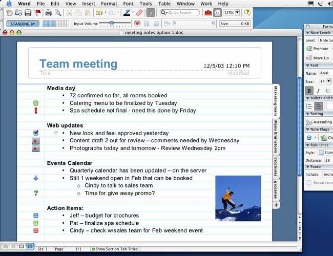
Yep. It could definitely be improved… Your workaround will also work, but only as a one-off for the odd project, not as a workflow to be used daily (that would drive any heavy pro user crazy). By the way, here are some examples of that feature on older software… It's not as good as full-blown video, but you can see how all of these apps respect the window chrome and force it from under any docked floaty bits: FreeHand MX 2004 with invisible toolbars (because I had Stuffit selected as the active app): FreeHand MX 2004 with visible toolbars (and also a nice example of a very old multiple-artboard document with universal layers – *wink-wink* *nudge-nudge* – which I did back when I was still a designer foetus, in my third year at the uni): I didn't have to do anything to avoid the window chrome from going behind the toolbars; when pressing the Zoom button, it would just snap to their left edge. As for the panels, the only thing I missed was the vertical scrollbar and all the scrollbar buttons and resize handles, but as I had, like most people, a scroll wheel mouse (actually, I already had an Apple Mighty Mouse by then) that was no biggie. In any case, Illustrator CS3 solved that for good, as docked panels automatically resized windows to fit along their left edge, too. Office X for Mac, taken from this article, which also explains the whole earlier Word 6 for Mac debacle, which, if I'm not mistaken, didn't include floating toolbars and irked Mac users to no end also because of that): Again, the toolbars, when snapped to the edge and to one another, wouldn't allow the title bar to go under them, no matter how hard you tried. I can't absolutely recall if that was the case, but I'm guessing that that floating panel on the side also stopped the Zoom command on its tracks along its right edge, too. And now, for a more modern app, FontLab VI, in both full “single window” and “separated” mode (they're not really called as such, but you can reproduce both by manually docking the toolbars to the sides of the screen or to the main window): For a bit of context, FontLab VI is based, of all frameworks, on Qt, for crying out loud! The very same framework used to produce that Soulseek Qt abomination. The difference here being that Adam Twardoch and his buddies have been working on a cross-platform (i.e. Mac+Windows) suite of apps for decades now, and fully respect the expectations of Mac users because they have all that prior knowledge and do care. IMHO, and no offense, but Serif devs seem to suffer a bit from the Dunning-Kruger effect when it comes to Mac-specific UX and UI; sure, they are excellent coders, and they indeed managed to produce a miraculously fast and smooth render engine and a boatload of tools to go with it. But for all their expertise, there are probably no first and foremost Mac devs/product managers over there a day older than 35 (i.e. who started coding for the Mac before 2005-ish); otherwise they would probably know just how important these details are for Mac users, and sweat them with nary a thought because they would know the good ol' Apple HIG by heart, too. I would strongly advise Serif to interact more, and compare notes with the guys from Panic, the Omni Group, John Gruber from the blog Daring Fireball, these guys from FontLab Inc. who I've just mentioned, Georg Seifert and Rainer Erich Scheichelbauer from Glyphs.app who I also mention on occasion, etc. Indy Mac devs – both Mac-centric and cross-platform but with a strong Mac tradition – who aren't even their competitors and who really show they care in whatever piece of software they put out there. I, for one, feel a bit betrayed sometimes; Affinity started out as Mac-only, but never really felt 100% like it, and that perception hasn't changed one bit. The preferences window still looks odd through and through, as do the gradient transitions on titlebars because of the custom UI gamma thing and dark/light UI before that was even a system-wide thing – I'm guessing Serif eschewed native interface elements and conventions so they could implement those features, which would also explain why the window borders and titlebar corners looked a bit off during the transition to Mojave; on the other hand, Adobe CS/CC has always looked weird for similar reasons, so… meh –, but you know what? I've already let that kind of nit-picky UI stuff slide and am willing to live with it – again, see my comments regarding CS/CC; I really stopped caring a long time ago, and as long as apps aren't broken by design to the point they use crappy Flash-based panels (yeah, Adobe really did that a lot at one point) and don't react properly to a keyboard (Affinity apps had, and maybe still do, some issues with tabbing between panel fields, by the way… and then there are all those modifier key inconsistencies with bundled or otherwise first-party macOS apps I keep harping on about) and a multi-touch mouse, I'm good. I've been focusing mostly on UX instead because, at the end of the day, that's what really counts and affects one's daily grind, and this incomplete and cumbersome Separated Mode is, accordingly, yet another hill I'm willing to die on. If FontLab Inc. devs managed to do it properly – and on version 6.0.x and using a completely different framework than the Carbon-based one, probably some arcane Metrowerks CodeWarrior nonsense or something, they were were used to, no less –, so will Serif's team, eventually.

-
Ok, let's address these separately: No, I do not have a video example yet, and unfortunately I shall not be doing one of those until after the 24th, as I have a keynote presentation to make, hundreds of pages to print and annotate and a few books and papers (including my entire dissertation) to review yet again. But I'll try and do a few after that, in between sending out CVs and going on vacation. As for the second one, it depends on the app; Safari, Finder, etc., (i.e. apps that open multiple windows, but which aren't necessarily documents) allow you to open new windows in a “old-school” way (usually cascading, though when they are full height they open side by side) by pressing Command+N, and tabbed, by pressing Command+T, whereas Photoshop allows you to set the default as a global preference. In either kind of app and default setting, you can always dock and undock windows from tabs (though in the Finder and Safari, to dock single windows to a different window you must have “Show tab bar enabled”. Now, the entire CS suite, traditionally, worked in a Application Frame-less state, with docked/floating toolbars, toolboxes and panels, and floating document windows that, when zoomed, would automatically fit the available space, as long as the Workspace (i.e. the Studio, in Adobe's parlance) was fully docked. The intermediate step, if I am not mistaken, was the addition of tabbed windows. And the ultimate step was the addition of an Application Frame, which looked and worked precisely like all versions of Adobe apps since Illustrator v.1 on Windows, Corel on Windows, and Affinity's default mode since its inception on both OSes. But, to this day, you can still work with Adobe CC's DTP portion (the old Design Standard/Premium subset of the larger Master Collection, which equates roughly to Affinity, except for the added bonus of Acrobat Pro) in that “classic Mac” mode. I've since stopped working in that mode in Illustrator and InDesign, mostly because of the advent of Affinity (so I would get used to the Application Frame, because Affinity's Separated Mode was and still is suboptimal), and also because I get spoiled with my 27'' iMac with 40 GB of memory and open too many windows for Exposé/Mission Control to be useful (though I usually work around that by using a dedicated desktop just for DTP apps) but I keep working in that mode in Photoshop. There's no other way to easily move entire layers across documents, period. And there's no split document view/automatic tiling on Affinity Photo, either, so… Yeah, things look a bit bleak. I tested Affinity Photo the other day for a pro bono project (basically I was recreating a vaporwave filter a friend of mine used on some Android app, except on a proper photo editor and with the original, full-res image), and I did have to compare two files side by side, which forced me to fidget with window resizing operations to get my views just right, something which, on Photoshop, would've been a breeze. Now imagine if I had to an operation across four different files at the same time or something? Imagine if I had to do that every day, for 8 hours? So, in a nutshell – and, unfortunately, only in screenshot form, and not video screen capture –, this is what I wish for. I would like to see toolbars docking to the edges of the screen, and windows not sliding behind them (whether when performing the Window>Zoom/Option+Green button command, or when manually dragging the title bar behind them), just like in Adobe CC and other old school Mac apps. Seriously, try it out on any Adobe app on a Mac (you have to turn off the Application frame first, though; it's akin to Separated Mode, except… it's functional, useful and most definitely intuitive and not frustrating in the least): when the viewport zoom level is small, the windows will neatly wrap around the content, when it's high and makes the canvas exceed your screen size the windows will neatly snap to the docked UI elements, and then you try and drag the windows behind them, no matter how far you push them, their titlebars will always snap back into full view. And this is good, well-researched UX. Is it too much to ask?
-
Yes, that's what I eventually resorted to doing, too. Except then I end up with one (or multiple) extraneous object(s) which I then have to delete. It's an extremely cumbersome workaround, which becomes vastly impractical with larger, multi-object selections (or, worse even, selections of objects which then obscure or are obscured by others). You see, most of my proposed solutions – which are, in a nutshell, reimplementations of stuff Adobe already did – make sense, are well thought-out and can save a lot of time. Which, for all their other failings, is a testament to Adobe's developers' foresight. These aren't just “entrenched Ai user behaviours”, as if that's a inherently a bad thing or something; they are about the only practical and logical ways of solving certain use cases. Ghost objects – whether they are a ghost of the “before” or the “after” – and self-snapping are useful and, in some cases, essential features, period. And workarounds sometimes just don't cut it.
-
I'm obviously not 100% sure, but I reckon it wouldn't. Is there anything forcing developers to implement it by default? There are many apps which, to this day, still don't support fullscreen mode as a design and UX decision, and Apple hasn't ceased promoting them. Besides Illustrator and, more importantly, Photoshop (duh… and there's a reason for that, so users can do precisely what I described above and compare images, drag layers and other stuff across documents, etc.), I can name a few other examples, if you wish. And it's not like Apple is enforcing the HIG with a stick and eschewing apps and developers if they fail to comply at every step of the way (Affinity being the most glaring example; it suffers from a lot of un-Mac-like decisions and behaviours and, yet, it's consistently put by Apple high up on a pedestal at every opportunity – like, say, WWDC, their app stores, etc.… As long as a developer takes advantage of their latest tech and SDKs, Apple really doesn't care if they veer off of conventions slightly, especially if it makes sense and doesn't break something else, and that really doesn't seem to be the case here). As for the workaround you suggested, I already addressed it in my first comment. It doesn't work properly. When you Option+Click the now mostly “Fullscreen” button, the window indeed doesn't go into Fullscreen mode, yes, but the button still behaves as a MS Windows “maximize” button (something which, on the Mac, should only ever happen with single-window apps just like Affinity apps themselves while on single-window mode, iTunes, Calendar, etc.), and not as Window>Zoom should behave as per the HIG. When performing Window>Zoom on a floating document window, the chrome should always toggle between default/custom (it starts out as a default size and once you resize it, the coordinates and size are saved somewhere) and fit-to-content sizes (I'm not even sure how that would work on Designer and Publisher, but if you were at such a small zoom level that all your artboards/objects/pages fit on your screen, I suppose the window could shrink to fit them; as for Photo, make it behave the same as in Photoshop, period). I didn't want to go there, but you forced my hand; I'm sorry if I come across as rude or something, but please don't argue with a veteran Mac user who studied UX in higher education, or if you do at least take the time to properly decode what I've said. I know my comments are long, but the information, albeit a bit drowned in fluff and asides, is all there and it's entirely factual and correct. As I've said before, I'm no expert, in the sense that I didn't take a full degree like the postgraduate one some former colleagues of mine are now teaching, but I'm a bit of a UI history buff myself (all the way back to Douglas Engelbart's famous mouse demo and the Xerox Alto) and I know without a doubt a badly implemented Mac app, professional or otherwise, when I see one. I've strongly, persistently and informedly complained about this and other issues (which you've recently saw me rehash on the forums as well) more than four years ago, and they all went unaddressed. As I've said before, I'm unabashedly sticking to a bit of a program here: not giving Serif devs a moment of respite until I'm no longer available to badger them with these requests or until they do indeed address them (whichever comes first, and right now I'll have to go offline so I can prepare for my viva voce on the 24th; after that, it's a complete blank, and maybe you'll still see me around, or maybe I'll be gone to work full-time somewhere, pursue further research opportunities, whatever). To recap: Serif's implementation of Separated Mode seems to be completely lifted off of other “lite” apps such as Pixelmator, and, thus, suffers from the same glaring limitations and “un-Mac-like behaviour”, instead of going full-on against the 800lb-gorilla-beast-thing like its marketing seems to imply. It feels like an afterthought, like something which the devs themselves don't really use daily and, as such, never got to become frustrated with, and it's not nearly as useful or practical if it had been done right in the first place. And for examples on how it can be done right, it's not like there aren't hundreds of apps, both old and recent, an official Apple HIG and nagging veteran users like myself to learn from. At this moment, Serif devs have zero excuse not to get this right by at least, say, version 2 or 3 of the suite (yes, I'm indeed giving them some leeway here, as I remember Adobe CS' palette implementation, for instance, being a complete, all-over-the-place “flustercuck” until CS3, with internally inconsistent implementations such as those weird InDesign's CS/CS2 sliding tabs). Huge screens, floaty UI bits – some of which could and should be dockable, even in separate mode – and pro photographers and designers wishing to tile their stuff, automatically or by hand, on their Macs aren't going anywhere, no matter how many million iPadOS-powered iPad Pros Apple ships, so these features should at least be tucked into some internal roadmap of theirs somewhere. Anyway, my job here is, for now, done. I'll point whatever easily fixable bugs I find here and there (and you may have noticed I'm already doing that much more frequently, again) if I keep testing Affinity apps, but hopefully these last few posts cover my biggest, “foundational” gripes with the suite (if you put them all on one table you'll recognise the two running themes are “inconsistencies with the host OS” and “inconsistencies with sound WYSIWYG behaviours well accepted and established across the industry” which Serif looked over or, worse even, created for no good – or overall positive and justifiable – reason; those are the biggest factors which, historically, made Mac – and pro – users eschew altogether or otherwise tolerate through gritted teeth certain software packages – never forget Word 6! Ai versions in general in the eyes of former FreeHand users! QuarkXPress during the OS X transition! The list goes on… –, as I've said before, perhaps Serif would have even more happy users, right now, if they addressed those). I would indeed love to be able to make more video demos, but considering all the work I have to do over the next two weeks, you guys are on your own for now, sorry. If you want to see how proper Mac apps in “separated mode” behave, fire a an old Rosetta-compatible Snow Leopard VM (there are some pre-packaged ones lying around, I'm sure), or Basilisk II/Sheepshaver if you want to go even further back (and yes, I know that would be venturing further into Mac OS Classic/Carbon territory, but it's still possible to do those under Cocoa – Adobe CC being a prime example of that, and it works perfectly –, and it should be done if and when it makes sense), download some old abandonware and see for yourselves. Do your own research, please. That should be your job, not mine.
-
Hi guys. Once again, I'm sorry for overusing my “CRITICAL & OVERDUE” “tag” of sorts, but… until the end of the v.1.x cycle, better get used and pay attention to it. I'm reserving it only for the most glaring omissions, especially those which damage Affinity apps' reputation the most as professional tools. Anyway, I digress; what I'm asking is: please make Affinity apps (especially Photo, where it makes the most sense) under Separated Mode behave like all Adobe apps when the Application Frame is disabled, FontLab 5.x, Microsoft Office X/2004/2008 for Mac, AppleWorks, and pretty much every classic Mac app with floating UI elements since 1984. Nineteen-freaking-eighty-four; those are thirty+ years of muscle memory for some users (in my case, it's only a respectable 16, but still). Floating palettes and other UI elements have a reason to exist, but they also should work in a sensible and intuitive fashion, otherwise you might as well not have them at all. If you decided to implement a “Separated Mode”, at least take the time to fully learn, understand and respect Apple's Human Interface Guidelines (and, by extension, Mac users). Don't make the same mistakes Microsoft did with their infamous, universally-hated Microsoft Word 6 for Mac (source: https://blogs.msdn.microsoft.com/rick_schaut/2004/02/26/mac-word-6-0/ ). As it stands, the Separated Mode is very cumbersome, forcing users to painstakingly resize windows by hand, one by one, so that they fit on the screen and fit their content, aren't obscured by the floating UI elements (which forces them to switch to another app or toggling the Studio just so they can grab their titlebars), etc. Making them dockable and properly coding the document windows and Zoom behaviour to prevent those scenarios would allow one to open several windows in cascade, side by side, tiled, etc. I should add that the Window>Zoom command/green “+” titlebar button is not MS Windows' “Maximize”!!! We all know that Serif devs come from a Windows background, and this is a common misconception former Windows devs have, and a common error they commit, when porting their apps to the Mac. To make matters worse, the Affinity apps actually started out as Mac-only but never even behaved properly as such, ever. Please make that button behave precisely like in Photoshop, Preview, TextEdit, Pages, etc. Will it be inconsistent with the Windows version? Maybe, yes. But it should, first and foremost, be coherent with the host OS. On the Mac, that command/button should be a toggle between a default/custom size and a “fit-to-content” size (which can be very useful in Affinity Photo, and which I constantly use in Photoshop, Preview, etc.), and not a “maximise button”; for that, we have the default Fullscreen behaviour. Better yet: under Separated Mode please disable Fullscreen for the green button and make it Zoom (properly, please) by default. Seriously, try activating Separated Mode and opening a document window in Fullscreen; it's not very useful and doesn't bring much to the table, functionality-wise, over opening the app in regular mode and making it Fullscreen am I right? I'm willing to bet that maybe 0,0001% of your users ever turn to that particular combo… At least, please allow the user to set the default behaviour under Preferences. Yes, I know this is no longer the default “green button” behaviour in macOS, and that Apple is pushing us heavily towards Fullscreen mode. But seriously, until Apple disables it altogether (and I reckon they never will, as they keep selling huge iMacs and now will start selling the even bigger Pro Display XDR, which will be a massive hit with pro photographers), please implement it correctly for the users who still use the Window>Zoom command. It's the least you can do as a self-respecting Mac developer.
-
Hi guys! Yeah, that pretty much sums it up. I was rearranging my Studio panels across the suite so that they would be somewhat similar on both Single-window and Separated mode, and I realised Publisher was missing the Cmd+Opt+F shortcut for that toggle which is already included by default on Designer and Photo. I manually added it back via System Preferences, but having it set by default on Publisher as well is obviously the optimal scenario.
-
Hi guys. Basically that's just it, what's on the tin. I was fooling around with my new Huion tablet drivers and realised that that essential shortcut for a multi-touch-less workflow – I've since stopped using my Bamboo Pen & Touch, and besides my H950P I only have a Magic Mouse connected to my iMac – was MIA (it's present and fully functional on both Designer and Publisher on their default personas, and also on their respective Pixel and Photo personas). Can we expect it to be back on the first 1.7.0.1 fix?
-
Affinity Publisher Public Beta - 1.7.0.376
JGD replied to AdamW's topic in [ARCHIVE] Publisher beta on macOS threads
Hi guys. Despite all my latest criticism on the suite as a whole, and all the delays in Publisher in particular, your progress on the latter lately is absolutely commendable, and I must say that I am very happy with its current state (cool new splash screen too, by the way), as it does feature some essential features for longer texts, which may come in handy if it's released in time for my next project. The number of “must-have” stuff you managed to finish in time for the GM is, indeed, impressive, and I can only hope you keep up this level of work across the suite. Now, as for the pre-order pricing and installation when it finally comes out, I have just a practical question: how exactly does the whole payment and download situation work on the Mac? Does our pre-order give us access to some sort of Mac App Store download redeeming code or something? Or are we buying the app directly from you and then have to update it internally like with the betas? -
Oh, another thing: even if we accept the Command+Drag as the default behaviour for duplication operations as a fatality, let me just add that it is extremely buggy as of now in the latest v.1.7.0.12 beta. If the operation is done too quickly, AD will not duplicate the object and, instead, just drag the original, which makes it extra frustrating, to say the least. That was not an issue in the MAS version, and if this latest beta is already an RC, as I've read elsewhere, the next MAS update will come with a new bug right out of the gate.
-
Also, on this subject, I should add that, for consistency and usability, objects should already snap to their originals when doing Option+Drag duplication operations, which is already their behaviour when performing Command+drag operations. And I've just realised, while looking at the status bar messages, that apparently Command is [now? Since v.1.6? Since… ever?] the default modifier for duplicating and Option the default modifier for ignoring snapping. This, per Apple's Human Interface Guidelines is completely unacceptable and inconsistent with the behaviour in the Finder and pretty much all macOS apps. When you click and drag an icon (or an image or block of text in any text editor, like TextEdit or Pages, or any object in Keynote) while pressing Option, you will always get a duplicate, and when you click and drag the same icon while pressing Command, in a window – or the desktop – with “snap to grid” activated, the Finder will ignore the grid (and so will Keynote regarding snapping, if you're dealing with objects). WHY should Affinity behave in such a blatantly inconsistent way with the rest of macOS? It started out as a macOS app, first and foremost, and if you really must have it be consistent across OSes, at least allow the users some degree of finer control as to how modifier keys affect its operation. You don't want to become the new Adobe (or, worse even, outdo them) when it comes to OS-app UX inconsistency, trust me on that one. Designers do not take that lightly.
-
Hi again. This is a rehash of yet another feature request I made more than four years ago, which is still preventing me from working in Affinity Designer in a sensible fashion. As you know, Ai implements drag operations in an '80s/'90s style “ghost” drag model (not unlike the Classic Mac OS window and icon drag model). The WYSIWYG part of the equation is the original position of the object, while the new position will be shown as a “ghost”, i.e. an outline, which you can snap to the original position of the object. This behaviour, while not being completely WYSIWYG or very elegant, is VERY useful, especially – but not limited to – when doing modular typography. Affinity Designer, on the other hand, features a completely WYSIWYG drag mode, in which no “ghosts” exist. You just can't snap an object to its initial position, period. This is suboptimal, and forces the user to use impractical workarounds, such as duplicating objects instead, or to rely on complex grid arrangements, which may be overkill for simpler projects. [For some context, InDesign features both Illustrator's drag model, when you perform a quick click+drag operation, and Affinity Designer's model, when you perform a longer, click+hold+drag operation.] My suggestions (either a single one of them or a combination thereof) as to how this problem can be solved are the following: • Add a toggle in preferences so a different drag model can be used instead of the current strictly WYSIWYG one; • Allow users to perform a different drag model, perhaps like in InDesign, by holding the position after clicking and before dragging, but reversed (the preferred default model should still be a selectable option, as above); • Allow users to use the Command+Drag operation to temporarily activate a ghost of the initial position (currently, this shortcut duplicates the object, which makes zero sense as the Option+Drag shortcut already does this and there's no need for two redundant shortcuts for the same operation). As before, if you want me to make a little demonstration video of the intended behaviour, I'm more than happy to do so.
-
Well, that much I can say about InDesign, too. I rarely use layers on that. There's probably one or two complex and recurrent projects I've used them on, but that's about it. However, in Ai, that's a whole different story… I just can't work without functional, universal layers in about half of all my projects. And on AD, the only workaround I can think of is treating it like Ai CS2 and just ignore artboards altogether until I need to export stuff (which can be a bit of a bummer if I'm working with a client and need to show some .PDFs along the designing process, by the way).
-
Arrowheads please. . .
JGD replied to bpedit's topic in Feedback for Affinity Designer V1 on Desktop
Ok, some observations on the feature, which I may eventually use one day for the aforementioned kind of projects (and, indeed, the kinds of arrowheads available right now do seem to be mostly geared at technical drawings rather than “artistic” stuff): What I like: the fact that you can see the arrowheads in outlines mode. It really helps a lot, since in the projects they are most useful in their current state, that's also where that mode frequently comes in very handy. It's also a nice preview of the Expand Stroke command when working in that mode. So, kudos on beating Adobe on this particular point, as it's already shaping up (ha!) to be nicer overall. What I don't like much, but understand it's probably not to be expected in a v.1.7.0 implementation, as it's so new: you can't have separate “within the line/at the end of the line” parameter settings for head and tail, but must instead select it for both. Seeing how there's an “origin” terminal, it would make sense to have, say, that one “at the end of the line” on the tail, and an arrowhead at the other end, “within the line”. A small panel reshuffling would be in order, as the “swap arrowhead with tail” button would have to give way to a duplicate pair of radio buttons for that parameter (maybe by getting rid of the “Start:” and “End:” labels altogether? I mean, that portion of the stroke panel is pretty much self-explanatory)… And, by the way, the “swap…” button should also swap that parameter along with the corresponding arrowhead. Since I've mentioned Adobe before, I just realised Ai does not even allow for this option. Should you choose to implement it, you'd actually be one-upping them. Also, and I know I'm going out on a limb here, I've just realised that the “cap” on a stroke is just another form of terminal (please pardon the typographic jargon, but that's just how my brain works). What if you consolidated the panel further and got rid of those three “cap” radio selectors altogether, while changing “arrowheads” to just… “terminals”? The “square” (or, in Ai jargon, “projecting”) cap could just be achieved by using that parameter, with the added bonus that you could also have a round cap with the outermost node contained within the stroke, and different caps on different ends. Again, that's something Ai can't do, and which could be very useful in diagrams like the ones I've shown you on the other thread (and please, oh please, do add triangular caps/arrowheads that don't protrude further than the stroke, while you're at it; I know it could also be yet another form of “cap”, but the arrowhead implementation is just so much more flexible right now and could become even more so if you added that suggestion). The only issue I could see with this would be… now that you've opened the whole outlines view can of worms, how would those caps display? But eh, I suppose that would be a little inconsistency (either the caps would not be visible at all, or be visible and appear as “arrowheads”, as the strokes/stroke bounds shouldn't appear in any case) that wouldn't hurt users that much. -
Indeed it has. Maybe you could take part in the discussion and chime in on those threads, even if it's just with your reactions? You see, it's also best to consolidate the discussion on those, instead of spreading it out across new ones. This is a pervasive issue across the entire Affinity range and it must be solved ASAP (as in, hopefully in v.1.8.x, as it is way overdue) if it is to be taken seriously. I've been seeing scattered users asking for this, but I believe there are many more of us than Serif devs suspect. Many of them may not even be reacting, but just abandoning the suite altogether after they finish their trial.
-
What feature are you alluding to, pray tell? Maybe I missed something, and/or I'm not fully understanding your comment. As for the development strategy, I do believe you can and should have a mix of both. Yes, you must adhere to some sort of over-arching strategy, lest you give off that aimless vibe I was talking about before, and not just pander to whatever preconceived notions of your audience, as that would also devolve into the whole “giving them a faster horse” thing. On the other hand, you really should listen to your user base if they flat-out tell you that one of your ideas is completely nonsensical and hinders them more than it helps them. Yes, even if that means buckling to one of said “preconceived notions”, because not all of them are inherently bad/wrong. I can absolutely guarantee that while Adobe's implementation of multiple artboards isn't as elegant as it might have been (Freehand's, as far as I can remember, was much more so, as you could even select and focus on the damn things directly on the Navigation panel, and I can't for the life of me understand nor accept how Adobe, being the sole owners of Macromedia's entire IP, couldn't have straight up lifted the entire UX from FH and put it into Ai after all these years), the overall layer concept and its relation to artboards is more flexible, WYSIWYG and intuitive. And that's not just for me, but for the entire combined mad-at-Adobe-because-of-CC Ai, former-and-even-more-disgruntled-because-of-the-Macromedia-takeover FreeHand, and curious CorelDRAW user base that Serif seems to wish to attract judging from their marketing (even though, in all fairness, they seem to be gearing themselves towards the Pixelmator and Sketch crowd with the actual product). And it's a very safe extrapolation for me to do because I happen to have used all three applications throughout my career, and so did many of my colleagues (CorelDRAW being very popular in secondary education in my country and elsewhere in Europe, I believe, and the former two in undergraduate and professional education since time immemorial); I really feel dead sure that Serif's management and devs are shooting themselves on the foot with this. Unless, of course, that is a remnant of Draw Plus' UX, to which I also say – much to the chagrin of Plus users, which I know are also a bit disgruntled – good riddance. They weren't afraid of distancing themselves from their old suite in the past, and if it's the case again they shouldn't be now, either. In any case, whether it's a rehash of an old idea or a brand new one, this whole lack of universal layer support and “artboards-as-containers” thing is the proverbial hill I'm willing to die on. Users are willing to tolerate drastic changes/omissions to their tools, and even to the UI (Corel's, for instance, is very different from everything else, with those ridiculous panels that only open one at a time and waste huge amounts of screen space, and that's one of the reasons I personally didn't wish to go back to it even if I had the chance – and, in fact, I now do once again –, but if I was forced to at least I would be able to, you know, do my job somewhat unhindered; and I guess the same goes for Quark, even with its likewise stupid, non-standard keyboard shortcuts, and its limited tool set…), but there's only so much divergence they are willing to accept and live with when it comes to core features and workflows. And if those changes/omissions render a piece of software useless for half of their projects, it's all but guaranteed they will just ignore it or, worse even, if they are reviewers or influencers, outright pan it. Once again, my mention of Corel and Quark isn't that innocent, either. Right now, Adobe has real, cross-platform competition from three different companies, and while Serif is the only one which offers a comprehensive and affordable suite that also runs on iOS, the other two also offer perpetual licenses, so if you're that mad at Adobe you could, in theory, buy a CorelDRAW suite and a QuarkXPress licence and have, right here and right now, a complete, mature, industry-standard and cross-plaftorm solution on desktop hardware. Ever since CorelDRAW came back to the Mac, this scenario became a serious existential threat to Serif, IMHO. No matter how expensive those products are, we all have to face that reality head-on, because… guess what, schools can get those software packages at a reduced price, too. On the other hand – and I'll say it again –, judging from Corel's feeble commitment to the Mac and Quark's abysmal response to Apple's technological transitions in the past, the upcoming transition of the Mac to ARM-based A-series processors is a golden opportunity for Serif. But that will only work in their favour if their product is ready for competing with the “big boys”, which, no matter how good their sales figures may look, I feel it still isn't. Edit: even with the latest “2 million users” milestone revealed at the Serif Keynote, I'm not budging on my last statement. How many of those two million bought Affinity apps and then left them in the drawer? Are those stats for customers, as in people who purchased the apps, or individual active users in the last “x” days? And how many of them are just dabbling with the apps while they get up to speed, instead of being heavy, daily or near-daily users?