

DavidDoesAffinity
-
Posts
92 -
Joined
-
Last visited
Posts posted by DavidDoesAffinity
-
-
Adding to this request, I am a Video editor who uses Grass Valley Edius. Grass Valley are a big player in broadcast hardware and software. particularly in the US. Whilst it may not be as well known as Adobe it is as stable as Nelson's Column. It's users needless to say are not Adobe fans. We have requested support for aphoto native files but have been told by GV that there is no Affinity SDK. The GV forum mods (GV employees) are big fans and users of Affinity and like many users would love to see it supported. Of course PSD and PNG etc can be opened by assigning Affinity to open the files on the timeline or bin but not being able to open .aphoto is a PIA and it's addition would be a game changer.
I am happy to put you in touch with my contacts at GV.
-
One of my video colleagues in Aus has been playing and come up with a 90/1 motion blur and I have to say it just works and my mission is over and I can get back to real work.
-
-
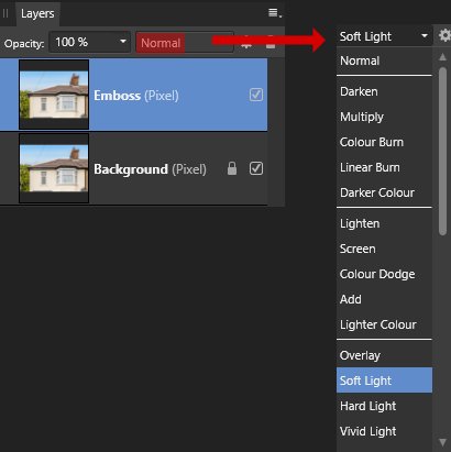
4 hours ago, Lisbon said:
I cannot guarantee that this will work. I would need a better quality image to be sure.
But you can try this.Its a destructive workflow, so start by duplicating the background, name it "Emboss" and change the blending mode to Soft Light.
Next go to Filters > Colours > Emboss
This filter will shift the edges.
After masking you can try to reduce the opacity of the "Emboss" layer to keep the maximum amount of details.
I fell at the first hurdle as I couldn't figure out how to get the blending mode Soft Light onto the duplicated layer as is. All
-
Thank you. I came across it yesterday. The one pixel shift was something I sometimes did in the days of SD. I'm still experimenting and learning.
-
6 hours ago, Old Bruce said:
I have had a fair amount of luck with a simple tenth of a pixel Gaussian blur applied to images and having that get rid of most if not all the Moire.
I will play some more. It is now a learning mission.
-
4 hours ago, smadell said:
If the roof resists fixing, why not just go around the problem? This took me about 5-8 minutes, using a New Pixel Layer and the Clone brush. With more time, a better result would still be an easy solution.
Which would be fine except that it is for an Estate Agent and has to be somewhere near not fake.
-
Thanks Carl
When you added the FFT was it constrained just to the roof area (I assume on an adjustment layer) or does it find the bits it will do the biz on...like a particular video filter I sometimes need to use?
-
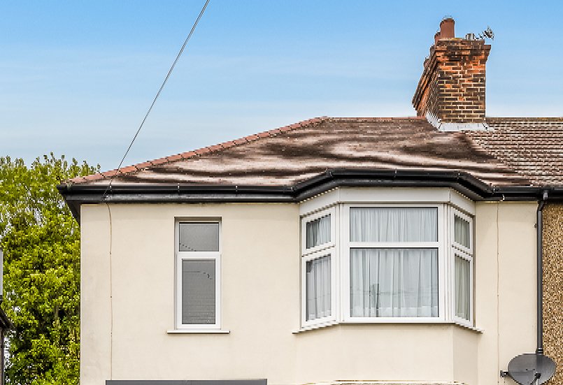
31 minutes ago, joe_l said:
I am afraid the G'MIC plugin with its moire filter does not produce anything better than your second image.

Arghhh! the second image is effectively a crop from the original. Well it was worth a try.
Thanks for your advice.
-
I have tried to find a suitable FFT Denoise tutorial but other than the manual (yes I did RTFM) I cannot get anywhere.
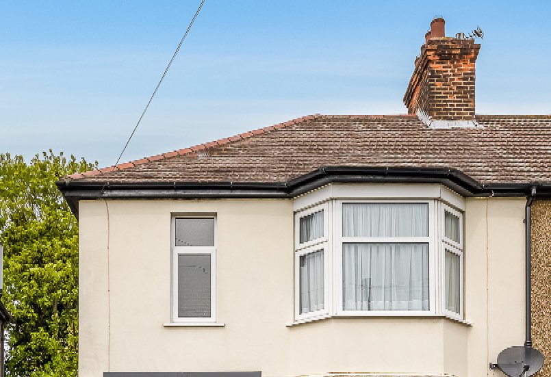
I was asked if if I could advise an Estate Agent who was putting together animated stills of a property and it was under attack from Moire patterns. Front aspect of property with tiled roof.
It has now turned into a "mission"!!!!
I was sent samples and was surprised that they had done nothing wrong. Both video size and data rate were good. The stills were razor sharp so my first port of call was to put the still in my old Photoshop and use the deinterlace filter. It certainly showed the problem whether Upper or Lower field was selected (in PS filter). (I don't think such a filter exists in A Photo).I then turned to tools within my Video editing software to animate and was able and to tame the problem, using a cocktail of two filters.
However, as I was now on a "mission" I turned to Affinity to see what I could do with the original pic. The problem is the tiled roof so any filter I needed to "Paint" on the tiles only. At that stage I was out of AP skillset!!!!
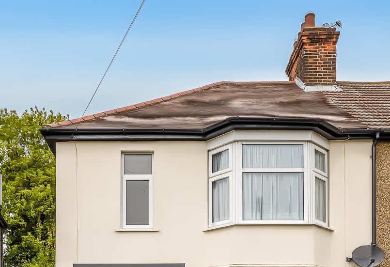
The Deinterlaced file (PS filter) shows the inherent problem.
Thanks for any links, advice etc. As I said I can resolve in my video software but want to explore all other remedies.

-
-
I seem to have lost a few Presets I thought I had in My Presets. (PC Photo and Publisher) Just made a new one but cannot for the life of this old git remember, how to save into "My Presets"
Thanks
David
-
Hi Walt
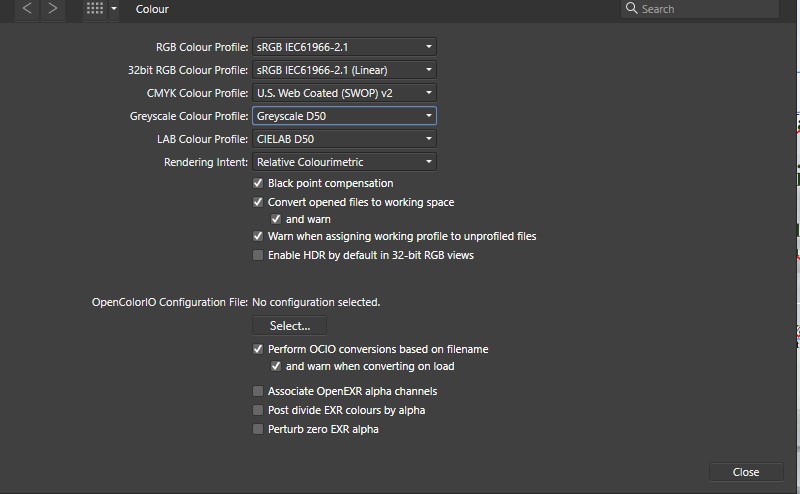
Apologies for the delayed reply. Colour space would have been the default profile from a template I made when I started using Publisher. Attached
Printer is a Brother Laser L8260. Sadly there are black holes in my knowledge of print colour space. Video ... 35 years experience but sadly a local print shop that could have helped me sort this, closed last year ironically 3 weeks ahead of the Covid lockdown.
EDIT: As a test this morning I printed the sleeve in 3 layers. 1 Background in colour, 2 overlay "watermarks" in B&W and 3 the rest of the layers in colour.
PIA for sure BUT it now looks as we envisaged it
-
Here I am trying to be subtle, designing a DVD sleeve for a project nearing completion and the idea was that a couple of old photos would be used as what I would call watermarks. Using Publisher and Photo on the PC the screen image is sublimely subtle, or in Essex speak "looks well bloody good".
The print out produces images much darker and have a red tinge.
I have tried reimporting them as Grey 16 but they still are way less than acceptable.
Any words of wisdom or should I scrap subtlety and change the design and have a beer?
I would add that the background across the whole page is a silk texture that I have switched off. ie it's currently white.
-
I came across this scanning "shortcoming" recently. I thought I had missed something and used the scanning utility (PC) that came with my Canon MF scanner.
Are there any advantages by using VueScan or SilverFast over the Canon utility?
-
I should have been in Publisher...but for whatever reason I wasn't. I'm a PC user whose Braincell must have been on Windows 3 when I opened the file in Photo. I guess it's one of those errors you do once and don't do it again... without the "alarms" flashing.😁 Had the text frame been the right colour I may not have even realised I was working in the wrong app.😋
-
Thank you both for confirming I had not missed something obvious.
- walt.farrell and Gnobelix
-
 2
2
-
Cue violins! This morning I suffered a senior moment and found myself editing/modifying a Publisher DVD sleeve in Photo. I only discovered this after 15 minutes, when I could not find a way to change the colour of a text frame. Of course, once in Publisher, click click and done. Is there a way that I missed to change the colour of a text frame from within Photo?
Also on the subject of text frames, has anyone found any third party ones that can be used and modified from within Publisher?
-
Thank you all for the explanations...and also why I need to source a Unicorn or two.
All I have to do is remember it, the next time I need to create a gradient in A Photo 😉
-
A Photo on PC: I'm sure I'm missing something and search hasn't helped me.
I make a gradient BG ie Blue to white on a diagonal. I want to modify it but the gradient wheel does not reember my last seeing or the setting on the layer I'm working on.
Swearing at the screen has no effect. 🙄 What should I be doing so that I can modify my layer without starting the gradient from scratch?
-
Make sure that none of the apps are running. Also I think it is a good idea if you are having a problem to disable the firewall and antivirus is Windows defender.
-
Many thanks. I must try grouping again. Despite not having the BG included it was being affected. The lockdown may have affected a Braincell or two so will check later.
-
A search has taken me round in circles so apologies if I have missed the obvious.
I have been supplied with a logo that looks like a hand drawn script. it is white with a slight shadow.
I have split this into "bits" to do some simple animation. I wanted to adjust the colour to experiment with a different background. I made an adjustment layer but how can I copy that onto all my other "bits".
Thanks and stay safe.
-
As my proper work is on hold, I put together a photo montage (under the supervision of "the boss"). The Preview going out to my laser looked good (as laser previews) but when I printed on Photoglossy on my Canon MG 7500 Ink Jet the colour was way beyond awful. Paper and quality setting was correct but what else can I do. I'm printing direct from app. Should I rasterise, use a profile, print from a file etc.
Printing to my laser on a laser glossy also looks acceptable.
I would add the original plan was that these would be printed by one of my photographic shop clients on their kit but events have taken over.
Thanks and stay safe
David


Paper Format for Print - Size discrepancy?
in Affinity on Desktop Questions (macOS and Windows)
Posted
This maybe an uninformed 10p's worth from Essex but here goes anyway.
What driver are you using on your Brother printer? A few weeks ago, I had a problem with my Brother Office Laser on my work/home network and made it worse before it got better. I removed and reinstalled the printer but unbeknown to me it had used the Microsoft driver. All seemed to be great until a few days later, when I printed a custom DVD Case sleeve, from a template I have used 100s of times from Publisher, only to discover after trimming to the cut lines that it was was shrunk by 4%. Having established the doc printed fine on the Canon IJ, I replaced the MS driver with the Brother driver and normal service and size was restored.