Mithferion
-
Posts
1,646 -
Joined
Everything posted by Mithferion
-

DWG and DXF Export
Mithferion replied to Ash's topic in [ARCHIVE] 2.4, 2.3, 2.2 & 2.1 Features and Improvements
I don't work with this File Format but I've seen it being requested for so long. I'm glad it's here for those who need it and I hope the available support fits well in users' workflows. Best regards! -
Spiral Tool
Mithferion replied to Ash's topic in [ARCHIVE] 2.4, 2.3, 2.2 & 2.1 Features and Improvements
Really nice. Thank you. Best regards! -
Spiral Tool
Mithferion replied to Ash's topic in [ARCHIVE] 2.4, 2.3, 2.2 & 2.1 Features and Improvements
Hi there! Here is the official explanation video by th Affinity Team. You might find it useful: Best regards! -
Hi there! In preparation for the 2.3 release (totally unrelated, but just an excuse) I bring other Fonts that might prove useful for you: But first. I want to let you know that Inter reached Version 4.0. It includes the known Styles as well as a Display Fonts set. Now, the new Fonts: SANS SERIF - NeverMind SANS SERIF - NeverMind Compact HEADLINES - NeverMind Contrast The whole package of the NeverMind Super Family is in the GitHub repository. Included are several Typefaces from different categories. I only point here to the ones I see as the best ones. HEADLINES - Pretendard (Derived from Inter and Source Han Sans) HEADLINES - Seshat HEADLINES - Tilda Sans HEADLINES - Vela Sans (A better version of Manrope) SERIF - Alegreya SERIF - Cardo SERIF - Gambetta The main Topic has already been updated. Best regards!.
-
[ADe] Cartoon Monster - Replica of a work by Drawkman Drawkman
Mithferion replied to Mithferion's topic in Share your work
I love that idea: taking a child's work and do something from that, either in 3D or 2D. Best regards! -
Hi there! I came across with the work of Drawkman Drawkman, and I wanted to try and replicate one of his Cartoon Monsters. Most of this is flat vectors with slight usage of gradients in some areas and transparency. What do you think? Best regards!

-
Hi! I haven't installed the Beta but I'll ask blindly: is there an option to fix the background visualization for each Category? That way you'd have to adjust once for each Category. If that's not the case, I think remembering that setting would be appreciated. Best regards!
-
Spiral Tool
Mithferion replied to Ash's topic in [ARCHIVE] 2.4, 2.3, 2.2 & 2.1 Features and Improvements
This looks nice, and it has more options than the Spiral found in Inkscape. Hope it's added since I can see the benefits. By the hope, hope I can participate in this Beta run, Best regards! -
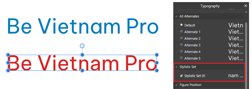
Hi there! Not much to add here, just a couple of good Typefaces: SANS SERIF - Be Vietnam Pro - It's a Neo-grotesque that has italics and it has single story and double story "a". SERIF - Sentient Best regards!.
-
Hi! Typography enthusiast here. It's a wonderful and a giant world. I hope I can help: I would ask the following questions, in the following order: What are the technical requirements of the Text? This means: Whats the language or languages that the Typeface must cover? Beyond Latin script, you might need Greek or Cyrillic scripts, for example. I use Spanish as my primary Language of work (Latin script with some aditional characters) What are the Numbers features that you are going to require? Do you need Old Style figures? Do you need Tabular figures? Any other? What are te Text formatting features that you need? Do you need Small Caps? Do you need specific weights for this project? Maybe you need Extra Black fonts or Lighter fonts? What are the stylistic requirements of the Text? This usually means if your project is best serverd by using one of these: Sans Serif (maybe aplayful one if you are doing something for kids) Serif After that, you can narrow down your search and find something that fits. This might provide some light. But, to be honest, Font Licensing is sometimes confusing. Anyway, long story short: Microsoft does not put any restriction for your use case: https://learn.microsoft.com/en-us/typography/fonts/font-faq But, when in doubt, use an Open Source Typeface (SIL). For Typeface selection, refer to my first answer. Also, for printed material, my clients are best served with Open Source Typefaces because it basically have no restrictions Either Sans Serif or Serif. Which ones I prefer? there are more than this but just to provide a quick list: Sans Serif: Inter Source Sans 3 Hanken Grotesk Metropolis Montserrat Noto Sans Serif Amiri EB Garamond Libertinus Serif Libre Bodoni Ibarra Real Nova Crimson Text Which Fonts people buy for Body Text? Well, depends on the Budget and what the Designer has picked for them. There are some Typefaces that are popular. There are some time-tested Typehaces that are classics that are safe to use but... Personally, the ones I use are intended for Logo Design (if the respective License allows it) Caslon is one of the classics, yes. And the version provided by Google Fonts is good, yes. It has one of the largest collections of Fonts, having acquired several Type Foundries it's becoming more like a monopoly. But nonetheless, sometimes they run Sales and they have very good deals. But if you are starting out, maybe you should skip that for a while. Best regards!
-
[ADe] 2.1.1 - Shape Builder Tool glitches
Mithferion replied to Mithferion's topic in V2 Bugs found on Windows
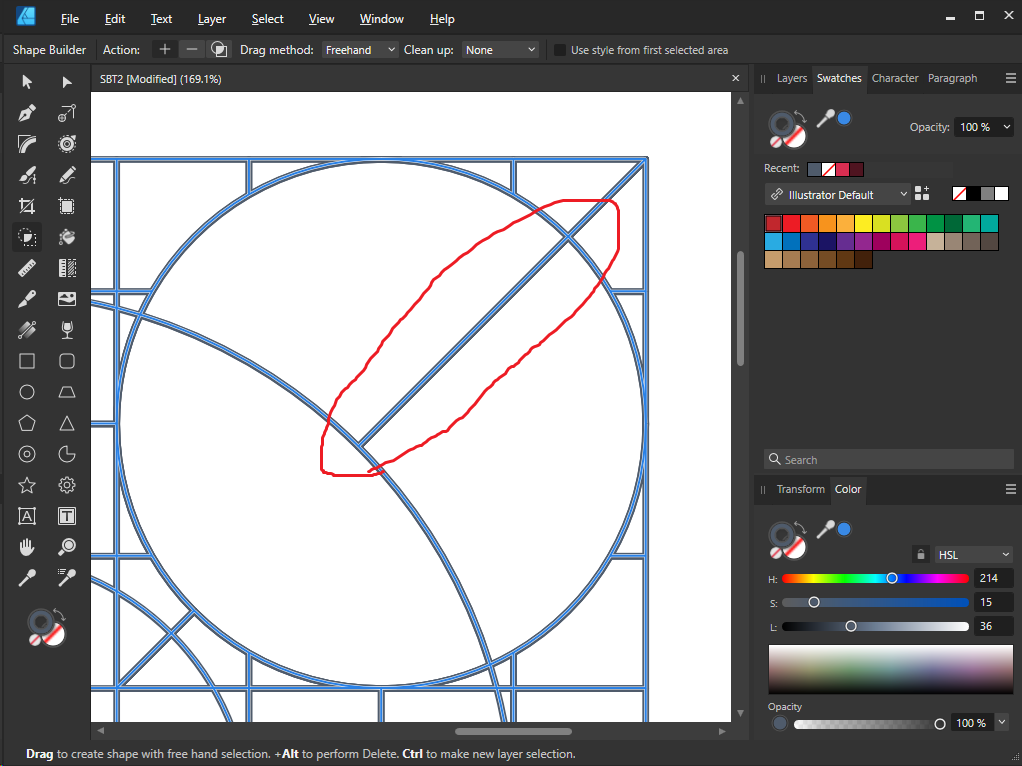
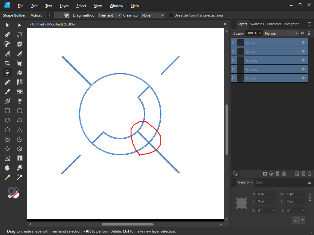
Oh, I didn't notice that! It did improve the experience overall. But still this happens from time to time. I have to click and drag again to delete it, sometimes even more than twice: Also, with less shapes, this happens as well: It mostly works well but there might be something to improve : SBTV.mp4 Best regards!
-
[ADe] 2.1.1 - Shape Builder Tool glitches
Mithferion replied to Mithferion's topic in V2 Bugs found on Windows
Hi! It helps to a degree, indeed. But still, I think it's worth investigating the issues, for a better SBT. Best regards! -
Hi there! I tried to find any similar Topic and I didn't, so apologies if this is a repeated report. When using the Shape builder Tool, in an scenario where there are multiple shapes it doesn't delete intersecting some areas or lines, as seen in the video below: SBT.mp4 I attach the sample files. Best regards! SBT2.afdesign
-
In Mexico, we would say "cuarto para las siete" to say "15 minutes before 7", or "veinte para las siete" to say "20 minutes before 7". Just as a minor curiosity. For what you mention, we would only say "a la media" (at half an hour) but only when both parties know what hour we are talking about. Following your example, it'd be 19:30 h. Best regards!
-
Since working at night as IT Support, all I can think of is from 00:00 to 23:59 h. No more am or pm for me, haha. Best regards!
-
Hi there! I couldn't resist to bring some more Fonts to the Forums (hope you don't mind). So, here we have: DISPLAY - Catallina DISPLAY - Moniqa DISPLAY - Rousseau Deco HEADLINES - Lexend HEADLINES - Margaret HEADLINES - Rondal SANS SERIF - DM Sans SANS SERIF - Satoshi SANS SERIF - Supreme SANS SERIF - Switzer SERIF - Zodiak The main Topic has already been updated. Best regards!.
-
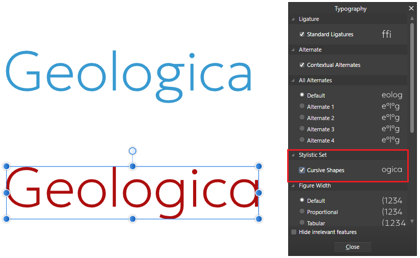
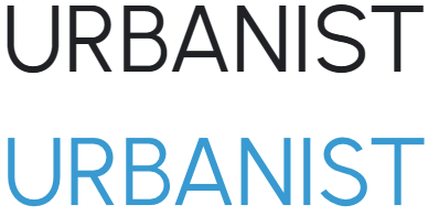
Hi there! Here we have a couple more Typefaces to add to the list. Two Sans Serif goodies this time: HEADLINES - Geologica - A good Geometric Typeface, saldly with no italics (maybe there is an update in the future). I installed the Auto variant of this Font, included in the Google Fonts download. You can have a more traditional geometric design if you select the Cursive Shapes Stylistic Set SANS SERIF - Urbanist - Another Geometric Typeface, but this time it includes italics. I link to the GitHub page because it has an important correction (at least to me) in the upper case S, because the one in Google Fonts has a wider top section that doesn't look that good: Best regards!
-
And... done. Best regards!
-
Hi! To celebrate the release of 2.1 (not really related, but well...), I bring another selection of Fonts to add to this list. BLACKLETTER - Fette UNZ Fraktur BLACKLETTER - CAT Walthari DISPLAY - QT Peignior DISPLAY - QT Bengal DISPLAY - MADE Mountain HEADLINES - Instrument Serif HEADLINES - Gloock HEADLINES - Wix Madefor Display HEADLINES - LC Sac SANS SERIF - Instrument Sans SANS SERIF - Wix Madefor Text I'll update the main list later. Best regards!
-
Affinity Publisher 2 for Windows - (2.1.0)
Mithferion replied to Patrick Connor's topic in News and Information
No problem at all installing this new version. Best regards! -
Affinity Designer 2 for Windows - (2.1.0)
Mithferion replied to Patrick Connor's topic in News and Information
This version installed without a problem. Best regards! -
Vector Flood Fill
Mithferion replied to Ash's topic in [ARCHIVE] 2.4, 2.3, 2.2 & 2.1 Features and Improvements
Some of the results on the video seem a bit random to me. I like the idea overall, but when shapes overlap... not so much. Best regards! -
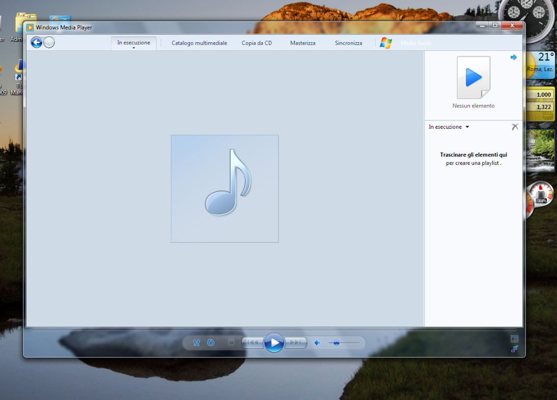
That's one of the Screenshots I used as a reference. But since that's the Windows XP version, it's not using the AERO interface. This is how it was on Windows Vista, with the frosted glass-liked window decoration: Best regards!
-
It sure is to me: I enjoy UI Projects I like looking at visual things and trying to reverse engineering them (that's what you do when you draw, basically) I like this Windows Media Player UI. I think it looks pretty Best regards!
-
What I would like to know is the Fonts name. I now there are a few Art Deco out there but… ehhh… it’s for a school work… Best regards!