Mithferion
-
Posts
1,646 -
Joined
Everything posted by Mithferion
-
Hi! Just to let you know that Renner* has been updated and now has more weights (18 fonts in total), and in the heaviest of them, it has an alternate for the lower case "a". Best regards!
-

Flip Horizontal Glitch
Mithferion replied to Mithferion's topic in [ARCHIVE] Photo beta on Windows threads
You are welcome! It’s nice to see all rough edges softened and all bugs gone. Best regards! -
affinity photo My First Digital Painting In Affinity Photo
Mithferion replied to Gecko1993's topic in Share your work
Hope it helps! Best regards. -
affinity designer [ADe] Design for a Tattoo
Mithferion replied to Mithferion's topic in Share your work
Thanks again for your comments. As you can see, I am kind of unfamiliar with tattoes. Best regards! -
affinity designer [ADe] Design for a Tattoo
Mithferion replied to Mithferion's topic in Share your work
Good thing to keep in mind. I have a question: do the clients come back to remark the watercolor part? Like some kind of maintenance? I have a rougher version, the one I made on paper. I will send that to the tattoist as well, and I hope we can talk in order to refine the design. Best regards! -
Another DXF IMPORT Request
Mithferion replied to S_Metzger's topic in Feedback for Affinity Designer V1 on Desktop
That's true. Designer is lacking in those areas, but if you have a broader view, you can see that the Affinity range lacks in more areas, like Format support. That's also another feature that's being asked for. And I'm confident that the folks at Serif took notice of it. I'm sure internally they have something like that. Why they don't shre it with us... well, maybe the dicussions would be even more passionate about why something goes first that the other, and they Devs would spend more time here answering (because people demand answers) than developing. So, I know how you feel, and things could be made better, but anything they do, it won't be enough. Best regards! -
Hi there! Well, I was comissioned to design a tattoo, with the following requirements: It's going to be placed in the inner forearm It has to be colorfoul, like with a watercolor effect Tribal style was allowed as an option It had to have the legend "je t'aime" The wolf is the main thing in the tattoo So, with that in mind, this was what I came up with. I drew it on paper, then I made the vector version in Designer. I used the DAUB Digital Watercolor brush for the colors (one of my favorites, by @paolo.limoncelli). The legend is written with Alex Brush font. It still needs to be reviewed by the tattooist, so changes might be made... what do you think? Best regards!
-
I believe here is the answer. Best regards!

-
affinity photo [APh] Cartoon Pirate - Finished art challenge
Mithferion replied to Mithferion's topic in Share your work
Indeed! I know how to draw, but with this I have another kind of challenge to polish my skills. Best regards! -
affinity photo My First Digital Painting In Affinity Photo
Mithferion replied to Gecko1993's topic in Share your work
Hi there! I myself am not an expert digital painter, but I believe you will benefit from these videos for beginners, also, check out that channel. Borodante knows about this. Now, composition wise, I can tell you this: The left eye of the character is too low; consider the perspective. About the layout of the speech and the legends: Use upper case for all the letters in the speech bubble, as that's usually the style. Also, since you are refering to the 20 years, you could groupe thm like I did. Also, I think the main message is the thanks you give to the author, so, I made this little excercise... In case you are interested, all the fonts used are free for commercial use. In order of appearance: Cinzel Komika Hand Bebas Neue Also, I attached the AFPHOTO file in case you are interested. Best regards! Excercise.afphoto -
affinity photo [APh] Cartoon Pirate - Finished art challenge
Mithferion posted a topic in Share your work
Hi there, guys! I was watching this Brad Colbow's video, where he proposes AAC (Another Art Challenge). The things goes as follows: He shares a sketch Others finish that specific sketch with their own style So, I decided to play along using Affinity Photo. I wanted to try that cartoonish style (as any challenge, the purpose is to improve, so it's a good opportunity). Also, I recently opened my twitter account just for this challenge. Glad to see that the Affinity account liked it. Any feedback will be appreciated. Best regards! Best regards! -
But that's not the only possibility. Many big companies have had problemas with the delay of a product launch. Take Windows Vista as an example. Just to know, have you ever coded anything? And I believe you are being treated seriously. Best regards!
-
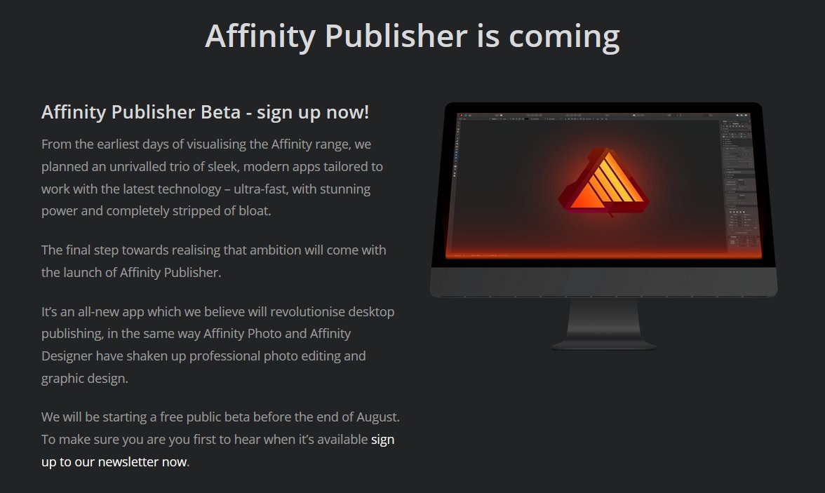
Thanks for sharing this with us, Matt. I know it's hard for you as well, because I'm sure you'd love to have Designer on the iPad as well as Publisher on Desktop out here in the wild right now. Keep up the good work, stay focus and be confident that some of us are really excited about the work you are doing. I know some people get angry, frustrated and the only way out for them comes in the form of harsh words (having part of reason or not). Well, I recommend those people to try some angry management therapy or something. It's not good for their own health. Also, for those who are as impatient as I am: keep showing the Dev Team the interest in their development, but without cursing their entire bloodline, please (it's no use). I know that Publisher was promised for 2016, but it's not like Serif said "we are going to troll these folks for some laughs". Best regards!
-
And that's the thing, for many people, the iPad version was more suited to their needs. Best regards!
-
Because developing Software is unpredictable. And for many people the time for a DAM is now, as well as some people wanting Editing Video capabilities now. I'm sure, if you were part of the managing team, you'd realize that just launhing it to the public like that without being a good Beta, would be a mistake. Best regards!
-
TGA export?
Mithferion replied to imacken's topic in Pre-V2 Archive of Affinity on Desktop Questions (macOS and Windows)
Tons of work, basically. Best regards! -
That seems to be the case. Best regards!
-
Well, there is people who miss some news. Best regards!
-
Some of us simply want to know. Even if the news are not that good, being in a stated of not knowing causes more anxiety. Now, even if we know that there is only one bug preventig the Dev Team from releasing the Public Beta, said Bug could be worth a thousand of regular Bugs in terms of effort required to fix it. But still optimistic: Before 2019. Best regards!
-
Before 2019. Best regards!
-
Yes, and it's included in the list I made of Free for Commercial use fonts. I just wanted to share it in case someone needs more weights and the condensed width. Best regards!
-
Hi there! Just a post about some good discounts/offers I just came across on the following Typefaces (prices on USD). I thought it may be of interest. EDIT: Now that the some of the discounts are over, I just leave mention of the Typefaces. If I find another good offer, I will post it here. Walbaum. (Ended on July 17) Neue Hans Kendrick. To me, this is a very good alternative to Futura, one of the best. Inspired in the former and Avenir, this Typace includes 9 weightas with italics and an alternate for the lower case "a". (Volume discount, 25% off) $38.25 for the Desktop License (1-5 users) $57.46 for the Desktop and Web License (1-5 users) Neue Hass Grotesk. (Ended on June 30) ITC Avant Garde Gothic. (Ended on June 30) ITC Franklin Gothic. (Ended on June 30) Hope it's useful for someone. Best regards!
-
Another DXF IMPORT Request
Mithferion replied to S_Metzger's topic in Feedback for Affinity Designer V1 on Desktop
And just as an example: people here need the TGA w/Transparency Export functionality; I've read about how that format is so used for games... who can say which should come first, total support for TGA or partial support for DWG/DXF (I don't think it will come fully sopported at once in a future update)? I can't say, since I don't use such formats. And even if I'd love to see them here and now for you to enjoy, there is a wide gamma of functionalities that are so important for different professionals that the lack of it would prevent them from adopting the Affinity programs. For them, another feature equals the door you mentioned. Best regards! -
Another DXF IMPORT Request
Mithferion replied to S_Metzger's topic in Feedback for Affinity Designer V1 on Desktop
It'd be interesting on making a poll or something about the equivalence between doors in a car and those File Formats, considering that I, and others, don't need them. I know you do, and I'll be happy when they are supported so you can take advantage of them. Best regards! -
You can make a Group out of the desired Layers, Groups, Objects, etc., then right click on it and then "Rasterize", if you want a flat Pixel Layer as a result. Best regards!