Ros
-
Posts
121 -
Joined
-
Last visited
Everything posted by Ros
-
 Just all my hopes and wishes. And a couple of raster images, which I then duplicated like crazy to create some shadows. Which I then duplicated like crazy once again. I could have done that with vectors easily. But, in my defence, I do often add bitmaps to my vectors to create atmospheric effects, but it never went as nuts as this file.
 -
@Michelangelo_ The fact that the words "meritocracy" and "democracy" are being used here blows my mind. Even talking about what is "fair" and what is not, in this context, sounds a bit out of touch for me. This is not a contest, neither is a competition. Furthermore, I would argue: Single thread means less exposition, not more. You won't flood a forum if all your stuff is kept together, right? @BrianHermelijn creates flawless artwork across many styles, and engages in conversation with those who have a question or a comment. That is what give him whatever amount of visibility you may think he gets. Nobody "gets visibility thanks to Affinity". Is the other way around. We the users help by using it, talking about it, sharing our work and using the right hashtags offsite. Passive aggressive rhetoric rarely works.
- 11 replies
-
- 1
-

-
- vector
- illustration
- (and 1 more)
-
From a bunch of characters I made in 2016. Have a nice day.

-
Thank you Kevin, and I would add: there's just something satisfying about well done vector software.
-
Now it makes perfect sense.
-
-
I really like the final stage.
-
Outstanding. Layout, typography, color scheme, photo selection... 10/10
-
I love it. Perfect balance between cuteness and elegance. BTW, at first I thought it was an animated gif, because It seems too move a bit. Just an optical illusion. It happens when I look to the original too.
-
affinity designer Letter V is for Vector (AD)
Ros replied to VectorVonDoom's topic in Share your work
Love it. It reminds me a little bit of the old Spanish cards by Heraclio Fournier, but cleaner and more detailed, of course.
-
I am Adobe-free since december 2014. I keep Photoshop installed just for checking .psd files exported from AD, and for the ocasional warping. Once in a while I need to do basic video editing work (like adding a gradient map to a bunch of stock videos to make them homogenous and on-brand), but since Photoshop can handle that, I really don't need After Effects / Premiere. Back when Macromedia was a thing, I was 99% pro-Illustrator, mostly due to FreeHand's poor interface. I guess I couldn't wrap my head around the notion of creating things with a tool developed with such disdain for aesthetics. But then when Adobe acquired Macromedia, I was really mad at Adobe for letting go the opportunity to blend both vector apps in what could have been the best vector software ever. That feed my fear of being dependant to a huge monopolistic company that seem to believe it is ok to purchase something just in order to shutting it down. Both from a market view point and an ethics view point, it was bad news not only for FreeHand users, but for Illustrator users likewise, because it gave as a glimpse of the tyrant Adobe would become. Not just a tyrant, but a lazy one too. Good soil for the Affinity seed to grow. I was so eager to escape that I gave Pixelmator several opportunities, with no success. BTW, I feel the same way regarding Apple. A gorgeous jailhouse, but a jailhouse anyway. I'd love to see a rising competitor make Apple focus once again on the Mac, and that can only start to happen if they stop taking users and customer for granted.
- 161 replies
-
- 5
-

-
- subscription
- adobe
- (and 1 more)
-
affinity designer Concept art for a 3rd Person or 2D game | "Code Black"
Ros replied to GrahamT502's topic in Share your work
Welcome GrahamT502, I look forward to see more! -
affinity designer SpaceX retro-futuristic poster design
Ros replied to Metin Seven's topic in Share your work
I'm in love again. That flat shading is clever, specially the triangular pattern in the solid rocket boosters. Wow. -
I think you are right. I was trying to avoid making every building the same size.
-
I love every single bit of it.
-
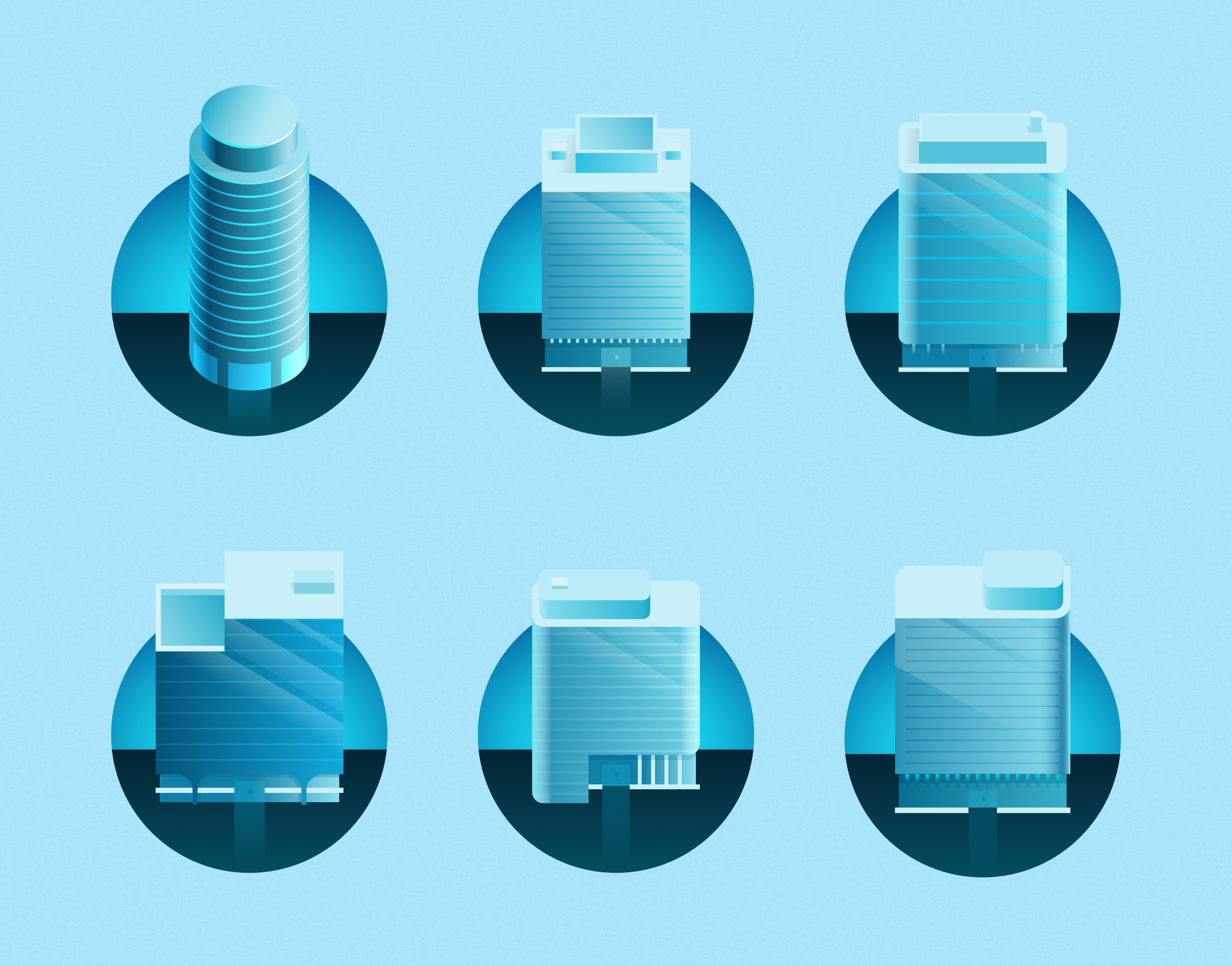
Hi everyone, Here is a small icon set from a recent project. Have a good weekend! Previous set:
-
OMG the amount of great details... The interdactilar membrane, the horns, the eyes. Just wow.
-
affinity designer Mk1 Golf GTI, v2 Progress (AD)
Ros replied to VectorVonDoom's topic in Share your work
You are insanely good. I like the fact that, despite the result being so amazingly real, you manage to keep the amount of layers to a reasonable number. If I tried to achieve something remotely similar, I would probably generate tons of collateral crap in the process. -
Please get bored more often. This is good stuff. Just a couple of things: - Maybe the reflexion is too sharp and opaque. - I think the shadow needs multiplying.
-
Clean and straight to the point. Dig it.
-
I'm still Team Version #1.
-
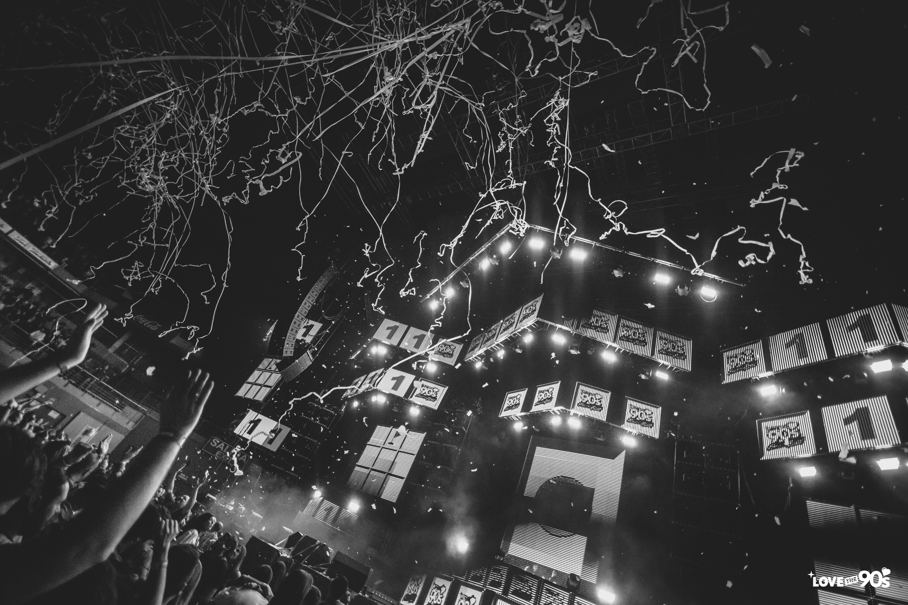
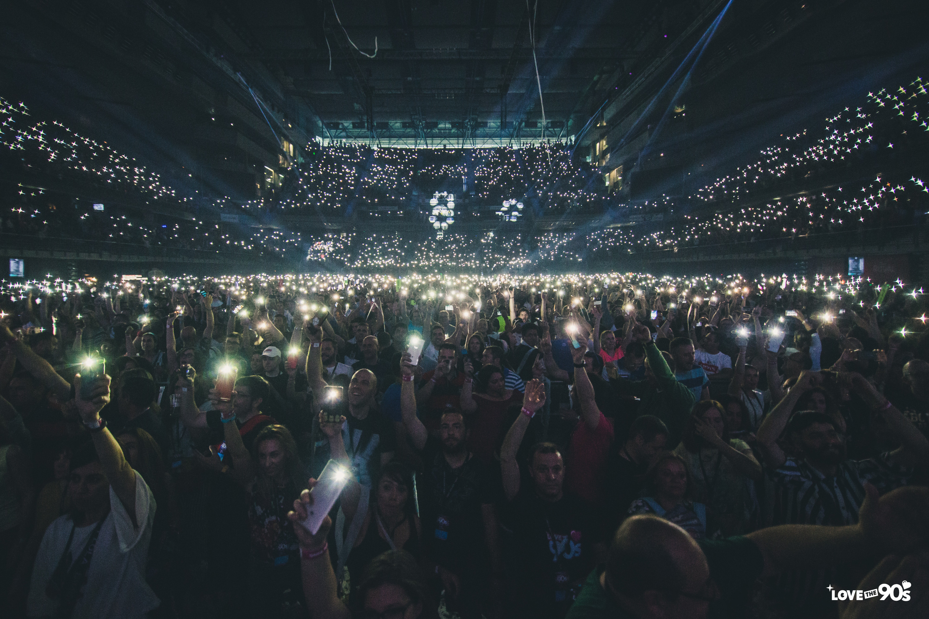
So... We kicked off the tour last weekend and it went pretty well. Have a good day!
-
On the one hand, I think cute smiley faces improve * e v e r y t h i n g * On the other, I think the original is already cute and nice enough, so maybe it loses a bit of subtleness.
-
Clever, indeed. Also, clean and nice.


RaulBarcia-12.jpg.af09204cf366d4c380c9994fdb0ca6f3.jpg)