Ros
-
Posts
121 -
Joined
-
Last visited
Everything posted by Ros
-
Just a bunch of icons for a telco.

-
Really good job.
-

affinity designer Cisco Systems presentations 2016-2018
Ros replied to Ros's topic in Share your work
Thank you guys, I appreciate it. -
I love it. It has some Teen Titans flavour on it, but better. Are the tribal details (like the bones and belt) from an existing storyline or are they your own idea? I've been a TMNT fan all my life, and it's been fun to see the different stylistic choices made through every iteration of the franchise. They have gone a long way since issue #1 I still have it, since 1990. As a kid I was stunned by the style, the roughness of it. But I was even more stunned by the fact that all the turtles wear red bandanas.
- 1 reply
-
- 1
-

-
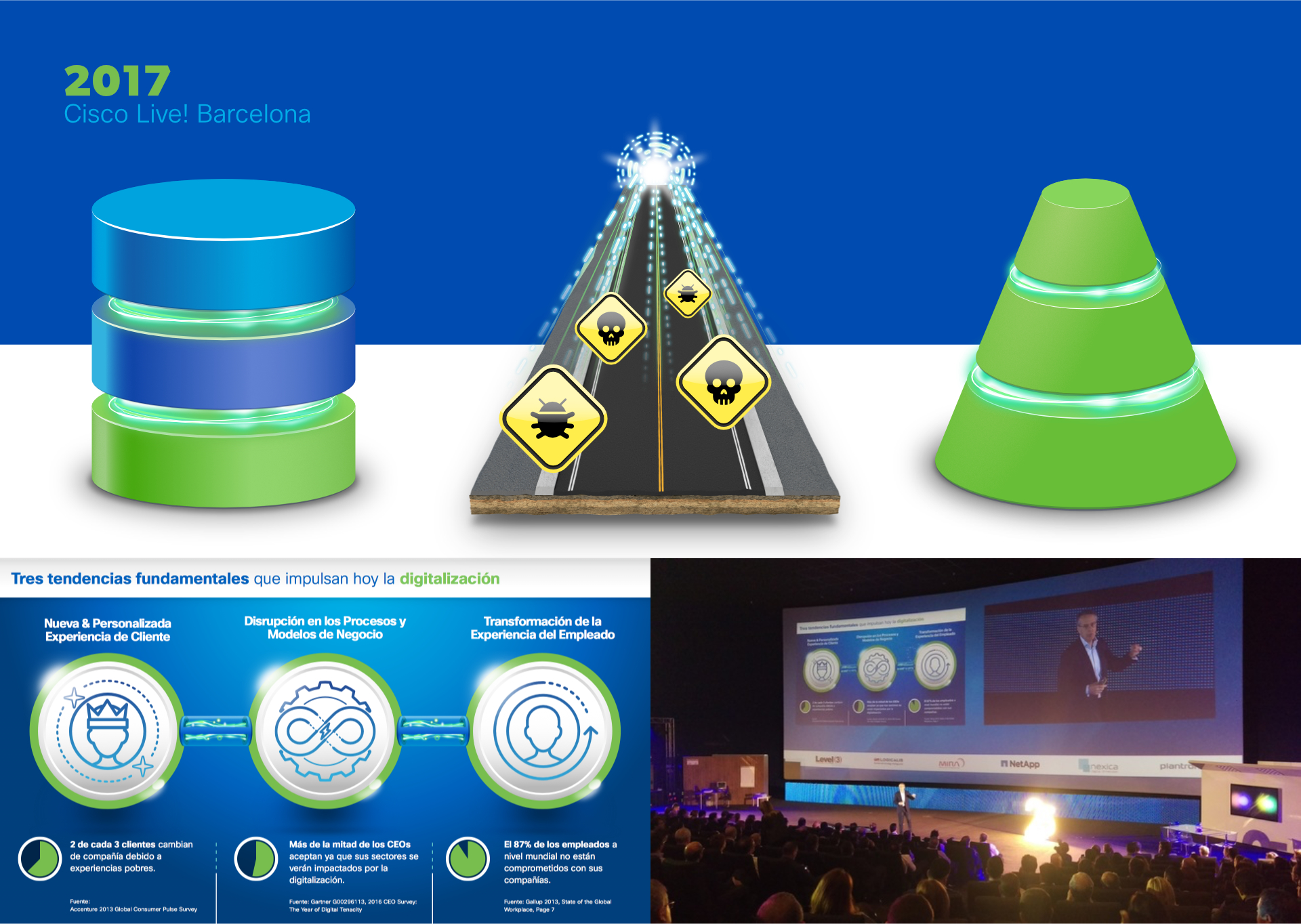
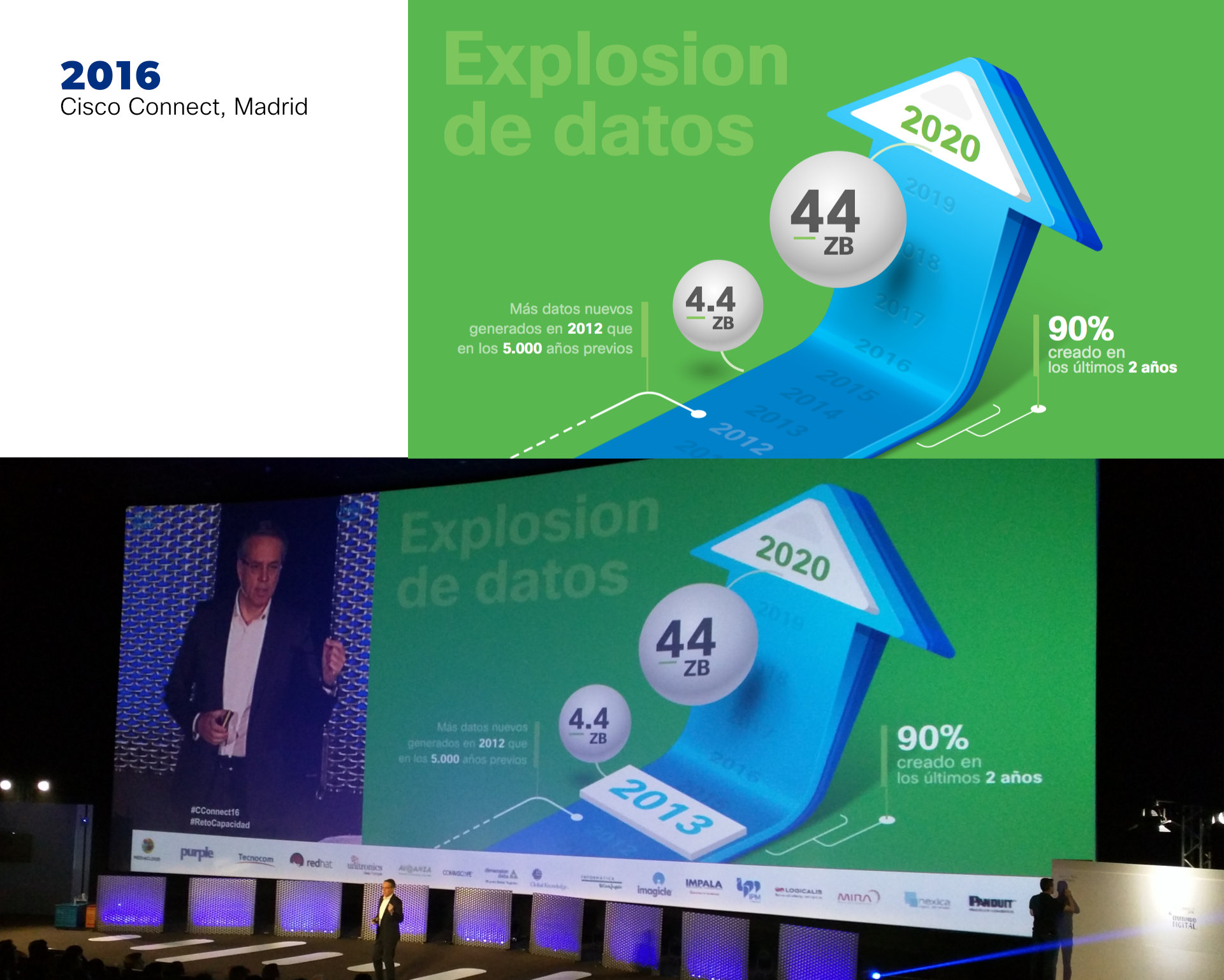
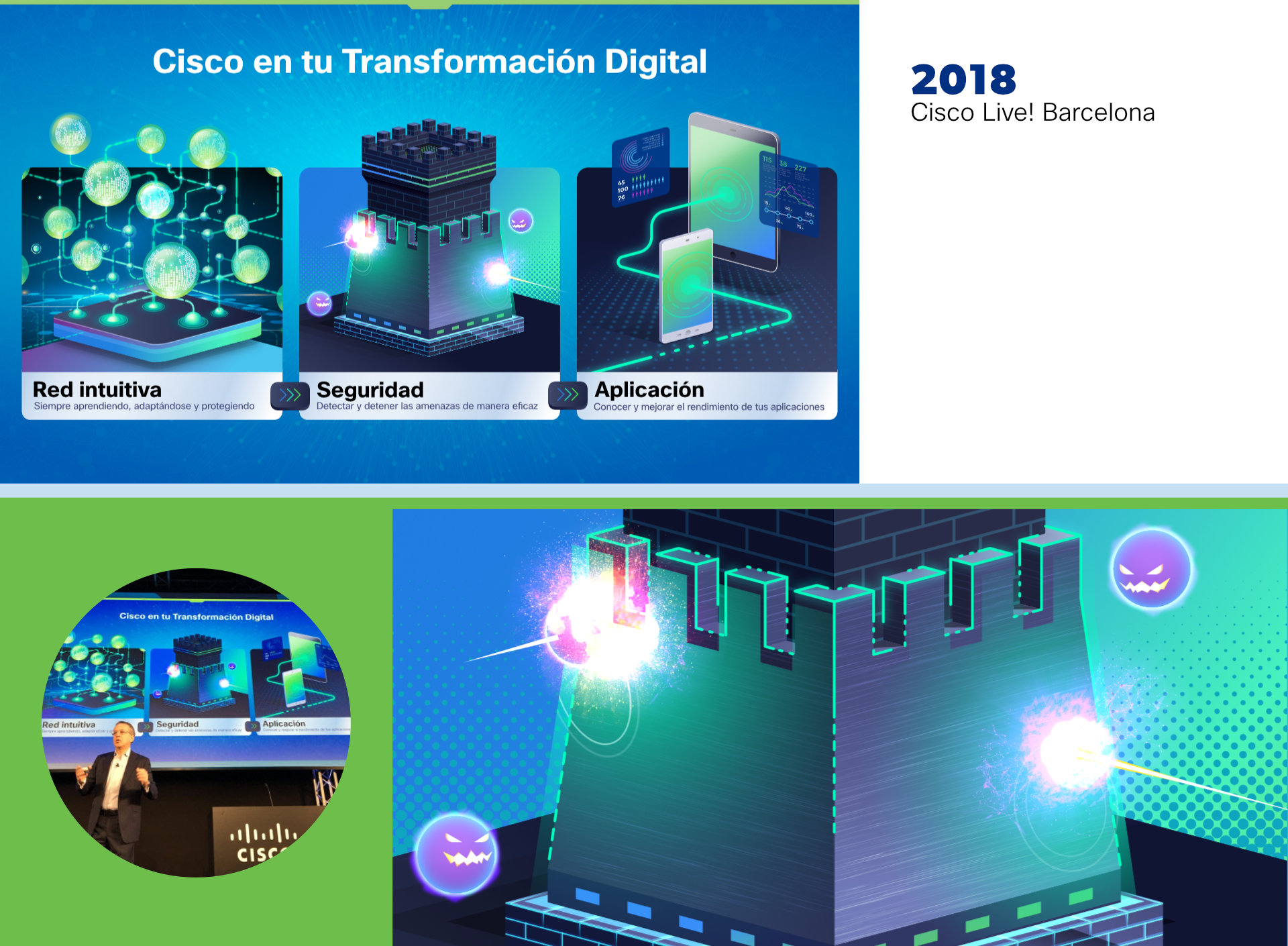
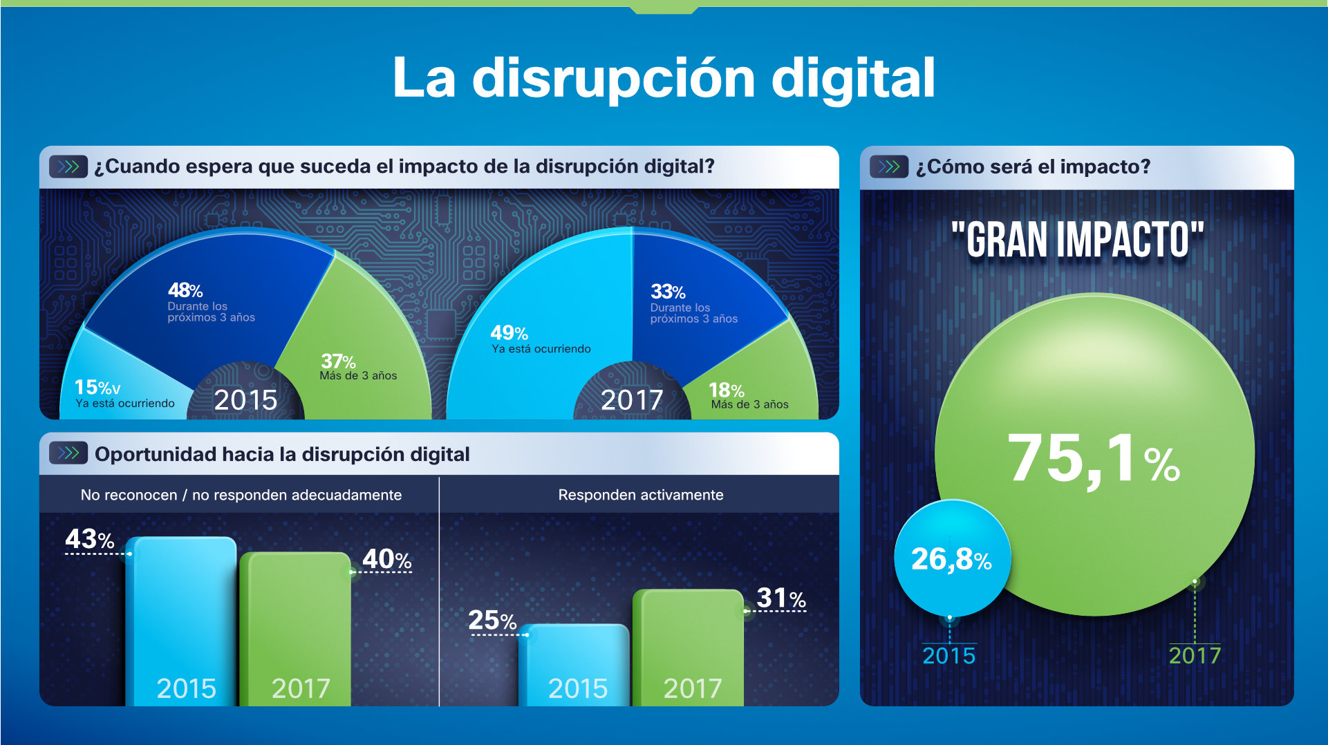
Hi, everyone! For the last 3 years I've been commissioned to design presentations for Cisco Systems general manager in Spain. I wasn't allowed to show it for a while, despite it being openly posted on their official YouTube channel (at least the speech). Now I can share some parts. Hope you guys like it. Have a great weekend. EDIT: Some of the icons are from Shutterstock with little editing (the blue outline ones).
-
affinity designer Playing with polygons, Grant Wood American Gothic 1930
Ros replied to VectorVonDoom's topic in Share your work
I had no idea. Thank you so much. -
affinity designer Playing with polygons, Grant Wood American Gothic 1930
Ros replied to VectorVonDoom's topic in Share your work
Could you elaborate on that, please? -
Thank you Lon, I appreciate it. It is way easier to do than you may be thinking. Here is the AD file in case you wanna take a look. Cheers! lock_telefonica.afdesign
-
Hey how're you doing? I made these 3 a couple months ago for a Keynote presentation. Have a great day.
-
affinity designer Playing with polygons, Grant Wood American Gothic 1930
Ros replied to VectorVonDoom's topic in Share your work
Cecco himself, if I'm not mistaken -
affinity designer Playing with polygons, Grant Wood American Gothic 1930
Ros replied to VectorVonDoom's topic in Share your work
As a Caravaggio aficionado, I'm stunned by your skills. -
Stunning piece!
-
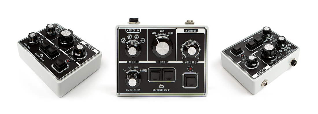
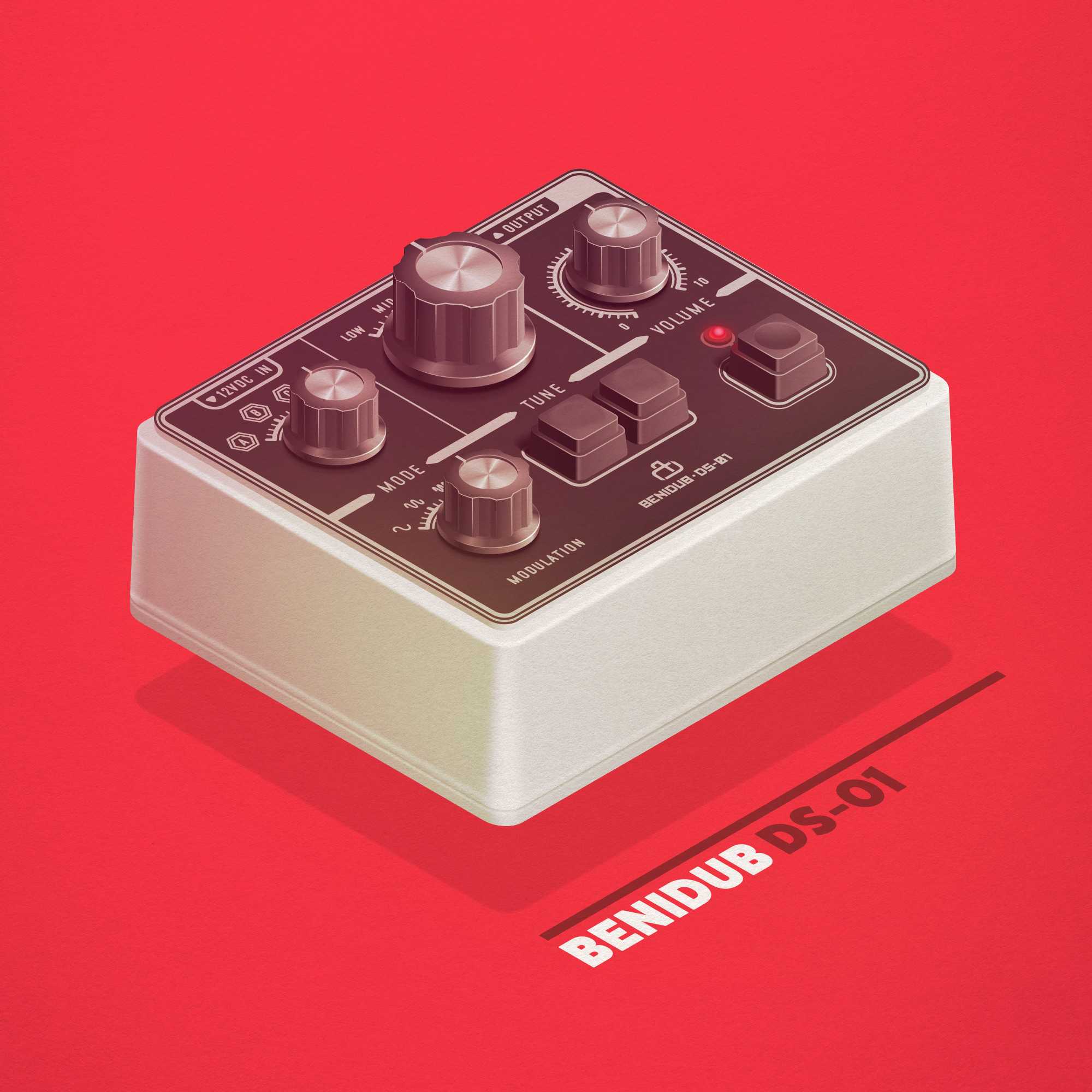
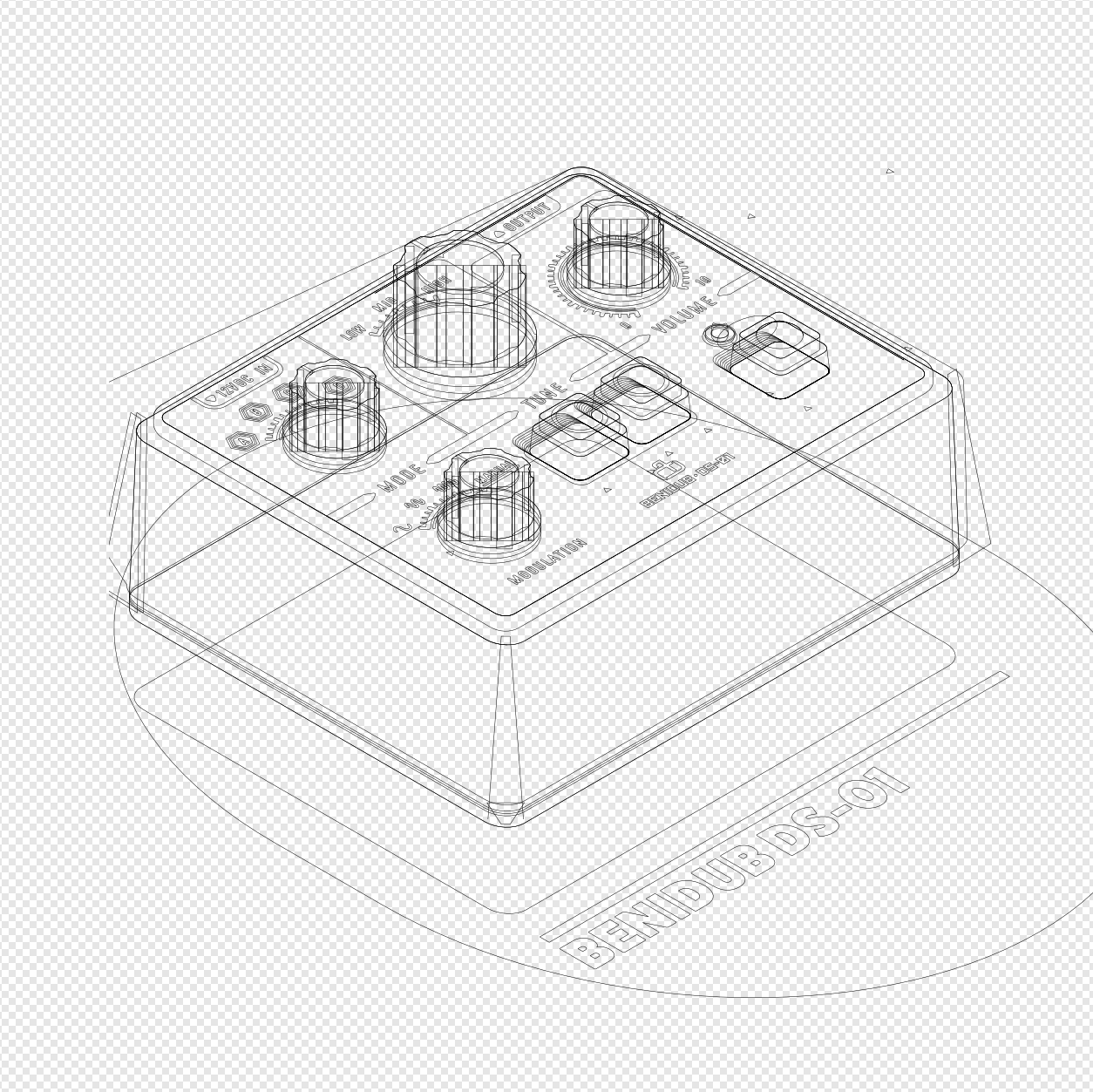
Yeah, it's a pretty obscure item. It's called a dub siren, because it's used predominantly in reggae and dub music. It's a cheap synthesizer, similar to those used in old toy guns to generate different type of laser-like noises. I don't have the DS-01 anymore (hence the isometric homage, I was saying good bye to it lol) because I got the new one, but is similar enough. So here's a short demo. Cheers! dub siren demo.MP4.00.mp4
-
Thanks @avo, the idea was to keep it between realistic and yummy. I went for a warmer feel than the original machine has.
-
This is a DS-01 unit, manufactured by a guy named Benidub.
-
Hi everyone! I've been playing around with this brand which I work for since 2003 (yep, not a typo... I'm getting old). These 3 are different stages of the last iteration of the logo. We relaunched the brand late 2014, around the same time I switched to Designer. The (mildly) interesting thing is that they represent very well my daily dilemma working with Designer: Should we always go as far as the software allow us? What I mean is this: the 2015 version is, in my opinion, better as a logo than the most recent ones. What do I see in the 2018 version? That I had A LOT of fun with Designer that day. Have a great day!
-
Distorting/transforming text
Ros replied to Marrrc's topic in Tutorials (Staff and Customer Created Tutorials)
Not yet, I'm afraid. This is the only reason I have to open Photoshop sometimes. -
Clean, neat and outstanding. Congrats.
-
Love the graph/chart. Subtle.
-
Great style indeed. Tarot meets Where The Wild Things Are.
-
affinity designer Jaguar E-Type Lightweight (AD)
Ros replied to VectorVonDoom's topic in Share your work
Stunning skills, @VectorVonDoom. Do you experience any performance issues, like crashes or slow screen refresh/render? -
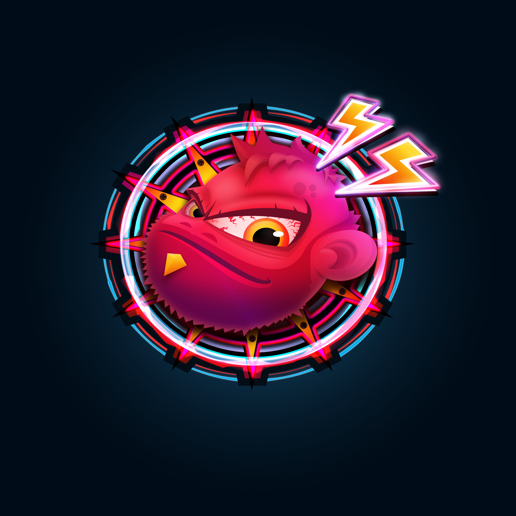
Work in progress... lights are kinda random right now.
- 1 reply
-
- 7
-
-
- character design
- branding
- (and 2 more)
-
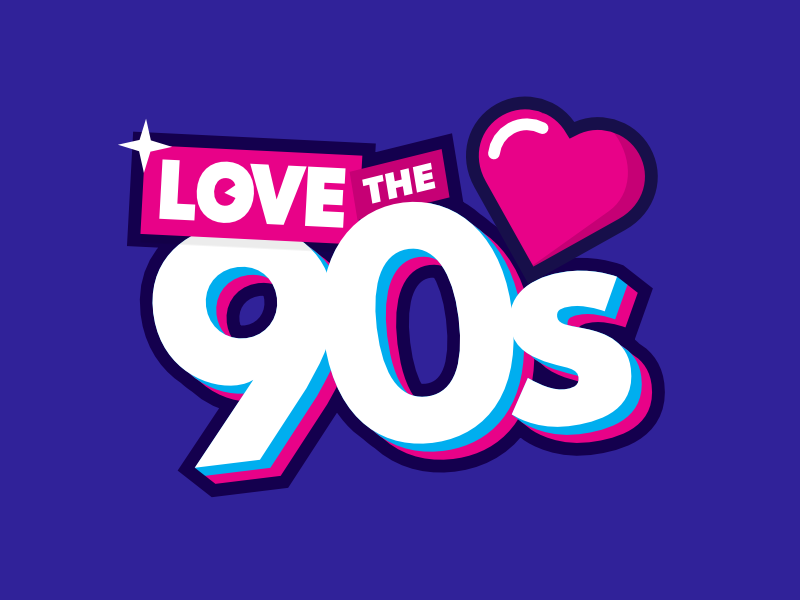
Hi guys, here is a logo for an euro-dance tour which begins in a couple of months in Spain. We created every single piece of artwork with Affinity Designer & Photo, from branding to stage decorations. Except for video, of course :-) More info: http://yosaliadefiestaenlos90.com
-
Thank you PixelPest. So disappointing. I didn't expect this kind of misleading trick from Serif.
-
Thanks a lot Jer, but that is not the same thing. You used an isometric grid, but the example has a vanishing point.