Ros
-
Posts
121 -
Joined
-
Last visited
Everything posted by Ros
-
I love the way the corner reveals a cross.
- 2 replies
-
- 2
-

-
- draw
- perspecive grid
- (and 2 more)
-
I don't know what I'm doing.

-
Nice and clean. I love the fact that you avoided using black for the stroke.
- 7 replies
-
- 1
-
-
- kirby star allies
- fan art
- (and 2 more)
-
Great work @GabrielM, and good choice too. He always had a certain swag...
-
Really good work.
-
I love that Silent Hill vibe.
- 6 replies
-
- 1
-
-
- isolation
- decoupling
- (and 2 more)
-
Some slides from a recent event. Have a great day!
-
The colors in the first one are gorgeous.
-

affinity designer Affinity Designer - Cutter knife
Ros replied to Mensch Mesch's topic in Share your work
Now we need to see this excellent cutter knife slicing the chocolate cake. -
Thank you guys, I really, really appreciate it.
-
affinity designer Affinity Designer - Vector chocolate cake
Ros replied to Mensch Mesch's topic in Share your work
Sweet heaven, this is mind-blowing. -
affinity designer The date with a girl from Andromeda galaxy
Ros replied to avo's topic in Share your work
This is amazing. -
I just got this video from my boss
-
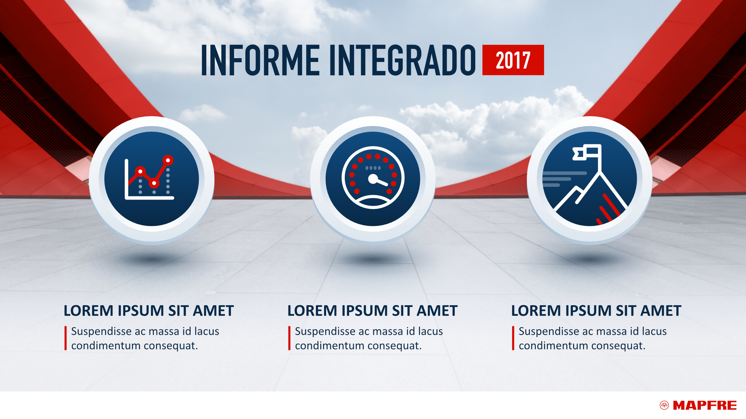
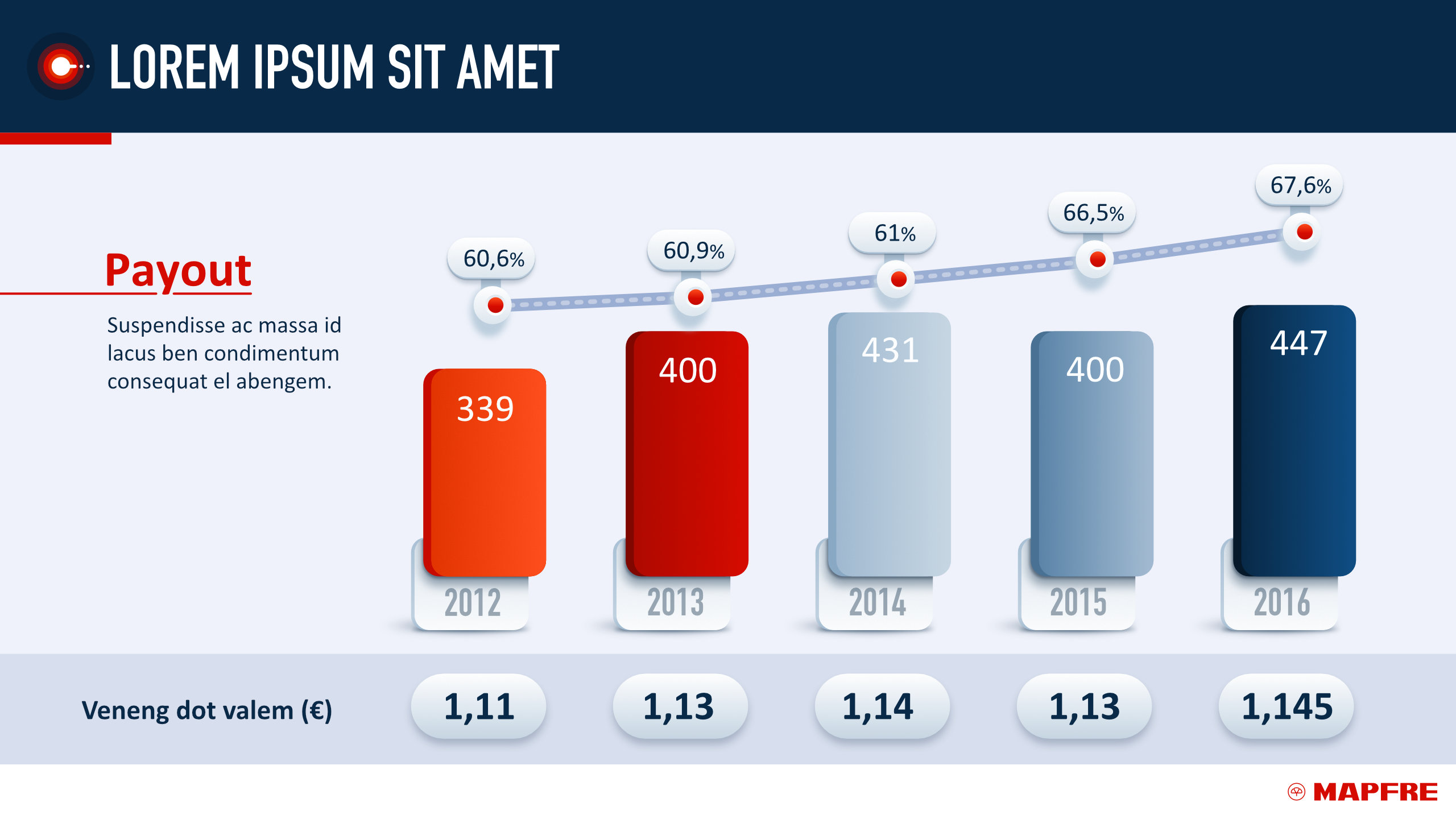
affinity designer Cisco Systems presentations 2016-2018
Ros replied to Ros's topic in Share your work
Apple Keynote. -
Gracias, hermano.
-
-
This one didn't make it to the final version:
-
That's a legit click-pic.
-
My fav so far.
-
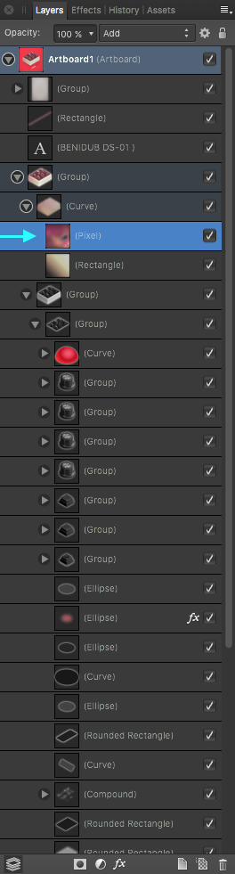
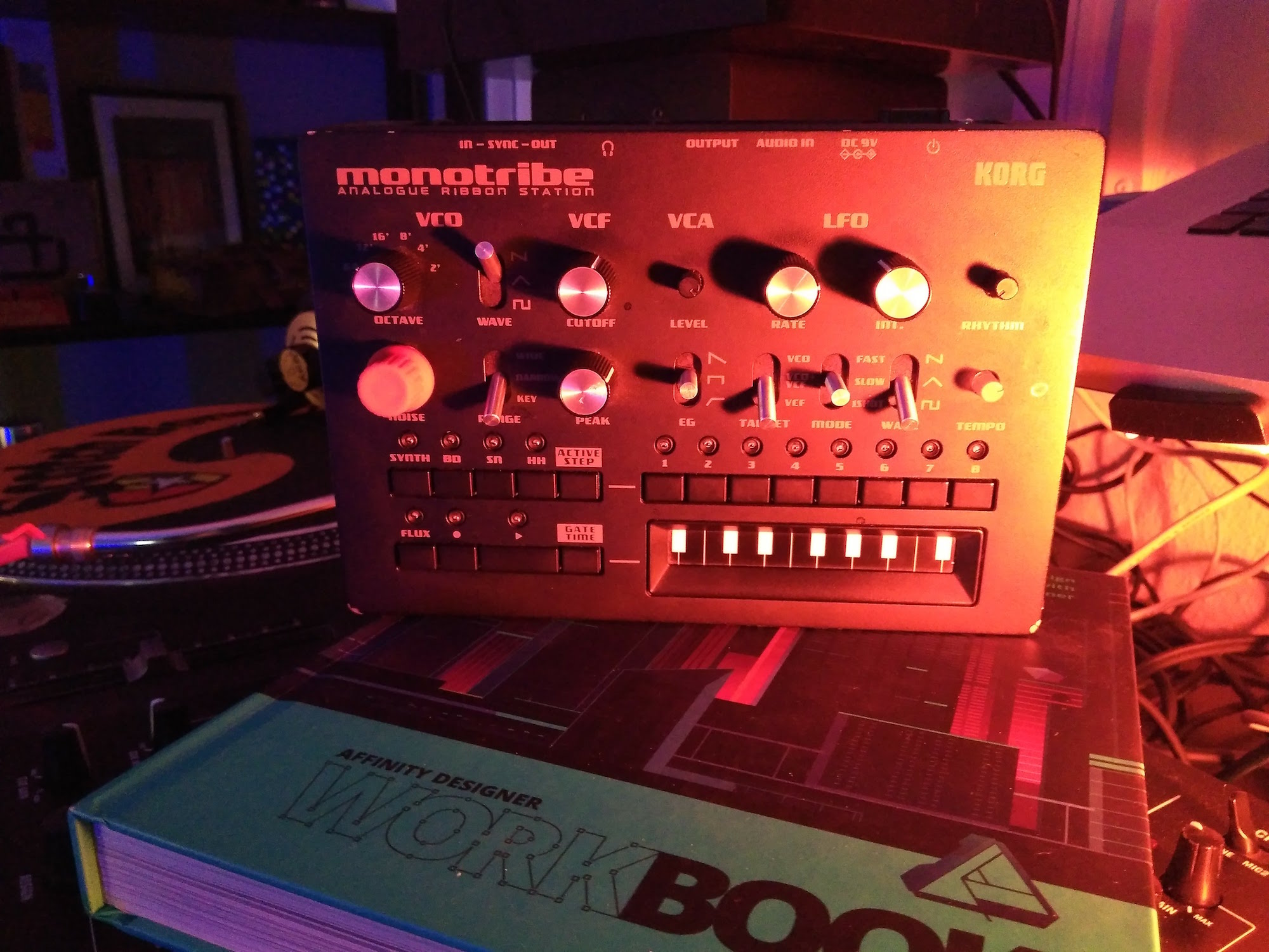
Hi @peter, it's a blurred pixel layer, as you can see here: Dub sirens have always been handmade by indie manufacturers, so there are tons of different designs since the '70s. Even Benidub's products are handcrafted one by one, but with an unprecedented attention to design, materials and construction. Most dub sirens used to look like this: The closest thing on the regular market would be Korg's Monotron / Monotribe:
-
Beautiful colors indeed.
-
affinity designer I Never Had To Say "I'm Batman" (AD)
Ros replied to VectorVonDoom's topic in Share your work
Somedays you just can't get rid of a bomb, or may I say it, the hands. -
Hi @Bri-Toon, this is an interesting exercise to do, and I like the results. I would choose the first one. Maybe you could try to integrate it a little bit more with the original by replicating the subtle shadows that the inner shapes have and adding another color in a subtle manner, as the green-ish "light" in the center of the AD icon. Have a great day.
-
affinity designer Cisco Systems presentations 2016-2018
Ros replied to Ros's topic in Share your work
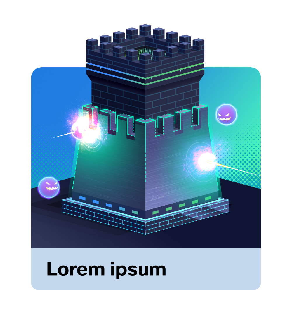
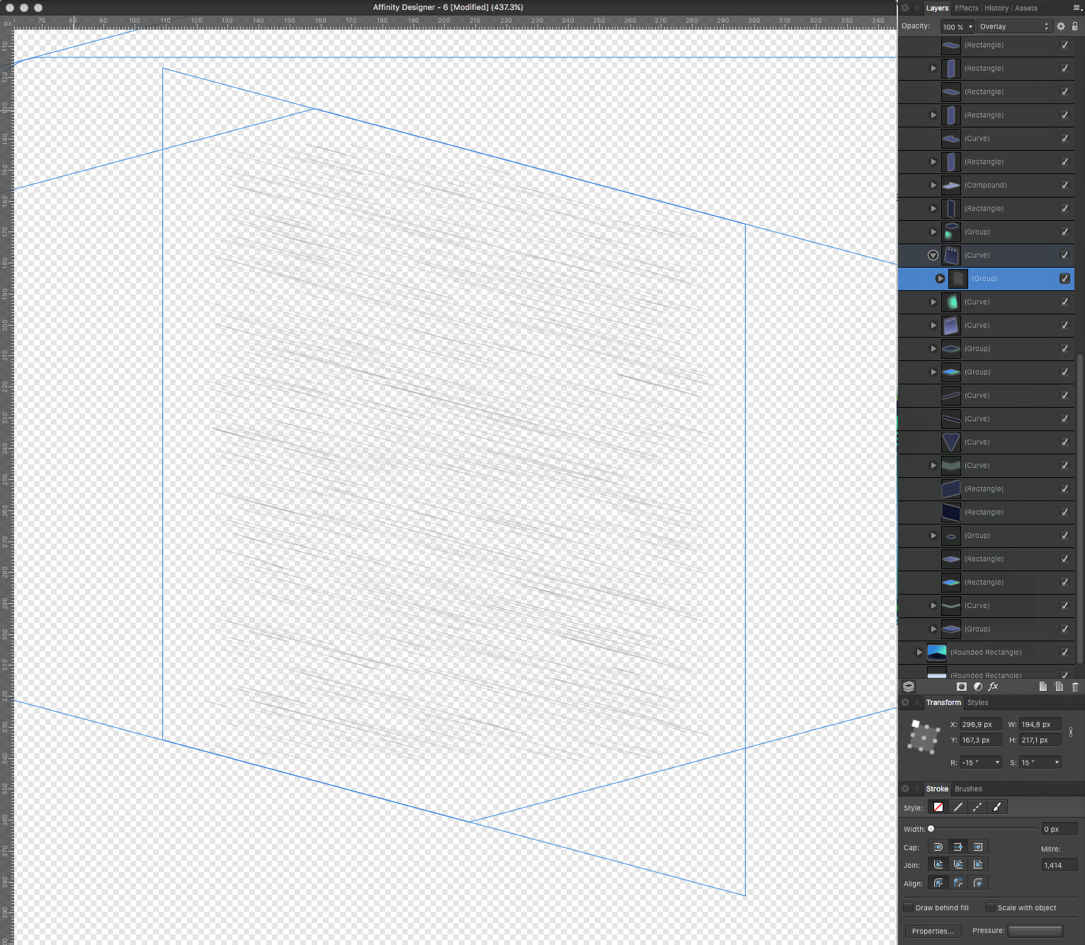
Thank you @voitek, I'm kinda proud of the tower and those spherical malware creatures. The metallic texture you asked about are just lines with different width and pressure, expanded to avoid unwanted changes when skewing the whole thing. Here's the AD file so you can take a look: cisco_tower.afdesign Also, I just realised I made a mistake in the image I uploaded (the elipses near the explosions should be properly aligned with each explosion, because they are supposed to be waves created by it). Like this: