penwiper
-
Posts
117 -
Joined
-
Last visited
Everything posted by penwiper
-
I really WANT to see this image, but it's far too big for my screen and I am only getting very small slices of it. @marpla, if you resize it a little smaller you will have a better image upload time and more people can see it full-size. :-) Welcome to the forum, glad you're having fun too! @devs-- any chance of having an automatic resize to "fit window" option for oversized images in the forum?
-

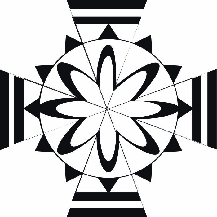
affinity designer 30 Mostly Nontraditional Compass Roses
penwiper replied to penwiper's topic in Share your work
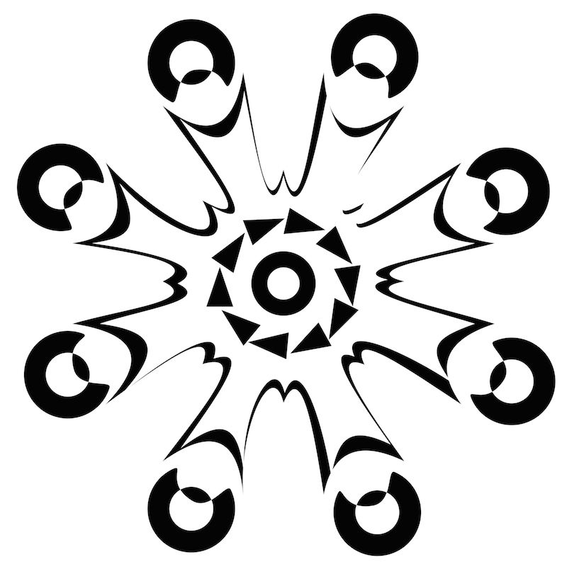
Next up, 11- 15. 11 is honestly one of my least favorite the entire series, but I was experimenting. 12 and 15 are two of my favorites, on the other hand. :-) Ah, the power of fx effects and layer adjustments . . .
-
affinity designer 30 Mostly Nontraditional Compass Roses
penwiper replied to penwiper's topic in Share your work
Here are the next 5. 7 and 10 in particular might make good screen prints or linoprints. (I know I'd choose linoprints first-- I don't have the set up for screen printing right now, other than by using stencil methods or EZ solar screenprinting, which I haven't tried before but looks easy enough with the right materials.) Critiques welcome! Thanks guys!
-
Hi! I have had great fun with Affinity Designer's shapes and making this series. So relaxing! I have learned a lot while doing this, as I'm sure you'll be able to tell as I post more-- such as, how to use gradients, boolean operations, converting to curves, centering objects, grouping, bitmap fills, etc. Essentially I've learned how to use AD while making these. I will say that after a bit I realized that if I was going to call the series "Compass Roses" they should have at least multiples of four points, so some of the early ones broke that rule. That said, here are the first five and I will post the others in a bit. There are other wonky things too, but I call that a process of learning and I'm very happy with the last windroses especially. I'm still working on my "villains" series, but they take a LOT longer to do than these compass roses...
-
After positioning, I'm curious-- wouldn't it be simpler to use ALT and boolean divide tool to separate the pieces? Then one could just click through and alter the colors of the inbetween sections as needed . . . Thanks for the tutorial, though! I was actually making a similar design as a possibility for a friend's tattooed wedding ring using the old Wedding Circle Quilt pattern, so I thought I would mention the possibility of a shortcut. (Still not sure if the tattoo thing will go through, though. They want something VERY small yet classy and I told him to check with their tattoo artist first . . .I'm just not sure how much detail they'll be able to get in a few millimeters of space.)
-
affinity designer A Galaxy far far away...
penwiper replied to denironaut's topic in Share your work
Very cool piece of work, nice design! I'm not sure how I feel about the strange looking mouths on Luke, Leia and Han though. It makes sense with Obi-wan's beard and Yoda is, well, Yoda, but I'm not so sure about those three. Maybe it is the darker color? I feel maybe a lighter band might also be more appropriate for Princess Leia. I was reading a story with a prison break online and was amused to note that the rescuer was using all of Han's lines in the Death Star before rescuing Leia . . . So this is my second Star Wars encounter for the day. :-) My Mom wants to do this, adding in our three Welsh Pembroke Corgis to make sure everyone is included. Fortunately she's never ACTUALLY done it. -
That is super sweet. Nice job on the textures! :-) Does the sign on his back say "Kick Me" in Martian?
- 6 replies
-
- 1
-

-
- illustration
- childrens
- (and 3 more)
-
Custom fills?
penwiper replied to jackamus's topic in Pre-V2 Archive of Affinity on Desktop Questions (macOS and Windows)
The only way I can think of right now is to use bitmap fills. The Devs might be able to help more with that-- but basically what you do is you make a pattern and export it to PNG. (Or, you know, just search for copyright free patterns online, but stupid Shutterstock keeps popping up anyway even when I define my searches in advance mode on Google so I try not to do that too much.) Then, using the Gradient tool, select Bitmap from the fill option and find your file. The size of the bitmap can then be adjusted by the handles that appear with the fill. I've used this method a couple of times to make an interesting background pattern for some objects, then copied said object and used a gradient level on the copy to give it more depth, but you have to be sure the shape is exactly the way you want it because I don't think you can adjust nodes on separate layers to do the same thing. I know what you're wanting though, and it would be cool . . . especially if it was completely vector-based. -
affinity designer The world was such a wholesome place until . . .
penwiper replied to penwiper's topic in Share your work
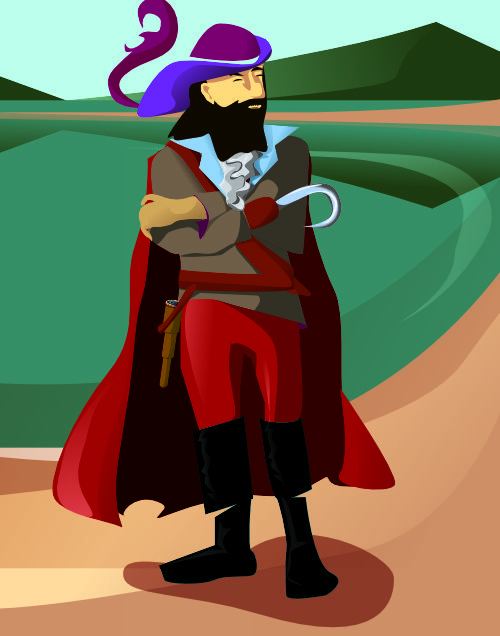
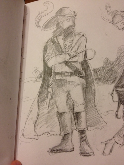
Next up . . . Captain Hook. :-D (By the way, Peter Pan is a great book. I reread it last year and it definitely holds up the Test of Time. There's a reason it's a classic.) "In the midst of them, the blackest and largest in that dark setting, reclined James Hook, or as he wrote himself, Jas. Hook, of whom it is said he was the only man that the Sea-Cook feared. He lay at his ease in a rough chariot drawn and propelled by his men, and instead of a right hand he had the iron hook with which ever and anon he encouraged them to increase their pace. As dogs this terrible man treated and addressed them, and as dogs they obeyed him. In person he was cadaverous and blackavized [dark faced], and his hair was dressed in long curls, which at a little distance looked like black candles, and gave a singularly threatening expression to his handsome countenance. His eyes were of the blue of the forget-me-not, and of a profound melancholy, save when he was plunging his hook into you, at which time two red spots appeared in them and lit them up horribly. In manner, something of the grand seigneur still clung to him, so that he even ripped you up with an air, and I have been told that he was a raconteur of repute. He was never more sinister than when he was most polite, which is probably the truest test of breeding; and the elegance of his diction, even when he was swearing, no less than the distinction of his demeanour, showed him one of a different cast from his crew. A man of indomitable courage, it was said that the only thing he shied at was the sight of his own blood, which was thick and of an unusual colour. In dress he somewhat aped the attire associated with the name of Charles II, having heard it said in some earlier period of his career that he bore a strange resemblance to the ill-fated Stuarts; and in his mouth he had a holder of his own contrivance which enabled him to smoke two cigars at once. But undoubtedly the grimmest part of him was his iron claw." Critiques welcome! Thanks for your comments, guys, I appreciate them! This is a lot of fun. :-) A female villain up next I suppose. I am trying to alternate between gender . . . We'll see how far that goes. Also I figured out a way to speed up my shading process, so go me!
-
hmm. I can't open the file; are you using Afinity' Designer's Beta? It says I do not have the right "persona." However, I will tell you what my professor told me when I was doing a painting assignment in black and white with shiny objects: it's all about contrasting edges and highlights vs shadows, particularly with something shiny like tin or copper or even glass. This sped up drawing I found on youtube of a monochrome marble might give you a good idea of what I mean: https://www.youtube.com/watch?v=ItmXEUz4sdg If you're drawing an iphone of course the transparency of the glass will be different and the iphone's black screen will reflect the area around it if it is not on and backlit from inside. Of course you would have to simplify this in a vector image. Maybe also try utilizing the transparency wine glass button for sharp vs soft edges . . Definitely study your image or an actual iphone, drawing it out as detailed as possible, paying close attention to what you SEE rather than what you think is there. Some quick sketches might also help solidify what you need to finish your drawing properly. I would not rely completely on AD 3D tool in the effects section to do this. It needs the personalized touch. :-) Good luck!
-
The update feels more complete than the first image; I think the purple color glow change in the background and transparent lettering in the bottom of the fonts helped quite a bit to tie it together. The letters don't look quite so pasted on. :-) I wonder if you could make some wind trails from the top of the triangles' tips to add in even more movement?
-
Hmm. Now after seeing this post I may wait a bit to update my software to 10.10.2. . . . I at least want to finish my current image. Good luck figuring everything out. *fingers crossed.*
-
Tutorial please for how you make your stamps also? This looks so cool! I love printmaking . . . :-) Stamps are just another printmaking device, after all. Thanks for sharing!
-
Very nice! Have you worked at all with linoleum or woodcut printmaking? Because that seems like it would be right up your alley! :-) Bold, sumptuous blacks and whites with striking reds. Now I want to go buy some more linoleum . . . and some red ink.
-
Oh wow, super nice. I love the simple colors in this. I wish the UFO was a little more detailed, but I can see why you would leave it like it is, so I'm on the edge about that one. I wouldn't want too much more. :-) I love your character too, nice highlights and shadows.
- 8 replies
-
- 1
-
-
- illustration
- digital art
- (and 2 more)
-
affinity designer The world was such a wholesome place until . . .
penwiper replied to penwiper's topic in Share your work
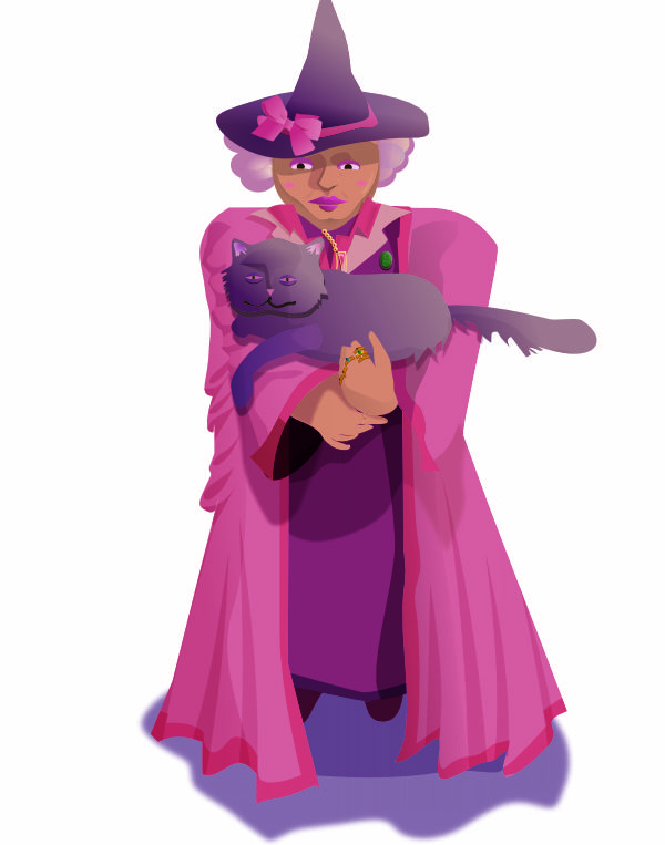
I think honestly my computer was not having fun toward the end of this drawing. When I'd clip things I'd have bits of the original sections version disappear but not all the way. *sigh*. Still, it came out fairly well all things considered. "When they entered the Defense Against the Dark Arts classroom they found Professor Umbridge already seated at the teacher’s desk, wearing the fluffy pink cardigan of the night before and the black velvet bow on top of her head. Harry was again reminded forcibly of a large fly perched unwisely on top of an even larger toad." Harry Potter and the Order of the Pheonix by JK Rowling. I've never watched the movies, so my impressions are solely book based on this one. She's got on a more "traditional" robe and hat in this image mainly because I can't see her NOT wearing a robe. Also she has a cat with her so I think this portrait must be prior to her Hogwarts DADA stint.
- 13 replies
-
- 1
-
-
- illustration
- villain
- (and 2 more)
-
Nice work! This looks great. :-) I love the simplicity of this.
-
affinity designer The world was such a wholesome place until . . .
penwiper replied to penwiper's topic in Share your work
Here's my next villain, Doctor Fu Manchu. I've been listening to a free audio book via "Classic Tales" podcast featuring him as a character. "Imagine a person, tall, lean and feline, high-shouldered, with a brow like Shakespeare and a face like Satan, a close-shaven skull, and long, magnetic eyes of the true cat-green. Invest him with all the cruel cunning of an entire Eastern race, accumulated in one giant intellect, with all the resources of science past and present, with all the resources, if you will, of a wealthy government--which, however, already has denied all knowledge of his existence. Imagine that awful being, and you have a mental picture of Dr. Fu-Manchu, the yellow peril incarnate in one man." (The Insidious Dr. Fu Manchu Chap. 2) Even though I loved my initial sketch, I couldn't use it because it didn't match too well with the character description. I like my sketch better honestly, but I do think the vector turned out fairly well. I got the brocade pattern from an online resource. It's so much easier to come up with male villains' names...
- 13 replies
-
- 2
-
-
- illustration
- villain
- (and 2 more)
-
I definitely like the second rocket better with the black lines; to me it is a cleaner image and the spaceship stands out more. That said I do like your little spacecraft logo also-- it reminds me a little of an R2D2. :-)
-
Okay! So I have finished drawing my first lady villain; Cruella de Vil was a LOT of fun to draw. I loved the Disney movie as a kid and I am ashamed to say that I have not read the book, although I just picked it up to read on an online library. That'll happen maybe later on today. :-) "A large car was coming towards them. .... A woman came out onto the front-door steps. She was wearing a tight fitting emerald satin dress, several ropes of rubies, and an absolutely simple white mink cloak, which reached to the high heels of her ruby-red shoes. She had dark skin, black eyes with a tinge of red in them, and a very pointed nose. Her hair was parted severely down the middle and one half of it was black and the other white-- rather unusual." 101 Dalmations, Dodie Smith I've taken a couple of liberties because I felt they worked better with the design; namely, the coat and the hair. I'm still rather pleased with how this turned out, though. Also, this is a call for female villains from literature. I'd like some more ideas; I have a few-- Shine, from Archer's Goon by Diana Wynne Jones (plus a few others; DWJ had a THING about evil older ladies due to mother issues of her own, apparently), the Medusa, Belatrix Black or Dolores Umbridge from Harry Potter, and the infamous principal Agatha Trunchbull of Matilda's school by Roald Dahl, and the Winter Queen from the Dresden series too, perhaps. Anyway, critiques welcome! More villains to come later.
- 13 replies
-
- 2
-
-
- illustration
- villain
- (and 2 more)
-
I like the design very much, it is nice and clean. (I wonder what you'll be able to do with Affinity when its publisher app comes out?) The red and green repeat nicely throughout the flyer and add a sense of urgency to the "call to action." :-)
-
Oh, very nice indeed! I love the expression on her face and the lighting in the trees especially. I think since the water is moving quite a bit you don't need to worry so much about reflections of the boat. :-)
-
Yep, I also feel Paekke has some valid points. I'm assuming this is for name initials? I saw several of my graphic designer friends working on a similar project. Maybe try making a few thumbnail sketches of different initials and pick the best out of at least 10 or so; small quick sketchy drawings help a LOT. :-) If you need ideas for cool labels or fonts, just try pulling out groceries from your cupboard and look at the fonts there, or, if you can, visit the tea/coffee aisle of a large grocery store or health food store. So many cute packages and designs! Good luck!
-
I had fun drawing this lady; I grabbed some images of 20th century dresses, mixed and matched various items (the top, the skirt, the belt, etc,) and drew my own face and hair to make her mine. I was intending to get started on my villains series but, well, she doesn't look particularly villainous. She's just ready to go to a party. That said, anyone have ideas for female villains from literature? :-) I've got *plenty* of guys. (I think I'll try for an illustration of Cruella de Ville next. A fur coat ought to be interesting to draw!)
-
Hi, I am really enjoying Affinity and I have been receiving a lot of help from the forums, so hooray forums! One feature in Affinity I use a quite a bit is shapes and I was wondering if there is a keyboard shortcut for "convert to curves?" I find myself interrupting my workflow frequently to toggle that option. :-) It's not big deal, but I'd love to have a keyboard response for such a useful tool.