penwiper
-
Posts
117 -
Joined
-
Last visited
Everything posted by penwiper
-
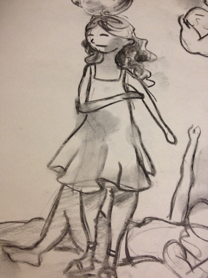
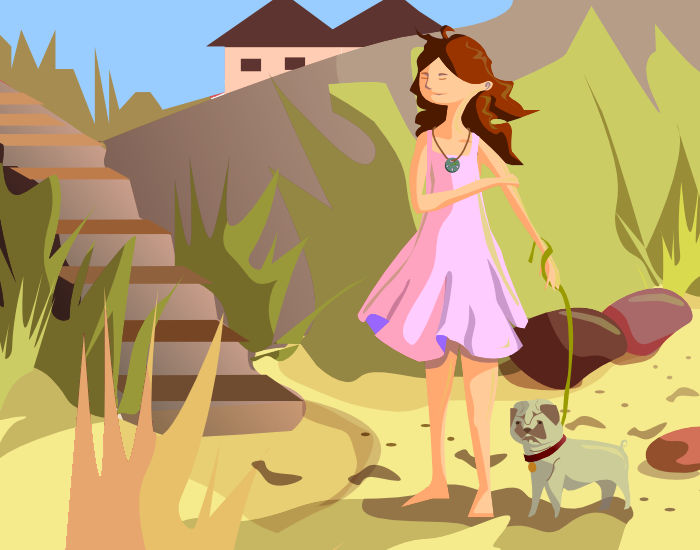
Another practice drawing of a girl and her dog. Critiques welcome! I wish I was at the beach right now! Last week I sat down with my newsprint and charcoal and drew a lot of small images, took pictures of the best ones, and now I'm excited to turn them into something more substantial. :-) I love how if there's a line you don't like with charcoal you can just erase it with your fingers (it'll get a little smudgy but who cares) and newsprint is cheap enough that I'm not worrying about wasting materials. I've included a photo of the sketch, as messy as it is, so that you can see my starting point! Some changes made to the sketch: the hands are more defined, there's an actual background, the legs are placed better on the body and more proportionate and I nixed the sandals. I may put them in later, but I think that's enough for right now. Not sure about the darker reflecting green stripe on her dress. That may be too contrast-y.

-
affinity designer Shading with Gaussian Blur
penwiper replied to raymondemery's topic in Share your work
Here's some shading that I typically do. 1. Make the shape and color with a midtone. 2. Decide where the light is hitting. In this case, from the top right down on the ball. 3. Add shadows and highlights This is a handy post http://gurneyjourney.blogspot.com/2010/02/light-and-form-part-1_15.html (actually James Gurney is awesome in general on art matters and posts frequently +++ recommend his blog) explains form in detail. I'm not being particularly obsessive about this circle . . . that would need a lot more layers. 4. Watch out for reflected light. Depending on how shiny an object is, most things will still pick up cast light from other strong colors. So if you place a red shiny pot next to a green bush, it'll get a greenish tint to the shadow. This helps objects "sit" in place in a painting. 5. Once that's done I start applying the transparency tool and various opacity levels to even things out. It's not that my way is better (I'm still learning this program too) but you might want the extra info? Transparency tool is a lifesaver. :-) Thanks for sharing your method with us, I'll mess about with it myself I think. shading.afdesign -
Looks fun, but I hope he's not spying on ME. :-) There's only one Person I want looking in on me all the time. Thanks for sharing, it's super cute. His feet and pants legs at the cuffs are especially nice. I'll have to bring him some chocolate chip cookies (biscuits, for the English people here) and visit so he is distracted.
-
Looks nice! May I be nosy and ask which card game it is? I love playing Euro board games and I am equally fond of innovative card games . . . I'd enjoy looking up the game at boardgamegeek.com. I love the lighting on this in particular and the nice textures, and there's a nice balance between warm and cool receding colors. If I had a critique, it might be that the shoulders seem a little too wide, especially in regards to the left part of his waist, which narrows quite a bit? Widening out the jacket would probably do the trick. This may just be my eyes messing with me because I can't see the full image on my small screen without scrolling down, though.
-
Not to step on MEB's toes as a moderator, but I'm going to give a shout-out to their awesome tutorial videos on the homepage. This topic would be directly related to the last video as you scroll down under Quick Tips: "Adjusting Noise and Opacity in Fills." :-D Actually all the videos are pretty awesome.
-
affinity designer My First Two Works In Affinity Designer
penwiper replied to specworkfan's topic in Share your work
Those are psychedelically awesome! :-) I love the purple background for the mushrooms and that gorgeous texture, and in the San Diego Poster the surf boards sticking up like rabbit ears are pretty cool too, especially their shadow. They're nicely balanced by the sand runner. My critique for the mushrooms would be that while you have varied them in size to create a sense of distance between them, they are all the same hue in the color spectrum and in fact it looks to me like the farthest mushroom away from the viewers is even more vibrant than the others when it comes to its shading. Normally of course in a more "natural" setting the mushroom would be less distinct in both color and shading since it is further away. Granted, this is a dream scape so anything goes, but it's something to keep in mind. Yeah, Affinity is fun, isn't it? :-D Welcome to the forum, these are great! -
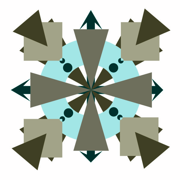
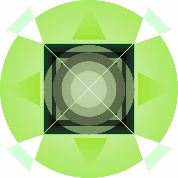
affinity designer 30 Mostly Nontraditional Compass Roses
penwiper replied to penwiper's topic in Share your work
Thanks MEB! I'm looking forward to when Affinity Designer supports triangular grids. That'll be awesome. :-) -
affinity designer The world was such a wholesome place until . . .
penwiper replied to penwiper's topic in Share your work
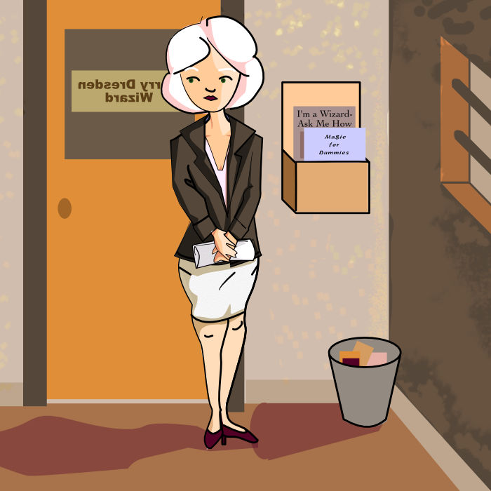
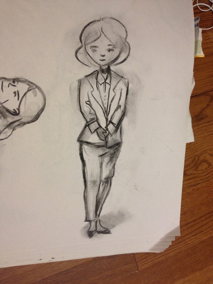
Next up, Queen Mab from Harry Dresden series by Jim Butcher, a series about Chicago's only practicing wizard detective, which really starts picking up around book two or three. She appears in Summer Knight, book four, and is a thorn in Dresden's side for the rest of the series. In the ruins of my office stood a woman with the kind of beauty that makes men murder friends and start wars. She stood by my desk with her arms folded, facing the door, hips cocked to one side, her expression skeptical. She had white hair. Not white-blond, not platinum. White as snow, white as the finest marble, bound up like a captured cloud to bare the lines of her slender throat. I don't know how her skin managed to look pale beside that hair, but it did. Her lips were the color of frozen mulberries, almost shocking in a smooth and lovely face, and her oblique eyes were a deep green that tinted to blue when she tilted her head and looked me over. She wasn't old. Wasn't young. Wasn't anything but stunning. I tried to keep my jaw from hitting the floor and forced my brain to start doing something by taking stock of her wardrobe. She wore a woman's suit of charcoal grey, the cut immaculate. The skirt showed exactly enough leg to make it hard not to look, and her dark pumps had heels just high enough to give you ideas. She wore a bone-white V-neck beneath her jacket, the neckline dipping just low enough to make me want to be watching if she took a deep breath. Opals set in silver flashed on her ears, at her throat, glittering through an array of colors I wouldn't have expected from opals - too many scarlets and violets and deep blues. Her nails had somehow been lacquered in the same opalescence. Male villain next! Hmm. Who shall I pick? . . . :-D
-
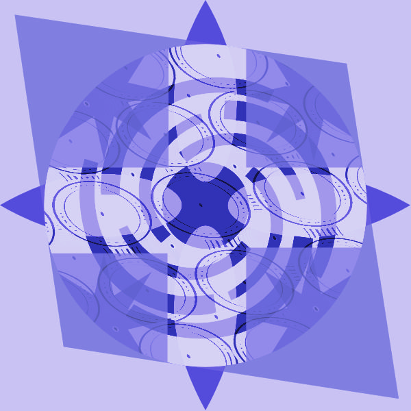
affinity designer 30 Mostly Nontraditional Compass Roses
penwiper replied to penwiper's topic in Share your work
Last batch, plus a bonus windrose I made on the side later. Thanks guys! Hopefully you've enjoyed this series. It was entertaining enough maybe I will make a spinoff later. I LOVE working with Affinity's shape tools. :-)
-
Very nice! The background is lovely also, I like those geometric triangles hiding in the background. The brushes are pretty darn cool, I have to agree. :-)
-
First thought: Lilo and Stitch, which is crazy because I've only seen the movie once. :-) Nice artwork there!
-
So I was messing about with Affinity Designer and I experimented with some line/pressure work and a style I haven't used before in this program. I'm not sure how I feel about it! All that's to say, critiques are welcome here... I've seen some pretty cool pen work around the forums lately and thought I'd give it a shot myself, especially since normally I play with converting shapes. :-) This was fun though!
-
I like what you've done with the font so far, and the texture is great. I would focus on lighting also, that will help the font read if it is ON TOP of everything else or engraved into the stone. The lighting on the texture is strong enough that it should have some effect on the lettering too. :-)
-
Heh, I don't know if this is specifically my family tradition, but when we hardboil eggs we draw on the shells with sharpies to mark them. Usually it's a variety of faces, so your gallery reminds me of that. I've always liked a nice egg shape. Maybe also why I enjoyed making bowls in ceramics class on the wheel? I dunno. Anyway, good job!
-
So today I was working on a more complex project and I noticed that there was a sort of border around what should have been a solid piece. I double checked my workflow and layers and low and behold, fx was turned on with Inner and Outer fx full blast. I would have had absolutely no reason to select those options and I'm sure I would have remembered if I had done so. Is this happening to anyone else? (This is completely weird! At least it was an easy fix.)
-
I'm sure the devs are working on it, but I am excited about Photo Beta and I was hoping there would be a "Share Artwork Photo Beta" specific topic in the forum. :-) It makes sense to me to keep the Artwork from different programs separate, at least until the full designer package is available and certain projects combine all three apps. Thanks for your work guys! Also, my first "piece" made with Affinity Photo, messing with brushes and selection tools. The wooden sculptures are from Africa and Peru respectively.
- 1 reply
-
- 1
-

-
These Painting Tools...
penwiper replied to jabbadagrif77's topic in [ARCHIVE] Photo beta on macOS threads
Wow, I just spent 20 minutes fussing around with different brushes; they ARE awesome. Can't wait to upload some photos to edit. One thing I noticed: @devs, is it possible to keep the same level of opacity between switching brushes? Sometimes it was the same, other times it switched back to 100%, seemingly without reason. -
Colour Balance Request
penwiper replied to leethcam's topic in [ARCHIVE] Photo beta on macOS threads
Yes, I also would love this option. :-) It was one of the main things I used when editing my photos as a student in a digital photo class. I'm trying to get used to AP's (non-adjustable?) RGB histogram. That said, I just got an interlibrary loan book-- "Creative Photography Lab" by Steve and Carla Sonheim and I'm excited to go out and start taking photos using the lessons there. I have the book for a month. We'll see what I can learn in that time. -
affinity designer Affinity illustrations and experiments
penwiper replied to Deadbyxmas's topic in Share your work
Oh, that looks perfect! Also, thanks for showing your sketches; I love seeing things like that along with finished pieces of work. :-D It's like a little slice of view into the working process. -
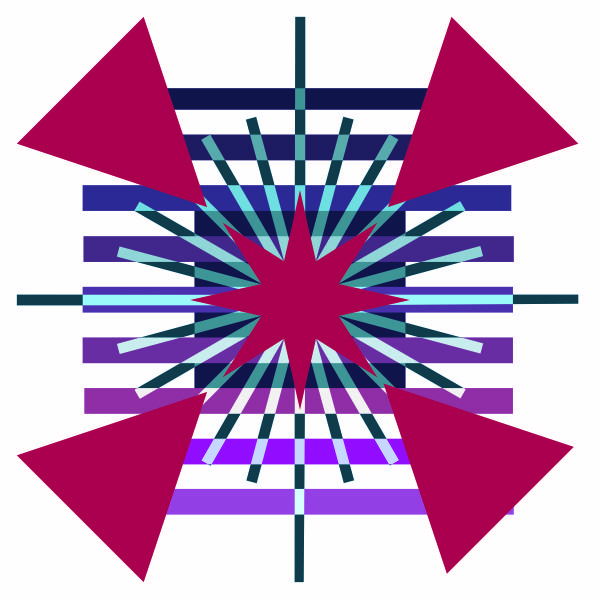
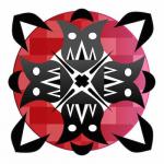
affinity designer 30 Mostly Nontraditional Compass Roses
penwiper replied to penwiper's topic in Share your work
I really love this set overall. There's a bit of unconscious Arabic influence probably; I was listening to the Voyages of Sinbad the Sailor while drawing windroses 22-24. He's a jerk, you know? In his fourth voyage he gets stuck in a tomb after his wife dies (custom of her people) and ends up murdering other people (women too) who are thrown alive into the mass grave with their dead spouses. He then steals their food and grave robs so that if/when he escapes he'll be able to survive their stuff and he sells it all later to get filthy rich. Cannibalism wasn't mentioned, but . . . I wouldn't have been at all surprised. *shudders.* I didn't remember all this stuff from the first time I read the Arabian Nights as a kid . . . My favorite windrose might be 23. I don't know, though.
-
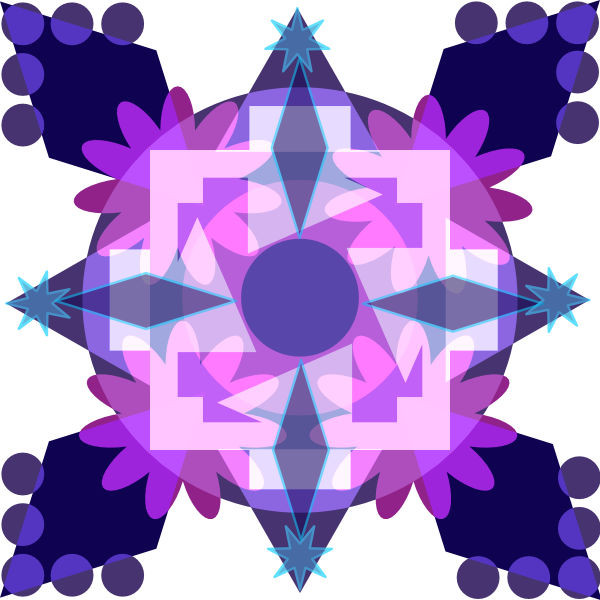
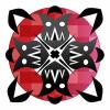
affinity designer 30 Mostly Nontraditional Compass Roses
penwiper replied to penwiper's topic in Share your work
Here are some more, 16-20. I'm not quite sure what to think about the non-symmetrical ones; some of them I like, others are a bit too wonky even for me (18) but overall this is a pretty good group. At windrose 20 I finally figured out clipping vs masking so I was experimenting with that quite a bit as well. I was also trying to vary my colors a bit. :-) 19 used to be a horrid pink gray mauve and I altered it substantially, which I believe was a wise move... Critiques welcome!
-
Sweet. Color is a lot of fun too. If you can draw this you'll be able to figure it out in no time. :-) Nice curves and simple lines.
-
ah, much better, thanks! It looks very nice. :-) Great capture! I can't wait to try the beta myself...
-
affinity designer Affinity illustrations and experiments
penwiper replied to Deadbyxmas's topic in Share your work
Oh, I like the textures on this quite a bit! Excellent job there, your character is lovely and I like the torn jeans also. One critique: I might raise the trees (bushes?) a little bit in the middle so there is not that white-ish contrasting area underneath her crotch which I find a bit distracting and not in a good way. I think that simple correction would make this a top-notch illustration. Also, not necessary, but might make a good addition: a bra strap sliding off one shoulder. Normally unless they're pinned to the overall's straps or they're VERY tight you can see them, esp. since the neckline of her t-shirt is so low. Good job, thanks for sharing! -
Wow that is weird looking as far as the gear teeth- turning in on themselves is concerned! Very cool though, I'm going to take a look at all the layers in just a minute and ogle. :-) Great job! (I'm not a tool aficionado, as you might have guessed. Those helical gears are wild.)