quantos
-
Posts
32 -
Joined
-
Last visited
Everything posted by quantos
-
 Thanks again Dan. Much appreciated and thanks for the link too - although colour preferences already set to sRGB.. I've also ordered a SpyderX Pro colourimter to properly test my monitor (even though by reputation these new QD-OLED monitors are supposed to have very good SDR colour values out of the box.. but the QD-OLED is a relatively new spec still and the pixel structures and the same as LED or LCD's which may be a factor for eye-dropper (?). Either way, your help/support has been great and it looks like every is fine (except those very minor tolerance differences via the eye-dropper, which is still curious unless explained by the shape of the QD-OLED pixels, or something else still). Thanks again meantime. Q.
-
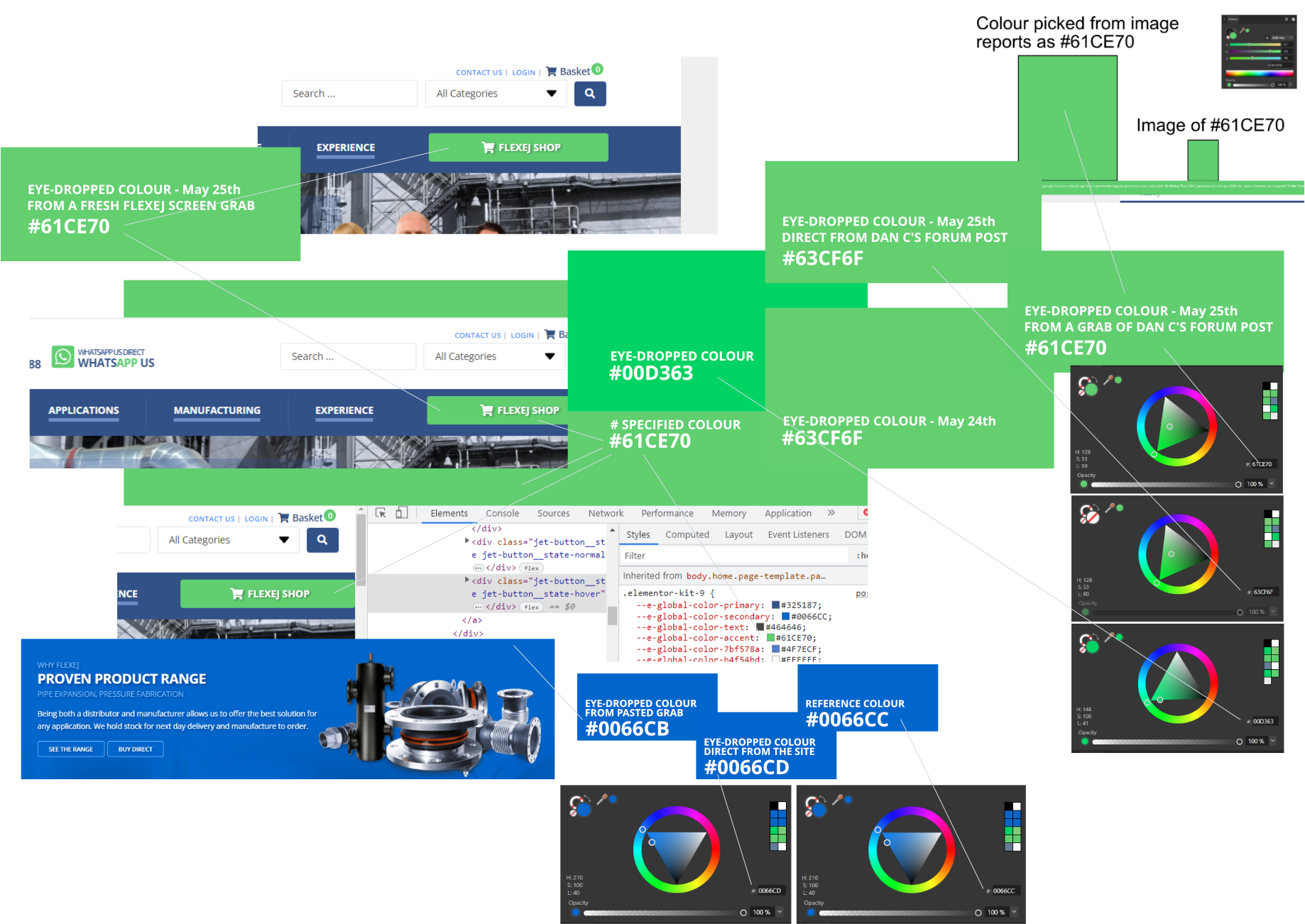
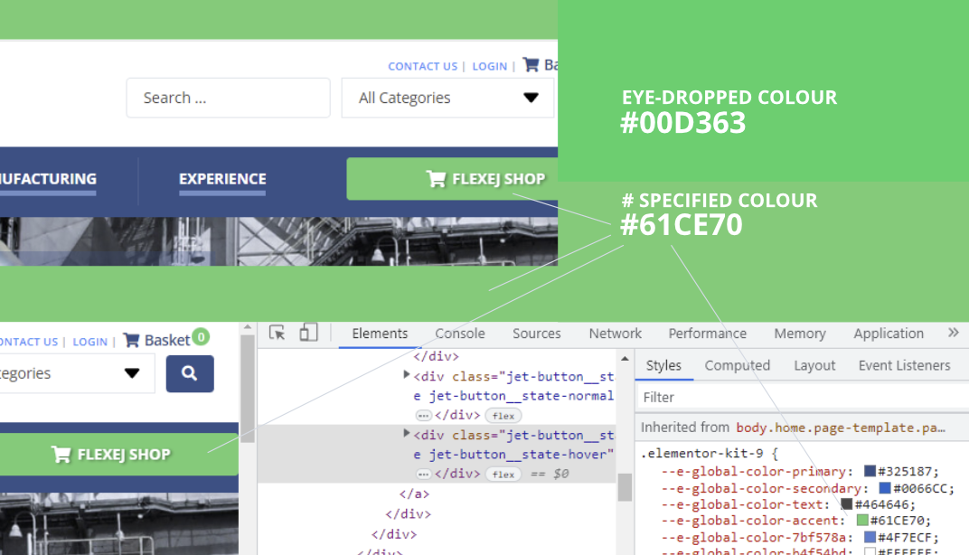
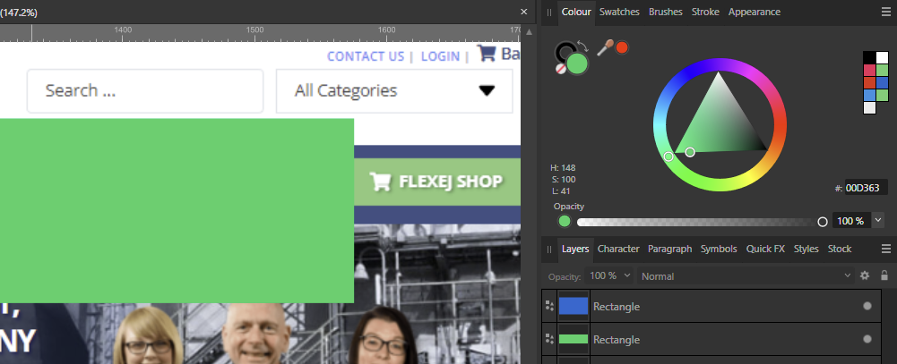
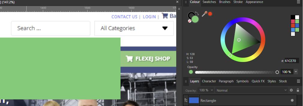
Hi Dan C/Affinity.. I might yet have to go back to re-test everything to make sure I haven't made a mistake but I have just made another simple test today with a fresh screen grab of the flexej.co.uk reference site (see attached) which can be seen in the top left area and Affinity Designer reports via the eye-drop tool that this is the target #61CE70 colour. This is also the same if I screen grab Dan C's post, paste that into Affinity 2.1 and then eye-drop that grab within Affinity 2.1 BUT if I eye-drop either this test site directly or eye-drop Dan C's post directly from the forum then Affinity Designer reports that BOTH colours are #63CF6F! Obviously there's only a very small mathematical difference between #61CE70 and #63CF6F, just 2 points of Hue of 1 point of luminance but shouldn't they be identical? HSL/hex colour dial grabs of these also included for quick reference. Also now included: some reference grab/tests around the specified #0066CC which I can see shows only a very tiny difference between the specified hex colour and eye-drops from the pasted-in screen grab (which Affinity 2.1 thinks is #0066CB) whereas if eye-dropped direct from the site/browser (Chrome) is #0066CD. I can also see that in terms of HSL specification that Affinity is reporting that all three of these blue #0066CC variations are HSL 210.100.40 - and so the question is are these just all machine/tolerance variations (which are possibly OK) or should we expect these all to be the same? Hope that helps. Q.
-
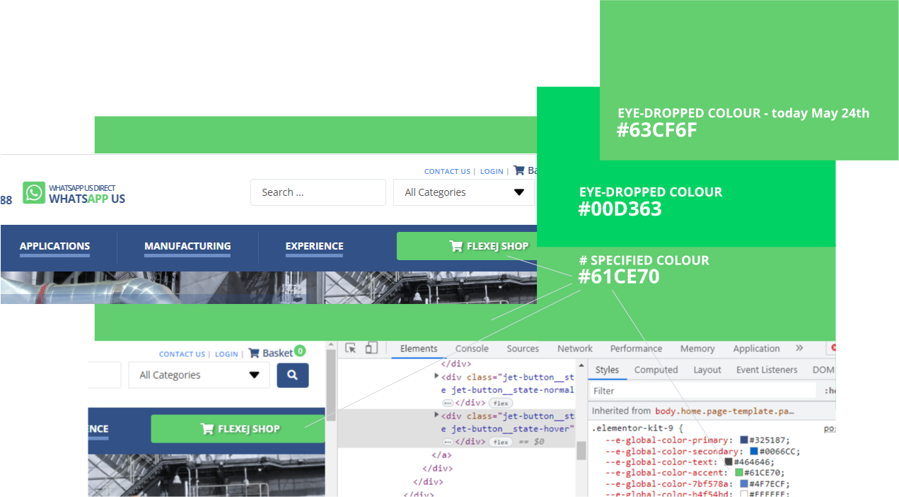
Thanks Dan... Grabs below of my current settings.. where I have now used the Windows colour calibration tool to create a slightly modified sRGB profile. The oroginal tests were all done using the standard sRGB profile exactly as yours is set-up. Here's the grab of my current set-up: As well as the Monitor settings: Using the new calibrated profile (shown) I now also get a new colour reference variation using the eye-dropper tool but have noticed that it's only in the middle-green area of the HSL colour picker where the variations are coming from (although why they are different to the hex-referenced grabs is still beyond my understanding).. NB that #00D363 eyedrop was the original pre-calibrated grab (which perceptually to me here looks to be 'right'). The new #63CF6F was taken just now using the new calibration which closely matches the screen grab and actual #61CE70 and so all a bit strange. Document set-up colour here: PS I have noticed that Affinity Designer 2.1 seems to be eyedropping other colours accurately and it is only these mid-scale greens that seem to have the problem - although I'm no expert and can't really guess how this is possible. HDR, by the way, is turned off for all this and I don't use it for graphics/colour work. NB eye-dropping those other two primary and secondary colours shown the html #325187 and #0066CC seems to work flawlessly. I could set-up a better two for you if you suspect the colour-drift is based on either Affinity Designer or the monitor not actually using the colour profiles specified (if that makes sense)? IE if the monitor is really using Display P3 instead of the specified sRGB? Do let me know if you need anything else to investigate further- thanks. Q.
-
Hi guys. I presume I'm correct to assume that someone from Affinity will get back to us here on the issue mentioned in the subject as from my professional perspective there's a fatal error with the software right now (or something in my set-up) but to summarise again: Affinity Designer 2.1 doesn't seem to be rendering sRGB IEC61966-2.1 colour correctly (for all the reasons stated).. if someone could please confirm they will be looking into it. How long does a reply normally take at the moment? Many thanks meantime. Q.
-
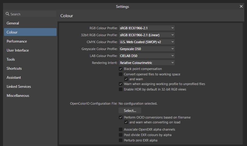
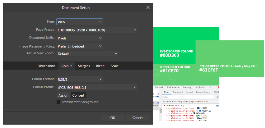
Actually, there is something odd going on here... but I don't know how/where and it may be the same on Affinity Designer 2.0 and 2.1 and so my apologies for any confusion but now I've checked everything again do look at the freshly-attached new grab which I think explains itself but the explanation + query is this: Hex colour #61CE70 shows 'correctly' in the browser. This is a long-term client secondary brand colour reference; but Eye-dropping the specified (and correct-looking) colour from Affinity Designer (2.0 in this test) Designer thinks the colour is #00D363 - which when viewed in either Affinity Designer 2.0 or 2.1. IE it looks correct (perceptually correct/more luminescent). If I paste in a Windows screen grab of the page (with the referenced #61CE70 green button) into Affinity Designer, the colour looks washed out (as mentioned in my earlier reports) and Affinity's eye-dropper also believes the washed-out colour is #61CE70! So the question is why don't these colours all match correctly? And the concern is which colour reference system is right? IE Why does Affinity believe that the specified #61CE70 is actually #00D363 when viewed in the browser? Re the various colour settings in play here (on my Windows 11 desktop PC): The document colour space (profile) within this test Affinity Designer file is set to sRGB IEC61966-2.1 colour format is RGB/8 My Alienware AW3423DW OLED display is set within Windows > System > Display > Advanced to use the monitor's Standard (SDR) color space (8-bit depth/RGB) The display monitor is also set to use the sRGB IEC61966-2.1 ICC profile via the System > Display > Advanced > Color Management utility Brightness/contrast and gamut all set to use recommended/out of the box monitor parameters too. And so my understanding is that everything should be displaying correctly/consistently under the sRGB IEC61966-2.1 specification - where the underlying problem is the concern that the colours I'm using within Affinity don't seem to match specified hex/rgb colours used elsewhere within Windows. Perceptually, the colours specified in my sites/css and shown in the browser window/s seem correct so can you explain what is going on or have recommended guides/sources for checking what Affinity is doing in my/this case?
-
Oops. Ignore this for now. I've just spotted that my Affinity Designer file was set to use the wrong colour profile internally (and not the sRGB IEC61966-2.1 profile in my preferences). I'll re-test but there's a very good chance that everything posted above is completely wrong! 🙂 I'll update again if it's not. C.
-
In case not clear, the image grab behind the rectangle also shows the wrong flat green being imported into Designer 2.0/2.1 (from a previous test). The actual site the grab is taken from is https://www.flexej.co.uk/ - in case you want to check/test actual hex colours set there. NB In my test file I was trying get the new AW3423DW Alienware colours to work best in what it calls 'Standard' (or SDR) mode which for now also seems best suited to using sRGB colour mode. IE when that monitor is set to use the sRGB colour profile colours and properly bright and match existing Affinity Designer 2.0 artwork + actual colour in web browsers. And so this is a very unwelcome set-back in Designer 2.1, hence need to re-install back to 2.0 - although I do need a proper primer again on colour management within Affinity Designer as well as on how to set-up both my monitor and Affinity Designer to use the higher colour spec "Display P3" which I can't get to run at all properly on the new monitor either. All colours drop all vibrancy/luminescence and overall screen brightness drops a good 40% or more - hence sticking with sRGB and standard colour mode until I can get all the colour spaces to work properly together at that specification. As you guys must be working with this all the time it would be great to see if you have any updated guides you've put together that goes through colour set-up for Affinity and the latest generation of high-gamut monitors. Many thanks. C.
-
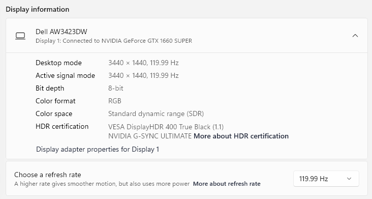
I have just this moment updated Affinity Designer to v 2.1. I probably need to re-install the previous version to fix the following glitch, which is that upon installing 2.1 colours are washing out in the editor and Affinity seems to have changed it's look-up values (sorry I can't explain that more technically) but here's what I've just found.. In a colour test document I created several days ago (to test my new Dell Alienware AW3432DW (QD-OLED) monitor) I created a flat rectangle in Affinity 2.0 with a flat rgb hex colour #61CE70 (a bright limish green) from my target website and pasted in a grab from the homepage target website that uses this colour. In Affinity Designer 2.0 with the workspace set to use the default sRGB IEC61966-2.1 colour profile pasted-in flat colour (#61CE70) perfectly matched the flat rectangle. But after updating to Designer 2.1 the colours don't match and rather oddly I can see, using the colour inspector, the previously input hex reference has been changed from #61CE70 to #00D363 whereas the colour being displayed (to the naked eye) is the correct (brighter) colour that match the browser (Chrome and Edge). See grab #61CE70-mismatch-pic-1.png attached. IE Designer 2.1 seems to have taken upon itself the job of updating colour objects set in 2.0 to 2.1. My new OLED monitor supports a very wide gamut spectrum well beyond sRGB but is presently set within Windows 11 Color Management to use the ICC sRGB IEC61966-2.1 colour profile - from my test colour matching file was first set-up (in Designer 2.0). My colour preferences within Designer 2.0 were not changed before running the update. I suspect that Designer is perhaps ignoring the preference setting to use sRGB IEC61966-2.1 colour profile set (in Designer 2.0) - but don't have any tools/ability to test that further - and suspect it is attempting to update the colour values within the document to match this monitor's default colour profile (in Windows) which is roughly 95% of "Display P3" colour specification. One of the reasons for suspecting this is I do re-input my test flat rectangle to use #61CE70 again (as specified in Designer 2.0) the test colour then re-matches (more or less) the washed-out lime green in the grab. This is shown in the second attached image #00D363-mismatch-pic-2.png. If you compare the two images attached here you should be able to clearly see (and hopefully test/debug) what's going wrong here. Do let me know if supply any more information - but meantime I'll have to re-install Design 2.0 to work around this problem. Thanks. C.
-
Affinity Publisher won't open
quantos replied to wanderingalbatross's topic in [ARCHIVE] Publisher beta on Windows threads
Thanks Jon. I have about 20 from the period (May 12th) and a couple of older ones in there (that are bigger and might not be relevant. The last 3 .dmp file attached - with thanks. Q. 1f978de9-8d0a-4c06-91a0-8cef6704d6ae.dmp 3c35be51-924f-4255-8ae0-00b0cefd4705.dmp 4ab97622-68e3-438f-b76b-c27d9439f1c6.dmp -
Affinity Publisher won't open
quantos replied to wanderingalbatross's topic in [ARCHIVE] Publisher beta on Windows threads
Interesting. Extra feedback for you. I've just found out that: 1. if I click on a file directly, the file opens without any issues. 2. If I then open the/any file from within the open app then there don't seem to be any problems; but 3. If I try and open the app itself from my pinned shortcut, it fails (closes after 2-3 seconds); and 4. If I try and open any file from my pinned shortcut lists, they also fail to open (same error); and 5. If I try and open from the short-cut alias (on the desktop), it also fails (same error); and 6. Same error if try from the standard Windows start menu 7. Which is also true if I try and open Publisher.exe file directly. Seems strange to me (as a non application programmer) but at least I seem to be able to consistently open files directly. -
Affinity Publisher won't open
quantos replied to wanderingalbatross's topic in [ARCHIVE] Publisher beta on Windows threads
Unfortunately, updating to .Net Framework 4.8 seems to have made no difference so any tips/clues would be highly appreciated. Let me know if there's anything I can do to surface any actual events (logs?) that I can get to you. Many thanks. -
Affinity Publisher won't open
quantos replied to wanderingalbatross's topic in [ARCHIVE] Publisher beta on Windows threads
The latest version of .Net Framework would appear to be 4.8 which for Windows is available here: https://dotnet.microsoft.com/download/thank-you/net48 I'm testing that now/as soon as it finishes updating. -
Affinity Publisher won't open
quantos replied to wanderingalbatross's topic in [ARCHIVE] Publisher beta on Windows threads
Cross-referencing another thread for this, if that's not considered bad etiquette: Where the reply is: "Can you please make sure you have the latest (4.7.2) .Net Framework installed?" I don't yet know if that's what my problem is but will check that and report back here if it fixes it. -
Affinity Publisher won't open
quantos replied to wanderingalbatross's topic in [ARCHIVE] Publisher beta on Windows threads
Hi guys. Late post on this one but this was the first/best thread I found when googling 'affinity publisher not opening' - which for me is a brand new problem. Have just updated to the latest version too (after the previous recent version didn't open). New version is 1.7.0.312. The "only" change since I last opened Publisher (within the last few days) was I update my NVIDIA Geforce graphics drivers (for the first time in 2 years) to GeForce Game Ready Driver - which is v 430.64 released May 9th 2019. I'll check other posts and update this one if I find any but the problem/bug is quite simple (on Windows 10 64bit): 1. Click to open Publisher. 2. Initial loading graphic runs/loading the programme 3. The programme starts to open as usual (at least the outline shell of it does) 4. IE the menus don't load, just the outline + the close button etc 5. Within roughly 2-3 seconds (5 at the most) the progamme shell window just silently closes. 6. Closes with no warning, no message, no error, nothing. It just closes. Running as Adminstrator makes no difference. PS Affinity Designer seems unaffected (if this is an NVIDIA GeForce driver error). I haven't updated that for a week or three and that version number is 1.6.5.123. I'll look around now and see if I can find a more specific/recent thread on this. Thanks guys.
-
Oops. @MEB. I just realised that feature works differently to expected (and Fireworks where I'm coming from) after I re-read Andy Somerfields' post "Select this slice, then at the top, choose "PNG" and choose a "Matte" colour - your file will then export with the colour as the background"... I was expecting to be able choose the transparency colour (from the colour index) using that tool as I needed to alias out to particular colour. With Fireworks you can select which of your index colours to use for the transparency (which is what I need) and so it seems that might not be possible (after taking another look). Apologies for the confusion - although I still would like to be able select the colour to index out. Q.
-
Thanks @MEB. Current version (1.5.3.69) of AD on Windows 10 Pro/64bit. I'll test AP too. @Geowil, yep, a straight transparent background export works great for PNG 24 and PNG 8 but sometimes you do want/need to matte out a particular colour to properly alias out/blend into any given background colour - being the query. Thanks guys. Q.
-
Connected to this, I can't get the 'matte' selection tool to work either. The scenario, a common one, is that I have various objects including cropped bitmaps sitting on a coloured background (shape object). I want the object aliasing to continue to the same background colour as the final export, stripping out the background colour in the export. IE This is a very common requirement. However, I can't get the selected matte colour to render as transparent. It outputs the background colour every time - seemingly ignoring the matte setting. What's the trick I'm missing? Q.
-
Color Discrepancies
quantos replied to hr4art's topic in Pre-V2 Archive of Affinity on Desktop Questions (macOS and Windows)
Guys/team Affinity. With a little testing I've just realised that, in my case, I need to use a different Colour Profile to the recommended/default sRGB IEC61966-2.1 for web/digital work. IE using sRGB IEC61966-2.1 seems to desaturate the colours (all colours) of every image I bring into Affinity Designer's workspace. If I switch to Adobe RGB (1998) the colour match (from any other app/browser to Affinity) is much better whereas it's only if I switch to use the colour profile of my DELL U27313H monitor that the colours match perfectly (as far as I can tell). I'm on a Windows 10/64bit workstation here. Request: Can this 'feature' or a good explanation of what's going on here be added to your Help section, tutorials and anywhere you can mention it. I don't have this issue with any other professional design/art programme I use and whereas I'm sure the option must be there some very good reasons that perhaps don't apply to anyone, like me, that only work in the web/digital sphere - unless I've missed a very important tutorial somewhere in my 20+ years working as a digital designer. PS Your otherwise excellent Affinity Designer WorkBook (book) doesn't mention any of this either. IE there's nothing in it at all about colour calibration and the tools/presets that might be needed to work with colour in AD (or AP). -
Color Management weirdness
quantos replied to Volker's topic in [ARCHIVE] Photo beta on macOS threads
Thanks @hschneider. I think you've solved the problem (workround) I've just posted about on two other threads. Apologies everyone. I'll update those threads but working here but for me I get best colour matching if I set Colour Profile to match the colour profile of my monitor (DELL U2713H Color Profile, D6500). Switching the Colour Profile to use Adobe RGB (1998) gets it close but my own DELL U2713H makes it match perfectly. I'll petition (or at least ask) the excellent Affinity team to add more information about this in their tutorials and set-up/help system as I've seen nothing about it and frankly it's embarrassing that a professional, qualified and practising graphic designer with over twenty years experience has no idea (or not enough) about what's going on here*. *Although I presume there's a clever/important piece of reclibration going here that I possibly just don't need. All and every other image I work with all in/every other professional design/illustration app (from Fireworks to Illustrator, PhotoShop and more) all seem to treat the reproduction of the image/colour identically. IE As far as I can tell it's only Affinity Designer and Affinity Photo that seem to require some/this additional configuration step (that isn't, as far as I can tell/see, documented anywhere in otherwise excellent Affinity documentation and tutorials. Thanks again meantime. An 'official' reply/pointer in the right direction would still be appreciated here though. Q. -
Color Discrepancies
quantos replied to hr4art's topic in Pre-V2 Archive of Affinity on Desktop Questions (macOS and Windows)
Hi @toltec / guys. Can you possibly help with another colour set-related issue (which is how I found this thread). The issue I thought @hr4art was going to describe is that Affinity Designer (and Photo) both seem to apply some kind of adjustment to their (my) workspace so that images viewed in any other application on the same monitor/session (ie side by side) seem to have completely different properties (roughly 10% desaturated) in the Affinity workspace compared to the same image viewed in Fireworks, Photoshop, any/every browser and every other app I've tried. I'm sure Affinity Designer is doing something really clever but as a professional graphic designer who only works in the digital space, it's driving me mad and can't find any way to turn off this adjustment. The pics shown in the other thread/post show exactly what's going on (but not how to fix/remove it): https://forum.affinity.serif.com/index.php?/topic/41155-designer-imported-images-appear-washed-outbrightened/. Many thanks in advance to you/anyone who knows what/where this setting is and how to turn it off. PS I'm using the latest Affinity Designer build but the same issue has been around since pre-release versions. My main workstation here is a Windows 10/64bit, if it makes any difference. Q. -
@MEB Keep going guys. You're doing a great job. However it does look like you have some background functionality in two of your existing functions (which might be extendable?): 1. Selection Brush Tool under the Pixel Persona menu set does allow a good marquee selection to be created (step 1) with pretty good fidelity and speed. 2. And your Grow/Shrink, Feather Selection and Outline tools already seem to be operating using some kind 'path' logic once that initial selection has been created - but the tool options stop there. 3. I'm not a programmer in any shape or form but would it really be so hard to add 'Now save this path so I can edit it further' option? Just in case it sounded like I might have been describing something more complicated. It just seems you're so really, really close with these tools as they stand and that's all anyone might reasonably desire at that next step.
-
Thanks for the replies guys. Looks like I'll continue using Fireworks for that - or try Inkscape (thanks Toltec). Generally speaking I think you've done a great job on Affinity Designer and Photo (I've got them both) so keep up the good work. For just about every other feature it beats Fireworks hands done (and blind-folded).
-
Hi guys, I can't for the life of me workout (or find any tutorials) on converting a marque selection into a path and vice versa. In Fireworks this is easy, and I use it all the time, you just create a new marque (based on colour range selection, say) and use the Selection menu too Convert Marquee to Path and to go in the opposite direction use the Modify menu and click "Convert Path to Marquee". Job done. I just can't find/see any way to do this with Affinity Designer or Photo. Typical example of what I use this for: find a flat pixel graphic that you want to convert into vectors to recolour and scale up etc. I'm trying to create some new maps from some older pixel maps right now. How can/do I do that? Thanks in advance. Q.
-
Color Management weirdness
quantos replied to Volker's topic in [ARCHIVE] Photo beta on macOS threads
Hmm. Looking further I can see that my Affinity Designer application seems to be stuck in 'print' mode whatever I try, new docs, editing existing docs anyway. I can't see what actual difference that makes (from the Help system) but would that explain the colour differences anyway? Can't see how it should if we separately specifying the colour profiles used by the document. Anyone know? Q. -
Color Management weirdness
quantos replied to Volker's topic in [ARCHIVE] Photo beta on macOS threads
Hi guys, Newbee to Affinity Designer (Windows Beta) here. I just found this post while searching for colour calibration after editing then exporting the images to be quite surprised how different they were exported compared to when viewed in Affinity Designer - and was trying to see if there was an internal calibration/explanation for this. There's a couple of screengrabs here that graphically (and non-technically) but clearly shows the problem: The first image here (affinity-colour-comparison-b.png) shows the 24bit png exported from affinity but displayed in Chrome (top) and MS Edge (bottom). Note reasonably well-balance colours of the two guys whereas the girl is overly saturated towards red (most glaringly): The second image here (affinity-colour-comparison-a.png) shows second 24bit png exported from affinity Chrome (top) and MS Edge (bottom) but this time I've overlain the top image part of the image with a screengrab of what I can see directly in Affinity Designer (Windows Beta). As you can easily see the two gents now look quite jaundiced (towards yellow) in comparison with girl who now looks more natural (less colourised). The two colour swabs are eyedrop grabs from the same pixel so you can easily see how far out the pixels are (taken from the central area of the main gent's forehead). IE First swab is the pixel colour as it appears in chrome/edge and second swab is the same pixel grabbed in Affinity Designer. I don't believe I have a more technical way of specifiying the difference and thought it better to show this for your eyes to see directly, although feel free to download test more precisely - assuming the Affinity Designer team browse and reply to these forums? Although checking the document set-up again I can see that the document setup seems to be stuck in 'print' mode even though I've tried to edit/change that mode several times back to 'web' mode. If anyone (or the developers) have any idea what the error/discrepancy is I'd appreciate the feedback and hope this helps anyone else looking into Affinity colour calibration issues. I'd better re-check the manual meantime or more than 5 hours on this will be out the window! :-) Quantos.