

gdenby
-
Posts
1,887 -
Joined
Posts posted by gdenby
-
-
If I'm understanding correctly, the Freehand method doesn't require an extra mouse click. The AD version I'm using shows the tool cursor change from pen to node control upon the press of the modifier key, but the pen tool resumes drawing after a mouse click at the next position.
-
Yes, press the command key, which puts you in node control mode, Position, and/or adjust curve. Release command, continue drawing. I'm using 1.4.2 on Mac, don't know what the modifier key for Win might be.
-
I can almost here it ticking.
If you might, how much time did you put into this timepiece image?
2 things.
The texture on some of gold-ish parts is very nice. A bitmap blended w. the vector shape?
Near the top are 2 screws. One is really neat because it has a slight imperfection as if it was screwed in not quite right. Nearby is another that seems to be overlapping a bevel, and is somewhat different than a similar one that has a bevel in a flat surface. Seemed a little out of place to me. -1 out a 100. ;)
-
Let me see if I can describe this simply.
Umm, no, I can't.
Imagine you have a simple grid, like a chess board, but all the squares are white. You can color in each square black to make shapes. Rectangles are easy. One black square after another, either horizontal or vertical. Diagonals are harder. Curves are even harder. If you are working on a piece of graph paper, you might use a compass to draw a circle. Then you have to decide if most of each grid square is mostly within the circle or not. All the squares mostly within the perimeter get colored black. Close up, everything is "jaggy."
Early displays and output resolutions were severely limited. I forget the resolution of early video display. It was different in Europe than the US because of the electronic system, but my recollection is that early US video displays were 640 squares wide by 240 high, but could be rapidly varied to produce an image that seemed 640 X 480. Printers were much more limited.
Appearances got better as computer input and output gained color capabilities. Still, everything was a grid. The numerical record of the grid was called a bit map. Images that were sent to a video output were called "rasterized." Rasterized images and printed images often did not match well because the video and printing device had different resolutions and available grey/colors.
About 45 years ago, a standard was advanced that described how mathematically defined shapes could be transformed into the highest resolution and color space of whatever device was being used. The real shape or image could be depicted at the maximum for either display or output. The forms can be shifted across the space, and best fits made for them in display. Basically, this is what computer draw/vector programs do.
If you have a 600 dpi laser printer, that is how fine the shapes will be made.
Photo/paint programs are still limited by the base resolution of the input device. The input can be from a graphics tablet, or a digital camera, etc. But it still might be from an old digital camera image w. a resolution of 640 x 320. The applications have been developed to make the bit maps as subtly shaded as possible, but they still cannot quite equal a pure mathematical shape. The "jaggies" still remain If you start with a sample that is 300 dpi, it is unlikely that it will print out at 600 dpi without being a little fuzzy.
Hope this helps.
-
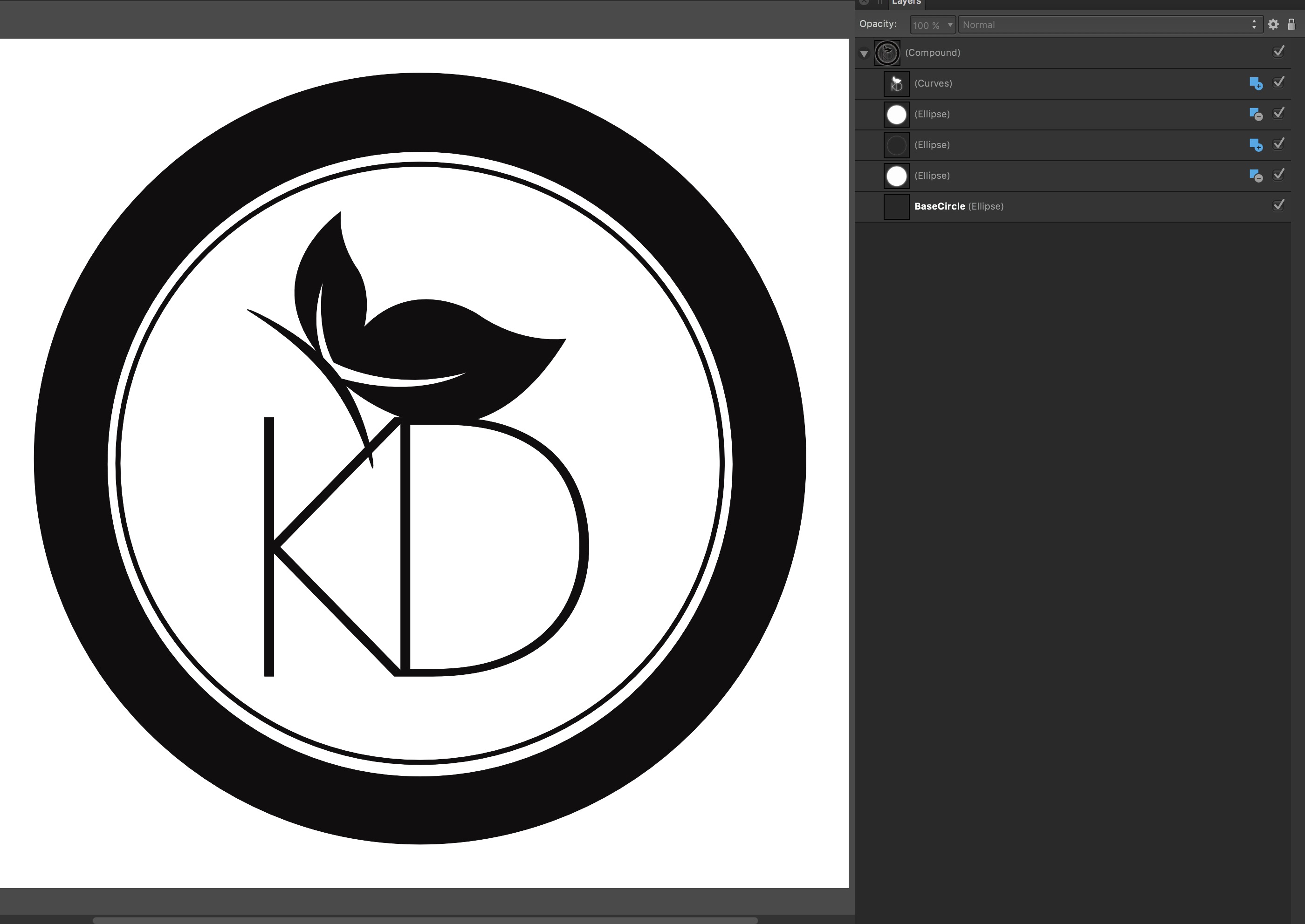
Here is what I managed to figure out and do.
1st, I ungrouped the butterfly, and made it an object. It seems to me that groups and compounds don't go together correctly. I compounded all the object layers. The it was a matter of figuring out how to make the layers interact. That is, add, intersect, subtract, or xor. I'm not quite familiar w. how those work. Eventually I found I needed to add another smaller white circle, and subtract that from the underlying black circle that was in the original.
Here is an image of the results, w. the layer panel showing the structure.

This saved OK as an .svg
-
-
Draw the object. By default, the rotation handle on the bounding box rotates around the object center. Click on the show rotation center widget in the tool bar across the top, and move the rotation center to wherever you want, either in the object, outside it, or snapped to its own or other object vertices. The use the rotate handle. Holding down shift will constrain the rotations to 15 degree increments.
-
Yes, the command J gives a proportional change. The easiest I found was to turn on the grid, invoke snapping, and draw, draw, draw.
-
Hi gdenby,
Currently you can already set shortcuts for Break Curve and Join Curve operations. In the Keyboard Shortcuts section (Preferences), set the first dropdown to Draw and the second to Node Tool to find them.
Thanks, great! I was getting pretty good at clicking the widgets, but keyboard short cuts should save me many seconds. Obviously, I still have many things to discover.
-
Thank you for that... however, I've come from Illustrator, where you can draw two wiggly lines, finish the end of one near the end of the other, and use Command J to join them. When I'm drawing complex maps, and I need to rest my hand, it works well. How can I do this? This is a real world problem, and I wonder if I'm missing something obvious!
I haven't found a keyboard short cut. You need to select the paths in node tool mode, click the join curves widget, and then the click the close curves widget.
The join will draw a line between 2 end points, the close curve draws between the other 2.
If you have a closed object, and break it at 2 points, the close curve will create a line between the ends of the 2 new objects.
-
I made a very simple transparent .tiff. Just a rectangle on a page set to transparent. It opened with the rectangle on a transparent background in Photoshop Elements, GIMP, and Pixelamator. Several other programs either rendered the page w. a white background, or simply failed to show anything.
My suspicion is that Autopano expects certain parameters to understand transparency. Perhaps output from AD, open in another app that has worked w. Autopano, and save.
-
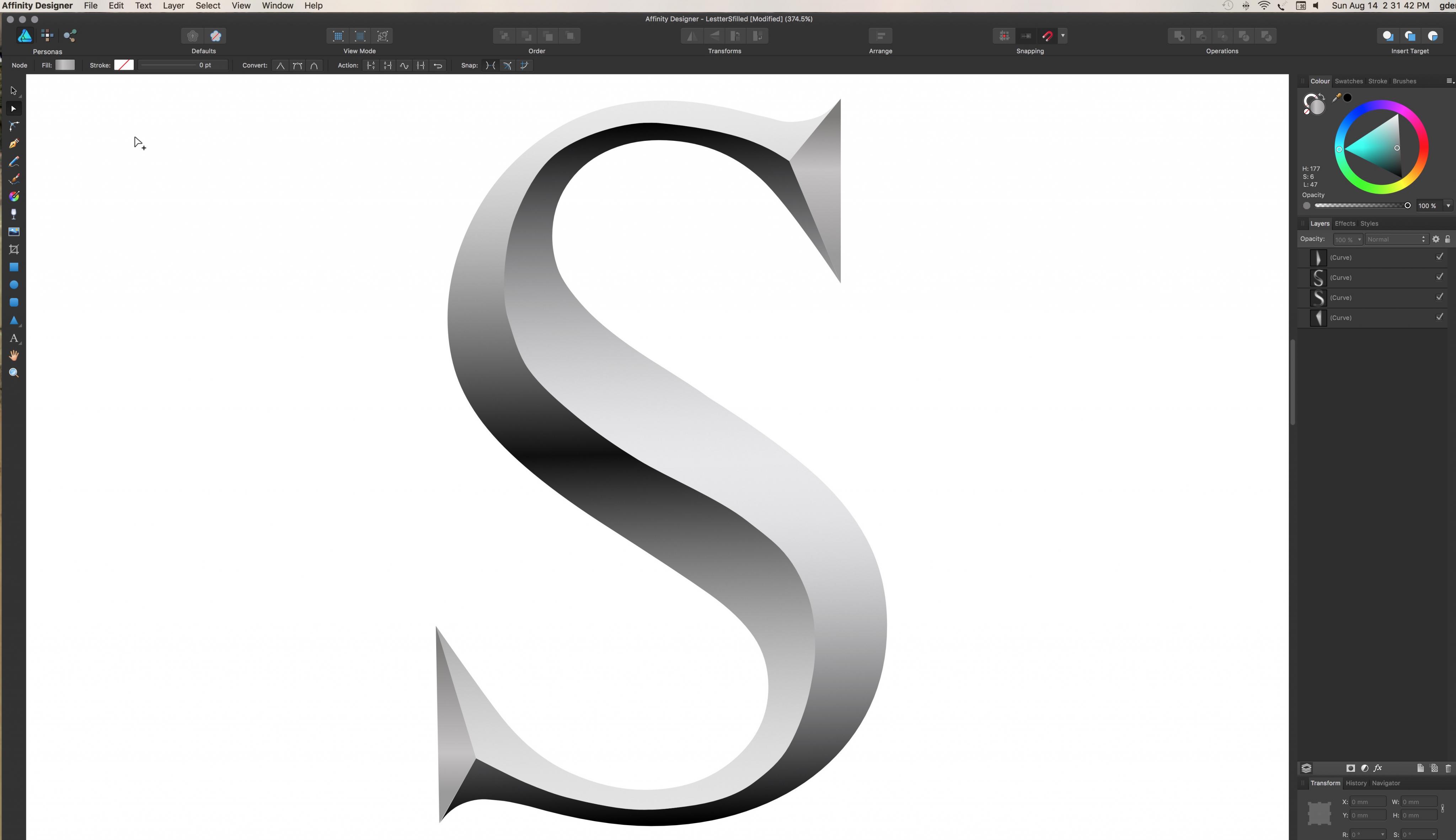
Sorry to be slow in making a reply. Sure, you can have the letter "S' in an improved version. I've been working on a whole alphabet in caps, and when finished, if anyone want it, they're welcome to it.
I'm learning a lot, not only about AF, but fonts and chiseling. I've become much better at breaking the font letters into chisel cut sections. Still not quite clear on what the carving standard in reality is, if there is one. Also, fussing w. adding chisel marks within the cut sections.
For now, I hope the portioned letter shape can be made to work w. gradient effects to simulate light from a specific direction.
-
You want each shape to be separated by a white space of identical thickness? I tried several things, such as expanding the stroke and then subtracting that from the original shape. I tried drawing strokes over shapes, and subtracting those. None of the approaches I tried ended up convenient. All took quite a lot of fairly time consuming manual adjustments.
This is using the 1.4.2 version of AD. From what I've read from the 1.5 roadmap, the convert pixels to vector, and perhaps the knife tool and knockout-groups may make the process quite easy.
-
A response guessing about what is needed.
Illustrations:
My understanding of the problem.Every standard vector shap is made from a fill and a stroke. In this case, each fill may be different, but all strokes must be white, and the white separation between each fill should be the same width.In addition, all of the stroked shapes should be surrounded by a different color stroke or shape.A simple approach. Flat color background. A blue sky and a green ground. That is, 2 rectangles on above the other on the page, not strokes.Switch to outline view.Select a drawing tool and set it to no stroke or fill. This example, a tree trunk made of a verticle rectangle. Converted to curves (vector lines), a nodes added nodes to stretch out for limbs.Draw an ellipse for the leaves.Here's where it gets to be "fun."Select the trunk and leaves and divide. Look at the layer panel, and find the shape portion that was formed by the difference between the trunck and leaves. Delete that. Select the curve that is the upper part of the trunk. Add to the selection the lower part of the trunk. In node tool mode, join the curves. Select seperated nodes if necessary, and/or just click on join curves.There should now be a leaf shape w. a continuous ouline. Its nodes will be in the same place as the nodes for the continuous trunck shape. Select either, and set a fill and a stroke width that is appropriate, in white color. Copy and past style to the trunk. Change the trunck fill to something different.Repeat the process for other new items. You may need to add more nodes depending on the shapes yopu draw, and snap those nodes to other shape nodes to get an exact fit.I haven't yet figured out how to outline the combined stroked shapes with a consistent width outline.Hope this helpsI'm not sure the images will display correctly. Not showing right in the post preview view -
bleduc,
I see what you are trying to do is more complex than the circle and section example.
Please clarify. What is the desired final result? In the right hand thumbnail example, I see 4 shapes. The paint bucket handle, the bucket, the inside of the bucket, and the pouring paint. The body of those shapes use 3 different blue colors. All are outlined by the darker blue color.
Do you want a white outline that separates the shapes from the intermediate blue color outline?
(Sorry for the quick and dirty example)
-
Hi, Bleduc
For the specific example you gave. There is a very easy way.
Draw a circle, and convert to pie, or start w. the pie tool. Make the section you want. Duplicate the object, then use the "negate" button on the tool options bar.
The doughnut, section and crescent tools have similar options.
For more complex shapes, I too would use the "divide option.
-
I'm posting this to requests because I don't think there is any way to do this other than as a work around.
When using the node tool, it could be handy to split a curve segment in half. Eye-balling doesn't work very well in some cases. In other words, select at least 2 contiguous nodes, and add a new node in the middle.
Not a big deal to me, but I think it might be handy.
Waiting most anxiously for "symbols."
-
Hi gdenby,
What do you mean "Not terribly accurate"? Looks pretty darned fabulous to me!
I'm still learning to control the vector drawing tools. The center of the V gouge line wobbles some, and isn't quite a 50-50 split.
-
Not an easy job. AF is a 2D application, and this sort of thing is easier to model in good 3D programs, tho' when I used them, the output was screen resolution only.
Here's what I did. I'm somewhat familiar w. Gill fonts, and stone carvings. I used Perpetua, his "modern antique" seriifed font, and typed an "S"
The hard part for me was breaking the form to the 4 components of the incised stroke. Not terribly accurate. Then assigned some gradients to fake lighting from above.
Maybe this will help Vernon.
-
For a 1st try, I, for one, am impressed.
If the chrome you are talking about is on the pick-up, and what I suppose is the on-off switch, I think it isn't specular enough. That is, the gradient is too even, and there isn't an almost reflective area where the light source shows as a high light.
Do a search on "ray traced specularity examples" for illustrations of the specular effect.
-
Nice drawing!
-
I won´t call this seamlessly when you look closely at "high-noon".
Left and right end of brush needs to be "identical". Have a look please at these two scanned brushstrokes:
Cheers
P.
Yes, I know. I haven't tried that operation for several years. Last time, I used Photoshop. This time, GIMP, which I've only been using for maybe 3 months, and so am still a little clumsy. "Hypothetically" it works. :)
-
Click on 'More Reply Options' and look for the 'Attach Files' section below the message composition area. Browse to your saved image file or Affinity document and then (very important, but easy to overlook!) press the 'Attach This File' button.
Got it, edited the post.
-


Hand draw and vectorise text script
in Pre-V2 Archive of Affinity on Desktop Questions (macOS and Windows)
Posted
I have Inkscape, but haven't used it much. I get better and easier output from the Mac app, Image Vectorizer, $5,than what I get from Inkscape. My results from Inkscape had far too many nodes. It was rather "blurry" compared to what I got from IV in about 3 seconds.