gdenby
-
Posts
1,887 -
Joined
Everything posted by gdenby
-
Hi, rodsal23, What's your market like? Where I live, it used to be pretty easy to get work designing T-shirts and vinyl signage w. base level skills. But professional work usually required having a portfolio showing about 4 years of work. And, often, at least 2 years of college level graphic design. I understand there was a market at least just a few years ago for CD covers. My elder daughter and her husband use CG all the time to develop tattoo designs for their clients. The clients often change their minds, so be quick to adapt is good. But most clients are like that. "Yes, yesterday I said that design was OK, but can you change it this way and be ready to go later in the day?" Maybe your question should be more like "Am I adept enough to change a polished design in 2 hours?"
-
 See: https://affinity.help/designer/en-US.lproj/index.html?page=pages/ObjectControl/duplicate.html?title=Duplicating%20objects
 -
You could try and adjust the stroke pressure graph, but it would be fussy. More work than I'd want to do. Easier to make a square, and group it w. a thicker pen line.
-
Hey, Vec, More nice work from you. Face is great, tho' the lower portion of the dress is maybe a little to "lo-poly". And I do know the real title.
-
Hi, anotherhoward, I'm not using the 1.8 release yet, just 1.7.1, but I 'spose the brush works the same. I'm a little unclear about what you are asking. "In Designer, after making a vector brush stroke, how can I just widen the object without lengthening it? When I try to just increase the width it is also increasing the object's height" The stroke along the vector is controlled by the object stroke attribute. Changing the stroke size will expand/contract the spread of the bitmap. Also, the stroke pressure map will vary the spread along the vector. Designer does not have an auto trace feature. A vector brush is just a bitmap tiled on top of a vector. One might do a screen grab, and run the pixels thru a bitmap vectorizer.
-
bug
gdenby replied to Fzyn's topic in Pre-V2 Archive of Affinity on Desktop Questions (macOS and Windows)
Hi, Fzyn, From looking at your posts, I guess you are mistaking curve stroke attributes for shapes themselves. Change your View Mode from Vector to Outline. Any curve levels, when subjected to a boolean operation, will add, subtract etc the areas defined by the curve nodes, not the stroke attribute. Hope this helps some. -
Hi, devoured_elysium, My understanding is that the boolean operations work on areas. A straight line has no area, so there is no operation. If the line is curved, it implies an area between the nodes. Then the bollean works, but it automatically closes the previously implied area. The new perimeter needs to be cut apart using the node tool.
-
No, tho' it is a basic subtract operation. S'pose theres something relevant out there. I mentioned adding the text curves together so that the flower shape would not need to be subtracted over and over for each character. Just the whole mass at once.
-
Hi, nullpointer, After converting the text to curves, add the text curves to make 1 text like figure. Subtact the flower shape from that
-
lined figure
gdenby replied to Rolandas's topic in Pre-V2 Archive of Affinity on Desktop Questions (macOS and Windows)
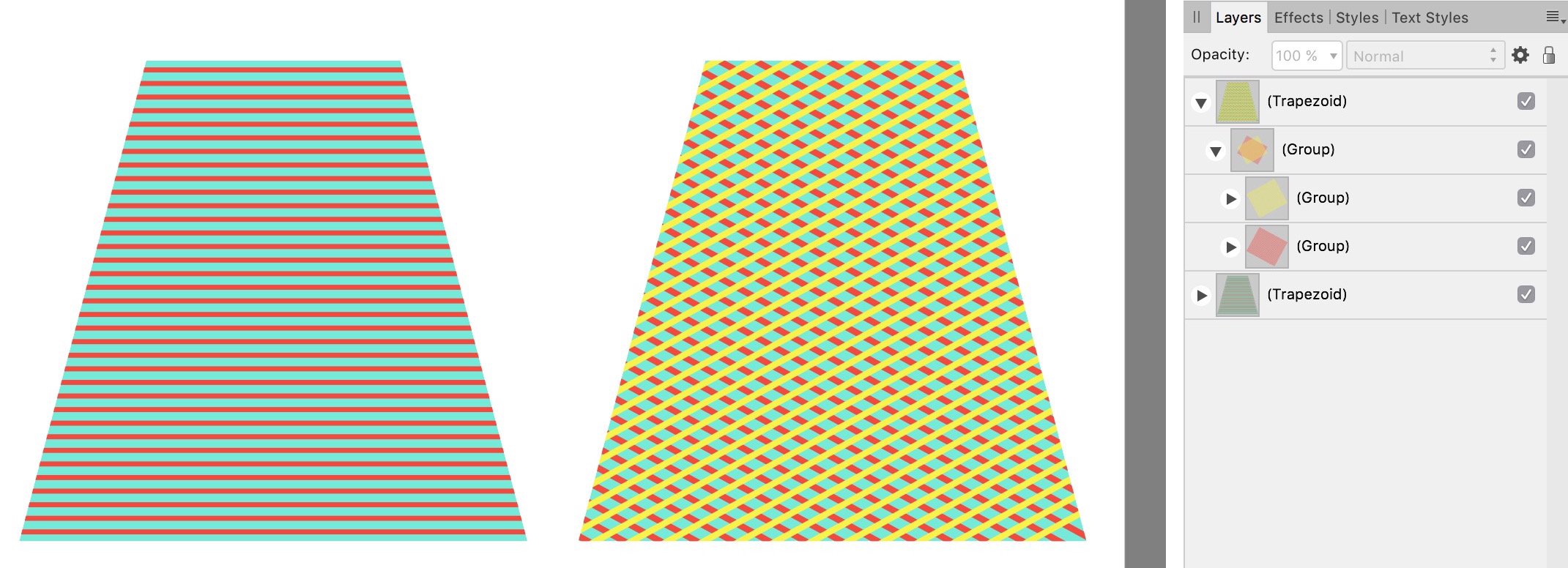
Hello, again, Rolandas, The "boolean" operation, such as add or subtract, can only work when a curve can enclose an area. My example is made from many thin rectangles. Expanding a stroke will make something similar, but often adds many un-needed nodes. The boolean operations will work on those thin rectangle groups. BTW, they were made by "power duplication," so after making the first line-like thin rectangle allows many repetions in just moments. -
lined figure
gdenby replied to Rolandas's topic in Pre-V2 Archive of Affinity on Desktop Questions (macOS and Windows)
Hi, Rolandas, Are you looking for something like this:
-
RGB VS CMYK
gdenby replied to AndyMane's topic in Pre-V2 Archive of Affinity on Desktop Questions (macOS and Windows)
Hi, AndyMane, RGB to CMYK conversions rarely reproduce in print what one sees on screen. In general, computer displays show a wider gamut of color than what printers can reproduce with inks. See, for instance, https://www.color-management-guide.com/relative-colorimetric-and-perceptual-rendering-intent.html. Essentially, one tries to squeeze or stretch and RGB image into a CMYK space. Typically, the CMYK image is rather dull and/or distorted. The only reliable solution I've had is to print trials, and tweak the original file till I get something that corresponds to what I want to see. -
Beat me to it. There's a swatch set of web safe colors.
-
Hi, Gargamel, Please clarify. When you say "border width of 4 pixels", do you mean the shape has a stroke width of 4? You may be getting confused by the apeearce of the stroke, which can be set to the outaside or inside of the shape, or centered on the shape boundary. The snapping is based on the shape, not the stroke. Try switch to outline view to see the base shape geometry.
-
Hi, Rebecca Fishburne, A simple mistake I made early on was to have only 1 level (curve) selected. As I moved the shapes around, only the last moved was highlighted in the layers panel. There must be at least 2, w. the one making the change (subtracting, etc) on a higher level than the other.
-
Agreed
-
Hi, hebbardkennedy, W/o seeing what you want to work on, I think it is likely that there will be lots of problems. What is your source material? Is it a digital file that has been compressed? Those are likely to have lots of "artifacts" that have lots of grey noise at edges between B & W. "Jaggie" stair steps. Using a threshold adjustment will give you a B&W image. In my experience, most images w. fine detail change shape slightly depending on the threshold setting. Fine lines in engravings can go from scattered black pixel smears to solid shapes w. minor changes in the threshold. Sometimes it helps to add a small amount of gaussian blur, about .5 pixel, to average out edge features before subjecting them to threshold. What you may want to do is clean up your pattern manually, and then change it to a vector drawing. Affinity does no do those, but the are good online free services for that, and some very inexpensive stand alone apps that do the job. The results will most likely need some smoothing by deleting extra nodes
-
Hi, Tlottrike, Probably the easiest thing to do is convert the donut to curves, and then do a boolean divide. That will make each ellipse a seperate object, and you can give whatever stroke widthe you like to each.
-
Space evenly
gdenby replied to Barry S's topic in Pre-V2 Archive of Affinity on Desktop Questions (macOS and Windows)
Hi, Barry S, Assuming you are asking about Designer, check out this tool bar widget: which will give you both alignment and distribution options.
-
Vector image help
gdenby replied to Keahi's topic in Pre-V2 Archive of Affinity on Desktop Questions (macOS and Windows)
Hi, Keahi, Basically, the starting image is really "dirty." There are lots of compression artifacts which muddle the shape edges, but one can still see the patch's thread work, which adds more extraneous detail. I tried a couple of different vectorizing settings, and did a little little image processing to clean it up for other tries, and got results much like PixelPest posted. One might start from there, and after lots of node tweaking, get a vector restoration that is a smoother and more accurate reproduction. -
Hi, Psych, I've used Painter, but its been several years since, and Krita a bit recently. AP is basically for photo development, adjustment, enhancement, compositing, etc. It has a good range of "brush" tools, as well as vector shapes. Unlike the above, it is not primarily a natural media emulator. For work being done w. both APhoyo & ADesigner, see here.
-
Center of Object
gdenby replied to JoergWe's topic in Pre-V2 Archive of Affinity on Desktop Questions (macOS and Windows)
Not at all. Simple as pie. Set up your grid, w. snap to grid enabled. Draw a circle of desired size. Press "command" (Mac, don't know PC) and drag to next desired gird intersection. Press "command J," "Duplicate, and repeat the circle as needed. If you then don't like the horizontal spread, move one end circle, and use the "distribute, horizontal spacing" widget. This will yield an equal spacing between al the circles. If I might suggest, stop thinking in AI, and start thinking in AD. Different methods for the same results. -
Hi, Shih, What you need is a bitmap auto tracer. Affinity does not have one of those built in. I ran your sketch thru one, but even after some preprocessing, the results were poor. Crucially, the line was not continuous. Tree..svg
-
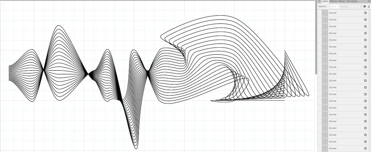
I've been sort of busy the past few days. Might have more time on the weekend. For now, some notes. The method starts w a straight line made up of evenly spaced nodes, a dozen or more. The line is duplicated in parallel. If all the resulting straight line curves are selected, and one switches to the node tool, one should see a grid of nodes. I prefer sharp nodes, because when the lines are bent, I find it easier to select columns of nodes connected by straight sections. Using the node tool, select a column of nodes from all the parallel lines. Then switch to the node tool selection box. This makes it easy to rotate, shift, skew and perform various transforms on the column. One may then, as desired, proceed thru other columns until all may have been twisted, expanded, contracted, etc. Then turn all the nodes into smooth. FWIW, one can apply a tapering pressure curve to one of the lines, copy the style to the rest. Then the series can be broken, making portions of the lines either wispy or thicker.
-
A quick manual example. Method. Use pen and snap to grid to make regular straight line, all sharp nodes. Duplicate. Select all, switch to node tool. Select columns, and click the transform box widget. Reshape node columns. Select all, and turn to smooth nodes.