gdenby
-
Posts
1,887 -
Joined
Everything posted by gdenby
-
 Considering that potrace has been in development for 15+ years, and is available free in Inkscape, or on the web at Vectorization.org (and in other forms), seems to me like there are other features that should be built into Affinity well before a bit map tracer,
- 16 replies
-
- 1
-

-
- bitmap tracer
- tracer
- (and 1 more)
-
Hi, Kev74, The learning curve is there, but it is not very steep. The UI has a ton of stuff in it, and it will take awhile to dig thru it. Also, the Affinity software is fairly "young." There is a lot of stuff that is available in older apps that isn't in Affinity yet. And features that are Adobe proprietary you will not find. Nevertheless, what is available works well. Its quick and reliable. In my experience, very few program failures compared to others. Some rough corners for some operations, but mostly just irritations.
-
Hi, Angelos58, It appears the problem above is caused by the diagonal lines being slightly offset from the square they fill. See attached:

-
The original file could contain bitmap images. I just d0loaded the youtube logo as an .eps, and it included a badly pixelated image for the shiny screen glint. It needed to be blurred. I suspect that the pixelization problem may be because the .png file is not large enough to start, or is being exported at a smaller size. As I mentioned above, all bitmaps will have shapes w. pixelated edges.
-
What format are you exporting? All pixel formats will, by definition, be somewhat pixellated. Of the various formats, .gif is usually the worst (its the oldest, back when everything was pixelated), .jpg not compressed or only slightly will be good, as will .png. Only .svg can be made close to no pixels/dots, because it is not a pixel image till rendered at whatever the highest resolution of the rendering device is. How are you making the art? Are you adding images from other sources into ones made w. Affinity apps? If those are pixellated, you might be able to process them into something useful. As R C-R mentions resampling, which is often helpful. Again, give an example.
-
Ah, just checked back after a long day entertaining family. Yes, that does it. Your method selects the parts that are needed, much easier than selecting all the un-needed ones.
-
I tried to make it easy, but this is really a difficult file. As I mentioned, I had a lot of trouble figuring out what white parts were supposed to be part of the back ground, and which were tube high lites. Check out the attached. The top layer, colored orange, needs to be duplicated. The glints, selected as nodes, need to be wipes out. Then that layer gets subtracted from its self, leaving the original whit layer part.
-
Hi, LeeScoresby, (Edit: I thought I posted this a couple of hours ago, but here it is anyway. What happens, I 'spose, when working on a morning coffee and vector work.) I gave it a try. Not a fun set of objects to work w. In the end, I made a couple of mistakes, because I was having troubles telling which white shapes were glints on the surface, and which were white areas that needed to de transparent. Attached is my attempt, w. flaws. Here's what I did to get the results. I duplicated the top layer till I had a copy for itself and each layer below. I then began doing a boolean subtraction w. a copy on each of the lower layers. Because of the way the .svg stack was made, that subtraction cut away any part of the under layer that was no the layers color. This is easy enough to do. The hard part was at the end. I had to figure out how to cut away the open areas within the tuba body outline, but leave the white glints. In other words, I had to cut a portion of the topmost image away from its duplicate. I see from the result that I messed up somewhere, and subtracted a few glints, and not the background, so there are a couple of transparent areas where there should white. I put in a patch white rectangle in the layer stack to fill that. The .svg structure was unusual ti me. More often, I find the layers stacked light to dark on top, which means the background is transparent. tuba_silber_vectorized_grau.afdesign
-
Have you looked at your "Sharing and Permissions" for the enclosing folders? If you own the upper level directory "chrstopheralmaraz" you should be able to grant access to any sub folder. The application will write to any directory the user owns. There is a possibility that there has been a directory corruption. Run the Disk Utility app, and do a repair. Messed up permissions used to be pretty common, but I haven't had one for over 10 years.
-
Hi, seannymurrs, If I've understood what you want correctly, you want the background very dark grey to be right next to the black outline around the golden color shape. Try this. Select the golden shapes, which appear to me to have both a fill and stroke assigned to them, and make the stroke aligned to inside. The default is middle, so the stroke projects beyond the edge of the shap a little, and over lapps the shapes on the lower level. Hope this helps.
-
Natural rainbow
gdenby replied to DesignT's topic in Pre-V2 Archive of Affinity on Desktop Questions (macOS and Windows)
What he said -
Natural rainbow
gdenby replied to DesignT's topic in Pre-V2 Archive of Affinity on Desktop Questions (macOS and Windows)
Here's my offering. Its an eliptical gradient fill in donuts. Rainbow.afdesign -
affinity designer what I need to do for next level
gdenby replied to Manozac2000's topic in Share your work
The underlying "sketch" is too dark, and continuous. Make the sketch faint, like the lightest touches of a pencil. -
Back to basic
gdenby replied to Jordane's topic in Pre-V2 Archive of Affinity on Desktop Questions (macOS and Windows)
Hi, Jordane, Looking at your file, it appears you are trying to us the vector curves like "paint" lines. At this time, Designer fills the space enclosed by a vector line, and you have a lot of open vectors that can not have a fill placed cleanly in them. The shoe needs to be put together differently. Don't think of it as a bunch of lines that can have color between them. Think of colored areas that need to join together sort of like paper cut outs. Attached is a re-build. I took lines, duplicated them, broke them into smaller parts, and then joined and closed them into abutting shapes. Rather tedious, but doable. OneShoe.afdesign -
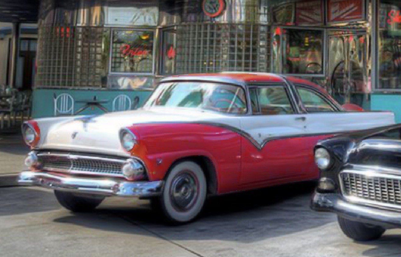
Hi, rudyp16 Techniques. The image you posted was fairly "dirty." Obvious compression artifacts, and pixellated. So I used a denoise adjustment to get rid of the artifacts. Then went over the pink areas w. the flood selection tool w. a low setting, 8% tolerance. Where I couldn't get a clean outline line, I used the selection brush at 4 px to add or subtract. Then Used the HSL adjustment to change to shift and deepen the selected pinks. There were some problems, so I used a blur brush here and there to smooth the pixelization. I probably should have resampled the image to a larger size to reduce the pixelization. Later, I looked up images of the car, and saw that the red was darker, more like "fire truck red." So I went back, made selections using the pen tool, turned to layers, then flooded w. reds sampled from photos. Adjusted opacity and merged down. Better results, but I've been doing vector pen drawing for quite awhile now. Not "auto-magic" and a little too saturated to fit the rest of the image.
-
A beer in one hand, a pulled pork sandwich in the other, about 5 min.
-
Hi, jefferis, I've never had any buggy problem w. any of the built in shape tools. Can you post what the tool context bar looks like?
-
Hi, American, I'm just a hobbyist when it comes to image processing, and after years of puttering around, I still have only the vaguest notions of how these things work. I think your perception of redundancy is because there can be a certain amount of overlap among filters and blend modes that are similar. But there are typically situations where one or another will give slightly better results. An example. Up until recently, if I wanted a grey scale image, I simply used the HSL adjustment, and dropped the saturation to 0. (Note, in GIMP, desaturation can work on the color average, or its luminance. Slightly different implementation of the same thing.) But then I noticed the the B&W adjustment could produce a wider range of grays depending on the color component. W. some settings, it would be roughly the same as plain desaturation, in others, far more grey levels within specific colors were possible. So if I want to get a grey scale image from something like an old yellowed photo, desaturation works well enough. But if I have something w. lots of colors in it, B&W is the choice. When I 1st started using Affinity, I noticed that it had more blend modes than photoshop. My daughter who uses PS extensively caught that right away. Affinity being relatively new at the time, had less documentation on the modes. I read a bunch of stuff about the PS ones, but then noticed a user here wondering what the exact numeric values for the modes were. That is, what range of hues or luminances, and what percentage of enhancement. From further reading, I found that individual developers implement the same notion is slightly different ways. FWIW, there was a nice explanation about Affinity blend modes here. My take on it is that there are certain filter, adjustments, etc that are most useful for specif images, or specific portions of images. Picking the right one is a matter of finesse.
-
Divided Circle
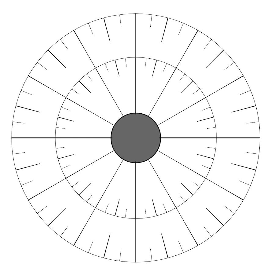
gdenby replied to TokyoMike's topic in Pre-V2 Archive of Affinity on Desktop Questions (macOS and Windows)
Tremendous progress. I'll bet it was mostly fun. I think that when centering the focal point, the problem may be a simple manual one. The mouse button has not been released completely, and so the point shifts slightly as one moves ones hand away. -
Hi, 828 Design, I've had some result like yours, but nothing quite as extreme. Try this. Select the zig-zag section of nodes. Make them smooth, not sharp, and then use the smoothing widget. My experience is that most of the excess nodes are gathered into a smooth curve, tho' slightly distorted. See the attached showing what happened when most of the teeth were corrected AFAIK, the stroke is created by a series of "dabs", and the expand routine tries to follow the edges of the dabs. When there is a tight curve in a stroke, the dabs stutter. When the stroke is scaled up, the stutters are big enough that the expand routine can follow them. In this instance, not scaling up works better. The same shape shown in the attached when expanded at original size did not make the saw teeth.
-
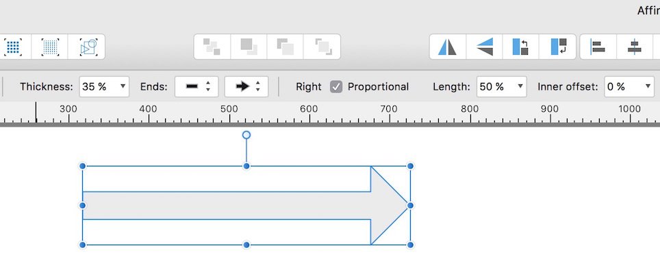
Hi, Gitmesteak, I think the problem is based on terminology. A pixel brush can be applied to a vector shape, but does not conform to the vector outline. It can be limited by the vector, but is applied manually. A vector brush is a pixel brush stretched and perhaps repeated along a vector. An outline of the shape, such as you presented, can have a vector brush traced over it. It can not have a simple pixel brush applied. While the stroke dialog shows an icon for a brush, that only applies to vector brushes. See the attached for examples of pixel brushes used within vector shapes, and a vector brush tracing an object. Smear.afdesign
-
Erm, a duplicate thrice fold. Actually, the original, and 3 others, so 4 copies available, 1 at 90 min interval, 1 noon and night, 1 each mid-morning, which is what I used to review the data entry integrity of the previous days work.
-
I managed a department's digital resources. I had triple duplicates made every 90 minutes to different machines in different fire protected zones. The fellow that took over from me contracted for off site encrypted in addition. For myself, storage is now so ridiculously cheap, and my cloud connection so hideously slow and until recently unreliable, that a handful of SD cards squirreled away in various places does the job. As a BTW, I'm going to wipe out an old snowball iMac before recycling, and the HD on that is stores less than the SD card plugged into my current machine.
-
Divided Circle
gdenby replied to TokyoMike's topic in Pre-V2 Archive of Affinity on Desktop Questions (macOS and Windows)
Try the cog tool, and amazing shape maker. The cogs can be formed to thin lines, and made in different depths. They can then be converted to curves, broken at the nodes, and superfluous lines deleted. Attached, a quick and sloppy version which was started by making 1 48 toothed cog, and altering it to ones of 24, 12, & 4 teeth w. different hole radii. Duplicated, and reduced proportionately for the second ring.