gdenby
-
Posts
1,887 -
Joined
Everything posted by gdenby
-
To me, the greyscale one really works. Almost completely "non-digital" in look and feel. Have you tried printing anything out?
-
If that is your 1st vector drawing ever, it is beyond brilliant. If it is the 1st in Affinity, still brilliant. Both sharp and subtle.
-
affinity designer Retro Coffee Robot. Vector and Raster combination
gdenby replied to kevinmcsherry's topic in Share your work
Cool. Most people don't know that the 18 +1/2 amendment to the US Constitution stipulated that the right to caffeine shall not be abridged. Its good to know that the future will facilitate this basic right. -
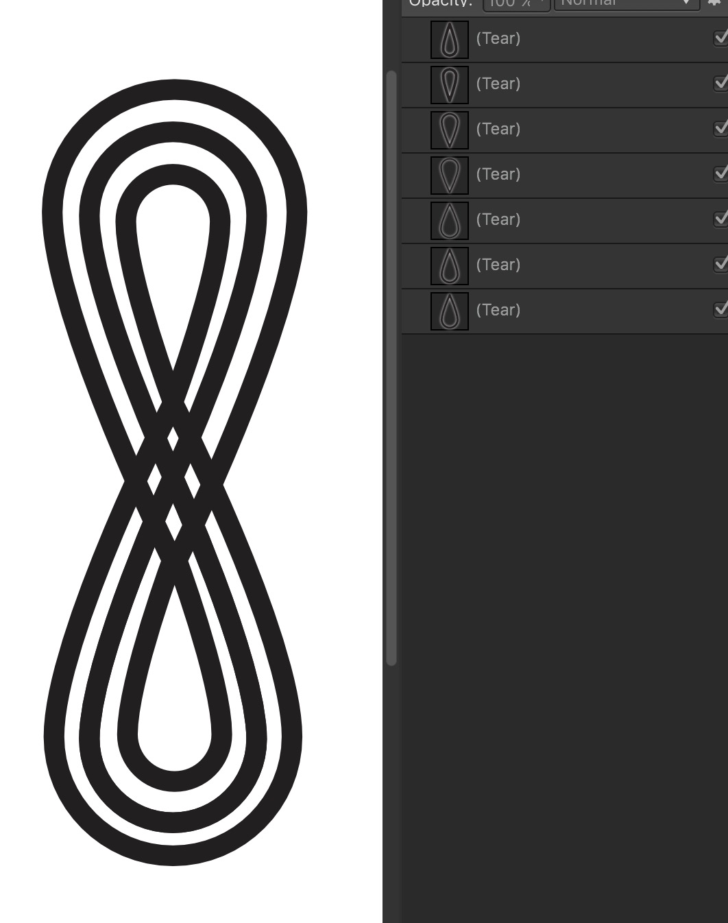
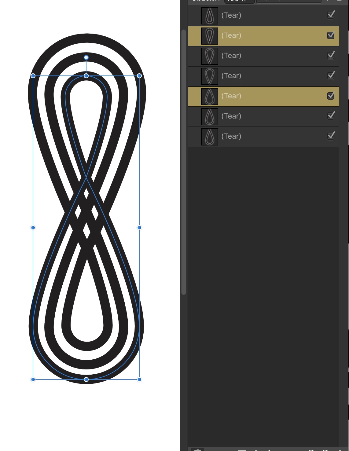
Umm, yeah, I still don't quite have a grasp on building vector brushes, and have had similar results. However, there is a pretty easy way to get something close to what you want. I used the tear shape tool, default setting. Fill, none, stroke 10 pt. Copied, pasted and flipped. Moved to make an upright 8. Duplicated the original and scaled it up till it looked about right. Duplicated & flipped as above. Repeated making a set of smaller tears. Then I started boolean adds for the pairs. Continued till I had 3 curves. Drew a black rectangle. Changed the stroke to white, and placed it over the rectangle. Rotated the "8s". Realized the strokes were not quite a smooth as they should be, and so tweaked some node positions. Next, the fussy part, hand drew in the shadow shapes. The results not quite what you showed. I suppose the tear shape needed to be altered a little at the start. But the method seems workable. Total time, with fumbling, about 45 min. I'm supposing I might be able to get that down to 1/2 hr. or less.

- 2 replies
-
- 1
-

-
- vector brush
- monoline
- (and 1 more)
-
Cut tool?
gdenby replied to Paul Martin's topic in Pre-V2 Archive of Affinity on Desktop Questions (macOS and Windows)
If you have used one of the shape tools, such as the rectangle tool, and then use either the "convert to curves" menu option, or click the widget for the same process, the node tool becomes active, and the break curve widget is available. A vector shape can be modified by the available corner tool options for the defining nodes. Once the object has been converted to curves, the nodes can be individually modified by breaking, made sharp, etc. Note, if the node(s) are suitable, the corner tool can still reshape the line, but not in mass, but by selection. If you are drawing a shape w. the pen tool, the break, close, and join options are always available. If you have used the pencil tool, you need to switch to the node tool to modify the "pencil" line. With a little practice, it becomes routine. -
I too used Corel Draw for several years after they were no longer developing for the Mac. Eventually, it became to unstable. It was a fine program, tho when I stopped using it, it was just starting to be useful for web design. Do note that CD had over 10 years of development at that point. I'm not surprised that some of the capabilities are not yet built into the AD framework. And yes, I recall it was very clumsy when used w. a tablet.
-
Selecting objects
gdenby replied to bikeman's topic in Pre-V2 Archive of Affinity on Desktop Questions (macOS and Windows)
Assuming you are using AD. You should be able to click anywhere within a vector shape, not just on the stroke outline if you are in vector view mode. But if you are in outline mode, you do need to click on the bounding line. In either mode, you can also select any object/layer shown on the layer panel, and the object(s) will be highlighted. -
Look at page 93 in the workbook, the introduction to tracing the guitar. Maybe try using the pen tool by itself 1st, to see what it can do. Essentially, use the pen tool to create a silhouette line from various connected nodes/points that are made by clicking, and adjusting.
-
affinity designer 1930s Style Travel Poster
gdenby replied to kevinmcsherry's topic in Share your work
Fine work. The "vintage" poster style remains wonderful. As a BTW, you might like looking at color woodcuts by a fellow named Gustave Baumann, who was active up until 1971. A master of line and shape w. a generally limited palette. -
Not currently possible. There is a work around. If you want a more subtle blend, and need it in just on one shape, 2 identical shapes can be set one over the other. both can have a gradient fill, and the top or both can have transparency applied, using the transparency tool,
-
I think I may have figured out what is going on. I'm using a Mac. Usually I drag an image file from a directory window onto an AD document,and it is resampled to the AD document resolution, say 300 dpi, and has many dots as pixels. That is, 900 x 600 pixels becomes 3 x 2 inches. 1200 x 900 = 4 x 3. Same happens using the AD media browser. This is independent of the images own resolution. 1200 x 900 x 72 px/in comes in the same as 1200 x 900 144 px/in However, if I use the place menu command, the image comes in and is displayed initially at the images own dpi. So an image at 900 x 600 at 72 ix/in comes into the AD document at 12.5 x 8.25 inches. I think part of your solution may be to add the images thru the media browser, and not "place," which will then need to be resized. If you have AP, I would expect it to have an image resizing/sampling feature so that the various files can be made the same reolution to start.
-
I don't quite understand your description of what you are doing. Are you trying to replace actual dials with restorations made in AP and/or AD? Or making an image that fits inside an image found online? Perhaps you are moving images between documents that are in different resolutions, and are having trouble manually scaling them to. I can clarify some of the terms. Dpi, Dots Per Inch, refers to print reproduction density. 300 dpi is about the density of dots needed when printing letters so that the letters look smooth, which is the common resolution of laser printers. Higher end printers approach 2000 dpi. I don't recall exactly, but I believe some early dot matrix printers were only capable of 60 dpi. Note, I do not have AP, but I'm assuming AD works in a similar fashion. When you set up a document in AD, it will offer default resolutions. For print, it might be 300, no matter how many inches high or wide the document is. For a device such as an older iPad, it will be 72, the highest/densest resolution the display could make. It will go above 300 for the Nexus 7 tablet. A pixel is the "dot" a computer display makes. It is a screen element, and can vary from screen to screen. The oldest display I ever had was an LED that was 36 pixels per inch. My current retinal display is over 200 pixels per inch. The programs make approximations on screen to represent output in inches or centimeters at various print densities. For better understanding, see wikipedia entries for pixel and raster graphics.
-
From trace to "C"
gdenby replied to KiheiMan's topic in Pre-V2 Archive of Affinity on Desktop Questions (macOS and Windows)
I'll go with "agree." Because the "C" needs to be well shaped, its easier to start with one that is well formed by the font designer. If/when AD gets a blend tool, I suppose the number of nodes between the 2 shapes will need to be the same from blend start to end. Better to define the trace by the number of nodes in the font "C." Also, while I completely agree that becoming proficient w. drawing Bézier curves is most valuable, AD still has a way to go w. node editing. In this case, not being able to constrain the control handles to fixed angles is problematic. My example:
-
My method for traditional comics was first to get the pencil sketch as exact as possible. (Its been decades since i did this, so my memory is not to clear.) Get rid of all the sketchy stuff. Simplify till various shapes could be painted in w. water colors. Then go back over w. an inked brush to make the pencil lines bold, and the edges of the watercolor clear. My recollection is that in a few cases, I was working on a layer of acetate film, w. the lines over laying the color shapes. In your example,I would paint in all the hair. It is not different objects, but 1 object with some color gradations. In AD, some of the gradations could be pixel painted clipped inside the vector shape. The glasses sit on that, and the face shape, etc.. The lenses in the glasses are another layer. In AD, the glass circles would be a mostly transparent fill. That by itself would shade the hair in the under layer. In some respects, traditional methods were faster and easier for making the image. But then it took huge amounts of photographic skill and lots of greyscale and color separations.
-
Yes, it is very simple. Draw the line. Select it w. the move tool. Use the command "Edit/Duplicate." You will notice there are now 2 lines shown in the layer panel. Type in the transform value. Continue using the duplicate command till you have made as many lines as you like. Both the line and the transform will repeat.
-
Also, check this recent thread: https://forum.affinity.serif.com/index.php?/topic/27687-cutout-filter-workaround/
-
An Example: Turn snapping on. Draw a circle near the top of a work space, centered on the vertical center axis. With the circle selected, click on the context toolbar widget that looks like a cross-hair. That will show the object center of rotation. By default, at the center of the circle.It can be moved wherever. Click on it and drag straight down till it snaps to the horizontal axis. Use the duplicate command. Rotate the new duplicate. I'll suggest using the shift key to constrain the rotation to 15 degree intervals. Continue using the duplicate command, which will then place copies around the same center.
-
I'm glad it is helping you. I'm still working thru the subtleties of the blend modes, and have barely scratched the surface of the adjustment layers. After looking at the "cutout" filter, it occurred to me that it was some form of posterization. I liked the results from luminosity for most of the samples I tried. The range of hues in the original image make the number of posterization levels vary from image to image. Some work well w. posterization down to 2, but 1 seems rather extreme.
-
Problem with Align Stroke to Inside
gdenby replied to SergiP's topic in [ARCHIVE] Designer beta on Windows threads
Tried the same thing. Same result. Almost invisible when the object is a vector, but becomes obvious when the object is rasterized. -
Maybe add a "posterize" adjustment layer? Set blend mode to luminosity and levels to 4 or less.
-
I haven't used Illus- for at least 5 years. I think what you want is the AD boolean combine. Ungroup the shapes. Then select them and use "Layer/Geometry/Combine." or click the toolbar widget at the far right of the boolean operation gizmos. The resulting combine can be subtracted from the underlaying rectangle.
-
affinity designer Many-eyed Monster illustration
gdenby replied to kevinmcsherry's topic in Share your work
Good, but there need to be some eyeballs in the hands, too. -
Was about to post, but what @RNKLN says is right. Groups cannot be subtracted. The individual shapes can be subtracted. Or, you can take all the shapes and use the boolean combine operation. Then all can be subtracted at once.
-
Or, if you want to just work in vectors, something like this: A rectangle w. a blue gradient. On top of that, a pencil scribble, copied, pasted, inverted, stretched, rotated, flipped, color altered about 20 times, all fuzzed by gaussian blur Fx. 4 daubs of a coarse vector brush set to around 200 px, made slightly transparent.
-
Drawing Dot Line
gdenby replied to Ammar's topic in Pre-V2 Archive of Affinity on Desktop Questions (macOS and Windows)
Have you looked at the "stoke" settings panel? Does it show stroke as a white box w. a red line thru it? If so, stoke is set to "none". If yurned on, and set to dotted, the stroke for any shape or line can be any thickness, and have different dot sizes and spacings. There is a tutorial for this.