gdenby
-
Posts
1,887 -
Joined
Everything posted by gdenby
-
 Something like this? I just tossed this together using AD. I'm sure AP would have many more options. Basically, placed the image on a white rectangle. Drew a bunch of vector circles, and added them together to form a mass. Add gaussian blur to the mass. Positioned the vector shape as a mask layer for the image, and adjusted the nodes to make sure all the photo's straight edges were masked away. Then used the Artistic Text tool to write a phrase. Converted that to curves, and then ungrouped them. Adjusted size, color, position, blend modes, fx as I liked. I'm sure there are other ways to do similar things.
-
Well, geez, I can't look for more than a second or 2. Pretty effective.
-
Press Z, hold down alt key and drag over the area you want to zoom in on.
-
digital painting
gdenby replied to doobie lit's topic in Pre-V2 Archive of Affinity on Desktop Questions (macOS and Windows)
Go to youtube.com, and search Affinity Photo painting. I haven't looked over all the results, but about half the first 50 - 60 returned vids are pertinent. -
Hi, Part of my job before I retired was developing and maintaining the departmental databases, and departmental support for 30-ish machines. I had admin status on them, but was about 2 layers under the institution' IT dept. Fortunately, other parts of my job had me doing 3-D, some photo manipulation and vector graphics. Much more fun than making sure the daily quintuple back-ups were being done, and that the supervisors were actually not letting interns sit down at their desktops. And the ever delightful "Have you checked to see if its plugged in?" I think you will find the logical layout of the apps to be quite delightful. And the response speed allows for lots of experimentation. I have to admit, at this point, AD is my elder playground.
-
I messed around w. the file some more. The original .png is really jaggy. I would expect the trace feature to pick up the huge number of pixel steps. Inkscapes "simplify path" command does an admirable job of reducing the huge number of nodes. However, I'm insufficiently practiced w. Inkscape that I used the simplify command on the whole image, which rendered the text into blobs. So I undid it, brought it into AD, and used the divide command to break the .svg into separate parts. Then back into Inkscape, where I could now select just those paths I wanted to auto-smooth. Managed to knock out over 50K of point data. see example.
-
I suppose the file is then only a bit map, tho' high quality. At this point, AD does not have an auto tracing feature. You can either hand trace it, which would be tedious, but doable. Or you can use a different app that does do tracing. I use an inexpensive one called ImageVectorizer. Inkscape, which is free, also does the job, but it is a large program, and the trace feature is a minor part. It would take some reading to know how to use it. In both cases, the results would probably need some cleaning up, given how many "jaggies" the original outlines have.. Depending on how exact the result must be, it might be faster to just redraw the image.
-
Nice. Concise. Does the job.
-
What is the file type? If it is a vector you should be able to clean it up w. a moderate amount of work. Click on the image, and switch to the node tool to see what can be cleaned up.
-
Smooth gradient
gdenby replied to Neith's topic in Pre-V2 Archive of Affinity on Desktop Questions (macOS and Windows)
When I open it in AD, I can see some slight variations. When I zoom to about 1200% the dithering is obvious. I edited my post. I had written that the tonal range was to large, but should have written too small for the size of the area. I am viewing on a retina display. It takes about a 400% zoom to view things at about the same grain as 72 dpi. I've just started reading about .svg. Only scratched the surface, but I wonder if a fix to the problem would be outputting the bar to that format rather than .png. If I'm understanding the spec correctly, it is rather like postscript, in that the files can be rendered to the best quality of the viewing/printing device. -
Smooth gradient
gdenby replied to Neith's topic in Pre-V2 Archive of Affinity on Desktop Questions (macOS and Windows)
I know what is going on, but know if I can quite describe it. Human vision can perceive intensity variations that are around .005 different. That is why 256 grey scale images are perceived as having continuous tones. At 200 shades, one will inevitably see slight differences. Dithering helps, but only if the dots are small enough to mix in the eye. That's why printed documents need to be at least 150 dots per inch, preferably 300. The sample image is at screen resolution, 72. The tonal range is slightly too small, and a smooth interpolation will have pixels that are more than .005 different. I haven't used AD's pixel features much, so I wasn't able to improve the file. I don't had AP. I do have Photoshop elements, and when I put the sample .png, the dither artifacts can be suppressed by doing a Gaussian blur of no more than 1 pixel. .5 is almost as good to my eye. -
Smooth gradient
gdenby replied to Neith's topic in Pre-V2 Archive of Affinity on Desktop Questions (macOS and Windows)
I'm not quite understanding what you are doing. The last time I made anything w. dithering was for 8 bit .gifs. By definition, those were noisy and usually banded. -
Perhaps pose a question about support for the processor. I came across a review from 4 months ago that the AMD A10-5800K has a number of proprietary instruction sets that not all software uses. That's about the time AD for Windows was released.
-
Umm,does your hardware meet the program specs? Myself, I can not draw a line as jaggy as your showed. When I draw a similar line, I get an already smooth line w. just 7 -8 nodes. Vector brush w. a pad, similar.
-
You might want to look at Affinity Photo, rather than Designer. It has most, if not all of the vector shape creation tools as AD. It also has a bitmap mesh distort. Designer currently does not have a mesh tool for the vectors, tho' it is on the development roadmap. I recall a post where someone on the Serif team said 3D is not being considered. So schematic designs for furniture would be limited to the various isometric grid types.
-
First piece of pixel comic art Critisim welcome
gdenby replied to jonfuller1004's topic in Share your work
Your drawing certainly has a style that came from the old Japanese work. Search on those. I think your inspiration will double. Those guys were brush drawing geniuses. -
I suspect Photo might suit you needs better than Designer, which is what I'm using. There is a liquify persona. Nevertheless. When in Designer pixel persona, any time using a paint brush, there is an option in the tool context bar to set the blend mode. Normal, screen. add, subtract average, and more than a dozen others. The smearing effect that mushes the pixels together must be done separately, which is in no way spontaneous.
-
I looked at the "just add water" Corel brush type. The brush form appears to be both a blending mode and a smear mode at the same time. In AD, I'm not seeing anything like that at present. No smear parameter in the brushes.
-
First piece of pixel comic art Critisim welcome
gdenby replied to jonfuller1004's topic in Share your work
1st try, pretty good. Decent technical facility. Myself, if I was trying to work in the style of Hokusai, Mizuno, Kuniyoshi, etc, I would not have added the shadow. Or at least not in a manner that wouldn't be like a brush stroke. Or a section of wood block. Also, while the size difference between the body and head makes the body strength obvious, I think the Japanese masters, who often drew caricatures, would have found the size difference to be extreme to the point of grotesque. -
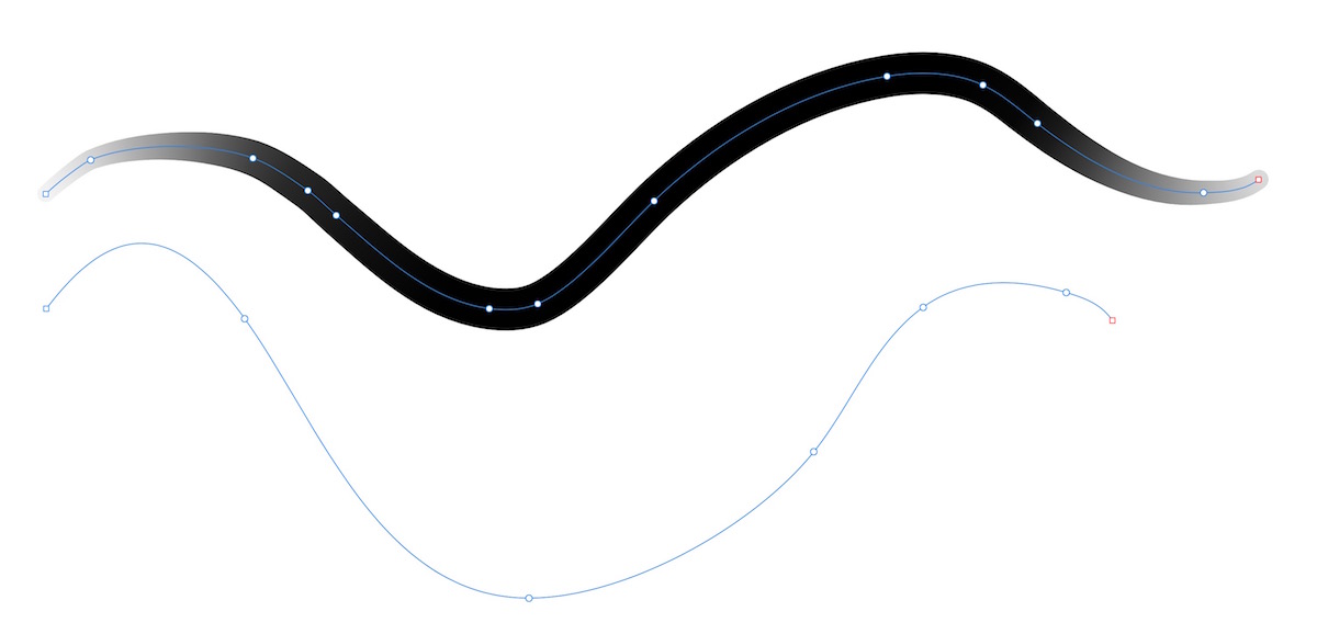
Perhaps the line actually has 3 nodes, not 2. I was able to recreate something similar. 1st I draw a vertical pen stroke, and set the dashes as you illustrated. I had the expected result. Then I drew another line, pen set to polygon mode, and made a third node on top of the starting node. It appears a solid line. But it I use the node tool, and set the node to curve, and drag, a bowed line w. dashes appears, connected to a vertical line w. dashes. Here are pics:
-
affinity photo Second painting with Affinity photo
gdenby replied to TonyJ's topic in Share your work
1st, Tony J, stopped in on this thread to see what else you had done. Was not disappointed. & Hi, michaelws. Also fine work. I too had an Amiga. My 1st was a 500. Unlike you, I bought it specifically for graphics. I'd been looking at PCs, but when I saw the 4096 color palette the Amiga had, and the sprite animation, my mind was blown. Later, I was using an image processor called Imagemaster. The programmer had figured out how to extend the Amiga HAM mode, and I could work in full 16 bit color. The down side was that just a single frame w. a large Gaussian blur took so long I could go out and mow both my front and back yard. I happen to have an old Amiga World from '89. In todays $s, Deluxe Paint was near $300. Pro Draw for vector work close to $400. Sometimes when folks gripe about AD or AP lacking some capability, I wonder what they'd say shelling out 6 - 8 times for apps that do about 1/8the what AD & AP do. And they crashed. A lot. -
I d-loaded the file. It seems like a lot of nodes were not at the intersection of the grid lines. There seemed to be a number of lines in the file that were about half way between nodes. They were parallel to, but not actually on the grid. My guess is that you were tracing over the pixel layer, whose shapes were not quite aligned to the grid. At any rate, it is easy to remedy by zooming in closer so that one can see the nodes being pulled to the grid intersection. Tho' it looks like ten some of the added vectors wont match the underlying pixel image very well
-
In Designer, its already possible to import photoshop brushes. So I'm pretty sure Photo does it as well. I used to use Corel Painter. Its focus then was on making imitations of various traditional media. That is not the focus of either Photo or Designer, tho they do a pretty good job. A few days ago, over in the "Share your work" part of the forum user Charlychuck showed some rather surprising effects painting with a freely available brush. And, lots of other nice work shown in that section using the painting features.
-
I approached it a little differently than R C-R, but his use of the pen tool is good to point out. I set up a grid with 4 divisions every 72 points. I turned snapping on. I used the polygon tool set to six sides. Fill set to none, stroke set to 1 pt. I drew the 2 larger nested hexagons. Then I drew the larger of the small pair over the others, and subtracted it from them. This resulted in a closed shape. I redrew the hexagon, and placed another on it. See results attached. FWIW, spend some time exploring the built in shape tools. There are a great many things that can be made just using them, and adding, subtracting, etc the shapes. Those tools are one of AD's strong points.
-
I like it. Which app did you use, AP or AD? Was there a basic routine for the repeated shape and color variations? It reminds me of some stuff I used to do w. Corel Draw's blend tool, which AD doesn't have.