biscuit
-
Posts
84 -
Joined
-
Last visited
Everything posted by biscuit
-
 The Help manual doesn't seem to work in the beta.
 -
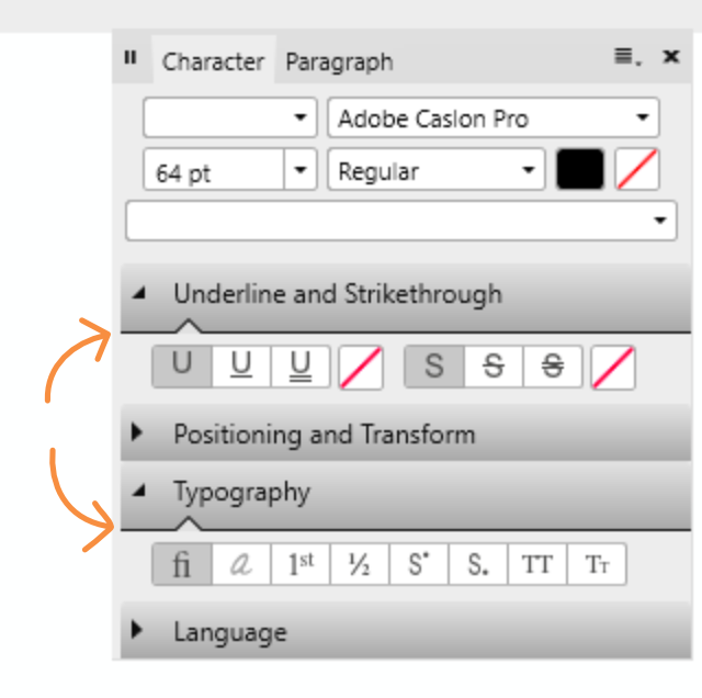
Hi there, A few remarks about the light UI: 1) Point size in toolbar is not properly aligned: 2) Line around fill less crisp than around stroke: 3) Contrast and hierarchy seems to be off in this example: Lack of contrast in panel header between selected Character and Paragraph. Subheading seem darker and more defined than panel header Point of high contrast and clearest division is the line when de-collapsing the subheading (orange arrows). There's a stark division within the subbox and barely any contrast between the light of the gradient (top of subpanel) and the rest of the panel. At first glance the marked lines seem to divide the entire panel in three blocks.

-
Hi, The program doesn't notify me of having sent a crash report, so I assume it didn't. Here is one 245e575c-edd3-4ec3-890a-31f584d5e815.dmp, I've got two more. When scrolling down the font list in the Glyphs browser AD crashes. It's at the end of the list. It doesn't crash when scrolling down the character panel. The last fonts are Webdings, Wingdings and Yu Gothic. When filtering "Missing" in the character panel it lists Webdings, so that might be the cause.
-
Wow, that stabilizer works like a charm! Smooth, completely responsive en very intuitive. The first time I opened the glyph browser the glyphs were white and contrast and legibility were very poor (light UI). Maybe because I started in dark UI and switched to light UI before opening panel? Maybe because I had a light foreground colour selected? Can't reproduce.
-
Hi a3k4, This hasn't changed. The only vector brushes you can expand are the basic ones with a pressure profile applied. And these generate an insane amount of vector points so only use when really necessary.
-
Additional object alignment options?
biscuit replied to drawroht's topic in [ARCHIVE] Designer beta on Windows threads
Another option would be to space horizontally with 0mm. (Uncheck auto-distribute first.) -
Hi, The beta version just suddenly crashed while scrolling through the font list. Didn't create a crash report.
-
Hi there, While trying out the font Cabrito Didone in AD I noticed it has true Small Caps, but no true All Small Caps. Checking All Small Caps doesn't turn caps into small caps. Probably the opentype-coding of the font is lacking, but it would be nice if AD was smart enough to produce All Small Caps from true small caps. (Turn caps into lowercase and then into small caps?). Now you have a font with true small caps and a button All Small Caps but it's no use. I would really like an all lowercase setting in the typography options as well. When trying out concepts it's much quicker to be able to toggle lowercase/caps/sentence. I use this feature in InDesign a lot.
-
On their site they also have AD-templates for app-icon designs. https://bjango.com/designresources/
-
Hi & happy 2017! -When opening a new document the font family of "body" text style is set to Arial while its based on "base". Shouldn't this be set to "no change"? -How can you set the "Body" paragraph spacing to "no change"? Basing its spacing on the "Base" style.
-
Hi Chris, I've had the same problem before but can't reproduce it now (problem occurred in earlier beta). What seemed to be the problem was that Photo also registered the mouse input while using my Bamboo tablet. There was some screen glitching and when releasing sometimes it picked the colour from the pen input and sometimes from the mouse (which I wasn't using). I used the color picker with Alt in the brush tool.
-
shortcuts that do not work
biscuit replied to Michail's topic in [ARCHIVE] Photo beta on Windows threads
Hi, Crtl+D is to deselect. Ctrl+H in PS hides the selection while keeping it active. Very handy, but I don't think Affinity has this functionality yet. -
affinity designer Biscuit's adventures in Affinity Designer
biscuit replied to biscuit's topic in Share your work
This last one was actually finished with the official release of AD. Printed it as a poster as a present for my younger brother. I'm not an illustrator so getting human poses right or working with perspective are not my forte. With just two shades of each colour it was quite tricky to keep al the objects distinct. And I had difficulty keeping the amount of detail consistent. Especially the face and the hair seem a bit off to me.
-
affinity designer Biscuit's adventures in Affinity Designer
biscuit posted a topic in Share your work
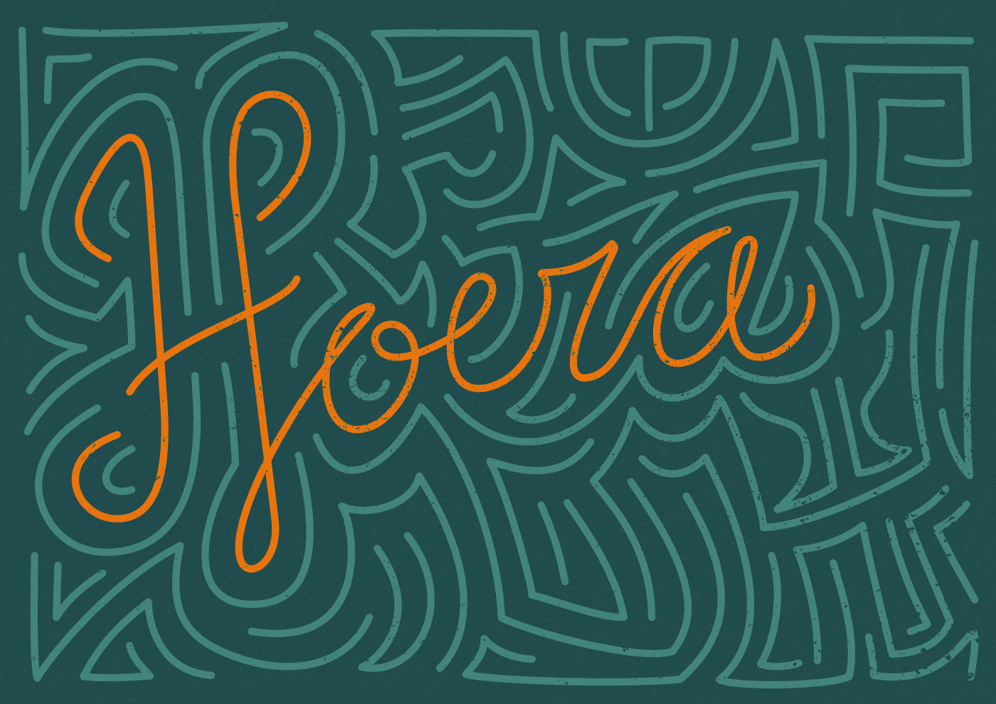
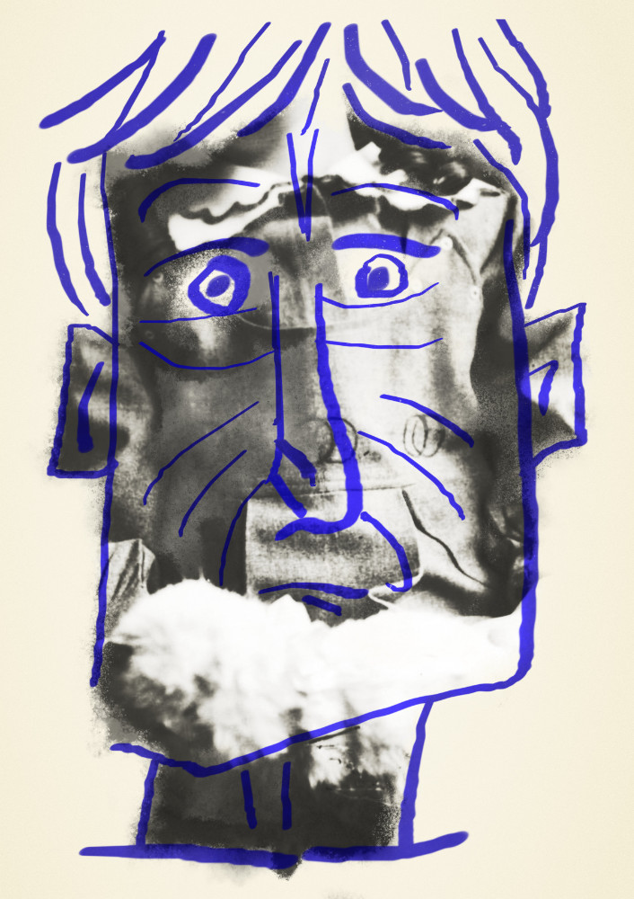
Hi there, I'm a graphic designer mostly working in InDesign and have been playing with AD since it started in beta. Following some presentable experiments along the way. I'm quite typography-oriented so tried out typesetting and opentype options first. Here I was trying the pencil tool and path handling. The texturing is done with a grunge texture with layer blend ranges applied, set to erase blend mode. Continuing with power duplicate and layer masking in the pixel persona. 'Refine selection' should be useful here but couldn't get any helpful results. Here I was getting the hang of gradients and symbols with the leaves at the bottom. The geometric background pattern wasn't created by me. This capital R started out as a comparison between node types: manual brezier curves vs auto smooth nodes. Combining brushes with a photo. I don't draw well and haven't found my smooth AD inking groove yet. Next full vector illustration. I already appreciated the technical abilities of AD. But when doing illustration I noticed the ease of use compared to Illustrator. Just drag to clip, everything clearly laid out in the layers panel and not getting stuck in the transparency panel. Playing around with gradients and blend modes. Could be an abstract book cover.
-
Nice abstract gradient in the space ship flame! How did you achieve that effect? Drawing to a grid and then rounding of with the corner tool? The ship itself looks a bit light and flat imo. Regarding the astronaut: the purple helmet looks a bit void, A darker base with highlight or planet reflection might give it a bit more depth. The composition could do with a bit more hierarchy, I think. As it is the planet and the astronaut are about the same size and sit next to each other in the middle.
-
Hi, I can confirm. And I found out I had to add the colour picker through 'Customize tools...' in the 0.39 beta.
-
Hello, When increasing the saturation for both the master and a specific color within the same HSL adjustment layer, the specific color turns desaturated when pushed to the limit.
-
Masks - my biggest negative so far
biscuit replied to Julian_K's topic in [ARCHIVE] Photo beta on Windows threads
Hi, Also good to note: - ctrl+i works on adjustment layers to invert the mask or selection thereof. So to copy another mask on an pre-existing (=white) adjustment layer: ctrl + click the thumbnail of the mask you want to copy ctrl + shift + i to invert selection select layer you want to copy the mask to ctrl + i to turn the selection into black/gray This is quite quick but usually not as quick as alt-dragging a mask in PS. - You can apply adjustment layers and filters to the mask of an adjustment layer. Just don't edit black and white but the alpha channel (levels & curves) and make sure 'preserve alpa' is unchecked (gaussian blur filter) - alt + clicking the layer thumbnail shows the mask. It is not a toggle so regular clicking to exit mask. Is this a bug?: When applying live adjustments to the alpha channel as described above, they don't show up when alt-clicking the parent layer. -
Creating Headlines
biscuit replied to Mhpreach's topic in Pre-V2 Archive of Affinity on Desktop Questions (macOS and Windows)
Hi Mike, For the use of creating headlines and exporting to png Affinity software will serve just fine. I would probably prefer it to Adobe CC because of the more direct access to opentype features. (Both Designer and Photo btw.) -Actions are available in Photo and are called 'macros'. -PS smart objects are not yet supported, so if you use those to create mock-ups or want to use existing mock-up PSD-files with smart objects you're out of luck. You can apply a live (smart) mesh distortion/perspective filter to an object in Photo. -Affinity does open PSD-files but not all features are supported. It should import text just fine, but you could wait for the trial version for Windows and try to import some of your PSD-files. -Affinity doesn't have a live preview of export compression yet. (Like PS 'save for web'.) -
If you paint black all color information will be black (left side of levels graph), it's the opacity that's different. If you select the alpha channel instead of the master your levels should work fine, I think.
-
Hi, When using my Bamboo tablet AD doesn't show arrow tooltips for resize, shear and rotate around objects. Snapping tooltips do show up. When switching to mouse input everything works fine.
-
A few bugs (beta 0.28)
biscuit replied to biscuit's topic in [ARCHIVE] Designer beta on Windows threads
@Sean 2b) I did indeed copy the symbol from another document 4) I tried deleting and opening some other files and they all stayed in Open Recent list. I also tried 'Clear' at the bottom of the list. The list remained intact, but 'Clear' turned light gray and unclickable. So it seems AD thinks it has cleared the list. All files are on the D-partition of my harddisk, AD is installed on C. @Ben Thanks for the explanation. Good to know it works as it should and good to know how to get a gutter top left. -
A few bugs (beta 0.28)
biscuit replied to biscuit's topic in [ARCHIVE] Designer beta on Windows threads
Hello Sean, Thanks for your reply. 2a) In this document lag with fx.afdesign when zoomed in at 400% panning+rendering goes notably slower with the outer shadow fx applied to the wave symbol. Remove the layer fx and it runs smoothly. 2b) New bug report: The symbol is on the canvas + layers panel, but doesn't show up in the symbols panel. 3) I understand margins in grid manager is a feature request. But is it by design that the gutter behaviour differs for horizontal and vertical? 4) I'm using Windows 10, latest update 5) Probably was a local clash. (I set up some other custom shortcuts a few betas ago and never did a clean installation.) -
Hello, Hopefully you are all enjoying a well-deserved weekend break, but better keep the reports coming, I suppose... A few bugs I encounter in the 0.28 beta: 1a) History panel: Maybe a confusing choice and not a bug but the history panel says 'Set fill' when changing stroke colour. 1b) History panel says 'Move nodes up/down' when changing the order of objects. AD uses the word node for vector paths (Node tool!). 2) Applying layer fx on symbols causes lag when panning even in simple scenes. (Effects panel not selected/visible.) 3) Grid gutter: horizontal gutter starts after first block, vertical gutter starts at top of document. The latter behaviour would be desired as long as you can't set margins. (I know that's a feature request.) 4) Deleted file is in File > Open Recent list. Clicking it prompts a question to remove it from the list. Filename stays in list anyway. 5) Shortcuts: This might have been local, but for me the I-shortcut for the colour picker tool was only assigned in the pixel persona and not the draw persona. 6a) Swatches panel: icons for 'Add fill to palette' and 'Add current colour to palette as global colour' are the same. 6b) The tooltips for these icons don't seem very consistent. 7) Corrupted symbol: see attachments legotext.afdesign, 'corrupted' legotext-corrupted.afdesign is saved with history (one step): selecting one lego block symbol and moving it to the bottom of the stack, corrupts all of them and can't be fixed by undoing. This bug seems specific to this document.
-
Layer blend range bugs
biscuit replied to biscuit's topic in [ARCHIVE] Designer beta on Windows threads
Hi Chris, I get the same results displayed on windows. Type in 25% en 75% and it will actually map it to the 'mac values' which seem to be correct ones. Regarding issue 1: child layers with fx and parents with blend ranges seem to work fine, but if you apply both to the same the blend ranges will become invisible. Good to know there is a workaround though.