Kasper-V
-
Posts
419 -
Joined
-
Last visited
Everything posted by Kasper-V
-
You could make an animated gif. I don't suppose you've got the version of PSP that had Animation Shop bundled with it? (Not that I'm promoting rival products!)
-
 I've been using PSP since version 7 (and even v 4 on someone else's PC), and I've still got 8 and X6 on my laptop. But I've been using Serif software for donkey's years, and when AP for Windows came out in beta I gave it a whirl -- and eventually bought it. I haven't looked back! Like MEB and John, I keep an Explorer window or two open to select files for editing, and it works very well. The only thing I miss is PSP's script facility. AP's macros are pretty powerful, but not as versatile. But the advantages far outweigh the very few drawbacks.
 -
"Is he talking to you or me, David?"

-
What's wrong with cheesy? Although I say "chocolate box" -- much sweeter!
-
affinity designer Quilling, Letter A (AD)
Kasper-V replied to VectorVonDoom's topic in Share your work
I've been thinking about doing something on the same lines (no pun intended). Now you've set the bar, I'll have something to aim for! -
I like Terry Pratchett's notion that inspirations just fly through space like neutrinos, and eventually strike someone's brain at random. Happens to me a lot. Great artwork, by the way!
-
Inspired!
-
I agree with Peter, whiskers are hard to do realistically.
- 7 replies
-
- 1
-

-
- portrait
- watercolors
- (and 1 more)
-
PSP is similar. The extra parameters can be useful, and would be an asset in AP.
-
Frankentoon's tutorials are very good too -- take a look.
-
Just realised I made a mistake up there! I typed Filters>Distort>Polar to rectangular and it should have been Filters>Distort>Rectangular to polar. Sorry -- I've confused the issue. But the rest of my post stands.
-
There was a bug in Photo's rectangular to polar filter, which has been fixed recently. But there is still a puzzling effect, as these pics show. I made a grid of squares, with a border one pixel wide, then applied the filter (Filters>Distort>Polar to rectangular); then I applied the same transformation to the original image with Paint Shop Pro X6 ... Original AP PSP AP has expanded the one-pixel border to 87 pixels (the while image is 600 pixels wide) and shrunk the rest to fit, while PSP has maintained the dimensions. When the reverse transform is applied -- polar to rectangular -- AP returns the original (apart from a little expected distortion), but omits the extra border when applied to the PSP image ... Any thoughts?
-
Mostly, Jules, and mostly starting from basic shapes as far as possible, then using the pen tool for the very fiddly bits. I used a textured pixel brush to add shading and some highlights, in the way those nice folks at Frankentoon demonstrated. (https://www.frankentoon.com/)
-
The lion and the unicorn were fighting for the crown, The lion beat the unicorn all around the town. Some gave them white bread, and some gave them brown; Some gave them plum cake and drummed them out of town. I thought it would be much better if they made it up and went for a pint at The Crown. It's done in Designer, with a couple of brief excursions into Photo to blur the background and stop it competing with the important bits, and to reduce the brightness of the unicorn a little. The woodgrain and the badges on the beer pulls are bitmaps acquired online, but otherwise everything is my own.
-
I forgot to say this is almost entirely made in Designer, but the blurry bits are pixel layers and a couple of them were done by switching to Photo for the radial blur filter. There's a couple of items you can download for examination if you like, here:
-
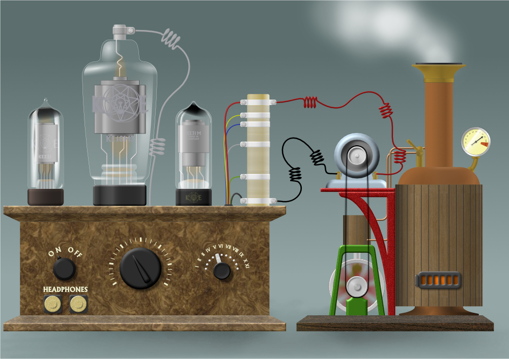
There was a suggestion of the Affinity Facebook page that I might make a tutorial on my 'Steam radio' AD job (see the link below). I thought about it and decided ... not to. But here are a couple of the things in afdesign format for you to look at. I'm sure you can work out how everything was done, and you can always ask if there's something not self-explanatory. Here is the left-hand valve/tube ... valve1.afdesign And here is the steam engine ... engine.afdesign I do need to add a brief explanation for this one ... The stationary flywheel spokes ('spokes (Curves)' layer) is turned off. I made the 'motion blur (Pixel)' layer by going to File/Edit in Photo, then rasterizing the layer and applying a radial blur. I did something similar with the connecting rod.
-
Ah, I see what you did there, Alfred!
- 6 replies
-
- 1
-
-
- steam engine
- dynamo
- (and 6 more)
-
Thanks for the kind words, Stuart. I don't suppose I shall be able to rest on my laurels now!
-
Isn't it nice to have all the time in the world, a head full of daft ideas, and the means of bringing them into being? I'm old enough to call the bit on the left a wireless; my grandfather used to make 'em like that for his own amusement back in the twenties. He'd have been quite capable of setting up the steam generating set to drive it too! (You get better reception if you connect the headphones!)
- 6 replies
-
- 10
-
-
- steam engine
- dynamo
- (and 6 more)
-
I could set it to give the victim subject a shock if they're too outrageous, Peter. Maybe another switch to set the voltage?
-
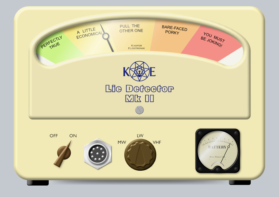
Perfectly true, retrograde! It's the 3d effect. There's also a slightly-distressed pixel layer, but I turned it off to add the shadow underneath and forgot to turn it back on! It's quite gentle, so you;re not really missing anything.
-
Sometimes I get these urges ... I just have to give in to them or I'd go mad ... Well, it beats scribbling on bits of paper, but one of these days maybe I'll create something useful!
-
affinity photo Tone-mapped holiday snaps in AP
Kasper-V replied to Kasper-V's topic in Share your work
The first one was 1/100s f/13 ISO 100 and the second 1/13s f/32 ISO 1600, John. I normally shoot with aperture priority, and I had the ISO set to auto. It was a sunny day, and I was behind some bushes with trees behind me partly blocking the light. (I've often thought I ought to keep notes (especially when I used to use film), but what I really need is a roadie.) It's not really to my taste either, to be honest; the novelty wears off pretty quickly. It was a spur-of-the-moment notion to make two extreme exposures, and it looked a bit dreary with no local contrast at all. -
affinity photo Tone-mapped holiday snaps in AP
Kasper-V replied to Kasper-V's topic in Share your work
Nearly forgot: I created a bit of vignetting on the sides and bottom by painting black onto a pixel layer. The bright tone was distracting from the 'meat' of the image. -
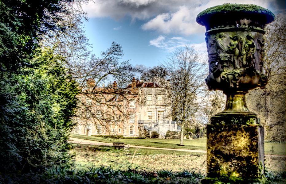
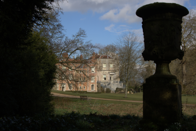
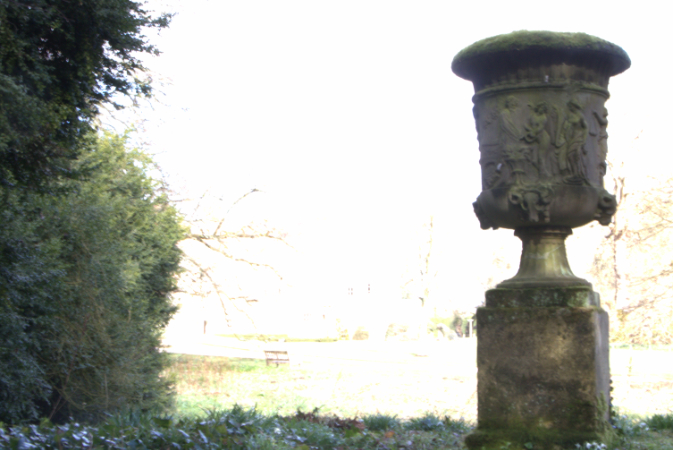
I was at Mottisfont Abbey in Hampshire, UK, a couple of days ago and took a few photos. This pic is from two photos taken with very different exposures, as I wanted to see what I could do a a tone-mapping job. I cranked up the tm and the local contrast all the way and increased the vibrance to exaggerate the colours. The dark patch in the middle of the sky is an artefact of the processing; I decided to leave it that way rather than even it out. These are the originals. I haven't edited them at all, just converted them to jpegs direct from the raws.