
Kasper-V
-
Posts
419 -
Joined
-
Last visited
Posts posted by Kasper-V
-
-
Another video!
When I lived on the Isle of Wight, we could hardly move without falling over a Morris Dancer. As a folksinger, I naturally met and made friends with a lot of dancers and musicians there. Some years ago, a lady name Helen Akitt wrote this funny song poking gentle fun at her Morris chums, a parody of the lovely song The Whitsun Dance, and I've been singing it ever since I discovered it. The assets in this still--the grass, trees and flowers--actually came from DrawPlus. I saved them as svg and imported them into AD. The unusual format with decorations down each side is because I made the 'pages' in A3 format with a view to printing them some time; YouTube resizes everything to 16:9, which would leave black bars at the sides.And now I'm going to have a rest . . .
- TrentL, AffinityJules, Alfred and 2 others
-
 5
5
-
-
Another one! You may know the old cowboy song, The Streets of Laredo, and you may even know of some other parodies, notably by the Smothers Brothers. This one is possibly older than the SBs'; writers' details in thevideo titles. All made in AD and Serif MoviePlus.
(I came across this version on the Mudcat Cafe (https://mudcat.org/), a great source of serious and humorous songs, and a great forum too.)
-
I began the illustrations for this in AD V1, but it went on the back burner for ages. I recently finished them -- all in V2 -- and yesterday I put the video together.
Billy Bennett was a very popular 'comic turn' on the Variety stage in the 1920s and 1930. He specialised in songs an monologues, includng parodies of well-known 'straight' monologues. -
-
3 hours ago, Callum said:
Would you be willing to provide a copy of the file so I can test some things here?
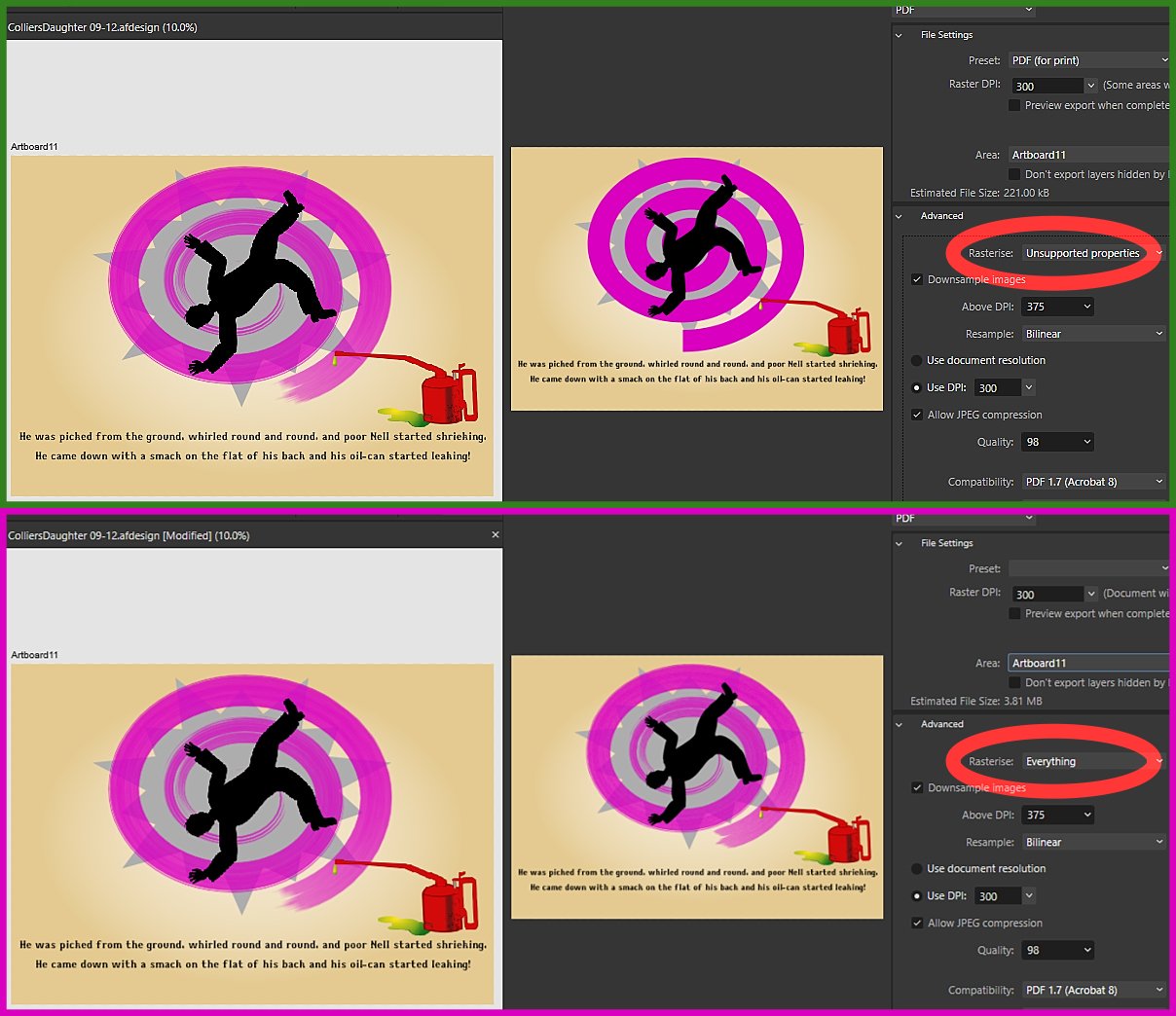
Thanks Callum -- I've done that. A little bit of background: two of the layers were linked files, so I've rasterised them, and the brush is a freebie I had from Frankentoon (the layer has the brushe's name).
-
A page from a project I've been working on. The violet curve is a spiral with a vector brush applied. Is it possible to keep the appearance when exporting as a PDF without having to rasterise either the whole artboard or just the curve?
(If you're wondering, it's from a comic monologue by Billy Bennett, called The Collier's Daughter; you can find it on YouTube and other websites.)
-
-
11 hours ago, walt.farrell said:
Someone else is fighting back, too.
Thanks @walt.farrell!
-
I could have called this Many hands (and feet) make light work. We're all getting browned off with Artificial Intelligence stealing copyright works. I thought it was time I made a stand and made my own AI image. In this case, it probably means Astonishing Inaccuracies.

- Mithferion, TrentL, William Overington and 15 others
-
7
-
 1
1
-
 10
10
-
-
5 minutes ago, Ashcat said:
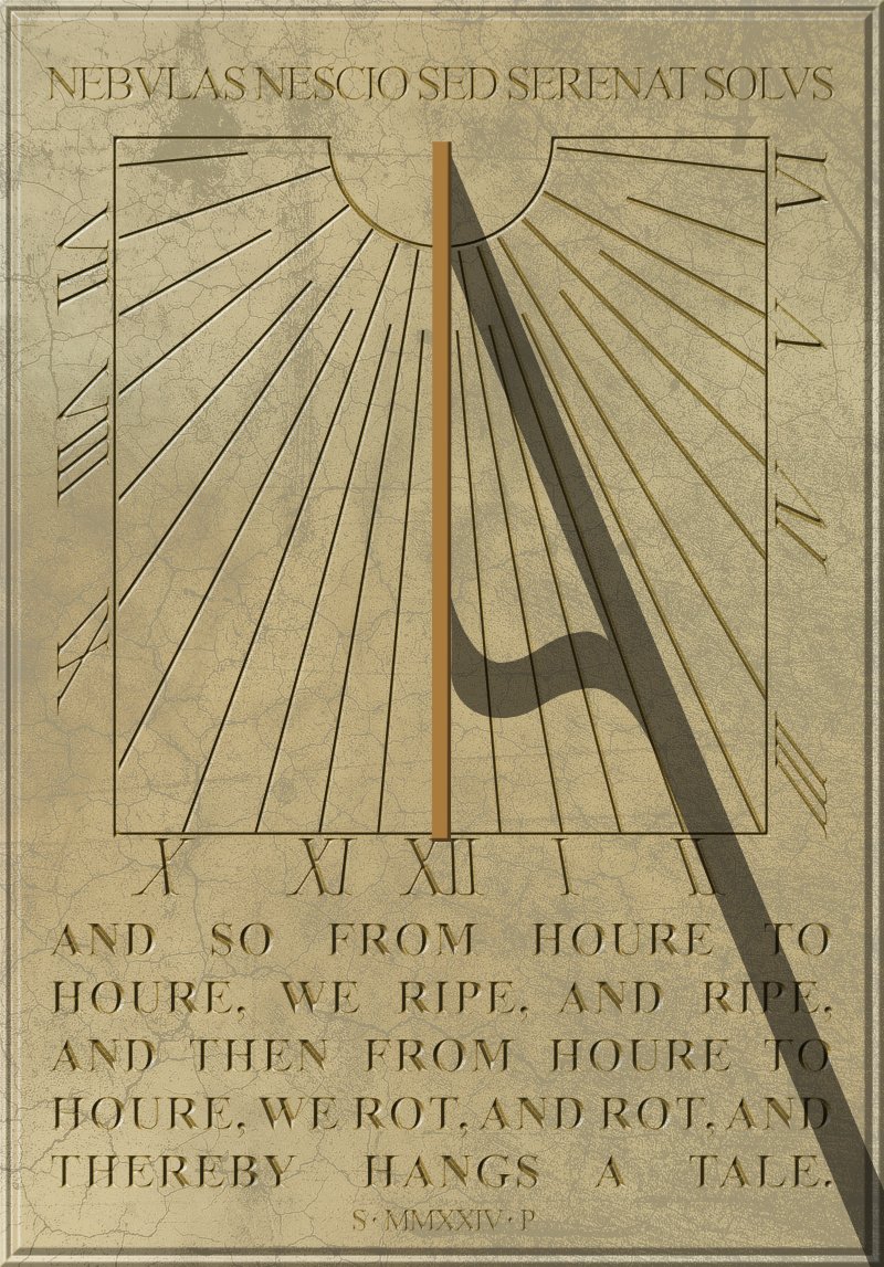
I don’t know anything about sundials but somehow position of the hours doesn’t feel correct. They are no clockwise. 😳Or is that linked to the stand of the statue? (As twelve o’clock has no shadow) Anyway, I love this artwork! Compliments!
Thanks for the compliments, Ashcat! This is in the northern hemisphere, and the sun moves across the dial from right to left, so the shadow moves the other way. Clocks came after sundials, so I don't know why 'clockwise' is actually 'widdershins'!
-
10 hours ago, William Overington said:
Would it be possible to make a separate version without the shadow of the gnomon on the picture, then if the gnomon were a separate piece then both pieces printed on cardboard there could be a construction kit.
William
Yes it would, William. But the angle of the gnomon and the position of the hours will depend on your latitude and the direction the wall is facing. This one is about 53 degrees north and facing a little off south.) There are websites that can give you the information and some will explain how to work it out yourself.
-
I found a pic of a wall-mounted sundial at Norbury Manor in Derbyshire in my old photos. (It's a National Trust property, and open to visitors from time to time.) It was erected as a memorial to (I think) the former owner, who died in 1987. I've changed all the inscriptions in the foolish hope of looking clever.
The base colour is 45/38/71 in HSL . . .
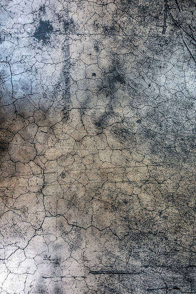
and I found a grungy texture in my collection (this is a reduced copy) . . .
and after some playing about, I found an opacity or 25% and a blend mode Colour Burn gave me a pleasing marble-like effect.
For the incised text, I darkened the fill slightly and applied an Inner Bevel/Emboss FX using the first (triangular) profile, inverted. I adjusted the radius till the bevels met in the middle, making the letters look as though they'd been carved. -
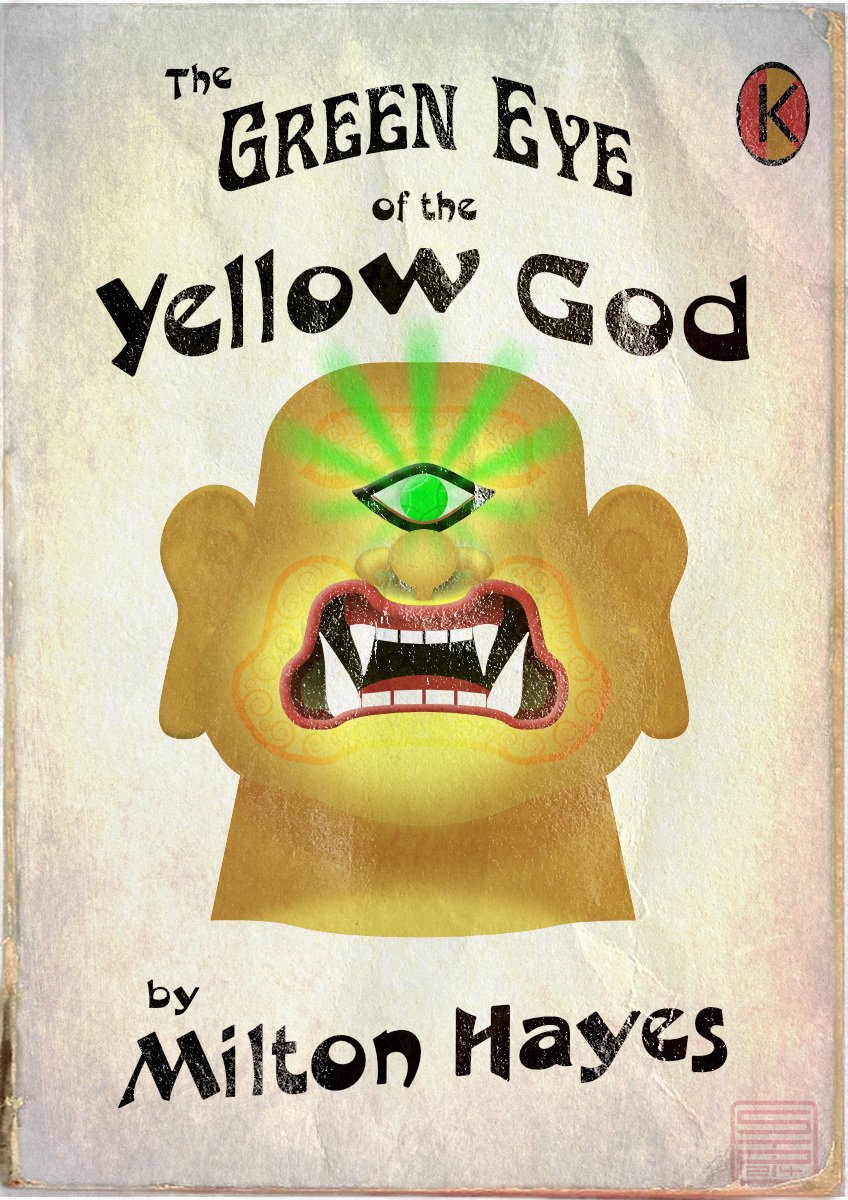
The Green Eye of the Yellow God, aka The Green Eye of the Little Yellow God, is a dramatic monologue written in 1910 by J Milton Hayes. Despite one or two comic parodies, it's still a Ripping Yarn if delivered straight; you can look up the words, or a recitation on YouTube. Meanwhile, I thought it would make a good subject for a 1960s-style pulp paperback cover (though it would be a very short book, as it will fit on a single page).
Made in Designer, with a couple of pixel texture layers.
- bah is life, TrentL, Ash Eldritch and 2 others
-
5
-
A very striking image, minuir. My only criticism (and it's a constructive one) is your moon's the wrong way round! The dark areas lie in roughly the form of a letter C. But neve mind that: it's a great pic.
-
Thank you, @StudioJason! My iPad is too old for Procreate, but I might be able to persuade my daughter to get it 😊.
-
A few days ago I made a rather silly picture I titled The perils of poorly-maintained Gents' lavatories (that's men's public restrooms in American). And then I thought I could animate this! There's nothing on view that actually requires censoring, I should point out. The moving parts are all on separate layers, so each one transfers to a layer in MoviePlus X6. (MoviePlus: still doing the business, and more intuitive to use than a lot of other video editors 🙂) I recorded the sound effects in the kitchen on my iPhone; the little bit of speech will be recognisable to Goon Show fans.
-
You've made a great job of it, @Ldina, but I hope your wife has a sense of humour! But she looks a little disapproving; I really think a smile would make her look more cheerful.
-
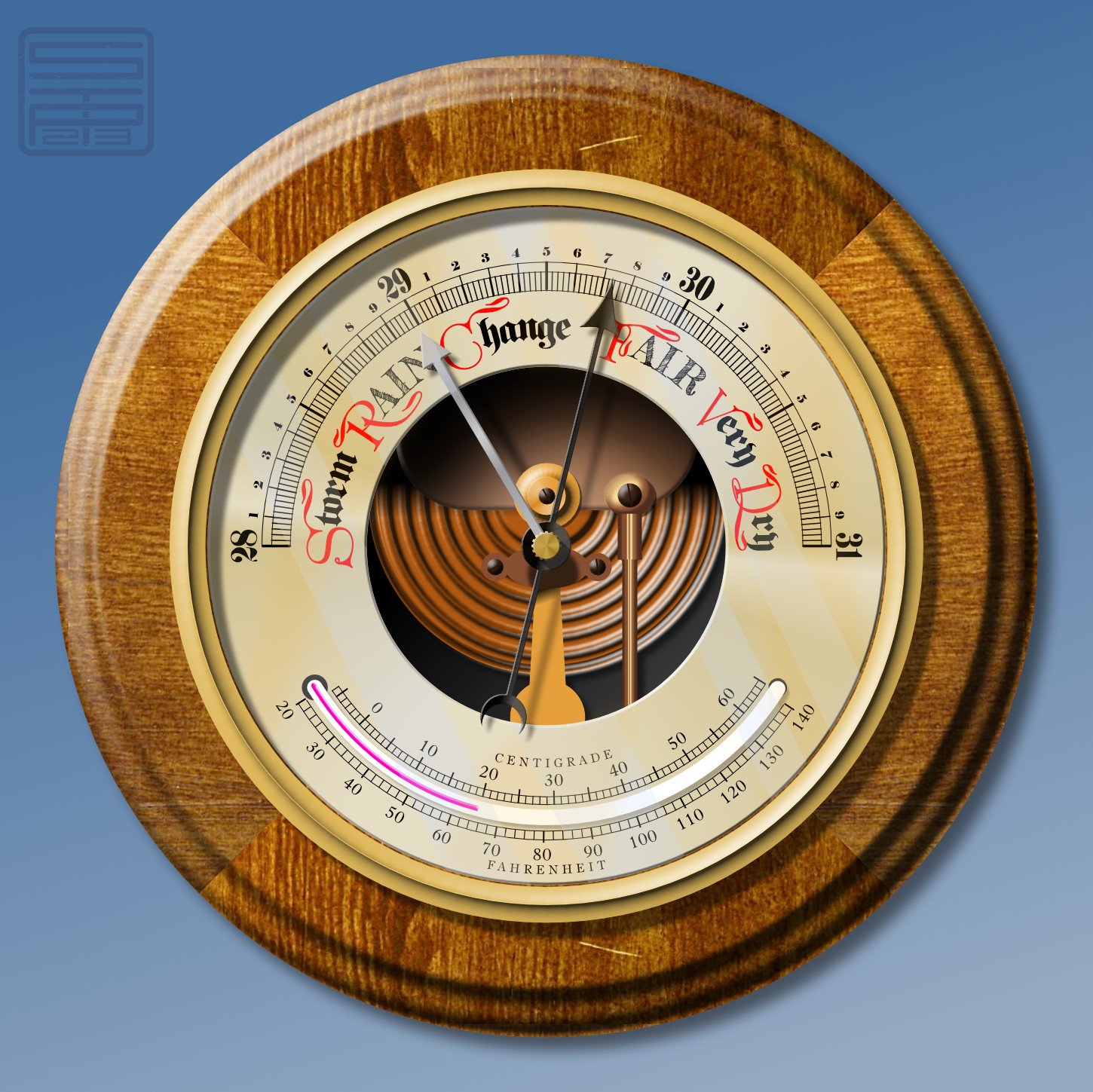
I made a picture of an old-fashioned barometer because . . . well, because I can! Who needs an excuse? I discovered quite a while ago that I enjoy making things with scales and pointers, for some reason; and the Version 2 Duplicate dialogue makes it so much easier to make circular scales.The woodwork is created from a stock photo of a piece of wood, which I sawed into quarters and turned a profile edge (digitally, that is). All the rest is made from vectors, using three photos for reference and picking out the best features. (There were some curlicues on the thermometer scales, but I forgot to do them! ) The red letters are from a freebie font called Great Victorian, which has plain and swashed cap forms.
- j3rry, AffinityJules, stokerg and 9 others
-
12
-
Nice work, @Allard! We still have my wife's old Dansette upstairs, complete with long tapered legs, and a good many discs (including several hundred 78s!).
Now I'm going to be a little critical, but it's meant to be constructive criticism; and unlike a lot of critics, I won't be at all put out if you take no notice! Only two things . . . The tone arm is on the wrong side. The lines of the hair look a little too free to me -- did you use the stabiliser? It looks as though you did with the other lines. (I'm really rubbish at drawing hair, so I shouldn't make such a fuss.)
But I really love the whole design, the concept, the composition, and the colours and white space. And being a child of the 50s and 60s myself, the nostalgia! -
Great artwork, @Jochum Berg! I love old motorcycles, especially the odder ones. If you're ever in England, you'd enjoy a visit to Sammy Miller's museum (link below). I went there a few years back, promising myself I was NOT going to photograph every bike in the place . . . my battery went flat after 200 snaps!
https://sammymiller.co.uk/ -
A nice treatment.
The castle seems to have gained a tower or two since my last visit! -
Bored. Bored, bored, bored . . .
Inspiration! Do what all artists do when there's nothing to draw: a selfie!
Result!!
SIGH What am I going to do now . . . ?
- NotMyFault and stokerg
-
2


Fun and learning with Shape tools
in Share your work
Posted
Love 'em! Great work, Jonopen.