Kasper-V
-
Posts
419 -
Joined
-
Last visited
Everything posted by Kasper-V
-

affinity photo Those mittens! I've jumped on the bandwagon.
Kasper-V replied to Kasper-V's topic in Share your work
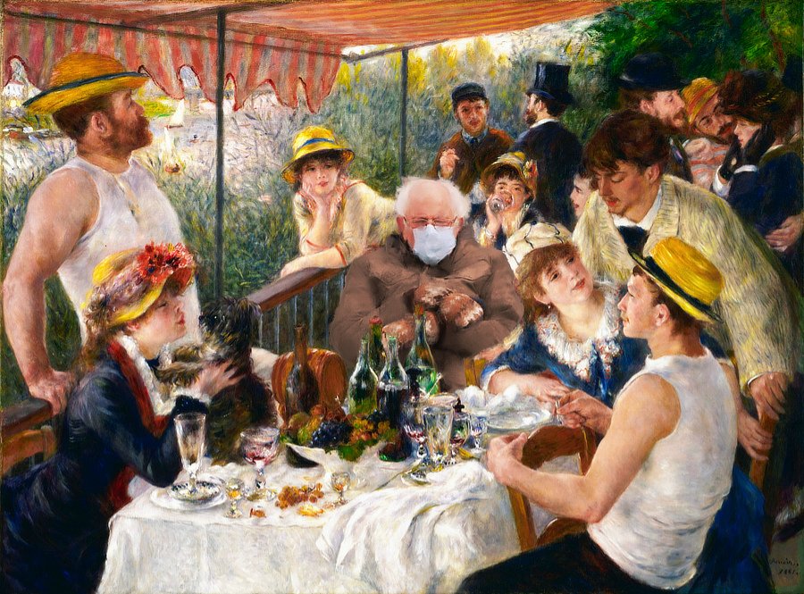
I don't think my painting would stand up to scrutiny on a larger scale, Ren. If I were thinking of printing the image at , say, A2 or larger, I'd have to take a lot more trouble because Renoir's brushwork would be more detailed. And I don't know if I'd have the nerve or the bare-faced cheek to compete with the Masters! But on the small scale, it works well; you could use it to make a whole photo look like a painting. And to set aside the humour for a moment, I think we often look for a quick way to achieve an effect or a look in our editing; but sometimes we have to accept that it can take time and effort to make a good piece of work. And it's worth it! -
affinity photo Those mittens! I've jumped on the bandwagon.
Kasper-V posted a topic in Share your work
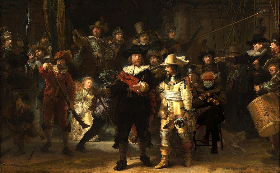
Utterly apolitical, I promise! I'm not even from the US, so I have no axe to grind. As everyone on the interweb seems to be popping Bernie Sanders into humorous settings, I thought I'd have a go myself. I looked for the largest photos I could find, as it's much easier to work at the larger size -- and the mistakes are less obvious when I save the jpeg at a much smaller size (I hope!). OK, the first one is The Night Watch by Rembrandt (but you know that).I found a copy of Mr Sanders' photo online and selected out the figure and the chair. After some trial and error, I thought this was the best position to place him, but I had to flip the image to make the perspective of the chair to match. Fortunately he's fairly symmetrical, so it's not obvious. I made a slight Curves adjustment to get the contrast more or less right. Then I selected a section from the costumes of the figures in the background, upper left , applied an Average blur to it and laid it over the Mr S layer, set the blend mode to Overlay, and dialled down the opacity till the colours looked right. Finally I made a selection with the Pen tool and used that for a mask to put him behind the chap in front.I ought to have removed that dog, I suppose -- or moved it back a little so it doesn't look as if it's under the chair. And this is Luncheon of the Boating Party by Renoir.I used the same original image I'd extracted for the previous pic and masked out parts of the Renoir to out him behind the table. Then I Cloned in some background to remove the chap who was originally sitting there -- a little bit of his head and shoulders was still visible. I made the same adjustments as before, including the colour overlay (from the big fellow's arm on the left) to try and match the skin tones.Now here's the clever part! I made a copy of the Bernie layer and its adjustments and rasterised it. (This way I still had the group intact if I made a mess of it.) I opened the Paint Mixer brush and selected the Impressionist Oil 01 brush, set the foreground colour to none, and painted brush strokes over the raster Bernie, making sure I had Auto Load Brush on and clicking Clean Brush frequently. In this way I made the texture match the rest of the painting and not look like a photograph. I didn't need to do this with the Rembrandt, as his style is photographic.
-
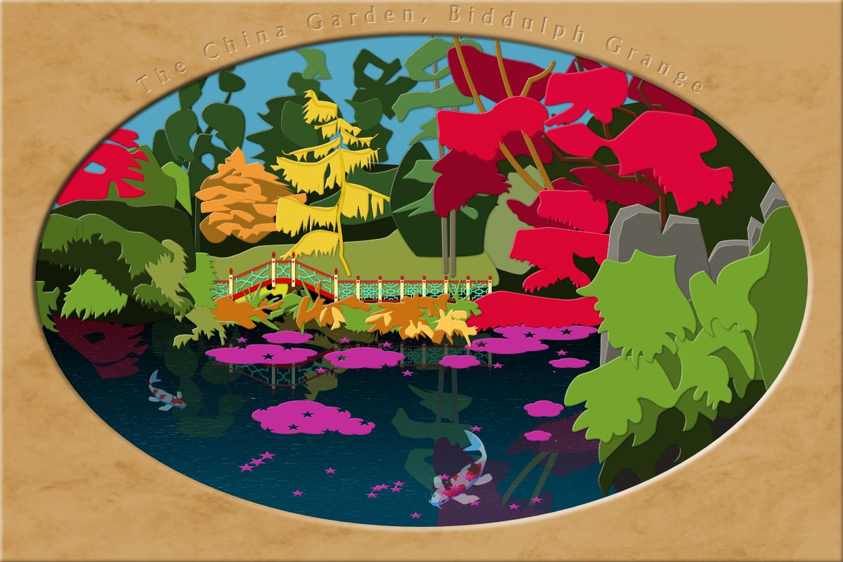
Thanks Alfred! Well, I set up the original file in Photo, making the matte with a couple of shapes and a texture over the fill colour. (It's slightly bigger than the canvas so the Bevel/Emboss layer fx is mainly visible on the cut-out, not the edges.) The letters came at the end just before I added the fish, which I drew in Photo. Once I had the front and my guide photo in place I switched to Designer for the fiddly hand-drawn shapes. The Chinese fence and bridge I made up from symbols -- it took me two or three tries to get the colours and shading just as I wanted them.
- 3 replies
-
- 1
-

-
- paper cut
- chinese garden
- (and 3 more)
-
For no particular reason (except for keeping myself occupied and out of trouble) a picture of the China garden at Biddulph Grange. Made in AD (and a little bit of APh) to look like it's cut paper and card. Based on some rather poor photos took in 2012. I must go back (when it's not raining this time). The original was made at 5x4 to fit A2 paper. I'm pleased with the way the lettering came out. A nice bold font (Andre Heavy), with a Layer fx Bevel/Emboss Inner and Fill opacity set to zero.
- 3 replies
-
- 2
-

-
- paper cut
- chinese garden
- (and 3 more)
-
I love this! Well conceived, well composed, well drawn ... great images individually, and a great tetraptych (if that's not too pretentious a word).
-
Oh yes, you can have hours of fun with symbols -- they're addictive! Especially with this kind of design . . . Now, this is not quite what you're doing, but a few years back I made some brushes to create Greek key patterns. If they're of any use to you, you're welcome to download them from the link in the topic below. I made them partly as an exercise in brush-making, so if you're new to making brushes, you might find it helpful to click the brushes' 'More' tab to see how they're made.
-
Such an elegant aircraft. There's on still flying in the Shuttleworth Collection in England, if anybody's out Bedfordshire way. https://www.shuttleworth.org/collection/dh88comet/
-
I'm looking forward to seeing your mandalas, Bevvie. When my son got married a few years ago, the lady who was to do the mehndi decorations for the guests didn't turn up, so my daughter rushed out and bought some henna and after looking up some designs on her phone went to work. Here's one she did on my wife's hand; not bad for someone who'd never done it before!
- 1 reply
-
- 3
-
-
affinity photo Now the gerbils are sending out Christmas cards
Kasper-V replied to peter's topic in Share your work
Well, you can't expect perfect grammar from a gerbil. -
Oh, you're too kind Peter! But it's true -- a little bit -- that it's too much bother to animate the mouths properly. I have used a not-very-friendly animation program in the past, but it has a poor output format with a restricted size. Rather than do all the mouth shapes, I just used one face-mask shape, which only required one layer in MoviePlus. (And a separate one for the eyes, of course.) Well, I can put my feet up and get back to my box sets until next Christmas now 😊
-
Well, it's been a pretty awful year. let's hope things will start to improve. Here's my New Year video, made with APhoto and MoviePlus. For those who can't understand the lads' Black Country accents (which will be most of you, I expect!) I've provided subtitles in English -- click on the little icon in the bottom right-hand corner.
- 6 replies
-
- 6
-

-
-
- serif movielus x6
- video
- (and 1 more)
-
You've made a great job of it, Buko. I know the feeling, of never fixing all the errors. But I'm told in some societies it's considered a bad idea to approach perfection too closely because the gods will be jealous; an artist or craftsman will deliberately mar his or her work in some small way to avoid this. A less superstitious notion I discovered man years ago is to hold the work up to a mirror so as to see it in an unfamiliar way. On the computer, of course, we can simply flip it on-screen.
-
affinity designer Started a "rotring" drawing....
Kasper-V replied to Antony parks's topic in Share your work
Incredible! It would have been great with a plain shirt; the stripes took me right back to my mis-spent youth in the Op Art sixties! (Is she the great-grand-daughter of the Kodak Girl?) -
More bad puns masquerading as a Christmas greeting. Made with Affinity Photo and Serif MoviePlus X6. Stock photo credits at the end of the video. Merry Christmas (we can but hope 😊 )
-
- 6
-
-
- christmas
- serif movieplus
- (and 4 more)
-
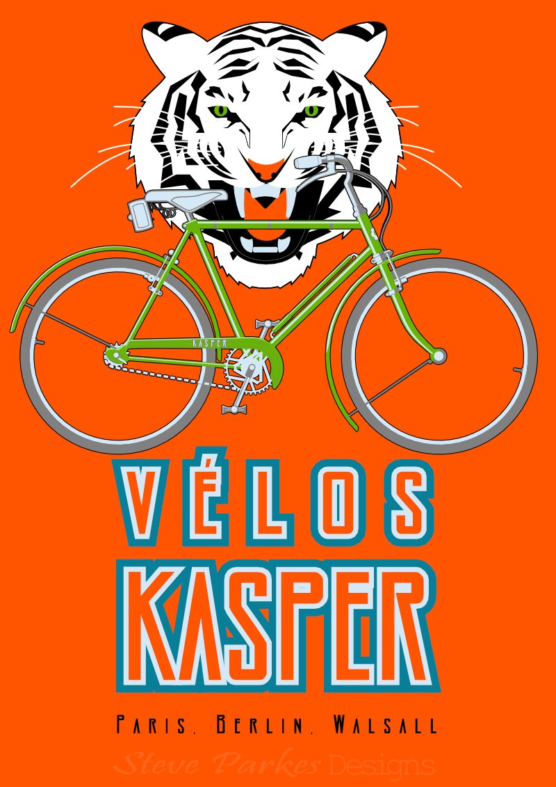
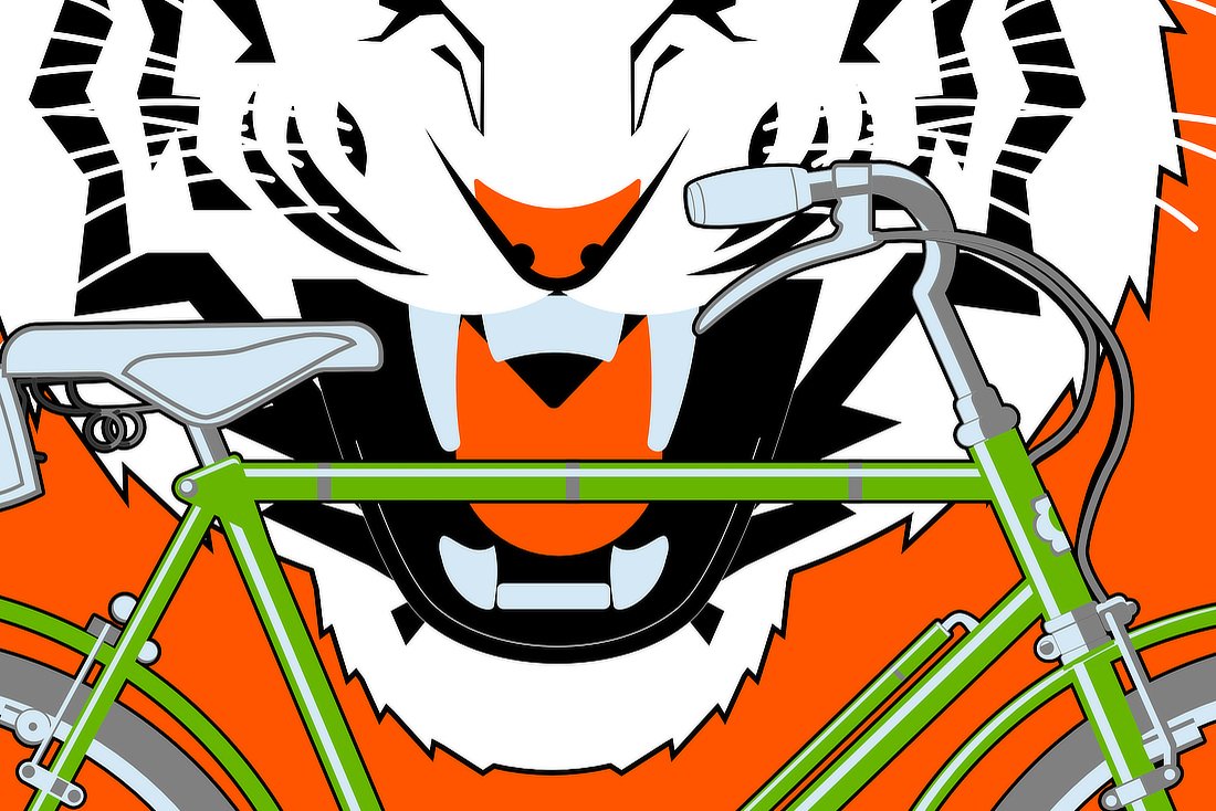
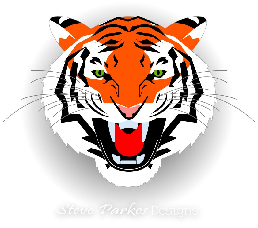
Browsing for something else, I came across a poster advertising Peugeot cycles, and I was inspired to have a go myself. After quite a few changes of colour and relative size, I finally settled for this: The original is A2 size, though I don't intend to print any copies. Here's a bigger (but not full size) crop: And here's the original tiger, which I made first. I dropped the orange markings for the poster, as the tiger clashed with the bike (and we have some gorgeous white tigers in the local zoo). Oh, and if you were wondering, Walsall is the English town I grew up in. It's not noted for its bikes, but is famous for its saddlery and leather goods, and lorinery, which is the metal bits and pieces in horse harness.
-
I've done a bit myself, and I echo what jeffers has said. Grand job!
-
affinity designer Art Deco: Birmingham Airport & aircraft
Kasper-V posted a topic in Share your work
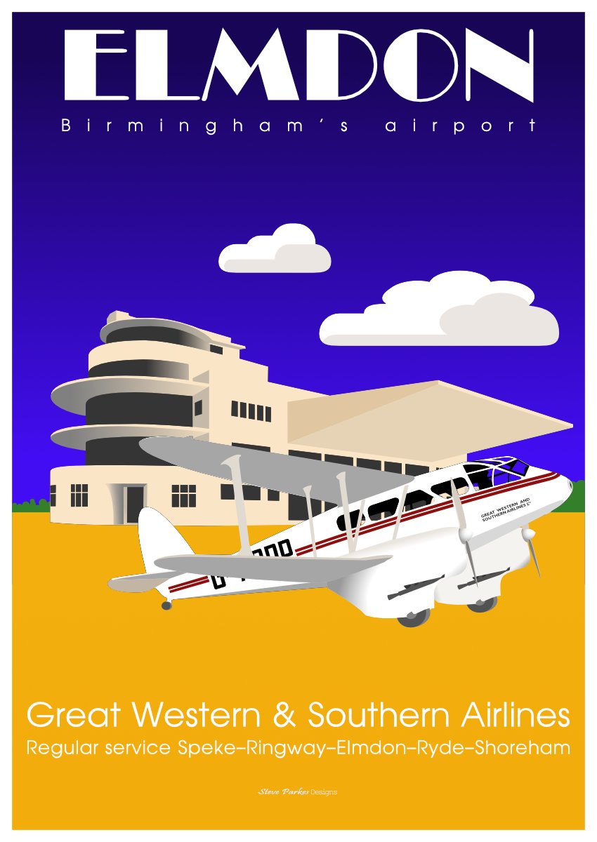
Inspired by a photo in a book and made in the form of a poster. Elmdon (Birmingham, England) Airport opened in 1939. This de Havilland Dragon Rapide G-ACPP was the first airliner (up to ten passengers!) to land there. The old terminal building still stands; it's a little different now, bit it's a glorious piece of Art Deco architecture in the form of an aeroplane. The Rapide is an elegant 1930s design, with an elliptical biplane configuration and fixed undercarriage in 'spats'.It was operated by Great Western And Southern Airlines Ltd, but at the outbreak of the War, it was acquired by the RAF; later it was operated by Scillonia Airlines, flying to the Scilly Isles. As far as I know, it's still around and flying. (I've rashly promised to make another with Ryde Airport in the background, as I live on the isle of Wight.)
- 9 replies
-
- 15
-
-
- elmdon
- de havilland
- (and 6 more)
-
As you say, it's small enough to work -- I can't see any rough edges.
-
"Come to Daddy!" Nice work, shipmate.
-
LOL! It wasn't in my original plan,but if you want to ave a go, feel free!
-
I made these using black & white photos found on the internet as guides. Although I usually work in Photo, I did a lot of the vector work in Designer, as I find it easier to switch between the Pen and he Node tools; then again, some things are easier or only available in Photo.She wasn't just a comic dancer: she was a decorated war hero of the French resistance, and set up and funded a number of philanthropic projects, as well as championing civil rights back in the US.And she really did have a pet Leopard named Chiquita. This first one was made entirely from vectors with flat fills and no outline (apart from the text, of course). For this one, I got a little more ambitious. It's made with Vector shapes, gradients and brush shading. I had the style of Gaspar Camps in mind, but it's a lot simpler than his work. Still., I'm learning! More ambitious still! Made the same way as the previous pic, but with a lot more brush shading and gradients. Here I was thinking of Alphonse Mucha; see previous comment!I made two image brushes for the leopard's rosettes (spots to you and me). The 'leaves' are supposed to be feathers! I've tried out a couple of alternative colours with HSL adjustments, but I can't make up my mind which I like best..For the shadow, I created a new pixel layer in Photo with 'Merge visible', converted it to black (Levels), stretched it with the Move tool (and a little adjustment to the feet with the Mesh Warp tool). I then applied a gradient and a Box Blur live filter, also with a gradient to make it lighter and more blurred further up the image.
-
A problem I've noticed in the last two or three days: after a while the cursor disappears when I move it out of the Document View are. It's still there but invisible, as I can see when it moves over interactive regions: tool tips appear, for instance. I'm running the latest version of Photo on a Windows laptop with 8GB RAM. So far I haven't had this with Designer.
-
Great work, Tom! I've been intending to do something similar myself for ages -- now I can see how high you've set the bar, maybe I'll stir myself.
-
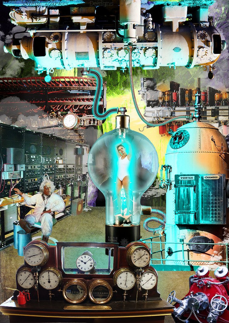
Way back in the good old 30s, 40s & 50s, before real science had begun to catch up with pulp fiction, there was a penchant among sci-fi magazines for mad scientists to experiment on scantily-clad ladies in glass vessels. I've seen quite a few on FaceBook pages lately, so I thought I'd have a go at making a realistic-looking one of my own, mostly in Affinity Photo.As far as possible I've used my own photos, but the unfortunate female is from Pixabay, the Mad Scientist is Doc Brown from Back to the Future with William Herschel's head (photo: Julia Margaret Cameron), the glass thingy is from off the internet; the tubing is some Affinity Designer image brushes I made for the purpose. The whole thing was largely inspired by Richard Hamilton's Pop Art collage Just what is it that makes today's homes so different, so appealing?. It grew organically, which means I had a half-formed plan in my head and mostly added stuff willy-nilly and moved it around till I was happy. Oh, and I had to paint everything electric-shock blue. I made this A2 size, which is a bit bigger than it needed to be really: the while thing is nearly 300MB, even after I'd flattened quite a few of the layers and groups. This is Hamilton's iconic work, which kicked off the Pop Art movement in 1956. In those days, cut and paste meant a pair of scissors and a bottle of Gloy!
- 1 reply
-
- 6
-
-
- science fiction
- mad scientist
- (and 5 more)
-
Well spotted!