Kasper-V
-
Posts
419 -
Joined
-
Last visited
Everything posted by Kasper-V
-
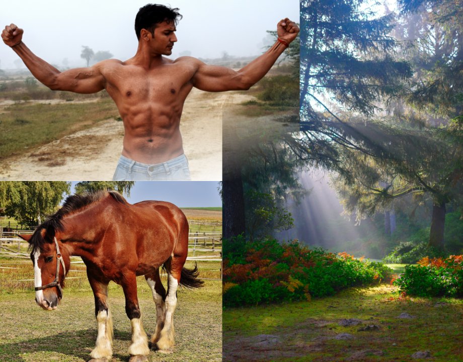
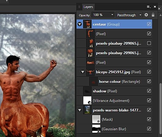
I had a sudden inspiration to create some critters from mythology. I intended to start with a faun/satyr, but I couldn't find a photo of a goat's hind legs in the right pose, so I went for a centaur instead. Source photos from Pexel. Source images ... And the layers ... For the horse's right shoulder I copied the horse layer and flipped it -- that's the turned-off layer -- and used the clone stamp to copy the rump. I made a rectangle with the chestnut colour of the horse and a gradient of 100% to zero to make the colour change between the horse and the man look seamless and more natural. I blurred and dulled down the background image to make the centaur stand out better. And now I suppose I'm just going to have to go out and take my own photograph of a goat standing on its back legs!

-
Wow, this takes me back to my impressionable teens! I had a hard time trying to explain to my Art master at school that Op Art was NOT simply a matter of geometric patterns. Neve did convince him. I'm a Bridget Riley fan too. There was a retrospective in Birmingham (England) a few years ago which I saw.
-

affinity designer Art Deco: Birmingham Airport & aircraft
Kasper-V replied to Kasper-V's topic in Share your work
Thanks for putting me straight on that, Alfred: I obviously didn't read the comment properly. I'll just plead the effects of the season! 😊 Without digging out my archive HDDs I can't be certain, but I think the font is one of the Futena family, which is very similar. I was looking for an open face rather than historical accuracy, and again this just looked the part to me. Thank you William. I thought it needed something to fill the gap without distracting from the important part of the image. I tried a more natural-looking cloud or two -- in a deco style -- but in the end these very simple ones seemed to work best. You can easily work out how I did them: add some rounded rectangles and/or cloud shapes, convert to curves and tweak a node or two.- 9 replies
-
- 2
-

-

-
- elmdon
- de havilland
- (and 6 more)
-
affinity designer Art Deco: Birmingham Airport & aircraft
Kasper-V replied to Kasper-V's topic in Share your work
It's Broadway, in fact. I wanted a very bold Deco-style typeface, and I thought this fitted the bill nicely. I didn't know the history of it till you prompted me to look it up, but according to wikipedia: The original face was designed by Morris Fuller Benton in 1927 for ATF. Ah well, whatever, as the young people say. I'm happy with it anyway 😊- 9 replies
-
- 1
-
-
- elmdon
- de havilland
- (and 6 more)
-
affinity designer Art Deco: Birmingham Airport & aircraft
Kasper-V replied to Kasper-V's topic in Share your work
I've no plans to make it available for sale, Toby -- but you're welcome to copy this image to print if you like. It's only 850 x 1200 pixels, so it wouldn't be very big.- 9 replies
-
- 1
-
-
- elmdon
- de havilland
- (and 6 more)
-
I usually make a little video for New Year's Eve, but with one thing and another I haven't managed it this time. Instead, here's a greeting card from 1908 slightly (greatly!) edited for the occasion.
- 1 reply
-
- 4
-
-
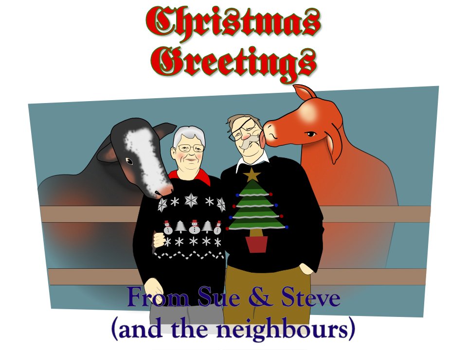
Well, it's been a funny year for us in the Kasper household: we've left the Isle of Wight and moved back to the North Island (or England, as the natives call it). We're still getting ourselves sorted out, and it hasn't left me much spare time for creating the usual Christmas video. Instead, I've made a Christmas card, with the most authentic portraits of us and a couple of the neighbours. (Yes, they live just across the back fence.) As you'll no doubt see, I couldn't be bothe didn't have time to draw in the calves' legs -- but it was rather misty at the time anyway! Merry Christmas!
-
I had to look that one up, Alfred: yes, that was me, a good many years ago! Are you going to illustrate that one?
-
I did one in Spanish too, because ... well, why not?
-
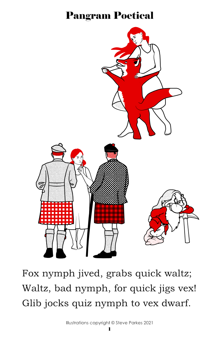
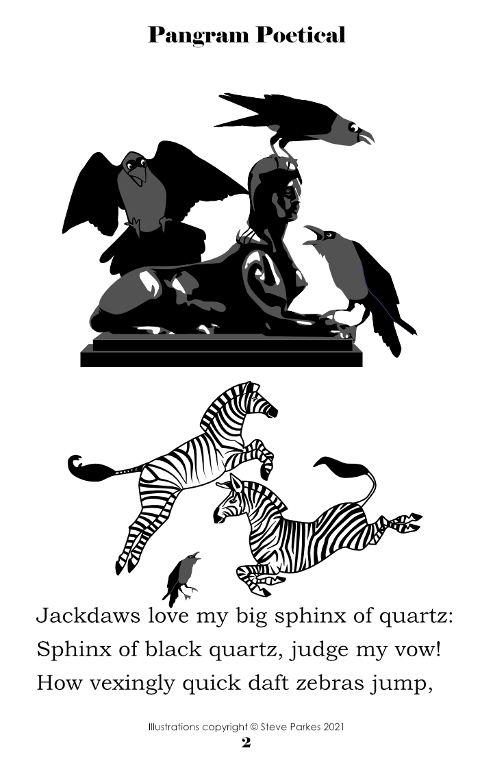
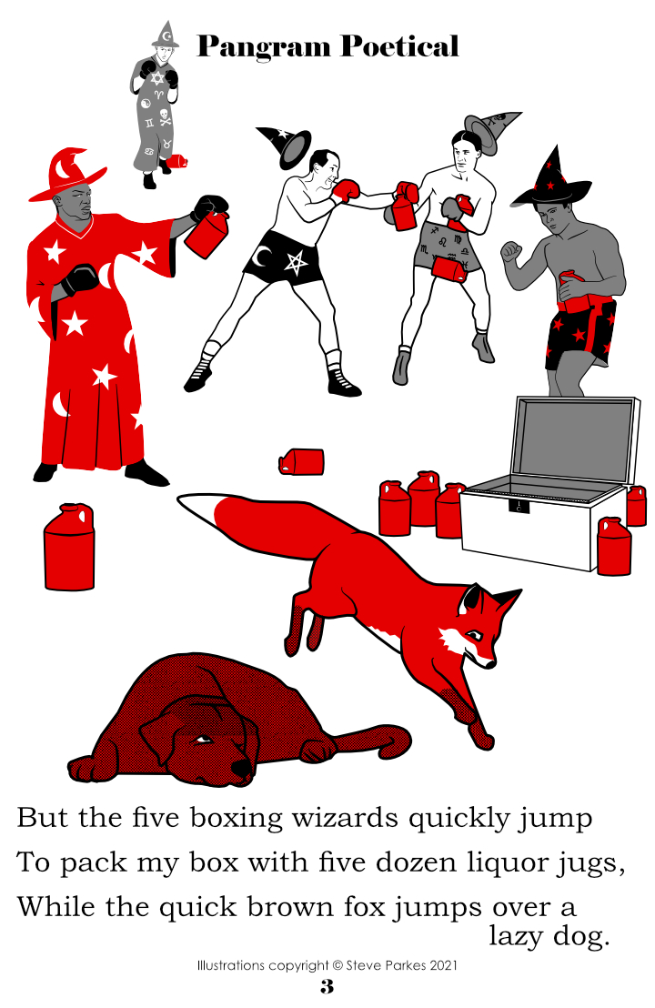
I see quite a few fellow Affinity users have celebrated National Poetry Day recently. I missed it, because of a drawn-out house move, but I'm beginning to get settled in now. Here's something I wrote earlier in the year, lavishly illustrated by your humble poet. A pangram is a sentence containing all the letters of the alphabet at least once, and when I looked them up I found they had a certain poetical quality; after some modest effort on my part I organised several pangrams into, well, a sort of poem. And then I illustrated it . . .
-
I can't follow the text as I don't have the language, but the mathematics looks good to me! This work shows you have a good understanding of the principles, oterwise you wouldn't be able to illustrate them. Maybe you could ask your maths tutor about sharing them with the other students or using them in lessons?
-
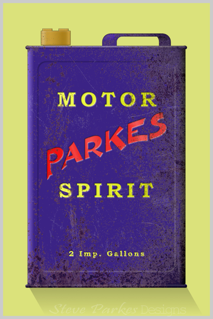
As usual, I made this for no good reason*. (Who needs a good reason to work with Affinity anyway?) Maybe I've watched to many of those TV shows where they find old junk and clean it up to make money. Whatever; this was made entirely from vectors apart from two jpeg textures applied to the can and one more to the cap. * I just wanted to play with the lettering, and the can seemed a good vehicle for it. But if a job's worth doing . . .
-
- 7
-
-
- motor spirit
- gasoline
- (and 1 more)
-
System backups. Er . . . yeah! I back up my work regularly, but I never got into the habit of doing that as I didn't have much storage for a long time. I must get it organised, and I'll certainly back up my assets before I make any future additions. Meanwhile, I'll grin and bear it (though the grin may be a little forced). I didn't lose very much, as it happens, and it won't be a great deal of trouble to replace them. Thanks for the advice, folks.
-
I'm using the current 1.9 versions of Designer and Photo, on a WIndows 10 laptop with 8GB of RAM and plenty of spare disk space. I was creating some assets -- I'd got up to nine subcategories each with sixteen assets -- when Photo froze. After a long wait with nothing happening, I restarted my computer and opened Photo again. The new category I'd created had disappeared, and so had several others that I created months ago. I opened Designer, which had some different asset categories, and tried to rename a subcategory, only to have Designer freeze too. Eventually Windows closed it, and once again I found several asset categories, including the one whose subcat. I was trying to rename, had disappeared when I reloaded Designer. Can anyone suggest where the assets have gone and if they're recoverable?
-
affinity photo Pattern layers and cross-your-eyes stereo
Kasper-V replied to Kasper-V's topic in Share your work
Oh, I see what you mean, sacboi. Now I can see them too -- makes me think of a character that was rejected for the Muppet Show! (And now I've got to try and not see them 😵) -
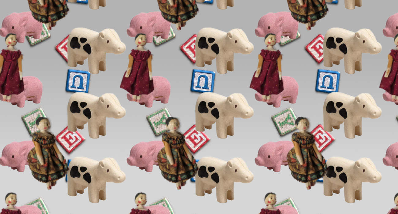
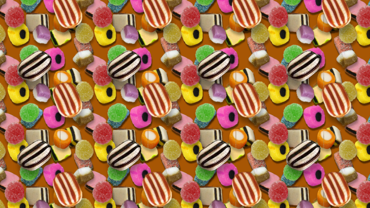
I came across a book from the 1990s of stereograms -- those weird patterns where if you crossed (or diverged) your eyes you would eventually see a solid three-dimensional image. Or not: some people could never manage it. But it made me think I might make something similar with APhoto layers. Here's a couple of fairly successful efforts. I created a pattern layer based on a rectangle of a particular width with images clipped inside, then another layer on top with a wider rectangle. A fair bit of trial and error was involved too! To view the effect, look at the image from a comfortable distance, then cross your eyes until two humbugs or dolls overlap. With a little practice, you'll find the details suddenly come into focus and you'll see three layers at different depths. (In fairness, I must admit that a few people never get the hang of it, so if it doesn't work for you, it's no fault of your own. But try again in an hour or tow, or a day or two: sometimes it's easier than others.)
-
I don't think FB has an opinion -- I think we can trust other Affinity users not to misbehave on this point.
-
Quite a few users are under the impression that v 1.9 will be followed by v 2.0, if Facebook posts are to be believed. Several of us have tried to reassure our fellow Affiniteers that the next version will be 1.10, followed by 1.11, 1.12 . . . and no new fees to pay. I hope I'm right! Can you put our minds at rest please?
-
I've just -- literally just! -- discovered this too. If I double-click an Unsplash thumbnail it opens the image on their website. Normally I search the big preview images on the providers' websites -- I signed up to all three -- so I haven't encountered this before.
-
affinity designer Commission Portrait: Caroline
Kasper-V replied to Greggry P's topic in Share your work
I've made the trip often enough! We use the Lymington route these days (when we get the opportunity), but I have some (analogue) photos from way back. You've obviously done a very good job of recreating the buildings! -
affinity designer Commission Portrait: Caroline
Kasper-V replied to Greggry P's topic in Share your work
Great work, Greggry. Is that The Isle of Wight ferry leaving Portsmouth Harbour? (You know, the more I look at this, the more I appreciate how work you've put into it. Brilliant!) -
affinity photo Using Color To Improve Tones In Black & White Photos
Kasper-V replied to Smee Again's topic in Share your work
If you use the HSL adjustment to desaturate a colour image, you get the same problem. But if you use the Vibrance adjustment to reduce saturation (not vibrance!) it uses the human-perception values . . .
-
Well, I can keep a secret! Can you? ☺️
-
So far I haven't summoned the patience to work in this kind of detail, but I ought to.