Kasper-V
-
Posts
419 -
Joined
-
Last visited
Everything posted by Kasper-V
-
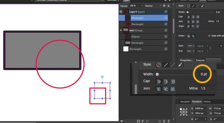
 Here's an example: just a rectangle with the default Bevel/Emboss FX opened. I manually set Azimuth to 0 and then alter the Radius value. But when I move focus from the Radius field, Azimuth resets to 135. (The same happens when I change Soften.) If I change Azimuth (say, to x) by dragging the white dot this doesn't happen; but if I then change that value manually and alter Radius, Azimuth changes back to x. And while I have the View tool active, it makes no difference if I have Move or any other active. I haven't tested any of the other parameters, nor any of the other FX.
-
It happens in Photo too. I only just got around to checking.
-
I've just found that I can't alter the azimuth value by typing it in: as soon as I alter the Radius, it resets to 135%. This doesn't happen if I set it by click/dragging the dot on the Direction disc; it remains as I set it.
-
No . . . it just seems to be not-working differently -- I think. But it was broken before.
-
The shortcuts issue appears to be fixed in the new release (1079).
-
I found that all of the keyboard shortcuts worked only intermittently. Another user, maxen, said 'Clicking on an objects/layers name to rename it, triggers the problem. The shortcuts get active again as soon as the name field isn't active anymore and you switch to another tool or create a new object.' If I click off the layers panel to deselect (Ctrl-D won't do it!) the kb shortcuts become active again. I should think this applies to Tab too, though I haven't tried it.
-
OK, thanks maxen -- that will make life a bit easier for me.
-
Just begun testing V2.1. These problems apply to Designer on WIndows 10. Keyboard shortcuts only work sometimes -- can't work out what turns it on/off, if anything Shift+ works on main keyboard and numeric kb, but Shift- only works on main kb Pen tool defaults to Vector brush and doesn't allow stroke properties to be changed -- need to select any other tool first
-
An awful lot of us have complained about this issue. Now I'll add my name to the list! Please can we keep the last used grid every time we apply it?
-
Panic over! It's because the two documents have different DPI. I need to go and do some Serious Thinking and then set everything to the same value. 🤔
-
I haven't noticed this problem before, but I may simply have failed to notice it. I found it in Designer and Photo Version 2, but it also occurs also in Version 1. When I copy an Affinity Designer or Photo file with vector objects into another larger image, the stroke widths are changed. This is a nuisance if there's only one vector layer, but it's very frustrating when there are a great many layers: a lot of fiddly work back and forth between the original and the target to restore the stroke thicknesses. I'm running on the up-to-date version of Windows 10 I tested this in Version 1 and found it was reducing strokes as follows: image 1 (source): 800x600 px Grey rectangle 10 pt, red circle 5 pt, small rectangles 5 pt & 0.1 pt image 2 (target): 3,000x3,000 px Grey rectangle 2.4 pt, red circle 1.2 pt, small rectangles 1.2 pt & 0 pt (i.e. < 0.1 -- it's still there) Yesterday's 'live' file in V2 reduced 2.8 pt to 0.7 pt. With the test shapes today, V2 is reducing 2.8 pt to 2.1 pt. The reduction seems to be random, but consistent throughout a session.
-
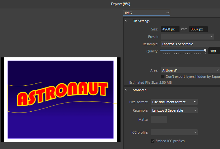
I went through it again just to make sure I hadn't followed you properly, but the problem is still there. Then I applied a stroke to see where the rectangle was after warping. This is cropped from a screen grab -- and this is the Export dialog (I did actually export it and the JPG was the same) --
-
The font is called Bauhaus 93.
-
Doesn't work, I'm afraid:
-
I've also found that altering the zoom level affects how it's displayed, some levels cropping to different amounts, and others not at all. (The original is part of an A3 size image at 300 dpi.)
-
Wow -- that's even worse, @Red Sands!
-
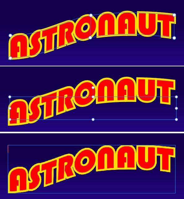
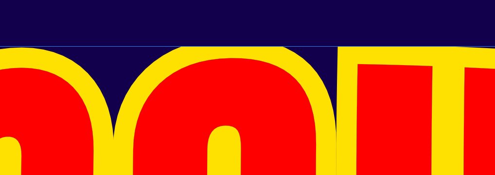
A problem I've just discovered. When I export this text as a jpeg or when I rasterise the Warp group the top of the text is cropped. (There's a slight cropping of the bottom too, but it's barely noticeable.) You can see the effect here . . . Here's the Warp group with the Node tool selected (top), the Move tool (middle) and the rasterised result (bottom). Switching the stroke alignment has some influence, but doesn't solve the problem altogether. The stroke is outside and in front; changing this doesn't look how I want it. I can avoid this by reducing the stroke width, but the appearance is 'thin' and is also not to my liking. I could experiment with different fonts, but I particularly want to use this one! And I want to spend my time getting on with the project.
-
I've had the same issue. So far I've only found it with text -- it doesn't happen with shapes, however complex. (As far as I've been able to find out.)
-
I agree with @LassiP, it's great; and the skin texture is really good. I wouldn't have know you're just starting out with Affinity. I have trouble with hair too, and noses; you're not alone 😊
-
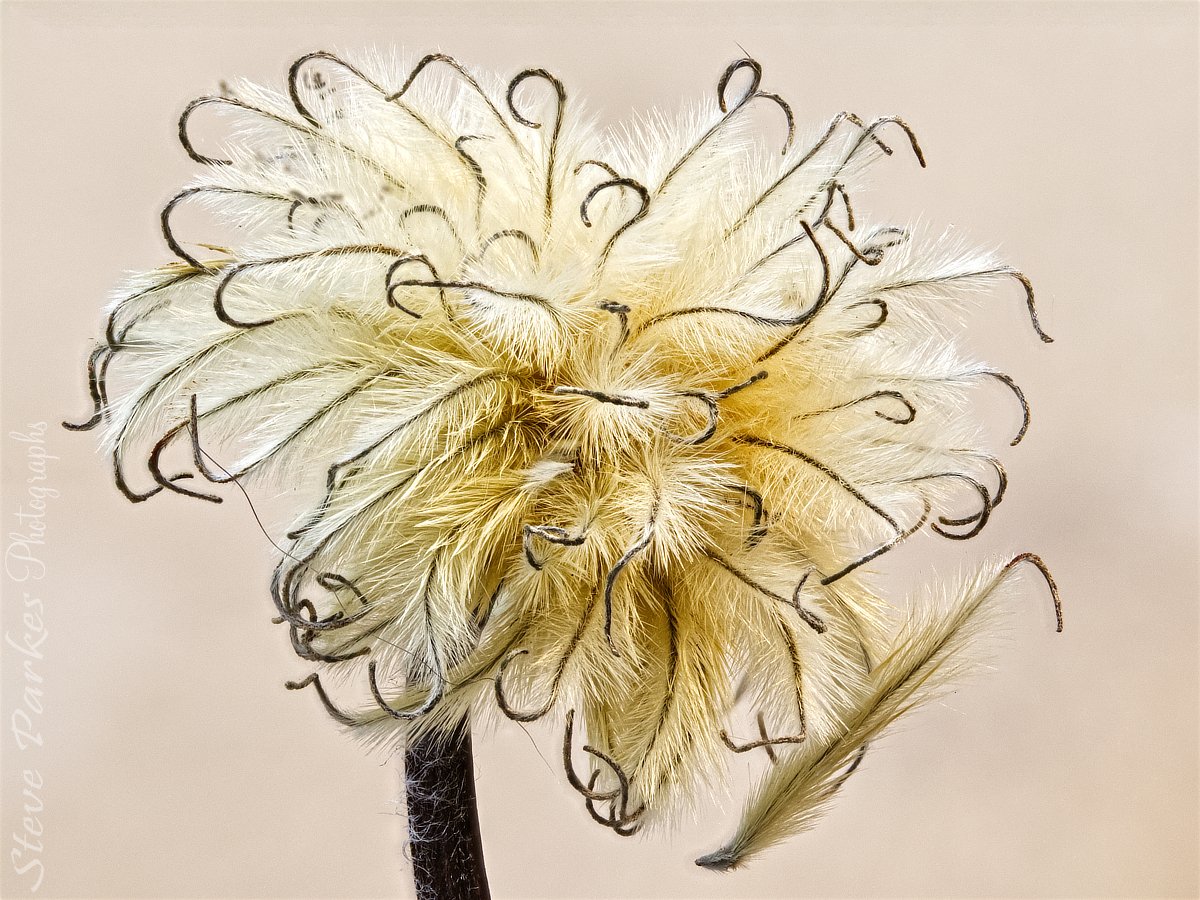
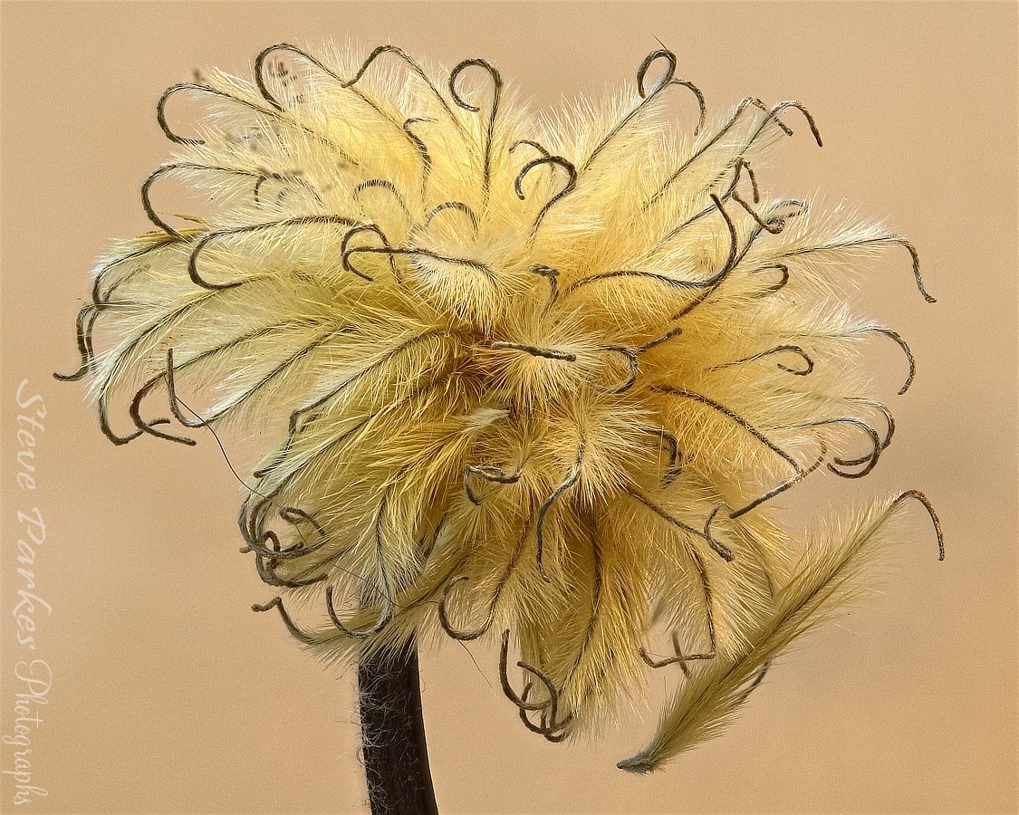
affinity photo Focus merge: clematis seed head
Kasper-V replied to Kasper-V's topic in Share your work
Thank you Alfred.- 4 replies
-
- 1
-

-
- focus merge
- focus stack
- (and 2 more)
-
Another one. The clematis flowers have all started going to seed, and some of the heads are getting quite fluffy. I'd intended to make another merge or two, but the camera battery ran out! Technical stuff: Canon EOS750D camera, Canon EFS 60mm (96mm equivalent) macro lens, f/2.8, ISO 1600 (because I forgot to set it to 100 before i started!); thirty photos. I have the camera set to save CR2 (Canon Raw) and jpeg; for quickness, I made the first merge from the jpegs straight out of camera then adjusted white balance and vibrance, saved the afphoto file, then reduced the size and ever so slightly sharpened the image. (For some reason I get an error trying to upload the first file, but this slightly compressed version works.) Although I set the white balance and vibrance to give what i thought was the same result, as you see the two pics are quite different. I think I prefer the first one, but that's just me. And maybe a more contrasting background next time?
- 4 replies
-
- 7
-
-
- focus merge
- focus stack
- (and 2 more)
-
More whimsical nonsense. I saw a meme recently asking what if prey animals were predators and vice-versa. Naturally, I thought 'I can do better than that', and perhaps I have. (I haven't got the original to show you, so you'll have to take my word for it.) In case you can't recognise them, this is a rabbit and a wolf, but I've switched the eyes and the teeth. I think the results are a little disturbing . . . Both source images are from Pixabay. The rabbit is by David Mark, the wolf by WikiImages.
- 2 replies
-
- 8
-
-
- photo
- stock photos
- (and 3 more)
-
I realise I haven't posted anything here for some time, so here's something I made to amuse my musical friends on Facebook (with some success). The concept is taken from a Will Heath Robinson drawing I saw in an exhibition not long ago. I could have bought the original (if I had lots of money) but I decided to steal emulate the Master's idea instead. The original image, on the left, I found on the internet; it's not very big, and so my piece isn't either.
-
Great job! I must have a go at one or two of mine; haven't got a Rollei, though I have a Microcord, which is based on it.
-
It's certainly a hundred or two fewer than some of the vector stuff I've done, Jules!