MickRose
-
Posts
982 -
Joined
-
Last visited
Everything posted by MickRose
-
It probably depends on the print/cut software you are using. With Versaworks, then in Affinity Designer you create a spot colour called CutContour and tag cutting lines with that outline colour. Then make sure spot colours are preserved when exporting to PDF.
-
No more rotation of the document possible
MickRose replied to Michail's topic in [ARCHIVE] Publisher beta on Windows threads
Pages/spreads will sometimes have a mixture of text frames, some of which will have rotated and some not. A rotated view makes it easier to edit rotated text frames. The orientation of the page itself is not the issue. -
No more rotation of the document possible
MickRose replied to Michail's topic in [ARCHIVE] Publisher beta on Windows threads
Hi Sean P - I'd have thought the ability to rotate the view by 90 & 180 degrees is pretty useful for a page layout program. If that has been removed it's a shame. -
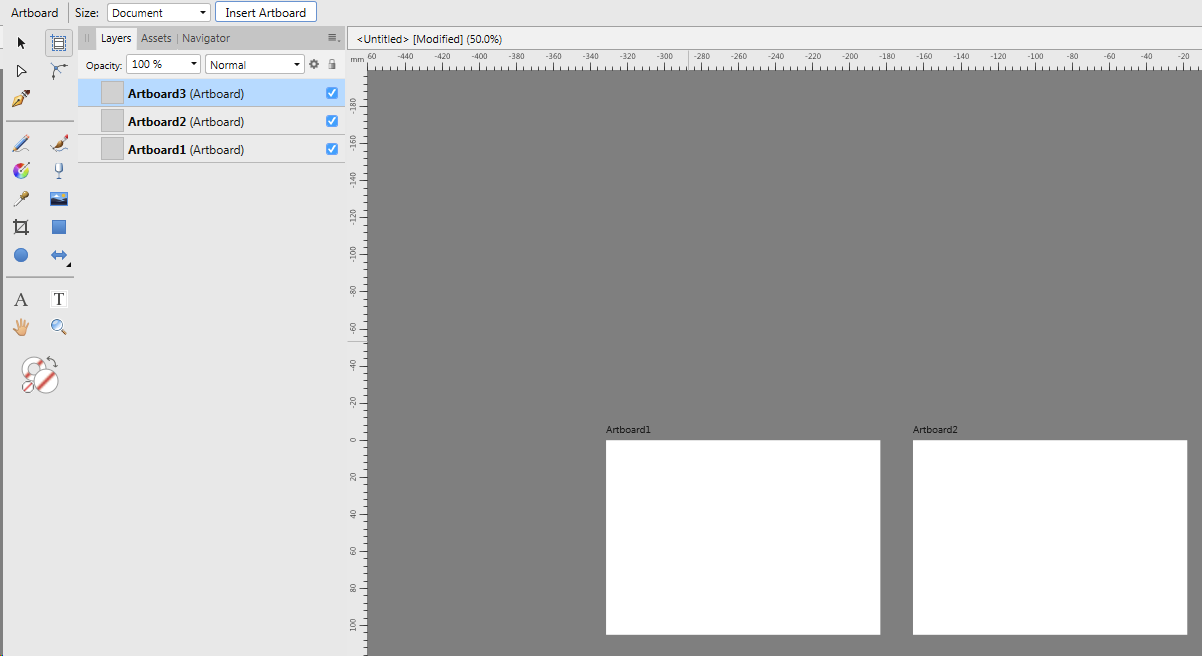
Designer uses "Artboards" rather than pages but they act similarly. The Artboard (A) tool is next to the Move Tool (V). Once you click it you can insert as many Artboards as you want. You can export the file as a PDF with the Artboards coming out as PDF pages. Why don't you download Designer Beta & give it a go?

-
Extract images from PDF
MickRose replied to andyjones's topic in Feedback for Affinity Photo V1 on Desktop
If you have a CS version of Acrobat I'd just be thankful & continue to use what I think is great software. I think it's unlikely that any Serif programs will want to have Acrobat functionality in the foreseeable future. -
Extract images from PDF
MickRose replied to andyjones's topic in Feedback for Affinity Photo V1 on Desktop
Do you have Acrobat Professional? If so you can extract all the images from the PDF. -
Extract images from PDF
MickRose replied to andyjones's topic in Feedback for Affinity Photo V1 on Desktop
Hi andyjones - Affinity Photo can open a PDF with layers so I don't see the problem. -
When I first open Publisher & create a 20 page document I get a grid view in the pages panel and "small" is ticked in the Page options. The visible label on all the pages from 10 to 19 is the same. If I change the option to Medium or Large and then back to Small I get a linear view which is much more usable. If I change the Pages panel width I can get this. I think the Pages Panel needs a bit of work on it. But this a minor niggle on what's looking like great software.
-
Non-breaking spaces too large
MickRose replied to Zero Zero's topic in [ARCHIVE] Publisher beta on Windows threads
InDesign doesn't seem to have this problem with BT fonts
-
I can't see how to do it either using the shape tools.. If you create a shape with the pen tool or join an adjacent rectangle & triangle, then you can make this shape a text frame and get what you want.
-
Capitalisation after Apostrophe
MickRose replied to benskipper's topic in [ARCHIVE] Publisher beta on Windows threads
I don't get that here. There was a capitalisation issue that got fixed in version 238. -
Transform tab between fields
MickRose replied to Jeremy Bohn's topic in Feedback for Affinity Publisher V1 on Desktop
I agree. It's a problem with the light interface where the thin pale blue line is almost impossible to see. -
Definite problem with that file in trying to open in Publisher/Designer. The file opened up fine in Acrobat Pro. From there you can print to the PDF driver & make a new PDF which does open in Publisher. Missing fonts but looks okay apart from that.
-
Create a shape a bit smaller than the object you want to feather. In the layers panel drag the shape slightly to the right of the photo. You can then apply a Gaussian blur to this mask and the bit within the mask doesn't get blurred. It's non-destructive and you can reshape/move the mask to suit. I use it all the time for feathering photos.
-
PDF export Zapf Chancery
MickRose replied to MickRose's topic in [ARCHIVE] Publisher beta on Windows threads
I'm not able to reproduce this now. I might have had 2 identically named fonts installed - I'm not sure. I have tidied up the installed fonts & all seems okay. I'll try later. -
PDF export Zapf Chancery
MickRose replied to MickRose's topic in [ARCHIVE] Publisher beta on Windows threads
Hi Sean P - I've uploaded the font. Its an ITC font which might have installed when I installed an HP printer. The Bitstream version of this font is fine. -
PDF export with Zapf Chancery is a jumble. Seems to be the same problem with ADesigner beta 1.7.
-
Are the objects themselves 154mmwide x 216mm high and centred?
-
That is indeed how APublisher tables work and I agree with you that it is not sensible. What you would need to do is use the Shift Mouseclick on the table header and the move the column. The strange thing is that table row height works the other way round.
-
A lot of us have been confused by the terminology because we are used to the language of ID & Quark. Maybe the word Linked should be replaced by Updateable and the word Linked only brought in when an image isn't actually stored in the document.
-
I think this is a known problem. Windows also. There have been previous posts about it. Until it gets sorted out you can change the preferences to turn off capitalise first word of sentence.
-
Hi Nigel - sorry, I don't agree with you. I think the idea is you select whatever views you want to in your normal working pattern and then toggle the preview for a clearer viewpoint. That seems sensible. I understand what you say about bleed toggling the preview mode but generally I'd have thought you'd have some of the View options ticked and after a quick preview you'd want to go back to where you were. What might be useful is a quick way to deselect all the views.
-
Why do you need anything to be transparent? If you are making posi film or making a cut out stencil I'd have thought the file you already have would be okay. But I've only got a tiny bit of screen printing know-how so please correct me if I'm wrong.
-
I don't think the pictures need to be detached from a picture frame layer in order to be missing from the Resource Manager. They simply need to be placed into a picture frame on an ordinary page if the picture frame was created on a master page.
-
It seems that Preview Mode remembers the settings for the 7 view options and toggles between the remembered views state and all views off. That seems sensible to me.