Jimmini
-
Posts
93 -
Joined
-
Last visited
Everything posted by Jimmini
-
Just because I exaggerate it for demonstration purposes doesn't mean it's not a problem. I wouldn't have made this report if I hadn't noticed it in normal conditions. Not that adding adjustments would be an unusual thing to do. Seams at gradient stops seems like a pretty big deal to me for a professional image editing software.
-
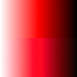
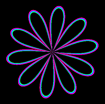
I'm not looking to disable dithering though. I do want it. In fact, I wish there was more of it in various situations. The problem I'm trying to bring attention to is the artifact that this specific implementation of dithering produces. To make it more clear (hopefully), here is a comparison between various gradients: The first is simply a black to white gradient. The second one is a darker gray to a lighter gray with levels applied on top. The third is the same as the second, except there is middle gray stop at the center, which produces the issue I'm talking about, namely the seam at the stop's location. The third is supposed to look like the second, but doesn't. The levels are just used to emphasize the issue, but it happens regardless. (The fourth is just something I stumbled upon when making this comparison, which is a another issue.) GradientBug2.afdesign

-
Gradient interpolation improvements
Jimmini replied to Jimmini's topic in Feedback for Affinity Designer V1 on Desktop
Interesting. I'm actually not aware of what the most "correct" color space for interpolation is. LAB does indeed seem to come quite close to linear sRGB in your example, and you can actually use that as your document color space and it will interpolate accordingly. What I was referring to though is that, in sRGB documents, currently colors are interpolated without first applying the inverse sRGB transfer function on the stop colors, which is what I did (abusing one of my own programs) in the examples above. sRGB colors are stored in a non-linear encoding to increase precision for lower (darker) values at the expense of higher ones, as 8 bit integers are not enough otherwise, but those values should never be used for processing if a correct result is expected. I assume the rationale for doing it regardless is to have consistent results in comparison to other software. A gamma setting (like the one for blending layers) could allow both results (approximately). -
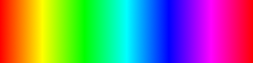
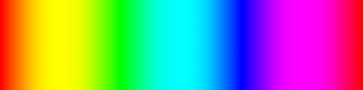
First, gradient stop interpolation is currently not being done in linear space. Here is how it currently looks like: How it should look like: This doesn't only affect the distribution of the two colors being interpolated but also what colors are produced in-between: How it should look like: I thought about posting this in the bug reporting section, but as it might have artistic utility to do it this way and for compatibility reasons, I guess it fits better in here as a suggestion for an option. In fact, there could simply be a gamma setting in the gradient popup, just like in the layer blending options, which could be set to 1.0 for a "correct" interpolation. Secondly, as it is closely related, another suggestion I have is an interpolation easing option, which can produce much smoother gradients, among other things. For example, using cubic interpolation: Thanks, I hope you consider adding such options.
-
I understand the purpose of dithering, and I do want noise, but there shouldn't be such a sudden increase in noise that actually introduces visible seams. Such an artifact isn't needed for dithering, and seems like an implementation issue to me.
-
Default document gamma for layer Blend Options
Jimmini replied to ronnyb's topic in Older Feedback & Suggestion Posts
I always want gamma-correct blending, so an option to set the default gamma to 1.0 in the global preferences, just like I can for text, would be highly appreciated. Sometimes I forget setting it for each layer, only to later find out I have to adjust colors again, etc. So, any update on this? -
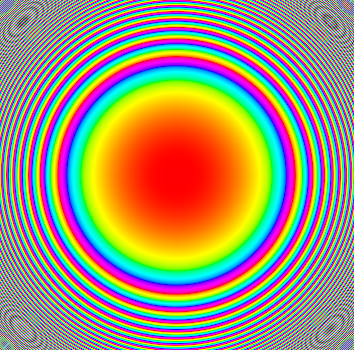
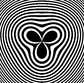
Using Affinity Designer or Photo 1.9.2 on Windows 10, I can see an abrupt increase of noise at the position of a gradient stop, which looks like this after applying a level adjustment to exaggerate it: The noise slider is set to the minimum value for all stops. It's not extremely noticeable but still quite visible in some cases. I can reproduce it for example by simply creating a shape with a linear gradient, a black stop, a gray stop in the middle and a white stop. An example file is attached. GradientBug.afdesign
-
Colors displaying incorrectly when using color profile
Jimmini replied to Jimmini's topic in V1 Bugs found on Windows
Alright, thanks a lot! -
Colors displaying incorrectly when using color profile
Jimmini replied to Jimmini's topic in V1 Bugs found on Windows
Actually I do have a question if you don't mind. Seeing that you're one of the few people who actually bothered to implement this properly, it would be very helpful if you could just briefly confirm whether I got the idea of this whole process right, so I don't base my decisions on wrong assumptions: 1) The display is roughly calibrated using OSD settings, if possible 2) Gamma curves are generated per channel that complement the prior calibration 3) A profile is created that accurately describes the transformation from CIELAB/CIEXYZ to the display's unique color space (assuming the prior calibration) 4) When the profile is installed, Windows loads the gamma curves into a table stored on the graphics card 5) Applications convert their colors to CIELAB/CIEXYZ, then to the display's color space using the transformation stored in the profile, and output it 6) The colors are automatically adjusted using the gamma table and then displayed On macOS, step 5 is done automatically system-wide. Is this somewhat correct? -
Colors displaying incorrectly when using color profile
Jimmini replied to Jimmini's topic in V1 Bugs found on Windows
I have the slight feeling Microsoft wouldn't be very interested in such a bug report heh. Actually, they do seem to have added system-wide color correction already, but I think only for HDR monitors: https://docs.microsoft.com/en-us/windows/win32/direct3darticles/high-dynamic-range#wide-color-gamut-with-automatic-system-color-management I understand why adding an option to intentionally break your own application just to have it behave like the rest of the system isn't very appealing... And you made a good point that it would really just look "correct" on my own screen. I guess I'll just work around it how you suggested when really needed. Thanks for taking the time to clear this up. -
Colors displaying incorrectly when using color profile
Jimmini replied to Jimmini's topic in V1 Bugs found on Windows
Hi, I appreciate your answer, and it seems you're right. I assumed that full color correction is done system-wide once a profile is set in the Color Management settings, but apparently only calibration curves are loaded. While that is definitely good to know, it doesn't change the fact that, as I mentioned before, colors don't match the ones in most other software, making it a pain to work with UIs, textures, screenshots, etc. So, is there a way to disable the color conversion, other than assigning my display profile to documents or disabling the profile on a system level? If not, would you consider adding such an option please? Anyway, sorry for the false alarm. -
Colors displaying incorrectly when using color profile
Jimmini replied to Jimmini's topic in V1 Bugs found on Windows
I've seen that article already. It mentions an issue with default profiles, which I'm not using, and the issue of other applications not taking the color profile of image files into account, which isn't the cause either, since even single solid color outputs from standard Windows APIs without any image files involved are displayed differently. Considering colors in Windows are inherently in sRGB space, I only work with sRGB images, and Windows is already transforming colors using the active display profile, I don't see why Affinity would need to perform any additional conversions in my case. Even if there is a good reason for it and it's not considered a bug, it effectively results in colors being displayed differently compared to how the operating system displays colors, and I would like to have an option to disable it as it makes UI design a trial and error process. Also, I just figured out that colors are displayed correctly if I use my display profile for the document, but that's obviously a bad idea. -
This seems like a pretty major and obvious thing, so maybe I'm doing something wrong, but on both my computers in Affinity Photo and Designer 1.8.3.641 (and previous versions), colors are not displaying correctly when the color profiles I created for my monitors are enabled. Both hue and brightness are shifted compared to how the colors look in almost all other programs I've tested, including with images saved by Affinity Photo itself. I use the standard sRGB profile for documents and the color settings are at their defaults: Programs I've compared it to include Windows Explorer, Internet Explorer, Edge, Paint, Visual Studio, Blender, and VLC, all producing colors as expected. Only Chrome and Firefox seem to alter colors to different degrees. I've also compared it to various application programming interfaces by outputting a single color, i.e. Win32/GDI, WPF, OpenGL and Vulkan, again with colors showing correctly. Additionally, I tested it by taking a screenshot of a document opened in Affinity Photo and comparing it to the actual document: Here I made a gradient in Photo, made a screenshot of it and inserted it below the actual gradient. The red color (255, 0, 0) is made slightly pink (255, 8, 34) among other things. Apart from the color values, it also simply doesn't look like how I expect it. The only way I found to "fix" it is to disable the color profile altogether (i.e. use the default sRGB IEC61966-2.1 profile), or to enable it while Affinity Photo is running (but only until I restart the program). I'm using Windows 10, a Nvidia 650M with the latest drivers on my laptop and a 1080 Ti on my desktop PC. The color profiles were made with a X-Rite ColorMunki Display and DisplayCAL. It makes no difference whether I enable them with DisplayCAL or with the Windows Color Management dialog.
-
Incorrect tab showing when using keyboard shortcut
Jimmini replied to Jimmini's topic in V1 Bugs found on Windows
Yes, exactly. -
In Affinity Photo 1.7.3.481, when switching document tab using the keyboard shortcut (Ctrl+Tab), often the wrong tab is shown. It seems like the keyboard-activated tabs are tracked separately from the ones activated with the mouse. Maybe the focus on the tab UI elements is being used to determine the next tab, which isn't being set when clicking on them?
-
In Affinity Photo 1.7.0.367, when switching to a document with an open live filter window, the application becomes unresponsive.
- 1 reply
-
- 1
-

-
In Affinity Designer 1.7.0.367, when holding Ctrl+Shift when selecting a layer in the layers panel, the Shift modifier to select a range of items is ignored. It is thus not possible to select a range of items, starting from the last item that was selected with Ctrl.
-
Is there a way to reset an out-of-sync layer (those with the dashed orange line on the left) within a symbol instance, so that it is reverted to it's state that is defined by the symbol? Also, is there a way to completely reset a symbol instance, but maintaining it's transformation?
-
Interesting. I somehow managed to overlook this filter. Is there a list of available functions I can use in these equations? But I doubt I'll be of much help with your filter, which already looks very nice. I'm just barely able to wriggle my way around some mathematical problems.
-
And another perfect example where a node editor would not only make all this possible at once, it would go far beyond that and allow everyone to adjust this and all other effects in every way physically possible, non-destructively. A fixed feature set works great up to the point where one needs more control, in which case one can nothing but pray that the developers invest their time to include more options and roll out an update, someday. A node editor would remove this dependency on developers and static effects with fixed sets of parameters, in many cases. You could just create this effect yourself. Furthermore, you could, for example, use the alpha channel as parameter that controls the noise's size, use the green channel of an external image to set the smoothness, or procedurally generate a pattern that adjusts the noise's spread. Then you could use that noise as parameter for a blur filter, or for a filter that you created yourself entirely.
-
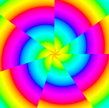
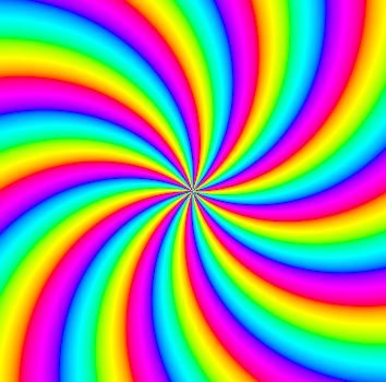
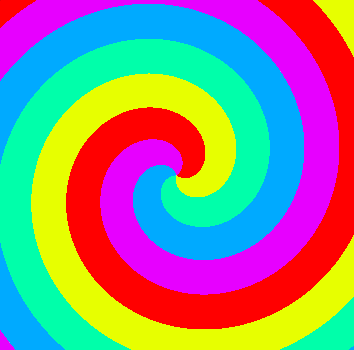
You're welcome, Alfred. The great thing about nodes is that you can easily reconnect them. So if you, for example, reconnect the "wire" that goes into the "hue" parameter to go into the "value" parameter (by dragging the "plug"), you get something like a red rose. Or you can connect them both to get a different result again. Even more, all this could be easily reconnected to get a distortion filter for an actual image. Or to specify this spiral as parameter for any other filter... truly endless this stuff. It would be great if there was an open format for this, to share nodes between applications. I've got some more examples attached. This is all achieved just by changing some values, adding a few nodes or reconnecting them.
-
Sorry, I still used 2.71, it seems they clamp the hue parameter in HSV nodes now. Here's the updated file. I just had to place a modulo node between the add node and the HSV one. Changing the value of the multiply node (which currently is 100), changes the zoom factor. With the power node on the right (currently 0.15), the "acceleration" of the spiral can be adjusted. I really don't know how even such a fairly simple thing can be made using traditional layers + filters with that kind of freedom to precisely adjust every parameter in every way mathematically possible, especially non-destructively. I absolutely love the idea of being able to mathematically/logically generate and manipulate images. With Affinity being internally node-based and the team being this talented, I have a good feeling about the future of this feature. Spiral Node Texture.zip
-
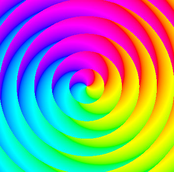
I created a small node setup in Blender that generates a rainbow spiral, to give you an idea on how this approximately works, just in case. The left most node gives the image coordinates, the right most is the output. Nodes can be grouped and reused for more complex setups. Just download the software from blender.org and open the .blend file within the attached zip file. You can manipulate values in the nodes and the result gets immediately displayed to the right. Of course, Blender really isn't made for image editing, so it lacks some important things to make this more than just a small peek at what could be. Sure, this isn't a small feature request, but I think this could greatly enhance the program's scope and provide a massive selling point that surely would find a lot of fans. Spiral Node Texture.zip
-
This absolutely needs to happen and would take Affinity to the yet undiscovered realms of next generation software, far from the reach of Adobe Stagnation CC. Layers are fine for the most part (and Affinity already offers much more flexibility than Adobe's stuff in this area), but the possibilities of a node based system would be truly endless. I can't even imagine all the amazing stuff some creative heads would build with this. Even more, they could share their setup with the community, allowing everyone to effortlessly apply it to their own project. In Affinity Designer, it could be used to create new types of shapes. All without scripting and installing of plugins. This system is even used in game developement, namely Unreal Engine. But also in Blender and the ones the OP mentioned.
-
Blur Filter with radius based on a BW layer
Jimmini replied to Kambis's topic in Older Feedback & Suggestion Posts
That's actually a very good request. I would even go a few steps farther. I think the biggest hurdle for this, would be the user interface. But a node editor could be a solution to this, like Blender or the Unreal Engine has. I think I'll even make a separate feature request for that, if there isn't one already. That would make me uncontrollably throw an exorbitant amount of money to the screen. By the way, Photoshop can't do a lot of things that Affinity Photo can.