LCamachoDesign
-
Posts
367 -
Joined
-
Last visited
Everything posted by LCamachoDesign
-
Affinity Publisher for Windows - 1.9.0
LCamachoDesign replied to Patrick Connor's topic in News and Information
I didn't realise in the beta thread discussions (I wasn't paying much attention to be honest) that Data Merge here means something different from Data Merge in InDesign. In InDesign doing a data merge means a one time import of data, meaning if the data source is modified later, tough luck to you. This mostly renders InDesign data merge as a useless function, everyone just uses XML linking instead. Turns out Data Merge in Publisher works much more like XML linking, meaning that if you change the data sources, you can update/sync the Publisher contents with a click of a button. This is quite amazing. This type of data linking is really hard to do, and you need some sort of masters degree to use the InDesign version (I know I spent almost a year perfecting this function for a client catalogue). That Serif was able to pull this off in such short notice is pretty amazing. Congratulations to the devs, well done and impressive work! -
Hi! I can confirm this is indeed fixed. Thank you very much! This however is still outstanding: It's a minor issue and I suppose it can be fixed after the initial stable release since it doesn't cause any crash or lost work. It's just confusing why aren't controls responding at the first encounter with it. Buy if it can be fixed before release that's best of course. Many thanks for the global colour work, it's super appreciated!
-
The window stabilizer will also work if you're moving relatively fast. That said, this is not a 1.9 bug, or even an iPad bug. This behaviour happens on all previous versions, and it also happen on Windows, both on a desktop PC (with a graphics tablet such as a Wacom Intuos) or a tablet pen (such as a Surface Pro). It even happens with a mouse, and I'm pretty sure it also happens on macOS. Fixing this will need a rework of how the pen and mouse input works, so it won't come on 1.9. I think it used to be worse in 1.7 and before, I believe some work to address this has made on 1.8, but not enough to fix it for good.
-
Yeah, but to be fair the global colour bugs are really minor and can be safely addressed after release. For the global colour without moving the sliders crash, since the dialog does not inherit the last used colour and always starts at white or black, you’re nearly always going to fiddle with the sliders, which makes the bug go away. The only way to trigger it would only be adding white/black as a global colour without touching the sliders. It would be best to fix this before launch, but not an issue if it’s fixed in the next few days. For the bug where the dialog box is not interactive when dragging the slider chooser, it’s also a minor inconvenience. Normally you fiddle with this once and don’t touch it for a while. In my case I set it to CMYK and leave it for good. Once again it would be great if this is fixed before release, but it’s minor and even less of a problem than the bug above. This can be fixed at a later time safely.
-
Both this: and this: Still happen. Just to let you know. Thanks!
-
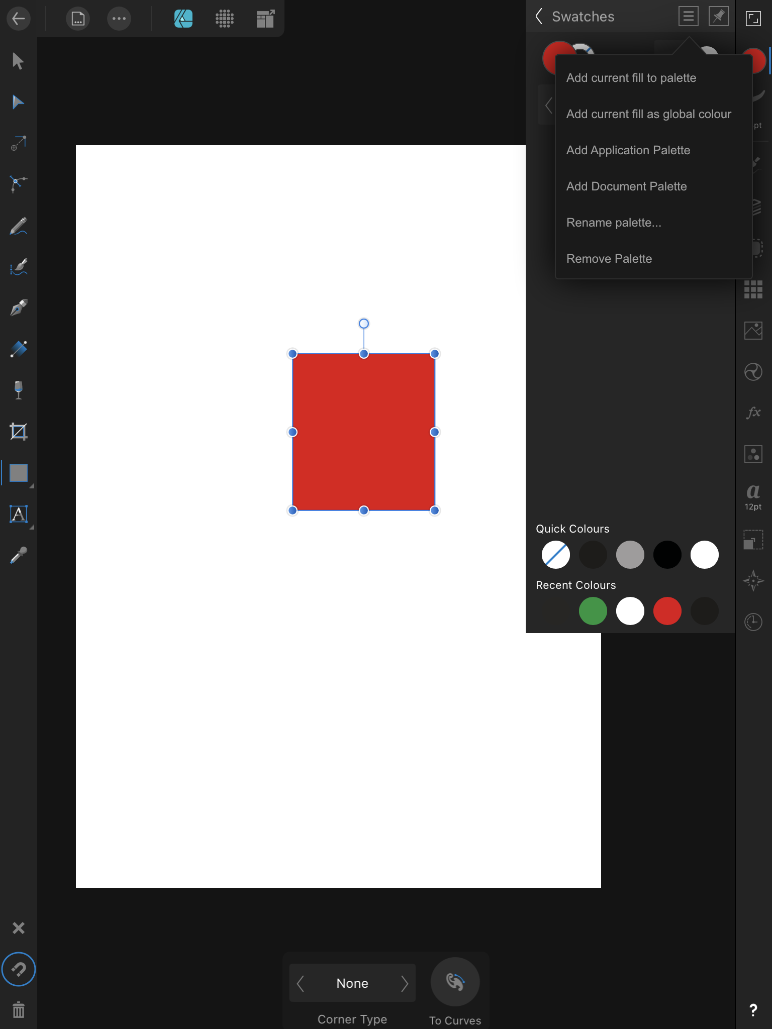
I can confirm this is happening to me as me as well. A few more details: Toggling Spot or Overprint does not prevent the crash Changing the swatch name does not prevent the crash Swapping to another slider type, like CMYK to RGB for example, does not prevent the crash The only way to prevent this crash from happening is to move any of the colour sliders, even if just a bit. I can also prevent the crash from happening by moving a slider and then moving it back. For example, starting with CMYK all at 0%, move K to 100% and then back to 0%. The crash is prevented. It seems like the slider values are not initialised until a value change happens. See attached video. FullSizeRender.mov FullSizeRender.mov
-
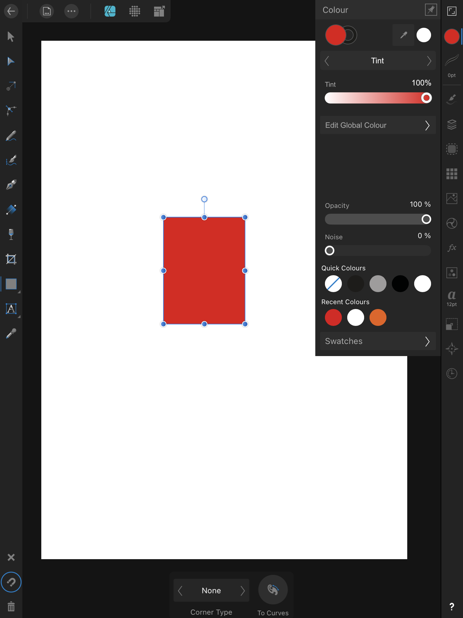
I see that global colour swatches are still not mentioned in the changelog. I find this troubling as it seems like you're unsure if it will be included in the retail build... Pretty please, no do not take this away! Global colours are a must, even if they're not doing everything they could, it's still infinitely better than nothing! That said, I do have a bug report for the new global colour dialog: Bring up the new global colour dialog Tap the slider type menu to bring up a list of slider types Drag your finger through the list and select any slider type Notice the list remains up if you try to compose a colour, and you can't change any of the values Notice that you interact with the shapes on the artboard instead Instead of dragging your finger on the slider type list, tap any slider type Notice the list is dismissed and that you can interact with the colour sliders now You no longer can interact with the shapes on the artboard as expected I also think the issue mentioned on the other thread is gone. I can rename the global colour on this dialog just fine. See the attached video for a visual demonstration of the bug. Thanks! RPReplay_Final1609936126.mov
-
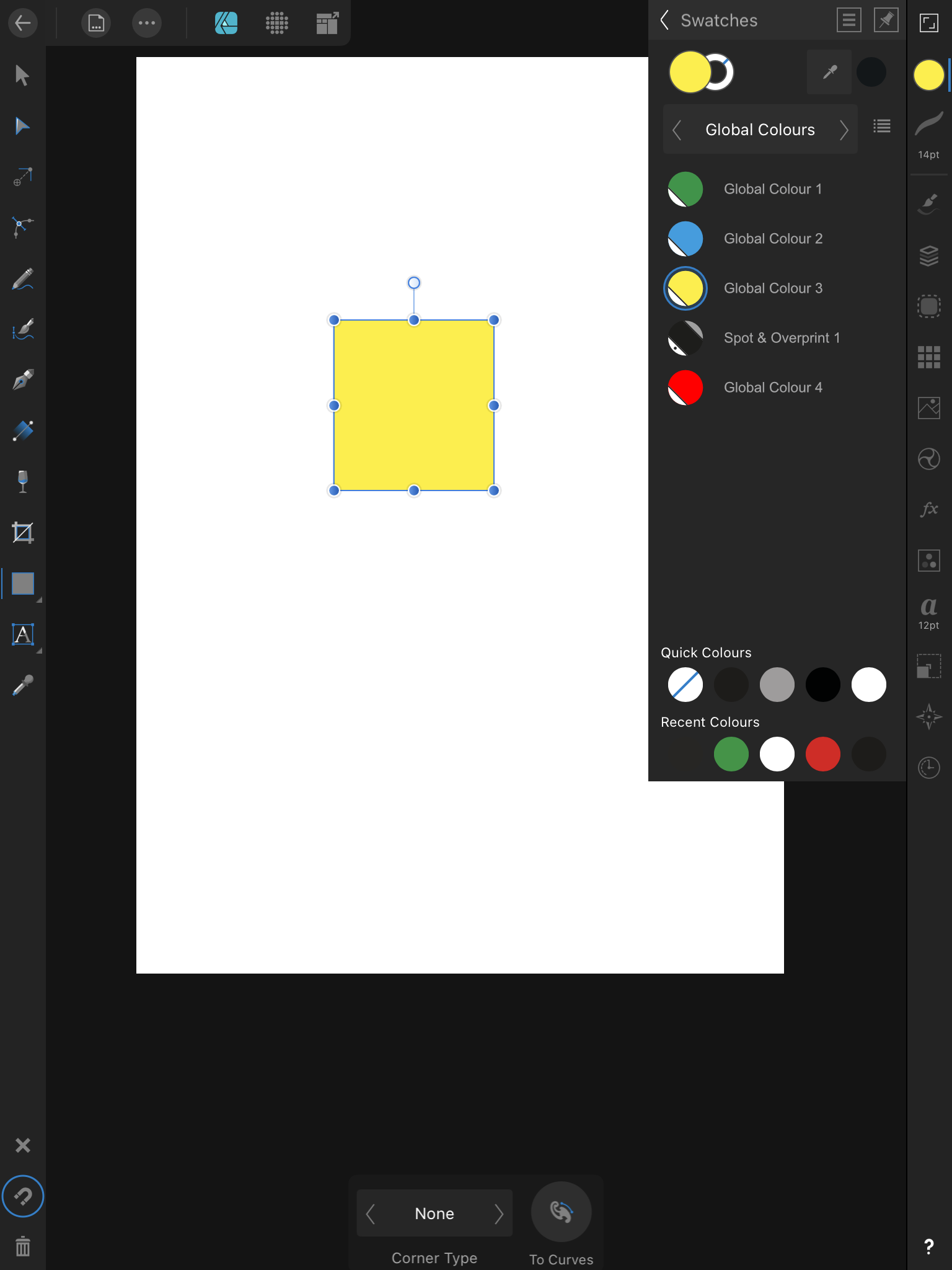
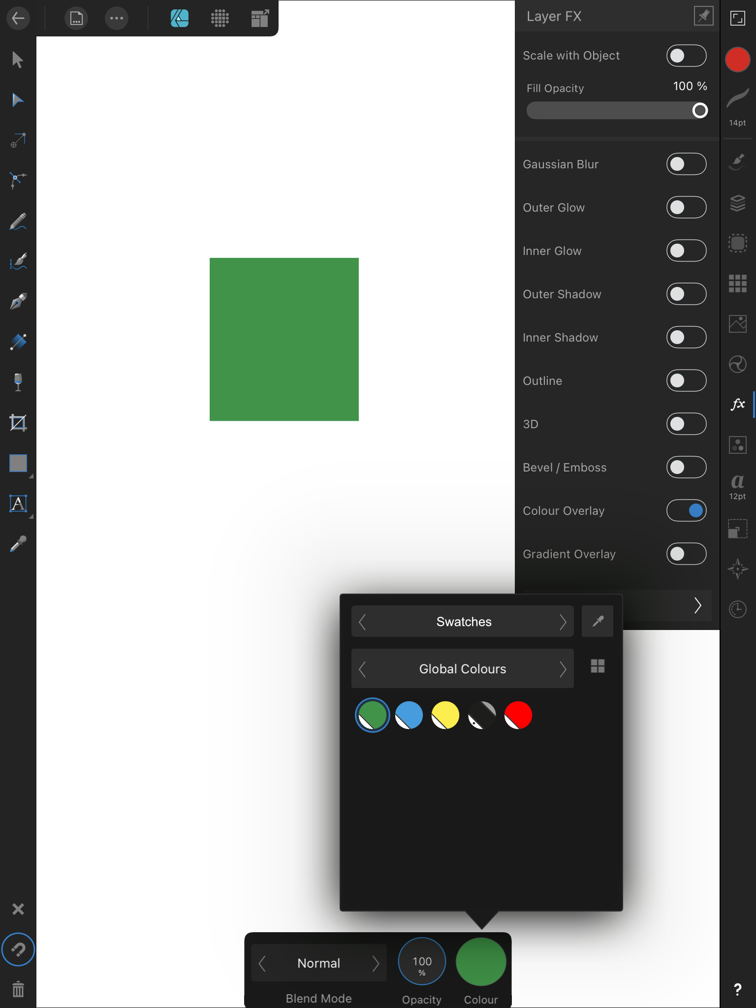
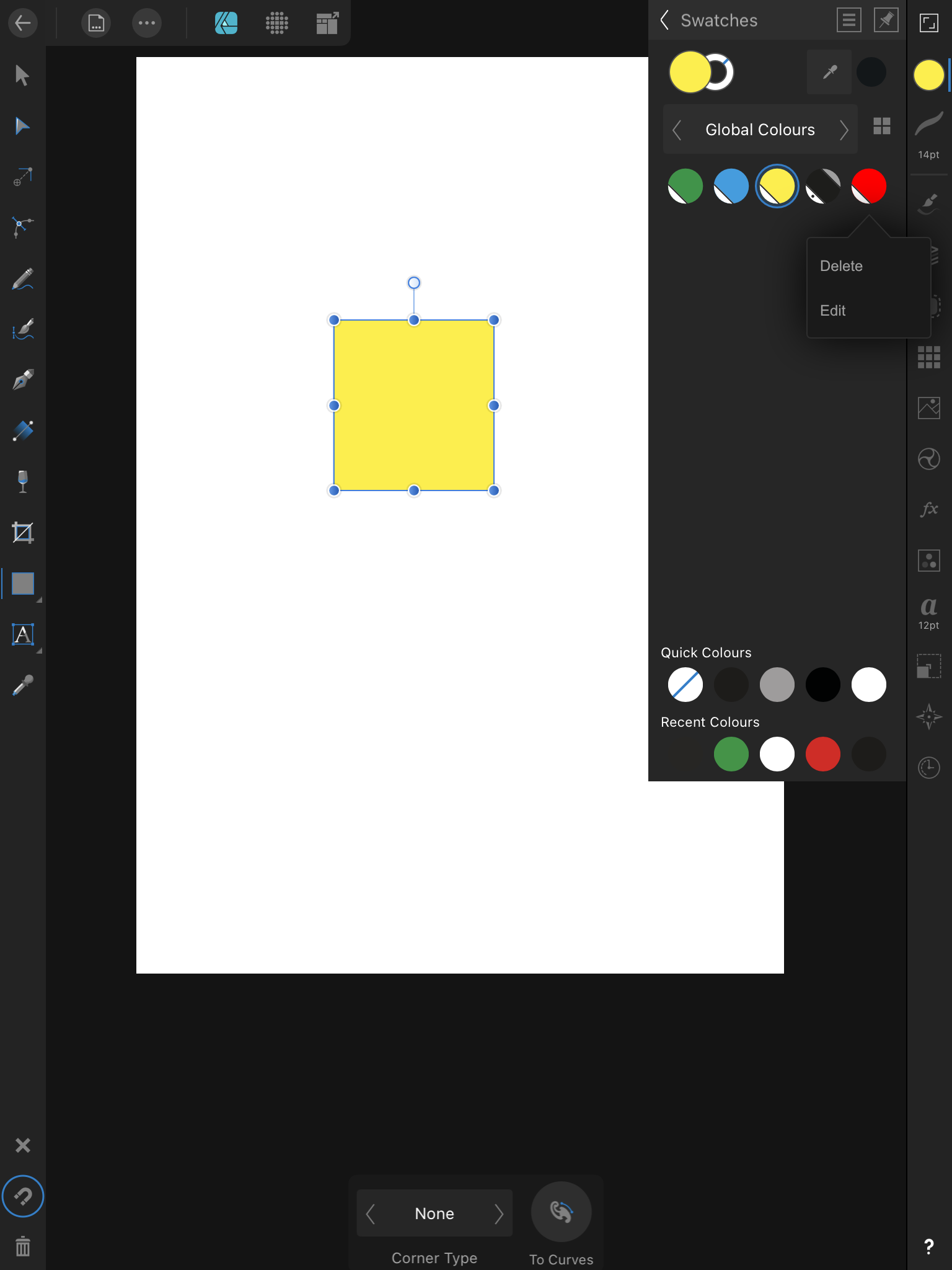
Actually, scratch that. I’ve downloaded the beta to fiddle with the contour tool (works fine for the use I’d give it), and since you haven’t mentioned anything, I didn’t bother to look for anything in the swatches panel... I just did that now. You’ve actually added the global colour swatches creating and editing! Why not mention it in the changelog? Maybe I’m in the minority, but I think global colours are the very best think that could happen to the iPad version! It will definitely be my favourite new function! On the feature itself, I have some feedback. Bugs: Only saw one, and I can’t trigger it again. When I first started fiddling with it, creating and editing swatches, I often triggered some soft of bug where I couldn’t interact with the sliders or even dismiss the creation/editing window. I’d instead resize or move shapes in the page, it’s as if my touches were passing through the window. It caused the app to crash at least once, and to regain control I had to back out to the iPadOS Home Screen. Maybe I’ll come across it again and fill you in with more details. Improvements: As I’ve mentioned in point 3. of my post it would be great if we could apply global swatches to layer effects. It’s particularly useful for the Colour Overlay effect. This already exists on the desktop, and I’ve suggested a UI if that helps. There’s no indicator showing a global swatch is applied to the selected shape, as I mentioned in point 2. of my post. This would be nice to have, but it’s also true that this feature is present on the desktop, and it doesn’t work very well there (I’ve already filled a bug report on that). If you can make this work reliably on the iPad and the desktop, it would be awesome. Otherwise it’s fine as it is. And that’s it for feedback. The addition of global colour swatches creation and editing is a wonderful, and much needed feature! Thank you very much indeed! 😁
-
That's a good start to select all objects with the same colour and apply a global colour for example. A global colour that needs a UI so we can work with them. For example, a suggestion such as this: [1.9] Global Colours editor UI is missing - Designer Beta on iPad - Affinity | Forum (serif.com)
-
Affinity Designer Customer Beta (1.9.0.2)
LCamachoDesign replied to MattP's topic in [ARCHIVE] Designer beta on macOS threads
Tell me about it... I'm really loosing patience with these companies that produce tools but have no actual idea of how customers use them... Illustrator has global colours on the iPad, which seems great, until you realise the editor UI to tweaks those colours covers THE WHOLE SCREEN. What were they thinking? The main reason to use global colour is to tweak and compare different colours in real time, by looking at how the work within the illustration. How are we going to do that if the UI covers the whole screen??? Ugh... -
I was waiting for the actual 1.9 beta to come out before posting this, but since it doesn't look like it's coming any time soon, I might as well post it in advance. Even if work in the UI has already started, I still think it's relevant to post this. If for nothing else then to make sure you avoid doing the global colours editor UI in the same disastrous way Adobe did with Illustrator for the iPad released today. To avoid the above you must understand one thing, the whole point of global colours is to finely tune the colours of our illustrations, in real time. This means you must see the colours change within the illustration as you tweak the swatch. As such you must do your best to avoid obscuring parts of the canvas, no full screen editors please. Another point with these mockups is to create them reusing as much of the existing UI as possible, so the amount of work needed to create this is reduced. This is a critical feature that has been missing for way too long, let's not delay it any further by requesting unique UI elements just for it. With that out of the way, let's get started. 1. The first step in editing global colours is to actually have some. For that you need to have a way to add them to the colour palette. A simple 'add global colour' entry on the existing flyout menu will do. The swatch will be further tweakable down the line, so this is enough or now. 2. Now that global colour swatches exist, you must be able to apply them. For that you'll need an indicator showing the swatch is applied, a simple blue circle around the swatch will do. This is the same colour as used in many other controls throughout the app. On the next point I'll show these swatches as a grid instead of a list. 3. We must be able to apply global swatches to things beyond simple shapes. Right now we're not able to apply any swatches, even regular ones, to things like layer effects. For global colours to be maximally effective this must change, we need a UI to select and apply swatches to things other than shapes. Here I'm showing how this would look when applying a global colour to a colour overlay layer effect. 4. Now that global colours are applied, we need to edit them. This is where I ran into a possible UI inconsistency issue. What makes sense to me would be to long press a swatch, choose 'Edit' from a popup, and be taken to a panel for that effect like shown in point 5. The thing is, I don't think there's any instance where a popup menu like this takes us to a subpanel? And like I said at the start, if I want to minimize UI changes in order to deliver this as fast as possible... ... so if the above is an issue, then another solution can be used. Instead of long pressing the swatch, we could instead head to the Colours panel and have it behave in a way similar to the desktop version. That is showing a tint slider with a button linking to the colour editor. 5. Time to tweak the actual colour values Independent of the design option chosen above, you'll end up on this panel to edit your global colour. You'll be able to tap the swatch name to change it, and more importantly change the colour values while you keep the canvas in sight at all time. Once you're done you can simple back out into other panels or tap away to close it. Add... that's it. I'm open to take any feedback, and I'm sure the developers would like that too. However, remember that we must reuse as much of the UI as possible, so this critical feature can be delivered as soon as possible. Thanks!

-
- 3
-

-
- global colours
- ui
- (and 1 more)
-
Affinity Designer Customer Beta (1.9.0.2)
LCamachoDesign replied to MattP's topic in [ARCHIVE] Designer beta on macOS threads
It was explicitly stated. And a speaker mentioned it on one of Adobe's stream. But now that AI for iPad is released, they took out the mentions about this, and indeed you cannot open .AIC files in Fresco or Photoshop. And you can't open .PSDC files on Illustrator either. Also, you can't rotate the canvas on Illustrator for the iPad! I don't even... I swear I'm running out of ideas to explain how companies seem to be able to sabotage themselves like this. 🤷♂️ You do get global colour swatches though, but the UI is clunky and badly thought out. So you're right and I was wrong. My bad. 😁 -
Yes, indeed. In normal work I wouldn't do it as slowly as in the video. I was testing as it felt this was what's causing the issue, and I guessed right. Yeah, I'd say the Surface is the worst offender here and the hardware is partially at fault. The pen is a bit... 'mushy'? It's hard to explain, I feel like it takes longer than the other pens to return to a 'zero pressure' state. Since it takes longer to return to neutral it gives more time to Affinity Designer to pick it up as cursor movement. 🤷♂️ Thanks!
-
I know about the polygon mode, it's a pretty great idea/mode too. It would just be nice if the pen tool were not as sensitive as it is now, so we don't have to switch around as much. That said, turns out this is not a Windows version bug... I've been able to replicate this on the iPad as well, so it's across all platforms. Essentially if you tap and lift the pen on the screen fast enough, you'll always get a sharp node, but if you tap and hold it just a few fractions of a second, you'll very likely get a smooth node. I suppose the Surface Pen is more prone to this as it's less responsive, or at least more 'mushy'? Knowing this enables me to replicate this issue, even with a mouse! All you need to do is click and hold, then even the slightest movement will make the node smooth instead of sharp. It can even be triggered without movement. Click and hold, then if the node location happens to be on a smart guide area like the center of the page, it will become a smooth point even though I have not moved the mouse. As such, there is a bug across all platforms. The pen tool should only create smooth node if you move the mouse/pen device a significant amount of pixels in any direction. The amount of time you have the mouse button/pen tip down should not matter at all to decide if it's a smooth or sharp node. Thanks!
- 7 replies
-
- 1
-

-
- smooth point
- pen
- (and 8 more)
-
That's what happens to me. I'm unsure about what adds more smooth nodes, going really fast, or going really slow. I can try fiddle with the Wacom settings, but on the Surface where I first noticed this I can't do any tweaks.
-
Bumping this to know if I'm the only one with this issue? Since it happens on 2 different machine it can't be? I've also updated the Wacom drivers on the Desktop to the latest version (6.3.41-1) and made no difference.
-
Affinity Designer Customer Beta (1.9.0.2)
LCamachoDesign replied to MattP's topic in [ARCHIVE] Designer beta on macOS threads
You can copy and paste shapes between Illustrator and Photoshop, and they'll retain their 'vectorness' if you choose to paste as shapes instead of bitmap or smart objects. But they loose any special properties. And you need to do this for each shape individually... meaning potentially copy/paste thousands of shapes individually! So yes, Affinity has an obvious advantage here, and yes, it's technically possible to work between Illustrator and Photoshop. But like I said, the pre-order page of AI seems to imply Photoshop/Fresco will be to natively read AIC files, retaining their 'vectorness'. I guess we'll find out in next week. I hope they added it 5 years ago, since this is a day 1 feature. That's kind of what upsets me, these are not advanced obscure features, it's literally the everyday bread and butter of any vector workflow. 😑 -
Affinity Designer Customer Beta (1.9.0.2)
LCamachoDesign replied to MattP's topic in [ARCHIVE] Designer beta on macOS threads
Obviously Affinity has an advantage here. I don't know how fast it will be on Adobe, but it's impossible to beat Affinity here since switching personas takes 0 time. This is not true. Once you move your Illustrator file to Photoshop you loose pretty much all vector information, you can't switch back and forth between them. This is actually a very good question. It's my understanding that's sort of what they've done with their Cloud documents. However right now the .PSDC and .AIC documents seem to be incompatible, or at least the applications will not show each other's files. However the pre-order page for Illustrator on the iPad clearly states that you can "[w]ork on a project across Adobe Illustrator, Photoshop, and Fresco." This seems to indicate the all 3 applications will be able to open and edit PSDC and AIC files after the MAX 2020 update. Or they'll drop/rename AIC files in favour of having everything as PSDC's (or other extension). Also, one of the guest illustrators at a recent Adobe stream literally said she could open her AIC (?) files on Fresco. Missing global colours on the iPad, or not even being able to delete more than one colour swatch at a time on the desktop seems to disagree with that. These are the very basics of drawing, it's literally basic flat colouring of shapes, and it's been missing since the beginning! I mean they have great features, the isometric drawing for example is really, really good. But not if it comes at the expense of being able to literally colour things properly! -
Affinity Designer Customer Beta (1.9.0.2)
LCamachoDesign replied to MattP's topic in [ARCHIVE] Designer beta on macOS threads
Yeah, that’s absolutely true. To me the niche that Affinity Designer filled was illustration, no other application does the mix of vector and raster... unless... And here the crux of the question. By dragging their feet with large releases like were in 1998, instead of putting out monthly releases with small but welcome improvements that build over time they open themselves to be overran by other competitors. From what I can gather Affinity may have the rug pulled from under its feet with the illustration niche advantage I’ve just talked about. As far as I know Illustrator for the iPad will produce editable files that are interchangeable with Fresco. This means you can build the vectors in Illustrator, and raster shade them on Fresco. Pretty much what I think is the only strong use case for their software. If Adobe does it too, but better, then it’s game over for them. No pro will use their software since were all forced to have Creative Cloud subscriptions anyway, might as well make the most of it by using all software you can... That said there’s still advantages to how Affinity does things, and I’m not sure if Adobe or other will catch up on these, but they might and that’s a dangerous game to play. -
Affinity Designer Customer Beta (1.9.0.2)
LCamachoDesign replied to MattP's topic in [ARCHIVE] Designer beta on macOS threads
Yeah, and another thing. My 'File' suggestion (which I've amended to include EPS files) would work wonders for stock patterns. If you hop onto GraphicRiver, ColourBox, Creative Market, etc... all the patterns you can buy there are already stand alone tiles that can be repeated just by placing them next to each other. By being able to open and use these files with the Fill tool the vector pattern issue would be... reduced. Like I said, excellent is the enemy of good, and with the very slow release schedules of Affinity, any quick patch that can be slipped into minor releases is a welcome reprieve. -
Affinity Designer Customer Beta (1.9.0.2)
LCamachoDesign replied to MattP's topic in [ARCHIVE] Designer beta on macOS threads
Cleaner boolean operations is a must of course. But the others, I'm not so sure, to me they'd be 'nice to have' but not critical. I personally think there's two areas that need the most attention right now: Swatches panel: Colouring artwork is the basic of the basics. This panel needs to work reliably all the time, and right now there's a few bugs that need cleaning up. Another very important area is the missing features, stuff like selecting multiple swatches to delete/move at once, select all unused swatches, merge swatches, and a better UI to edit them. Colouring is basics, it needs to be solid. Vector patterns: right now the Fill tool supports patterns, but only bitmap ones. The entirety of the textile industry lives off vector patterns, by continuing to ignore it you're leaving a whole industry out of the loop. Other industries rely on these too, like stationary and to a lesser extent, branding. Right now the quick and dirty solution would be to rename the fill tool 'Bitmap' option to 'File', and allow it to open and use AFDESIGN, EPS and PDF files as patterns, without rasterization obviously. This doesn't solve creating them, but it does solve applying. Obviously the best option would be a full integrated solution like in Illustrator, but you know the saying, excellent is the enemy of good. -
You have? Are you talking about just the beta then? On the stable version (1.8.5.703) try as I might I can't get the canvas to rotate with the two finger gesture. I haven't tried the beta yet, I normally only test these if there's a feature I'm really interested in testing first hand. Thanks! VID_20201005_104625.mp4
-
Can we use the two finger rotate gesture on the Surface Pro to do this as well? Just like in the iPad.
-
Affinity Designer Customer Beta (1.9.0.2)
LCamachoDesign replied to MattP's topic in [ARCHIVE] Designer beta on macOS threads
I really don't know why anyone would want mesh fills. They exist in Illustrator, I avoid them like the plague. They're impossible to manage, a pain to create, they're simply awful. If you're considering adding this so people can have multiple flowing colours in one shape, then consider... err... taking inspiration from Illustrator free form gradients. They'll serve most people's needs, and are so, but so, much easier to manage. Of course if we're going into personal requests, then my top vote will always be global colours on the iPad and a 'full rewrite' of the swatches panel on the desktop. -
I've came across this issue with the Pen Tool and stylus devices. If you try to draw straight lines with sharp nodes, very often you'll inadvertedly create smooth points instead. I've first noticed this on my Surface Pro 4, but I've also been able to replicate it on my desktop PC with very different hardware. At first I thought it was Windows Ink causing the issue since a similar bug was happening in previous versions, but switching to High Precision or Low Precision does not fix the issue. The 'trick' seems to be the rhythm at which you lay down the points? This is easier to replicate on the Surface Pro and it's pen, or at least it happens more often, seems like a somewhat fast laying down of points trigger this more often? On the desktop seems to be the opposite, slow and deliberate points seem to convert to smooth more often. I also got the feeling the longer the program runs, the more likely it is to trigger unwanted smooth points. Attached are videos showing the issue happening in both hardware / software combinations. There needs to be a higher 'dead zone' before sharp points transition to smooth points, otherwise it's a pain to deal with using the Pen Tool. Thanks! This first video is the Surface Pro 4 + Surface Pen + Windows Ink, while the second video is Desktop PC + Wacom Intuos + High Precision. Surface_Pro_4_+_Surface_Pen_+_Windows_Ink.mp4 Desktop_+_Wacom_Intuos_+_High_Precision.mp4