kevinmcsherry
-
Posts
165 -
Joined
-
Last visited
Everything posted by kevinmcsherry
-
I'd love to find a way of recreating the screenprint look, if anyone knows of a tutorial? GarryP of this forum mentioned an artist called Jason Edmiston. I was looking at some of his brilliant artworks -especially the screenprints. http://jasonedmiston.com/portfolio/posters/dr-jekyll-mr-hyde/ I suppose I should do an actual screenprint but there's no time...
-
Cheers George. I feel great now!
-
Most perceptive, most perceptive...*strokes chin and backs out of room* :)
-
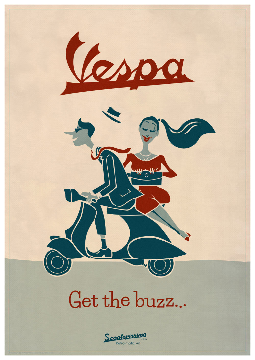
A 'vintage' retro poster for a poster/print for my special interest site www.scooterissimo.club I couldn't imagine pillion passengers riding sidesaddle on a motorbike now but they used to do this...

-
Thanks Jer, One of the reasons I did recreate the old image is because I thought the idea was good but the execution in acrylics didn't pass muster any more. There'll be a bunch more to do!
-
Thanks guys. I looked up Jason Edmiston. Amazing stuff.
-
I did an illustration in acrylics more than twenty years ago and just decided to recreate it as a vector image. It took me half the time to make it. I'm thoroughly convinced! Kevin
- 10 replies
-
- 14
-

-
Got them -Great work; thank you.
- 209 replies
-
- 1
-
-
- affinity designer
- resources
- (and 4 more)
-

affinity designer Vespa Poster Artwork
kevinmcsherry replied to kevinmcsherry's topic in Share your work
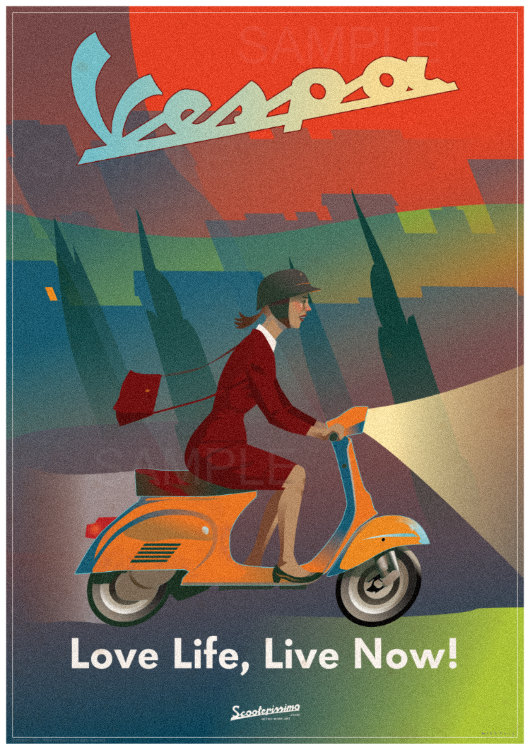
Thanks. This noise issue came up in another thread and still causes my brain to hurt. This was printed out at SRA2 and is perfect -ever so slightly grainy without looking like it's made of sand. Unless anyone knows of a better way, I had to take a punt that the amount of noise I added would print up looking correct. When I exported the small version to put up here, it's too noisy but I didn't want to sift through hundreds of layers converting levels. Maybe a screenshot would've been better but I didn't think of it...
-
affinity designer Vespa Poster Artwork
kevinmcsherry replied to kevinmcsherry's topic in Share your work
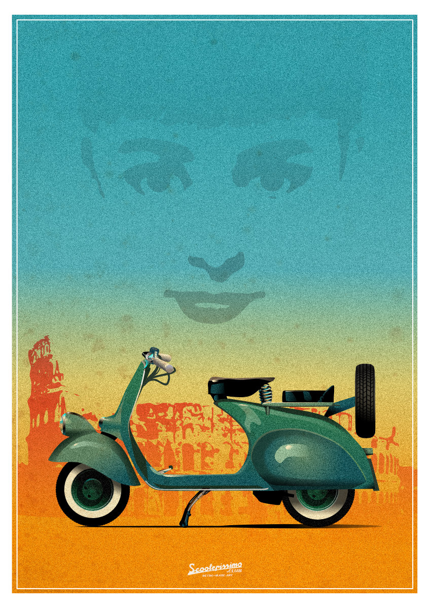
Thanks so much Jer. That Cushman looks as if it was a military machine mad to be dropped by parachute... Now's the time to get a Vespa! The modern ones look brilliant. -
Another Scooterissimo poster artwork. This is the 0 series vespa from 1953 which featured in the film with Gregory Peck and Audrey Hepburn. Roman Holiday. This is designed as an A2 poster and I wanted that grainy look, so I added 100% noise. There's also a scan of some old book endpapers multiplyed in there.
-
Thanks TT
-
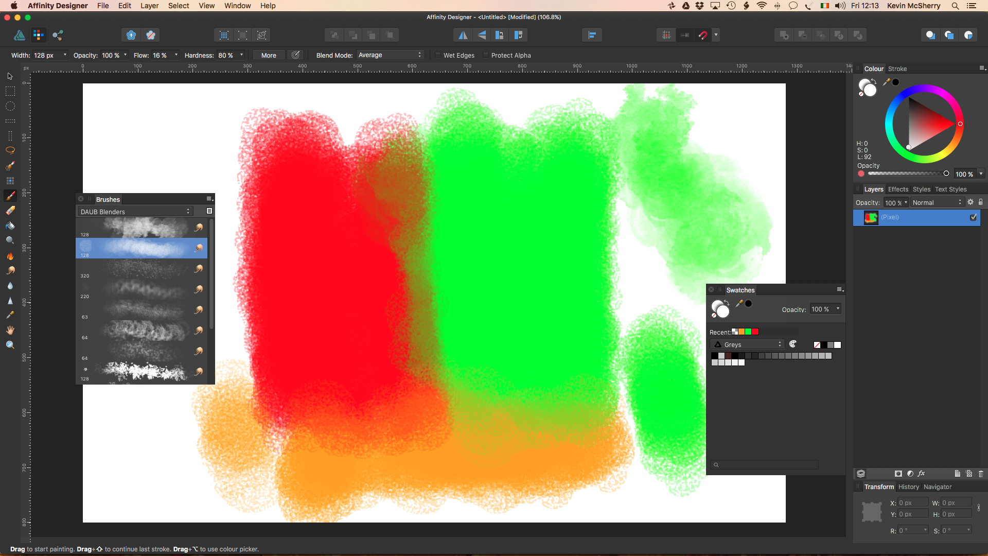
I had the same issue. Would I be right in saying that you have to just visually gauge the amount of noise and hope for the best -maybe output the file a couple of times until it looks right? For example, in the attached pic from AD itself (the 'canvas' -300dpi at A2), I added about 50% noise on each shape and it looked perfect at the size I was working -around 50%. I exported the file and looked at it at 'Actual' size (pic 2), the noise has diminished to a murmur and I think I should have added 100% noise to get the effect I wanted at the print size.
-
A new poster for my S6 shop:
-
affinity designer Creepy Furry Rabbit [AD]
kevinmcsherry replied to Frankentoon Studio's topic in Share your work
Yes! Love the texture. :) -
affinity designer Chrome effect on logos
kevinmcsherry replied to kevinmcsherry's topic in Share your work
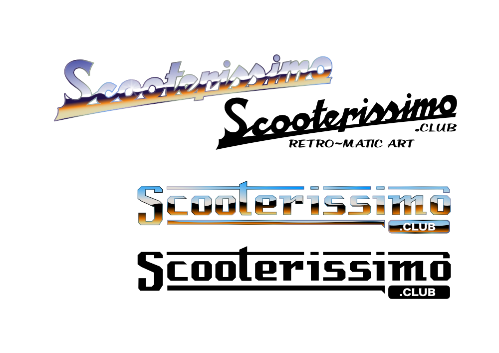
Thanks Retro. I had to go looking for a tutorial on vector chrome effect. There was nothing in Affinity that I could find but a couple of Adobe Illustrator ones helped with the approach. It took me a while to figure out how to use the 'Expand Stroke' function but really, it was pretty straightforward. It'd be good to have a tutorial video in Affinity. There's a finessing detail that I just couldn't figure out -where you suggest light is catching at the very point the letter meets the bevel. I saw this on one of the AI videos. Clever. As for Society6, I'm pleased with it so far (I've only been using it for a few days, so I'm not rich yet. :) It's very easy to use in comparison with other ones I've tried in the past. The uploading and editing of files is quick and slick. It looks good too. As items are published, very realistic objects are created, for example, the mugs have the image nicely wrapped around and have a nice shine (see below). As usual, it's all about the marketing, isn't it. That's where I've always fallen down at that stage! Seems as though it can only work with US dollars. Do you have any recommendations? Kevin
-
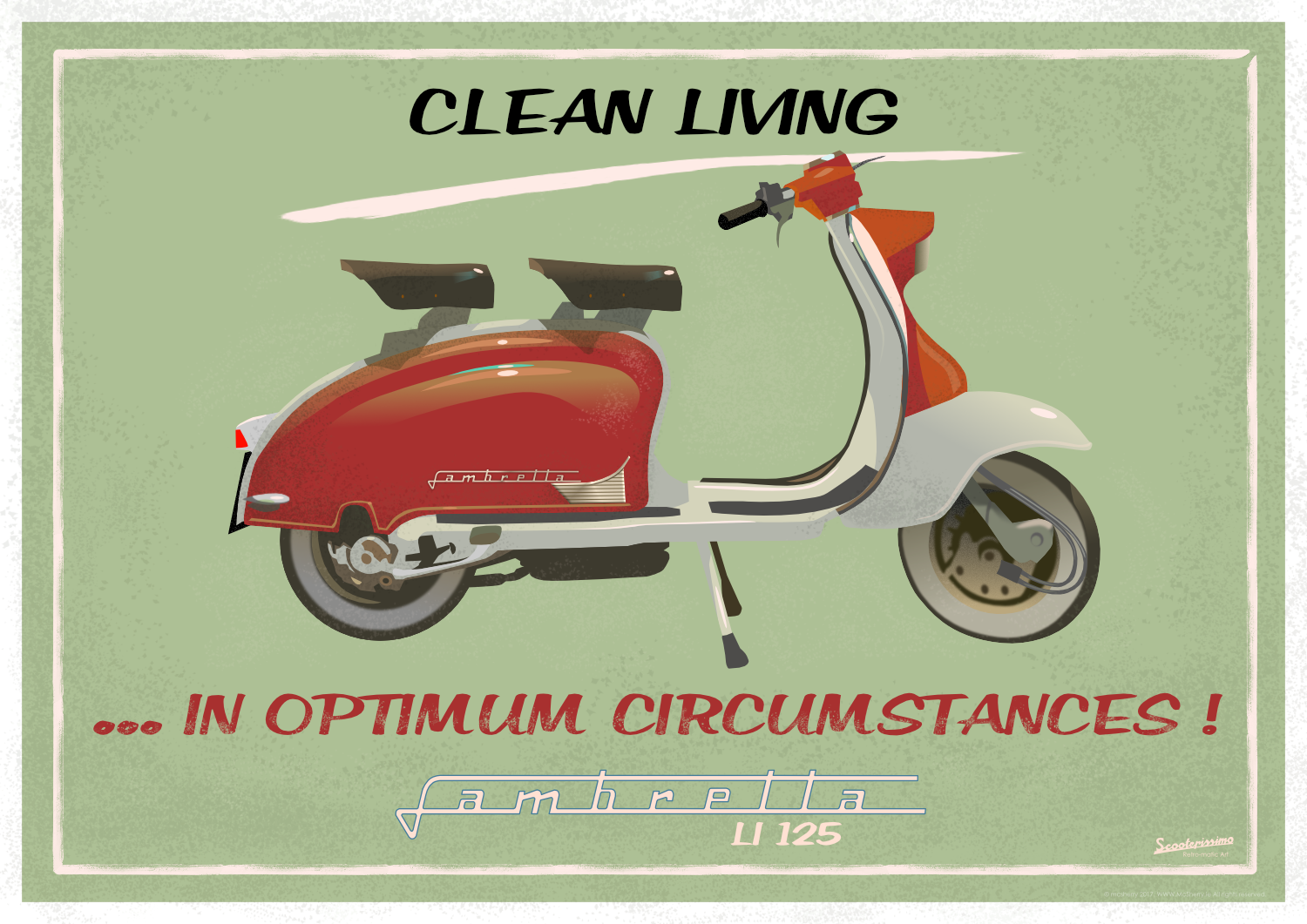
Hi all, I created a logo based on those of Vespa and Lambretta (I'm a longtime enthusiast). I 'chromed' them over the last couple of days. I'm getting the hang of it now but it was quite laborious. These are for my new Society6 shop, "Scooterissimo" (Stop laughing Paolo!) where EVERY product but one I've made is done in Affinity Designer. Link here: I'd love you to have a look: https://society6.com/coolprints Here's a poster of the Lambretta Li125 from 1958, all vector. Best wishes, Kevin (Generalissimo)
-
Just got them myself. Lovely work -thanks!
-
Yep -Downloaded them today -thanks again Paolo -you're a powerhouse!
-
affinity designer Digital Speedpainting in AD
kevinmcsherry replied to kevinmcsherry's topic in Share your work
Great explanation, thanks once again Paolo. Great wolf too...- 39 replies
-
- 1
-
-
- speedpainting
- scout
- (and 2 more)
-
affinity designer Digital Speedpainting in AD
kevinmcsherry replied to kevinmcsherry's topic in Share your work
Can someone explain 'tool binding' to this chap sitting at the back of the class picking his nose? I'm sorry if I wasn't listening attentively earlier... -
affinity designer Digital Speedpainting in AD
kevinmcsherry replied to kevinmcsherry's topic in Share your work
I found AP a little less versatile than AD, especially when creating vector images. I made this image in vector mode but applied raster textures (painted and scanned). I don't think you can do that in AP (I could be wrong!). So it's a matter of having the option to 'paint' in different ways.
- 39 replies
-
- 1
-
-
- speedpainting
- scout
- (and 2 more)
-
affinity designer Digital Speedpainting in AD
kevinmcsherry replied to kevinmcsherry's topic in Share your work
Ah -NOW I get it! I do feel daft; there's even a picture of the little pointing hand, for Heaven's sake... Thanks so much. And happy St Patrick's Day to you too, Retro (and all Affinitorians. Stormy day here, I'm glad I didn't venture out to see the parade -I watched it on telly! Kevin -
affinity designer Digital Speedpainting in AD
kevinmcsherry replied to kevinmcsherry's topic in Share your work
Hi Paolo, I just made a very quick movie of the blender at work. First: I realise that I'm probably doing something daft -or leaving something out but nevertheless, here goes... https://youtu.be/eYFqFpgwmzA
-
affinity designer Digital Speedpainting in AD
kevinmcsherry replied to kevinmcsherry's topic in Share your work
Using AD and AP, on OS X with a Wacom Bamboo; this hint is fantastic -thanks Retro.It works perfectly with me and saves a lot of time. Kevin