kevinmcsherry
-
Posts
165 -
Joined
-
Last visited
Everything posted by kevinmcsherry
-
 Zooming in presented no problems at all with me, AKJoe. I should update my signature so the team can see what Mac and OS I'm running...
 -
Hi, Not sure if it's something that I'm doing wrong. Anyway, here goes: With a document of 10 non-facing pages open and zoomed in to work on a text box. When I press Alt with the Zoom tool selected, and clicking to zoom out again, the document jumps to a point somewhere very south of the open pages.
-
Table of contents and hyperlinks
kevinmcsherry replied to Michael Gough's topic in [ARCHIVE] Publisher beta on macOS threads
Agreed, hyperlinks needed. -
Thank you very much Toltec, that's very helpful. In fact, gradient fills were also causing problems in my files when exported to PDF. If there was a curve containing a gradient fill or a transparent gradient, it sometimes wouldn't export that curve. All the best and thanks again, Kevin
-
Hi all. I wasn't sure where to post this question, since I can only see an option to post questions for the iPad. Mine is about Designer in OS X. Please move the topic if it's in the wrong place. I create posters -usually around A1 physical size, they're a mixture of sometimes very complex vector layers (as I convert mono drawings as in the example attached) and raster layers for ageing and texture. They can be around 150 -200MB. I also create them in CMYK since I was told that the colour space has a wider gamut. I have converted to RGB for one large format printer and they've had no problem at all outputting posters. Now -the problem: I sent these files as CMYK PDFs (reduced in physical size to A3) to a different printer, since that's what they wanted and my files caused all sorts of problems. Crashed the RIP (whatever that is) and generally took aeons to process. I had to cancel the task before I alienated this chap. Anyway, he said that the files weren't flattened -and that there were thousands of vector curves and the RIP couldn't handle them. So my question is -doesn't exporting to a PDF do the flattening anyway? Even after I exported to TIFF and then again to PDF, there were still problems. Can anyone tell me what best practice is for sending to a trade printer who wants CMYK files? Looking forward to hearing from anyone with expertise! Best regards, Kevin

-
Hi all. I have more or less the same issue. I create posters -usually around A1 physical size, they're a mixture of sometimes very complex vector layers (as I convert mono drawings as in the example attached) and raster layers for ageing and texture. They can be around 150 -200MB. I also create them in CMYK since I was told that the colour space has a wider gamut. I have converted to RGB for one large format printer and they've had no problem at all outputting posters. Now -the problem: I sent these files as CMYK PDFs (reduced in physical size to A3) to a different printer, since that's what they wanted and my files caused all sorts of problems. Crashed the RIP (whatever that is) and generally took aeons to process. I had to cancel the task before I alienated this chap. Anyway, he said that the files weren't flattened -and that there were thousands of vector curves and the RIP couldn't handle them. So my question is -doesn't exporting to a PDF do the flattening anyway? Even after I exported to TIFF and then again to PDF, there were still problems. Can anyone tell me what best practice is for sending to a trade printer who wants CMYK files? Looking forward to hearing from anyone with expertise! Best regards, Kevin
-
Dammit! Thank you -I was going up and down the View menu like Mr Magoo. I had forgotten it's called the context toolbar. It's all good now -thanks again to you both. Kevin
-
Hi Stokerg, Thanks for getting back to me -I've attached another screenshot -same problem though:
-
Hi all, I hope you can help me with this: I can't find the 'Refine' button. It used to be there but I've somehow lost it. I tried 'reset studio' but still no button. I'm know I'm overlooking something obvious but a hint will do! Looking forward to hearing from you, Kevin
-
affinity designer 1965 Ferrari Dino Berlinetta Speciale (AD)
kevinmcsherry replied to VectorVonDoom's topic in Share your work
Beautiful -
affinity photo Old Wheels - digital painting
kevinmcsherry replied to Zoltan Korcsok's topic in Share your work
Really good. Thanks for sharing, Zoltan.- 19 replies
-
- 1
-

-
- digital painting
- illustration
- (and 1 more)
-
affinity designer Retro City Woman
kevinmcsherry replied to kevinmcsherry's topic in Share your work
Could be, Martin. A very kind man in a sheepskin coat sold it to me down the pub. -
affinity designer Retro City Woman
kevinmcsherry replied to kevinmcsherry's topic in Share your work
I'm off to get my eyes tested. I can see a slight difference but only because you pointed it out. Maybe this is why I keep killing all those people at traffic lights? -
affinity designer Retro City Woman
kevinmcsherry replied to kevinmcsherry's topic in Share your work
Thanks very much Garry -if my meeting doesn't go as I hope, that's more or less what I'll be doing! -
affinity designer Retro City Woman
kevinmcsherry replied to kevinmcsherry's topic in Share your work
Hi Martin -do you mean just those bits you pointed to or all of the lapel shadow? Must be my eyes; I can't see it. You have me worried now... -
affinity designer Retro City Woman
kevinmcsherry replied to kevinmcsherry's topic in Share your work
Thanks Retrograde. In fact, there is one layer of a 'grunge' texture. Usually I would put another layer or two but I'm going to wait until after a meeting I'm going to have next week with a fashion museum. I'm not sure what they're looking for yet. I have a couple of nice book endpapers from a mildewed book that I like to use. A nice fold down the middle and all that stuff. I may stick them in and post up the results later. -
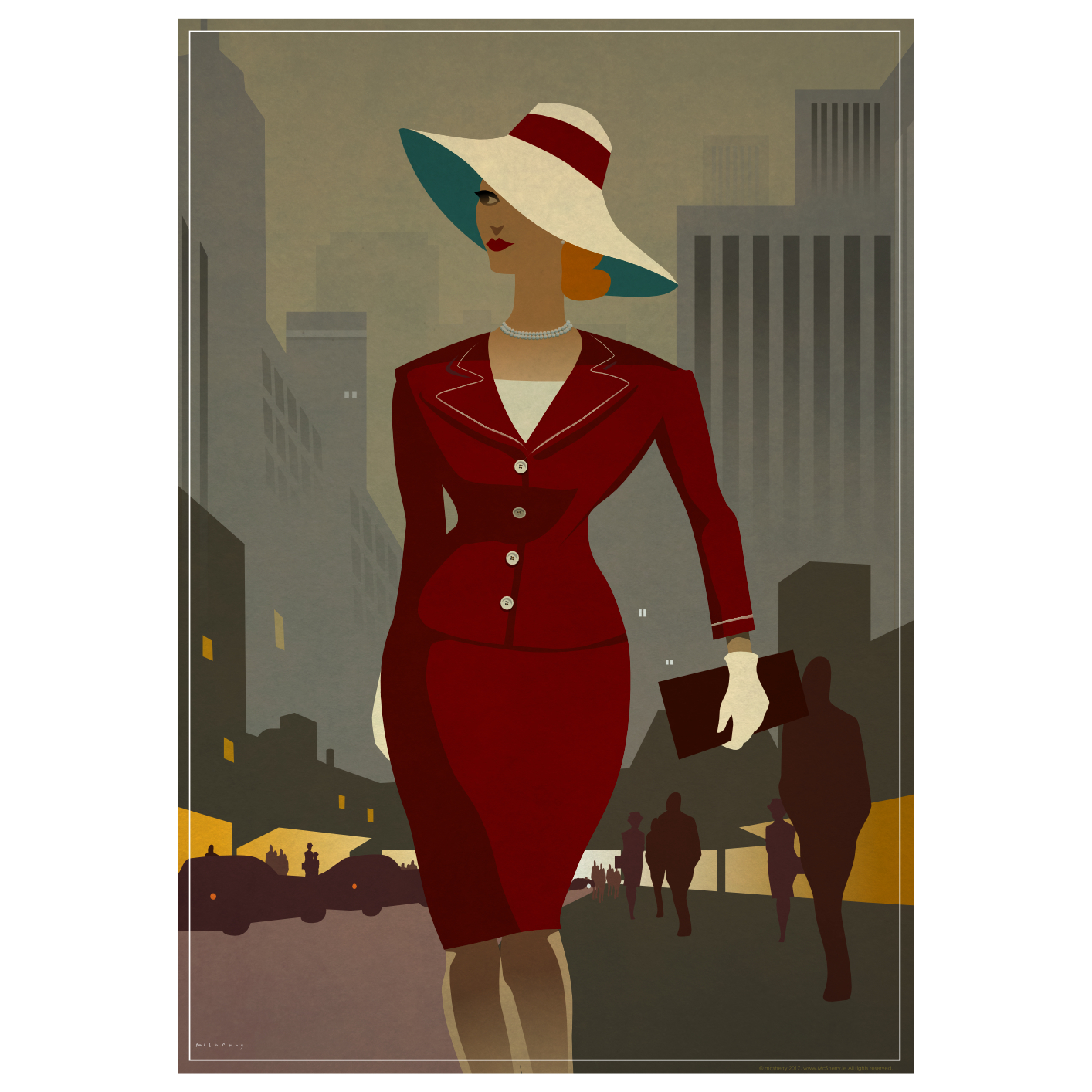
Inspired by the magnificent Joan Holloway character in Madmen, played by Christina Hendricks. Affinity Designer. I'm still getting to grips with some of the features. I started using the Vector Brush Tool (to make those silhouettes of the passers-by. I like the way it seems to auto-smooth the line, which is a feature I'd really like. Really well done to you people at Serif for making a full-on professional tool. I have no qualms about using this for client-work.
-
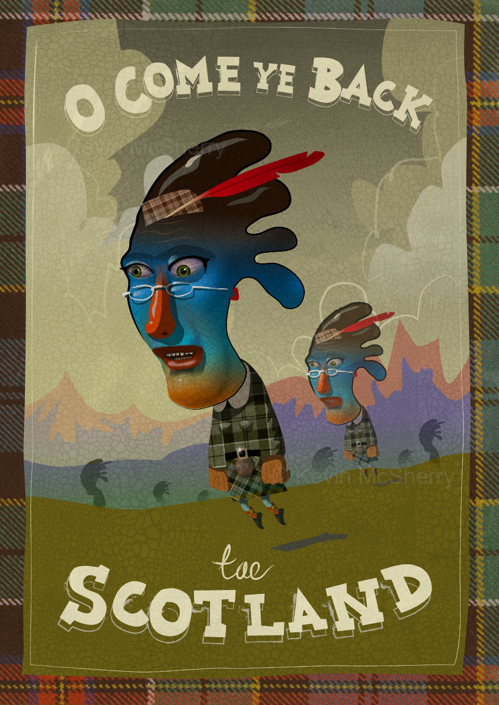
vector Come Ye Back Tae Scotland. Tourism Poster
kevinmcsherry replied to kevinmcsherry's topic in Share your work
Thanks Garry and Alfred. -
Thanks for all the responses, guys. @MEP. It's going to take a bit of getting used to. @Alfred. I'll have to look into Hexachrome, I would never have considered using it as I didn't know about it at all! All in all; much more reading to do. Is this topic covered in the AD book, by the way? Kevin
-
Thank you Freid.
-
Thanks Matt , In fact, I did convert in document setup and that's where I found the changeover of colour space jarring. I'm not absolutely clear on why this happens but I did read somewhere that RGB doesn't have the range of colour that CMYK does. I've attached a comparison screenshot. CMYK at left and RGB at right. I don't think this is a problem with AD -it's just choosing which space to work in? Looks like I should be working in CMYK...I'm more used to acrylics! I'll get there. All the best, Kevin
-
A reworking of another old illustration image in AD. Turns out I did the whole thing in CMYK and had to convert to RGB for web display at the end. I tried converting the AD file to RGB and it looked horrible (the colours suddenly looked too bright and unsubtle), so I didn't save it. It worked better when I converted the finished JPEB in AP. Would that be the proper way to convert?
-
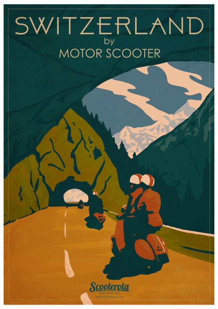
New work. This started out as just the head and it grew. I used this one to play with text -I just loved the way I could get right in and adjust the scripty word, 'Tae' until I was happy. Vector plus textures and a little work in Pixel mode. Anyway, I hope you like it. And do go to Scotland to see the famous 'Tobermory Floaties'.
-
Wow -thanks PM.
-
affinity photo A girl, a frog, a castle, two landscapes and so on ...
kevinmcsherry replied to Puck's topic in Share your work
I thought No 2 was an actual ad. Very nice. I expect to see it on a 48 sheet around town soon.