

zkarj
-
Posts
53 -
Joined
-
Last visited
Posts posted by zkarj
-
-
I completely understand the process as you described it @garrettm30. It makes perfect sense to me. Which is why, when I first spotted it in the style after @Gabe's post, I thought I had my answer.
The problem I now have, however, is that for some reason I cannot set either Base or Body to [No change]. In both cases they switch themselves back to Regular. Which brings me back to the final clause of my original post... "...I am unclear on why this cannot be changed in the style editor."
I would be reasonably confident that if I burned down the style structure and started from scratch I could get something to work, but I'd really like to know if I have found a bug or if there is some factor I am not understanding about why that setting will not change on either style. Remembering [no style] -> Base -> Body.
I've also discovered an interesting fact. The reason "...and Preserve Local Formatting" does not alter the font is because it is impossible to have unstyled text without a locally set font. Try this: create a text frame anywhere and make sure you have [No Style] set in the toolbar for both Paragraph and Character styles. As soon as you type any text, you will have an applied local formatting of the font based on the currently selected font details in the toolbar. As such, the "default style" that @Wosven referred to earlier is not really a default style, as much as a default setting of the toolbar.
Which means... I have to have the style itself actively preserve the local formatting for bold and italic but not the font. Which means... I need to get past my inability to set that in my styles.
I've attached a cut down version of my document where I basically stripped out all my real content but left the style structure as is, along with a test passage of text. The first para is a direct copy of the Markdown, the second para was copied and pasted as rich text. Try getting my Body style applied to the second para while retaining the bold and italics. Also try editing the Body or Base styles to see if you can get the Font trait to stay as [No change].
-
Just now, Seneca said:
This should be simple.
I agree. Yes, I tried all of those options. None of them work. Both "Preserve" options do indeed retain the bold and italic phrases, but neither changes the font. This is why I initially contacted Ulysses support, believing the pasted rich text was specifically tagged with the Helvetica font. They say it's not. I don't know how to verify that.
-
I should clarify one thing — the title of this thread should use the word "local" not "character". I am not applying Character Styles at any point in this troubleshooting. I copy rich text from a Markdown document in Ulysses, and paste it into Publisher. That gives me Helvetica text with bold and italic phrases. All I want to do is apply my Body style without losing the bold and italic. I believe that should be possible, but I cannot figure out how.
The Ulysses support people commented that applying a font that does not have Bold and Italic variants will strip the formatting, but if I apply my Palatino just as a font then the formatting is preserved. It is only when applying my Body style that they disappear.
-
9 hours ago, Seneca said:
This should not take longer than 2 minutes.
Sure, but it's a cognitive load, and it has to be remembered every time I paste text, and let's not forget search and replace cannot currently be scoped so I have to be careful about this action. Anyway, I don't believe this should be necessary, so I'm pushing for a proper solution.
1 hour ago, Wosven said:[No change] means the style will keep the propriety of its parent style, not that it will keep local formatting.
I understand that but why is it impossible to set [No change] on either Base or Body? If this is by design, that means it is not possible to apply a paragraph style over local formatting while retaining the latter. That seems wrong, and this is supported by the option to "Apply style while keeping local formatting". The trouble with that option is it also does not apply the font, which I also do not understand. I had previously contacted the vendor of the software I am copying from asking why rich text automatically came with the Helvetica font applied and they have responded that it doesn't.
Either there is something at play that I am missing (why does setting Font Trait: [No change] not persist?) or there are bugs in this area. I believe it should be possible to apply my Body style while keeping the original rich text attributes as local formatting. So far it seems impossible.
-
1 hour ago, Gabe said:
Hi @zkarj,
What is your style "based on"?
Where [no change] is shown, an attribute remains unchanged from the "Based on" style.
Ahhhh! It's based on "Base" which has Font traits: Regular set. That explains the result of the style, but surely the style definition for Body should retain the [No change] in itself? And in fact Base itself exhibits this same behaviour. It is based on [No style] and if I set the Font traits to [No change] it reverts itself to Regular. So aside from the proper inheritance on the page, the style definition still seems to be incorrect in that neither will take [No change] as a value and keep it.
I can find other styles that have [No change] set for Font trait, but all are greyed out and I don't understand why.
I also tried the Apply Style and Preserve ... options, but they do not change the font from the default Helvetica. I can't see a way out of this if I cannot force Base or Body to leave italics and bold alone. Short of burning these styles down to the ground and building up new ones — but I didn't build them, I inherited them from somewhere (I think they are defaults?)
I am familiar with @Seneca's workaround but that seems like a lot of work when the styles should be able to respect the original local formatting.
-
What I am trying to do is paste rich text into my Publisher document and then apply my body style without losing italic and bold text.
If I paste in rich text, it always seems to appear in Helvetica with [No Style] for Paragraph and Character styles. The text does still contain bold and italicised words.
If I then select the whole passage of text and apply, say, Palatino font, the font is switched as expected and the bold and italics remain in force.
If I select the whole passage of text and apply my Body style, the font also changes to Palatino (because that's in the style) but the bold and italic words are forced back to regular.
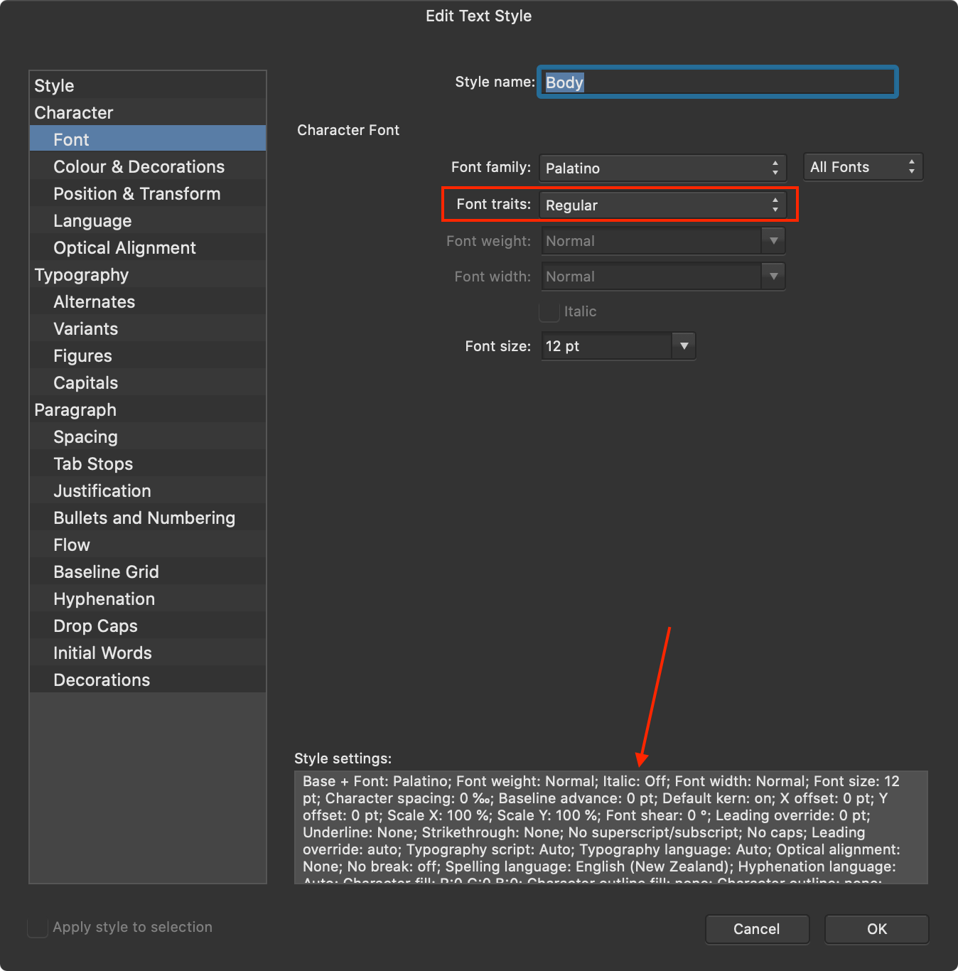
I tried bringing up my Body style in the style editor and noticed the setting highlighted below.I set that to [No change] but that does not remove the "Italic: Off" in the style description, and when I commit that change and then return to the editor, it once again says "Regular" in the dropdown. I suspect this is a bug in that setting [No change] should remove the "Italic:" entry altogether yet it doesn't.
I assume the Font weight: Normal setting is what is getting rid of the bold text, but I am unclear on why this cannot be changed in the style editor.

-
I think we're saying the same thing @NoSi. Your mention of bold, italic, green colour, and boxes made me think you were advocating a markup to annotate these. We're passing each other on the terms we use to describe these things. I like the term "semantic markup," which I learned many years ago in the context of HTML, because it conveys that the markup reflects meaning and not presentation. Depending on what type of content is being created, I can see that some presentation decisions may be made that do not reflect meaning but design. For instance a creator might choose to set different background colours to a series of block quotes and these differences serve only to alter the design, not the fact that the quotes differ in some way.
-
11 hours ago, NoSi said:
plus some general format instructions like bold, italics
Strictly speaking, all of Markdown is "structural" although I would use the word semantic. Markdown (as per the original Gruber spec) does not offer italic and bold but rather emphasis and strong emphasis. The "block" and "span" features of Markdown should be directly applicable to Paragraph and Character styles respectively.
I believe when you start trying to address actual formatting (like colour choice, borders, backgrounds) then it gets very messy very quickly. Markdown writing environments are generally geared to semantic writing only, and so they should be. It's the modern equivalent of the old adage applied in the days when Word ruled the roost: write your content before you format it.
-
Just been pointed to this thread.
The very simple reason I would like an Affinity DAM is because Serif have proven that they know how to build great software, and the same reason Adobe built Lightroom is a reason for Affinity to build a "darkroom" product. I'm sure there are photographers who use Photoshop to process RAW files, but I reckon an awful lot more use Lightroom because that's what it is designed to do. I believe both the Photoshop and Affinity Photo names are less than ideal. Both products are way, way more than photo-based tools, and because of this, they aren't well geared to a photographer's workflow. Indeed they shouldn't be.
In my past and/or current repertoire of "darkroom" applications are: Lightroom, Aperture, Luminar, PhotoLab, ON1, and Apple Photos. Aperture is no longer for this world, and without it nothing equals Lightroom when it comes to managing and processing photographs. Lightroom I now find boring, but it can't be beat as an all-rounder (subscription pricing aside).
Luminar is a capable processor with some interesting processing features (not including sky replacement) but its DAM is barely there. PhotoLab has fantastic RAW conversion, a good feature set, and its DAM is workable, but with some critical issues. It also has some severe performance issues. ON1 is a decent all-rounder, most closely matching up to Lightroom but not quite there just yet, and bettered in some areas by others in my list. Apple Photos ... not sure why I included it in the list to be honest, but it does have a DAM. Why? Because Apple recognise that photos need a place to live where you can find them again.
But... try putting a 100 MB, 24 megapixel, 16 bit, full colour TIFF scan of a 35mm slide into any of these applications and they struggle. Again, Lightroom is capable. Some of the others almost seize up. One of them actually crashed my computer. Put that same TIFF in Affinity Photo, whack a new pixel layer on for non-destructive workflow, and use the infill brush to remove hundreds of dust specks and it doesn't even break a sweat. And I can do it on my iPad with a Pencil, too! Affinity product performance is next level.
For an Affinity DAM, I would not be surprised to see jaw dropping performance with great workflow, and, of course, fantastic integration. Imagine Selecting "Place" in Publisher and having your DAM library as an option to pick the file - just like Apple do with Pages and Photos.
However, the current Affinity RAW conversion appears to be relatively basic. Elsewhere, I asked that Serif buy the technology developed by DxO for PhotoLab 3, because it does astounding things with RAW files. By profiling actual lenses on actual cameras they are able to bring out razor sharp images that no other product in my list, nor Affinity Photo, can do. Their noise reduction is the most impressive I've seen, too, because it de-noises the RAW data based on those same camera and lens profiles, not the decoded image like everyone else does. When it comes to clever coding, fantastic implementation, and next level performance, Affinity products have it in spades, but DxO put some leg work into working with the hardware that is providing the images and it shows. I don't expect Serif to go that far, but the results speak for themselves.
-
I'm struggling. I have or have used Adobe Lightroom Classic, Apple's (defunct) Aperture 3, Skylum Luminar 3, DxO PhotoLab 3, and now ON1 2020, as well as, of course, Affinity Photo.
I currently use Lightroom to catalogue because of the peerless keyword support and PhotoLab to process my RAW files because of its peerless lens modules. ON1 is introducing ON1 360 which looks fantastic. And finally, nothing beats Affinity Photo for speed.
In my perfect world, Affinity would produce a world class DAM as I know only they could, but would also buy DxO's lens module technology and build or buy a 360 service like ON1.
I can dream, can't I? But seriously... Serif, please buy DxO's module technology. I cannot use any other RAW processor now because of it.
-
On 4/26/2020 at 3:46 AM, Old Bruce said:
Set up a few Character Styles, Bold, Italic etc to replace your 'local formatting'. Use find and replace to find the Bold text and replace it with the Bold Character Style, rinse and repeat for the other 'local formatting' styles then apply the body style.
Ahhhh, thanks! I still don't quite have my head around character and paragraph styling but this helps.
My first thought on reading this was "but what if I use local formatting somewhere else because Find and Replace operates on the whole document?" but then I realised a) it's not that hard to use the results pane to focus the changes only where needed, and b) getting rid of all local formatting is probably a good goal to have!
Learning, learning, learning. Love this software!
-
I should add, that in my search for tools, I did find some that output large resolution maps, so if anyone wants/needs to go that way, they exist. But that doesn't solve my problem, it just moves it.
-
31 minutes ago, ErrkaPetti said:
Or, why not captures zoomed part of the map and the stitch the result into Affinity Photo to an big map?
Certainly that's a possibility, but I'm trying to make the process easier.
There are probably other tricks that could be employed to get exactly what one wants, but for me the key point in this request is that it would be easiest to get the map looking just so, perceptually, and also to get the best output, if it was a native Affinity object. The only other way I would consider an improvement on what's possible now would be if something like Ahoy Map Maker did everything I want — flexible annotation and output options — but that would require it (or alternative) to build a lot of what Affinity already has in spades, and even then would have to be rendered before including in an Affinity document.
I think of it like this. You know how you might be going through your document just before final production and you'll stop and look closely at an image and decide maybe you'll just tweak the colour a little, or perhaps alter the crop slightly, or maybe you'll spot something else that's just not quite right? What do you do? You spend a few seconds with Affinity tools fixing the problem. I want that for my maps. I might decide that the zoom level looks wrong against the facing page content, or I should have included more of that park on the bottom edge for balance, or I spot that I've chopped off half a letter of a place label so want to nudge it across or tweak the zoom ever so slightly.
-
Also, grabbing maps as screen captures has an inherent problem — you are limited by your screen size. Some of my maps are covering an A4 portrait page. A 5K iMac screen is not tall enough to capture a 300ppi map this tall, so an extra step is required such as the Pixelmator Pro step described above. Affinity could render the map from MapKit at whatever the final resolution is on output.
-
@eab the advantage of Ahoy Map Maker is I can zoom in to place markers very easily and accurately. The trouble I then have is one of scale. Zooming the map in Apple Maps (or Ahoy) completely changes the level of detail presented and this can have a large effect on the final result, including the prominence of text in the map. It also requires careful selection of the map area in conjunction with resolution in the final document. I've been using Pixelmator Pro's ML Super-resolution to triple the pixel resolution of my maps so I have some leeway to rescale in Designer/Publisher.
After all of this, and dropping the map into Publisher, I often find it doesn't look right, so I have to decide what to change, then go back and reprocess from Ahoy, and reposition the markers in Designer. It's a cumbersome process.
This led me to think about this request. What if a "map" was an object in Affinity, with all of the inherent "mapness" of scale (map zoom level), rotation, and cropping (visible area) you get in Apple Maps, plus all the power of placing other Affinity objects on the geospatial coordinates. With this capability, the process of adding a map would be:
a) entirely in Affinity,
b) in the context of its final layout (be that Designer or Publisher), and
c) easily tweakable to make it look just right.
-
I'm trying to come up with a workflow to copy my writing from Ulysses to Publisher and it's proving more difficult than I had hoped.
I can copy Markdown and use Find and Replace to replace the markup with proper formatting. This works, but is cumbersome as there are many such Find and Replace actions to perform and no way I am aware of to automate them.
So the obvious choice seems to be to copy from Ulysses as Rich Text. This pastes fine into Publisher, but I cannot then apply my Body style to the text without losing all the markup that came from Ulysses. The problem seems to be the Rich Text from Ulysses is tagged with a specific font and this is thus deemed local formatting. So it becomes an all-or-nothing affair. I can either get my Body style and lose all local formatting, or I can keep the local formatting (and change the font locally too) but then my Body style is not in use.
Is there a way to strip off the local font on selected text so it just falls back to the base font, thus allowing me to have the best of both worlds?
-
I don't know where this fits. I want it in Publisher, but can also see it fitting in either Designer (it's infinitely scalable vector content) or Photo (the final output is rendered pixels). That is, I'd like to be able to add a map to my document as easily as I can add a text frame or shape.
On macOS and iPadOS the obvious choice would be to integrate MapKit. That would seem to leave out Windows users unless an alternate could be found, or perhaps integrating with MapKit JS.
I'm using an app called Ahoy Map Maker from the Mac App Store which creates output close to what I want but is a bit limited. The real trouble I am having is working out the scale between Ahoy and Affinity. It would be really, really great if I could add the map natively and adjust scale and position to suit. I also need annotations but Designer is very capable on that front, so all it would need is a means of anchoring objects to a geographic point on the map.
Aside from all the web-embed options, there is one prior example of this type of capability that I know of. iMovie lets you add animated maps as footage.
-
10 hours ago, walt.farrell said:
Pasting rich text (or .docx), or importing via File > Place, should work. If you're having trouble with that, you might want to post a separate topic in the Questions section.
Goodness knows what I did before because I swear it didn't work when I tried it. But clearly it does now. Thanks.
-
This would be a huge boost. Publisher is not a writing environment. As it stands, there does not seem to be a way to get even such simple stuff and emphasis into Publisher from an external source. Can't paste rich text, HTML, nor Markdown.
Markdown seems the obvious choice because it is intended for writing and it is surging in popularity. There will be some choices to be made over variants of Markdown but many software vendors have made their decisions and got on with it.
I'd settle for just headings, emphasis, lists, and links for starters.
-
I'm also finding the inability to scope Find and Replace to be problematic at the moment.
I'm already using complex regular expressions so could expand those but it's not ideal.
I also can't do the work outside of Publisher because I am applying styles on the replacement.
Then again, the only reason I have to be doing these Find and Replace actions is because it's the only way to get styled text into Publisher. (I copy Markdown so I have the characters to target for replacing with styles.)
-
Well, yes. Yes it does. I looked high and low for a menu option and did not think to look on the File menu. In my mind, that menu is for "whole of document" actions.
Thanks for pointing me in the right direction.
-
I have been able to do the following steps:
- Create a table.
- Place an image (which places it on the page, not in the table).
- Cut the image (Cmd-X).
- Click into a table cell to place the text cursor.
- Paste the image (Cmd-V).
After these steps the image appears to be embedded in the table cell and adheres to horizontal and vertical positioning applied to that table cell.
That's good to see, but how can I place the image directly into a table cell? The above workflow is cumbersome when doing a lot of these.
-
I've been watching lots of tutorials and playing around with Designer to get used to it. When I got to the video on Symbols in Designer 1.5, this concept leapt to mind, and so I made it.
It makes use of Symbols, Artboards and the power of the Export Persona to simplify outputting all the required sizes for an iOS application icon. And of course designing the artwork in the first place is easy and fun with all the Designer tools at your disposal.
This blog post explains how to use it and contains the download link.
-
Silly me!
I just spotted the "Scale with object" check box in the Stroke settings pane. Fixed!

Applying paragraph style to text with existing character styles
in V1 Bugs found on macOS
Posted
Thanks @Gabe for acknowledgement of the bug, and @garrettm30 for the workaround, which I have replicated and can now use successfully!