thomaso
-
Posts
11,610 -
Joined
-
Last visited
Everything posted by thomaso
-

Hugh PDF file sizes
thomaso replied to Ross Hurley's topic in Affinity on Desktop Questions (macOS and Windows)
What file type and what colour space & bit depth are the placed images? Does the resulting PDF file size change if you export with preset "for print" or "press ready" – instead of "flatten"? ("flatten" does not downsample and creates 1 large image per page, including images, text and blank space) -
AI discussion (split from Canva thread)
thomaso replied to JGD's topic in Affinity on Desktop Questions (macOS and Windows)
... or reorganised first, instead of "banned" soft- or "confiscated" hardware. … also discussed from various views since this recent result of face recognition usage: "BERLIN, Feb 29 (Reuters) - Investigative journalists using artificial-intelligence tools were on the trail of a heavily armed fugitive member of the notorious Red Army Faction well before German police announced a breakthrough in the 30-year-old case earlier this week. (…) German police and security services have drawn criticism over their failures in some politically charged investigations. Their defenders say strict privacy laws limit their ability to use the kinds of artificial intelligence-enhanced tools that a German TV podcast deployed to track down Klette last year." https://www.reuters.com/world/europe/journalists-used-ai-trace-german-far-left-militant-well-before-police-pounced-2024-02-29/ -
I am not sure what you mean with "in" and "out" in a mirror. It could mean from its centre to its edges or from its back to its front. While the language seems to use "left/right" ambiguously (my left arm -> from my view vs. from an outer view) there also can be a setup where the mirror switches top to bottom: That is why this thread reminded me to this question: because the orientation of a.) the map (horizontal / top-bottom view) and b.) the viewer (vertical / left-right) get mixed. Unlike a usual mirror the two planes aren't parallel but in 90º to each other … and switch front-back or top-bottom, too.

-
How to check the ink coverage
thomaso replied to Giorgia's topic in Affinity on Desktop Questions (macOS and Windows)
1. Ask them how that is possible / what got changed between the different print results for the same "green" colour. 2. Ask them for a print profile. * 3. Setup your document's profile to the export/print profile. 4. Make sure you define a colour in the Colours Panel and as CMYK. To check a colour deactivate the lock icon. 5. Create dark colours with more black (K) but less CMY to reduce the Total Ink Coverage (TOC). – For instance this green with 150% instead of your initial green with 278%: * If your first screenshot shows your document and the second your exported PDF colours then apparently some profile / colour conversion was involved.
-
AI discussion (split from Canva thread)
thomaso replied to JGD's topic in Affinity on Desktop Questions (macOS and Windows)
If you have 'Adobe Stock' (iStock etc.) in mind: While they may own the brand / company they do not "own" the image resources but rather the legal right to sell copies with / for use under certain, limited conditions. Apart from this aspect it is hard to proof whether a specific texture, shape, mood, light etc. within a generated image is developed from the data of a specific image file of their stock library. It is still evolving and nobody "knows" until court rulings are made… "Sarah Silverman is suing OpenAI and Meta for copyright infringement" https://www.theverge.com/2023/7/9/23788741/sarah-silverman-openai-meta-chatgpt-llama-copyright-infringement-chatbots-artificial-intelligence-ai "We’ve filed lawsuits challenging ChatGPT, LLaMA, and other language models for violating the legal rights of authors." https://llmlitigation.com/ "More than 200 musical artists (…) have penned an open letter to AI developers, tech firms and digital platforms to "cease the use of artificial intelligence (AI) to infringe upon and devalue the rights of human artists." https://www.axios.com/2024/04/02/musicians-letter-ai-replace-artists … and used to create, adjust, fine tune existing or new law, for instance: "EU AI Act: first regulation on artificial intelligence – The use of artificial intelligence in the EU will be regulated by the AI Act, the world’s first comprehensive AI law." https://www.europarl.europa.eu/topics/en/article/20230601STO93804/eu-ai-act-first-regulation-on-artificial-intelligence "Want your content made using generative AI tools to be accepted into the Adobe Stock collection? Find out how to submit authentic assets that meet our quality, legal, and technical standards." https://helpx.adobe.com/stock/contributor/help/generative-ai-content.html -
Layers exportation
thomaso replied to Séverine's topic in Affinity on Desktop Questions (macOS and Windows)
"The Future" from 2019 to 2021: -
It depends on the "room" + the viewer's position -> in the entire coordinate system ("space"). |•| --> •|• I assume the OP's map will not be placed on two opposite walls with the viewer in between but the viewer at different positions with the mapped area in between. It is the typical "You are here" problem that ignores a "true" orientation and occurs when top view (map) + side view (you) need to get mixed/combined. Related problem: “Why does looking in a mirror always change left + right but never up + down?” 🙄
-
This is a CMYK profile. It will be available if you switched in the "Convert" dialog the document colour format from RGB to CMYK.
-
Note it's a plan in top view, not side view. Thus it can be useful to switch top & bottom for a different plan position, – while they represent north & south or east & west for instance. No. But for the required adjustments after flipping/mirroring the entire layout it may be easier to use the option "Transform Objects Separately" -> select all text and icons only -> set the anchor in the transform panel to centred -> flip/mirror these items again. Nevertheless single objects may still need adjustment if the dimensions of their bounding / selection box is not identical with their visual content.
-
How to check the ink coverage
thomaso replied to Giorgia's topic in Affinity on Desktop Questions (macOS and Windows)
Do you mean the same print file was printed with different results, "green" versus "black"? What values was set for the "green" colour in your layout document? It appears odd that the printer's PDF shows your "green" with 40% red + 60% black. Even without black it would rather be "olive" than "green". What colour profile was set for the layout – and which for export? If you open your delivered print file in Affinity what colour values does it show for the "green" text? Unless they use a special print material + profile the limit of 150% would mean that saturated colours would not be possible, e.g. this mid green or red:
-
Forum for typesetting issues
thomaso replied to philipt18's topic in Affinity on Desktop Questions (macOS and Windows)
While the forum is mainly used to report + discuss issues, the large range of existing tutorials may be a shorter and smarter way to learn or understand basics of typography, typesetting and object styling. Also, trying / experimenting with the various tools & menu commands together with the Help articles may shed light more directly on certain workflows than the forum may do. A forum search for "text" limits the displayed threads quite well to topics regarding "typesetting" (which is a rather seldom keyword). Nevertheless, not all threads offer solutions or workarounds and thread titles may be misleading, in particular if a reader has a certain feature or workflow in mind while a previous thread creator had no idea of the related terms when creating the thread, e.g. "The text is invisible" if another object got Text Wrap activated or "Page 10 doesn't show a page number" if its frame is too small, etc. Also the thread history demonstrates that existing threads, tutorials and help files often don't get read (or searched or found) before a thread is started, even for simple, well known tasks/solutions, which results in multiple threads for identical issues, e.g. "Text size changed" caused by dragging the outer frame handle… / "Paragraph leading does not work" caused by leading override or baseline grid… / "White is not white but yellowish" for confused colour profile settings… / "Text does not export as black" if K only is expected but not set or exported accordingly, etc. For such reasons of ambiguity, a further forum split could not be able to result in the wanted ability just "to scroll through all typsesetting issues and seeing how those issues are solved" or to discover effectively "how to best get rid of orphans, widows and runts" (btw., these keywords are seldom, too). -
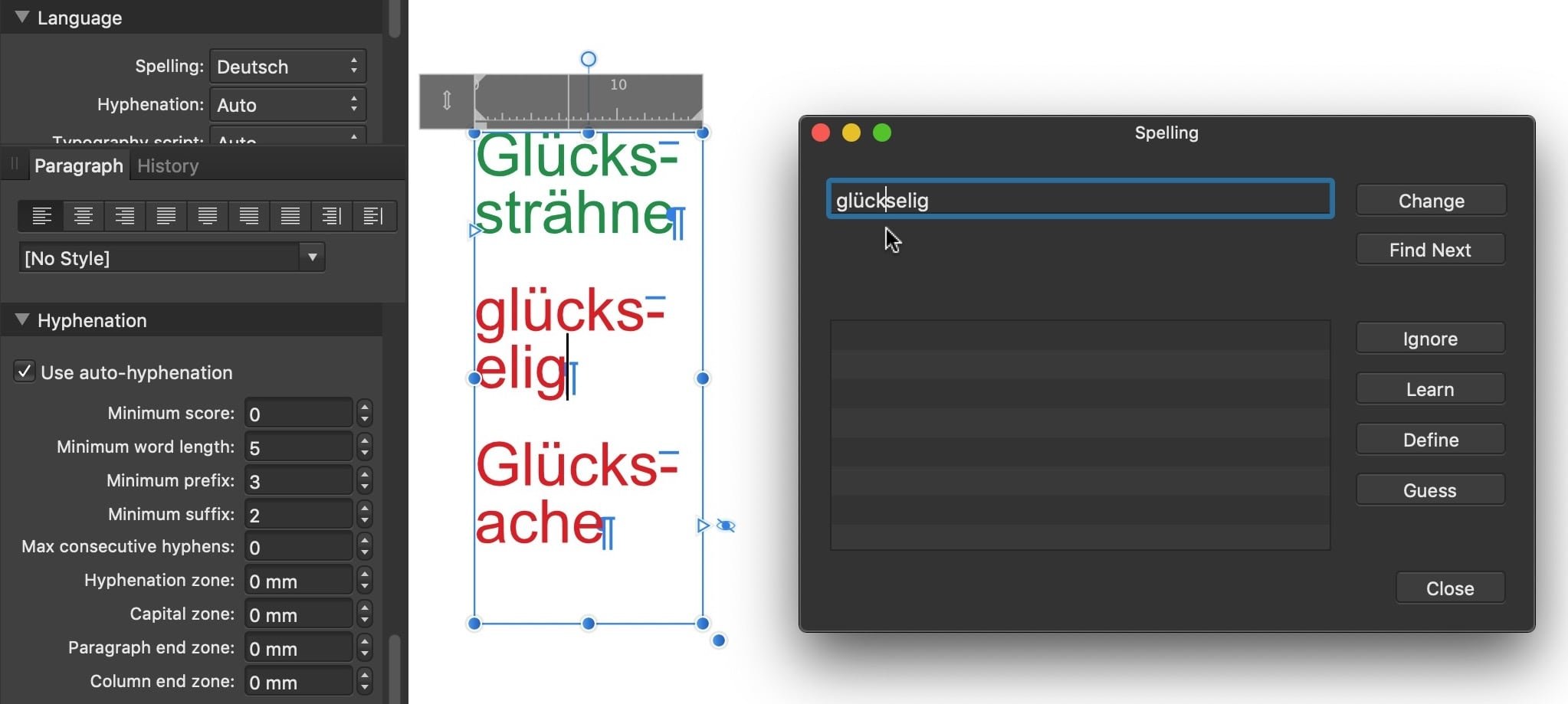
You can cause a discretionary (conditional, optional) hyphenation by inserting a Discretionary Hyphen ("Soft Hyphen", "bedingter Trennstrich") at the wanted position within the word. (menu Text > Insert > …) If you expect generally more hyphenation within a paragraph you might check / adjust the hyphenation settings. (Paragraph panel > Hyphenation) The German dictionary used by Affinity is known for missing or wrong hyphenation, in particular for certain compounds. Since those aren't marked by spell-check and I am unable to enter a discretionary hyphen in the "Spelling" dialog (-> "Learn") I don't know* a way to add correct hyphenation to the dictionary. * while the hyphenation dictionary seems to be an editable text document I still don't know its rules, in particular its handling of words vs. syllables vs. pre- and suffixes.
-
Bold shortcut doesn't work
thomaso replied to Handyann's topic in Affinity on Desktop Questions (macOS and Windows)
Yes, that is what it was meant to illustrate. (and possibly may have avoided a need to install macOS Sonoma) -
Bold shortcut doesn't work
thomaso replied to Handyann's topic in Affinity on Desktop Questions (macOS and Windows)
As far I understand the "B" and "I" button try to cause the auto-selection of another, existing font trait without the need to open the font menu. They also may switch to a font's style which is named other than "bold" or "italic" and thus they may mislead or fail. The precision appears to depend on the font file quality, apart from its style names (see above: 'medium' alias 'bold'). Compare "small caps" as character style setting versus as separate font characters, or accordingly "Sub-/Superscript" as app function versus separate font file property. The complexity is related to font files and their various types, technologies and standards, grown over years for more improvement, e.g. platform compatibility and flexibility. This is no simple thing. The simple thing is rather an expectation or experience in the user's view – in particular since the "B" and "I" buttons added to possibly make things simpler. – With other words, to keep it simple use the font trait menu only … avoiding the complexity caused by the "B" or "I" button / function 😉 macOS Mojave 10.12 with Khmer MN.tcc v.14 (2019):
-
Bold shortcut doesn't work
thomaso replied to Handyann's topic in Affinity on Desktop Questions (macOS and Windows)
"Making" it bold by selecting an existing font trait / font file is technically not identical with the "B" option.
-
For instance: https://www.instagram.com/affinitybyserif/ An internet search might show more results.
- 1 reply
-
- 1
-

-
Bold shortcut doesn't work
thomaso replied to Handyann's topic in Affinity on Desktop Questions (macOS and Windows)
Can you use the 'B' button or the menu command in this situation or is it grayed-out? – Note, the 'bold' option is not available for every font file. -
Thanks for clarifying your goal. It appears to differ from your previous note… … and would, imho, rather mean that you do want to edit the imported text by its style properties at least and thus want to influence hyphenation and cause a different text flow which may affect the entire document and even the required number of pages. For this use opening a PDF is indeed limited and less helpful in Affinity. Although you have the option to open the PDF with its lines of text grouped as Frame Text layers ("T") different to Artistic Text layers ("A") you would have to link the frames manually as @walt.farrell pointed out. So it appears to be more useful to import the text via a text file (not PDF). While I am not experienced with your text editing application and its 'hidden' style + 'comments' feature I assume you have options to handle this in APub without issues, for instance by… • saving a text document version without your comments and comment styles before using the file in APub, or • ignoring unintentionally imported style entries in APub Text Styles panel (you can't "hide" styles in APub's Text Styles panel but may 'Group' or delete them), or • editing these "hidden styles" in APub to make them appear as wanted (for instance assign "No colour" or colour with 0% opacity), … while it is still unclear to me whether you are 'just' disturbed by style entries occurring in APub's Text Styles panel – or also get your "comments" imported? (not their styles only) If your "comments" get imported unintentionally (i.e. not their styles only) and have their styles assigned in APub you possibly may assign a certain fill colour for the comments and then use a Select menu option to select all items with that fill colour to hide these layers in the Layers Panel or even delete them from APub if wanted. Alternatively you could use the Find & Replace panel to search for all instances of this comment text style across the entire document and edit their text content independently from the desired story text, for instance by replacing all comments with a space character. – The 'best' workflow to get rid of these 'comments' in APub depends on how the comments appear, for instance whether they are written within the story text or get imported as separate text frames (objects, layers).
-
Potential Bug in Liquify Filter
thomaso replied to lagmoellertim's topic in Affinity on Desktop Questions (macOS and Windows)
Hi @lagmoellertim, Welcome to the Affinity Forums! A potential solution could be trying the various Liquify Tools (-> Tools panel on the left) for a more swirling twirl result without this centred focus when painting repeatedly circular around a centre only. -
Styles are considered by Affinity as used if they are assigned to text or are used as base for other styles. For what purpose do you want to "hide" or delete styles? If you want to re-style the text in APub you can double-click an imported style and change its properties. To print the text document or the existing PDF you don't need to use APub, right? If you want to add page numbers in APub you can create a Master Page + add a text frame with a page number field (menu Text > Insert > Fields > Page number) + apply this master page to all document pages. If you want to turn a single paged document into 2-page spreads with left and right pages and page numbers near the left/right corners you need to set the document properties to "facing pages" and use a 2-page Master Page spread to place the left + right page number. Is text flow relevant for your goal? What is your goal with APub? If you want to edit the tracking or another style attribute you better don't open/import a PDF but rather place or paste a text file. Can you show a screenshot of this option to "vectorize"? Can you upload a sample PDF?
-
Both notes seem to indicate that your PDF contains text as curves. I am not aware that Affinity is able to convert text by itself when editing an embedded or when opening a PDF. – Can you upload any sample page of a PDF created from your text editing application? If styles get imported but aren't assigned to text (your story) you can choose "Delete Unused Styles" in the Text Styles panel to get rid of these styles. – If your comments get copied/pasted, too, you can possibly save your text document before copy/paste as a version that does not contain your comments. Why go back? Can't you edit the text in APub once it got transferred? For what purpose do you want the text in APub?
-
see also "by design": as expected - on purpose - as wanted…?
-
'PDF' is a container file format, it may contain a range of various object / file types, e.g. text, vector, image, video, audio, fonts, interactive elements… If you insert a PDF via menu "File" > "Place" inside an APub text frame it gets placed as a pinned object, nested in the text frame layer. Depending on its size and pinning options for scaling + position it may not show directly within the text frame once it got inserted but may require modified settings. As a pinned object it will flow with the text, e.g. between columns or linked text frames. – Nevertheless, its text will not be editable with this workflow. If you want to insert text as editable object in Affinity you can either … • Open a PDF (not 'place'). • Place a PDF as embedded, then press "Edit Document" in the "Context Toolbar". • Place a text file (.txt, .rtf, docx, …). • Copy/paste text via the computer's clipboard.
-
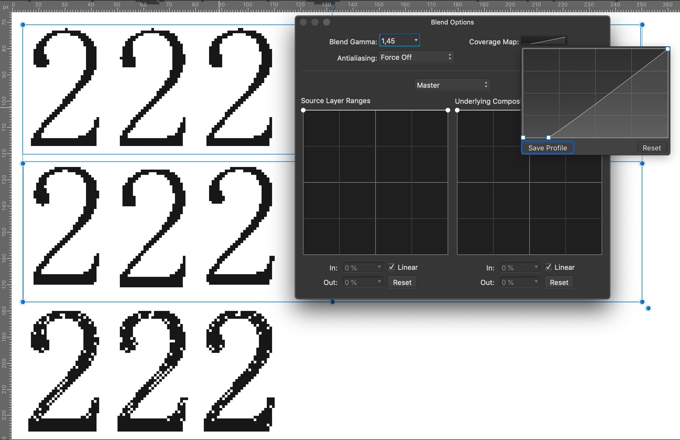
Even for "somewhat" it is too far from the requested solution which at least would result in an identical appearance for same glyphs, independent from their x/y position. Compare the OP's initial screenshot of the wanted goal with the different rendering of your workaround: every of the 6 characters has another look. (the bottom row has a different curve map set)
-
Really? To me in V1 the default "Press Ready" preset (e.g. A4) has 3 mm bleed at all four edges in a facing-paged document. This makes sense, imho, because the print service may ignore this area in the imposition process easier than creating this for an exported PDF which lacks the inner bleed. Your document setup is fine. In fact, this layout page arrangement is particularly useful (-> necessary) when layout objects are placed across the spine of a book and appear on the left and right pages of a spread, regardless of whether it is the middle spread of a book or another spread. There are various terms around, even within Affinity: while its document setup says "facing pages" its Export options say "spreads" when talking about double-pages. It may be even more confusing in other languages, for instance the German version says "Layoutseiten" instead of "Druckbögen" (= "Spreads") although all single pages in a single-paged-document are "layout pages", too.