thomaso
-
Posts
11,597 -
Joined
-
Last visited
Everything posted by thomaso
-

X Camera and Photo information
thomaso replied to redmorgie's topic in Affinity on Desktop Questions (macOS and Windows)
Again, so what? As mentioned & illustrated above, this factor of limited and different screen spaces is experienced, known, handled and solved "by design" in Affinity for various aspects / spots of the existing interface already, while the existing solutions can be used for future UI items, too. There is no demanding requirement to reinvent the wheel – while additional, alternative solutions aren't excluded of course. -
X Camera and Photo information
thomaso replied to redmorgie's topic in Affinity on Desktop Questions (macOS and Windows)
Sounds like an odd argument if we consider that the UI is designed "by design" to display certain info at various, alternative spots. Especially the two Toolbars have items that are available via panels, too. They even can show the (space demanding) Align buttons synchronously as duplicates: This screenshot also shows that the interface is not really optimized: If two objects are selected the "Lock Children" button is a lot easier to access than with only one selected object – even if one of this two objects has no child at all and would not make the checkbox appear if selected alone. (e.g. picture frame + text frame) However, I don't miss the exif data, I was just wondering why you literally mentioned screen space as the reason for not being displayed there (which, like file name + zoom, also could be solved via tool-tip on low screen space). Nevertheless, as @firstdefence pointed out, users might want to choose specific info for being displayed there, which indeed would mean a lot more coding, design and developing work.
-
X Camera and Photo information
thomaso replied to redmorgie's topic in Affinity on Desktop Questions (macOS and Windows)
By the way (though it's answered for Affinity): The free exif Tool lists all these meta data which are stored with an image: https://exiftool.org/ It can be more verbose than the APhoto Metadata panel. Click an item, e.g. a brand name, to get a full list of possible tags: https://exiftool.org/TagNames/index.html -
X Camera and Photo information
thomaso replied to redmorgie's topic in Affinity on Desktop Questions (macOS and Windows)
So what? Also the bottom Status Bar for instance may contain more text than can be displayed, e.g. with the Node Tool. – Here on a 16" retina screen, 2880 px: Another similar spot in the UI is the Status item in the Toolbar: it gets auto-cropped depending on the available space left by the other items. Fortunately, it displays the full file name + zoom level as tool-tip when hovering: When developing in Lightroom I appreciate the option to make various info appear (+ toggle through 2 customizable sets) in the upper left corner by pressing a single key. For instance ISO, time and time correction. Also pixel dimensions or full file name are useful there, or aperture in certain situations, e.g. if variations where shot.
-
I'd rather try to reboot the mac in Safe Mode first. https://support.apple.com/guide/mac-help/mh21245/12.0/mac/12.0 This way also the mac's font data base gets reset. (… while resetting Affinity to factory defaults resets all your custom preferences).
-
"Zooming out" brain teaser
thomaso replied to nickbatz's topic in Affinity on Desktop Questions (macOS and Windows)
Therefore, I would say that it is an impossible (paradoxical) goal or idea to solve this problem along a technical recipe ("brain teaser"). Instead it is a matter of visual phantasy and imagination first about the detailed texture you want to see versus the exact details you want to exclude. It is not a question of reality (as a photo might suggest) but a lot more of art and artificial, free creation. -
"Zooming out" brain teaser
thomaso replied to nickbatz's topic in Affinity on Desktop Questions (macOS and Windows)
I thought so already, from the sample images in your other thread. But then it is even more useful to describe an expected result or wanted modification with unambiguous words, while a comparison like this… … did not help to describe or even define a wanted visual appearance. – I even guess that a finally satisfying result could also trigger this association, who knows? In the small image size your wall texture looks like mold, which is a similar, possibly unpleasent comparison and without a clear definition of its look. -
"Zooming out" brain teaser
thomaso replied to nickbatz's topic in Affinity on Desktop Questions (macOS and Windows)
There is no "look the same" in this case. Something larger will either show more details or will appear missing details. Thus it will require a visual idea (imagination) or ideally the ability to describe the wanted result in a way that it may get technically transferred. (like the terms 'pixel', 'resolution', 'colour value' or 'contrast' do.) You might get closer to the wanted result if you create a new photo with a lot higher resolution. Then zooming would not cause any 'new' texture because upsizing and technical resampling would not be required. Brain teaser comparison: Do these images show reality? Do they "look the same bigger as they do smaller"? Are these surfaces "real"? https://www.gettyimages.de/grafiken/elektronenmikroskop -
"Zooming out" brain teaser
thomaso replied to nickbatz's topic in Affinity on Desktop Questions (macOS and Windows)
I think this is a misunderstanding which results from the fact that we (the human) are able to technically zoom-in but our biological eyes never can. ( I guess no animal can, right?). Accordingly it doesn't make much sense to expect a certain look when zooming in or to feel a zoomed view as right or wrong with a specific amount of details. As mentioned before, just imagine a birds view on green grassland. Zooming in as photo is something fully different than zooming in in real life. The latter brings you closer to the single straws and finally to the brown ground, means to a fully different motive and reality – while the photo doesn't even know about the single straws and the ground but the pixel and resolution only. So, for your goal you can simulate only – and just feel it look correct. -
Hard to understand for what purpose or possible advantage a company names a product with common words like "Preview", "Designer", "Photo", "Publisher" …? It's even worse because possibly more confusing than e.g. "Genious", "Intelligence" or "Tomorrow". Will a newborn ever be named "President"?
-
"Zooming out" brain teaser
thomaso replied to nickbatz's topic in Affinity on Desktop Questions (macOS and Windows)
If details are wanted to be reduced then down-sizing might be more interesting than up-sizing here. Nevertheless, any scaling / resizing affects the entire image in one same way and does not distinguish between small or large details with high or low contrast but just considers pixel "size" (resolution). -
Affinity V1 optimized for M2?
thomaso replied to Nick12961's topic in Affinity on Desktop Questions (macOS and Windows)
I don't think there is a universal "optimum," so your ideas are worth just trying. Note that not all users and not all M1 or M2 Macs are or were affected by the same reported problems, which might indicate that it depends heavily on specific hardware + performance settings + workflow. -
"Zooming out" brain teaser
thomaso replied to nickbatz's topic in Affinity on Desktop Questions (macOS and Windows)
If yes, detail contrast also gets influenced by Luminance Noise Reduction only, for instance: p.s.: once the contrast got reduced it may get increased in an additional step to re-emphasize major edges. Also the Clarity affects contrast in a similar way and can get used for both sharpening and unsharpening. You can block me in your forum options. While I don't see were I did "need" or request anything from you. To me it appears I tried to describe with words what I see in your images and what I assume or possibly misunderstood in your descriptions. No "do this or deliver that". And, R C-R did not text at all in this thread, right?
-
Affinity V1 optimized for M2?
thomaso replied to Nick12961's topic in Affinity on Desktop Questions (macOS and Windows)
Regarding your topic, V1 will receive future updates only in limited situations, such as "critical problems caused by the operating system", which I don't understand as optimization in the sense of speeding up app usage. – Accordingly, future hardware changes will not cause Affinity updates for V1 but quite likely will (have to) be considered in V2 updates. https://forum.affinity.serif.com/index.php?/topic/173986-affinity-v2-updates-pricing-and-no-subscription-repost/ -
Affinity V1 optimized for M2?
thomaso replied to Nick12961's topic in Affinity on Desktop Questions (macOS and Windows)
It seems neither V1 nor V2 are "fully optimized" (whatever aspect you mean) as the various issue or/and bug reports respectively their frequent recommendations to deactivate hardware acceleration indicate. Also, the performance preference options appear to leave "optimization" partially up to he user and may depend on specific tasks when using the apps. https://affinity.help/publisher/English.lproj/index.html?page=pages/Workspace/preferences.html?title=Preferences V1 – Performance options RAM Usage Limit—allows you to set your preference for optimising application performance for your projects. Disk Usage Warning At—choose the limit at which you are warned about disk usage. Undo Limit—choose the history length you are able to access. View Quality—choose the way in which the image displays during modifications. Select from the pop-up menu. Choose whether to dither gradients, when working on projects, to speed up performance. Choose a clipping option for optimising performance. File Recovery Interval—sets the interval for saving temporary data for currently open documents, allowing a document restore to be offered at startup if the app develops a fault. Display—Choose whether to use hardware acceleration such as Metal, OpenGL or OpenGL (Basic), or use Software acceleration. If your computer experiences performance problems, use the above option order until performance is acceptable. Metal requires Sierra macOS (10.12.x) and above, with Affinity optimised for High Sierra 10.13.x) and above. If your Mac has an additional discrete graphics card, checking the Use only integrated GPU will not allow access to it, therefore reducing power consumption and conserving battery life (useful for unplugged MacBook Pros). Retina Rendering—choose your rendering experience. Select from the pop-up menu. Automatic (Best)—renders as non-retina followed by retina for balanced performance and quality. Low quality (Fastest)—renders as non-retina only for highest performance level but compromises on quality. High quality (Slowest)—renders as retina only for high quality but may compromise performance. Hardware Acceleration—checking Enable Metal compute acceleration boosts some tasks' performance if a compatible GPU is available. See the Hardware acceleration topic. -
Affinity certified courses
thomaso replied to SalvioC's topic in Affinity on Desktop Questions (macOS and Windows)
https://duckduckgo.com/?q=corso+affinity+app+italia&t=ffab&ia=web < click to enlarge
-
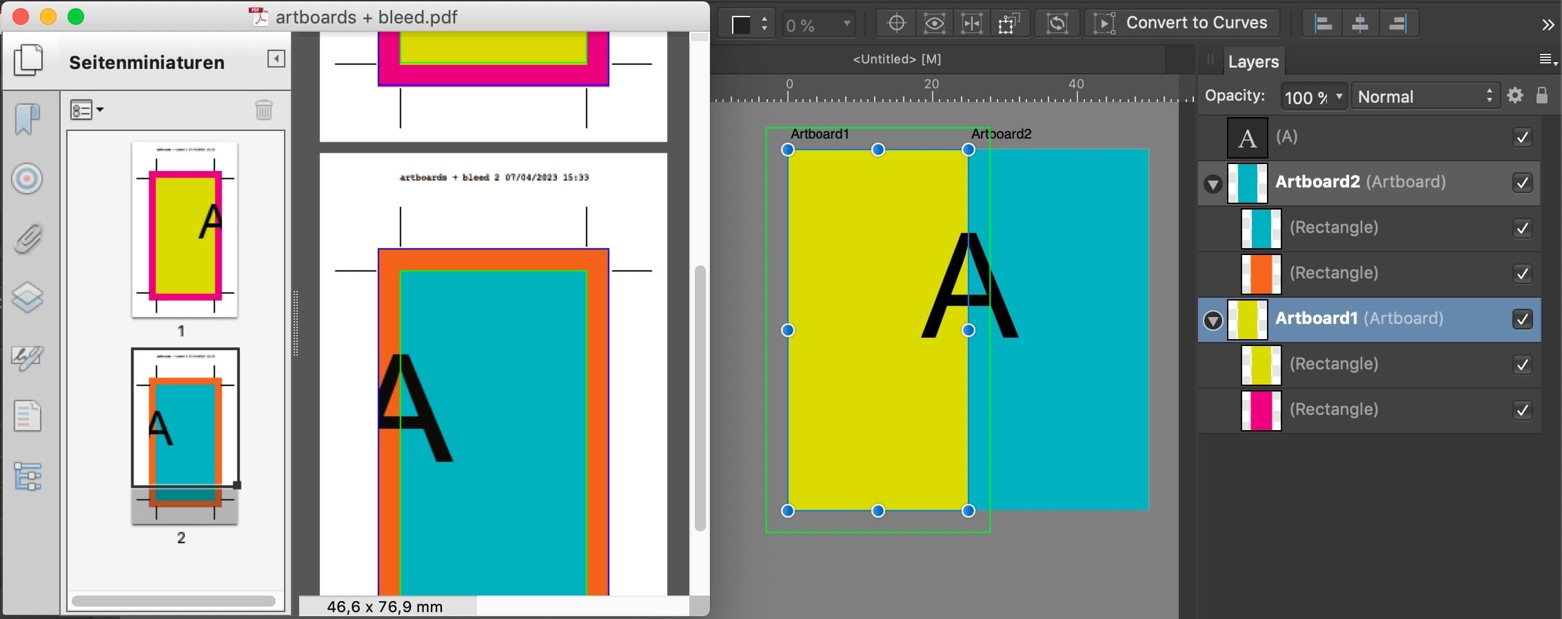
Do you have bleed activated in the export options? – Here another sample (pink: bleed at an outer edge / cyan: bleed between panels): (To avoid confusion in my screenshot: Acrobat shows the page size as the thin green line (and the bleed as dark blue) – whereas I had set in AD green for the bleed. Stupid me, sorry)
-
In my screenshot the dimensions + layout items are just any examples, while two rectangles per panel should indicate the panel size versus bleed size. Yes, the empty artboards 1, 2, 3 represent your single panels. With this workflow you don't need to add manual, faux crop marks. As mentioned above (for APub), those would not get interpreted as crop marks by an automated prepress / print workflow. Why a double export with re-importing and not using bleed + crop marks from Affinity? I don't see an advantage and I think it is not required to achieve your goal.
-
You are right, objects outside an artboard layer get auto-moved by Affinity once you do any modification to them – which is not useful here during the layout phase. To surround this disadvantage you can create an extra artboard for the layout only (below: "ALL"). Its size + position covers exactly all panels (the single print pages) which remain empty and get used as export pages only. Then, before export, you move all layout layers in the Layers panel out of this "ALL" artboard to make them occur after export on the other artboards as wanted. After export you can delete the "ALL" page from the PDF.
-
Can you add an additional page (empty), zoom out to display both pages in the layout window and show the transform panel with these objects selected in a new screenshot? … and possibly respond in your initial thread, not here?
-
"Cologne. Its a VERY beautiful city!" – No. At least from architectural aspects it is famous for its ugliness, "by design" of the 1950th. Additionally it's heavily critisised for its terrible cycling infrastructure AND overcrowded by cars. – Where are you from?
-
What Affinity app? In AD you can place artboards accordingly and combine the panels this way while each will get output with bleed + crop marks. In APub you need a workaround via extra rectangle objects in bleed size (color not necessary & layer hierarchy doesn't matter) and use these for export as "Selection Area". Unfortunately you can't export with auto-crop marks this way. And, while you may add crop marks manually drawn in the layout, an exported PDF, respectively a PDF reader app, would not "notice" them technically as bleed & crop marks and the resulting page size would include the bleed and crop mark area this way and may confuse the software or printer.
-
the boy stood on the burning deck … but forgot the checkbox. beaten! 🦄 P.S.: "shift" depends on your custom app preferences (and object types, too). So "shift" may be required or not to maintain the aspect ratio while dragging.
-
Table of Contents
thomaso replied to E9B6's topic in Affinity on Desktop Questions (macOS and Windows)
Instead of choosing left or right aligned (= two styles) you can choose the option "Away From Spine". This will require 1 style only and auto-align left/right accordingly.
-
Use the outer handle in the bottom right corner for dragging. This will adjust the font size of Frame Text objects even if they are not grouped. Whereas resizing numerically (via Transform Panel) does never affect the font size of Frame Text objects, regardless of being grouped or not, but Art Text objects only.