h_d
-
Posts
1,472 -
Joined
-
Last visited
Everything posted by h_d
-
 Could be me doing something wrong... Colour coding gone mad:
-
The background switch only occurs when you open a window or dialog in the app. If I'm running Safari in Desktop One and I launch Photo from the dock it doesn't switch to Desktop 2 until I choose Open or New from the File menu. Minor detail really though.
-
Yes, it definitely does.
-
In my case I didn't assign Designer or Publisher to specific Spaces, they automagically assigned themselves. I've now manually assigned the three apps to three different Spaces and everything works as it should (purple background for Photo, blue for Designer, orange-red for Publisher, natch).
-
If you use Spaces in macOS, you can assign individual apps to individual desktops via the Dock. EG - go into Spaces, create a new desktop and give it a grey background. Launch Photo, then ctrl-click its Dock icon. Choose Options... and then Assign to This Desktop. Next time you open a file in Photo, you'll automatically switch to your grey desktop background. However... I discovered while experimenting with this that assigning Photo to the grey desktop also assigns Publisher and Designer to it. Whether this is a bug or a feature or either macOS or the Affinity Suite I do not know.
-
Rotate a photo?
h_d replied to Moreteavicar's topic in Pre-V2 Archive of Affinity on Desktop Questions (macOS and Windows)
The 'grid of smaller squares' indicates the inevitable transparency ("alpha areas" in the video below) that you will get when you straighten as the corners of the original are moved round. This is the official Affinity guide to Straightening Images: -
That wasn't entirely clear from your original question There's quite a bit of overlap in functionality but Designer has several features that aren't available in Photo: Symbols (synchronised edits across multiple instances of the same object); Select Same (quick multiple selection of objects with the same attributes, eg fill, stroke, blend mode...). Dedicated vector editing mode, dedicated pixel editing mode. Artboards... Isometric drawing grids... Plenty more. Have you read Serif's description of what Designer does and who it's aimed at? If you regularly create concept art, print projects, logos, icons, UI designs, mock-ups and more then why not give it a go? There's a link to the free trial at the bottom of the page. Alternatively, watch some of the tutorial videos to get a feel for the software. But as @v_kyr says, ultimately only you can decide if you need it or not.
-
I would create a second, blank master page for the 'chapter pages' and apply it to them.
-
Absolutely.
-
No probs, sorry for the confusion.
-
Ahh sorry this only works on single spreads. I'll leave my original post as it may give someone some ideas, but back to the drawing board I fear...
-
In Publisher, switch to Designer Persona. From the Select menu, choose Select Object > Embedded Document. In the Layers panel they will all be selected. Change the blend mode to Darken. Switch back to Publisher Persona. Hope this (or a variation) works for you. If only... (sobs quietly in a corner).
-
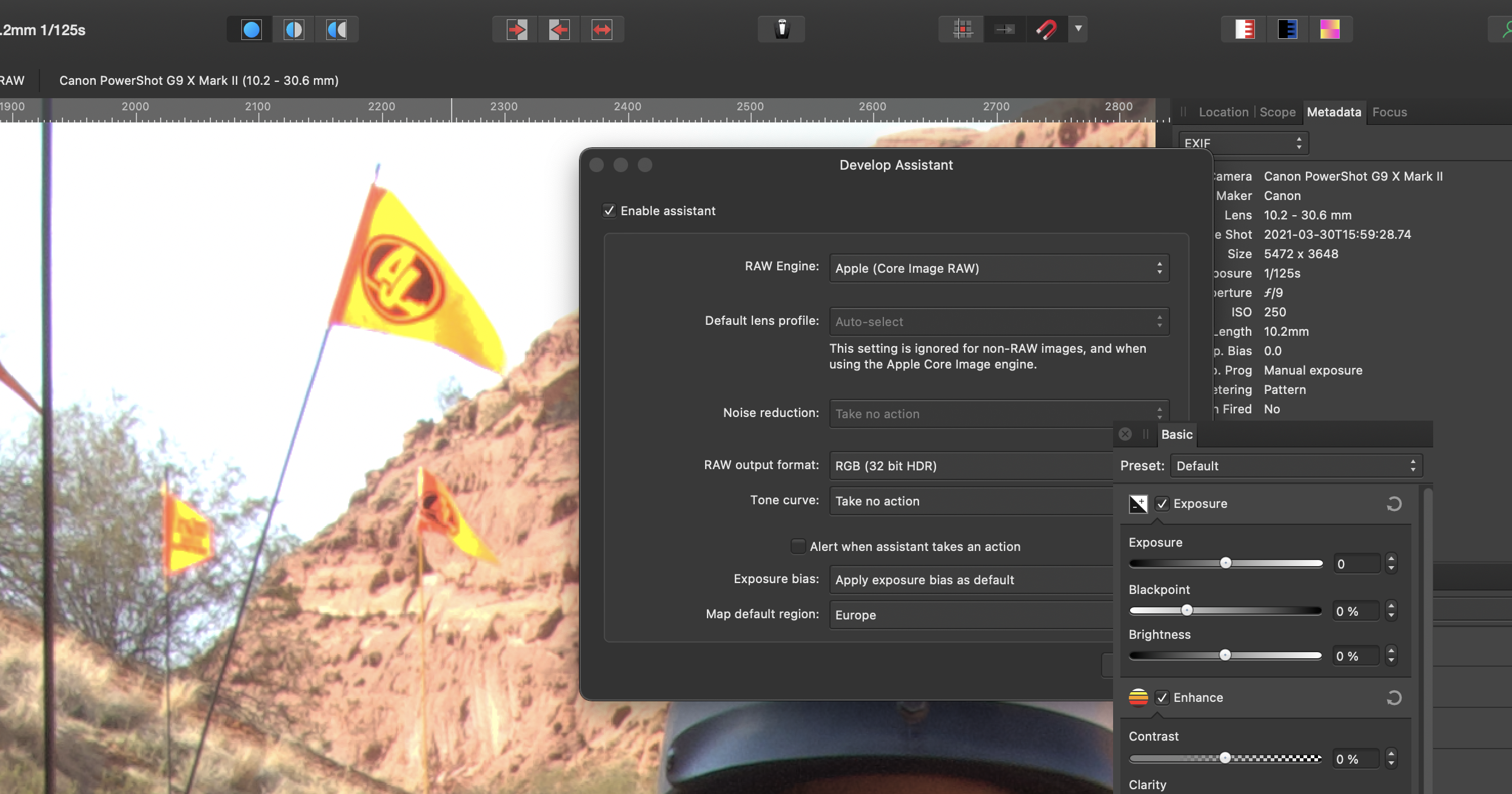
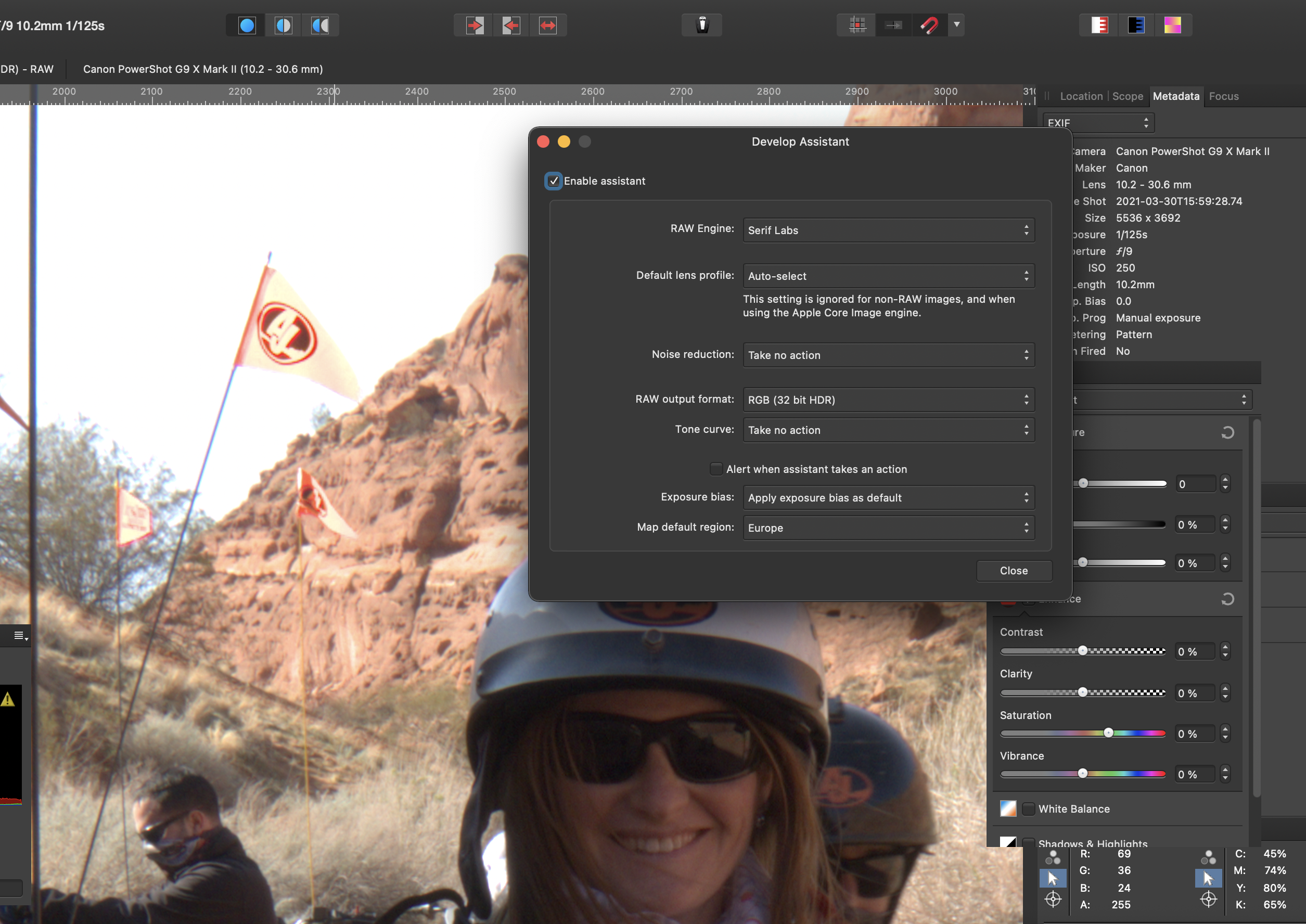
You may be able to improve things somewhat by turning off the default Tone Curve and applying exposure bias by default in Develop Assistant: (It doesn't help that the flags are up against a large area of blown highlights.) Above is using the Serif Labs RAW Engine. (A bit OT this next bit... This is what I get in Develop Persona when I switch to Apple's Core Image RAW: I made this second grab immediately after opening the .cr2 file in Affinity Photo, Develop Persona, without any adjustments except for the exposure bias in the Develop Assistant. The flag actually looks more saturated on my screen than it does in the grab. And this is the exported .jpg, of the image after development, with absolutely no adjustments: I appreciate that this probably doesn't solve the problem for you as you look to be on Windows, so Core Image won't be an option for RAW development. But it does show that the data is there in the original .cr2 as opened by Affinity Photo.)
-
Hiya @Ohls and welcome! Hope you didn't feel you were being ignored Not that I'm aware of, but it may vary depending on hardware and OS. I don't think so, no. Yes - with the curve selected and the Pen tool active, just select all (Cmd-A on macOS, Ctrl-A on Windows I believe.) Yes - Preferences, Keyboard Shortcuts, Designer, Layer menu, scroll down to the Geometry commands and type your shortcut into the box. (Same procedure for macOS and Windows.) Cheers, H
-
One intro is @James Ritson's tutorial on compositing images.
-
All I can tell you, having recently reached it, is that you get four blobs at 1000 posts. (Where has my life gone?) At some point (certainly on three blobs) you can customise your title on your profile page. The version of the website on my phone (iOS 14, Safari) has a different layout from the desktop version and works quite well, although it's not an app as such.
-
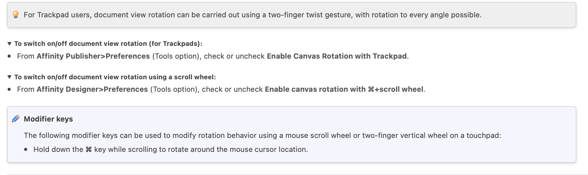
Hi, very minor thing but the help page for Rotate Document View (online and in-app) refers to Designer prefs not Publisher when describing rotation with the mouse wheel. Cheers, H
-
Pleasure - hope it works for you!
-
Here you go. In my original description I omitted one step - adding the smaller circles to the larger one after 'punching through' the circular holes. This step is included in the history of the attached file. converted bbc negative logo.afdesign
-
Hi Adam, There's no punch tool as such - it's simply the name I gave to the layers that I was using to 'punch through' the white shapes using Geometry - Subtract. Bear with me and I'll upload an .afdesigner file with the history saved so you can walk through it. TBH you could probably do the job in Publisher but the Geometry tools are a little bit more accessible. Cheers, H
-
Hiya @John Kirk and welcome! You need to use Export from the File menu to create a .jpeg (or .tiff, .png, .pdf etc) from an Affinity Photo document. You can then either save the Affinity document as a separate file, or close it without saving. In both cases this will leave the original .raw file untouched.
-
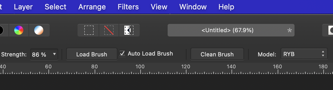
Some ideas (not a tutorial). Photo is definitely the right program to use for it. Start with a white fill layer and rasterise it. This will give you something akin to Bob's liquid white background. Use the Paint Mixer brush with different colours, sizes, shapes and strength settings. Experiment! Use muted colours - Bob paints with pigments, whereas Photo paints with light. Using the RYB setting for the Paint Mixer brush will help with blending. Auto Load Brush will also help. Clicking Clean Brush will make you feel like Bob whacking his brush on his bucket and spattering the film crew. The rest is just happy little accidents... and I'm not showing you mine 😆
-
Hiya @vik and welcome! I'm not entirely sure what you mean - something like this perhaps? Changing the blend mode on the triangle in the Layers panel (here I've set it to Lighten) modifies the appearance of the underlying colour. But it's quite a limited effect, in that the resulting blend is dependent on the original colours) You could duplicate the triangle and choose a different blend mode on the top copy: but if you wanted anything more complex then tbh using masks is probably going to be your best bet.
-
... One of the problems with following Photoshop tutorials using Affinity Photo is that you have to be pretty familiar with both programs in order to understand the concepts - and the differences between them. Not saying it's not possible, it's just an added layer of complexity, which may not be ideal if you're of an impatient persuasion.