

David4
-
Posts
210 -
Joined
-
Last visited
Posts posted by David4
-
-
-
Got it. Hoped to use this feature with levels.
Haze removal has the tool. In future iterations that feature could be in levels, and curves.
Cheers,
David4

-
In printer dialogue I would like to move the image in the box, up, or down, in order to utilize the
portion of the printer paper I choose.
Thank you
David4
-
Using levels, I want to have the screen split, vertically, so I can see what the adjustment does compared to the 'original'.
How do I do that?
Kind regards,
David4
-
-
James.... uncheck or delete "it" before hand. What is "it"?
If you are using soft proofing, just be aware that if you flatten, print or export your image, it becomes rasterised and affects your final output, so uncheck or delete it beforehand.
Hope that helps
-
RCR I don't see what else David can possibly tell you that will enlighten you to help him with the last response. Looks pretty cut and dry. I can follow all the things he was asked.
Why, thank you, evtonic3. People who have NO idea of critical color management and digital capture and digital printing are not helping.
Quoting from RCR: Phrases like "several hours of curing" or "I make adjustments in LR or PS" tell us nothing about that -- it is a lot like saying "I did some stuff & didn't get the results I wanted."
RCR: Curing: This is a natural physical phenomena for a Giclee print. Whether canvas or archival, acid free watercolor paper. Colors change. Some areas get lighter, some darker. Professional printers know not to judge a print immediately after is comes out of the printer. I usually have a client look at an Artist proof, a day after printed.
When I print the 'target' that will be read for custom .icc profiling of the printer/ink/substrate, I wait three days before reading this target.
Cheers,David4 -
Hi David,
as R C-R and others have said, it would be very helpful, if you were able to detail your workflow in the form of a numbered list from start to finish (without leaving any detail) and if you did so for Photoshop as well. As you can see from earlier threads, many people who are willing to help have a hard time to guess where the point at issue has to be located. Would you be so kind to take the time and write down a protocol in the following way:
1. Affinity Photo Colour Management Settings:
a. RGB Colour Profile: ____ProPhoto RGB_______________
b. CMYK Colour Profile: _none___________________
c. LAB Colour Profile: _____none_____________
d. Rendering Intent: _perceptual_________________
e. Black point compensation: __ ticked __x unticked
f. Convert opened file to working space: __x ticked __ unticked
f.a. And warn: _x_ ticked __ unticked
g. Warn when assigning working profile to unprofiled files: __ ticked __ unticked
2. Develop Steps, for instance:
[a. Open RAW etc.] white balance, exposure, brightness, black point, be sure I am in ProPhoto RGB for working/editing space profile.
[b. Adjustments to the RAW file in Develop Persona] exposure, brightness, black point, flatten
[c. Click Develop] exposure, brightness, black point, soft proof for printer/ink/substrate being used, levels. crop and size flatten
3. Further Adjustments in Photo Persona same as above
4. Export Steps, for instance:
[a. Choose File > Export … export only if need tiff for printing to LSI's Printao 8
[b. Select Tiff] yes
[c. Click More … button] double checked, yes
[d. Embed profile (which one?), tick respective button] ProPhoto RGB, the color working space.
5. Use of External Application for Printing use AP's print dialogue to send to printer. Also use LSI's Printao 8. This requires export as tiff.
That would be very helpful. Does that make sense? :) More thoughts? David4
Cheers, Alex
The print, after several hours of curing, is less saturated than on display..
When using PS CS5 or LR 6.5.1. the print is nearly, almost, the same as what is on the screen. You see, I make adjustments in either LR or PS, and know those modifications will print as I see them.
I never every tell my clients results will be perfect.....though sometimes, for whatever reason, they are.
At this point, AP cannot be used for "professional" printing.
If someone IS using AP for professional printing, please inform me how they do it.
-
Well, I had shown how they look different with screen captures.. Then other discussions showed up regarding displays, which had no baring on screen capture. Screen capture simply allowed others to view the differences.
Are you asking me how I create my custom .icc profiles for my Epson Pro 9900 44 inch printer? What the steps are?
Are you asking me where and how I use my printer profile in AP?
For me, it would be easier to speak with you on the phone. Let's speak on the phone. If okay, I will give you my phone number.
I am ready now
PS: What I keep repeating is the simple way color management is implemented in PS CS5, and in LR 6.5.1. No secrets. No complications.
Should it be I am missing some simple step in implementing color management, a simple phone call can help me.
Answering the below question, I look at the images. full screen on my NEC PA 272 display. 27 inch display. Not thumbnails.
Also, it would help to know how the appearance differs, if you are using the small preview in the OS X print dialog for comparison
-
Okay. Let's get this straight. ProPhoto RGB is my color working space. Repeat. My color editing space is ProPhoto RGB. I cannot be any plainer than that. My color working, color editing space IS ProPhoto RGB. Not my printer profile.
NOT my custom .icc printer/ink/substrate profile ! ! ! !
Target format is tiff. tiff!
If you folks are not on the same page with me, David4, than there is a huge gap in our thinking, and goals.
So, work with me ! ! ! Please.
Custom .icc printer profile is used for printing to my Epson Pro 9900, 44 inch wide printer.
ProPhoto RGB is my editing/working space.
Got it?
Forget all the stuff about displays and screen capture. Has nothing to do with fine art printing. I had been requested to send screen captures for others to compare what I saw on my PS 272 professional display. And I did. Then some of you started discussing the display issues. That had NO baring on looking at differences in screen captures, or what gets printed.
Simply put, when I am prepared to send an image file to my Epson Pro 9900, 44 inch wide printer, I have a choice of two methods. One method is to use the print dialogue in Affinity Photo. I have the option to see a preview before printing. The preview does not have the appearance of what my finished image file looks like and I expect to print. Period.
The other method is to export as a tiff and use this exported image file to print through LSI's Printao 8 software. And again, what I see on the display does not match what I have prepared to send to the Epson Pro 9900, 44 inch wide printer.
In either situation, the image file needs more adjustments. THAT SHOULD NOT BE THE CASE ! ! ! ! !
Kind Regards,
David4
-
Been using it.... and again just now. Not the solution. Box has been checked.
-
Hi
Question
Make sure ProPhoto RGB is chosen, or the custom .icc printer/ink/paper profile is chosen?
-
Naw...that can't be it. ProPhoto RGB is already chosen. Maybe I should choose the custom paper profile I have created.?
Again: "By default, exported files are unprofiled, i.e. a colour profile is not embedded within them." Does this mean when I export an image file from AP, the .icc profile is not included?
Really wished there was a simple answer, like what I know, in PS CS5 and LR 6.5.1. No goplbley gook, strait and narrow. Been using those PS since 3, and learned color management from the best. Lectures with auther of Real World Color Management , Bruce Fraser.
And lectures and classes galore. Not bragging. Just I have not sat around and done nothing regarding color management.
I am not sophisticated in coding, and other stuff. Nope! Beyond my abilities.
David4
-
Thank you for asking, R C-R. I go to file > export > and the dialogue box comes up. I use tiff, lanczos 3 non-separable. and finally export button
David4
-
Hello Affinity family. This is from the help menu.
"By default, exported files are unprofiled, i.e. a colour profile is not embedded within them." Does this mean when I export an image file from AP, the .icc profile is not included? Help says this file is not included for use in WEB. I don't export to web. I export for further imaging corrections, and finally to print.
What are the steps to do what the below sentence requests? Possibly, this is the reason I see inaccurate image presentations when viewing the same image file in AP and PS CS5.
- With Export Persona active, choose your Preset in the Export Options panel.
- (Optional) Select a different ICC profile from the pop-up menu. Otherwise, the document's colour profile will be embedded. 3. Check Embed ICC profile.
To embed a colour profile on file export:
- With Export Persona active, choose your Preset in the Export Options panel.
- (Optional) Select a different ICC profile from the pop-up menu. Otherwise, the document's colour profile will be embedded.
- Check Embed ICC profile.
You can also embed an ICC profile via File>Export (click More> in the dialog).
By default, exported files are unprofiled, i.e. a colour profile is not embedded within them. This maintains a low file size optimized for web use. On opening the file, your working colour profile will be assigned to the file.
-
Posted 26 February 2016 - 11:27 AM
No one has responded to this post I did, Feb 26, 2016. I would request MEB, or Allan, or someone would respond.
My goal in my workflow requires me to reproduce original art, as close to the original as is mechanically and chemically possible.
I personally create .icc profiles for the Epson Pro 9900 printer and substrates, my professional display, and Canon EOS 6D camera.
With LR 6.5, as well as with RPP 64, what I adjust in RAW looks pretty much the same in tiff. Adjustments are minor.
Not so in AP. I can adjust RAW in AP to appear as close to the original art as possible. In RAW I choose develop assistant, and make sure no changes will come about with the choices. Take no Action. Meaning I don’t want curves or exposue bias affecting and anything else messing with the RAW file. Adjust the image file as close to the original art as possible and ‘develop’.
Go to develop and all looks well. However, choosing soft proof, I am back to making large adjustment, again! So. back to the adjustments.
Seems there is no point in making adjustments in RAW.
I know RAW has quite a latitude for adjustments.
Am I tossing the RAW adjustments to the wind?
In advance, I thank all, MEMBERS and STAFF, for assisting me.
Have have made AP my workflow application. At times, I will also use RPP 64 for my RAW converter, and AP for the balance of the workflow. Printing is done with Printao 8, an application from LSI.
And I thank everyone for such a good job on developing AP!
Again, put full genuine color management in Affinity Photo.
Cheers,
David
-
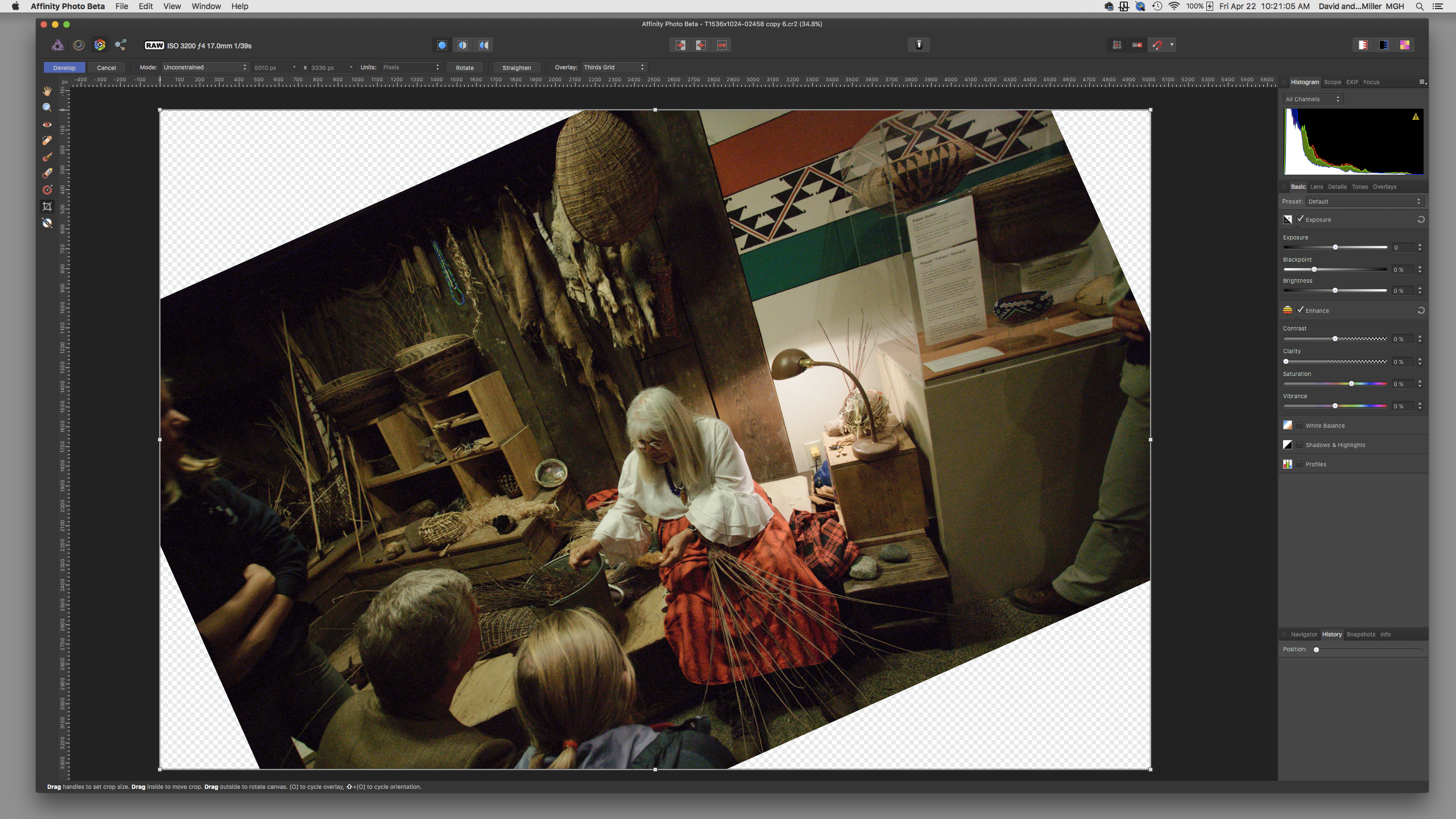
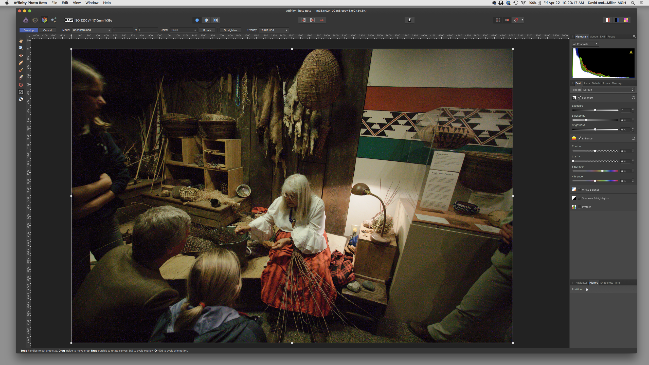
I have not been able to capture a screen shot of the leveling tool used in RAW and develop when I click on 'straighten". Please send me a link to instructions on how to use this tool.
Kind regards,
David4
-
Thanks mystrawberrymonkey..........
And, sobi, simply look for david4's posts in the forum.
Kind regards to all.
Cheers
David
-
sobi, I agree with you. No contest. What I have done, is, accommodate to these issues. Color management is my biggest issue.
I benefit from the way Lanczos 3 non-separable can create a larger image file without the blemishes introduced by
on1's perfect resize. I still use on1's gallery wrap.
-
Hello Sobi. Me, David, is not on staff. Just a simple minded user of AP.
I also had issues. Won't go into them. And you can find them in the questions and in the help areas.
After much help from strawberry monkey, and probably 13 others, I have learned to use AP. Now that I know (I think I do) AP, I just cannot visualize returning to PS CS5, and LR 6.5.
PS CS5 and LR 6.5 are still in my workflow, secondary to AP. Couple of things I do is easier with PS CS5.
My earlier posts......well, just look at them. Now I have mellowed. NO! I don't smoke anything.
Staff and members are of great help.
youtube as well as facebook, have excellent tutorials. Some authors make exceedingly fast presentations and I have had to repeat them several times to learn what they are presenting.
Kind Regards,
David
-
Good question, Garnick. I'm waiting for an answer also
-
R C-R: Thank you for your explanation. I appreciate you! Still, I need to know what steps to take in Affinity Photo, to do the work flow I show in my screen shots. What you write is good for me! How do I do what I can do in PS CS5, in Affinity Photo, forgetting the ability to read the mb's of the file?
Cheers,
David
-
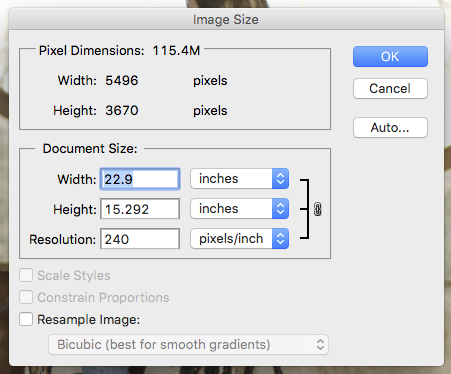
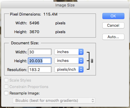
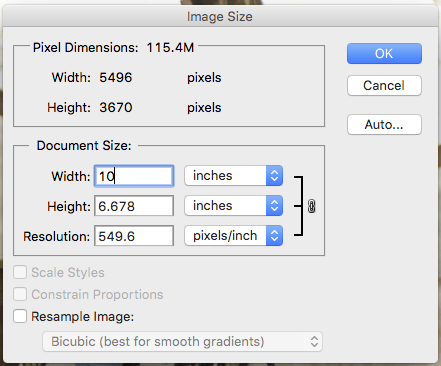
Let’s say I have an image file size of 300 mb’s. Working with this image file size of 300 mb’s, and keeping 300 mb’s I can increase or decrease the dimensions, top, bottom, left and right.
Not dealing with pixels, dpi, ppi. Physical size IS 300 mb’s.
So, what is important to me is to keep the 300 mb’s. I can then resize the image, smaller or larger and not change the 300 mb’s.
What will change is the RESOLUTION. And this is okay with my workflow.
How do I do this in AFFINITY PHOTO?
Also, where do I find the mb size of an image in Affinity Photo? For instance, a 300 mg file, without having to go to export to learn the size.
Using PS CS 5, screen shots show what I am writing about.
Cheers,
David
-
Resample checked or not checked?


To embed a colour profile on file export:
in Pre-V2 Archive of Affinity on Desktop Questions (macOS and Windows)
Posted
Alex, I did not know not to. Now I understand. Thanks ! ! ! I now unclick soft proof adjustment before flattening.
Could you elaborate on why you flatten your image with the soft proof adjustment applied? :)
Cheers, Alex
RCR: But if David would use his custom printer icc instead of ProPhoto he would not need any SoftProofing and would not have to do any conversion on his way to the printer?
Good question RCR... ProPhoto RGB is an editing space, and working space. Originally created by Eastman Kodak. It's a wide gamut editing/working space that not all devices can deal with. Consider looking into Chromix web site. They may have visual presentations of various color editing/working spaces. I use their ColorThink 2.3.1 regularly to compare my profiles to each other.
Consider downloading it. I think it's a valuable tool for digital imaging.
Melissa RGB color working space is similar. It's the native color working space in Adobe Lightroom. Melissa RGB is a Gamma 2.2 variant of linear ProPhoto RGB.
I would suggest I, and others use ProPhoto RGB for future applications and future hardware that will need this larger editing space.